As part of an experimental ideas exhibition, Tomas Ghisellini Architects (TGA) have designed an extension to the Italian Institute of Culture in Paris. Nine Italian practices were engaged by a consortium of French and Italian institutions, and this cohesive union of cultures is mirrored in TGA’s design. TGA’s proposal plays with transparency and layering, with two large volumes of glass and steel referencing the “Parisian architectures of transparency,” whilst displaying the excellence of Italian materiality and craftsmanship. The exhibition is being shown at the historical complex of the Hotel de Galliffet in Paris until December this year.
Courtesy of Tomas Ghisellini Architects
Rather than creating distinct Italian icons within the Parisian fabric, TGA proposes a scheme which is respectful and complementary to its context. The Italian influence is expressed instead through the delicacy of detailing and quality of material production, with both glass and steel manufacturing being perfected by the Italians after the techniques were adopted from the Middle East. Through its transparency and reflection, the expressiveness of the facade is mixed with the colors, characters, and forms of the Parisian architecture.
Courtesy of Tomas Ghisellini Architects
The buildings are made formed using dry construction, and are able to be reduced to their core elements and completely recycled, if necessary. Identical shading crystal slabs “build up the impression of changing, mysterious and somewhat indecipherable objects,” whilst similarly referencing the Italian’s perfection of crystal and glass sheeting. The glass elements, alternating in different depths and ledges, draw patterns and three-dimensional warps.
The blockish nature of the two buildings is offset by the softness of these smoked amber glass elements. To further integrate the buildings into their surroundings and respect the heritage of Paris, the rhythm of the vertical facade lines align with the facade features of the seventeenth, eighteenth and nineteenth-century buildings that are still visually present in Paris. The balcony positions reference the Parisian railings, and the crystallized nature of the facades reflect and obscure the buildings around them, creating “particle images” of the neighborhood.
By day, the buildings will absorb the skies and colors of Paris, at night, they will become amazing lanterns of soft light explained the architect.
Courtesy of Tomas Ghisellini Architects
The exhibition was created to foster innovative ideas for the actual extension of the Italian Institute of Culture in Paris. It was organized by the Italian Ministry of Culture and Foreign Affairs, the Italian Institute of Culture in Paris, MAXXI – Museum of 21st Century Arts in Rome and La Biennale di Architettura di Venezia. TGA’s proposal, along with the eight other Italian practices that composed a response, is currently being shown at the Hotel de Galliffet in Paris until December.
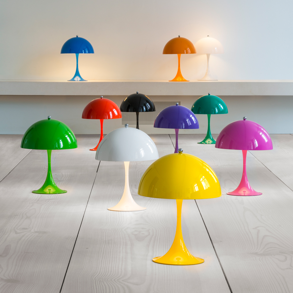
Danish lighting manufacturer Louis Poulsen is producing a new version of the iconic Panthella lamp by Verner Panton that was originally developed in 1971 (+ slideshow). (more…)
The selected design for the Marubi Museum developed by Casanova+Hernandez architects aims to promote a rich dialogue between tradition and modernity, between the past and the present. The legacy of the tradition is underlined by restoring the historical building designed by the famous Albanian painter, sculptor, photographer and architect born in Shkodër, Kolë Idromeno, while preserving its spatial and structural qualities without any volume transformation or new interior partitions. Conceptually, Idromeno’s building becomes an important “object” of the exhibition to be shown, contemplated and visited.
A modern image associated to the new museographic program is achieved by installing five “functional boxes”, which are prefabricated and detached from the original building, working as pieces of furniture or sculptural elements. Tradition and modernity establish a dialogue in every corner of the building. At the exterior of the museum, a showcase element works as a landmark that indicates the museum entrance; in the interior of the building, the original windows and spatial qualities of the building dialogue with the exhibition boxes; and in the courtyard, the old building coexists with a new modern and sculptural back facade.
On the one hand, the museum program expands into the public space and one of the “functional boxes” becomes a showcase installed in front of the museum, serving as a landmark that invites citizens to visit it. On the other hand, public space enters the museum and the project erases the border between street and institution with a transparent and accessible ground floor that hosts a free-entrance multifunctional space for lectures, workshops and temporary exhibitions. As a result, the project intends to create an open and alive museum capable of becoming a cultural landmark linked to the street life of Shkodër.
Information and education combined into a multisensory experience
The exterior side of the functional boxes located on the first floor of the museum presents a chronological exhibition, which is intertwined with the thematic exhibition exhibited inside them. The chronological exhibition shows the life and achievements of the Marubi’s dynasty with texts, historical pictures, videos and objects organized around the biography of the three members of the Marubi’s dynasty. This information is put into context together with the history and culture of Albania and the city of Shkodër, thus acquiring an important didactic dimension.
The thematic exhibition complements the chronological exhibition by stimulating a multisensory experience that makes the visitor interact with the space and with the devices of the three thematic rooms. These rooms show three phases of the traditional photographic process presented inside the ideal reconstruction of the historical spaces where this process took place: the photo-studio of Pjëter Marubi “Driteshkronja”, the darkroom of Kel Marubi and the Gegë Marubi’s archive.
The modern image of the museum is based on an abstract pattern, which is inspired by the geometry of the aperture of the photographic camera that opens and closes to control the light. This abstract pattern is used to design the structural layout of the five exhibition boxes installed in the building, while at the same time integrates a complete and versatile exhibition system that includes frames to exhibit photos and documents, showcases for objects and video screens for slide-shows and short movies.
Section
Section
The abstract pattern, which is always mixed with the photos and objects of the collection, becomes the symbol of the museum. It can be recognized at different scales and in several parts of the building such as in the logo of the museum, in the design of the street showcase, in the layout of the functional boxes inside the building, and even in the structure of the new artistic back facade that frames the views over the surroundings and filters the light within the building. Marubi National Museum of Photography acquires its own specific identity by linking all spatial, structural, functional, graphic and visual aspects, helping visitors to identify building and collection with a complete, rich and unique experience.
Upon opening its doors for the first time on a rainy winter’s night in 1932, the Radio City Music Hall in Manhattan was proclaimed so extraordinarily beautiful as to need no performers at all. The first built component of the massive Rockefeller Center, the Music Hall has been the world’s largest indoor theater for over eighty years. With its elegant Art Deco interiors and complex stage machinery, the theater defied tradition to set a new standard for modern entertainment venues that remains to this day.
Industrialist and noted philanthropist John D. Rockefeller Jr. was approached in 1928 by a group of leading New York citizens seeking to build a new opera house for the Metropolitan Opera Company. Though Rockefeller himself was not particularly concerned with opera, his sense of civic duty and the favorable economic climate of the late 1920s convinced him to support the project. In October of the same year, he signed a lease with Columbia University for a parcel of land in Midtown Manhattan. Unfortunately, infighting between members of the opera committee and the Stock Market Crash of 1929 led to the project’s demise, leaving Rockefeller with a long-term lease that cost him $3.3 million a year.[1]
Courtesy of Flickr user Roger
Rather than attempt to break his lease, Rockefeller made the decision to build a complex of such exceptional quality that it would attract tenants in spite of the tepid business climate of the early 1930s. Beyond mundane fiscal concerns, however, Rockefeller dreamed of creating something that would leave a powerful impact on the fabric of New York City – an icon that would stand for optimism and hope—the “American Dream”—amid the dreariness of the Great Depression.[2]
Rockefeller’s search for a tenant to replace the Metropolitan Opera Company led him to the Radio Corporation of America, which manufactured radio sets and owned both the National Broadcasting Company and the movie studio RKO. This partnership, which was made official in June of 1930, brought in one of NBC’s radio stars, S.L. Rothafel – more popularly known by his listeners as “Roxy.” With a litany of successful theater openings in his wake, he left the Roxy Theatre to take a new position as director general of the two theaters to be built at the Rockefeller Center. The Roxy Theatre had boasted the highest occupancy of any in the world upon its opening in 1927, and now Roxy once again sought to claim that title for his latest project.[3]
Cutaway diagram from a 1933 edition of Popular Science. Imagevia thomwall.com
While Roxy may have been a star in his field, the designer chosen to create the Music Hall’s interiors was a relative unknown: Donald Deskey. Deskey, who had previously designed rooms for the Rockefellers’ Manhattan townhouse, was a proponent of the Bauhaus ideal that design should not cling to the past, but establish a new and timeless classicism of its own. He had also attended the Exposition Internationale des arts decoratifs et industriels modernes, the 1925 exposition that became the namesake of Art Deco. His forward-thinking design rationale was perfectly suited to the theme of the Rockefeller Center: “the Progress of Man, his achievements through the centuries in art, science, and industry.”[4]
via randylee.tv
Rather than rely on profuse ornamentation, as had been typical for theaters before 1930, the Radio City Music Hall was to make its mark through a modern approach and a considered restraint. Deskey designed over thirty spaces, including a Grand Foyer, several lounges, and smoking rooms, each with its own unique individual visual motif. Craftsmen contributed textiles, balustrades, and other decorative elements, while a collection of artists created several murals and sculptures. While Deskey did make use of traditionally luxurious materials like gold and marble, he combined them with new industrial products like Bakelite, permatex, and aluminum. The result was not the typical shock of frenetic ornamentation, but a more subdued, streamlined Art Deco luxe.[5]
Courtesy of Flickr user Steve Huang
To an external observer, the sheer scale of Radio City Music Hall is not readily apparent. While the neon marquee stretches a full city block, the ticket lobby is a comparatively humble space. Once guests pass through the doors, however, they enter into the Grand Foyer – a cavernous lobby standing sixty feet tall. This space was shocking in its muted elegance, with sleekly curved bronze balustrades, full-height mirrors backed with gold instead of the usual silver, and an immense mural composed of the same faded red and gold hues as the rest of the room. Typical theaters of the period mimicked exotic styles of other cultures or the past, evoking a sort of fantastical detachment from reality; Deskey’s design, meanwhile, would have seemed more suited to an upmarket hotel or ocean liner than a theater.[6]
The Dancers' Medallion on the exterior of the Hall. ImageCourtesy of Flickr user Heather Paul
Although the Grand Foyer is stunning in itself, the auditorium is naturally the centerpiece of the Music Hall. A series of proscenium arches, the largest of which is a full sixty feet (18.3 meters) tall, radiates from the stage itself. This stepped series of arches was Roxy’s brainchild; he explained to the press that he wished to recreate, through architecture and lighting, the same effect as a sunrise he had witnessed on a transatlantic crossing. Thanks to the colored lights hidden behind each successive arch, a multitude of visual effects beyond a simple sunrise can be achieved.[7]
Courtesy of Flickr user Mattia Panciroli
The curved ceiling also aided in acoustics, though it would be enhanced by the installation of loudspeakers behind golden grilles in the walls. Technology and architecture complemented each other in this system: the plaster covering the arches absorbed excess sound reverberation, allowing the broadcast through the auditorium’s speakers to be heard clearly and cleanly.[8]
The most elaborate technical achievements, however, were to be found in the stage itself. Various features were included to ensure that the Music Hall would be able to dazzle audiences watching the full variety of stage productions. The stage was split into three sections, each of which could be hydraulically raised or lowered independent of its neighbors. In addition, a circle radiating almost thirty feet from the center of the stage could be made to rotate in either direction, the first time these two capabilities had been combined into a single stage. Even the curtain itself was a technological novelty, with thirteen electric motors driving cables that could allow the drapery to take on a variety of unusual configurations beyond merely being opened or closed.[9]
The Gentlemen's Lounge. ImageCourtesy of Flickr user Kristina D.C. Hoeppner
Though Radio City Music Hall’s opening program on December 27, 1932 was panned by critics and attendees as long and dull, the building itself received no such complaint.[10] In fact, while the lackluster response to the show literally sent Roxy to the hospital, Deskey’s elegant Art Deco interiors were an instant hit with the theater’s visitors. An article published the following morning in the New York Tribune declared that “The least important item in last evening’s event was the show itself…it has been said of the new Music Hall that it needs no performers; that its beauty and comforts alone are sufficient to gratify the greediest of playgoers.”[11]
The Ladies' Lounge. ImageCourtesy of Flickr user Kristina D.C. Hoeppner
In the decades following that rainy winter’s night in 1932, the Radio City Music Hall has cemented its status as one of the world’s leading performance venues. 300 million people have attended shows and events at the theater since its opening, and it has consistently seen performances by leading actors and musicians throughout its illustrious operational life.[12] The theater’s interiors are also largely unchanged from their original appearance, thanks to careful maintenance and preservation by Rockefeller interests. Those who come to see a show at Radio City Music Hall today therefore walk into a carefully-preserved piece of history, one that appears to have achieved Deskey’s goal of creating its own timeless beauty.[13]
References
[1] Francisco, Charles. The Radio City Music Hall: An Affectionate History of the World’s Greatest Theater. New York: Dutton, 1979. p2-3. [2] “History.” Radio City Music Hall. Accessed July 19, 2016. [access]. [3] Francisco, p3-5. [4] Francisco, p8-10. [5] “History.” [6] Francisco, p24-27. [7] Francisco, p15. [8] Thompson, Emily Ann. The Soundscape of Modernity: Architectural Acoustics and the Culture of Listening in America, 1900-1933. Cambridge, MA: MIT Press, 2002. p221-223. [9] “World’s Biggest Stage Is Marvel of Mechanics.” Popular Science, February 1933, 16-17. p16. [10] Thompson, p221. [11] Francisco, p24. [12] “History.” [13] Francisco, p24.
Photographs: Courtesy of Flickr user Erik Drost, Courtesy of Flickr user Ed Schipul, Courtesy of Flickr user Roger, Courtesy of Flickr user Steve Huang, Courtesy of Flickr user Mattia Panciroli, Courtesy of Flickr user Kristina D.C. Hoeppner, Courtesy of Flickr user Heather Paul, via thomwall.com, via randylee.tv
Casa Tobogan is a private home located in Madrid, Spain. It was designed by Z4Z4 AAA. Casa Tobogan by Z4Z4 AAA: “A family is looking for a new home able to represent their trips around the globe, their desire to live in a garden and to embody the cinematic diversity of domestic life. The result is the design of two different houses on the same plot. The Tobogan House is..
We live in a go go go society. Don’t stop. Go to work, go shop, go home, get dinner, back out, go to extracurricular events for kids and family, go home, go to bed, rinse and repeat tomorrow. I’m exhausted just typing that out. When do we stop? When we’re sleeping? By the time we actually get to fall into bed we’re too tired and can’t sleep. It’s time to chill out. In fact, it’s necessary for your health.
We want to accomplish everything in such a short time. Save the world, if you will. Maybe we can’t save the world but we do want to try to do for others to save them. Maybe? The only one who pays for this madness is you. You can’t save the world or anyone else for that matter, but there is still time to save yourself. Here are a few reasons why you need to chill out, now.
1. Your mental health depends on you.
While you are busy running around and trying to save the world, your brain is screaming at you to stop or, at the very least, slow down so it has time to recharge. You need to give it time to process things, and relax. It needs time to decompress otherwise overload sets in and that isn’t good for anyone, especially not you. Exhaustion comes in many forms, not just physical, but mental too. When you recognize your brain shutting down, it’s time for you to shut down too and chill out.
2. Put that donut down.
Yes, you heard me. Put it down. When we are busy running around and not paying to the time of day, soon we realize it’s 2 pm and we haven’t had lunch yet so we stop at the local coffee shop and grab a donut, muffin, croissant or something that we think is going to fill our belly. It does, but only temporarily. Not only that, it adds unwanted calories and sugar into our bodies. These treats or midafternoon snacks are far from healthy. Throw a bag of almonds or some fruit in a bag and take them with you on your errand running day.
3. So stressed out!
That’s what happens at the end of the day. You have been going all day, eventually running on empty and realize that your nerves are frazzled. You didn’t save the world after all. In fact, you couldn’t even save your friend either. That’s not what you are here for and when you realize you aren’t, and you can’t save them you get stressed out. What did you do wrong? How come that didn’t work? Why is the world still falling apart? It’s not for you to answer these questions. Time to chill out and let others take care of their own problems.
4. Nurture your own growth.
When do you have time to do that? Are you making time for that? What about your passions and your hobbies and your enjoyment? Have you made any time for that or is that all sitting on the back burner while you run around for everyone else? It is important to take time to chill out and spend time with you. During this time, maybe you can nurture one of your hobbies or passions. Get a little more pleasure out of life. I mean, this is your life after all.
5. Bedtime is the best time.
Right? Who doesn’t love bedtime? Other than your toddler that fights to not want to go to bed, we all love bedtime. Ironically enough, you get there and can’t sleep. You’re wired up and fired up. Too much on the brain, too agitated from the day’s events, just too filled with anxiety to sleep. Sleep is crucial to our well being and without a good night’s sleep you will run the risk of creating health problems, physical and emotional, that were not there before. Take some time just before bed to unwind. Listen to some nice soft music, meditate, sip herbal tea or whatever else soothes your soul. Do this every day.
Remember, you are the most important person in the world and you can’t pour from an empty cup. Put your cup down every day and spend time with you. Chill out and enjoy some alone downtime.
Built using traditional techniques and local materials, the modern architecture is influenced by masserie (farmhouses) of the past. Set in five hectares of olive groves with trees up to 500 years old, Masseria Moroseta is an enclave of pared-down relaxation and rural simplicity.
Floor Plan
As in a traditional farmhouse, everything is set around the central courtyard: the salon and veranda with their views to the sea, the staircase to the roof terrace, and the six rooms and suites on either side, half with private gardens, the other half with private terraces looking out across the fields.
Vaulted ceilings and stone floors keep the inside cool on even the hottest days. The communal spaces encourage the kinship of community, while providing many intimate nooks for moments of simple solitude, both inside and out, including the living room, the veranda with its outdoor kitchen and bbq, the spa and gym, and the large pool. Leaving out the marks of time, Masseria Moroseta connects us with the past in a peaceful environment, and grounds us in the traditions of the Puglia countryside.