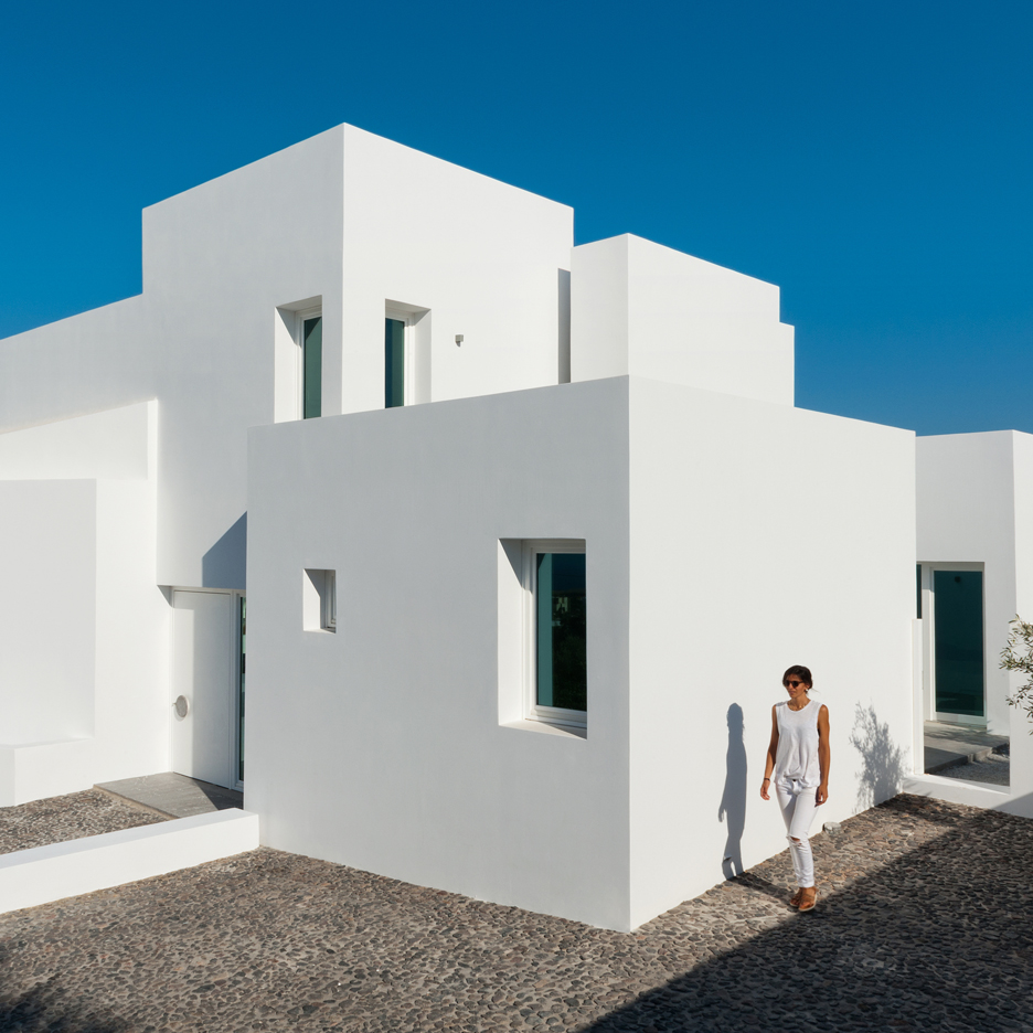
From the architect. Our senses open up when we sense a silence in a campus filled with sound, or when we feel darkness in a bright space. In this space time, a soundless force strongly gestures to us. Intension of the design for the BUFS(Busan University of Foreign Studies) Chapel is to create a silhouette towards the entire campus, which stands for the ideology of the school.
‘One cross’, ‘one silhouette’, and ‘one light’ became the central concept to make this a one and only being. The one and only space creates new relationships by opening itself up to the surroundings. Although it is not located on the dead center of the campus, it is expected to be the center of one’s heart as the light fills up the surrounding space, which brings a holy atmosphere.
The volume which reveals the energy of the mountain will become an object, which will emphasize the ideology. We revealed the structure through the materials of interior and the exterior and adapted the waffle slab structure in order to create space of ‘the one’. We only allowed bricks-which covers the whole campus-, white walls, and the object to sit on the top of the forest hill. The bridge and the massive door become and object that symbolize the one, and offers the direction of the users.
From the architect. Office AIO transforms tiny Hutong spaces into a serious coffee bar and B&B
Nestled within Xiang’er Hutong in central Beijing, Big Small Coffee + B&B has a total area of 34 square meters. The project consists of two parts: a coffee bar (19 sqm) and a guest room (15 sqm) linked by a courtyard shared with an elderly neighbour.
Owners of the coffee business wanted to bring serious artesian coffee to their customers in a small space, emphasising focus on just a good cup of coffee. Hence the brand “Big Small Coffee” – being small in size but big on intention.
site plan
Sun and Kwan – founders of Beijing studio Office AIO :“We imagined Big Small Coffee to have a fresh, and professional identity and we wanted to bring attentiveness to the design specific for its function and context. Making the most out of these two tiny spaces by turning constraints into design features.”
The spatial function is primarily split into two. Baristas and customers each occupies a side of the bar. This spatial distinction is expressed visually through a crisp change in materiality.
The small white butcher tiles scale the space, and is a timeless, versatile, bright backdrop. With a limited width available for baristas to move along the bar, strong magnets customised to the same size as the tiles are devised to provide easy, flexible access to tools, orders and any miscellaneous items.
The cork panels on the other hand is warm and inviting to the touch, it is also a sound absorber, making it an ideal choice of material in the context of a co-shared wall with the neighbouring living space.
Elongated bar concept
Tying the two sides together is the bar. Volga Blue granite is selected for its shimmering black with accents of a spectacular blue colour, secretly celebrates the brand’s visual identity.
The slab of granite is afloat by its mirror-clad body, punctures through the transparent glass façade. While providing extra seating on the front patio, the gesture also serves to dissolve the envelop in-between interior and the hutong scenes.
western elevation
Product display and storage is limited due to the spatial constraints. A custom designed open shelf unit is hung from above the bar bench, efficiently occupies the relatively generous height of the space without interrupting circulation. The transparency provided by the use of acrylic sheet diminishes the weight of the shelving unit visually, allowing focus to be on the displayed items.
On the southern side of the shop is another zoning threshold, marked by a camouflaged set of overhead storage cupboards. This threshold transits to the back of house washing area and a water closet. The washing area is meant to be accessed after hours, a full sized sink is in place but concealed during operating hours, allowing this right of way to remain a pleasant waiting area.
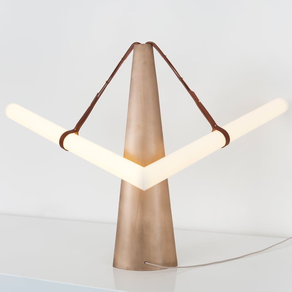
Hung by four hand crafted leather straps is a bold, singular 2.4M customised stroke of light. Floating right in the centre of the spatial volume above the bar, the luminaire catches ones eyes, adds weight to the space, while accentuating width and linearity when encountered front-on facing the bar. It also provides a softer, more delicate details to the threshold between shelf and bench top. Brightness is adjustable for the desired mood and or function.
A large opening on the southern slope of the pitched roof is introduced to bring in natural lighting as well as allowing the shadows from the trees above to cast onto the interior surfaces throughout the day.
With a north facing frontage, a crystal clear acrylic canopy provides protection from rain for customers sitting on the front patio while still allowing all available natural light and views to the foliage above to be preserved.
Stainless steel foldaway plates are custom designed to provide flexibility and interaction for the patrons to intuitively transform its function just by a simple flipping action. At its resting state, the plate serves as a small table for patrons who just want a quick coffee or to stand around and mingle. When folded up, the plates give way to circulation and becomes a series of slender support for picture frames to be displayed.
“But why not turn it into a guest room instead?”, Office AIO suggested.
The room was originally occupied by the landlord and her son until he went off to college. The 8sqm main room was used as a living space cramped with a TV unit / desk and a single bed / sofa, and the overstuffed 800mm wide wing was the son’s ‘bedroom’.
Office AIO made a small extension into the courtyard and tear down the original façade to create an L-shaped entrance leading into the guest room. This entrance is then filled by a set of double-hinged doors that can be opened up to form a small internal courtyard.
The main living space was refreshed with a layer of straw clay over the internal walls, straw mats lining the original pitched ceiling, walnut timber flooring to match the existing tone of the timber rafters, and new timber joinery. The result is a bright yet warm space with reminiscence of a traditional hutong dwelling interior.
The interior is furnished sparsely to fulfil the basic needs of a B&B: a built-in double bed with drawers to store extra beddings and luggage, a cantilevered cork desk for travellers to get some work done during their visits, and a classic Achille Castiglioni pendent as desk and bedside lamp.
The linear bathroom were covered in small white butcher tiles, with the water closet on the short end, and vanity and bathtub on the longer end closer to the window for natural light and ventilation.
From the architect. The site for the project measured 60×40. The requirement was to build a 30 bed dialysis center. The unique feature of the site was that it was adjacent to an ancient South Indian Temple which was revered by the neighborhood for both its architectural presence and religious value. The context in that sense was atypical of a generic urban setting. The position that we took was to make a sensitive intervention into the context, we looked at the building as a backdrop to the existing scenario with the temple as the main protagonist.
The wards were stacked vertically to accommodate the thirty beds. The building was detached from the ground to enable congregational and waiting spaces for the people. The services of the building were relegated to the rear and the terrace of the building was conceived to be a cafeteria.
The building façade is formulated by surfaces built out of brick that has a bellowing quality about them; the sensual quality of the surface dematerializes the brick surface and renders an ephemeral feel to the building. The slivers between the bellowing shells allow light to permeate into the building only to create a spatial and visual feel that is as divine as the temple outside.
Local firm FABG has made major improvements to the Musée d’art de Joliette outside Montreal, restoring the original building and adding three new volumes to the museum (+ slideshow). (more…)
The apartment is located nearby Kiyomizu-Temple, and has excellent views of the five sacred mountains of Kyoto. Our plan was to transform a typical (drab) Japanese condominium into a guesthouse where artists and creators can pursue their creative activities and enjoy living as well. We also tried to integrate traditional Japanese techniques normally not used in construction into the design.
Plan
[Highlights] In traditional Japanese lacquerware “Urushi-Nuri”, the technique calls for lacquer resin impregnated jute fabric reinforcement of the wooden base, forming a rigid composite structure beneath the polished upper coat.
This composite technique is alike to FRP (Fiber Reinforced Plastic) layering, so we chose FRP using translucent resin for the washroom floor to mimic this method. The translucent resin is polished to reveal the underlying glass-fiber layers over the wooden base, resulting in a translucent, yet complex visual texture while achieving material strength and waterproofing needed for the location.
The Japanese have traditionally repaired broken ceramics by gluing fragments together with Japanese lacquer and gilding the seams with gold powder to enjoy the beauty of imperfection as “Kintsugi”, literally meaning “to join with gold”. In construction, traditional plastered mortar cracks when it sets. This cracking is usually deemed as inferior work, and current improved mortar seldom cracks. We noticed that this cracking resembles broken ceramics. Using traditional mortar, we emulated the art of “Kintsugi” in the living room by joining the cracks with gold coloured epoxy- resin, thus transforming what was considered imperfect into a subject of beauty.
The mirrored bathroom doors double as a changing room when opened. The highly polished metal surfaces reflect the room interior and surrounding scenery producing a kaleidoscopic effect.
The American Institute of Architects (AIA) has selected seven recipients of the 2016 AIA National Healthcare Design Awards, given to the year’s best projects in healthcare building design and healthcare design-oriented research. Projects were selected for displaying “conceptual strengths that solve aesthetic, civic, urban, and social concerns as well as the requisite functional and sustainability concerns of a hospital.”
The award is given in four categories: Category A: Built, Less than $25 million in construction cost; Category B: Built, More than $25 million in construction cost; Category C: Unbuilt, Must be commissioned for compensation by a client with the authority and intention to build (No projects were selected in this category this year); and Category D: Innovations in Planning and Design Research, Built and Unbuilt.
Read on for the list of winners.
Category A: Built, Less than $25 million in construction cost
The design for this LEED Gold radiation therapy building focuses on providing a highly supportive environment which provides treatment and care of cancer patients. The challenge was to create an environment that reduces stress for patients and families, provides the best current technological infrastructure, and is an excellent space for physicians and staff to perform their work. The design approach focused on the distinct needs of cancer patients and their treatment schedules, which typically occur five days a week for five to eight consecutive weeks. The design provides a calming, nature oriented experience through the use of natural light, organic forms, outdoor views to nature, soothing interior colors, and an internal “Zen Garden” which contains a vibrant living wall garden visible from the treatment areas.
For its first center in Queens, Planned Parenthood sought a facility that was a bold expression of its commitment to state-of-the-art care for all, provided an excellent patient experience, and welcomed one of the most diverse communities in the world. Since opening, the facility has ranked in the 99th percentile for patient satisfaction when compared to comparable hospitals. The building’s contemporary design contrasts with its brownstone neighbors, establishing itself as a welcoming and important community institution. The simply-planned, sleek, and light-filled interiors are uplifting and easy to navigate, reducing patient stress. A bold color system aids in orientation for the diverse users and brings spatial delight throughout.
Category B: Built, More than $25 million in construction cost
Memorial Sloan Kettering (MSK) Regional Ambulatory Cancer Center; West Harrison, New York / EwingCole
Operationally efficient layout helps to reduce the cost of healthcare delivery and support both short- and long-term expansion possibilities at the West Harrison site for Memorial Sloan Kettering’s Regional Cancer Center. The challenge for the design team was converting what was a 1950’s office building with the dated brick and metal panel building with large floor plates, into a state of the art cancer center which upheld MSK’s preeminence as the leader in cancer treatment. The building not only accomplished the stringent task of achieving LEED Gold but also implemented additional healthy-building initiatives such as specifying entirely PVC-free products for both construction and design.
The Christ Hospital sought to unify their main campus and forge a model for integrated, patient-centered joint and spine care. Skidmore, Owings & Merrill worked with patients, medical professionals, and hospital staff to design the new state-of-the-art Joint and Spine Center. Inside the hospital, spaces for patients are filled with daylight, outside views are maximized to support well-being, and quiet spaces for family and staff are programmed with comfortable furnishings for conversation and rest. The building, a model for future hospitals with its flexible design and commitment to sustainability, is LEED certified. Since opening, the facility has ranked in the 99th percentile for patient satisfaction when compared to comparable hospitals.
The University of Arizona Cancer Center (UACC) at Dignity Health St. Joseph’s Hospital and Medical Center; Phoenix / ZGF Architects LLP
The 220,000-square-foot UACC is intended to deliver the highest standard of care within an evidence-based, multidisciplinary model, using the most modern technologies. The building program includes spaces for radiation oncology, diagnostic imaging, endoscopy and interventional radiology, exam and procedure rooms, a support and wellness center, infusion, a clinical pharmacy, and a healing garden. The building was designed to emphasize the user experience, integrate the natural beauty of the landscape, and address the needs of the UACC staff and patients for years to come. An exterior shade system, along with chilled beams, the first to be used in an Arizona healthcare setting, greatly contributed to the sustainability of the facility.
University Medical Center New Orleans; New Orleans / NBBJ
University Medical Center provides New Orleans with critical safety-net care in a sophisticated 1.5 million-square-foot facility built to withstand natural disasters. Features include inpatient services, cancer care, behavioral health and a Level 1 trauma center. The design promotes holistic healing, from landscaped courtyards to all-private inpatient rooms with natural light and in-suite bathrooms. Wide double-bays and sliding breakout doors enable swift action in treatment zones. Floor-to-ceiling windows in public spaces create transparency and uplifting views, while custom artwork and graphics throughout the hospital celebrate New Orleans’ rich heritage. The project is the state’s largest teaching hospital and training facility for physicians, nurses and allied health professionals.
Category D: Innovations in Planning and Design Research, Built and Unbuilt
Seattle Children’s South Clinic advances the current hub-and-spoke model of healthcare that brings outpatient services closer to patients in their communities to offer more responsive care while reducing demand for acute care services. The clinic was designed with a focus on patient flow so providers can serve patients quickly and efficiently. Located in the Seattle suburb of Federal Way and within a shopping center—with existing parking and adjacent community destinations—the design adapts a former Circuit City store into a 37,000-square-foot outpatient clinic that houses urgent care, occupational and physical therapy, and a number of specialty services.
This year’s jury was comprised of: Doug Hocking, AIA, LEED AP BD+C (Chair), KPF; Rosalyn Cama, FASID, EDAC, CAMA, Inc; Tatiana Guimaraes, Assoc. AIA, Perkins+Will; Anthony Haas, FAIA, FACHA, WHR Architects; David Montalba, FAIA, Montalba Architects; Sid Sanders, AIA, Houston Methodist Hospital and Kenneth Webb, AIA ACHA, LEED AP BD+C, HKS.
For more information on the winning projects, visit the AIA website, here.