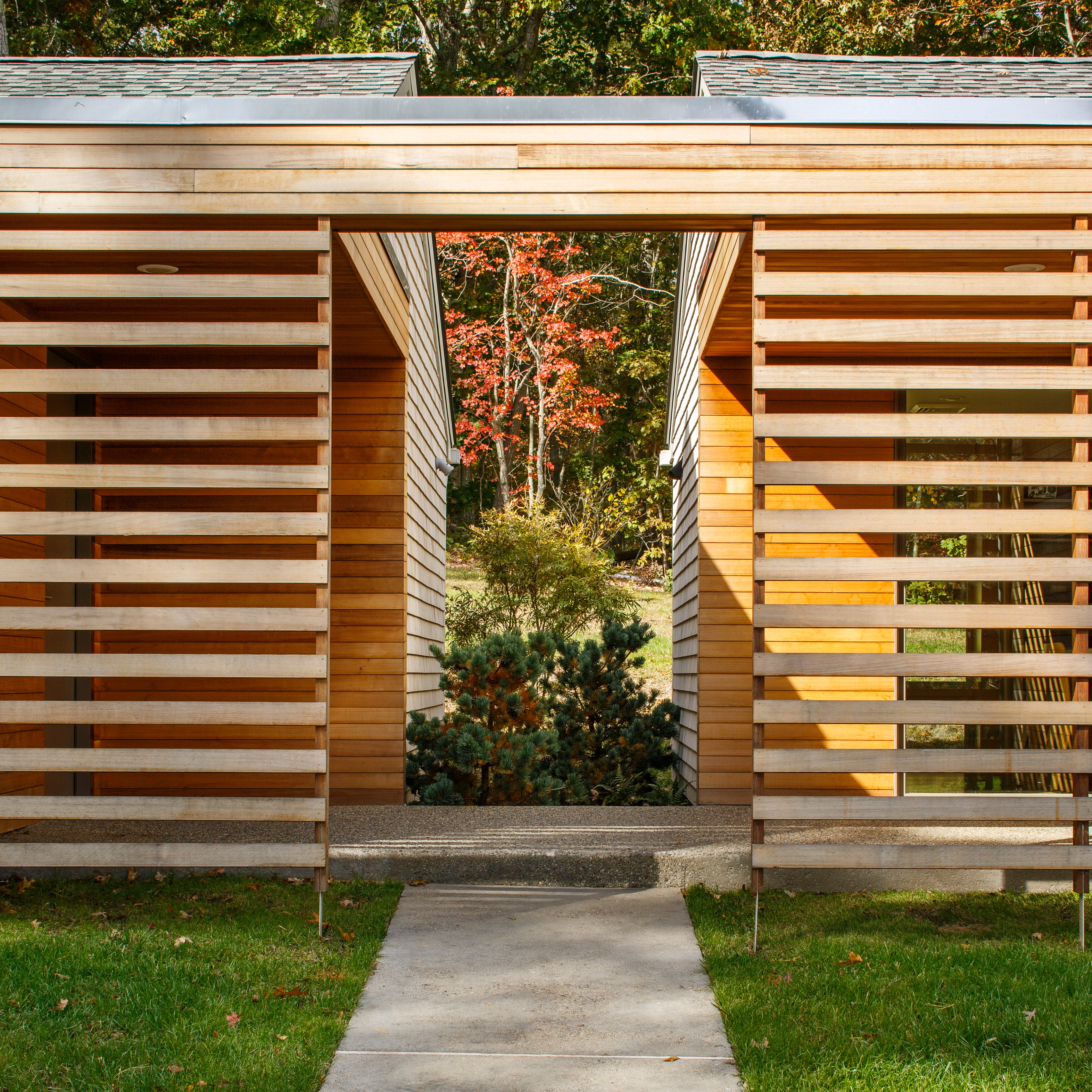
© Purnesh Dev Nikhanj
- Architects: Design Equilibrium
- Location: Sector, Madhya Marg, 9D, Sector 9, Chandigarh, 160009, India
- Design Team: Ar. Dhruv Sarveshwar Lal (Principal Architect), Ar. Sheetal Sharma, Ar. Gagandeep Singh
- Area: 925.0 ft2
- Project Year: 2016
- Photographs: Purnesh Dev Nikhanj
- Graffiti Team: Komal Sharma, Simran Singh Paul Reen
© Purnesh Dev Nikhanj
From the architect. he client wished for an eatery which served vegetarian food in a comfortable informal setting, a setting which feels and is accessible to all cadres of society, where the outlook of the project does not depict or is least suggestive of any certain style or form of interiors. The plain contemporary or industrial design approach was too bland for their taste. So, they put forward guidelines where the interiors should be lively and reflective of the brand ideology ; affordable food, experimentation and the interiors would reflect a sense of community, equality and bonhomie.
“No form of Nature is inferior to Art; for the arts merely imitate natural forms” -Marcus Aurelius
The interiors are envisioned as an analogy to a picnic by adding the dimensionality of a comic strip to the translation, furthering the ideology of the brand to provide affordable food accessible to everyone, in an informal quirky setting:
© Purnesh Dev Nikhanj
‘People sitting huddled under a tree in full bloom, the leaves rustling in the wind, and light sieving through the foliage to create sun kissed patches all around, to augment light hearted friendly chatter all around’
The sheer rush of feelings, colors and textures experienced in this single moment expanded over an area of 600 sq.ft.; by breaking down the complexity of the experience into basic representation of elements following the depiction of evolution of art from curvilinear and ornamentation like, to its minimalistic industrial depiction in defined contemporary straight lines.
© Purnesh Dev Nikhanj
The concept originates when 5 interacting entities are identified – Earth, Air, Water, Vegetation & Sun.
The attempt – To create and an environment where every entity involved is depicted by infusing colors and textures symbolic of their existence to enliven the space, instantaneously detaching it from the concrete urban jungle outside and providing a quirky and eclectic tangent to an industrial interior design.
© Purnesh Dev Nikhanj
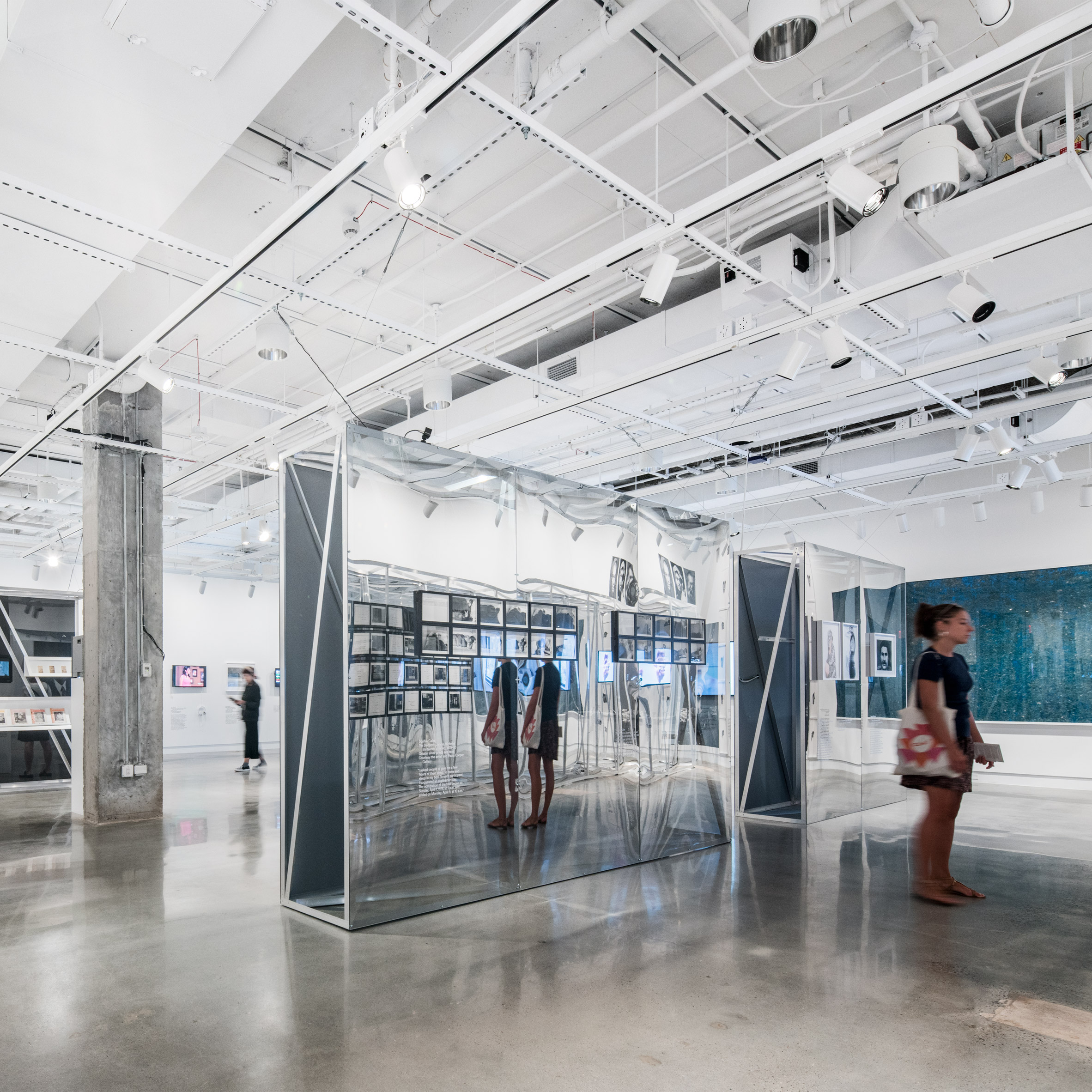
GRAFFITI
The standout at the entrance is a captivating graffiti which portrays a calm soul emerging, its existence as if anchored in the amalgamation of remaining elements quietly supporting it. With its large vivid tones of blue, it depicts water- the element of life and regeneration. This instantaneously, visually segregates the interiors from the urban environment outside by infusing a mood color relief; initiating calmness.
© Purnesh Dev Nikhanj
Grafitti
GREEN WALL
The green wall in its light and dark existence with letters extruded and illuminated in front is derived via a thought of conversations while walking on grass under the sun with the turf being pressed in parts, imagining the reaction of grass when it is being walked on, while playing with your senses visually by the use of soft and hard surfaces.
© Purnesh Dev Nikhanj
FLOATING WOOD WALL
The wooden paneling suspended mid air with illuminated niches, devoid of contact with the ground, portrays the trajectory of a gust of wind getting entangled in the branches of a tree before passing through, and dialogues being exchanged while sitting under that tree. The largest extent designated to its depiction for it begins and ends beyond ones physical reach. This element plays a pivotal role as it is meant to dynamically & subconsciously carry an individual from one end to the other of the seating floor.
Diagram
FLOORING
Following the thought process of depiction of natural elements in their basic colors, the flooring also is portrayed as a rustic brown color over a concrete floor with tarnished patches on it. The flooring has also been set as a dynamic element in the frame, giving it a chance to change naturally with due passage of time.