After four months of research identifying works in Latin America and the Caribbean that met the eligibility criteria of the ‘Latin American Architecture Prize Rogelio Salmona: open / collective spaces’ a list of finalist has been compiled. Members of the International Curatorial Committee, architects Ana Maria Duran (Andean Region), Ruth Verde Zein (Brazil Region) and Fernando Diez (Southern Cone Region), and Art History background Louise Noelle Gras (Mexico, Central America, and the Caribbean Region), postulated a total of 62 works covering the four regions.
On the 5th of August, upon completion of a shortlist the International Curatorial Committee selected 20 works whose authors will be invited by Rogelio Salmona Foundation to participate in the second round of this award.
Here are the 20 Finalists of the Latin American Architecture Prize Rogelio Salmona.
The jury that will decide the winners of the second cycle of Rogelio Salmona Prize shall consist of the members of the International Curatorial Committee and architect Wilfried Wang. The Prize will be awarded in a ceremony to be held in Bogota on last week of October 2016.
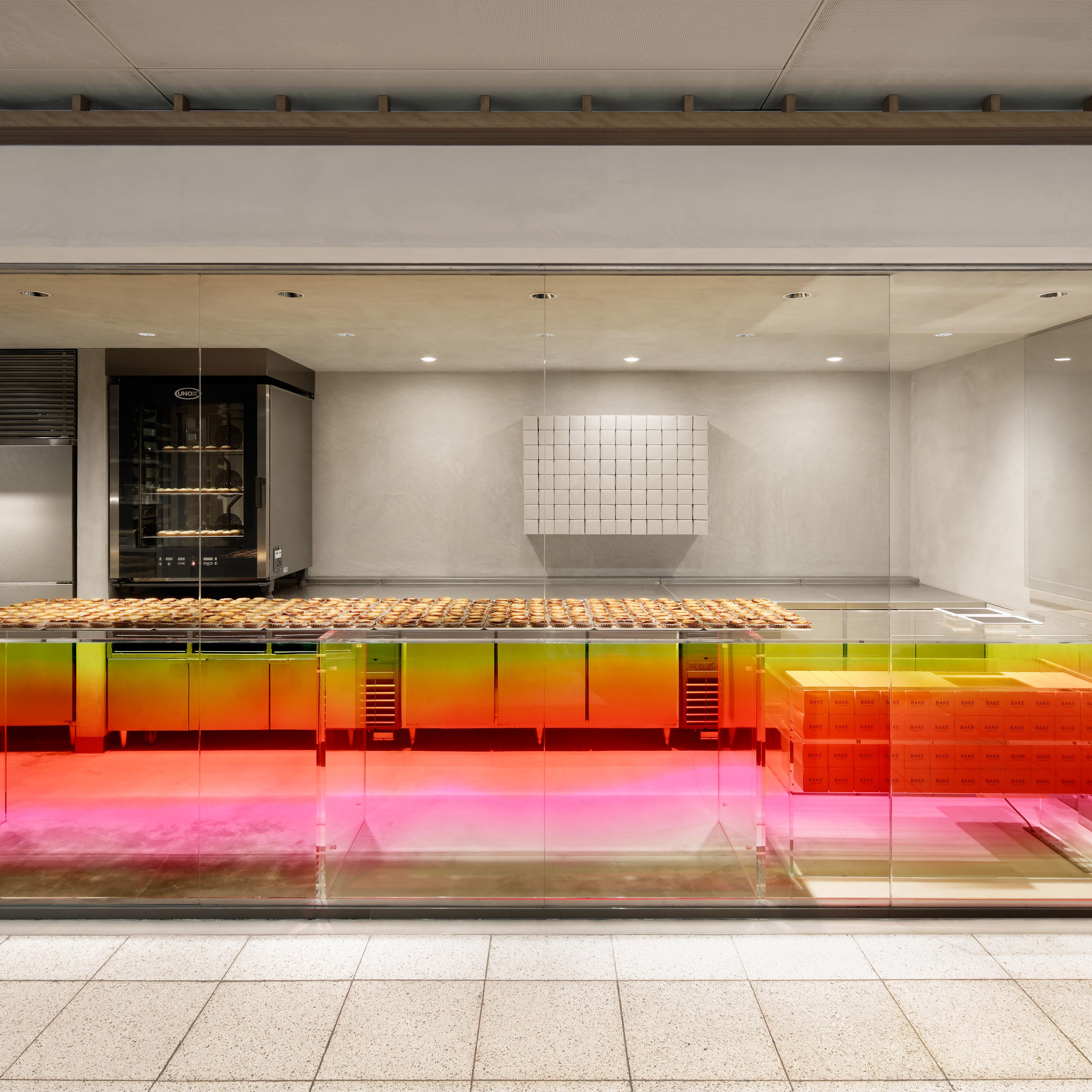
Japanese designer Yota Kakuda has combined industrial and citrus tones in his interior design for Bake Kitasenju, a cheese tart shop in Tokyo (+ slideshow). (more…)
From the architect. The choice of location for deployment of the buildings aimed to make the most of the view of the terrain. At the same time it takes a small promontory to the location of a yard, located to the west of the dwelling, for the parking and maneuvering of vehicles.
The outside form resulted from the intention of creating situations of full/empty, adopting a composition of parallelepiped volumes, which create misalignment through its two courtyards, prolonging the experience of the house to the outside.
Floor Plan
The location of the openings in the composition of the elevationsprovides visual crossings, the difference in height between the volumes of the rooms, kitchen and the living room, reinforced by a vertical marking the fireplace chimney, resulting in a dynamic composition.
The openings, searching outside framings, act as plans of light of careful proportions that simultaneously capture and filter the surroundings.
The house, with entrance to the West, develops along the north/south axis and the master bedroom, with private toilet, is located on the North top, followed by the living room with a higher ceiling height, the kitchen, with two support areas intended for storage and laundry room, and finally a volume with two rooms with private sanitary facilities.
Across the East housing front, with a direct and privileged relationship with the outside, are located a patio with access through the kitchen and living room, and the pool, surrounded by a paved area with different areas, both in terms of function and material and its permeability.
Apartment in Moscow is a residential project completed by Alexandra Fedorova. The elegant apartment is located in Izmaylovo District, in Moscow, Russia. Photos courtesy of Alexandra Fedorova
Gjura Stojano’s mural “The Spirit of Sports” was the centerpiece of the Sportswear Department. ImageCourtesy of Balcony Press
With its iconic copper-clad tower looming over WilshireBoulevard, the Bullock’s Wilshire has been a celebrated element of the Los Angeles cityscape since its opening in 1929. Known for its lavish Art Deco aesthetic, the department store made its mark as a prime shopping destination in a city filled with celebrities. But the Bullock’s Wilshire was more than a glamorous retail space; with a design centered around the automobile, it was to set a new standard for how businesses adapted to a rapidly changing urban environment.
A 1946 postcard with the Bullock’s Wilshire in the background. Imagevia digitalpostercollection.com
It is unsurprising that this shift occurred in Los Angeles. The city thrived in the early 20th Century, and especially during the 1920s, so that by the end of the decade it had become the largest city in the world by land area.[1] Explosive horizontal growth and a well-developed road system made Los Angeles uniquely suited to travel by automobile; by 1915, Angelenos were five times as likely as most Americans to own a car and, by 1925, there was more than one car for every two residents.[2]
The rapid increase in automobile traffic wreaked havoc downtown. By 1924, more cars were traveling in and out of the city center each day than were registered in the entire state of New York.[3] Those traveling west of downtown did so along WilshireBoulevard, a thoroughfare proposed by Frederick Olmstead, Jr. in 1923 as a solution for the city’s newfound problems with traffic congestion. The proposal proved eminently popular with voters, and the new street was completed by 1927. Business interests also enthusiastically supported the construction of the new boulevard, as it provided them with an ideal street on which to develop new retail spaces outside the increasingly crowded downtown.[4]
Bullocks Wilshire under construction. ImageCourtesy of Balcony Press
It was in this heady environment that John Bullock made his own grand plans. Bullock had emigrated from Ontario, Canada to Los Angeles in 1896 and promptly set about making a name for himself in the retail industry. He soon came to be employed the Broadway Department Store, which used the concept of fixed prices—pioneered by the Bon Marché in Paris but never imitated in California—to set itself apart and become one of the city’s premier shopping locations. In 1906, Bullock was asked to set up and operate an independent department store in order to reserve the space should the Broadway lose its current lease. That store, which would be named Bullock’s after its proprietor, was designed by John and Donald Parkinson, a pair of architects whose talents Bullock would call upon again in the 1920s.[5]
As development began in earnest along WilshireBoulevard, Bullock conceived of a branch location for his wildly successful department store. The idea was, at the time, highly unconventional, as few believed a large store outside a city’s downtown core could never draw enough customers to sustain itself. Wilshire itself was largely a residential district during its early years, lined with mansions owned by the city’s nouveau riche elite. Bullock’s vice president P.G. Winnett, however, believed that customers would be willing to drive long distances (up to twelve miles away from beachside Santa Monica) in order to shop at a worthwhile location.[6]
Courtesy of Balcony Press
The building that arose at the corner of WilshireBoulevard and Westmoreland Avenue would soon prove itself more than worthwhile. The initial, traditionally elegant design drafted by Parkinson and Parkinson was discarded upon Winnett’s return from the Paris Exposition Interationale des Arts Décoratifs et Moderne in 1925. The new design that emerged at Winnett’s behest was a Zigzag Moderne monument to the social upheaval and economic prosperity of 1920s America, representing a more modern ideal of luxury. Moreover, as befitted the store’s suburban location, the design would primarily appeal not to passers-by on the sidewalk, but in cars.[7,8]
Many of the Bullock’s Wilshire’s most notable features are the result of this automotive focus. The store had two main entrances, the larger of which faced not onto Wilshire itself, but onto the expansive parking lot. After driving through a pair of dazzling Art Deco gates, shoppers could enter the building underneath the shelter of a large porte-cochère, the ceiling of which was adorned with a mural by Herman Sachs called “Times Fly.”[9] The streetfront windows were fitted with large plate glass windows, featuring eye-catching product displays to entice potential customers driving down Wilshire.[10] In this sense, it was a building geared towards an automotive city.
Detail drawing of gate. ImageCourtesy of Balcony Press
The tower rising above the street entrance was as much an element of the building’s appeal to automobile drivers as the window displays and ample parking. Clad in tan terracotta and patinated copper, the slender tower emerged from the building’s various escalating setbacks to stand a full ten stories tall. It was a largely ceremonial gesture, one which stood out amongst the store’s residential surroundings and made the building visible from miles away. Those not close enough to be tempted by the glamorous displays could still not miss the Bullock’s bright tower on the horizon.[11]
Luxury did not end at the door, however. The interior of the Bullock’s Wilshire featured an eclectic assortment of architectural styles applied to an equally numerous set of boutiques and departments. Shoppers could pass through the Bauhaus-inspired grand foyer to browse through the Moderne sportswear department; the airy, cubic International Style featured in the Saddle Shop was at odds with the heavy Mayan, Wrightian aesthetic of the menswear department. Historicism, while not at the forefront, was not entirely abandoned, either – the “Period Rooms,” high-fashion salons on the second floor, were finished in the style of Louis XV and XVI. Here, patrons would see the latest fashions modeled under the light of crystal chandeliers. On the fifth floor, exhausted shoppers could sit and recuperate in the spacious Tea Room, whose blue, pink, green, and tan color scheme gave it a decidedly CaliforniaModerne appearance.[12]
Courtesy of Wikimedia user MikeJiroch
Winnett’s instincts soon proved correct – and perhaps more importantly, profitable. The Bullock’s Wilshire was an instant sensation, its sumptuous design and quality service attracting a clientele that included many of Hollywood’s brightest stars. Celebrities like Clark Gable, Mae West, Katharine Hepburn, and Judy Garland were regular sights, entering under the glamorous porte-cochère to peruse and purchase the latest fashions. The Bullock’s Wilshire itself appeared in numerous films and television series, starting in 1937 with the premiere of the comedy film “Topper.”[13]
The Bullock’s Wilshire managed to survive the Stock Market Crash of 1929, the subsequent Great Depression, and the death of John Bullock in 1933 to establish itself as the most fashionable department store in Los Angeles for decades. But its glory began to fade as the decades wore on and the city grew around it; ironically, a store that had deliberately been situated in the suburbs eventually came to be seen as too close to downtown. The neighborhood had long since lost its luster, and when riots broke out over police brutality in July of 1992, the Bullock’s Wilshire was not spared the wrath of looters. Fortunately, only the first floor was damaged and the building was not successfully set alight, but business would never truly recover. By March of the following year, the Bullock’s Wilshire—by then owned by Macy’s—was closed for business.[14]
Courtesy of US Library of Congress
The store’s closing became a hot topic for architectural preservationists, who vehemently opposed the potential demolition of such an important city landmark. Debates raged over how best to repurpose the building, as its design was ill-suited to the more modern conception of a department store; its products had been intended for display on models, leaving little space for clothing racks, and there were no escalators. Fortunately, the former department store was given a new life upon its purchase by Southwestern Law School, which retrofitted the property to serve as part of their new campus. The iconic Art Deco interiors were only minimally altered, preserving their original splendor for generations of future admiration.[15]
Though its original context has faded into history, the Bullock’s Wilshire remains an eye-catching fixture on one of the busiest thoroughfares in Los Angeles. It’s once cutting-edge Art Deco design, though no longer so daring as it once was, is a reminder of the impact made when the store first opened in the twilight of the 1920s. Its avant-garde embrace of the rising automobile-centric culture proved greatly successful, initiating and validating a shift in the focus of urban and architectural planning that would ensue in the following decades. The Bullock’s Wilshire itself, meanwhile, remains standing where it has been for almost ninety years, a testament to a golden era long since past.
September 1929 Los Angeles Times article celebrating the store’s opening. Imagevia latimesblog.latimes.com
References [1] Strawn, James. Who’s Park: An Architectural History of Westlake-MacArthur Park. Master’s thesis, University of Southern California, 2008. p55. [2] Fulton, William B. The Reluctant Metropolis: The Politics of Urban Growth in Los Angeles. Point Arena, CA: Solano Press Books, 1997. p130. [3] Fulton, p130. [4] Strawn, p56. [5] Davis, Margaret Leslie. Bullocks Wilshire. Los Angeles: Balcony Press, 1996. p15-22. [6] Davis, p32-33. [7] Davis, p38-39. [8] Gould, Lark Ellen. Los Angeles, off the Beaten Path. Chester, CT: Globe Pequot Press, 2004. p35. [9] Gebhard, David, and Robert Winter. An Architectural Guidebook to Los Angeles. Salt Lake City: Gibbs Smith, 2003. p224. [10] Davis, p39. [11] Korom, Joseph J. The American Skyscraper, 1850-1940: A Celebration of Height. Boston: Branden Books, 2008. p389. [12] Davis, p49-64. [13] Davis, p69-80 [14] Davis, p92-101 [15] Davis, p103-110.
Photographs: Courtesy of Balcony Press, via digitalpostercollection.com, Courtesy of Wikimedia user MikeJiroch, Courtesy of Wikimedia user Jrkagan, Courtesy of US Library of Congress, via latimesblog.latimes.com
Oh, how breaking up hurts. Not only that, it really does suck. The feelings we go through after almost consume every ounce of you. It feels nearly impossible to function day in and day out. Your heart hurts, your head hurts and every other part of you seems to just ache. It’s downright horrible. But we all know it’s only temporary. That still doesn’t make it any easier. Is it possible to love and honour yourself after a breakup and while you are going through this whirlwind of dreadful emotions? Of course.
Let’s go through a few ways to do this now.
You are perfect.
This is a hard one to wrap your head around especially if you are the dumpee and your partner told you there are things about you that aren’t good enough. Don’t believe that and release that thought from your mind immediately. You are perfect just the way you are. There is someone who will appreciate you exactly as you are.
Date yourself.
Take yourself out on a date. Dinner, a movie or a night of dancing. Get dressed up and get out and have fun. Do the things that make you feel happy. Go do something you haven’t’ done in a really long time that makes your heart sing. If you want to invite your bestie, you can do that too but make a date with you and stick to it. Take a whole day and be selfish. Which leads us to the next point.
Be selfish.
More than in number 2. I mean be really selfish. Go shopping if you can and buy a new outfit, or a new car! Think about only yourself and how magnificent you are. Remind yourself that you are the most important person in the world and take a whole day reveling in that thought. You are the best. Treat yourself like you are. often when we are in a relationship we forget about ourselves because we are too busy trying to make the other person happy.
Have a sorry for myself day.
Take a full day if you need to and just cry or scream or yell or throw a fit. Do whatever you have to do to get all the anger and sadness out. Full and hard. Don’t answer the phone, don’t go out (really don’t go out), stay off the computer and no texting. Just you and your sad emotions. Feel them, own them, embrace them and then let them go. Cry and cry and cry and scream and yell if that’s your thing. Get it all out.
Unplug.
Carrying on from number 5, turn off all gadgets. Be in the now, with your emotions. No distractions or possible texts from your ex or your ex’s friends or even your own friends. Just be with yourself, alone with your feelings. Turn off the tv, the computer, shut off your cell phone and iPad. Turn on some music if that will help you a little bit.
Meditate, get a massage, or have naps.
Or all of the above. Do mellow, quiet and mind calming things. Relax your mind and send your thoughts, all negative thoughts, out to the universe. You will be consumed by horrible negative thoughts for days and weeks, maybe even months after a breakup. It will be very important to take time to calm yourself and your mind and be at peace. It is in this place that you will find answers and relief.
Though breaking up is really hard and really shitty, it doesn’t have to be horrible forever. Take time to do things for you and remember you are perfect and awesome just the way you are. Love yourself.
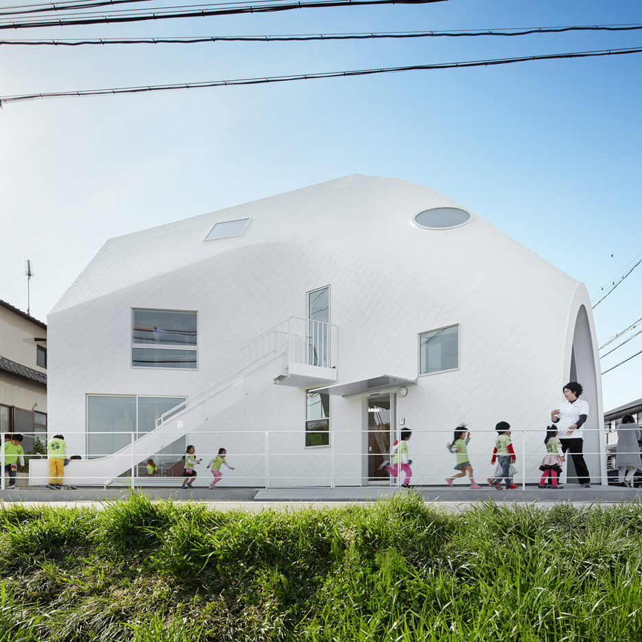
From the architect. MAD architects have completed their first project in Japan, the Clover House kindergarten. Located in the small town of Okazaki, the school’s setting boasts views of the paddy fields and mountains, characteristic of the Aichi Prefecture. The kindergarten was originally operated out of the old family home of siblings Kentaro and Tamaki Nara, which soon became too small and unfit for expanding their educational goals. The siblings desired to create a modern educational institution where children could feel as comfortable as they do in their own homes, allowing them to grow and learn in a nurturing setting.
“I think it’s important to create a homely atmosphere inside this kindergarten, so instead building a brand new building, we decide to keep the old wooden structure as the memory and the soul of the space, and work around it.” stated Ma Yansong, founder of MAD Architects.
MAD was commissioned by the family to transform their old two-story family house into a fully developed educational institution. The transformation started with an investigation of the existing 105 sq m house. Like the surrounding houses, this wooden building was first constructed as a standard prefabricated house. To keep the construction costs to a minimum, MAD decided to recycle the existing wood structure, incorporating it into the new building’s design. The original wooden structure is present throughout the main learning area as a symbolic memory of Clover House’s history. Its translucent and enclosed spaces easily adapt to different teaching activities. The windows, shaped in various geometries recognizable to a child’s eye, allow sunlight to sift through and create ever-changing shadows that play with the students’ curiosity and encourage imagination.
“We have designed the building from a child’s point of view, and the layout focusses on creating intimate and diverse spaces.” said Ma Yansong.
The new house’s skin and structure wrap the old wooden structure like a piece of cloth covering the building’s skeleton, creating a blurry space between the new and the old. The starting point of The Clover House is the signature pitched roof. This repurposed element creates dynamic interior spaces, and recalls the owners’ memories of the building as their home. The form of the house brings to mind a magical cave or a pop-up fort. Compared to the original assembly-line residence, the new three-dimensional wooden structure presents a much more organic and dynamic form to host the kindergarten. The facade and roof utilize common soft roofing materials, such as asphalt shingles, to provide waterproofing, while wrapping up the whole structure in a sheath of paper-like pieces.
“We wanted to create a playful piece of architecture that would stay in the memory of the kids when they have grown up.” – Ma Yansong
Adding to the sense of playfulness, there is a slide that descends from the second floor of the building to an outdoor play area and an open courtyard in front of the building.
Chinese studio MAD has draped a “skin” of white asphalt shingles over the wooden structure of an old house in Japan’s Aichi Prefecture to create a kindergarten with a curving roofline (+ slideshow). (more…)