The existing house, is the home of a family with two young children. The former ground floor layout was biased towards the front of the house. A playroom, dining space and kitchen were arranged within an undefined open space, oriented towards the street and the party wall of a neighbouring extension. The brief was to reconfigure and extend the ground floor in order to improve the connection to the garden.
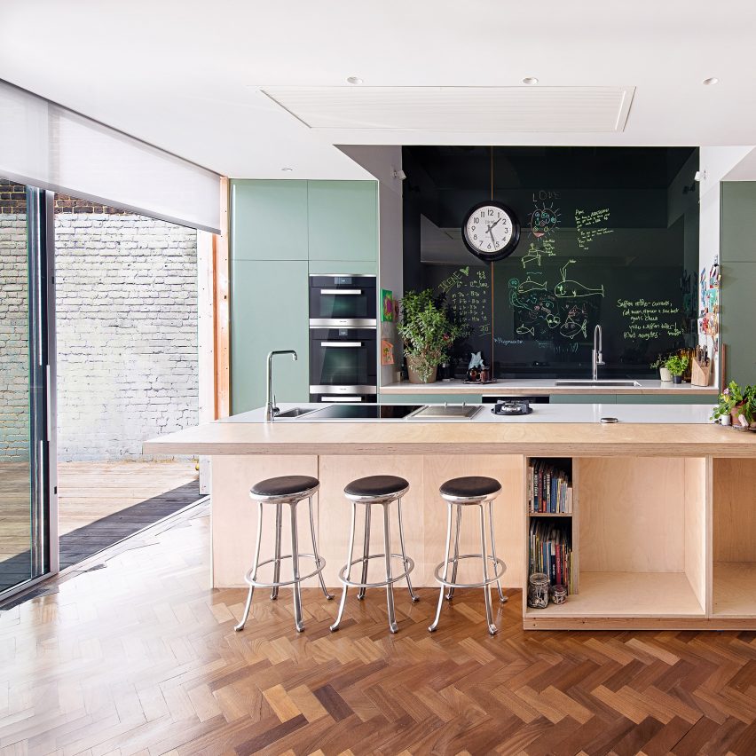
The new ‘garden room’ inverts the former street-facing layout. Benefiting from the afternoon light, this space forms the new heart of the house, incorporating kitchen, dining and play area for the children. The kitchen layout is turned 90 degrees to face the garden.
Existing Floor Plan
Floor Plan
The flank and rear walls of the original extension were removed at ground floor level in order to accommodate the new extension with side return. The space is tectonically defined by the new structural elements, which bear the load of the floor above.
The former bay window arrangement was reinterpreted as one large opening with a deep window seat, corresponding with the depth of the first floor bay window. A movable oak framed window allows the space to open towards the terrace. The children’s toys are stored in large drawers underneath the upholstered window bench.
A generous roof light, along the length of the room, washes the new party wall with natural daylight. Level access to the garden is via a 1.2m wide and 2.5m high timber framed glass door.
The existing narrow outdoor terrace was enlarged to form a patio. The pre-cast concrete window sill and masonry plinth serve as seating areas, while a new timber fence structures the garden and was designed to form a back rest along the masonry bench.
Lime washed masonry, precast concrete, and white oiled oak were used throughout. Precast concrete was used for the sill, lintel and copings. The precast elements are composed of white limestone aggregates and white cement, and sandblasted to a rough finish. The structural components were clad in oak veneer internally, matching the floor boards and built-in furniture. The work surfaces in the kitchen are formed of single concrete slabs with exposed aggregates and a honed finish.
It’s a project out of every architect’s childhood fantasy: a 100 foot (31 meter) long suspension bridge, constructed completely out of LEGO.
Envisioned as part of the ongoing BridgeEngineering exhibition at London’s Institute of Civil Engineers (ICE), the massive bridge utilized over 250,000 individual LEGO bricks in shattering the World Record for the longest LEGO suspension bridge. Stretching further than the length of three London City Buses end-to-end, the bridge weighs in at over 1,600 lbs (75 kg).
The replica of the Severn Bridge, designed by certified LEGO professional Duncan Titmarsh and his company Bright Bricks with consulting from ICE Gold Medalist Dr. Robin Sham, took a team of builders nearly 650 hours to construct. The bridge was first assembled, and the world record broken, at Weydon School’s sports hall in Farnham, Surrey, before being relocated to its place within the BridgeEngineering exhibition.
“Bridges connect people and places, both physically and emotionally,” said Dr. Sham. “The ICE’s visionary Lego Bridge project connects civil engineers with the public, demonstrating the monumental accomplishments of civil engineering. Using familiar Lego bricks to demystify and showcase the extraordinary feats of engineers, I hope the next generation will be inspired to consider engineering as a career.”
In addition to the LEGO bridge, the BridgeEngineering exhibition also features a tour of notable bridges throughout British history and an interactive zone that encourages people to design their own bridges. The exhibition will be on display until April 2017.
Check out the video below to see how the LEGO bridge was designed and assembled, and learn more about the event here.
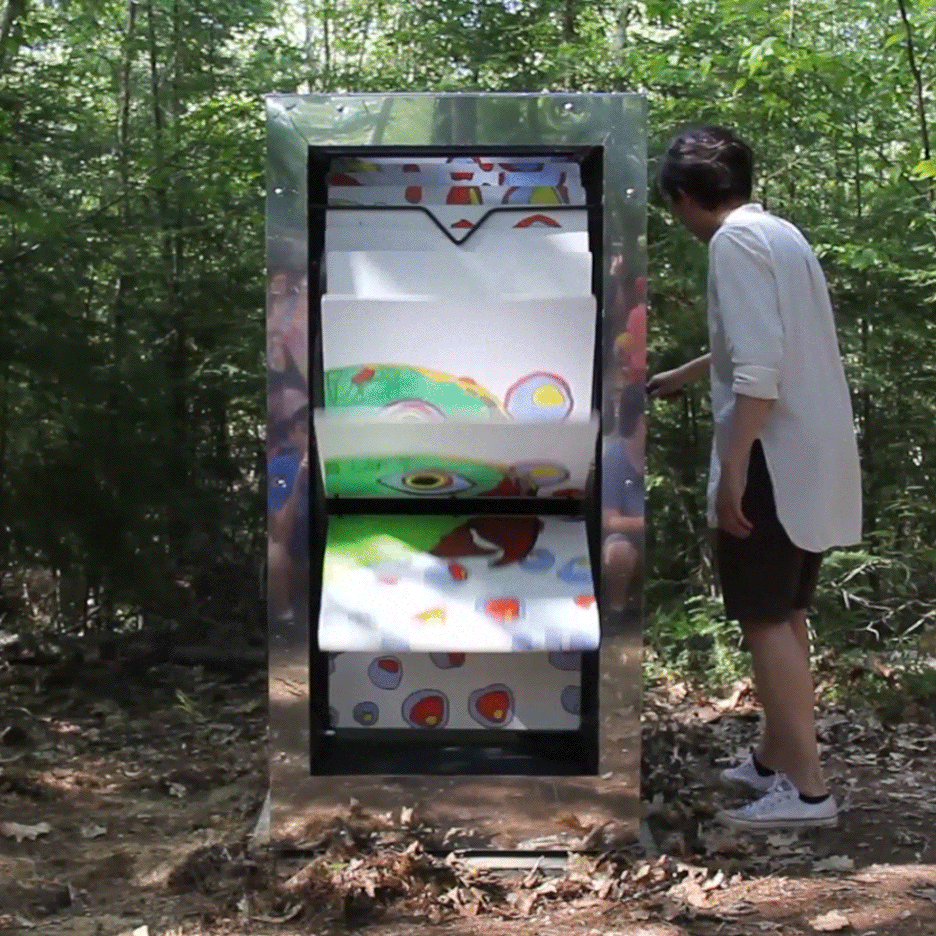
London-based Mobile Studio Architects has collaborated with students at a US summer camp to create a series of oversized flip-books that depict fictional forest tales. Read more
From the architect. Located in a residential area of Mexico City, Caúcaso House rises one meter and thirty centimeters above the sidewalk in order to take advantage of the view, because the site is in a privileged point where the west is seen beyond the horizon and over the tops of the trees, leading to a basement level one meter below the sidewalk where the parking area and services are located.
On the first floor, through a double-height lobby, the social areas are oriented towards the west and two bedrooms are oriented to the east, both with bathroom and dressing room, giving the feeling of living on a single floor.
On the second floor, through a bridge crossing the double height, is the master bedroom and a fourth bedroom, both with terraces, bathroom and dressing room.
Longitudinal Section
The house is built on a logical and exposed structure made of concrete, stone, steel and glass. In turn, the vegetation is an important part of the design.
In the living and dining area, contained in the same space, a terrace runs parallel the entire length. Upon opening the glass doors, the terrace is integrated with the interior, cohabiting at the same time with the garden.
Dezeen promotion: a space-saving white and wooden island forms the centre of the Modern Pantry restaurant founder Anna Hansen’s kitchen, which is revealed in this series of films by Miele. Read more
Mrs. Jane Jacobs, chairman of the Comm. to save the West Village holds up documentary evidence at press conference at Lions Head Restaurant at Hudson & Charles Sts. (1961). Public Domain
My introduction to Jane Jacobs was completely ordinary. Like many, many architecture students since its publication in 1962, I read The Death and Life of Great American Cities for an introductory course in urbanism. Jacobs was a joy to read, whip-crack smart and caustically funny, and she wrote in impeccable, old-school sentences that convinced you with their unimpeded flow. She explained her ideas in utterly clear and simple language. Planners are “pavement pounding” or “Olympian.” There are “foot people and car people.”
Why were we reading her? I expect it was to encourage us to look harder at the city, and to imbibe some of her spirited advocacy for experience over expertise. It was a captivating message and delivered at the right time. Today it seems as though everybody interested in cities has read at least part of Death and Life and found personal affirmation in it. Michael Kimmelman wrote, “It said what I knew instinctively to be true.” For David Crombie, “she made it clear that the ideas that mattered were the ones which we understood intimately.”
This quality was important, and one of the reasons that Jacobs endures in our culture is the facility with which we can identify with her. She is one of “us,” whoever that is—not an expert, more like an aunt than a professor. Her speciality was the induction of rules from patterns discovered by individual observation, like a 19th-century gentleman scientist. Her work gave seriousness to reactions that might otherwise be dismissed as taste, ignorance or prejudice.
Yet for all that, the Village, the neighbourhood she loved so fiercely and immortalized in Death and Life, has died. It was not levelled by the planners; it was slowly strangled by the invisible hand. Of course, it does not look dead. If anything, it looks recently repainted. But the vitality is gone. Its rich new residents have closed in on themselves, and more businesses serve tourists than locals. Writing in Slate recently, Peter Moskowitz bemoaned its state: “The same neighborhood Jacobs lauded for its diversity in the 1960s and ’70s is today a nearly all-white, aesthetically suburban playground for the rich.” But if Jacobs won, how did her neighbourhood lose?
Google Doodle for Jane Jacob's 100th birthday, May 4, 2016 (via <a href="http://ift.tt/2dCT6i7; Google Doodles Archive</a>)
“The starting point must be the study of whatever is workable, whatever has charm in city life,” Jacobs wrote in 1956. She appealed to pragmatism and common sense based on a conviction that her discoveries on the street could be generalized. Part of her near-mythic status comes from the fact that, at a historical peak of institutional power guarded by men, she was a woman who dared to make people trust their own eyes. As Marshall Berman wrote, Jacobs gave us “a language to appropriate our own experience.”
Her inattention to racism, whether in the form of American housing markets or in official policies like redlining, is well known—at least within the academy, and it was noticed before Death and Life was published. In 1961 her editor, Jacob Epstein, wrote her that he was worried about the absence of any discussion of the race issue: “I don’t think that you can proceed as though the question didn’t exist.” Jacobs replied that she had her reasons but no time to explain them. Sociologist Nathan Glazer wrote her that he agreed with Epstein, then shrugged off the concerns they both had as unrealistic: “on the other hand, you can’t do everything.”
Original illustration by Lisa Vanin (www.lisavanin.com) for the Literary Review of Canada
Step outside Jacobs’s crackling narrative, and suddenly all you can see is what she leaves out.
Unfortunately, there are a lot of things you do not see, especially if you are a middle-aged, middle-class white lady in 1950s New York. What you see depends on who you are, and many of Jacobs’s appealing dictums seem much less universal once you consider race, class, ethnicity or other less visible relationships of power. Tweak to those and step outside Jacobs’s crackling narrative, and suddenly all you can see is what she leaves out. It is unpleasant but it is necessary, for whoever today invokes her blindly invokes also her blindness.
Indeed, on a low level a garage and a studio take place. We can also find all the technical elements necessary for the efficiency of the house. The accesses to these spaces are completely hide since the outside, by dint of the rigor of the drawing.
Long Section
Above the low level in lacquered aluminium, the main level is as “posed”. As if it placed naturally on it on one side and on the ground of other one, so catching up the slope. Its decline in cantilever on the east façade not only allows the living room to open up existing vegetation but also to cover the entrance and access to the garage.
All the rooms of the house have natural light. Even the corridor, which is in the heart of the house, can enjoy natural light. Firstly, it is lighted by its roof window and secondly, by the glazed upper part of the thick wooden wall separating the rooms.
The entire house has been realized in reinforced concrete combined with external insulation. The main cladding is in Anstrude stone. Its bright colour contrasts with the dark grey lacquered aluminium that is at the bottom.
Inside, two pure materials meet. On the one hand raw concrete, the other of wood panels called “Tilly”. These are oak panels in the careful and delicate appearance that fit berries, hide a fireplace, and draw an office according to their precise pattern layout.
Product Description. The building is characterized by the purity of the materials that are used. The thin lacquered aluminium carpentry on the south facade contrast with the parapet. This one has an important overhang and its facing in stone of Anstrude, aims to be massive. From the entrance (East elevation), the facing turns around in facade and becoming a guardrail.
109 Architectes has released its proposal for the Beirut Museum of Modern Art (BeMA), for which a competition was recently held. The proposal was shortlisted, but did not ultimately win. In this proposal, BeMA is a box—“a generic form that belongs to everyone”—based on a scene in The Little Prince, where a traveler is asked to draw a sheep. The Prince rejects each sheep drawing until the traveler draws a box, inside of which a sheep is hidden. “The cube is a neutral form in the Little Prince’s search for identity. Within it, he sees what he wants to see.”
Within this generic box, visitors will thus be able to project their views of Beirut—the city’s chaos, diversity, creativity, history, streets, people, and more.
Courtesy of 109 Architectes
The box portion of the Museum stands alone in the heart of the plot, surrounded by event space, and facing the National Museum of Beirut so that the two buildings are linked by an open plaza. The building is separated into two halves by an inner street, representing the concept of the box “cracking” after failing to contain Beirut’s intensity. This central space will additionally act as a gateway to the Museum, as well as eventually to the city.
Courtesy of 109 Architectes
The inner street is present on each floor of the building, connecting exhibition spaces on both sides via bridges, and contrasting with the outer portion of the building in its transparency.
Courtesy of 109 Architectes
Courtesy of 109 Architectes
In a second phase, ground floor development and a network of streets and plazas will activate the space, turning BeMA into a place to gather and socialize, and allowing the Museum to connect more with its surrounding neighborhood.