
Sunnanö is a private home located in Sunnanö, Sweden. Completed in 2015, it was designed by Murman Arkitekter. Sunnanö by Murman Arkitekter: “The brief was to design a family house on a north facing triangular promontory, overgrown with pine and blueberry bushes, covered with large boulders. The first sketches were made in 2010 and were put on hold until 2013. The project was completed in 2015. Connected with the water..
Ma Vie La / Selim Erdil

© Tunç Suerdaş
- Architects: Selim Erdil
- Location: Çeşme, İzmir, Turkey
- Area: 300.0 sqm
- Project Year: 2015
- Photographs: Tunç Suerdaş
- Other Participants: Gözde Özder, İzgi Yazıcı, Meltem Çarıkoğlu, Selim Ardalı, Bahadır Sarıca, Nevzat Yavuz
© Tunç Suerdaş
Half of the visible structure, is cantilevered by 8 meters. The superstructure is a 16 meter long by 7.5 meter wide concrete box with no columns or beams. The 520m2 land contains this very large house that only has a 64m2 footprint.
© Tunç Suerdaş
This is a house with a strict minimalist approach. 5 main materials were used. Concrete, Steel, Stone, Wood and Glass. The main ambition was to make as much use of the land as possible while creating a variety of wide and open spaces that can be used depending on the wind and weather conditions. The folding/sliding window and door systems, the 8m long cantilever and the pool placement on the side of the house are all design decisions to maximize the living areas. The folding/sliding systems make convertible living spaces to switch between indoor and outdoor. The cantilever was designed to minimize the footprint while maximizing open areas. The cantilever also serves to push the building mass toward the sea view, clearing the adjacent house, to create a large roadside terrace and to provide plenty of shade by the pool and garden.
© Tunç Suerdaş
© Tunç Suerdaş
The steep grade of the land would have created very large, long, narrow and unusable side gardens terminated by very tall retaining walls. So the design team decided to use the building’s side façade and the retaining walls bordering the property as a pool basin, connecting the ends with L shaped wall. This with the cantilever design created a very large pool and a sizable garden.
© Tunç Suerdaş
The building façade is raw concrete which also makes up the load bearing structure, cast in a textured wooden formwork. The shutters are made from wood. Exterior flooring is done with The interior has marble flooring on the common areas and bathrooms. The bedroom floors are rustic oak wood.
© Tunç Suerdaş
The landscaping was done with local plants such as olive, mastic and cypress trees in Cor-ten steel clad concrete planters. The site irrigation is done with an 80 metric ton cistern that collects rain water year-round.
Section
The house can be used as a main home or a summer home. But since it’s built in the resort town of Çeşme, Turkey, it will likely be used primarily as a summer home.
© Tunç Suerdaş
© Tunç Suerdaş
This house is a real estate development project. It has not yet been sold. The company (Erdil Construction) acquired the land, developed the design and built the house for the intention to sell.
© Tunç Suerdaş
Dezeen’s latest Pinterest board celebrates iconic Brutalist architecture
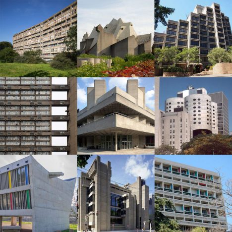
We’re revisiting the best examples of Brutalist architecture with a new Pinterest board this week, including Sydney’s threatened Sirius apartment building and London’s soon-to-be-demolished Robin Hood Gardens.
Follow Dezeen on Pinterest | See more Brutalist architecture on Dezeen
Tower House / ON Architecture

© Joonhwan-Yoon
- Architects: ON Architecture
- Location: Gimhae-si, Gyeongsangnam-do, South Korea
- Architect In Charge: Woongsik-Jung
- Design Team: Hyukki-Kim, Hansol-Yoon
- Area: 145.77 sqm
- Project Year: 2015
- Photographs: Joonhwan-Yoon
- Partner In Charge: Namsu-Kim
- Site Area: 752.90 sqm
- Building Area: 128.93 sqm
© Joonhwan-Yoon
From the architect. The site is located in a housing land development area behind Gimhaehyanggyo Confucian School. The client purchased the site just because of its fascinating view over the cityscape of Gimhae, and wanted to build a house. However, unfortunately when he was eventually able to start the project, multi-household houses were already on construction around the site, and as even more houses were planned to come, thus the site environment seemed to come up with a different scene which betrays the client’s wish. Nevertheless the architect tried to do bring the cityscape of Gimhae that had captivated the client’s mind, into the new house. Therefore, as a solution, he introduced a concept of observation tower in a form of family room. And also, inspired by the hobby of client; collecting ornamental rock and pot-planting, the architect created a foyer with a vertical gallery connected to the tower. The foyer presenting another distinguishing feature to the house, works as a communal space linking and integrating all the individual rooms. And the vertical gallery provides an exhibition space with a circulating route for ornamental rocks and pot-plantings.
© Joonhwan-Yoon
Plan 1
© Joonhwan-Yoon
The client wanted to build a very small house compared to its site size. Therefore, it was difficult to use actively the vast outdoor space while the architect believed that a true architectural manifestation comes out of communication with the outside. At least, he wanted to give every each room a separated outdoor space. This architect’s wish and the client’s wish to have south facing living room and master bedroom filled with the sunlight are unified together and resulted in a unique x shaped building arrangement.
Section
The architect got attracted by in-between spaces created by the x shaped configuration rather than the shape itself. He placed living room, master bedroom, kitchen and small rooms one by one along the flow of house so that the in-between spaces formed among the rooms can work as an independent outdoor space for each space. Especially the in-between space of living room and master bedroom are oriented to the south in order to draw abundant sunlight into the space. The terrace in front of the living room, which is inspired by Numaru; a Korean traditional loft floor structure, is constructed above the ground over the slope flows into the garden, and the space under the terrace structure is designed as a resting space. Tower House will deliver a very new living environment filled with diverse features to the client.
© Joonhwan-Yoon
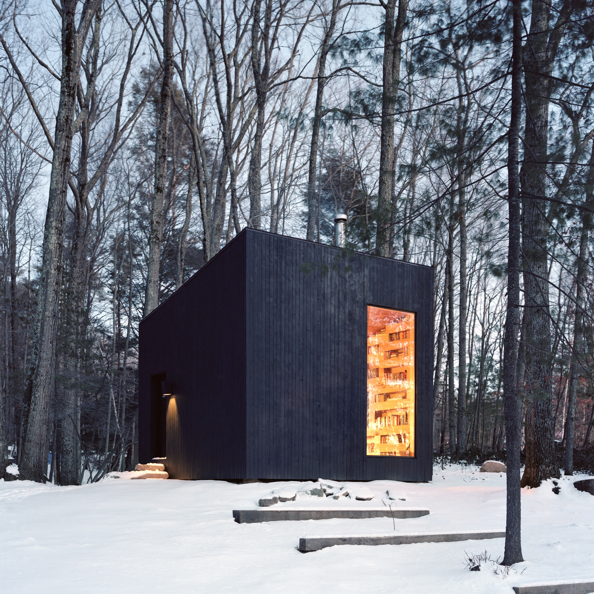
Studio Padron creates secluded library in the woods of New York state
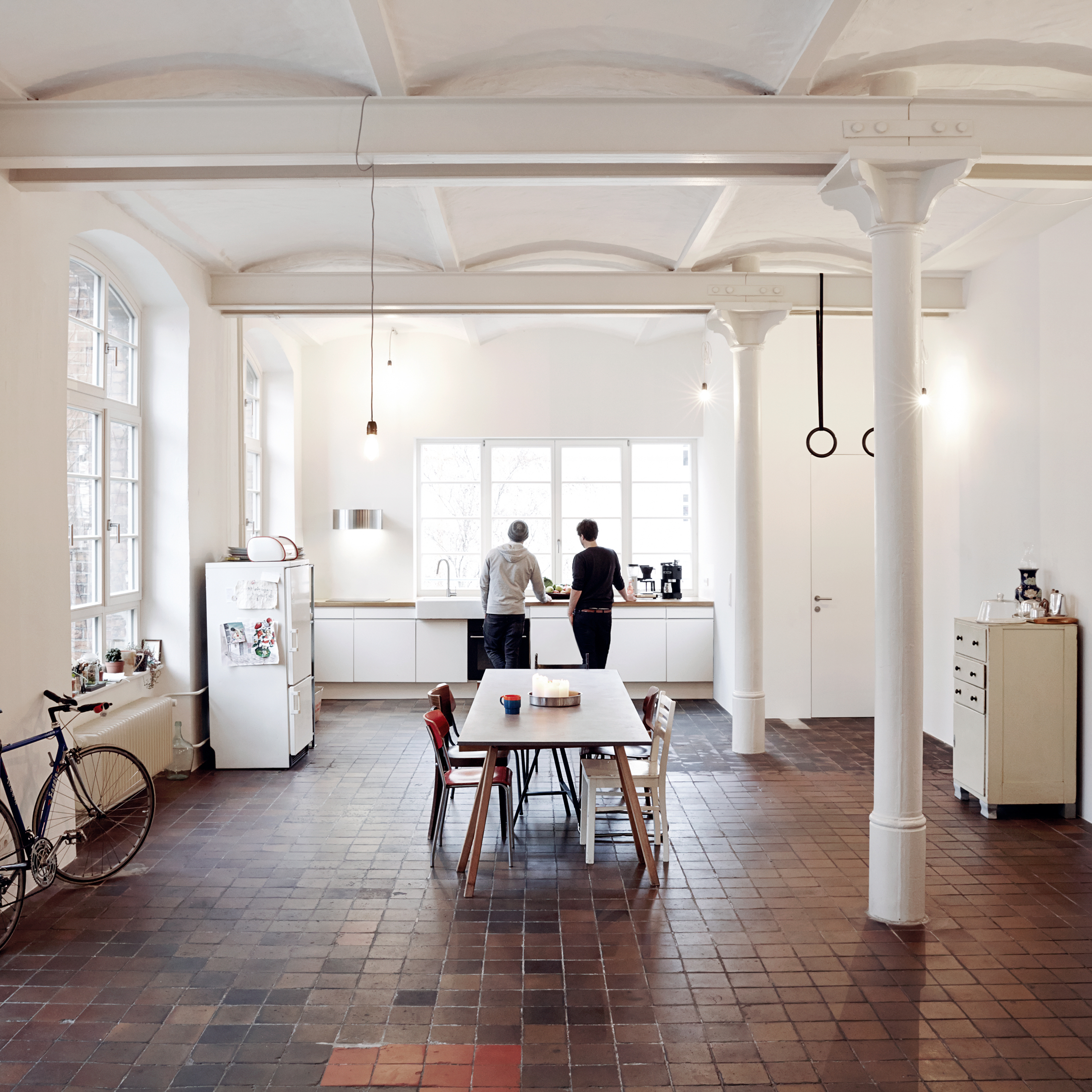
IFUB creates loft apartment with vaulted ceilings in former Berlin chocolate factory
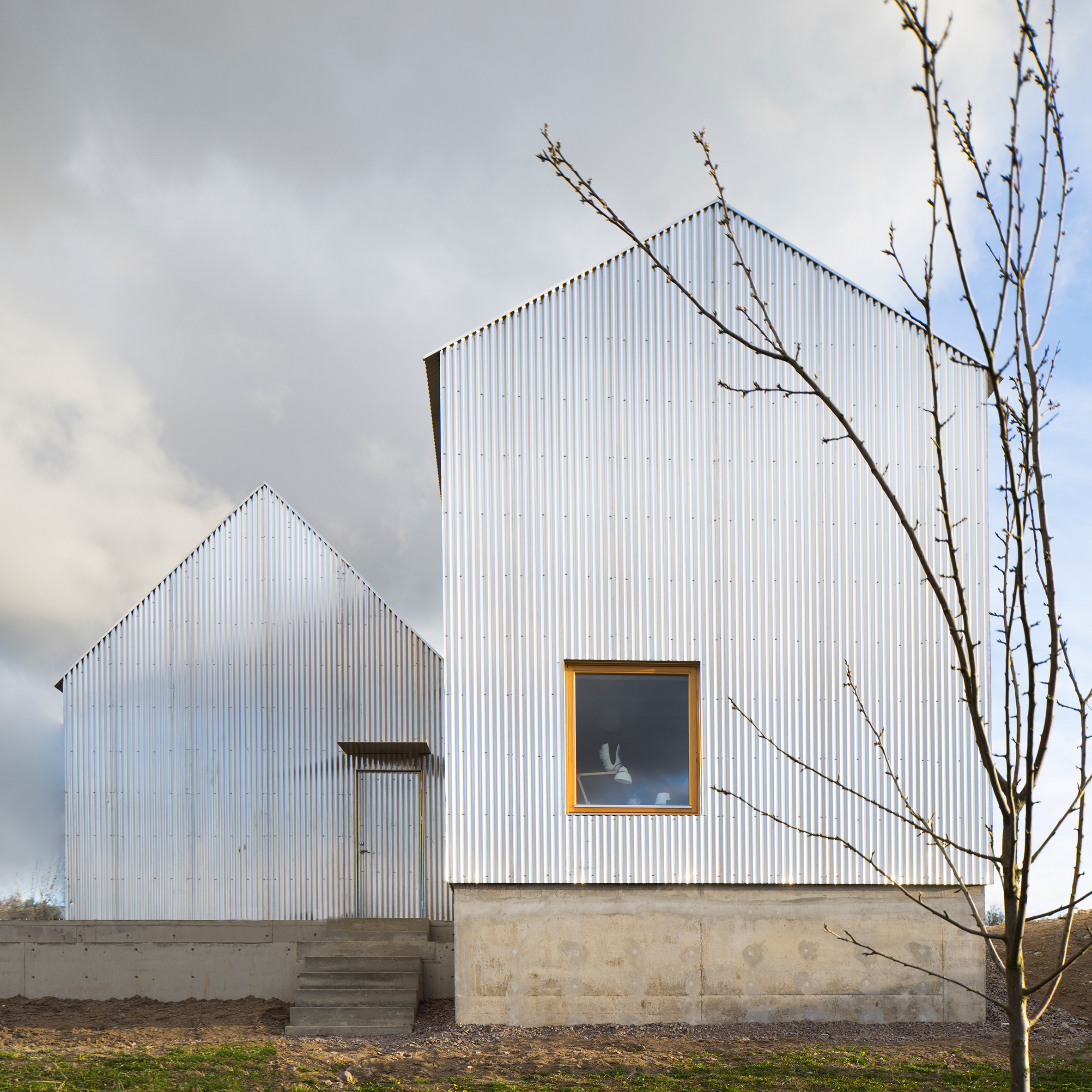
Björn Förstberg’s house for his mother features pointed roofs and reflective walls
House in Beccar / Film Obras de Arquitectura

Courtesy of Film Obras de Arquitectura
- Architect: Film Obras de Arquitectura
- Location: Zeballos 2337, B1643AGQ Béccar, Buenos Aires, Argentina
- Architect In Charge: Carlos Fernandez, Jorge Isaias, Gabriel Lanosa , Claudio Maslat
- Area: 305.19 sqm
- Project Year: 2015
- Photography: Courtesy of Film Obras de Arquitectura
- Collaborator: Romina Aira, Nicolás Waldman
- Engineer: Pedro Gea
- Area: 258.38 sqm
Courtesy of Film Obras de Arquitectura
From the architect. This house is a combination of a new architectural entity with an existing house, which has been constructed by “Federación del caucho” in a working-class neighborhood.
Plan
The house, which has an irregular slab framed with inverted beams and supported on the main walls, can be identified in most of the constructions of the neighborhood. It has a good construction quality. Now, this neighborhood has become from a working-class to a high-valued district.
Courtesy of Film Obras de Arquitectura
The new concrete shell is the result of connecting two prisms in half levels. It avoids supporting the existing house; therefore it creates a half-cover entrance and the expansion. Over the roof of the old house we define the main space with variable height and also with a terrace, which balcony over the lateral courtyard and the gallery.
Section
The existing house was remodeled to ensure that the front and back green areas were linked and to get more brightness. We took all the non-bearing walls and we expanded the openings of some lateral bearing walls.
Courtesy of Film Obras de Arquitectura
The original entity is connected with the new shell without leaving its identity. However, it does not contrast with it, looking for a new and complex unity.
Section
The raw concrete defines the new building. Shaping a shell supported by three beams of ten meters free span, it releases the eye vision of the front, back and lateral. The concrete casing with vertical tables was used to create continuity with the vertical wood. We want to highlight the tightness of the private spaces in the front and back of the house.
The existing house was covered with a rustic cement looking for a texture and color like the raw material. The connection between the existing building and the new one is a glass window. It works as a connection between the existing house and the new one. Following the section defines the limits between “inside” and “outside”. The irregular section of the shell configures a landscape over the lower slab. A wood ramp leads to a garden full of wild plants and a lot of cactus.
Four horizontal plans (slabs) and three vertical plans (beams) define a continuous concrete entity suspended over the transformed house. The private spaces are between horizontal plans, making two rectangular prisms at different levels. The extension of the top slabs creates a meeting space (playroom – home office) over the existing slab.
2D
The unintentional contrast between the house and the local architecture is the result of the intentional decision to link the new house with the existing natural landscape and the new one, the courtyard. We want natural airflow and natural lighting all over the place.
Courtesy of Film Obras de Arquitectura
The determination of an abstract formal concept, hanging over the existing house, creates the spaces and defines the architectural identity. That guarantees the building as a whole.
Courtesy of Film Obras de Arquitectura
Never-before-heard Audio Gives us Insight to the Creativity of Prominent Architects and Reveals Forgotten Bauhaus Secrets

via 99% Invisible. Image Courtesy of f Institute of Personality and Social Research, University of California, Berkeley / The Monacelli Press
In two intriguing new podcasts, the team over at 99% Invisible uncovered some never-before-heard audio and forgotten secrets about elements of architectural history. In the first, The Mind of an Architect, producer Avery Trufelman explores the audio archives of the Institute of Personality Assessment and Research (IPAR), where a study undertaken in the late 1950s mapped the personalities of prominent architects. Eero Saarinen, Philip Johnson, and Richard Neutra were among the study group, and the data came to some interesting conclusions about the role of ego and the presence of creativity.
In the second, Photo Credit; The Negatives of the Bauhaus Sam Greenspan explores the misattribution of credit for some of the most prolific images of the Bauhaus. Taken in the 1930s by German photographer Lucia Moholy, the historic images paint one of the clearest pictures of life at the Bauhaus. In the turmoil of the war, her negatives were lost, and absorbed by the school’s collection, denying her the credit she deserved.
The Mind of an Architect
Creative rankings of the architects involved, via 99% Invisible. Image Courtesy of f Institute of Personality and Social Research, University of California, Berkeley / The Monacelli Press
Architects have often been regarded as both mathematicians and artists, blending elements from each outlook to create the perfect hybrid. The IPAR certainly believed this, and in 1958 engaged a subject group of 40 architects to participate in personality tests to determine the markers of creativity. Catalyzed by the space race, the program was run in the hope of extracting characteristics of creatives and leaders, to then apply to a broader field.
The never-before-heard audio clips from the study show some insight into the minds of these famous men; whether it be Philip Johnson referencing The Fountainhead in an ethics discussion or the group arguing about where on the body a third arm should be placed. You can listen to the episode via the Soundcloud link below, or check out the illustrated transcript at the 99% Invisible website.
Photo Credit: Negatives of the Bauhaus
Bauhaus School Photograph via 99% Invisible. Image © © Lucia Moholy Estate/Artists Rights Society (ARS), New York/VG Bild-Kunst, Bonn
Intellectual property in photography is not black and white; as explained in the podcast, a photo of someone else’s artwork is unlikely to receive credit. Conversely, a photo of a three-dimensional object or scene, such as a building, requires a great deal of compositional skill that makes an image one’s own. Lucia Moholy’s Bauhaus images captured the building and its ethos in an unmistakeable style, and the images went on to help define the world’s understanding of the legendary school.
Moholy’s work often focused on the buildings of Bauhaus founder Walter Gropius, and her compositions were similarly balanced and simplistic. After the turbulence of the second world war in Germany, Moholy’s negatives were lost. When the pictures started cropping up as promotional and documentarian material for the Bauhaus, it was eventually revealed that Gropius himself had assumed the right to them, essentially having Moholy “written out of the history.”
To hear the full story click on the Soundcloud link below and for more of Moholy’s photographs head to the 99% Invisible website.
News via 99% Invisible.
The Stories Behind 17 Skyscrapers & High-Rise Buildings That Changed Architecture

The skyscraper: representative of spatial economy and a symbol of power. This building typology has a storied, turbulent and even contested past. Here, we bring you a selection some of the skyscrapers and high-rise buildings featured in our AD Classics section.
1891 – Wainwright Building / Adler & Sullivan
Wainwright Building / Adler & Sullivan © University of Missouri
Among the first skyscrapers built in the world, the Wainwright Building by Louis Sullivan and partner Dankmar Adler is regarded as an influential prototype of a modern skyscraper design. The building aesthetically exemplifies the theories of Sullivan’s tall building, with the tripartite composition of base, shaft and attic, which is based on the structure of the classical column. It’s construction system is based on a steel frame that is clad in masonry and is credited for being the first successful utilization of steel frame construction.
Read more about the Wainwright Building
1902 – Flatiron Building / Daniel Burnham
Flatiron Building / Daniel Burnham. ImageBy Unknown Beinecke Rare Book & Manuscript Library, Yale University Public Domain, https-//commons.wikimedia.org/w/index.php?curid=8097208
As one of the most widely recognized buildings in New York City,the Flatiron Building was a daring architectural statement at the turn of the 20th Century. Known for its triangular design at the intersection of 5th Ave. and Broadway, the Flatiron Buildings iconic presence has transformed an entire area of Manhattan into the Flatiron District. The Beaux-Arts styling and detailing give the steel scraper a touch of architectural precedent found Europe at the time.
Read more about the Flatiron Building
1913 – Woolworth Building / Cass Gilbert
Woolworth Building / Cass Gilbert. Image© The Pictorial News Co transferred from en.wikipedia, Public Domain, https-//commons.wikimedia.org/w/index.php?curid=16735728
The Woolworth Building, an innovative and elegant early skyscraper completed in 1913, endures today as an iconic form on the New York City skyline. A historicist exterior sheaths a modern steel tower, embodying both the era’s modern spirit of progress and its hesitation to fully break from the past. ornate monument to the growing economic dominance of New York City, the building was dubbed the “Cathedral of Commerce.” While initially envisioned as the tallest structure in its neighborhood at 45 stories at 625 feet tall, the final design grew to 60 stories at 792 feet tall, making it the tallest building in the world at the time of its completion.
Read more about the Woolworth Building
1924 – AD Classics: Ville Radieuse / Le Corbusier
Ville Radieuse / Le Corbusier
Ville Radieuse (The Radiant City) is an unrealized urban masterplan by Le Corbusier, first presented in 1924 and published in a book of the same name in 1933. In accordance with modernist ideals of progress (which encouraged the annihilation of tradition), The Radiant City was to emerge from a tabula rasa: it was to be built on nothing less than the grounds of demolished vernacular European cities. Though radical, strict and nearly totalitarian in its order, symmetry and standardization, Le Corbusier’s proposed principles had an extensive influence on modern urban planning and led to the development of new high-density housing typologies.
Read more about Ville Radieuse
1930 – Chrysler Building / William Van Alen
Chrysler Building / William Van Alen. ImageBy Detroit Publishing Co. – This image is available from the United States Library of Congress's Prints and Photographs division under the digital ID det.4a25712.Public Domain, http://ift.tt/2co9PGx
The Chrysler Building by William Van Alen is identifiable from great distances thanks to its distinguishable style and profile in the New York City skyline. Standing 319.5 meters (1048 feet) high, the Chrysler Building houses 77 floors. Its patron intended for it to be the world’s tallest building, but it only remained so for eleven months (until it was surpassed by the Empire State Building) in 1931. The Chrysler Building is a classic example of the Art Deco style, with distinctive ornamentation based on features found on Chrysler automobiles at the time.
Read more about the Chrysler Building
1950 – SC Johnson Wax Research Tower / Frank Lloyd Wright
SC Johnson Wax Research Tower / Frank Lloyd Wright © Ezra Stoller/Esto
A corporate commitment to innovation combined with Wright’s penchant for visionary design, yielded a pioneering yet challenged structure. An expansion of the company headquarters adjacent to the Wright-designed Administration Building from a decade earlier, the tower design expanded on the architect’s visions for modern workspace and biomimetic structural systems. Floor slabs cantilever from a reinforced concrete “taproot” core, and bands of brick and crystalline glass tubes enclose laboratory spaces. Reverently maintained yet mostly unused by the SC Johnson company today, the tower can be considered either form pursued at the expense of function or a daring architectural accomplishment.
Read more about the SC Johnson Wax Research Tower
1958 – Seagram Building / Mies van der Rohe
Seagram Building / Mies van der Rohe. Imagevia 375parkave.com
Located in the heart of New York City, the Seagram Building designed by Mies van der Rohe epitomizes the elegant principles of modernism. The 38-story building on Park Avenue was Mies’ first attempt at tall office building construction. Mies’ grand gesture with the Seagram Building was to set back the building 100 feet from the street edge, creating a highly active open plaza. The detailing of the exterior surface was carefully determined by the desired exterior expression Mies wanted to achieve. Additional vertical elements were also welded to the window panels not only to stiffen the skin for installation and wind loading, but to aesthetically further enhance the vertical articulation of the building.
Read more about the Seagram Building
1958 – Pirelli Tower / Gio Ponti, Pier Luigi Nervi
Pirelli Tower © Flickr user IK's World Trip used under CC BY 2.0
In contrast with its traditional Milanese surroundings, the Pirelli Tower is one of the earliest examples of Modern skyscrapers in Italy. Affectionately called “Il Pirellone” (The Big Pirelli), the 127 meter tower stood as Italy’s tallest building from 1958 to 1995. The design of the structure, led by architect/designer Gio Ponti and engineer Pier Luigi Nervi, featured a tapered plan—as opposed to the conventional rectilinear volume which was prevalent in America—encouraging greater creative freedom during a time when skyscrapers typically lacked experimentation. Ponti’s slim, 33-story structure appears to shoot up from the ground like a missile, towering over its low-rise context. Centrally located on the project site, the tower is pushed away from the streets.
Read more about the Pirelli Tower
1961 – Chase Manhattan Plaza / SOM
Chase Manhattan Plaza / SOM © SOM
Completed in 1961, the 60 story skyscraper by Gordon Bunshaft of SOM is a coming of age story for Skidmore, Owings, and Merrill presence as an national leader of corporate architectural design that evokes efficiency and functionality. Rising 813 feet above the bustling streets of Manhattan, the slender tower only occupies 30% of the 2.5 acre site. The building employed the most readily available and economic materials that were present at the time of construction and is clad in anodized aluminum with a glass and steel facade system.
Read more about Chase Manhattan Plaza
1964 – Peabody Terrace / Sert, Jackson & Gourley
Peabody Terrace / Sert, Jackson & Gourley © Jannis Werner
Built in 1964 during his tenure as Dean at the Graduate School of Design, Josep Lluís Sert’s Peabody Terrace provides housing for almost 1500 Harvard graduate students and their families. One of several projects Sert designed for Harvard’s campus, it is a manifestation of his vision for the ideal neighborhood. Many elements such as the negotiation of scale, mixed use program, shared open space and design aesthetic were influenced by but represent a departure from earlier modern housing projects. Peabody Terrace is a prototypical example of a twentieth-century project heralded by the architectural community as an exemplar of progressive modern ideals, but lambasted by neighbors and members of the general public for being unattractive, cold and imposing. Three-story volumes at the perimeter step up to five and seven stories towards the interior. This lower composition of masses is punctuated by three 22 story towers. The gradation in height relates to the adjacent low-rise residential context while also providing the greater density required by the university’s demand for housing.
Read more about Peabody Terrace
1964 – Marina City / Bertrand Goldberg
Marina City / Bertrand Goldberg. ImageBy User-Brianwc – Own work, CC BY-SA 3.0, https-//commons.wikimedia.org/w/index.php?curid=26320965
Although, it is not as widely recognized as the Sears Tower or the John Hancock Building, Marina City’s distinctive “corn-cob” shape has a strong presence among modern architecture, as well as Chicago’s skyline. The architect, Bertrand Goldberg, thoroughly believed that people wanted to live in downtown Chicago. His approach to Marina City was to design a “city within a city” that could fully accommodate people’s everyday needs and activities just a short distance from their homes. It was a method of bringing suburban commodities and ease of access to an urban setting.
Read more about Marina City
1967 – Shizuoka Press and Broadcasting Center / Kenzo Tange
Shizuoka Press and Broadcasting Center / Kenzo Tange. Courtesy of Petr Šmídek – http://www.archiweb.cz
Built in 1967, the building was the first spatial realization of Tange’s Metabolist ideas of organically-inspired structural growth, developed in the late 1950s. The Shizuoka Press and Broadcasting Center is far more significant than its relatively small size would suggest, encapsulating the concepts of the new Metabolistic order in architecture and urban planning that prevailed in post-World War II Japan.The infrastructural core was a 7.7 meter diameter cylinder, reaching a height of 57 meters, containing stairs, two elevators, and a kitchen and sanitary facilities on each floor. The core served as an access shaft to the modular office units: cantilever glass and steel boxes of 3.5 meters which punctuated the main core on alternating sides.
Read more about the Shizuoka Press and Broadcasting Center
1973 – Willis Tower (Sears Tower) / Skidmore, Owings, & Merrill
Willis Tower (Sears Tower) / Skidmore, Owings, & Merrill. ImagePhoto taken in 1998 by Wikipedia user Soakologist. No rights claimed or reserved. – From enwiki., Copyrighted free use, https-//commons.wikimedia.org/w/index.php?curid=784660
Towering over the windy city of Chicago, the Willis Tower (formerly known as Sears Tower) was once the tallest building in the world upon its completion in 1973. The “bundled-tube” configuration was innovated by engineer Fazlur R. Khan from SOM, and these nine tubes formed the skyscraper’s basic structure. This system allowed for large open office spaces on the lower levels (where the Sears offices would be located) and smaller floors as the building soared in height with unobstructed views of the city.The structural system also saved ten million dollars in steel costs.
Read more about the Willis Tower (Sears Tower)
1976 – World Trade Center / Minoru Yamasaki Associates + Emery Roth & Sons
World Trade Center. ImageBy Sander Lamme – Own work, CC BY 3.0, http://ift.tt/2ccX8MZ
A New York City icon that once rivaled structures such as the Statue of Liberty and the Empire State Building, the World Trade Center, colloquially known as the Twin Towers, was one of the most recognized structures in history. Designed by Japanese-American architect Minoru Yamasaki, it held the title of Tallest Building in the World from 1972–1974. Up until its unfortunate demise, the WTC site was a major destination, accommodating 500,000 working people and 80,000 visitors on a typical weekday. The facility was envisioned as a physical expression of world peace and as a place for communication, information, proximity, and face-to-face convenience for a variety of business and financial stakeholders. The two 110-story skyscrapers primarily housed open office space, but also included an underground parking lot for 2000 cars, a tall lobby, and an observation deck. The towers shared a simple plan: a 208-foot by 208-foot square with slightly chamfered corners surrounded an 87-foot by 135-foot core that was comprised of 47 steel columns.
Read more about the World Trade Center
By Sander Lamme – Own work, CC BY 3.0, http://ift.tt/2ccX8MZ
1977 – Citigroup Center / Hugh Stubbins + William Le Messurier
Citigroup Center via flickr user Paulkhor used under CC BY 2.0
In a city of skyscrapers of nearly every shape and size, the Citigroup Center on Lexington Avenue is one of New York’s most unique. Resting on four stilts perfectly centered on each side, it cantilevers seventy-two feet over the sidewalk and features a trademark 45-degree sloping crown at its summit. The original structure responsible for these striking features also contained a grave oversight that nearly resulted in structural catastrophe, giving the tower the moniker of “the greatest disaster never told” when the story finally was told in 1995. The incredible tale—now legendary among structural engineers—adds a fascinating back-story to one of the most iconic fixtures of the Manhattan skyline. To keep it hyper-efficient and low on mass, the finished structure was built to a minimal safety factor, a decision that would eventually come to haunt the engineers.
Read more about Citigroup Center
1984 – AT&T Building / Philip Johnson and John Burgee
Sony Building © David Shankbone
It may be the single most important architectural detail of the last fifty years. Emerging bravely from the glassy sea of Madison Avenue skyscrapers in midtown Manhattan, the open pediment atop Philip Johnson and John Burgee’s 1984 AT&T Building (now the Sony Tower) singlehandedly turned the architectural world on its head. This playful deployment of historical quotation explicitly contradicted modernist imperatives and heralded the mainstream arrival of an approach to design defined instead by a search for architectural meaning.While the building’s most iconic feature may be its “Chippendale Top,” a moniker it acquired for the pediment’s resemblance to the furniture maker’s classic highboy chests, perhaps the formal elements most illustrative of Postmodern sensibilities occur 647 feet below at ground level. There, a soaring entrance portico suggestive of great Italian arcades immediately removes visitors from the modern Manhattan neighborhood.
Read more about the AT&T Building (now the Sony Tower)
1984 – PPG Place / John Burgee Architects with Philip Johnson
PPG Place / John Burgee Architects with Philip Johnson. ImageBy Derek Jensen (Tysto) – Self-photographed, Public Domain, https-//commons.wikimedia.org/w/index.php?curid=1664741
The design of PPG Place, by Philip Johnson and John Burgee, melds the notion of the modern corporate tower with a neo-gothic monument. It is a cluster of 6 volumes: a 40 story tower, a 14 story volume, and four 6 story buildings. The composition of lower volumes negotiates the verticality of the main tower and the lower surrounding context, yet all buildings are materially integrated and organized around a central plaza. Clad in almost a million square feet of glass manufactured by the anchor tenant PPG industries, the architects ingeniously rethought accepted practices in curtain wall design. The 1.57 million square foot complex was one in a series of high profile corporate projects completed during Johnson’s controversial foray into postmodernism.
Read more about PPG Place
__________________________
What other skyscrapers and high-rise buildings would you like to see in our Classics section? Tell us in the comments!
