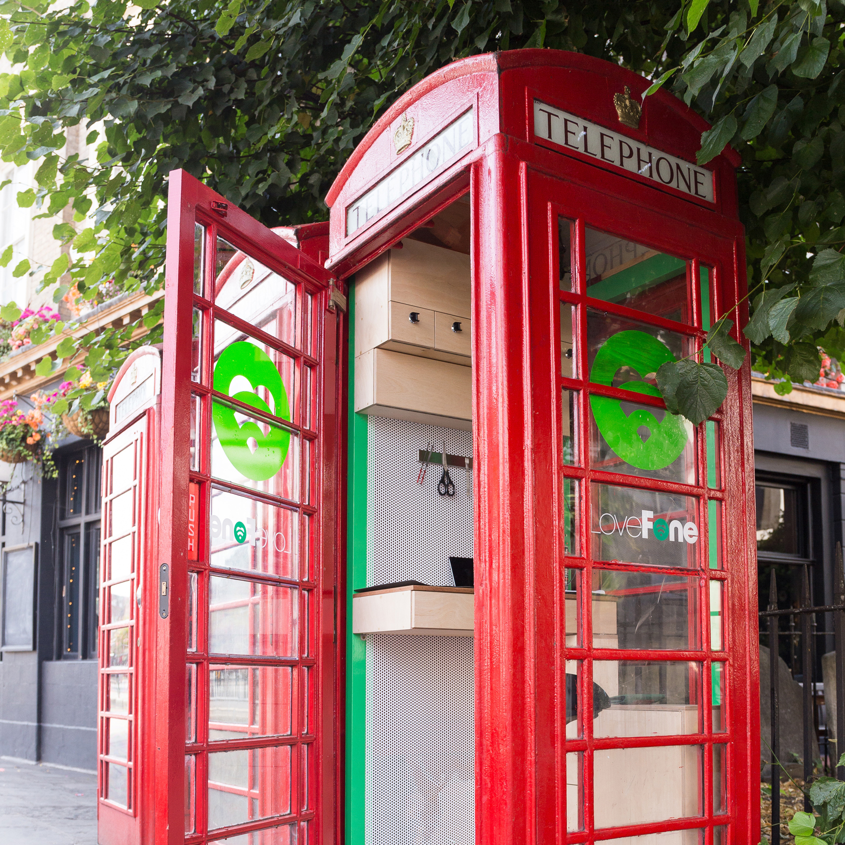
The UK’s iconic red phone boxes are being repurposed for a more contemporary telecommunications need: mobile handset repairs. (more…)
The UK’s iconic red phone boxes are being repurposed for a more contemporary telecommunications need: mobile handset repairs. (more…)

The Dancing Pavilion is Interactive Architecture created for the Olympic Park 2016.
Scattered sensors inside of the dance floor capture the beat of the music and the movement of people dancing, which activates the motors of the mirrors on the façade of the building. The result is a kinetic architecture that hypnotizes people, and transforms the space into the most exciting dance club of the 2016 Olympics.
The pavilion was designed for a Brazilian beer brand to host music, parties, DJ’s and shows. Located in the Barra Olympic Park, the primary location for the stadiums in the Olympic Games Rio 2016, the building has an interactive architectural skin. The outer face of the metallic skin is composed of various colors that suggest diversity. Inside is a gigantic surface of mirrors: What would it be like to dance inside of a disco ball?
Scattered sensors inside of the dance floor allow the skin to react to stimulations, such as the beat of the mu- sic or the excited commotion of people. This Interactive Architecture is made with around 500 round mirrors that spin, opening and closing, creating optic effects.
Under the sun, this kinetic pavilion creates graphics with light and shadow on the floor and its surroundings. At night, light cannons dramatically cast an explosive light outside, calling attention as far as the entrance of the Olympic Park. As emotional architecture, it shivers like an excited body.
To create this experience of design and technology, we wanted to provoke the visitors of the largest sporting event on the planet. We wanted to take them from a common place, to stimulate the athlete that exists in everyone, and bring them to a dream state of joy and escapism.
This project is an outcome of a research process that Estudio Guto Requena has been developing for the past 10 years, investigating hybrid architecture, weaving together our concrete and virtual worlds, using sensors and interactive technology to transform our perception of space and sharpen our sensoriality.
The hardware and software necessary to give life to the skin were developed by D3, a producer of interactive installations that work in the intersection of technology, design, and poetry.
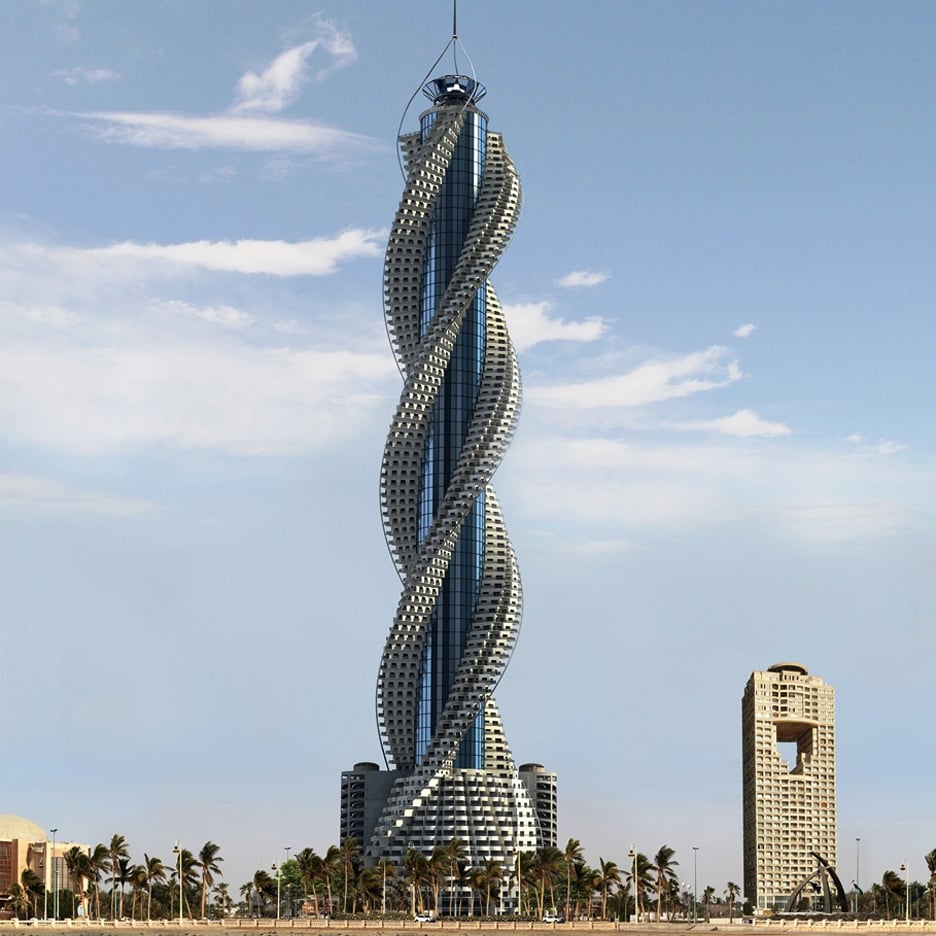
Spiralling skyscrapers are more popular than ever according to a new industry study charting twisted buildings around the world. (more…)

At the 2016 Venice Biennale, Peter Zumthor has put his designs for the Los Angeles County Museum of Art (LACMA) on display for the professional community. Inside the Arsenale building, a model of the tar-pit-inspired building has been suspended to float within a curving display of textile artworks by Christina Kim, while a soundtrack by Walter De Maria – “Ocean Music,” written in 1968 – provides a rhythmic backdrop for the installation.
Continue for more on the exhibit, featuring images by photographer Danica O. Kus.
Rather than bring along artwork from LACMA to exhibit alongside the model, Zumthor and LACMA director Peter Govan selected artist Kim to create a textile artwork consisting of two curving rows of fabrics in a gradient of colors. The fabrics are picked up in the reflection of the model’s continuous glazed wall, where they serve as an abstraction of how the collection of paintings and artworks will contrast with the museum’s dark gray concrete shell.
Kim has previously worked with both LACMA and architectural themes as a participant in Wear LACMA, in which Los Angeles-based designers were tapped by the museum to create pieces inspired by LACMA’s permanent collection. Kim’s label Dosa created a 10-piece collection inspired by paintings of Simon Rodia’s Watts Towers.
The Arsenale exhibit also contains a small set of site plans and architectural drawings of Zumthor’s design, as well as a calming presence in the form of a bamboo garden.
Other images (including a photograph of the museum’s section drawing) can be seen here. A review of the display by LA Times Architecture critic Christopher Hawthorne can be found here.
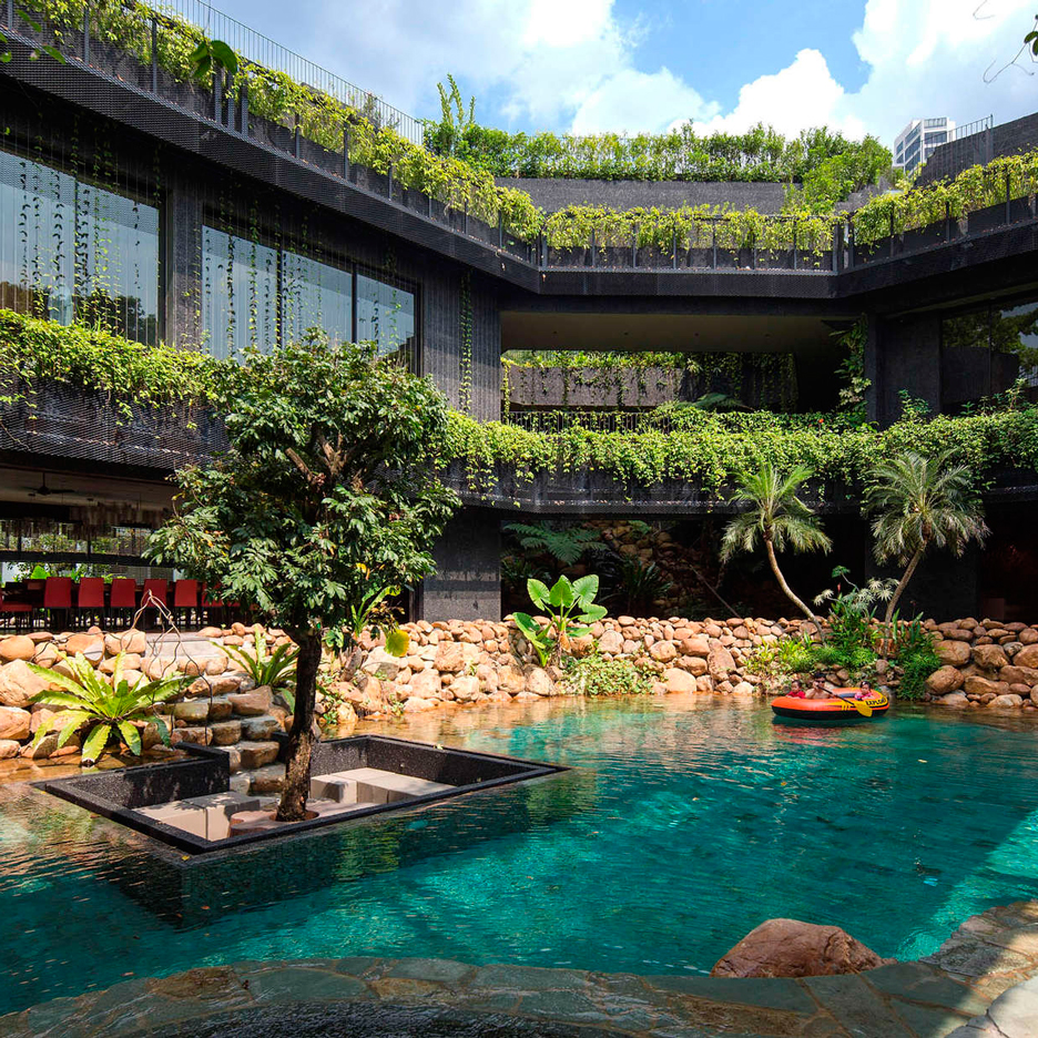
A+Awards: featuring a swimming pool, waterfall, Koi carp pond and a terraced roof garden, this large family home in Singapore was another of the winners in Architizer‘s 2016 A+Awards (+ slideshow). (more…)

Casa Candelaria, Located at the outsides of San Miguel de Allende, Mexico, was conceived under concepts that detonate the strength in it presence and belonging to the place where it uproots, for which it was decided to return to the program of the Mexican haciendas and solve the new house around courtyards which themselves contain an activity that represents the tension and the relationship between the functions of the volumes that surround it.
Another key intention for the design development was the decision to use as constructive method rammed earth walls, with natural aggregates that allows the earth to become black toned that seeks the integration and mimicry with the environment where it was intended that the main element outside was the vegetation.
As for the benefits that the use of rammed earth gives us, is the thermal storage because of the thickness of 50cm, in a place of extreme weather, as San Miguel de Allende, it´s sought to achieve spaces that during the day could stay fresh and at night preserve the thermal gain they achieve during the day and radiate it into the interior, in order to create warm spaces. This strategy along with saving on the purchase and transfer of materials from distant places, make the construction time, cost and functional outcome to optimize in the best way possible.
Volumetrically the house solves each of the areas independently, creating blocks of black soil with predominance of solid and opening to the nature that surrounds the volumes through gaps that arise from floor to a 2.44m height where privacy and control of light is given by wooden blinds, revolving plates that generate an aperture and a total integration with the outdoor space.
Programmatically the project uproots in an area of 4 hectares and consists of a master house, the big house, another smaller houses, the guest house, a club house, the caretaker’s house and a jogging track 1km long that unites and represents all the project itself, giving way along its route activities, contemplation and transit between the volumes that make up the hole house.
The big house consists of 12 volumes that are organized around 2 large courtyards, dividing public and private areas of the house with 930sqm and 630sqm of outdoor areas between patios, terraces, pool and gardens and two interior corridors that weave the total volumes outwards.
The guesthouse consists of 4 volumes connected by a covered courtyard and 200sqm of construction. The materials used in this project as key players are compacted soil walls, parota wood indoor and archaeological stone outdoor, accompanied lesser extent of concrete, blacksmithing and tile floors.
In short, this house responds to Mexican haciendas in contemporary time with an innovative and effective construction system.
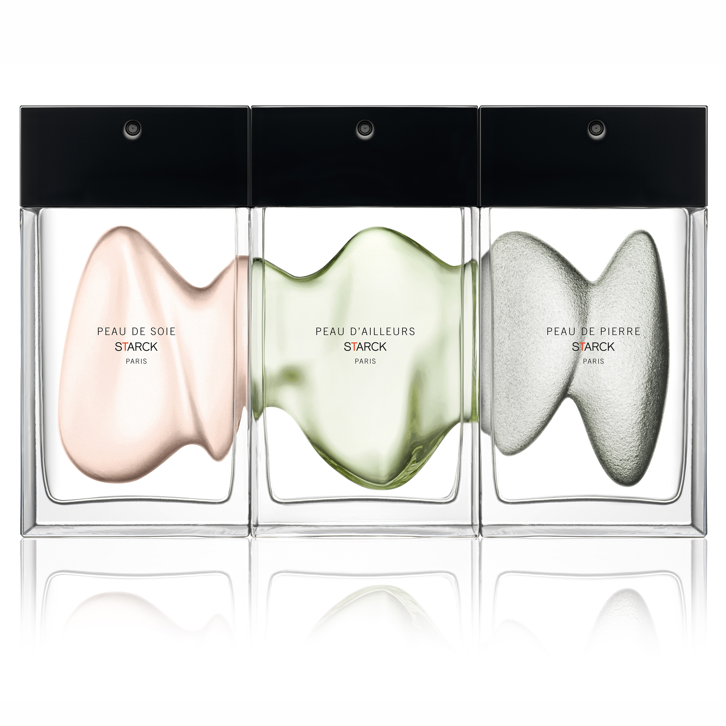
Philippe Starck has become the latest designer to venture into the fragrance industry, adding three eau de toilettes to his extensive catalogue of products. (more…)

This article was originally posted on ArchSmarter.
ArchDaily recently posted an interesting article on using animated GIFs for architectural drawings. The article had some great examples but was short on details of how to actually create these images.
I was curious how to create animated GIFs using Revit so I looked into the process. It turns out it’s pretty easy, provided you’re systematic when creating your views and have access to photo-editing software, like PhotoShop. Want to try it yourself? Follow the steps below to create your own animated GIFs in Revit.
Animated GIFs work best when you use a consistent view point and change something within the view, like the visibility of elements or the cutting plane of a section box. For this example, I’m going to change the cutting plane of a section box so my GIF will animate the the movement of the section through the building.
To start, I create the initial 3D view and turn on the section box. This is my starting view so I make sure the section box isn’t cutting the building. I name this view with a “_01” suffix. I also create a new 3D view template and add it to this view. I’ll use this template to control the visibility of the section box in all the animation views.
Once that’s done, I duplicate the view, move the section box into the building by about 20 feet and rename the view with an “02” suffix.
I continue this process of duplicating the view, moving the section box, and renaming the view until the section box has passed through the entire building.
Try to use at least 8 – 10 images. The more images, the smoother your animation.
Once I’ve created all the views, I edit my view template and turn off the section box.
Now that you have all the images created, export them using the “Export Image” dialog. Go to the Revit button, select “Export” then choose “Images and Animations” and finally, “Image”. This will launch the “Export Image” dialog.
In the “Export Image” dialog, select the views to export in the “Export Range” section. I like to use PNG files so, in the “Format” section, I select PNG for “Shaded views” and “Non shaded views”. Also, set the image size for the images in the “Image Size” section. I like to use 600 pixels horizontal for animated GIFs.
Select the output folder then click “OK” to export the images.
Now that we have the image files for our animation, we need to put them in the GIF file and animate them. To do this, we’re going to use Photoshop. The first step is to load the individual image files as layers using the “Load Files into Stack” script. To access the script, go to File > Scripts > Load Files into Stack.
Each image will appear as an individual layer in the “Layers” dialog box, as shown below.
Photoshop has a cool feature that lets you manipulate an image over time. We’re going to use this to create the animated GIF. To open the Timeline window, go to Window > Timeline. This will open the Timeline window at the bottom of your screen.
With the Timeline window open, click the “Create Frame Animation” button, as shown below. If you don’t see the “Create Frame Animation” button, don’t worry. Just skip to the next step below.
Once you’ve done that, click the menu button on the far right-hand side of the Timeline window and select “Make Frames from Layers”. This will import all the layers into the timeline.
The individual images that we imported as layers will make up the key frames of our animation as shown in the image below.
Now that we have all the frames of our animation, we can specify the time interval between each frame as well as how many times the animation should repeat.
First, shift-click and highlight all the frames in the timeline. Once you have them all selected, click the “0 sec.” drop-down on one of the images and choose your interval. I like 0.5 seconds but you should experiment to see what works best for you.
Next, select how often the animation should repeat. I like my animated GIFs to loop continuously so I select the “Forever” option as shown in the image below.
To test your animation, click the “Play” button at the bottom of the Timeline window. This will cycle through all the images in your animation.
Our animated GIF is all set. We just need to export the file. Go to File > Save for Web to open the “Save for Web” dialog.
In the “Save for Web” dialog, choose your GIF options. I typically select the “GIF 128 Dithered” preset at the top right-hand side of the dialog. You can also specify your final image size in the “Image Size” section.
Once everything looks good, click “Save” and specify the location where you want to save the file. That’s it!
To view your GIF, drag the file into a web browser, like Chrome or Firefox. This will play the animation automatically.
If you want to step through the file manually, open the GIF in an image viewer like Windows Live Photo Gallery.
Here’s another animation of the same model:
Animated GIFs are a lightweight and easy way to create more dynamic architectural diagrams. Using the steps above, you can quickly express your design intent in a very compact format. If a picture is worth a thousand words, an animated GIF is worth at least a few dozen pictures, right?
How about you? Have you used animated GIFs on your website or in a presentation? If so, what methods have you used to create the diagrams? Leave a comment below!
7 Ways to Use Animated GIFs to Improve Your Project Presentation//cdn.embedly.com/widgets/platform.js
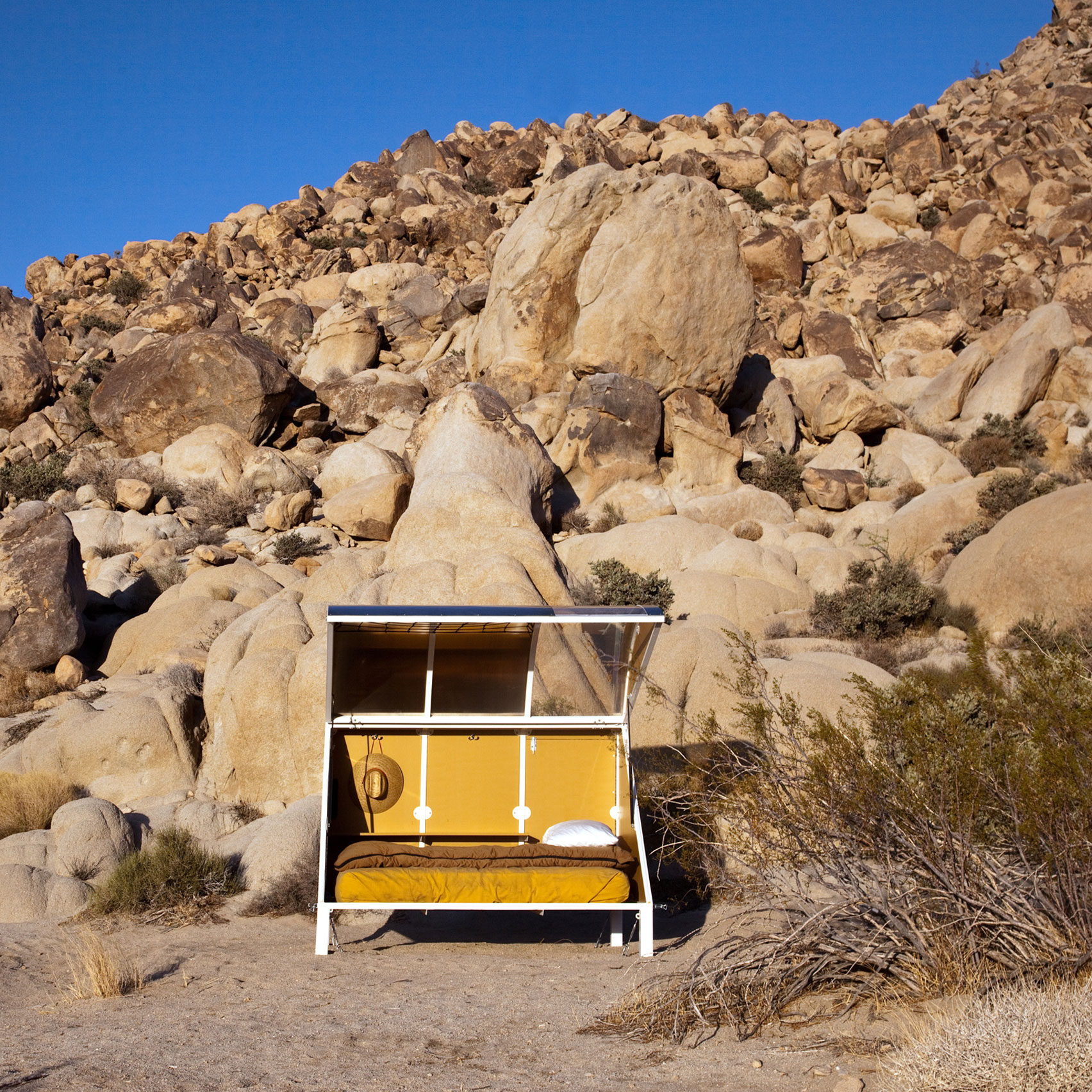
Love the great outdoors but not prepared to slum it in a tent? These micro cabins and sleeping pods provide more glamorous accommodation for holidaying in remote locations (+ slideshow). (more…)

The PLAY-TIME apartments is a project of seven units for short term rental in Ciudad Lineal, Madrid. The developer chose the place because he was looking for an oasis in the city. As architects , we proposed to intensify that condition. The movement of the building gives each housing with its own terrace and the construction system provides its own garden in the perimeter. The units, two per floor , are independently assembled on a vertical core -with elevator and services- so they can be oriented freely, limited only by urban conditions and the spiral staircase that climbs around the perimeter, to which they turn their backs.
The result is seven tree houses, surrounded by more than forty different species of climbing plants, chosen according to the orientation, whether they are evergreen or deciduous, their leaves and fruit color, flowering period, smells and textures. Thus the green tapestry provides the main architectural features of the envelope (solar and hygrothermal control, vision and intimacy adjustments) and a catalog of sensorial experiences.
As a result, the building collects the aspirations of the developer as well as disciplinary obsessions (the vertical garden, the spiral organization, typological subversions, and the apparently free and in-formal envelope shape) but it does so in a way we had to learn everything along the way and we now feel that we could not do without any of the elements without sacrificing the entire project.

