From the architect. The bungalow is the first of a series of cabins to be built over a spectacular site in Tepoztlán, a small paradise located at about 50 km from Mexico City. The town has fantastic weather conditions, and a unique character built thru its pre-Hispanic origins that were followed by a colonial center that is still the heart of the village; its charm attracts the presence of intellectuals and thinkers to stay over the weekend, or for longer periods of time
Diagram
The bungalow is conceived as a refuge for temporary sojourns in Tepoztlán. In the site there is already an area for common uses, including a large garden with a lounge and a pool which were also designed by our office. The bungalow is designed as part of the same project. A minimal private space for a couple or a small family is the program; however, views, light, nature and quietness are the reason of the project.
Exposed to the breathtaking views of the valley and the common area of the property, this contemporary cottage is located on a leveled surface already existing within the forest that occupies the site. The building is a small box that hovers over this plain, opening to the views and interacting with the steep slope of the terrain below. It is built on concrete seeking for low maintenance, and with the outer shell painted black to minimize the visual impact on the landscape. It is a framed box with its sides shut to maintain privacy with the succeeding bungalows, but fully open to the frontal views. The project aims to reinforce the belvedere condition in each of its main spaces.
Being a temporary shelter, the project prioritizes both the living area and the master bedroom. Hence, the box brakes down in two at the front to make explicit the separation between those two main frontal spaces, allowing the vegetation to occupy the rift. To strengthen the necessary relationship with nature, these two key spaces have large front terraces that extend their experience and approach to the edge of the natural platform on which the bungalow stands. The cabin is a small plinth, a shelter among the trees to enjoy the views, the weather and the exuberant nature of the place.
Architect Anna Puigjaner imagines a future in which housing is suited to the needs of its inhabitants. Sometimes that happens to mean not having a kitchen. Her project “Kitchenless” has received the Wheelwright Prize from Harvard University, along with an endowment of $100,000 for research on existing models of communal residences worldwide.
Puigjaner and the other members of the Maio firm work alongside professionals from other disciplines in a beautiful spot in the Gracia district in Barcelona, which functions more as a co-working space than a conventional architectural office. The Maio team opted for this place in 2011, during the crisis, so in order to hold on to it they decided to open the space to other workers. In 2016 they could afford to be alone, but there isn’t any compelling reason for them to do it. This could be a summary of their philosophy and is surely one of the reasons why Puigjaner received the Wheelwright Prize, a unique prize among architecture awards as it doesn’t focus on a specific work or research but the relationship between the two, in direction and ideas.
She does the interview from her office and talks about the changes that lie ahead for the future of housing:
Would you live in a house without a kitchen?
I live in a house without a kitchenright now. Let me explain, I started with this idea of ”no kitchen” because it was the most provocative, I realized that when we talk about housing there was no problem if you eliminated the living room or bedroom, but if you touched the kitchen it generated a very curious adverse reaction. Kitchens were instilled with certain ideological values during the twentieth century linked to the role of women, politics, and the construct of the ideal family.
The part that interests me the most involves a large change in mentality. It’s about looking at a house not for it’s square footage but for it’s uses. In short, this idea of eliminating the kitchen was quite good because it simplified everything while being very provocative. Homes that do not have a room designated as the kitchen have a kitchenette. Here’s the catch, my kitchen is only 1.20 meters ( 4 ft.) long.
So, you don’t have a kitchen but you have a space to cook?
I have appliances I can use for cooking. The compact kitchen or famous breakfast bar that emerged in America in the late nineteenth century were always accompanied by a communal kitchen. They were kitchens where you would only cook occasionally.
When you talk about a communal kitchen, are you referring to buildings where several homes were accessing a shared space?
There are many types.The residences I studied from late nineteenth century New York had no kitchen or kitchenette but always had a common kitchen with a cook. During the twentieth century this model was politicized because the Russians began to copy it as a system of social housing and loaded it with political meaning. Suddenly a collective kitchen was associated with communism. Now, when I say communal kitchen people imagine a shared kitchen space but at that time it was more like a domestic service with a cook.
In a similar vein, multi-family housing also had built-in childcare, housekeeping or other facilities for daily life. In addition to this you had your kitchenette in case you wanted to cook for pleasure. When it became politicized, that system was immediately swapped out for housing as we know it today.
So the “kitchenless” system you’re talking about is always linked to domestic services?
Yes, for me services are the most important, not whether you have a kitchen or not . It is about outsourcing domestic work, with jobs where people receive compensation.
How would you define domestic comfort?
Domestic comfort is built and designed. When we contemplate the question “what do I like?”, in a design that someone has thought of, we have to grow accustomed to it. It is a slow process, it takes time, but social trends in domestic comfort happen when a group of people or a particular school influence society in some way until they establish an idea of whether something is comfortable, expensive, or cheap. Our criteria are variables. What we consider comfortable today is different from what was comfortable at other points in time. It was neither better nor worse, just different.
For example, in the nineteenth century it was considered unhygienic to have a kitchen inside the house, something that makes some sense if you think about how dirty kitchen trash can be. At that time there was also an interest in controlling the quality of the food and the best way to do that was leave it up to a professional. People thought that a cook would have better control over the quality and where the food came from. Now there is a resurgence of this idea, an interest in knowing the origin of our food, whether any pesticides were used, etc. There are countries, like Australia and Canada for example, which have seen a resurgence of communal kitchens since the late 90s.
In Canada three women started out with the intention of reducing domestic costs and that partnership of three families has grown and now there are 1,500 varying models of communal kitchens you can join by paying a fee: in some the members themselves do the cooking; in others, a professional. It’s like a consumer co-op, with the only difference being that you’re buying cooked food. This phenomenon is happening in Australia as well. In both cases the factor of socialization and community is important, people enjoy coming together.
So far we’ve talked about two very different models: a housing concept where the cooking is done by a professional chef, and another where it’s done by the families themselves. Which one is your research aimed at?
My doctoral thesis, based in New York, was basically about outsourcing domestic tasks. I was particularly interested in an absolutely capitalist system that moved away from communism but also had communal kitchens. Managing a space like that was very different and it also came about for purely economic reasons, as it was more profitable and it was to the benefit of property owners to offer group domestic services.
Now my interest is to show that this model has a contemporary relevance and could be a great help to people throughout the world. That’s what I’ll be doing for the next two years thanks to Harvard, defending the idea that there are many advantages to this type of housing and that they can be adapted.
There are many individuals or families that would never share a kitchen with their neighbors, the idea itself would be shocking…
Remember when we talk about the idea of a conventional family we are only talking about a small percentage of people when compared to other social types. The percentages of families that consist of a couple in their first marriage who have children represent 46% of the US population. Patterns change. Sometimes people who were reluctant at first are more open when they are looking at it out of necessity.
We’re beginning to see different families who do not want to go deal with conventional nursing homes come together and build homes adapted to the needs of the elderly people in their lives. Even here in Spain, there are examples in Basque Country and Valencia. Social needs are changing at a brutal speed. The key aspect of these models is that there are a lot of options and possibilities. You can have a kitchen but if you can’t cook then the residence will fix that for you. The mindset is not one of forcing people but that of giving more options.
Here is where the role of women in society has come into play a little. I imagine that houses were designed for women to do all the housework.
When I talk about this, I’m referring to the United States. What’s happening here in Spain isn’t my area and I’ve never studied it, but in the United States’ case it is very clear that after the Stock Market Crash of 1929 there was a political push for women, who were part of the workforce during the war, return to the home and that the home itself become a productive place.
It was important to increase domestic consumption and that’s when we start to see the design and marketing of appliances as well as the idea of the individual consumer and no longer communal spaces because it’s more profitable to sell 20 washing machines than one. This is also when laws changed, and incentives were given for the construction of single-family homes.
While domestic services were the norm in the late nineteenth and early twentieth century it was normal to be paying several people to work in your home, after the war these services became more expensive and people started to do them collectively. Later, with Fordism and Taylorism, compact kitchens, which had previously been dependent on communal kitchens, started being sold in ads and popular consumer magazines as kitchens that do it all. Suddenly, you no longer have a person in charge of the kitchen but you have a machine that will do it all. That was a big lie because those ads, with their own Fordist jargon, were selling the idea that appliances were taking over the act of cooking and thanks to them you could do everything faster. The big difference is that in Fordism, you broke away from using professionals in the kitchen and the woman took on all those responsibilities. Women lost many privileges in just a few years. Now we’ve gotten rid of domestic services, we have amazing kitchens, but we’re dedicating exactly the same amount of time to household tasks as 100 years ago, rather than understanding that housework should be done by paid professionals. We all believe we know how to clean very well but any ordinary professional could do a much better job than we can.
Suddenly, you no longer have a person in charge of the kitchen but you have a machine that will do it all. Those ads were a big lie, with their own Fordist jargon, they were selling the idea that appliances were taking over the act of cooking and thanks to them you could do everything faster. The big difference is that in Fordism, you broke away from using professionals in the kitchen and the woman took on all those responsibilities. Women lost many privileges in just a few years.
Now we’ve gotten rid of domestic services, we have amazing kitchens, but we’re dedicating exactly the same amount of time to household tasks as 100 years ago, rather than understanding that housework should be done by paid professionals. We all believe we know how to clean very well but any ordinary professional could do a much better job than we can.
I think that this part could seem pretty controversial, for example here (in Spain), in the middle of a crisis to think of hiring people to do household tasks…
This is where we get to talking about social norms and the fact that we consider these to be second-rate jobs. Why is working on a car assembly line more valued than cleaning a home? We have a problem. We are not talking about exploiting anyone, just normalizing these jobs.
Yes, but there’s also a financial element that could be difficult…
Now we’re talking about housing, in the 19th century it was cheaper because it came included in the rent. I would cost you the same to rent an apartment with domestic services included as it would to have an apartment that came with a kitchen and appliances. Why? Because you could build more units on the same piece of land if you had collective domestic services. The developers could build more homes and be more competitive. It was mostly a choice of what you wanted to have. These days it is more expensive because the current legal and tax systems aren’t structured well.
All of that brings me to ask, What do developers think of your idea?
One of the philosophies of the nineteenth century was that you rented services, you could have three rooms but then if you needed another room later because you had a child or whatever your reason was you could just add on because the buildings were adaptable. I’m talking about the kitchen because it’s the most interesting, but there are many other benefits to this model.
It is difficult at the moment, but for now we are working for a private developer who wanted to build a residential building that could be adapted on demand. What this developer wants is to rent these flats and asked us to make a building where you could adapt units on demand with just a few changes. Now we know that the 60-square-meter (645 ft2) units are the most popular, but if in a few years there is another kind of demand, they have got to be able to adapt.
This developer has found that demand changes very quickly and wants to be prepared for this: at the moment the units are 60 m2 , but in the future, he could have some flats be 120 and others 30. The internet is allowing for more flexibility with housing with things like renting individual rooms, but of course if the room isn’t well designed it is a nuisance. In the nineteenth century houses were designed to be much more flexible than they are now.
I imagine that these losses didn’t go unnoticed by property developers.
They are political, economical. After the crash of ‘29, they wanted to encourage domestic consumption.
Although you say that in Spain we’re decades away from the United States, what can you point out here? Anything in particular?
Here everything is very recent. We had several decades of Francisco Franco encouraging private property, there was a slogan that went “Let’s change this from a country of blue-collared workers to a country of landowners”. All of a sudden in the 60s being a home-owner became an ideal .The public housing that went on the market in the 90’s and early 2000’s was an outrage.
There is a culture of ownership and individuality related to housing, but gradually we realize that renting is positive. It implies a much less permanent relationship with your house, that your house does not have to be your house for life and it also allows for more respect for other people in certain ways. Taking care of things even if they aren’t yours. “Sharing” culture is growing and thanks to new technologies and the fact that we are spreading out more and more around the world makes it easier to be less afraid of others, or to let go of our things.
It is a drastic change. Even I find it difficult sometimes.
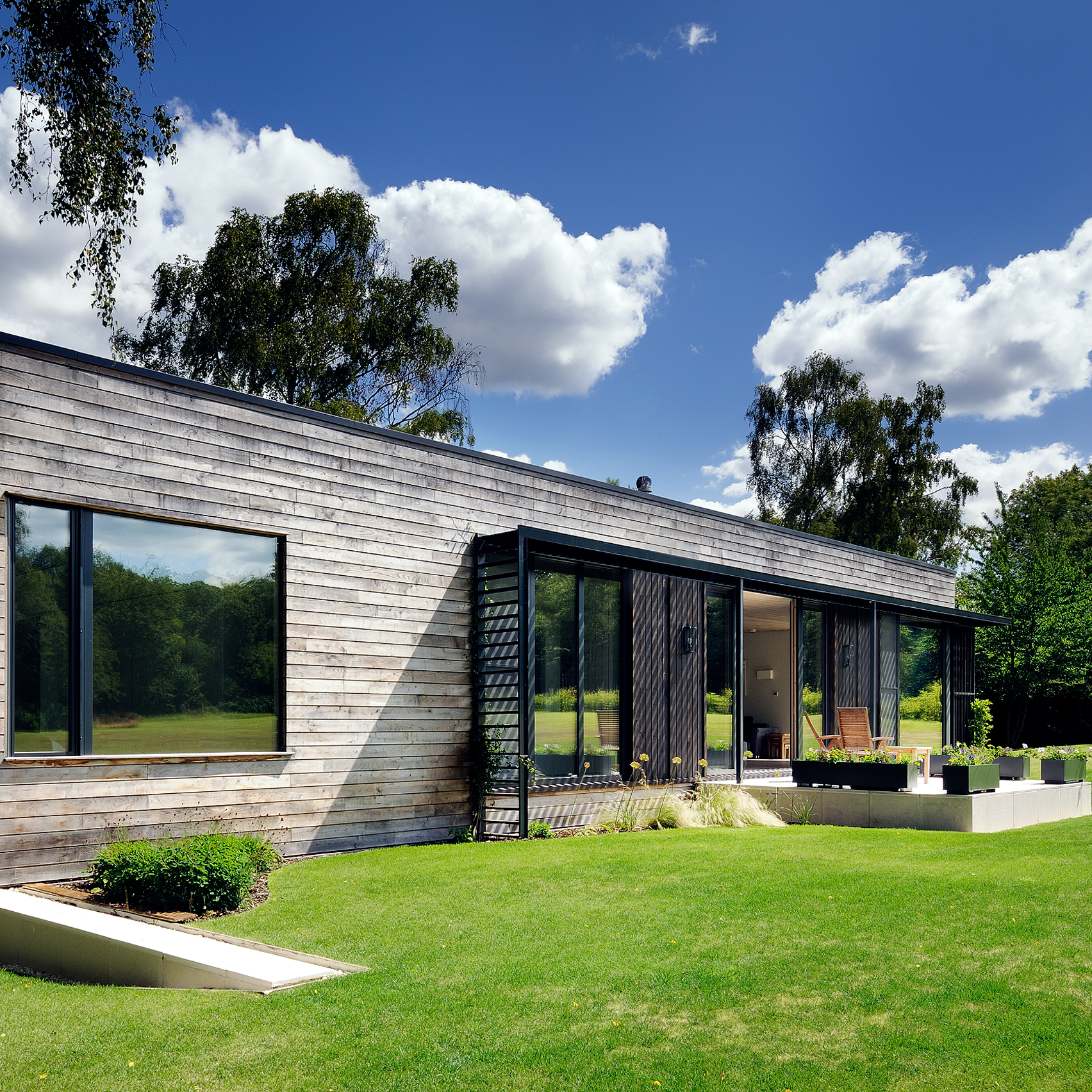
This chestnut-clad home by Pad Studio was prefabricated offsite before being craned into a clearing in the New Forest, a stretch of protected woodland in the English county of Hampshire (+ slideshow). (more…)
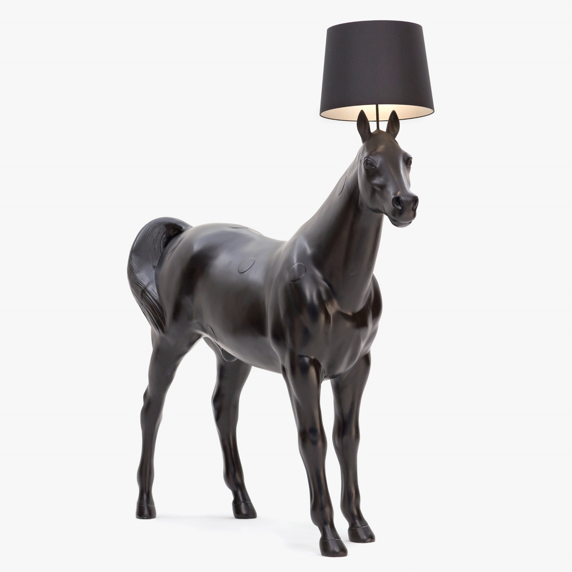
Most Loved: in our next exclusive movie, Anna Lindgren and Sofia Lagerkvist of Swedish design studio Front discuss the unexpected reaction to their range of lifesize animal products for Moooi. (more…)
A few months ago we put out a call for the best architecture résumé/CV designs. Between ArchDaily and ArchDaily Brasil we received over 450 CVs from nearly every continent. We witnessed the overwhelming variety and cultural customs of the résumé: some include portraits, others do not; some include personal information about gender and marital status; others do not. In the end, however, we based our selection on the CVs that stood out from the hundreds of submissions. We looked for CVs that transmitted the personality of the designer, their ability to communicate visually and verbally, and perhaps, the most intangible criteria for evaluation—the “creativity” of the CV. The documents below represent the diversity of styles and formats that just might land you a job at your dream firm.
But before we get started, we thought we would take this opportunity to present our top tips for designing your own résumé:
File Size: If you’re a decent designer/architect, then you should know better than to send a file that’s over 5MB.
Typos & Mistakes: If the language of your résumé isn’t your native language, turn to online communities or ask someone to proofread your résumé.
The most creative résumés stand out not only visually, but because they are not difficult to read or understand. Many submissions were elaborate visual mazes of information that weren’t aesthetically unpleasing, but utterly impenetrable when it came to understanding key information about the applicant.
If someone asks you for a CV or résumé, they are not asking you to send a portfolio. However, if you’re submitting your CV electronically, it’s not a bad idea to include a link to your portfolio!
Don’t copy: It’s ok to be inspired by certain designs, but straight-up copying isn’t just wrong, it probably won’t be the best representation of who you are and the design work you are capable of. If making an unconventional résumé doesn’t come naturally, it’s probably best to stick to a standard, more classic CV.
The ArchDaily editors are still on the fence about the trend of “rating yourself” in different areas of expertise. It seems very subjective and less informative than it is visually appealing. The jury’s still out on this one.
Submitted by Andrea Bit
About the design: “How could a résumé describe a candidate and be simple and clear at the same time? We have to make a choice. Mine is to use a very simple layout, working only with different heights and weights of one font. The résumé is only one part of the presentation: a QR code leads to a complete portfolio on the web. We live in a connected world. I think also the résumé has to express it.” – Andrea Why we like it: While simple, we love the impact of Andrea’s font choice and sizing, and the QR code is a great addition—it operates as both a zeitgeisty aesthetic addition and a functional way to communicate more about yourself.
Submitted by Bernadette
About the design: “This design was intended to be straightforward which captures the designer profile in one shot, through the use of pairing fonts to make each sections individual, yet harmonize with the entire flow. The color use is to allow the employee or interviewer to understand the interviewee strengths and weaknesses at a glance.” – Bernadette Why we like it: On an otherwise understated design layout, the presentation of the skills really stands out here, with the colorful icons grabbing the reader’s attention. As mentioned above, we’re not sure about the practice of rating your own skills numerically, but if you must do so this is the way to show it off.
Submitted by idan sidi hauben
About the design: “minimalism” – idan Why we like it: Well, I suppose we couldn’t have said it better ourselves. This design speaks to the architect’s innate minimalistic taste.
Submitted by turgut
About the design: “Love what you create, Create what you love, Inspire the world” – turgut Why we like it: Though deceptively simple in layout, this design is undeniably striking, thanks to the well-chosen image which grounds the entire page—while also providing a simple color scheme to highlight the skills section.
Submitted by Alfonso Bruna
About the design: “I wanted to make something brief and eye pleasant with only a small touch of blue to stand out.” – Alfonso Why we like it: Alfonso’s design cleverly uses a variety of different text formats, with text size, weight and color, all contributing to organize information effectively. Plus, we can’t fault the color scheme. 😉
Submitted by Ewa
About the design: “Very simple résumé, inspired by school of Bauhaus, for those more traditional ones.” – Ewa Why we like it: We can’t imagine an architect who wouldn’t break into a smile upon receiving this résumé and spotting all the Bauhaus references.
Submitted by Erik Mårtensson
About the design: “Curriculum vitae as landscape.” – Erik Why we like it: Unquestionably the most creative design we were sent, this one takes a while to understand. Normally, that’s not a good thing—but in this case the effort taken to interpret the information is well worth it.
Submitted by Bryanna R. McNeal
About the design: “My design aesthetic is centered around the use of color as expression, and the division of subject matter. I still have things to learn and enhance, in terms of my own résumé, but the most important thing in the creation of a résumé is the acknowledgement of how you are (and how you spell your name) and what you stand for. That said, I focused the majority of my résumé around my volunteer experience and my skills. Places these features next to each other is my own attempt in stating the relative nature and how two and two may work with and within another. They are also what makes me a potential asset and can be seen as the forefront of my digitally paper-based identity. Other than that, I consider these three things to be fundamental: fun, font, and flow. Sorry for the cheesy ending.” – Bryanna Why we like it: This modern-looking design shows off many different, innovative ways of displaying information—so much so that we’re inclined to believe Bryanna’s claim about her own PowerPoint proficiency.
Submitted by Alex William Robbins
About the design: “A balanced asymmetric design, organized by a varying hierarchy of lines.” – Alex Why we like it: Just as Alex points out, this design is all about the power of the line. With the connection between organizational importance and lineweight, there is even a sense of an architectural drawing about this one.
Submitted by Gaia Pellegrini
About the design: “The concept of my résumé is inspired on the life of the graduate student: a young person who always wanders into the world with his résumé in the backpack searching for new possibilities. With this résumé I don’t have to bring around my A4 notebook all the time to keep it safe, but just a small envelope! The design is exactly like its concept: clear, simple and effective. The graphic is based on grayscale in order to keep its efficacy also when printed in black and white.” – Gaia Why we like it: We love the way that experience has been presented as a journey here. And, while it’s probably not something that would be noticed by a prospective employer, the practical considerations that lend themselves to an adventurous, semi-nomadic lifestyle are a nice touch.
Submitted by Daniel Chu
About the design: “Simple single color approach to stress importance of certain elements of my résumé. Use of modern day communication visual style to introduce myself and bring readers into the rest of my résumé. Designed to be read from a pdf reader on the computer with guidance to scroll down to read more into the next page.” – Daniel Why we like it: It’s great to be aware of the medium your résumé will be read on, so the way that this design is optimized for pdf is a nice touch.
Submitted by Mario Medina Vilela
About the design: “The design of the résumé was divided in half to tell two stories. On the left, an introduction about my design philosophy and skills were depicted to illustrate my personality and strengths. On the right, chronologically I have portrayed my Education, work experience and Achievements during my undergraduate studies. In addition, using the black and light blue allowed me to create a résumé that stood out from the typical black and white résumé, and is interesting to read. Overall, the intention of the graphics were to be bold, simple and clear to understand for any architecture and non-architecture related professionals.” – Mario Why we like it: The use of the central timelines here is a great example of an informational tool that doubles as an organizational element. On top of this, the clear color scheme and bold icons make this design extremely clearly presented.
Submitted by yang yu
Why we like it: This résumé, in spite of its deceptive simplicity, tells a story and is full of personality. It took us on a journey, showed us the candidate’s attention to detail and graphic acuity and maintained the age-old architectural black and white aesthic.
Submitted by Claire McNabb
About the design: “In this résumé, a graphically-bold name stands out and makes it more memorable. The layout of the résumé directs your eye from the name down the left column and then over to the right. It is modern, but in a subtle way that is always suitable.” – Claire Why we like it: Claire’s design forces the inclusion of only the most relevant information. In this “less is more” approach, we were drawn to her distillation of information, rather than a graphic verbal-visual barrage of information.
Submitted by Jeremy Floyd
About the design: “Minimal design with graphics to illustrate my design prowess and aid in readability.” – Jeremy Why we like it: The small circle with one of Jeremy’s sketches was the first thing we noticed about Jeremy’s résumé. In this super-clean design he aptly demonstrates both his digital and hand-drawing graphic skills.
Submitted by Claire Flego
About the design: “This was the résumé I used straight out of university – I thought I was being a bit cheeky and clever – luckily my boss (of 3 years now) also thought the same!” – Claire Why we like it: Clever and cheeky indeed, there’s also something inspiring to Claire’s “blank drawing” résumé. She found an idea that made her résumé stand out and transmit her personality, which allowed her to connect with her future employer.
Submitted by Evan
About the design: “Simple, website-inspired design with quality typography and value which differentiates lines. Clear and not overly stylized.” – Evan Why we like it: This is a more traditional version of the classic black and white résumé. We appreciate the subtitles of graphic design and easily legibility.
Submitted by Rafael Nabiça
About the design: “The visual language inspired by social networks and today’s fastest media gives the reader a quick, understandable interpretation of the content without losing sight of its importance.” – Rafael Why we like it: An architect/designer who is aware of his/her context is an invaluable asset in the office. By cleverly using a visual language that we’re all familiar with—and subverting and modifying it to communicate the key information related to hiring processes—Rafael’s submission was not only fun, but smart.
*BONUS*
Submitted by Hendri Sudarman
About the design: For the first time I read this article, I found that in this submission you don’t have to make a résumé/cv properly as usual. Just think differently and make it unique. So, I thought out of the box to make this résumé. Inspired by Ludwig Mies Van Der Rohe, who said that “Less is more,” I decide to make it kind of simple but still extraordinary. The use black and white color is to give a vibe of simplicity, modernization, and sophistication. Then how to make it interesting and unique? The quote “Less is more” always inspired me. For now, I made this quote to be “Less is morse.” What is morse? It iss a method of transmitting text information as a series of on-off tones, lights, or clicks that can be directly understood by a skilled listener or observer without special equipment. So at I wanted make “some game” for the readers. With morse code I want to make the readers to do some observing; just like any architect does. I choose square to describe a dot and dash for the morse written. And why squares? It’s again inspired by Mies. Through his design, I found that the “square” is the form that Mies always used. For the final word, thank you to Mies who always gives me such inspiration for any situation, even for my résumé :)” – Hendri Why we like it: Even though it breaks most of the aforementioned rules/tips, it was a lovely breath of fresh air to receive Hendri’s submission. It came with the kind of explanation that made us immediately want to know about Hendri’s approach to design briefs. The gamble of making a practically illegible CV paid off for Hendri because it was clever, light-hearted and intriguing.
From the architect. The living and business house was built in 1893 and accommodates six 3.5-room apartments, an art gallery in the ground floor and a motorcycle workshop in the basement.
The dwelling levels are fully refurbished. The formerly North and street orientated living-/dining room is now facing the quiet south. The floor plan, which was divided into small sections with entrée, bathroom and kitchen, is now dissolved. A new infrastructure box with bathroom and kitchen is added and is spliting the loft like room in entrance, living and dining area.
Reconditioning the inside and facade of the townhouse on one hand, furthermore adding private outside spaces is revaluating the plot.
Detail
Detail
The Space between House number 47 and 45 is filled with a steel structure, which offers space for generous terraces for both neighbouring houses. The Volume is orientated at the street accompanied row houses, which already exist in the quarter. The new structure mimes a house, which is not allowed to be build – cause the two plots are already fully used.
Balconies are mounted across the community centre of Wipkingen towards the East. They are reserved in their expression and are orientating themselves on the existing outside spaces along the Ampère Street.
From the architect. Newly completed architectural miniatures park will open its doors in August 2016 at the black sea coastal resort Shekvetili. This small Georgian village has already enjoyed a grand opening of the nearby-located 10000-seat concert arena, a five star hotel and an amusement park is also underway.
Site Plan
Recently developing coastal region will be able to host thousands of tourists and offer them sandy beaches, seaside eucalyptus forests and unique leisure infrastructure. Among them one can visit a thematic park, ”Georgia in miniatures”. Park is full of architectural monuments, which have been gathered from all around Georgia in 1:25 scale. Park is aimed to display rich architectural heritage of the country.
Laboratory of architecture #3, a 10 year practicing, Georgian architectural company, has developed a park layout and a visitor center building. It is located at the entrance and serves as a kind of entree for the whole area.
It is important to mention that the building is a reconstruction of a cylindrical concrete volume of the former sewer cleaning facility, which was never used and was standing as an abandoned 30-meter diameter concrete drum.
Visitor goes through a poetic space, flanked from one side by the 60 meter long curved form black painted bamboo fence and a ribbed fiber concrete pavilion on the other. Bamboo is a very native material in local vernacular architecture as it is very cheap and easy to find throughout the region. However painting it in black is locally the first experimental attempt of this kind. The use of radical color continues in painting the educational space of the outdoor amphitheater, which is yellow and in blue staircase heading to the rooftop terrace.