Architecture
Lingenhel / destilat

© Monika Nguyen
- Architects: destilat
- Location: Vienna, Austria
- Project Year: 2016
- Photographs: Monika Nguyen
© Monika Nguyen
From the architect. The “Lingenhel opening” marks the completion of destilat’s most important project in recent times.
This project is very unique and was therefore quite an extraordinary challenge for an interior design firm such as destilat. The visual and spatial identity for Johann Lingenhel’s culinary-gastronomic vision was developed from scratch for this project, since no corresponding definition of it existed initially.
© Monika Nguyen
The two cornerstones of this architectural concept by destilat (www.destilat.at) are the project’s listed building on Landstrasser Hauptstrasse in Vienna and Lingenhel’s corporate identity.
Plan
Its counters, bars, and presentation furniture evoke images of cubically stacked wooden beams, which were inspired by the beams of the historic roof truss. Surface structures and haptics play significant roles in this concept. Patination reflects their change, which develops over the course of time; as a result, the building’s long history as well as the production processes of certain foods find their place in this house.
© Monika Nguyen
The central idea of this concept is not to fight against natural ageing processes but use them to increase quality. This turns ageing processes into improvement processes, which are naturally associated with the tasteful ripening of cheese or raw ham.
© Monika Nguyen
The counter will become more and more beautiful by being used daily. It captures its very own history over the course of time in the process.
© Monika Nguyen
The architectural concept’s second cornerstone – Lingenhel’s corporate identity, which was developed by Germaine Cap de Ville – plays a central role in this interior design project with its “Lingenhel check” pattern.
The check pattern is transformed from its abstract graphic origins into the basis for wall-mounted product presentations. Translated into the third dimension, it ultimately turns into shelves, which are used to present wine.
© Monika Nguyen
One of the Lingenhel universe’s central areas surely is the public cheese dairy with its adjacent tasting and event room in the historic court stables.
In this area, the goal was to merge the cheese dairy’s hygienic requirements with an atmospheric and multifunctional event room.
© Monika Nguyen
The area of the cheese dairy is separated from the rest of the room by a glass wall and can only be accessed through a hygienic sluice. The room’s sophisticated light installation evokes the image of a theatre stage, which deliberately puts the cheese-making process in the central limelight.
© Monika Nguyen
The huge central table made of raw wooden beams and the two minimalistic wire-mesh chandeliers give the tasting room its archaic flair, which corresponds with the room’s character and, at the same time, provide attractive contrasts to the cheese dairy’s sober, industrial atmosphere.
© Monika Nguyen
Material Focus: Salling Tower by Dorte Mandrup Arkitekter

© Torben Eskerod
This article is part of our new “Material Focus” series, which asks architects to elaborate on the thought process behind their material choices and sheds light on the steps required to get buildings actually built.
Installed last year, the Salling Tower provides a striking, sculptural landmark in Aarhus Docklands. From inside, its deceptively simple counterbalanced form provides a range of ways to look out over the harbor and the city – but from the outside the project’s designers, Dorte Mandrup Arkitekter wanted the tower to take on an abstract appearance, referencing nautical themes with its sail-like shape and porthole-like openings all while obscuring the process of its own construction. To do this, the firm created a structure composed entirely of a single steel piece resting on top of its foundations. In this interview, project architect Noel Wibrand tells us about how the project’s material choice contributed to the construction process.
© Torben Eskerod
What were the principal materials used in the project?
The viewing tower consists entirely of steel plates. Sheets vary in thickness from 20 to 30 millimeters. The construction is welded into one piece, which was mounted on a concrete foundation in a counterbalance structure. All steel parts were painted with a white paint used in the off-shore industry.
The project's drawings show how the steel plates were welded together into a single piece.
In terms of materials, what were your biggest sources of inspiration and influence when selecting what the project would ultimately be made of?
The viewing tower is conceptualized as a huge “origami” structure, and the picture of a piece of folded paper was used as design criteria in the tender and detailing phases.
© Torben Eskerod
Describe how material decisions factored into concept design.
The challenge in this design was to maintain the original idea as well a keeping the abstract feel of the design. The detail design process was very much about reducing and simplifying the detailing.
A very large part of the design resources was put into calculating loads and stability for the tower. With its many tilted faces this required a good amount of technical knowledge and skill with computer simulations and calculations. Søren Jensen Engineers provided a sound a professional expertise at this.
© Torben Eskerod
What were the advantages that this material offered in the construction of the project?
The advantage of using a homogeneous material, and having no climatic shell or requirements is that you actually can obtain a simple and light structure. The holes in the tower also helps reduce windloads and create a 20% reduction in material, along with freedom to place openings towards views of the city. The tower itself weighs approximately 85 metric tonnes.
© Torben Eskerod
Were there any challenges you faced because of your material selection?
Another challenge in the design was to connect the very small “footprint” of the tower with foundations. Even though the old harbor front has been used for loading cargo onto ships, the documentation for this specific construction required thorough investigations.
© Torben Eskerod
Did you consider any other possible materials for the project, and if so how would that have changed the design?
We did considering a lighter construction, with metal sheets on a rib structure. This alternative would have been much lighter, and easier to calculate and build on site, but would have resulted in a much less elegant design, as well as a less spectacular mounting process. One function of the tower was also to create an event to put attention to the development of Aarhus harbor.
Salling Tower / Dorte Mandrup Arkitekter//cdn.embedly.com/widgets/platform.js
Along the Levee / R3Architetti

© Twin Pixel Video
- Architects: R3Architetti
- Location: Turin, Italy
- Project Year: 2016
- Photographs: Twin Pixel Video
© Twin Pixel Video
This project arises from the client’s need to combine a two-room and a three-room flat into one apartment that would better accommodate the family’s new needs. The project strategy entails a clear division between the living and the sleeping areas and includes, within the distributive scheme, a little study area that would host the administrative headquarters of the family business.
© Twin Pixel Video
We have imagined to spatially define an interior landscape through a prism, a levee that divides and, at the same time, conceals the most private functions of the house. This expedient has allowed us to conceive the living area as a sort of ‘outdoor’ space for the family’s most social activities.
Diagram
Diagram
The fil rouge that connects “Along the Levee” to our previous works is the choice of the materials which are, once more, raw, undisguised elements enhanced in their most authentic expression. Special care has been given in finding their harmonic combination, often obtained through contrast: the earth’s dense texture is softened by the ethereal quality of the resin, the harshness of concrete is tempered by the warmth of wood.
© Twin Pixel Video
The building process mirrors our vision for the project, where the integration and contamination between the artisans’ custom made work and the project’s technical expertise is paramount.
© Twin Pixel Video
Di Peng recreates the experience of dementia with sense-distorting helmet
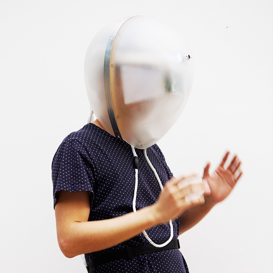
Graduate shows 2016: this Dementia Simulator headset designed by Central Saint Martins graduate Di Peng lets wearers experience symptoms of the disease for themselves (+ movie). (more…)
HASSELL + OMA Reveal Design for New Museum for Western Australia

The New Museum for Western Australia. Image Courtesy of HASSEL + OMA
With the contract to design and build the museum in Perth officially awarded to contractor Brookfield Multiplex, HASSELL + OMA have revealed the design for the New Museum for Western Australia. The WA Government commissioned HASSEL + OMA to design the cultural institution in April of this year.
HASSELL Principal and Board Director Mark Loughnan, and OMA Managing Partner-Architect David Gianotten stated: “Our vision for the design was to create spaces that promote engagement and collaboration, responding to the needs of the Museum and the community. We want it to create a civic place for everyone, an interesting mix of heritage and contemporary architecture, that helps revitalize the Perth Cultural Centre while celebrating the culture of Western Australia on the world stage. The design is based on the intersection of a horizontal and vertical loop creating large possibilities of curatorial strategies for both temporary and fixed exhibitions.”
New Museum – Museum Street entrance. Image Courtesy of HASSEL + OMA
The images of the project reveal ample public space and an impressive combination of new structures and existing heritage buildings. The designers explain that the driving concept of the scheme is “a public space that is the central point of the new museum, in terms of both location and programming.” This “outdoor room” seeks to increase public presence in the area, especially when the museum is not officially open.
Courtesy of HASSEL + OMA
New Museum seen from Francis Street. Image Courtesy of HASSEL + OMA
The New Museum is due to be completed in 2020, with main construction beginning next year.
New Museum Francis Street façade. Image Courtesy of HASSEL + OMA
New Museum with projections at night. Image Courtesy of HASSEL + OMA
RE: Designs Copper Colored Concrete Extension to Cyprus College of Art

Courtesy of RE:
Paris-based firm RE: has recently completed the design for an extension and refurbishment of the Cyprus College of Art in Paphos. With the idea of continuation, rather than radical reimagination, the project extends the existing sculptural wall of the college, creating new carvings and sculptures from a series of hung perforated copper-clad sheds.
Through this design, the cast concrete wall becomes a horizontal core for the building. Furthermore, this space will contain a series of building services, and can become a place of participation, as it may be carved or painted.
Courtesy of RE:
Courtesy of RE:
Arranged around the wall and the existing structures of the school, the sheds—new studio spaces—will maintain a “low-slung” character and “[reinforce] the village typology and deinstitutionalized nature of the existing school, while a new tower announces the position of this important cultural institution” explained the architect.
Courtesy of RE:
Courtesy of RE:
The extension and refurbishment aims to continue the college’s motto, “for artists, by artists,” by encouraging freedoms through its character.
Courtesy of RE:
The studios’ copper color is derived from the Lady of Lemba statuette, which was excavated from the site of the college and has since become a symbol for the village.
Learn more about the project here.
News via RE:.
Afsharian’s House by ReNa Design has a huge vertical slice in its facade
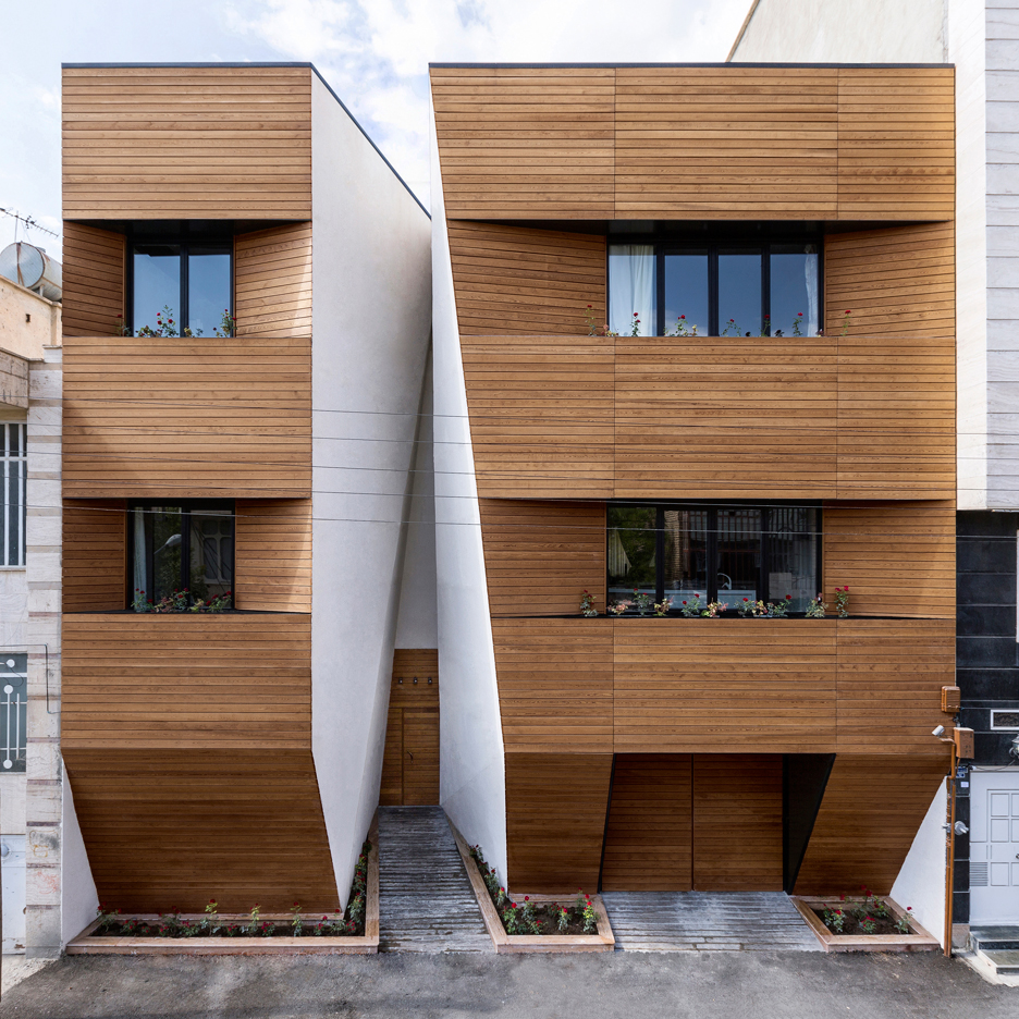
YCL Studio Designs a Contemporary Residence in Vilnius, Lithuania

Bazillion is a private home located in Vilnius, Lithuania. It was designed by YCL Studio in 2016. Photos by: Leonas Garbačauskas
Campus Motor / Pere Puig Arquitecte

© Carla Arbós
- Architects: Pere Puig Arquitecte
- Location: Barcelona, Spain
- Architect In Charge: Pere Puig i Rodríguez
- Area: 2816.8 sqm
- Project Year: 2013
- Photographs: Carla Arbós
- Constructor: Ferrovial
- Rigger: Manel Marín i Cruz
- Collaborators: Rafael Bosch Figueras, Marta Lucas Serra, Francesc Mestre Dalmau, Natàlia Pastor Laguna, Maria Garcia Codina, Núria Sabaté Casanellas
- Facilities: Raül Cristóbal, Josep Mª Juvillà ( IMOGEP )
© Carla Arbós
From the architect. The building is connected to a racetrack located in Barcelona, and is actively used as a training site for professional motor racing. Several companies involved in the industry have set up permanent offices in this building.
© Carla Arbós
A flexible design was needed for the building so that it could accommodate several companies of varying sizes. For this reason, the building is divided between several 35 square meter subdivisions or sectors.
© Carla Arbós
Each is independent from the other, and all mechanical, electrical and plumbing (MEP) utilities were installed below each sector, allowing for an unobstructed view, optimal energy efficiency, and minimized energy consumption.
Plan 2
The building had to be completed in only 6 months, and therefore we chose to employ already built concrete frameswhile the concrete was being moulded in a factory we begin to lay the foundations of the building and transform the plot of land.
© Carla Arbós
Special care was taken when selecting the glass panes. To prevents overheating, minimizes greenhouse effects and eliminates the possibility of an irritating glare appearing on, for example, their computer monitors.
Section
We sought to prevent any potential issues related to oxidation, or rusting of any metallic components. We therefore only employed aluminium, galvanized and or stainless steel, and obviously abstained from using any painted iron.
© Carla Arbós
The interior had to be crafted with the most durable of materials; cement plates were thus chosen as they are more resistant to shock and moisture exposure and damage than dry wall and sheetrock. A porcelain floor helped us to create a solid, durable, and shock resistant surface
© Carla Arbós
The interior finish was coloured white to complement and enhance the building’s light output. The air conditioning is powered by geothermal energy which is quite low maintenance, is more economical, and as a system it greatly reduces CO2 emissions.
Elevation
The lighting system includes an automatic adjustment feature that maximizes natural light.
© Carla Arbós

