
Southwood is a private residence renovated by LLI Design. It is located in Highgate, London, England. Southwood by LLI Design: “LLI Design recently completed a total redesign and refurbishment of a 4 story 1970’s townhouse in Highgate, a leafy and desirable part of London. The house had tremendous potential and the new owners, a young professional couple, wanted to embrace the 1970’s feel, rather than try to ignore it, albeit..
Ginko / Hessamfar & Vérons

© Arthur Péquin
- Architects: Hessamfar & Vérons
- Location: Bordeaux, France
- Area: 6893.0 sqm
- Project Year: 2015
- Photographs: Arthur Péquin
© Arthur Péquin
From the architect. This project involves building 93 multi-family and mid-range housing units in the Berges du Lac-Ginko development area, which forms part of the urban renovation scheme for the north of Bordeaux.
© Arthur Péquin
Context
Widely referred to as Ginko, this new district sets out to redefine the components of urban life: the place occupied by cars, how people get around, the distribution of energy, the shape of the urban fabric, the relationship with nature, and so on.
Floor Plan
On the scale of the city block, we thought carefully about how to arrange habitually separate programmes—residential buildings, mid-range housing, row houses, and detached houses—in the most appropriate way.
© Arthur Péquin
Architectural approach
The juxtaposed « cascade » arrangement both attenuates the block-like effect typical of long, low-rise developments and avoids urban sprawl. This fragmented massing makes it easier for residents to appropriate the homes, and we have ensured that most of the units command views of the lake.
© Arthur Péquin
So that pedestrian movements take precedence over vehicular traffic, the ground floor homes have private gardens that surround the car park inside the block and make the street more attractive.
© Arthur Péquin
The car park roof on level 1 is designed as a communal garden: this makes it possible for residents to walk around inside the block and between the buildings.
Section
Because the lobbies are at ground floor level, each building thus has three entrances: from the street, from the car park itself, and from the landscaped car park roof.
© Arthur Péquin
Dividing the buildings into four lots has made it possible to offer dual-aspect flats and corner balconies.
© Arthur Péquin
Roxanne Flick bases ceramic tea set on the shape of flamingos
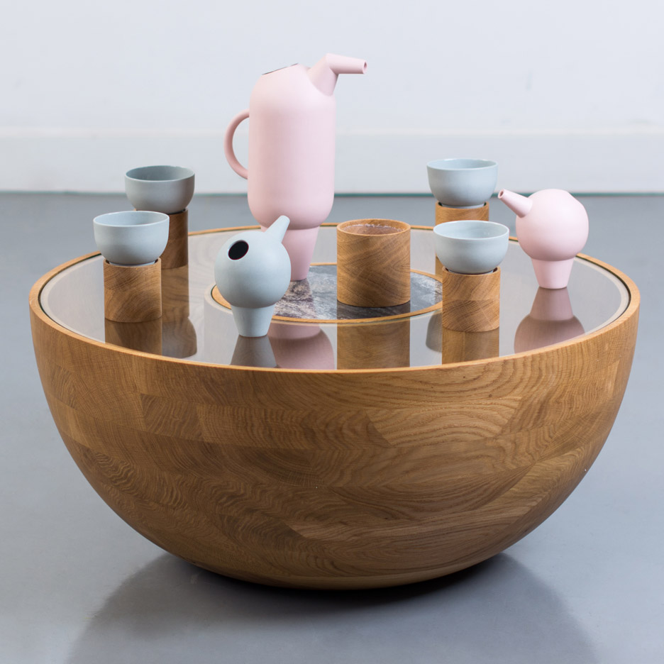
Graduate shows 2016: Pforzheim University graduate Roxanne Flick has created a porcelain tea set that resembles the long necks and bodies of flamingoes. (more…)
BUFS Chapel / Architects Group RAUM + Nikken Sekkei

© Yoon Joon-hwan
- Architects: Architects Group RAUM, Nikken Sekkei
- Location: Namsan-dong, Geumjeong-gu, Busan, South Korea
- Design Team: No Jung-min, Ha Jeoung-un, Kim Dae-won, Yu Seong-cheol
- Area: 495.16 sqm
- Project Year: 2014
- Photographs: Yoon Joon-hwan
- Construction : Wooho Construction Co., Ltd
- Electric Engineer: LJ ENC
- Structural Engineer : In Structure Engineering
- Mechanical Engineer : Jung Ang EMC
- Site Area : 144,916.30 sqm
- Gross Floor Area : 1,249.31 sqm
- Building To Land Ratio : 18.82 %
- Floor Area Ratio: 66.23 %
- Building Scope : 4F
- Client: Educational foundation Sung-ji School
© Yoon Joon-hwan
From the architect. Our senses open up when we sense a silence in a campus filled with sound, or when we feel darkness in a bright space. In this space time, a soundless force strongly gestures to us. Intension of the design for the BUFS(Busan University of Foreign Studies) Chapel is to create a silhouette towards the entire campus, which stands for the ideology of the school.
© Yoon Joon-hwan
Longitudinal Section
© Yoon Joon-hwan
‘One cross’, ‘one silhouette’, and ‘one light’ became the central concept to make this a one and only being. The one and only space creates new relationships by opening itself up to the surroundings. Although it is not located on the dead center of the campus, it is expected to be the center of one’s heart as the light fills up the surrounding space, which brings a holy atmosphere.
© Yoon Joon-hwan
The volume which reveals the energy of the mountain will become an object, which will emphasize the ideology. We revealed the structure through the materials of interior and the exterior and adapted the waffle slab structure in order to create space of ‘the one’. We only allowed bricks-which covers the whole campus-, white walls, and the object to sit on the top of the forest hill. The bridge and the massive door become and object that symbolize the one, and offers the direction of the users.
© Yoon Joon-hwan
Big Small Coffee + B&B / Office AIO

© Eric Zhang – Yu Cheng
- Architects: Office AIO
- Location: Beijing, China
- Area: 34.0 sqm
- Project Year: 2016
- Photographs: Eric Zhang – Yu Cheng
- Project Designer: Timothy Kwan
- Project Manager: Isabelle Sun
- Project Contractor: Wan Hong Gang
- Visual Identity: MEAT Art Direction and Design
- Client: Ipeng Zhang, Shan Nan
© Eric Zhang – Yu Cheng
From the architect. Office AIO transforms tiny Hutong spaces into a serious coffee bar and B&B
Nestled within Xiang’er Hutong in central Beijing, Big Small Coffee + B&B has a total area of 34 square meters. The project consists of two parts: a coffee bar (19 sqm) and a guest room (15 sqm) linked by a courtyard shared with an elderly neighbour.
© Eric Zhang – Yu Cheng
Owners of the coffee business wanted to bring serious artesian coffee to their customers in a small space, emphasising focus on just a good cup of coffee. Hence the brand “Big Small Coffee” – being small in size but big on intention.
site plan
Sun and Kwan – founders of Beijing studio Office AIO :“We imagined Big Small Coffee to have a fresh, and professional identity and we wanted to bring attentiveness to the design specific for its function and context. Making the most out of these two tiny spaces by turning constraints into design features.”
© Eric Zhang – Yu Cheng
The spatial function is primarily split into two. Baristas and customers each occupies a side of the bar. This spatial distinction is expressed visually through a crisp change in materiality.
The small white butcher tiles scale the space, and is a timeless, versatile, bright backdrop. With a limited width available for baristas to move along the bar, strong magnets customised to the same size as the tiles are devised to provide easy, flexible access to tools, orders and any miscellaneous items.
© Eric Zhang – Yu Cheng
The cork panels on the other hand is warm and inviting to the touch, it is also a sound absorber, making it an ideal choice of material in the context of a co-shared wall with the neighbouring living space.
Elongated bar concept
Tying the two sides together is the bar. Volga Blue granite is selected for its shimmering black with accents of a spectacular blue colour, secretly celebrates the brand’s visual identity.
© Eric Zhang – Yu Cheng
The slab of granite is afloat by its mirror-clad body, punctures through the transparent glass façade. While providing extra seating on the front patio, the gesture also serves to dissolve the envelop in-between interior and the hutong scenes.
western elevation
Product display and storage is limited due to the spatial constraints. A custom designed open shelf unit is hung from above the bar bench, efficiently occupies the relatively generous height of the space without interrupting circulation. The transparency provided by the use of acrylic sheet diminishes the weight of the shelving unit visually, allowing focus to be on the displayed items.
© Eric Zhang – Yu Cheng
On the southern side of the shop is another zoning threshold, marked by a camouflaged set of overhead storage cupboards. This threshold transits to the back of house washing area and a water closet. The washing area is meant to be accessed after hours, a full sized sink is in place but concealed during operating hours, allowing this right of way to remain a pleasant waiting area.
© Eric Zhang – Yu Cheng
Hung by four hand crafted leather straps is a bold, singular 2.4M customised stroke of light. Floating right in the centre of the spatial volume above the bar, the luminaire catches ones eyes, adds weight to the space, while accentuating width and linearity when encountered front-on facing the bar. It also provides a softer, more delicate details to the threshold between shelf and bench top. Brightness is adjustable for the desired mood and or function.
© Eric Zhang – Yu Cheng
A large opening on the southern slope of the pitched roof is introduced to bring in natural lighting as well as allowing the shadows from the trees above to cast onto the interior surfaces throughout the day.
© Eric Zhang – Yu Cheng
With a north facing frontage, a crystal clear acrylic canopy provides protection from rain for customers sitting on the front patio while still allowing all available natural light and views to the foliage above to be preserved.
© Eric Zhang – Yu Cheng
Stainless steel foldaway plates are custom designed to provide flexibility and interaction for the patrons to intuitively transform its function just by a simple flipping action. At its resting state, the plate serves as a small table for patrons who just want a quick coffee or to stand around and mingle. When folded up, the plates give way to circulation and becomes a series of slender support for picture frames to be displayed.
© Eric Zhang – Yu Cheng
B&B
Through the shared courtyard behind Big Small Coffee, the owner also obtained a 15sqm room originally planned for its staff accommodation and storage.
© Eric Zhang – Yu Cheng
“But why not turn it into a guest room instead?”, Office AIO suggested.
The room was originally occupied by the landlord and her son until he went off to college. The 8sqm main room was used as a living space cramped with a TV unit / desk and a single bed / sofa, and the overstuffed 800mm wide wing was the son’s ‘bedroom’.
Office AIO made a small extension into the courtyard and tear down the original façade to create an L-shaped entrance leading into the guest room. This entrance is then filled by a set of double-hinged doors that can be opened up to form a small internal courtyard.
© Eric Zhang – Yu Cheng
The main living space was refreshed with a layer of straw clay over the internal walls, straw mats lining the original pitched ceiling, walnut timber flooring to match the existing tone of the timber rafters, and new timber joinery. The result is a bright yet warm space with reminiscence of a traditional hutong dwelling interior.
© Eric Zhang – Yu Cheng
The interior is furnished sparsely to fulfil the basic needs of a B&B: a built-in double bed with drawers to store extra beddings and luggage, a cantilevered cork desk for travellers to get some work done during their visits, and a classic Achille Castiglioni pendent as desk and bedside lamp.
© Eric Zhang – Yu Cheng
The linear bathroom were covered in small white butcher tiles, with the water closet on the short end, and vanity and bathtub on the longer end closer to the window for natural light and ventilation.
Santorini summer house by Kapsimalis Architects is formed of bright white blocks
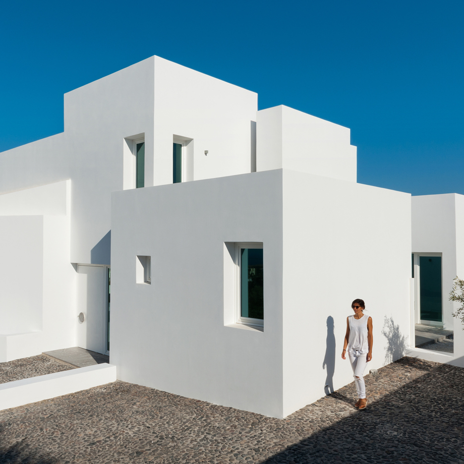
This bright white summer house on the Santorini coastline comprises a series of staggered blocks, designed by Kapsimalis Architects to reflect the traditional housing on the Greek island (+ slideshow). (more…)
KMYF / Cadence

© Sergio Ghetti & Cadence
- Architects: Cadence
- Location: Bengaluru, Karnataka 560001, India
- Area: 9700.0 ft2
- Project Year: 2015
- Photographs: Sergio Ghetti & Cadence
- Structural Consultant: S & S
- Built Up Area: 9700 Sq.Feet
- Site Area: 2400 Sq.Feet
© Sergio Ghetti & Cadence
From the architect. The site for the project measured 60×40. The requirement was to build a 30 bed dialysis center. The unique feature of the site was that it was adjacent to an ancient South Indian Temple which was revered by the neighborhood for both its architectural presence and religious value. The context in that sense was atypical of a generic urban setting. The position that we took was to make a sensitive intervention into the context, we looked at the building as a backdrop to the existing scenario with the temple as the main protagonist.
© Sergio Ghetti & Cadence
Plan
© Sergio Ghetti & Cadence
The wards were stacked vertically to accommodate the thirty beds. The building was detached from the ground to enable congregational and waiting spaces for the people. The services of the building were relegated to the rear and the terrace of the building was conceived to be a cafeteria.
© Sergio Ghetti & Cadence
The building façade is formulated by surfaces built out of brick that has a bellowing quality about them; the sensual quality of the surface dematerializes the brick surface and renders an ephemeral feel to the building. The slivers between the bellowing shells allow light to permeate into the building only to create a spatial and visual feel that is as divine as the temple outside.
© Sergio Ghetti & Cadence
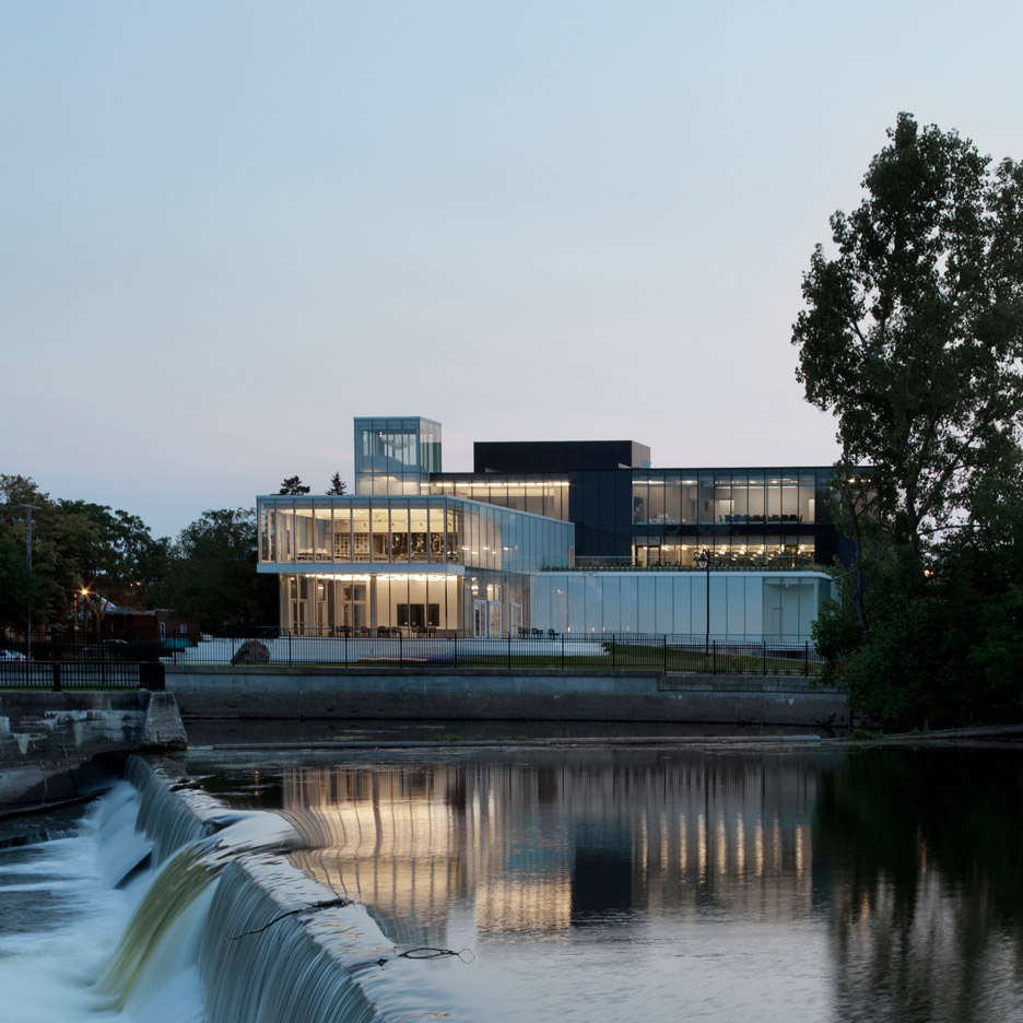
FABG renovates and expands Quebec’s Musée d’art de Joliette
Bec Brittain designs sculptural lamps based on tubes of light
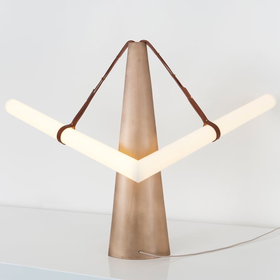
New York lighting designer Bec Brittain has designed crane-like lamps composed of brass, bronze, concrete and leather loops (+ slideshow). (more…)
Xchange Apartments / TANK

© Kenta Hasegawa
- Architects: TANK
- Location: Kyoto, Kyoto Prefecture, Japan
- Architect In Charge: Naritake Fukumoto
- Area: 47.0 sqm
- Project Year: 2016
- Photographs: Kenta Hasegawa
© Kenta Hasegawa
The apartment is located nearby Kiyomizu-Temple, and has excellent views of the five sacred mountains of Kyoto. Our plan was to transform a typical (drab) Japanese condominium into a guesthouse where artists and creators can pursue their creative activities and enjoy living as well. We also tried to integrate traditional Japanese techniques normally not used in construction into the design.
Plan
[Highlights]
In traditional Japanese lacquerware “Urushi-Nuri”, the technique calls for lacquer resin impregnated jute fabric reinforcement of the wooden base, forming a rigid composite structure beneath the polished upper coat.
© Kenta Hasegawa
This composite technique is alike to FRP (Fiber Reinforced Plastic) layering, so we chose FRP using translucent resin for the washroom floor to mimic this method. The translucent resin is polished to reveal the underlying glass-fiber layers over the wooden base, resulting in a translucent, yet complex visual texture while achieving material strength and waterproofing needed for the location.
© Kenta Hasegawa
The Japanese have traditionally repaired broken ceramics by gluing fragments together with Japanese lacquer and gilding the seams with gold powder to enjoy the beauty of imperfection as “Kintsugi”, literally meaning “to join with gold”. In construction, traditional plastered mortar cracks when it sets. This cracking is usually deemed as inferior work, and current improved mortar seldom cracks. We noticed that this cracking resembles broken ceramics. Using traditional mortar, we emulated the art of “Kintsugi” in the living room by joining the cracks with gold coloured epoxy- resin, thus transforming what was considered imperfect into a subject of beauty.
© Kenta Hasegawa
The mirrored bathroom doors double as a changing room when opened. The highly polished metal surfaces reflect the room interior and surrounding scenery producing a kaleidoscopic effect.
© Kenta Hasegawa
At a glance, each element may be simple, but as a whole serves a intuitive and creative atmosphere for the creative resident.

