Floating Studio / Studio Air Putih


© Sonny Sanjaya

© Sonny Sanjaya


© Sonny Sanjaya


© Sonny Sanjaya


© Sonny Sanjaya


© Sonny Sanjaya

  • C&S Engineer: Studio Air Putih
  • M&E Engineer: Studio Air Putih
  • Quantity Surveyor: Studio Air Putih
  • Landscape Consultant: Studio Air Putih
  • Interior Designer: Joke Roos Interior Consultant

© Sonny Sanjaya

© Sonny Sanjaya

From the architect. Located in a suburban satellite city 12 miles west of Jakarta, this 10 person architects’ studio occupies a walled rectangular parcel with several pre-existing tress. The studio occupies a corner of the site and is defined by  a 4 x 8 m grid of slender steel columns.


© Sonny Sanjaya

© Sonny Sanjaya

A large reflecting pool abuts the structure on two sides and a wooden terrace cuts across the site, dividing the ground – floor plan of the studio. The ground floor houses a double-height work area at the front of the structure and across the terrace a smaller meeting room.


© Sonny Sanjaya

© Sonny Sanjaya

A painted steel chair leads to an upper floor office. Seperated by an exterior area, an additional two storey volume at the back of the site houses a kitchen and lavatory on the ground floor and a servant’s room on the upper storey. While the exterior walls of the ground floor are glass, the upper storey, wider in plan and thus cantilevering over the space below, is clad in panels of glass-reinforced concrete.


Floor Plan

Floor Plan

A pitched wooden roof with concrete tile cladding covers the entire structure, projecting over studio and service volumes. The eaves of the roof are supported by the two exterior rows of columns, five of which fall within the water. Two inner rows of columns, situated within the glass walls of the ground floor, carry the load of the building to concrete foundations. The pool’s water comes to the edge of the glass perimeter, seemingly doubling the spaces of the studio with its relfection.


© Lim Ching Wei

© Lim Ching Wei

The use of glass is intended to maximize the view of the surrounding area : exotic leafy trees in an area of 500m2. The studio’s mass follows the pattern of established shady trees, with two buildings built right among the trees. The green landscape is exposed by the architect through the studio. The setting of the buildings are set by the existing of the trees around the site. The building was split it by two separated building one another. It is separated by existing tree which is located almost in the middle of the site.


Section

Section

The ground floor on the studio, which seems to float, is used for public activities, such as receiving guests, meetings, administrative work and negotiations with clients and suppliers. “We want the leafy trees to be visible to the guests, making them feel at home,’ explains the architect. 


© Lim Ching Wei

© Lim Ching Wei

The ground floor is efficiently designed with a clean line. There aren’t many ornaments on this floor so that it seems practical, modern and functional. Granite material is installed to exude coolness in the room, as well as a pool that delivers cool air.The second floor on the other hand is more spacious and is utilized as the main building. This is the place where the architects work.


© Sonny Sanjaya
© Sonny Sanjaya

http://ift.tt/29x1yNo

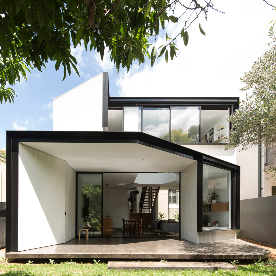
Wedge-shaped reading and sleeping nooks feature in Christopher Polly’s Sydney extension


Australian architect Christopher Polly has added an asymmetric extension to an early 20th-century house in Sydney, creating a bright double-height living space filled with Modernist furniture (+ slideshow). (more…)

http://ift.tt/29wUT67

Sinseol-dong Hanok / CoRe architects


© YongKwan Kim

© YongKwan Kim


© YongKwan Kim


© YongKwan Kim


© YongKwan Kim


© YongKwan Kim

  • Architects: CoRe architects
  • Location: Sinseol-dong, Dongdaemun-gu, Seoul, South Korea
  • Design Team: Zongxoo U, Vin Kim, Youngrae Choi, Aran Cho, Heera Kang, Yunjeong Park
  • Area: 99.9 sqm
  • Project Year: 2016
  • Photographs: YongKwan Kim, Courtesy of CoRe architect
  • Structure Engineer: S.D.M structural consulting engineers
  • Constructor: JEHYO
  • Client: Taejin international.

© YongKwan Kim

© YongKwan Kim

Restriction and Development

Sinseol-dong is a place that some ‘urban hanok’ still exist. However, as walking that area, it is hard to catch at once that the building is hanok. Because most of them are too old and repaired for several decades. Even some are too old to use as a dwelling and mostly over maximum FAR.


© YongKwan Kim

© YongKwan Kim

The site of project was so rigid with district plan and restriction. This place is not allowed to construct new building. In detail, it was only possible to construct 50% area of existed building ;49.5 sqm (Previous- 99.9 sqm). Paradoxically, because of the complicated restriction, this shabby, old hanok could survive so far.


Section

Section

Structural weakness of Hanok(traditional wooden structure)

Due to the Hanok’s wooden structure, It is hard to extend vertically. It became more weaker when remodeling hanok. That is one of the reasons why hanok is limited in progress as a modern architecture.


Before. Image Courtesy of CoRe architect

Before. Image Courtesy of CoRe architect

As a way to extend hanok vertically, we adapted steel frame structure to make the other volume floating above the hanok. So the hanok could be preserved as much as possible. And the new volume could stand as a independent structure.


Exploded Diagram

Exploded Diagram

New possibility (proposal)

All this time, the version of Hanok could be said that ‘the single-traditonal one’, ‘a 2-3 story adapted hanok’ or ‘a hanok on the other volume’.


© YongKwan Kim

© YongKwan Kim

‘Sinseol-dong hanok’ takes another position. It tries to make other floating volume above hanok by using a new steel frame structure. By repairing and reinforcing, the hanok and new volume could exist respectively and also co-exist. We’ve searched how the hanok could keep its shape and make balance with modern architecture at the same time.


1st Floor Plan

1st Floor Plan

There are many factors to repair and extend existing hanok; structure, restriction, cost etc. Also the factor of restriction and way to resolve will not be same in hanok in buk-chon and hanok in sinseol-dong. It can be said that the restricting factors in sinseol-dong gave clues to make other possibility in this project.


© YongKwan Kim

© YongKwan Kim

Piloti

It has 7 steel-columns on the ground -away from the court of ㄷ-shape hanok. It could have been more easy to solve if the column stood in the middle of the roof of hanok, but it would have worse in detail then -like insulation, waterproofing and finishing. To do this, we arranged column avoiding roof of hanok and made cantilever structure using horizontal beams and inclined beams.


© YongKwan Kim

© YongKwan Kim

For that reason, the columns and beams are avoiding existing hanok and supporting new volume making a sort of tension between old and new.


East Elevation

East Elevation

http://ift.tt/29gFEAf

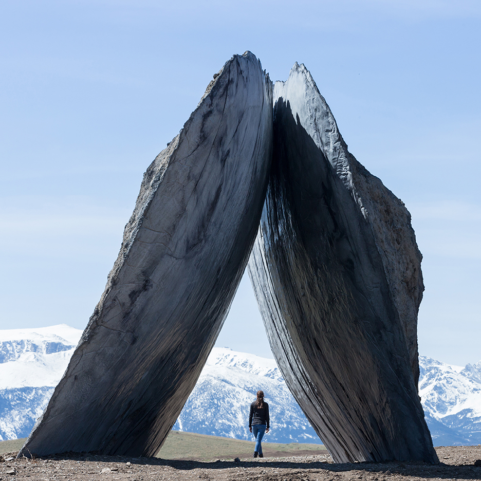
Tippet Rise Art Center opens on a cattle ranch in rural Montana


Massive earthen sculptures and a wooden concert hall form part of the new Tippet Rise Art Center, a vast performance venue and park in a remote area of Montana (+ slideshow). (more…)

http://ift.tt/29mk7TZ

Pink Moon Saloon / Sans-Arc Studio


Courtesy of Sans-Arc Studio

Courtesy of Sans-Arc Studio


Courtesy of Sans-Arc Studio


Courtesy of Sans-Arc Studio


Courtesy of Sans-Arc Studio


Courtesy of Sans-Arc Studio

  • Architects: Sans-Arc Studio
  • Location: 21 Leigh St, Adelaide SA 5000, Australia
  • Builder : Brojed Construction
  • Area: 102.48 sqm
  • Photographs: Courtesy of Sans-Arc Studio

Courtesy of Sans-Arc Studio

Courtesy of Sans-Arc Studio

From the architect. The brief for the project outlined a concept for a venue, running off a ‘vibrant’ lane way in Adelaide. The experience of this bar was to be entwined with a narrative. This narrative was of the outdoors, a childhood memory of fire cooked food and camping in the forest.


Courtesy of Sans-Arc Studio

Courtesy of Sans-Arc Studio

Concept

Throughout the design process the concept evolved and settled on exploring the typology of the wilderness hut. Huts are located in remote or isolated areas and often in geographically unique places. Generally speaking materials have to be sourced locally. As a result the materiality and aesthetics of the wilderness hut are varied but with a few common threads. Often timber is sourced by felling the trees on site and stone or earth is gathered from nearby. This approach creates a vernacular style amongst huts, with different elements or nuances associated with a particular region or locality.


Courtesy of Sans-Arc Studio

Courtesy of Sans-Arc Studio

The intention with Pink Moon was to create its own identity or vernacular; by designing and building in the way a hut should be. Firstly, an understanding of its unique climate. Sitting between two low-rise office buildings, narrow and long, running east-west with limited access to direct sunlight. The hut needs to embrace its surroundings, not dominate them, but embellish and appreciate them. Creating a moment of warmth and shelter within whatever context.


Courtesy of Sans-Arc Studio

Courtesy of Sans-Arc Studio

Volume and Spatial Planning

At 3.66 x 28 metres, the narrow site lent itself to a Japanese approach to programming. There was an obvious need for light to penetrate the space as well as create a compact, floor plan that dealt efficiently with the limited width. The result was two huts, separated in the middle by a courtyard of similar size, the bar to the street, a dining hut to the rear. This layered approach allows light to filter into both spaces, but also accentuates the movement of walking through the space, crossing multiple thresholds and experiencing three different spaces.


Courtesy of Sans-Arc Studio

Courtesy of Sans-Arc Studio

Floor Plans

Floor Plans

Courtesy of Sans-Arc Studio

Courtesy of Sans-Arc Studio

The internal ceilings are raked to express the 60 degree roof pitch and timber truss structure. This attempts to relieve the feeling of tightness associated with a narrow space by accentuating the height and overall volume. The front (drinkers) hut is light filled and airy whilst the dining hut is darker, dimly lit and focussed around the fire. The central courtyard has little of its own lighting, but instead allows light into the two huts during the day and is lit by them at night.


Courtesy of Sans-Arc Studio

Courtesy of Sans-Arc Studio

Materiality

All of the material selection was based around the principles of hut-construction and have been considered in relation to their impact / sustainability of production and ability for re-use. As much as possible, there was an attempt to use familiar Australian materials. The structure is timber framed and uses locally sourced Australian Hardwood as cladding; seconds of Spotted Gum, Tasmanian Oak and Ironbark. Excessive use of steel or other virgin materials was limited as much as possible. The bessa block walls and paving can be seen as the most vernacular masonry option in the Adelaide, our ‘local stone’. The colours are slightly inspired by the weird colour combinations of Himalayan mountain huts, but very much the Pink Moon Saloon.


Courtesy of Sans-Arc Studio

Courtesy of Sans-Arc Studio

http://ift.tt/29uLcrz

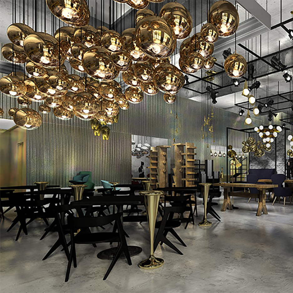
Tom Dixon continues US expansion with two new retail locations


Business news: British designer Tom Dixon has opened retail locations in Los Angeles and New York in the space of a month. (more…)

http://ift.tt/29gngHo

Space to Imagine, Room for Everyone: Inside Singapore’s Pavilion at the 2016 Venice Biennale


Singapore Pavilion – Space to Imagine, Room for Everyone - at Biennale Architettura 2016, Venice. Image © Don Wong

Singapore Pavilion – Space to Imagine, Room for Everyone – at Biennale Architettura 2016, Venice. Image © Don Wong

As part of ArchDaily’s coverage of the 2016 Venice Biennale, we are presenting a series of articles written by the curators of the exhibitions and installations on show.

Responding to the primary theme of 15th International Architecture Exhibition, ‘Reporting from the Front,’ Singapore’s presentation places the small “battles” fought at the home-front. These efforts are contributing to the emergence of an invigorated Singapore.

From within the comfort and the security of the domestic environments and public spaces that have been created over the past five decades, we are now pushing the home-front from within – to create more Space to Imagine, and Room for Everyone.


Map of Singapore with red pins indicating the HDB blocks where interior photos were taken and green pins indicating community gardens. Singapore Pavilion – Space to Imagine, Room for Everyone - at Biennale Architettura 2016, Venice. Image © Don Wong


Close-up of post-it notes handwritten by participants in P!D's (Participate in Design) engagement programmes. Singapore Pavilion – Space to Imagine, Room for Everyone - at Biennale Architettura 2016, Venice. Image © Don Wong


Singapore Pavilion – Space to Imagine, Room for Everyone - at Biennale Architettura 2016, Venice. Image © Don Wong


Singapore Pavilion – Space to Imagine, Room for Everyone - at Biennale Architettura 2016, Venice. Image © Don Wong


Singapore Pavilion – Space to Imagine, Room for Everyone - at Biennale Architettura 2016, Venice. Image © Don Wong

Singapore Pavilion – Space to Imagine, Room for Everyone – at Biennale Architettura 2016, Venice. Image © Don Wong

Through actions, guided and spontaneous, initiated by individuals, establishments and groups, we are witnessing active participation of our citizens: stepping out, taking actions, owning and adopting their environments. They have also heightened the role of design advocacy and participation, both real and imagined, at various scales and levels in schemes of future renewals, intensified in-fills of left-over spaces, in the narrow confines of domestic spaces.

In two broad themes (archetypal terrains), at every scale, in the boundary between the private and public realms, actions like participation, contestations, activations, appropriations, transgressions and occupations are enacted. All these happen in the building and urban fabric – on the grounds, in the void decks in the private abodes of our housing estates, and in our public spaces.


Map of Singapore with red pins indicating the HDB blocks where interior photos were taken and green pins indicating community gardens. Singapore Pavilion – Space to Imagine, Room for Everyone - at Biennale Architettura 2016, Venice. Image © Don Wong

Map of Singapore with red pins indicating the HDB blocks where interior photos were taken and green pins indicating community gardens. Singapore Pavilion – Space to Imagine, Room for Everyone – at Biennale Architettura 2016, Venice. Image © Don Wong

In a battery of actions on these terrains, we forge through design a new society built on the gains of the previous more austere generation. In pushing against this front, in turning Singapore inside out, we move beyond from being productive and technocratic, to be creative and egalitarian. Thus, these “battles” at the front is a poignant visual account of our human capacity building, in looking at the past with new eyes and broadly, and in our attempts to humanize the environments of Singapore.


Spotlight on the Rail Corridor. Singapore Pavilion – Space to Imagine, Room for Everyone - at Biennale Architettura 2016, Venice. Image © Don Wong

Spotlight on the Rail Corridor. Singapore Pavilion – Space to Imagine, Room for Everyone – at Biennale Architettura 2016, Venice. Image © Don Wong

The design of the exhibition uses the grid as a base onto which different meanings and potentials are projected. The grid (a frame with equal intervals in the x & y dimensions) signifies the order and rationality with which Singapore is planned. The grid however, also provides openness and freedom. In the exhibition space, we set up a grid that allows everyone to move freely, to appreciate the diversity of stories that thrive within.

The effect created is an atmosphere to envelope and immerse the viewer. The curatorial team endeavoured to make an emotionally charged experience using the hundreds of interior scenes from everyday life in our public housing estates, the Housing Development Board (HDB). More than experiencing any one of these HDB interiors in the skin, the exhibition would immerse the viewer intimately in the diverse collection of interiors, an intensified domestic experience.


Close-up of post-it notes handwritten by participants in P!D's (Participate in Design) engagement programmes. Singapore Pavilion – Space to Imagine, Room for Everyone - at Biennale Architettura 2016, Venice. Image © Don Wong

Close-up of post-it notes handwritten by participants in P!D's (Participate in Design) engagement programmes. Singapore Pavilion – Space to Imagine, Room for Everyone – at Biennale Architettura 2016, Venice. Image © Don Wong

Eighty-one (81) customised image lanterns are suspended at eye level in the central space. On three faces of each lantern, a photograph from the HDB: Homes of Singapore collection will be mounted. On the fourth side, one will look into the lantern2 to see a small model of the HDB block in which the interiors described in the photographs are sited. A bulb in the centre lights the model as well as the photographs from behind. A viewer will freely meander through these scenes of everyday life, glowing gently.


Singapore Pavilion – Space to Imagine, Room for Everyone - at Biennale Architettura 2016, Venice. Image © Don Wong

Singapore Pavilion – Space to Imagine, Room for Everyone – at Biennale Architettura 2016, Venice. Image © Don Wong

Singapore Pavilion – Space to Imagine, Room for Everyone - at Biennale Architettura 2016, Venice. Image © Don Wong

Singapore Pavilion – Space to Imagine, Room for Everyone – at Biennale Architettura 2016, Venice. Image © Don Wong

One may notice that in this pavilion staged for an International Architecture Exhibition, it is not showing buildings. Rather it is showing the connections between people and their spaces. The challenge is that while buildings are traditionally documented in drawings, photographs, and models, the stories of these small “battles” that were found on our home-front had no ready-made form.

To embody the spirit of each participant, the curatorial team selected from each an artefact, a visually striking object that bears the marks of their endeavour or tells the stories succinctly. In one example, the Ground-Up Initiative (GUI) displays the mud-bricks that their volunteers are making for the walls of their new campus. For Participate in Design (P!D), an array of the colourful, now universal, Post-It notes that the protagonists gathered from their consultation sessions is presented.


Close-up of the lantern, featuring photographs of interiors of HDB flats on three sides. Singapore Pavilion – Space to Imagine, Room for Everyone - at Biennale Architettura 2016, Venice. Image © Don Wong

Close-up of the lantern, featuring photographs of interiors of HDB flats on three sides. Singapore Pavilion – Space to Imagine, Room for Everyone – at Biennale Architettura 2016, Venice. Image © Don Wong

The selection of the artifacts that will carry the story of each participant is an act of design as much as it is an act of curation. This direct on-the-ground approach, like the preparation of fresh sashimi, is premised on choice and cut. No seasoning is required. The design philosophy for the Singapore Pavilion is, similarly, to present the inspiring stories in an honest and transparent manner. 


Singapore Pavilion – Space to Imagine, Room for Everyone - at Biennale Architettura 2016, Venice. Image © Don Wong

Singapore Pavilion – Space to Imagine, Room for Everyone – at Biennale Architettura 2016, Venice. Image © Don Wong

   Singapore Pavilion – Space to Imagine, Room for Everyone - at Biennale Architettura 2016, Venice. Image © Don Wong

Singapore Pavilion – Space to Imagine, Room for Everyone – at Biennale Architettura 2016, Venice. Image © Don Wong

http://ift.tt/29gmSJ0

Massimo Dutti / Sordo Madaleno Arquitectos


© Jaime Navarro

© Jaime Navarro


© Jaime Navarro


© Jaime Navarro


© Jaime Navarro


© Jaime Navarro

  • Architects: Sordo Madaleno Arquitectos
  • Location: Presidente Masaryk 431, Polanco III Secc, 11550 Ciudad de México, D.F., Mexico
  • President: Javier Sordo Madaleno Bringas
  • Architecture Leader: Javier Sordo Madaleno de Haro
  • Project Leader: Boris Pena, Fernando Sordo Madaleno de Haro
  • Area: 1450.0 sqm
  • Project Year: 2016
  • Photographs: Jaime Navarro
  • Design Manager: Santiago García de Letona, Rodrigo Flores
  • Media & Marketing: Rosalba Rojas, Jimena Orvañanos
  • Interior Design: Sordo Madaleno Arquitectos
  • Interior Director: Enrique Ralph
  • Interior Manager: Fernanda Patiño
  • Interior Team: Regina Jarque, Pawel Kryzstof Niedziwiechi, Ana Tejada
  • Structural Engineering: Palacios Ingeniería & Concepto
  • Façade Engineering: Afibra, Vitrocanceles
  • Electrical Engineering: COISA
  • Air Conditioning Engineering: SAASA
  • Systems & Special Engineering: COISA
  • Hydrosanitary Engineering: Arquitech
  • Lighting Consultant: Luz + Forma
  • Audio & Video Consultant: Trison
  • Landscape Consultant: Verde 360o
  • Security Consultant: Prosegur
  • Construction: Arquitech
  • Site Area: 415 sqm

© Jaime Navarro

© Jaime Navarro

From the architect. The new agship store for Massimo Dutti is located on Presidente Masaryk Avenue, one of the most prestigious streets in Mexico City. Home to leading brands, it is considered the city’s “golden mile” and has recently undergone a makeover to improve its urban qualities.


© Jaime Navarro

© Jaime Navarro

With the goal of turning the building into a veritable work of architecture that serves as an aesthetic reference point within this exceptional context, the scale and design of the project re ects a desire to integrate it into the Polanco neighborhood.


© Jaime Navarro

© Jaime Navarro

The building façade is designed to match the formal landscape of heights and voids found in the zone’s historical architecture. The rhythm of rectangular modules is formed by an orthogonal metal structure, while the texture of the façade is a screen inspired by a reinterpretation of the traditional wrought iron railings of Polanco. The screen generates a series of rectangular niches that are randomly repeated within the orthogonal mesh.


Diagram

Diagram

This is a lively and exible architecture, thanks to the strong connection between interior and exterior. Each of these niches becomes a window, showcase or closed element, depending on the internal use. This system is only interrupted by the sheet of glass that frames the principal entrance, with a great triple-height vertical window.


© Jaime Navarro

© Jaime Navarro

The screen was manufactured using molds, and employs berglass in its construction. It represents a superb collaboration between traditional local skills and sophisticated technology.


© Jaime Navarro

© Jaime Navarro

While the rst impression of clients is of the building’s urban presence, upon entering users experience new sensations in the imposing double-height lobby space. Inside, the store is conceived as an urban and contemporary space with a minimalist style. With simple lines and purity of materials, a versatile and timeless space is created that does not interfere with the demands of fashion and ensures the product holds all the attention.


Section

Section

The vertical circulation nucleus was conceived as a sculptural element that welcomes clients as the visual backdrop upon entering the store.


© Jaime Navarro

© Jaime Navarro

The furnishing is simple, with geometric forms in wood and steel detailing. Following the same scheme, the brand’s classic pieces were reinterpreted and simpli ed to be incorporated into this minimalist space. A number of original pieces were designed for the store, including the hanging showcases, exhibition tables, and payment area.


© Jaime Navarro

© Jaime Navarro

Plan

Plan

© Jaime Navarro

© Jaime Navarro

The rooftop terrace was designed to complement the experience of the store for clients and their partners, where they can relax and enjoy a coffee or refreshment. It will provide a versatile space with kitchen and washroom services that offers superb views over the skyline of Polanco, and will also serve to host brand events.


© Jaime Navarro

© Jaime Navarro

The selection of materials was focused on the classical but innovative essence of the brand to create a neutral setting. Pale stone employing different treatments was used, together with accents in wood and metal.


Elevation / Details

Elevation / Details

The combination of these architectural elements together with the use of a sober palette for the interior were the tools to achieve the elegance required by the site, and which the brand represents. 


© Jaime Navarro

© Jaime Navarro

http://ift.tt/29i6vaR

11 of the best new buildings from Iran’s architectural awakening

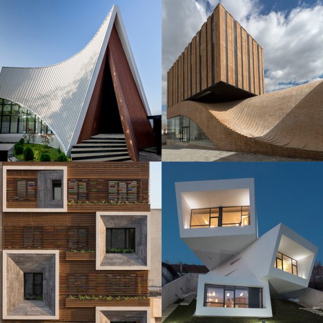
iran-architecture-projects-composite-sq

Iran‘s contemporary architecture scene is on the brink of a boom after the lifting of economic sanctions. We’ve collected together 11 of the best examples from the country’s new crop of buildings and bridges. (more…)

http://ift.tt/29oheDK

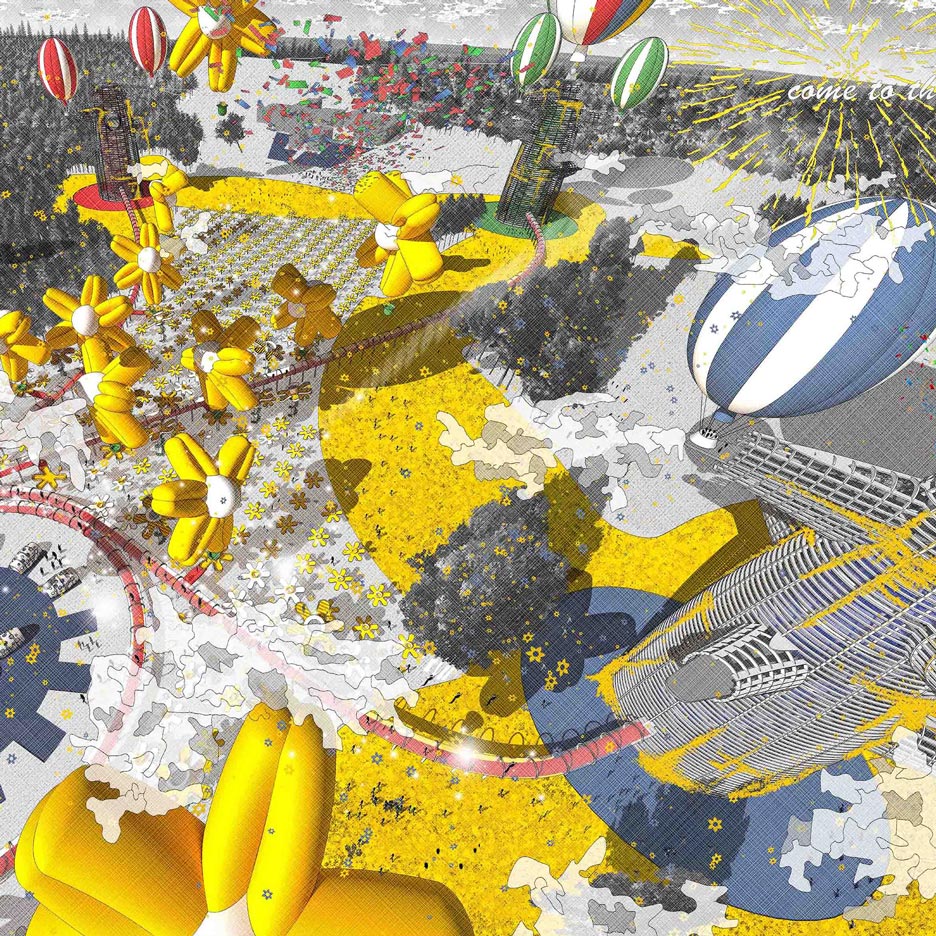
Marco Maycotte designs pleasure garden to become “the Las Vegas of Scandinavia”


Graduate shows 2016: the town of Vejle in Denmark is transformed into a pleasure garden in the spirit of Peter Pan’s Neverland in this design by Aarhus School of Architecture graduate Marco Maycotte (+ slideshow). (more…)

http://ift.tt/29m3qrx