Two Courtyards House + Bridge 130 Cafe / Lee.haan.architects


© Joonhwan Yoon

© Joonhwan Yoon


© Joonhwan Yoon


© Joonhwan Yoon


© Joonhwan Yoon


© Joonhwan Yoon

  • Architects: Lee.haan.architects
  • Location: Hwagae, Hadong, South Korea
  • Architects In Charge: Hoseok Lee, Boyoung Han
  • Area: 390.09 sqm
  • Project Year: 2016
  • Photographs: Joonhwan Yoon
  • House: 183.5 sqm
  • Cafe: 206.59 sqm

© Joonhwan Yoon

© Joonhwan Yoon

From the architect. To the west, the site is accessed by the famous road as known as the ‘Road to the Ssanggyesa Temple’ or the ‘Simni (10 ri) Cherry Blossom Avenue, Hadong.’ To the east, it is overlooking the Hwagaegol Valley and provides the view towards the distant tips of Jirisan Mountain, wild tea plantation, and the village.


© Joonhwan Yoon

© Joonhwan Yoon

The site is open all the way round and so required a solution that maintains the home privacy in its entirety as well as providing the view of surrounding natural landscape at any place within the house.

We made the cafe adjacent to the Cherry Blossom Avenue frequented by passers-by, and located the house far from the road so as to embrace two courtyards.


© Joonhwan Yoon

© Joonhwan Yoon

Two Courtyards House
The outer courtyard does not bother to visually block the inside, but enables free access. The entry hall, laundry, carpenter’s store, additional floored hall, and faucets are located around the courtyard, in order to embrace the meeting with neighbors and such an everyday life as to be quite laborious like Kimchi-making and laundry.


© Joonhwan Yoon

© Joonhwan Yoon

Around the inner courtyard, the living room, the kitchen, and the main room are arranged in an L-shaped form, while a long floored hall was located towards the valley.


© Joonhwan Yoon

© Joonhwan Yoon

The floored hall was completely open towards the valley, but guaranteed intimacy towards the village road with an additional door installed. While the distinction of inside or outside between the courtyard and the living room disappeared, the privacy was stabilized.


Plan

Plan

Going through the stepping stones on water, the gate, and the outer courtyard and entering the living room, one can see the valley under one’s feet and the distant landscape of wild tea plantation, which are invisible from outside.


© Joonhwan Yoon

© Joonhwan Yoon

Going upstairs to the study, one can also see the powerful and far-reaching landscape of the Jirisan valley that meanders through the north-south axis.


© Joonhwan Yoon

© Joonhwan Yoon

The exterior was clad with grey cement blocks and red cedar in their raw states so as to be well harmonized with the mountain, green tea plantation, cherry blossom trees, and unknown species of grass outside.


© Joonhwan Yoon

© Joonhwan Yoon

Bridge 130 Cafe
Like an old scenic gazebo where the literati enjoyed a refined taste, the cafe is maximally open where one can enjoy the flavor of the Cherry Blossom Avenue and the scenery of the valley.


© Joonhwan Yoon

© Joonhwan Yoon

The site, whose level is about two meters apart from that of the Avenue, was partly elevated to make the cherry blossom trees and the cafe meet with each other.


© Joonhwan Yoon

© Joonhwan Yoon

The floor and the ceiling were clad with the same material for both the inside and the outside in order to extend the inner atmosphere towards the outside continuously. This is to extend the cafe towards the outdoor space shaded by the cherry blossom trees. At the outdoor space, one can see the whole look of the house aside as well as enjoying the landscape of the valley stretching to a distance.


© Joonhwan Yoon

© Joonhwan Yoon

Designed to make easy access to the house, the bridge between the cafe and the house has a similar pattern with the handrail of the old Jeonggeumdari Bridge, so as to reflect the client’s past memories of the old charming bridge just beside the site.


© Joonhwan Yoon

© Joonhwan Yoon

We hope this house will be with composure and wisdom to enjoy together or alone the nature of Jirisan Mountain whose landscape is variegated with the four seasons.
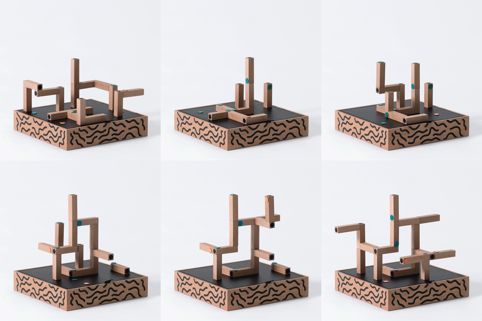
http://ift.tt/29eGcBX

Václav Mlynár combines physical and digital play in Koski board game


Graduate shows 2016: these simple, wooden blocks designed by Royal College of Art graduate Václav Mlynář’s contain a bridge to a hidden world that can only be unlocked by an iPad (+ movie). (more…)

http://ift.tt/29eCs3g

Bima Microlibrary / SHAU Bandung


© Sanrok Studio

© Sanrok Studio


© Sanrok Studio


© Sanrok Studio


© Sanrok Studio


© Sanrok Studio

  • Architects: SHAU Bandung
  • Location: Jl. Bima, Arjuna, Cicendo, Kota Bandung, Jawa Barat, Indonesia
  • Team: Florian Heinzelmann, Daliana Suryawinata, Yogi Ferdinand with Rizki Supratman, Roland Tejo Prayitno, Aditya Kusuma, Octavia Tunggal, Timmy Haryanto, Telesilla Bristogianni, Margaret Jo
  • Client: Dompet Dhuafa, City of Bandung
  • Area: 160.0 sqm
  • Photographs: Sanrok Studio
  • Contractor: Yogi Pribadi, Pramesti Sudjati
  • Signage Graphic Design: Nusae
  • Supported By: Dompet Dhuafa, Urbane Community , Indonesian Diaspora Foundation
  • Construction Costs: 35.000 Euro

© Sanrok Studio

© Sanrok Studio

The Microlibrary is located at Taman Bima, Bima Street in Bandung in a small square in a Kampung neighborhood near the airport. The neighborhood consists of middle class housing on one side and a Kampung (village) like structure on the other, where less affluent people live. The Taman Bima Microlibrary is the first realized prototype of a series of small libraries in different locations throughout Indonesia, which we intend to build.


Plan

Plan

With an Interest in books and reading declining in the past years, the illiteracy rate and school dropout rate in Indonesia remains high. Our mission is to rekindle interest in books by offering a dedicated place for reading and learning, availability of books, other media and courses. The Microlibrary adds identity and is a source of pride for all the people in the neighborhood. The activities and teaching are currently supported and organized by Dompet Dhuafa (Pocket for the Poor) and the Indonesian Diaspora Foundation. However, the ultimate goal is to enable the local people to organize the content and maintenance independently. 


© Sanrok Studio

© Sanrok Studio

The building is situated in a small square with a preexisting stage that  was already used by the local community for gatherings, events, hanging out and sports activities. Our intention was to add rather than take away, so we decided to enhance the open stage by shading it, making it rain protected and cover it in form of the floating library box.


Section

Section

The building is constructed via a simple steel structure made from I-beams and concrete slabs for floor and roof. The stage was reworked in concrete and a previously missing, wide stair was added. As the building is located in a tropical climate, we aimed to create a pleasant indoor climate without the use of air conditioning. Therefore, we looked  for available façade materials in the neighborhood that were cost efficient, could shade the interior, let daylight pass and enable enough cross ventilation. Initially, we found several small vendors selling used, white and translucent jerry cans. However, prior to construction the jerry cans were no longer available in the quantities we required. Instead, we found used plastic ice cream buckets that  were being sold in bulk.  This turned out for the better as they have a more positive image and are more stable when cutting the bottom open for cross ventilation.


© Sanrok Studio

© Sanrok Studio

While studying design options of how to arrange 2000 ice cream buckets, we realized that  they could be interpreted as zeros (opened) and ones (closed), thus giving us the possibility to embed a message in the façade in the form of a binary code. We asked the Mayor of Bandung, Ridwan Kamil, a supporter of the project whether he had  a message for the Microlibrary and neighborhood and his message is: “buku adalah jendela dunia”, meaning books are the windows to the world. The message can be read starting from the top left (facing the front) and spirals  down around the perimeter repeatedly. Not only does the facade give additional meaning to the building but the buckets also generate a pleasant indoor light ambiance since they scatter direct sunlight and act as natural light bulbs.


© Sanrok Studio

© Sanrok Studio

The buckets were then placed in between vertical steel ribs spanning from floor to roof and are inclined towards the outside to repel rainwater. For more harsh tropical rainstorms translucent sliding doors in the inside can be closed temporarily. Mounting 2000 buckets, making the fixture and punching out bottoms of more than half of them is time consuming. However, the local craftsmen made their own punch out/cutting tools to be faster while also maintaining  sharp and clean edges.


Elevation

Elevation

The building is very well received among the people in the neighborhood and we get regular feedback about ongoing events, e.g. school class excursions, etc.

http://ift.tt/29rQxQ8

22m2 Apartment in Taiwan / A Little Design


© Hey! Cheese


© Hey! Cheese


© Hey! Cheese


© Hey! Cheese

  • Architects: A Little Design
  • Location: Taipei, Taiwan
  • Design Team: Szu-Min Wang
  • Area: 22.0 sqm
  • Project Year: 2015
  • Photographs: Hey! Cheese

© Hey! Cheese

© Hey! Cheese

From the architect. This is a renovation project of an old flat which measures 22 sqm and 3.3m in height. Due to the high housing prices in Taipei City, the living space that young people can afford has become smaller and smaller in the last decade. Faced with such a living unit which is not spacious but still has a chance to fulfill all basic living functions, the needs of clients must be analyzed more precisely and arranged suitably. The client agrees with the idea that space is as important as function when it comes to a place where people will live for a long time rather than a room for a short-term stay. ( Though the footprint of the flat might be smaller than many hotel rooms. ) We both agree that space should be left free with the main furniture arranged discreetly to ensure the long-term living experience is comfortable.


© Hey! Cheese

© Hey! Cheese

Take the client in the project for example, she has to travel abroad frequently for work, and after finishing work and coming home, all she needs is a hot bath and a good sleep. Besides a fully equipped bathroom, a compact kitchen is also required and most storage is for clothes and books. She also hopes the living room in the lower space can have both a couch and dining table. ( Because many inhabitants of a small unit in Taipei can only have a meal on the sofa. ) In addition, make the left room empty for doing some exercise. Understanding the needs, we have decided to accept the restriction of the space and utilize it more effectively.


Floor Plan After

Floor Plan After

Firstly, the shower was replaced with a bath, and the washer was moved to the kitchen. Because in Taiwan the gas can not be piped into a house without a balcony and a small electric heater can not provide sufficient hot water for a bath, we adjusted the layout of the toilet to make room for a storage water heater, and a sliding door with a mirror which not only makes the maintenance easy but also amplifies the space visually 

Fixed furniture such as the kitchen cabinet, the wardrobe and the shelf are attached to the wall to fully utilize the height and avoid aisles. The wardrobe is below the shelf due to the higher frequency of use, but a part of the shelf still can be accessed conveniently from the mezzanine area. Because the height of the mezzanine floor can not allow standing, the furniture on it must be used in a sitting or lying position, such as the bed and the desk.


© Hey! Cheese

© Hey! Cheese

The tatami area and cabinet alongside the window make full use of the alcove and also provide ample storage. The light steel handrail on the stairs increases the visual penetration, and the wall below it contains a TV and two concealed cabinets for shoes. There are two wooden tables alongside the wall in the living room that could be a long bar table which economizes the room and can be combined in the other direction to be a dining table. Therefore, the empty space is flexible for different needs, and makes the small flat less cramped.


© Hey! Cheese

© Hey! Cheese

The flat has sufficient natural light and ventilation, and the main colors used are white and oak which makes the space brighter and more spacious. All equipment and fixtures are stacked according to the confines, but not be compressed in size. In a city like Taipei, where the living space is limited, we hope the project can provide a practical solution for people who own a tiny space like this.


© Hey! Cheese

© Hey! Cheese

http://ift.tt/29ipVyF

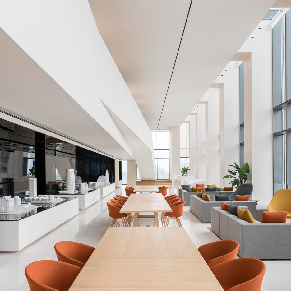
Aim Architecture designs contemporary interior for Soho Bund hotel in Shanghai


Chinese firm Aim Architecture sought to strike a balance between modern and Jazz Age Shanghai with this revamp of a 1930s-style hotel for property developer Soho China (+ slideshow). (more…)

http://ift.tt/29fyYhC

BAOBAO / Linehouse


© Dirk Weiblen

© Dirk Weiblen


© Dirk Weiblen


© Olivier Hero Dressen


© Dirk Weiblen


© Dirk Weiblen


© Dirk Weiblen

© Dirk Weiblen

Linehouse was commissioned to create a new branded architectural language for 甘其食BAOBAO, the first of many stores to line the streets of China and the US, selling the traditional Chinese street food baozi – steamed bread buns filled with meat, vegetable or sweet stuffing.


© Dirk Weiblen

© Dirk Weiblen

Linehouse created a spatial narrative that married with the brand’s ethos: from garden to plate, using the freshest vegetables in handcrafted baozi. In doing so they played with the concept of inserting a glass greenhouse building for the exhibition and growth of plants.


Plan

Plan

Elevation

Elevation

Linehouse proposed a series of house frameworks. The chefs occupy the greenhouse and their performance of rolling, handcrafting and steaming the baozi is framed by this insertion. At high level, a shelf wraps the framework with drooping greenery and branded icons stamped on the back surface. At lower level a high leaner also wraps the structure, with hanging lights allowing guests to linger and observe the activities within the kitchen.


© Dirk Weiblen

© Dirk Weiblen

The greenhouse is composed of hand glazed green tiles, two tones of wood and glass. This house extends out to the street, operating as a leaner for guests, and further framing the activities within to the exterior.


© Dirk Weiblen

© Dirk Weiblen

The cashier / service area plays on the idea of ​​a wheelbarrow and garden tools, allowing the menu boards to hang from above. Bluestone cobbles line the floor in the customer area creating a sense of the garden path, and the streetscape beyond. Two leaner tables sit adjacent to the greenhouse. Wood panels rest on a framework, with white metal threading through to become a mechanism for the lights to hang upon.


© Dirk Weiblen

© Dirk Weiblen

Linehouse was commissioned to develop the branding and graphics for BAOBAO. Bold graphics of a wandering pig, a family of vegetables from the garden and BAOBAO are repetitively stamped on the adjacent glass. The BAOBAO logo is embossed in a darker tone of wood into a pivoting panel on the façade and a wood cut out logo is displayed on the shelf on the exterior.


© Dirk Weiblen

© Dirk Weiblen

With six new BAOBAO shops now open at locations including Alibaba campus in Hangzhou and in Shanghai’s former French Concession, the newest BAOBAO is nestled among the greenery of Tongji University. The angular greenhouse structure extends above an exterior terrace, framed with layered graphics on sliding wooden panels.   


© Dirk Weiblen

© Dirk Weiblen

http://ift.tt/29ik6kZ

Leighton Beach Facilities / Bernard Seeber


© Douglas Mark Black

© Douglas Mark Black


© Douglas Mark Black


© Douglas Mark Black


© Douglas Mark Black


© Douglas Mark Black

  • Structural Consultant: Wood & Grieve Engineers
  • Electrical Consultant: Wood & Grieve Engineers
  • Hydraulic Consultant: Hydraulics Design Australia
  • Cost Consultant: Erik Postmus QS
  • Building Surveyor: Building Lines
  • Builder: CPD
  • Total Site Area : 2440 sqm
  • Kiosk Building Area : 92 sqm

© Douglas Mark Black

© Douglas Mark Black

From the architect. Leighton Beach has been undergoing significant redevelopment including infrastructure, housing and beachfront facility.  The City of Fremantle has provided Public Facilities to the redevelopment in the form of Access, Landscaping, a Kiosk and Changerooms.


© Douglas Mark Black

© Douglas Mark Black

The site historically has had changeroom and kiosk facilities present however over the years these had been neglected and with recent redevelopment works in the immediate surrounding and adjacent areas The City of Fremantle recognised the existing facilities no longer provided adequate service.


Site Plan

Site Plan

Access to recent developments and the beach has being re-established.  Particular attention to Universal Access is included to provide for users generally and for the frequent use by the Disabled Surfers Association of Western Australia.


© Douglas Mark Black

© Douglas Mark Black

Landscaping has re-instated the immediate dune structure while accommodating Universal Access and the broad re-instatement and augmentation of indigenous vegetation has provided a sustainable recreational environment.


© Douglas Mark Black

© Douglas Mark Black

The Kiosk provides for the user Public generally and in particular it supports adjacent picnic and park facilities.  New covered and shaded seating are provided for free Public access.  Building architecture is informal and adaptable in keeping with the beach culture and expected growth through use.  Timber, the prime building material has been adopted in response to the need for a maintainable while changeable technology.


© Douglas Mark Black

© Douglas Mark Black

The Changerooms connect public space and lead to beach access.  They provide external showering and internal change, showering and toilets. Family and Universally Accessible facilities are specially provided for.  The Architecture is robust and open.  The building is positioned immediate to the first dune formation and is protected and provides protection.  Planning follows the dune and is linear enabling connection in the landscape while facilitating separation of users through a single point of securable access.


© Douglas Mark Black

© Douglas Mark Black

Careful consideration of the building position, planning and formation has resulted in an Architectural solution that sits in sympathy with the surrounding natural environment and uses features of the natural environment to enhance the architecture. Natural ventilation, light and shade have all been achieved in this intelligent architectural solution.


Ground Floor Plan

Ground Floor Plan

Effective planning and use of materials ensure ease of long term maintenance, servicing and vandalism control.


© Douglas Mark Black

© Douglas Mark Black

A carefully considered and restrained palette of materials has ensured that the changeroom structure sits quietly within the dune landscape allowing the activity of user groups to add the dynamic quality whilst the vibrant ‘orange’ of the Kiosk acts as a marker allowing this to be referenced as a location and meeting point for the public and site it’s reference to adjacent open park space.


© Douglas Mark Black

© Douglas Mark Black

http://ift.tt/29fom24

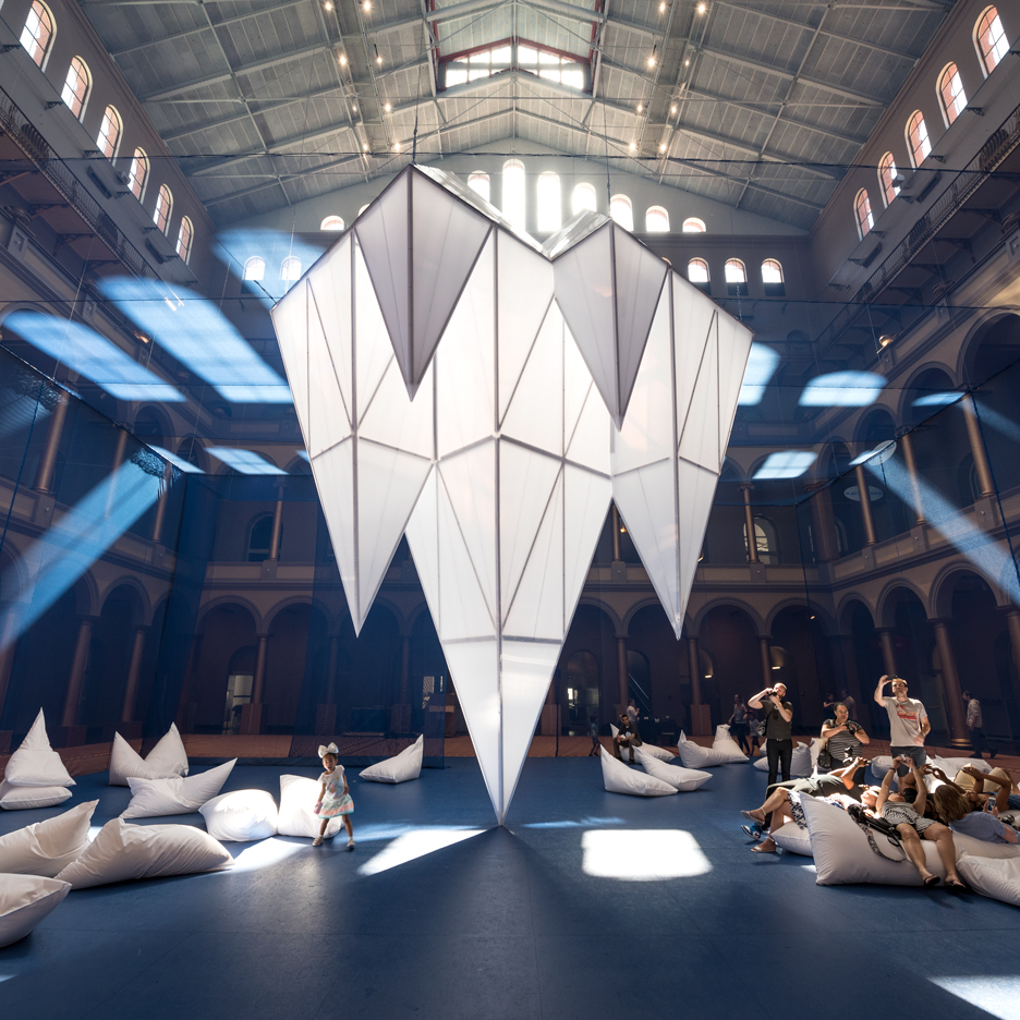
James Corner Field Operations installs over 30 “icebergs” in Washington DC museum


US studio James Corner Field Operations has created an installation for the National Building Museum in Washington DC that evokes a glacial landscape, with giant shard-like forms that jut upward and downward (+ slideshow). (more…)

http://ift.tt/29e44FW

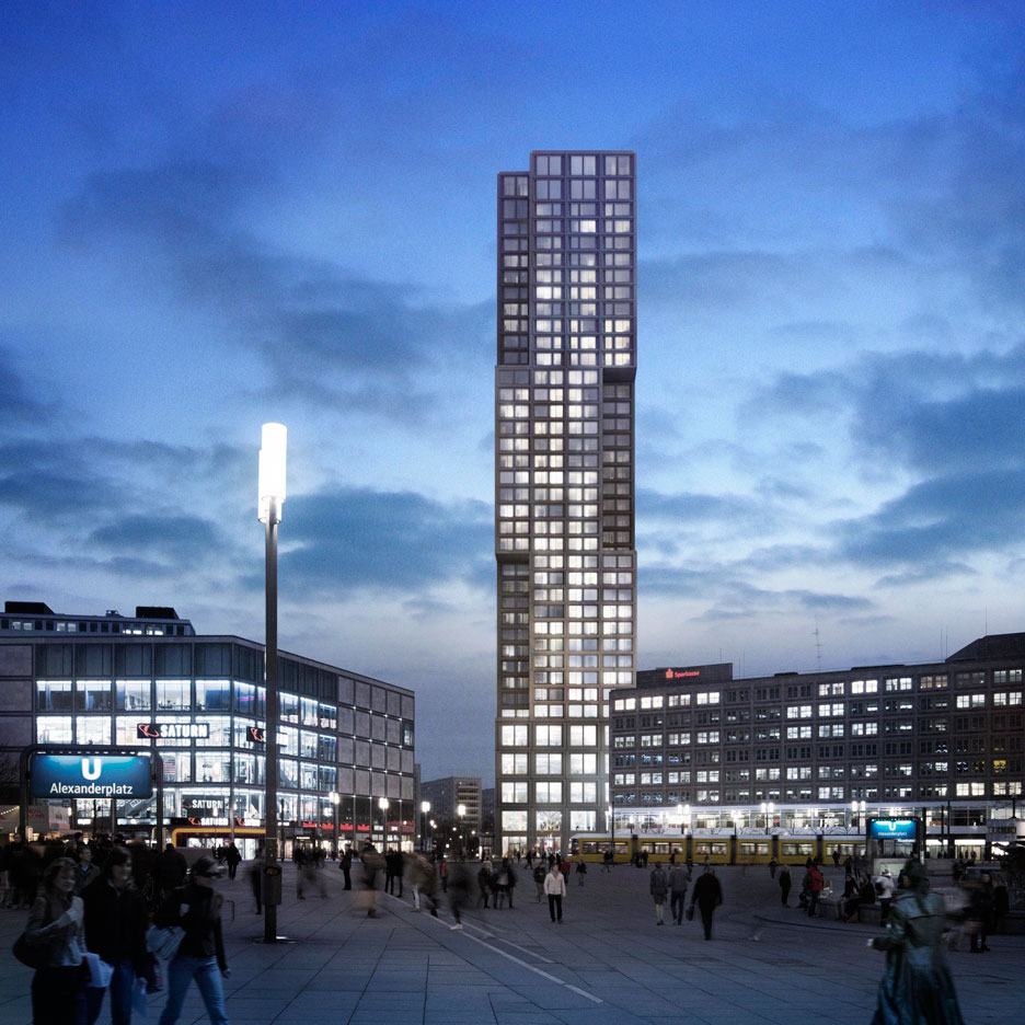
Designs submitted for Berlin’s tallest skyscraper


German property developer Bewocon has unveiled plans for a 150-metre-high skyscraper in Berlin, which could become the city’s tallest building. (more…)

http://ift.tt/29iKtbQ

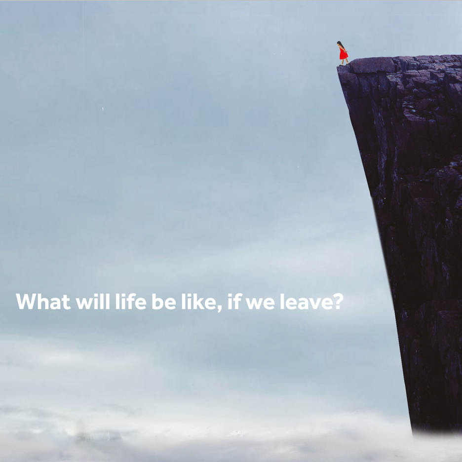
Advertising agencies unveil rejected Remain campaign posters


Brexit crisis: the agencies behind the Remain advertising campaign have shared their unsuccessful designs and described a “frustrating” process that was “doomed” to fail (+ slideshow).  (more…)

http://ift.tt/29fboBC