Beijing Greenland Center / SOM


© Lv Hengzhong

© Lv Hengzhong


© Lv Hengzhong


© Lv Hengzhong


© Lv Hengzhong


© Lv Hengzhong

  • Architects: SOM
  • Location: Beijing, Beijing, China
  • Project Year: 2016
  • Photographs: Lv Hengzhong
  • Owner And Developer: Greenland Group
  • Architects: Skidmore, Owings & Merrill LLP
  • Structural Engineers: Skidmore, Owings & Merrill LLP
  • Mep Engineers: Skidmore, Owings & Merrill LLP
  • Project Managers: Michael Pfeffer
  • Main Contractors: Beijing Liujian Construction Group Co., Ltd.

© Lv Hengzhong

© Lv Hengzhong

From the architect. Beijing: Anchoring Beijing’s Dawangjing business district, the mixed-use Beijing Greenland Center is a highly sustainable landmark building equidistant from Beijing’s bustling core and the airport. The 260-meter-tall, 55-story tower prioritizes sustainability and efciency and is clad in a prismatic trapezoidal glass façade that generates self- shading to enhance the building’s environmental performance. 


© Lv Hengzhong

© Lv Hengzhong

The design team sought to create an elegant, eye-catching tower by exploring interactions between simple form, light, and shadow. In a response to Beijing’s overcast skies, the tower catches and re ects daylight to enliven the surrounding neighborhood. The tower accommodates multiple programs—Class A o ce space and serviced apartments—and connects to an attached multi-story retail podium. The tower stacks 178 serviced apartments on top of four o ce  oor zones, organized around a simple rectangular plan with a central core to maximize  exibility. The tower’s striking façade pattern is informed by the bas relief carving technique: Isosceles trapezoidal modules function as prisms, catching daylight and refracting it to create an interplay of light and shadow. Each face is composed of two vertical, low-E insulated vision glass panels. Two trapezoid types alternate in a regular pattern up the tower’s height, tapering toward the sky or the neighborhood below. The trapezoidal skin increases the building’s performance, providing energy-saving self-shading on all faces.


© Lv Hengzhong

© Lv Hengzhong

The design aims to achieve a 30% reduction in energy use and water consumption compared to baseline by utilizing sustainable features such as a Direct Digital Control building automation system, a heat reclaim wheel, variable speed pumps for heating and cooling, and a water-side economizer to utilize evaporative cooling.


Diagram

Diagram

Addressing a need for environmentally responsible, mixed-use urban development, Beijing Greenland Center is a highly visible example of how visually striking design can also be highly  exible and sustainable.


© Lv Hengzhong

© Lv Hengzhong

A vibrant new neighborhood in Beijing 

Beijing Dawangjing is a new neighborhood located on Beijing’s northeast side, halfway between the city’s historic core and Beijing Capital International Airport. The mixed-use development was master planned by SOM to be a walkable, green district that prioritizes quality of life and responsible use of natural resources. Adjacent to the Capital-Airport Freeway and the 5th Ring Road and near the M15 metro, Dawangjing seamlessly integrates with the built environment in Beijing’s Wangjing area and brings new greenspace, cultural and civic venues, and residential, retail, o ce options to the growing Beijing neighborhood. Several SOM-designed towers, including the Beijing Greenland Center and a cluster of three towers at Poly International Plaza, anchor the district


Plan

Plan

A vision for walkable, green living

The master plan establishes principles and guidelines for the Dawangjing neighborhood that reduce environmental impact and make walking and bicycling safer and more compelling. A new park is the area’s centerpiece and incorporates destination amenities like cafes and recreation facilities to encourage interaction and a sense of community. Streets are designed to be as verdant and welcoming as the park, with bike lanes and sidewalks set alongside green features such as bioswales. Pedestrian-scaled commercial and retail bolster an active streetscape, and main o ce and hotel lobbies are located along pedestrian thoroughfares. Strategies for the massing of buildings emphasize the human scale, and design guidelines recommend the creation of timeless buildings with modulated facades—a long-term approach that focuses on design and planning principles that will endure.


© Lv Hengzhong

© Lv Hengzhong

http://ift.tt/28XE7v5

Monotype overhauls London Underground’s 100-year-old Johnston typeface


International font company Monotype has brought the London Tube’s 100-year-old typeface into the 21st century, adding the hashtag, at sign and lighter weights more suitable for digital use (+ slideshow). (more…)

http://ift.tt/28Xzf9j

One Person Gallery / Wutopia Lab


© SHAO Feng

© SHAO Feng


© SHAO Feng


© SHAO Feng


© SHAO Feng


© SHAO Feng

  • Architects: Wutopia Lab
  • Location: Shanghai, Shanghai, China
  • Architects In Charge: Ting Yu, Murong Xia
  • Area: 120.0 sqm
  • Project Year: 2016
  • Photographs: SHAO Feng
  • Client: Jing He
  • Construct: SKF, freelance decoration team
  • Gallery: 12 sqm
  • Supporting Space: 100 sqm

© SHAO Feng

© SHAO Feng

First Floor Plan

First Floor Plan

One Person’s Gallery between two buildings is located in a terraced courtyard at the heart of Shanghai. It consists of two parts, one is 12 m2 gallery as an iconic space, and the other is the cave, which could be easily ignored, including a library and a co-work space. 


© SHAO Feng

© SHAO Feng

Archaeology 

One Person’s Gallery used to be a storage structure which filled with used materials (we called them old things) of a bankrupt company looked like disaster site. The project started without any original blueprints. The architect got an inspiration when him watching the workers cleaning the space. He decided to use the arch as the motif of interior design. Instead of cleaning up the trash, the architect decided to make use of it and tried to turn it as an advantage. The old furniture was replaced as decorations in the library and courtyard, some of the old doors were reused, and others were reconstructed as ceiling. Some unpredictable effects were found and kept deliberately by architect when exploring the site. This is the reason why the architect took the project as an archaeology work. 


© SHAO Feng

© SHAO Feng

Section 2

Section 2

Antithesis 

The proposition of antithesis could originate from Chinese rhetoric, like the Yin Yang. If we took one side as the old, big, dark, a bit dirty, hidden indoor commercial cave with ornaments the other side would be the new, small, bright, neat, highlighted outdoor art workshop. From this notion of antithesis, the idea of the one person’s gallery in the gap is gradually composed.     


© SHAO Feng

© SHAO Feng

Silhouette

The air in Yangtze River Delta called Jiangnan is always filled with moisture, so the ancient local artists developed a distinctive aesthetic technique by depicting Silhouettes rather than emphasizing light and shadow. Architect chose 3 layers of PMMA panel and timber structure to build gallery. It looks like an entity from outside, but when you get into gallery, you will find the outdoor surroundings display on the wall as silhouette. The silhouette digested materiality of solid wall at last. This is the architect’s purpose.


© SHAO Feng

© SHAO Feng

© SHAO Feng

© SHAO Feng

Tip of iceberg 

The gallery is the tip of an iceberg. More artists and architects will be invited to exhibit their critical work about urban and architecture. The only limit is that gallery rejects graphics work. The owner invited the architect who designed gallery as the curator to run the one person’s gallery. It’s the beginning of a new story. 


© SHAO Feng

© SHAO Feng

Sketch

Sketch

http://ift.tt/28W1t3D

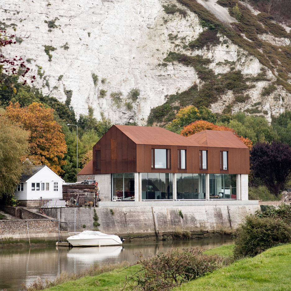
Riverside house by Sandy Rendel Architects contrasts weathering steel with concrete and glass


This riverside house in southeast England was designed by Sandy Rendel Architects with an upper storey clad entirely in weathering steel mesh, and a base of exposed concrete and glass (+ slideshow). (more…)

http://ift.tt/290Mvhg

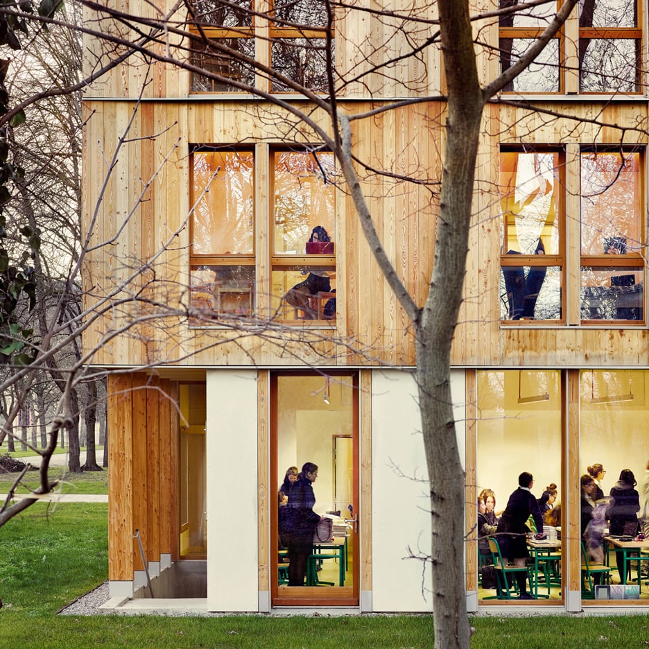
Timber and glass dormitory building nestles among trees in a Paris park


Paris firm Belus & Hénocq Architectes has added a timber-clad educational centre and student dormitory to a boarding school, which sits in a landscaped park in the Saint-Denis area of Paris (+ slideshow). (more…)

http://ift.tt/28W9h9P

LEVS Architecten Infuse “Dutch Approach” in New Residential Area in Russia


Courtesy of LEVS Architecten

Courtesy of LEVS Architecten

Dutch firm LEVS Architecten won an international competition to design a new residential zone near the Russian city of Kazan. The winning design encompasses the 180-hectare masterplan for the area as well as its architectural content. Along with VLUGP landscape, LEVS used a “Dutch Approach,” embracing pedestrian networks, green space and “spirited architecture.” The extent of the project will form its own neighborhood, titled “Machaon Valley,” and is intended to be fully realized by 2025.


Courtesy of LEVS Architecten


Courtesy of LEVS Architecten


Courtesy of LEVS Architecten


Courtesy of LEVS Architecten


Courtesy of LEVS Architecten

Courtesy of LEVS Architecten

The project is sited upon a largely untouched landscape bordering the town of Malye Kabany, 20 kilometers south of Kazan. Over the next 20 years, the area will undergo rapid urbanization, with the implementation of several new neighborhoods and the necessary infrastructure to link the area to other cities and the nearby airport. The masterplan for Machaon Valley was designed with these connections in mind, while also orienting itself to the natural landscape. 


Courtesy of LEVS Architecten

Courtesy of LEVS Architecten

LEVS and VLUGP have used their shared approach to landscape design to thoughtfully negotiate the disjunct between this historic natural setting and the proposed development. Their design takes its cues from existing geographic features such as the rolling terrain and dry riverbeds to echo the natural topography. Where the development meets the natural landscape, the periphery is softened by an extended parkland, which will eventually create a green link to future north-eastern developments.


Courtesy of LEVS Architecten

Courtesy of LEVS Architecten

The new neighbourhood is divided by a second, urban parkland that connects the new area to the old town. Distributed across the site are new apartments in a series of closed or half-open blocks, each encircling its own green courtyard. The residential density is punctuated with public program, including a community center and library, a theatre, retail, schools and daycare centers. Along with planned communal zones, the intimate dimensions and informal walkways encourage additional, unplanned social interaction. 


Courtesy of LEVS Architecten

Courtesy of LEVS Architecten

Run by Kazan-based developers Unistroy, the competition sought to break from the “typical monotonous and isolated Russian neighborhoods of repetitive housing.” After 11 practices were engaged for the first stage, LEVS and two other firms were asked to present their conceptual masterplans earlier this year. LEVS’ win makes this their second active residential project in Russia, alongside a new neighborhood currently under construction in Yekaterinburg.

News via LEVS Architecten

http://ift.tt/28VfwaM

Cubes House / Studio [+] Valéria Gontijo


© manufatura creative

© manufatura creative


© manufatura creative


© manufatura creative


© manufatura creative


© manufatura creative

  • Author: Valéria Gontijo
  • Co Authors: Isabela Moura e Isabela Valença
  • Landscape: Ana Paula Róseo
  • Structural Calculus: Situare Engenharia
  • Execution And Construction Management: Multiambiental Engenharia
  • Light Installation Project: Lumini

© manufatura creative

© manufatura creative

From the architect. The conception process of the Cubes House has started with the primary need of a blind façade, seeking the privacy the residents were looking for. However, in contrast with the primary condition, the proposed idea was to make a dynamic arrange of volumes out of the basic and monolithic initial form. The result was the cubes, highlighted by large wood panels framed with steel plates.

The exposed concrete was the first choice since the beginning, which added to the project’s aesthetic. A practical, functional and timeless house that could be inserted on the context of a young and modernist city like Brasilia. The couple and its two children accepted all the process as a challenge to make a dream come true.


© manufatura creative

© manufatura creative

Wood, concrete and steel is the trilogy that marks all the facades, coatings and elements in the whole project, besides the brutalist and modern aspects the project was seeking. It was important to take advantage of the impact of the concrete to achieve the facades’ blind plans at the same time where the metallic structure allied to the reinforced concrete made the large spans possible.


© manufatura creative

© manufatura creative

It was important to the couple that the living room, dining room and gourmet area were totally integrated. The solution was to use large glass sliding doors that could be collected in-between the walls to assure the formation of one single area when necessary. On the ground floor, a small scale movie theater for 12 people took place, attending the family’s passion for art and to gather friends.


Ground Floor Plan

Ground Floor Plan

The top floor was projected respecting the privacy of each room which are connected by the 2 meters wide main balcony. The use of skylights, pergolas and wood blinds guaranteed the natural ventilation and lighting, also, the wood blinds made possible the ventilation without losing the aspect of privacy. The cumaru wood flooring is the same for all the environments, making comfortable the constant use of concrete.


© manufatura creative

© manufatura creative

The landscape, executed by the office of the landscaper Ana Paula Róseo, and the lighting design, by Lumni, were all done along with the architecture studio that always seeks integration of all the project steps in order to keep unity on the final result.


Section

Section

As result, an architecture of straight lines with no excesses. We have never had luscious houses and projects in our minds. Just like Mies van der Rohe’s quote: Less is more! Also, every client is unique, therefore, they deserve to be listened with attention because it not only makes our jobs easier but also brings the project closer to reality.


© manufatura creative

© manufatura creative

Doubtless, Brasilia is stimulant to our profession. The city’s modern architecture represents all explored construction possibilities of its time in which we also try to transpose on our projects. We are always seeking this growth, developing the projects’ structure, the large spans and deleting the unnecessary, focusing on what is important: to create projects that are compatible with the architecture of the city.


© manufatura creative

© manufatura creative

http://ift.tt/296mQBq

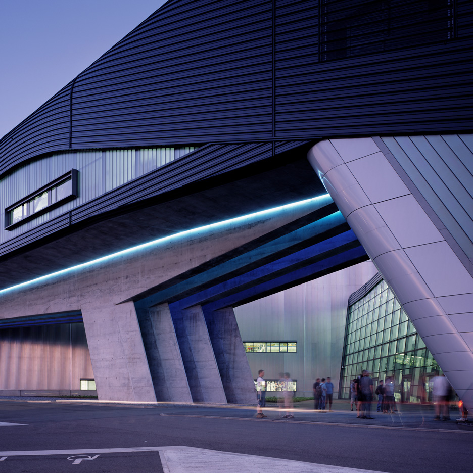
Zaha Hadid’s BMW Central Building is “a radical piece of thinking,” says Amanda Levete


Zaha Hadid 1950-2016: British architect Amanda Levete explains why the BMW Central Building in Leipzig, Germany, is her favourite Zaha Hadid project in the next movie in our exclusive video series. (more…)

http://ift.tt/291R2Ar

ArchTriumph Present the “Energy Pavilion” Now Open at Museum Gardens


Courtesy of Sergio Grazia and Luc Boegly

Courtesy of Sergio Grazia and Luc Boegly

This week, Museum Gardens became the host to the annual Triumph Pavilion, this year focusing on the concept of “energy.” Five Line Projects’ aptly titled “Energy Pavilion” takes a multi-faceted approach to the theme, addressing social sustainability, movement and the power of community. The pavilion presents a playful meeting place, designed to explore the impact of a single positive action on its surroundings.


Courtesy of Sergio Grazia and Luc Boegly


Courtesy of Sergio Grazia and Luc Boegly


Courtesy of Sergio Grazia and Luc Boegly


Courtesy of Sergio Grazia and Luc Boegly

ArchTriumph run an annual, open call competition in order to offer an alternative stream of expression to the architectural profession. They search for innovative, experimental and engaging projects which have the power to benefit society. Five Line Projects is comprised of multiple disciplines, and their enthusiasm and lateral thinking lead them to win this years’ entry. The London-based office’s selection makes them the youngest winners in the competition’s history.


Courtesy of Sergio Grazia and Luc Boegly

Courtesy of Sergio Grazia and Luc Boegly

The pavilion is formed by a forest of stainless steel rods, stacked with mills reminiscent of a children’s pinwheel. By spinning a singular wheel, an individual will set into motion the movement of the adjacent wheels, creating a rippling effect through the forest. This acts as metaphor for the “collective energy of community,” as one action is seen to set off a chain reaction. It also creates a kinetic playground of moving objects, energetic in its own right.

The design focuses on user engagement, and the forest becomes a place where inclusion and accessibility reign supreme. Able to be inhabited by multiple users at once, the pavilion encourages playful interaction between people of all ages and denominations. The prominent site is overlooked by the V&A’s Museum of Childhood, and is attracting architects, designers, museum visitors and the general public.


Courtesy of Sergio Grazia and Luc Boegly

Courtesy of Sergio Grazia and Luc Boegly

The pavilion, engineered by Arup, covers 64 square meters and is entirely self-supporting. It is predominantly constructed from bamboo, a sustainable material choice, and also uses stainless steel rods, timber, CLT panels and solid aluminium cladding.


Courtesy of Sergio Grazia and Luc Boegly

Courtesy of Sergio Grazia and Luc Boegly

News Via ArchTriumph

http://ift.tt/28Umo6m

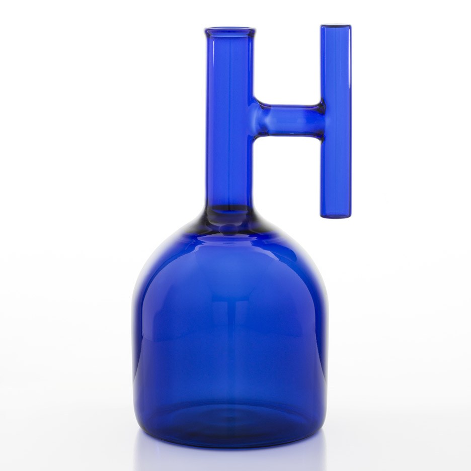
Lanzavecchia + Wai designs cobalt blue glassware based on lab equipment


Designers Lanzavecchia + Wai are the latest to craft objects in coloured glass, producing bright blue tableware for online retailer Luisa Via Roma (+ slideshow). (more…)

http://ift.tt/28XhQlZ