View from Hickson Road pedestrian bridge. Image Courtesy of Tzannes
Adding to the growing trend of timber-framed architecture, Tzannes has released plans for International House Sydney, the “first modern commercial engineered timber building of its size and type in Australia.” Located in the new urban district of Barangaroo, the building was conceived as a gateway to the area, linking pedestrian infrastructure systems and providing six floors of new commercial space.
View from Hickson Road colonnade. Image Courtesy of Tzannes
Taking advantage of the structural capabilities of timber, Tzannes’ design features a colonnade of y-shaped members, giving the building a dynamic presence from the street and providing shade and cover for the pedestrian “Merchant’s Walk.” Behind the colonnade, the seven-story building is made up of two components: a two-story base housing retail that responds to surrounding pathways, and a simple glass envelope above that allows the building’s unique structural frame to be displayed from both the inside and outside.
View from Hickson Road. Image Courtesy of Tzannes
The building has been sited to complete the streetwall on Hickson Road, complementing surrounding buildings and acting as a transitional structure between the street and the towers to the west. The design interacts with the two pedestrian bridges flanking the project, drawing people into the ground-level public space and connecting Barangaroo with downtown Sydney.
In addition to the extensive use of structurally engineered timber, the design for International House Sydney employs recycled hardwood throughout. Noting the renewable and ecological character of timber-framed structures, Tzannes hopes that the project will be seen as a leader in environmentally sustainable design and will set an example for future development in the area.
View from Hickson Road pedestrian bridge. Image Courtesy of Tzannes
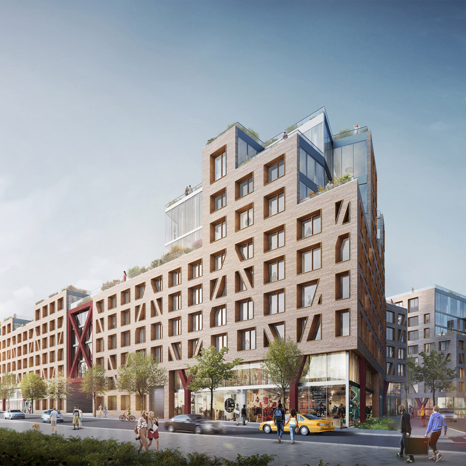
Brooklyn‘s Bushwick neighbourhood is set to receive a vast housing development designed as a “European village” by architecture firm ODA New York (+ slideshow). (more…)
London’s Tate Modern just got bigger. Last week, the well-known modern art museum opened its new extension to the public. The so-called “Switch House” was designed by Swiss architects Herzog & de Meuron, the same firm that designed the successful rehabilitation of the original Giles Gilbert Scott’s Bankside Power Station in 2000.
The museum could not be more satisfied: “It’s a dream,” says Tate Modern’s new director Frances Morris, “We’ve never had such an open space before. The possibilities are endless.” While critics generally approved of the design, they expressed mixed feelings for the addition’s materiality and urban character. Read on to find out more about the views of Frieze Magazine’s Douglas Murphy, The Evening Standard’s Robert Bevan, The Guardian’s Rowan Moore, and The Financial Times’ Edwin Heathcote.
Writing for Frieze Magazine, Douglas Murphy acknowledges the architectural form as being typical of Herzog & de Meuron, but questions the use of brick on the facades, as well as the use of similar visual codes for the two building parts:
The Switch House is by no means a simple box – it nearly matches the height of the monumental chimney of the power station, and has a twisted aspect familiar from H&dM’s work elsewhere, but it is deceptively cloaked in a skin of bricks that appear to be blending into rather than shouting over the original building, a strategy followed, with some exceptions, within.
Murphy admits that “moving around the new building is a joy,” especially “at the building’s sloping edges, where the bricks jut out in all directions, giving the silhouette the fuzziest of edges,” but he raises concerns for the quality of the finishes where the two building parts blend:
It’s not all great – externally the old and new parts don’t meet half as well as they should, while some of the internal detailing is hamstrung by the folded form. Not all the finishes are to top standard, sacrifices towards achieving an admirably low energy building, but overall the client and design team have created something entirely of a piece with the original, while adding a new layer of richness. Now all it needs are the sullen school groups.
In his review for the Evening Standard, Robert Bevan says that “the junction between old and new brickwork is awkward in places,” but supports the architects’ choice to unify the two parts as one organism by quoting Jacques Herzog: “The most important challenge was to make it all feel like one building. One thing with different atmospheres but the same organism.”
Yet Bevan questioned the relationship with the nearby plaza limiting the Neo Bankside residential buildings. “On the south side,” he explains, “a pointlessly winding path and high garden wall to the terrace above The Tanks means that the opportunity to enliven Sumner Street has been lost. Tate Modern’s immediate setting remains unnecessarily compromised. This is not the ‘city plaza’ that the architects promised.”
“Some of the glad-to-be-gloomy parts are plain glum. But if Tate Modern’s extension could be accused of having too much architecture, it is architecture that, once found, you wouldn’t want to lose.” – Rowan Moore, The Observer
For the Observer critic Rowan Moore, although “the perforated brickwork is too heavy to deliver the sun-dappled interior effects that it seems to promise,” and “there can be a lack of correspondence between the exterior structure and the interiors it contains,” the feedback is generally positive.
Moore values the brick surface, as it remarkably contrasts with the glass-facades of the Neo Bankside development across the street:
The building you are in, by contrast, a public art gallery attracting many millions a year, founded on the principles of openness and access to all, is solid and opaque. It sets its face against the dominant piety of modern public buildings that democracy = transparency = glass.
He also notes that the “consistent and insistent use of materials” – brick on the outside, and concrete on the inside – unifies the wide variety of spaces that the architects developed to answer curatorial needs. Also, materials “derive from the former power station,” and profit from the building’s historical value.
“Tate Modern has sucked the power of the past up from below ground to create one of the world’s most memorable and monumental museums of modern art – and its most popular.” – Edwin Heathcote, The Financial Times
Likewise, Edwin Heathcote of the Financial Times notes that “the most visible response to the museum’s new context of glassy towers comes in the form of a massive perforated brick tower.” In reference to Herzog and De Meuron’s concept of “organism,” Heathcote says “the parts are clearly different yet have a common genetic code.” He further adds:
From an urban point of view, what they have achieved here is quite remarkable. They have managed to integrate the former power station into the city and streets behind while maintaining its sense of presence and difference.
While the urban stance is of great importance, Heathcote concludes by praising the Switch House as a “clearly civic space”:
At £260m, this is an expensive project. Yet it feels anything but elitist: this is an open building in which the luxury is that it is ours.
From the architect. The House Carrara’s Project is located in the modernist city of Brasilia and has considered this topic as a determinant factor for its architectural concept and materials choice, also allied to the aesthetic sense the clients were looking for, after all, the environment and the architecture conceived had to be designed to be occupied by dreams, people and its objects.
Then, it was born a residential project for a couple and its two children, who loved cement, concrete and wood. Out of this dream the house has formed its shape with a clear and objective volume, intentionally creating integrated spaces allying functionality to the modernism required by the city and the family’s day life.
The project’s program consists of an intimate house on the top floor, where all the rooms give access to an extensive exposed balcony that acts as a big solarium for contemplation. This results in great environments for each resident.
On the ground floor, all the rooms are divided by operable doors and panels that aid in connecting and isolating spaces. Living room, home theater, kitchen, balcony and gourmet area are connected by the house’s transparency even with the use of concrete and wood panels. The use of the same type of flooring helps the perception of the grand scenario.
Isometric
The kitchen integrates with the dining room by folding doors that follow the same cumaru’s wood sheating of the large slatted wood panel hiding the stairs that give access to the top floor rooms, always seeking an intimate and direct circulation. The same flooring on the living room and the gourmet area creates the spaces’ breadth and integration.
The blind facade is structured by an apparent fuldget and concrete painting, to preserve the gray brutalist language of the proposed architecture. Rebars were used as panels on the frontal gate, strengthening the idea of the main materials of the project: cement, steel and wood.
The landscape was executed by Ana Paula Róseo’s office along with the client herself, who loves architecture and has always participated and helped on the project’s conception.
The pool is sheated on hijau’s stone, throwing back to the moments lived by the client who experienced traveling to Asia. The deck is made out of dehydrated wood with no varnish.
The house is located on a plot, not very large. This situation invites to compact the house on one side, continuing the alignment of the street façade while maximizing the patio with good solar exposure.
The house occupies a corner plot. For this reason, instead of adopting the usual uni-directional organization (street-patio), of houses between medians, the proposal is organized in two perpendicular directions. The house does not have a dominant direction. The house wants to look in all directions.
Courtesy of TEd’A arquitectes
The structure is resolved with load-bearing walls arranged in a swastika form. The structure also does not have a dominant direction. The structure configures the space.
Aiming for the wall structure to be the protagonist of the space, services are placed in the perimeter, forming a thick façade, liberating the centre of the plan and allowing for visual and use relations between the rooms.
Courtesy of TEd’A arquitectes
The habitable sctructure coincides with the bearing walls structure. In these walls exterior windows are opened facing the street as well as interior windows facing the other rooms. There is no difference between them.
Courtesy of TEd’A arquitectes
The materialization of these walls will be fundamental in the construction process. A small building of bearing walls in marés, a local sandstone, already existed in the plot. Common sense leads us to reuse these pieces. The strategy is already served.
During the work process it is decided to reuse the marés. By handling and rearranging it, the work of the craftsman who years ago chiseled the grooves of the ancient abeuradors increases in value. These grooves were the space in which the mortar grout was poured to join the pieces together, nowadays the auberadors aren’t necessary anymore.
Courtesy of TEd’A arquitectes
Now they will provide texture and character to Can Jordi i n’África’s façade, a texture which through the years will absorb the patina added by time. The old pieces of marés, because of their quantity, are combined with new pieces. The new pieces, brought from the same quarry as te old ones, are used in the points were we need to define the work with higher detail: window frames, roof finishings, etc.
Courtesy of TEd’A arquitectes
Thus the building is implanted in the site through reading the environment and understanding the material and its construction.
The UK’s architects and designers have been left reeling by the results of yesterday’s referendum, in which the country voted by a significant majority to leave the European Union. (more…)
The relationship we have with our plotters is a complicated one. Between CAD and plotters, the production part of our job as architects is much easier than it was, even just 10 years ago. We still have plenty to complain about though, as the characters in Architexts demonstrate. If you have your own similar experiences, we’d love to hear from you for our next book project, Architects, LOL.
Pepper House is a mixed-used residential and office project designed by GEMA in 2016. It is located in Ho Chi Minh City, Vietnam. Pepper House by GEMA: “Vietnam is a rapidly developing country with dramatic changes in economic, social and numerous other sectors. In 2015 alone, the country has generated more than 97,000 startup enterprises, most of which are focused in the thriving Ho Chi Minh City. Along with the..