Location: Teollisuuskatu 1, 00101 Helsinki, Finland
Area: 130000.0 sqm
Project Year: 2015
Photographs: Courtesy of JKMM Architects
Main Designer: Asmo Jaaksi
Design Team: Marko Salmela (project architect), Eero Kontuniemi (project architect), Teemu Kurkela, Samuli Miettinen, Juha Mäki-Jyllilä, Ville Ukkonen, Jukka Mäkinen, Janne Leino, Teemu Toivio, Katariina Takala, Kirsti Larja, Arvi Mäkitalo, Aaro Martikainen, Harri Lindberg, Azizah Sulor, Johanna Mustonen, Katariina Knuuti, Salla Olkkonen, Päivi Puukari, Marko Pulli, Edgars Racins, Jarno Vesa, Karo Ojanen, Christopher Delany, Edit Bajsz, Anna Melander
Interior Design: JKMM / Paula Salonen (project leader), Viivi Laine, Tiina Rytkönen, Elina Niemi
The construction of new builds to replace the buildings along Teollisuuskatu as well as the northern corner house on the Päijänteentie side constitutes the most extensive change to the cityscape around the quarter. As these new buildings closely match their predecessors in height, the scale of the quarter has remained unchanged. The quarter will be completed in 2017, when new buildings are set to rise on the eastern corner of Teollisuuskatu.
Courtesy of JKMM Architects
The interaction between the inside and outside of the large quarter was at the heart of the architectural concept: The inside should be visible to outside observers, thus creating vistas of openness and transparency. In turn, those inside require visual contact with the outside world. This vision was brought to life through tall openings designed between the building materials, which punctuate the long façades and open up a view of the inside.
The design process has aimed to eschew rectangular designs in favour of a strong and memorable visual identity: the sculptural, massive quality of the new buildings recalls the imposing solidity of erratic boulders. The presence of the latter as an architectonic and design theme carries connotations of durability, permanence and Finnishness.
Elevation
The Premises
The “gallery”, a circular indoor path under a glazed roof, serves as the quarter’s hub, connecting various functional units and providing a meeting space. When considered vertically, three discrete functional zones emerge: the basements (parking, machine rooms, storage rooms and maintenance facilities), the ground level (foyers, restaurants, conference centre, welfare services) and the upper levels (offices).
The design of the premises takes its cues from a new work environment concept, in which solutions seek to enable various modes of working, from quiet concentration to active interaction and teamwork. The themes of openness, flexibility and functional communality take centre stage in the new multi-space work environment.
Courtesy of JKMM Architects
Courtesy of JKMM Architects
The Materials
The frame of the new buildings consists mainly of concrete, but steel has also played a large role in the realisation of a diversity of structures. Interior surfaces and furniture feature natural materials, stone and wood.
With the inner city’s stone buildings and urban environments in mind, the façades’ surface materials have been chosen to emanate durability and permanence. The new buildings’ façades are mainly plaster, Finnish granite and glass.
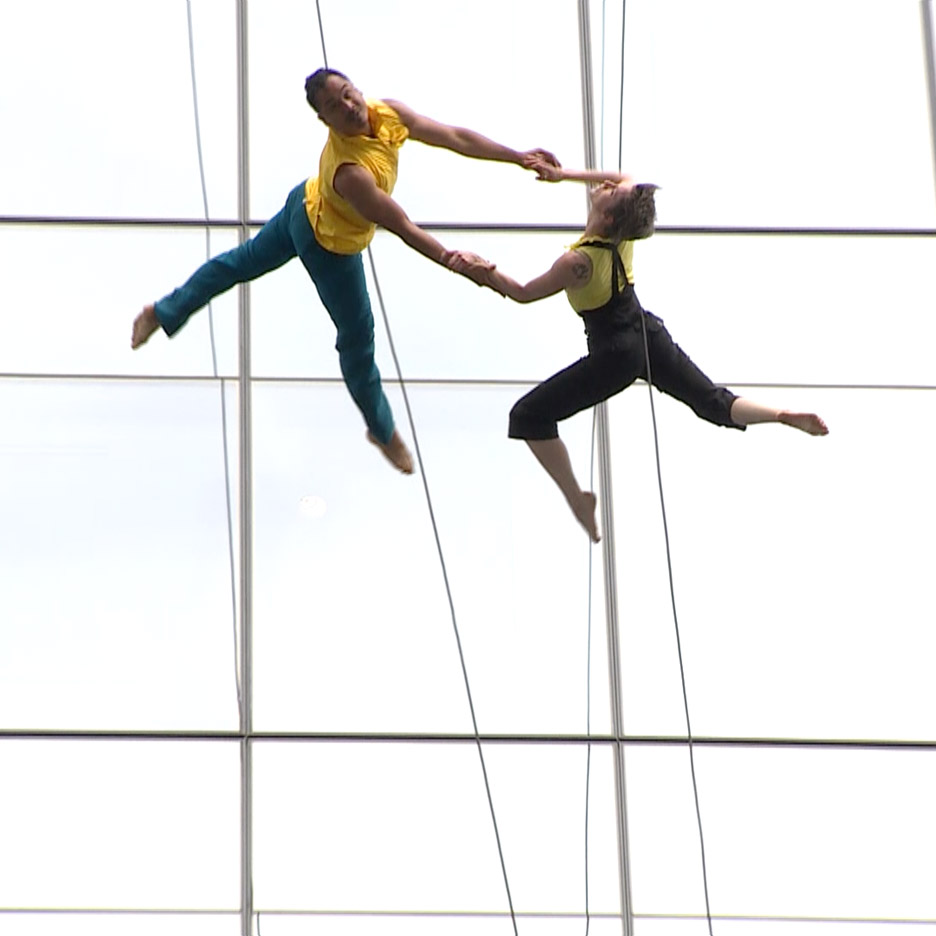
Performers from experimental dance company Bandaloop leap, flip and spin across the glass facade of a 17-storey tower at Boston‘s Fan Pier in this choreographed acrobatic act (+ movie). (more…)
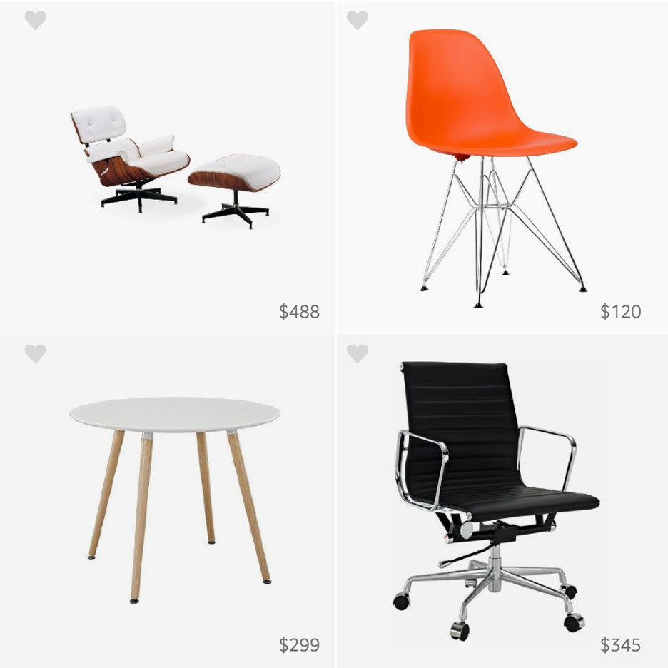
Online retail giant Amazon is celebrating the birthday of legendary designer Charles Eames with a pinboard that collects together replicas of his designs sold on the site. (more…)
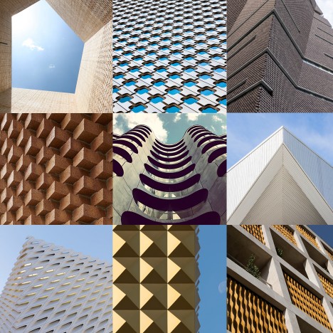
In this series, entitled Stacked, photographer Malte Brandenburg takes a closer look at the architectural merits of Berlin’s post-war housing estates. Captured against a flat blue sky, the images seek to strip away the historical and social burdens carried by the buildings, presenting them instead as pieces of pure architecture.
Once seen as symbols of freedom and prosperity for the German middle class, providing ample space at affordable prices in a time of reconstruction after World War II, a large number of these buildings have fallen into states of neglect. Today they are viewed by many as a blight on the city’s skyline. By placing the buildings outside their usual context, Brandenburg sought to highlight the towers for the qualities that once made them desirable.
In the photographer’s words, “For me they are not ugly leftovers from past decades in a city’s skyline. I find they tell a story, which is still relevant today, namely the tension between urban development and the human element.”
In a recent interview with the BBC, Rem Koolhaas (OMA) has spoken out against the campaign seeking to remove the United Kingdom from the European Union, upon which the British people will vote in a referendum next week. Reflecting on his time spent at London’s Architectural Association (AA) in the 1960s and ’70s, Koolhaas fears that advocates for withdrawal may be looking at the past through rose-colored glasses.
If you look at the arguments to leave you can see this is a movement of people who want to fundamentally change England back into the way it supposedly was before.
Rem Koolhaas. Image Courtesy of flikcr user Strelka. Licensed under CC BY 2.0.
Instead, Koolhaas explains, before entering the EU in 1973 the United Kingdom was a “world of pea soup and a complete absence of coffee.” Joining the EU injected both the AA and the country as a whole with a rush of new cultures. “The school was unbelievably English,” he continued. When he returned around eight years later, the school was staffed by people from Germany, Czechoslovakia, and France. “It had completely transformed. I think that that moment of transformation was something that on a bigger scale happened to England as a whole. It opened up itself, helping to modernize the whole of English mentality, the whole of English civilization.”
A long time supporter of the European Union (EU), Koolhaas also has professional ties to the situation and the ideas behind what is at stake. In the early 2000s the research division of his firm, AMO, worked extensively with the EU to develop new identity and branding strategies. These collaborations resulted in a new “Barcode Flag,” which featured a complex arrangement of colors from the flags of each member state and a set of panoramic murals expressing the evolution of the continent. Trusting in the enormous potential of the union, OMA*AMO had hoped the project would result in an EU that would be seen as “bold, explicit, popular.”
There is much more at stake, I think, than simply being in or out.
In 1953 Le Corbusier wrote a letter to the Chilean Architects, and was sent through Emilio Duhart, a very important Chilean Architect that was drawing for him the buildings that he was doing in that moment in India. In this letter he emphasize the need on taking care of people while developing a design process. He said that “in that moment academic ideas where left behind, and the smallest measurements, the shorter distances or the smallest built spaces, become precious as a glass of water in the desert”.
Since I was in the School of Architecture, I faced little projects, like cabins, vacation homes, etc. But they they were not just small in terms of area, they had also a small budget. So my first professional challenges where to manage doing good design with a few money. The big problem afterwards was that I kept on receiving this kind of assignments, because in some way or the other, I had specialized on doing ‘low cost design’.
So I started developing different strategies for reaching this goal of good design. I went on survey for prefabricated architecture, thinking of the technical possibilities of building with more control, faster, and cheaper. And I had some interesting experiences as my SIP Panel House in Santo Domingo, Chile. But prefabrication techniques require some industrial processes, related to commercial markets, that have a limit if you want to go down on the building cost. So then I tried working on ‘low tech’ design. In a country like Chile, you usually find precarious contexts were buildings rise. So is easy then to get in touch with local precarious techniques and workforce. And this precariousness is very well related to design in terms of the capacity of solving architecture problems with less time, local materials and little technological knowledge. This was the strategy that I used in my ‘Hostal Ritoque” in Quintero, Chile.
Elevation / Section
Diagram
Model
This Polycarbonate Cabin is a small house for rent, just beside another bigger house for holydays in the coast of Guanaqueros village. The owner lives on renting this two houses for people that are left outside the main beach resorts of the country. It’s a small scale personal enterprise to offer a place to stay and enjoy the beach, so in the beginning there was a very tight budget to build, just U$365 / sqm. So in this case I tried again working with low tech design, working with just one carpenter, with the techniques he knew, assimilating all this conditions in the beginning of the design process.
But there was another problem. The site had already a built house, and even a pre-existing room beside of 9 sqm. So there was a tight area also to build this second holiday house, and that meant lack of sunlight. That’s why I used two design operations aiming to solve this problem. The first was mismatching the walls of both rooms to create a light patio within the pre-existing room. And the second operation was to build with polycarbonate, the large wall that separate both house were it develops an 90 cm wide corridor. With this two operations we could give the house a very tight relation with the site, and a lot of sunlight for this Cabin.
This polycarbonate cabin is named like that because it has a long polycarbonate wall on the setting sun side. This white wall can reflect light and be translucent. As was told before, this little cabin is located in a site that has already a house. Being so close to each other, this polycarbonate wall gives light both the inside of the cabin, and the walkway between the houses. The structural system is done with standard boards of raw pine wood. All the house was built just by one craftsmen within 2 months.
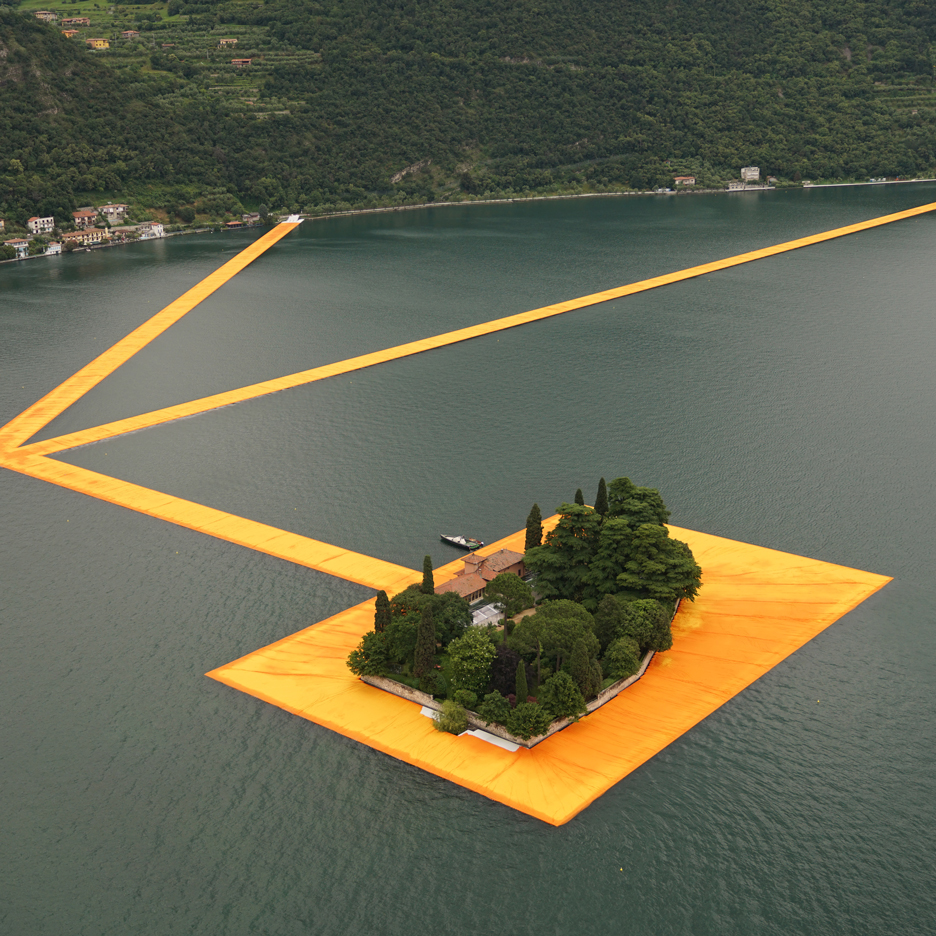
Three kilometres of saffron-coloured pathways temporarily connect the shore of Italy‘s Lake Iseo to islands at its centre in this installation by Bulgarian artist Christo (+ slideshow). (more…)
Urban design and landscape firm West 8 has released images of a newly designed sculpture park for Duke University. To be known as Three Valleys Sculpture Park, the 140 acre design will be set within the sprawling Duke Forest, alongside the Olmstead Brothers’ designed Campus Drive, and will help to strengthen the link between Duke’s east and west campuses.
Courtesy of West 8
Central to the park’s design is its interaction with the hub-and-spoke plan of the Nasher Museum of Art, designed by Rafael Viñoly Architects. The park will surround the building, transforming existing parking lanes into green space and creating new entrances into the 5 glazed corners of the museum’s atrium. Gently curving pathways will bring pedestrians to terrain for sculpture as well as a new vantage point from which to view the museum.
Courtesy of West 8
Further along the path, the three valleys from which the park gets its name will be given new bridges to replace outdated culvert systems, creating a more practical stream ecology and giving students and visitors the ability to enjoy the landscape for the first time. West 8’s vision plan also includes improvements to Campus Drive, museum gardens and plazas, a sculpture slope and a series of walkways.