The new Kindergarten and nursery is placed by the sea, on the tip of Islands Brygge in Copenhagen and the architecture is designed in accordance with the surrounding existing buildings, an area characterised by small boathouses and small dwellings. While still in the capital of Denmark, the children will have a daily life filled with fresh sea air and the sound of seagulls.
Nokken houses 124 children (3 nursery groups and 4 pre-school groups), has a good indoor climate and sustainable materials.
Inside the kindergarten and nursery a multitude of colours, intricate patterns and different surfaces great the children. Decorated with colours, patterned wallpaper and tiles. This gives the impression of a large jewellery box, and creates a colourful interior as well as a fun playhouse for the children. While the floor plan is intricate and labyrinthic, the various colours make it easy to navigate around the building.
Diagram
Playgrounds
The nursery has two playgrounds. The older children have a rugged playground facing the sea, with swings, slides and climbing frames. They have the fresh sea air and views to the water. They can follow the boats, kayaks and birds, habituating with live on the sea outside the nursery.
An inner playground for the smaller children, sheltered by the walls of building itself, it provides a perfect outdoor tranquil playground. This playground also works as an outdoor canteen and communal area for all the children on sunny days. Throughout the building there are view to this inner courtyard and playground.
Vivienda en Barcelona is a private residence renovated by GCA Architects. It is located in Barcelona, Spain and was completed in 2011. Vivienda en Barcelona by GCA Architects: “A total renovation is carried out of the whole property. The new distribution had to be adapted, above all in the night zones, given that originally it had bedrooms with very small bathrooms and with a very outdated distribution. To this end,..
From the architect. The project is located in the district of Molenbeek-Saint-Jean in Brussels. It is part of the urban renewal strategy of the city and holds a strategic position, facing the town hall, at the corner of two axis, one of them has been dedicated to enhance soft mobility.
The project responds to this context and proposes a real urban articulation opening the view towards the town hall. The facade of the building is slightly folded to broaden the perspective from the Brunfaut street, and connect the public space to the main axis without generating a „backside“. A new facade is so designed facing the prospect of the town hall. The existing road widening is thus transformed into a real space in continuity with the town square, stretching it between two landmark buildings.
A careful attention is given to to integration of the project into its context. The building proposed is compact, attractive, yet sober. The design of the ground floor is a search to amplify the continuities within the public space, while for the upper floors, the specificities of the program have motivated large openings cut into the main volume. They respond to the scale of the apartements, offering outdoor spaces and structuring the organization of the rooms and spaces for each of them. At the urban scale, they give the project its expressiveness.
The building is dressed with a skin made of a folded and perforated sheet of metal, interrupted only to reveal the large and bright yellow openings cut for the terraces. The sheet is folded following a variable rythm, the perforations are random. A dynamic effect, a vibration of the facade is so realised in order to accompany the urban articulation and underline the role of the project as urban signal.
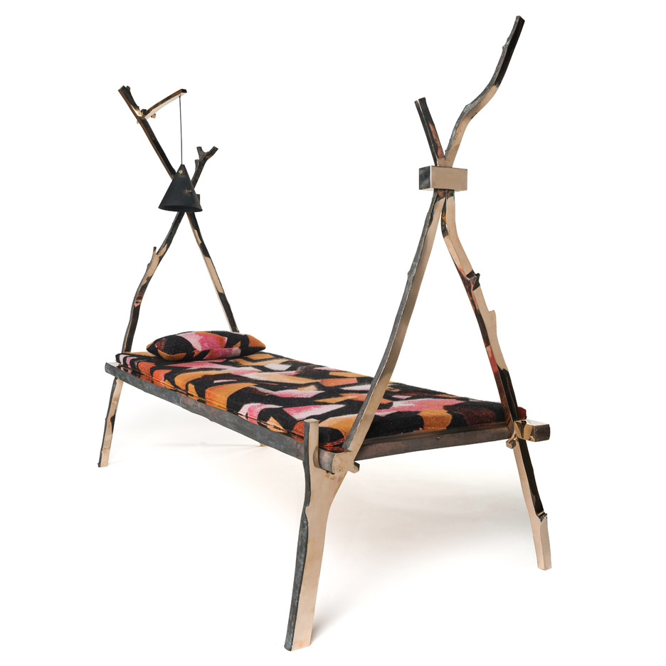
Design Miami/Basel 2016″ each of the objects in this furniture collection by Kiki van Eijk is modelled on branches found in the forests surrounding the Dutch designer’s Eindhoven home (+ slideshow). (more…)
From the architect. The purpose of this renovation project of a late nineteenth century building in Kyoto is to renew the reception area of a guesthouse, Kaikoan (http://ift.tt/1Q2RRIh), and to create a new space for a costume rental shop. Due to the differences of programs, the upper level and the lower level bring distinct atmospheres to the users.
The lower level, which is used for the reception, is a public area of the building and has a more open atmosphere. The existing columns and beams, which were formerly hidden behind panels, are now exposed with a continuous white painted wall. The new wall is featured with rounded corners and wraps around the columns. This brings an ambiguous quality to the wall: it is solid but at the same time feels like fabric. Additionally, the white colour of the wall and its height at the underside level of the beams provide a strong contrast to the space. This design feature detaches the wall from the original elements, allowing the post and beam structure to retain openness.
The upper level is designed for the costume rental shop, which includes a waiting room, a changing room, a makeup and hair-setting area. In response to the white colour of the exterior wall, the existing interior finishes of the peripheral walls and the ceiling are also painted in white. With this design feature, the space is presented like a floating white volume, an intimate space as if it is scooped out from a mass. The quality of the space is further enhanced by the apertures which, in contrast to the full height openings on the lower level, are holes in the wall. The columns, beams and walls other than those on the periphery are left as they are, being treated as separate elements distinct from the white volume.
From the architect. The office site is located on the ground floor of an old building at a film production campus, north to Laohe Mountain and West Lake in Hangzhou. The exterior façade of the building is in a chaotic and disordered condition, but the vegetation around is luxuriant and with four distinctive seasons. Thus, creating an unified identity and guiding the surrounding natural sights, were dealt with at the beginning of the project.
Architecturally, the original repressive and heavy impression of the building should be decreased, and light, dynamic and lively elements need to be brought in. All the walls and structural elements are striped to the bare minimum, and the concrete surfaces are exposed. A feeling of primitive simplicity is introduced, and thus brings the intrinsic calmness and rationality of modernism of the whole building.
The depressing base of the old building is outlined by a white paint metal plate that draws out an undulant white edge to the exterior façade. The original boundary beam is extended and connected to a one-meter wide oblique beam, which is held with the secondary ring-beam and implanted into the whole surface of glass with no mullion. This one-meter extension helps to far extend the office space, and separates the surface glass panels from the pillar. At trimming, the glass ceiling is staggered with beam bottom of ring-beam and packs it inside, which eliminates the repression brought by low height of exterior façade. The exterior façade thus becomes one connected screen, and allows for a continuous reading of the surrounding landscape, both transparently viewed and reflected.
The office space and the surroundings constitute the inter-borrowing of interface, and the striking margin becomes a visual mechanism of internal and external communication instead of one single eave. Indoor light is projected into the environment by trimmings of the white margin like an canvas. The submontane four season views get across the interface and permeate into the interior space, which create lively working environment and allow for different experience of transparency.
The interior space lasts the atmosphere of conciseness and tactility of exterior façade. The large poured concrete meeting table is a miniature of the re-constructed structural feature, where a diagonal cut is made sectionally around the table and allows for a light and thin touch for the edge. The rest of the building components and furnitures adopt with white color while some of the equipment and pipes is painted red. There is harmonious coexistence between the exquisite and smooth white edges and surfaces, and the extensive concrete space, based on the integration of overall conciseness.
There is no redundant color or surface inside the office and all components connect through the most direct form. Standing in one place, one’s sight could penetrate any place. In such opposition and transparency, people are welcomed with an emotional and pristine touch with the interface and to experience with the nature, seasons, environment as well as air.
Patterson Associates have created this Summer residence on Waiheke Island. A place famous for fine vineyards with illustrious names such as Cable Bay, ManOWar and Passage Rock.
This home is located on a steep coastal escarpment above a tree fringed white sand beach on its northern coast.
West Elevation
North Elevation
The vineyards are there as a result of Waiheke’s temperate coastal climate and some rare geology seams of pyrite rock criss cross the island like veins. Its this geology that give the grapes, primarily Cabernet Sauvignon, Merlot and Malbec, their distinctive Waiheke taste. The home uses this same local pyrite strata as a building material to create a sense of place in Architecture.
The pyrite is a dense, colourful hard stone which can be stacked, etched and layered into earthy walls and textures. The rock mass of the home is like a bridge, open both sides to exploit both the beach frontage and the afternoon sun. Under this, its main living area nestles safely into the escarpment between a spacious easterly ocean-front pool terrace and a grotto-like western courtyard to the west. The owners often use this grotto as an outdoor movie theatre.
Bedroom suites are grouped above as finely scaled, romantic and louvred lookouts in the canopy line of the trees lining the clear waters of the beach. Behind the grotto is an intimate bunkroom.
The home has been designed to be sustainably ‘green’ and uses an innovative air heating system to provide an efficient, even temperature gradient right through all levels, as well as incorporating an onsite waste treatment station and a reticulated water system with a large rain storage facility.
Location: Beijing city Chaoyang District Beiyuan North Qu Winery International Art District F1-1001, China
Principals In Charge: Xiaojun Bu Yingfan Zhang
Design Team: Kai Qin, Zhenwei Li, Dehu Du, Tongwei Liu
Area: 472.0 sqm
Project Year: 2016
Photographs: Courtesy of Atelier Alter
Civil/Structure/Mep Engineer: Jie Jin, Zhe Li, Wei Li, Ming Cheng
Landscape Architect: Xiaojun Bu, Dehu Du
General Contractor: An Hui Wan Cong Construction Services Co.,Ltd., Beijing Jingcheng Yongshun Science and Technology Development Co., Ltd.
Cost: $427,560
Courtesy of Atelier Alter
Level 1
From the architect. This rehabilitation project converts a storage space into a stone archive: to showcase the diversities of stone craft and to create a space for architects to contemplate their designs with stone.
Route-1F
Route-2F
As the most primitive construction material, stone comes with dignity and authenticity. However, as construction becomes more and more visually dominated, stones are crafted to be light and polished. The spirit within stones seems to be lost, as stones are gradually substituted by other superficial materials. This project attempts to propose a critic for modern construction.
Courtesy of Atelier Alter
Section-e
From rough to fine, stone processing begins with the moment when drill bits measure across the landscape and cut enormous cubical volumes of nature stones from the mountains. Our project departs from this notion by imagining the seven meter high storage space into a complete piece of stone. By dissecting the volume with angular plates, we create solid and void spaces: while solids are for exhibition, meeting and archive spaces, the voids become the circulation. The cutting plates are also materialized as different stone shelves for the separation and mediation between spaces.
Courtesy of Atelier Alter
Three layers of stone shelve walls array from exterior to interior to create a narration of stone processing in space. The stones used in the shelves are recycled materials from different stages of stone processing. The first layer that separates architecture from the street is a perforated stone wall made from thousands of 10cm stone cubes cut directly from left over dimension stones in the quarry. The three trapezoidal openings punched through the perforated stone walls are the entrance, the clerestory window and the opening to the restaurant. Between the perforated and existing wall, there is a garden that brings light and breeze into the space. The second layer of stone shelves sets apart from the inside of existing wall and creates a residual space that prepares visitors for entering the gallery. The outwards-tilted stone shelve in the second layer is composed by the stacking of mountain skins cut away from dimensional stones. The trace of chisel and the roughness of stone unveil the live of the material. The third layer of stone shelves is zigzag stone screen that separates exhibition space, meeting hall and stone archive within the double story gallery space. The stone screen is made of small flag stone slabs sliding between a structure net welded by steel. The space above and space below are connected and separated simultaneously by the stone screen.
Courtesy of Atelier Alter
1F Exhibition Isometric
As the material processing impacts the internal logic of architecture, architecture also becomes a reinterpretation of the material. By inventing new construction methods based upon levels of local craftsmanship, we strive to find coherence between the architecture scale and the detail scale of the work. We combine steel and stone construction in perforation, suspension and inclination to represent the authenticity of stone in a new way. Stone becomes the subject but also the background of the show.
Courtesy of Atelier Alter
Detail-The Tree Room & The Tilted Display Shelf
Small restaurant, bar and cafe is placed next to the gallery. The catering space is enhanced by a library and an internal courtyard. The furniture and lighting of the space are designed with polished slabs and super thin complex stone veneers, which represents the finest degree of stone processing. A stone carpet made from parametrically arranged slabs brings the three spaces together.