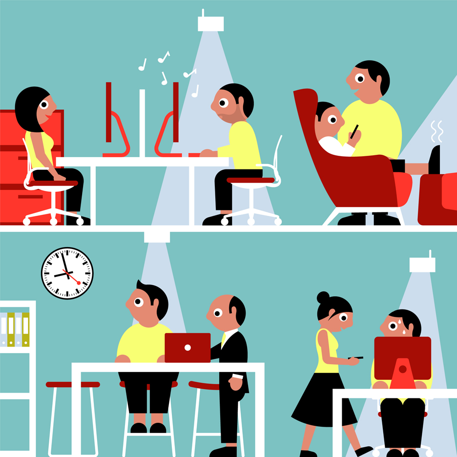
Haworth white papers: sophisticated sensors could contribute to a healthier and happier workforce by tracking the way offices are used and adjusting them automatically, according to new research by US furniture giant Haworth. (more…)
Haworth white papers: sophisticated sensors could contribute to a healthier and happier workforce by tracking the way offices are used and adjusting them automatically, according to new research by US furniture giant Haworth. (more…)

From the architect. The project B5 Boulogne is part of the urban development zone called Seguin Rives de Seine near Paris. This area was formerly home to the monumental Renault factories. As a result of the delocalization of these factories, a surface of 74 hectares has been liberated. This new area named “Macrolot B5” has been divided into seven smaller blocks distributed around a large urban garden. Seven architects were selected to design seven different buildings, organized by an urban coordinator in charge of the Macrolot B5.
White concrete, implemented in several ways, is the material connection between the buildings in the project. They are also connected through a common garden, located in the centre of the Macrolot B5. Not only is this generous garden visible from the surrounding streets through vaults in the buildings, but it also forms a generous ecological biotope providing calm and green views to the inhabitants. Additionally, most of the rain water is immediately treated on site to prevent over pouring the urban drain system. As a result of this, the Macrolot B5 works as an ecological hamlet, inviting people to meet, talk and reinforce a more environmental behaviour.
Our building is located in the centre of the site, which was the main constraint, just as a fountain in the middle of a cloister. How could the building’s position transcend this constraint ? The pillar of our design proceeds from this principle, this central position, providing both generous indoor spaces, and outdoor spaces by gently protecting the views brought us to this design: the Boulogne Arches.
Visible from all sides, like a sculpture set on the ground, the building evolves evenly across each facade. The arch compositions are a contemporary interpretation of the classical vocabulary of the former Renault factories, yet this second skin is not just a formal one; the arches, in fact, extend around the building fulfilling different functions, with the accent on accommodation.
Each property enjoys a private outdoor space of long balconies which are protected by this double skin.
The width of these balconies varies according to their orientation; they are narrower to the north thus maximizing illumination. However to the South, East and West the arches provide shade against natural overheating in summer.
Despite the central location of the building the second skin also provides privacy, by preventing visibility of the interior from the outside.
Moreover, the housing is multi-oriented, thus benefiting from natural light and solar energy throughout the day. Finally, social housing is reinvented here thanks to the unique appearance of the structure, offering 33 social housing units in an encased building, a finely designed central piece of Macrolot B5, Boulogne.

This guest post is by Kate Hood. DuPont’s new Corian® and Zodiaq® color palettes of are a fresh fusion of modern sensibility and timeless style. These 16 colors and patterns create exciting possibilities for any aesthetic, whether that means complimenting a room’s design or serving as the focal point. The collection includes: Deep blues, ranging from midnight skies to sparkling seascapes Earthy greens and browns with a refined take on..

Denpassar Residence is a private residence design by Atelier Cosmas Gozali. It is located in Jakarta, Indonesia. Denpassar Residence by Atelier Cosmas Gozali: “The concept of this residence is the combination of Traditional Javanese house with a modern look. The combination of the terrace, courtyard, pool and landscaping come together and make this residence as an oasis in the middle of the dense areas with the high rise buildings. The..

Built in the early days of airline travel, the TWA Terminal is a concrete symbol of the rapid technological transformations which were fueled by the outset of the Second World War. Eero Saarinen sought to capture the sensation of flight in all aspects of the building, from a fluid and open interior, to the wing-like concrete shell of the roof. At TWA’s behest, Saarinen designed more than a functional terminal; he designed a monument to the airline and to aviation itself.
This AD Classic features a series of exclusive images by Cameron Blaylock, photographed in May 2016. Blaylock used a Contax camera and Zeiss lenses with Rollei black and white film to reflect camera technology of the 1960s.
Though airplanes had existed since the early 1900’s, it was not until after the Second World War that commercial air travel started to become commonplace. Trans World Airlines was a key player in this development: by allowing customers to purchase flights in discounted packages and offering extended payment plans, the airline took an expensive luxury option and made it accessible to America’s burgeoning middle class. In some cases, their price reductions made travel by airplane cheaper than that by train.[1]
With air travel on the rise, the Port of New York Authority instituted a plan to expand Idlewild Airport (today’s John F. Kennedy Airport) in 1954. The plan, which would allow the airport to handle the massively increased air traffic in and out of New York City, called for each major airline to design, construct, and operate its own independent terminal, a scheme dubbed “Terminal City.” This arrangement was made at the urging of the airlines themselves, who saw it as an opportunity to forge lasting brand identities for themselves in the new terminals they would build – regardless of the spatial and aesthetic disarray it would ultimately foment.[2]
TWA approached Eero Saarinen with the project in 1955. Tellingly, the decision was made by the artistic director of the public relations department – a clear sign of the terminal’s role in advertising the airline. This mandate was even made official in the company’s project commission, which called for efficient ground operations infrastructure that would “provide TWA with advertising, publicity and attention.”[3] Saarinen took the airline’s emphasis on public attention to heart from the beginning, capitalizing on a site that sat at the apex of the airport’s main access road.[4]
With the site chosen, Saarinen began to develop a design that would take full advantage of its prominence within Idlewild. He ultimately proposed a symmetrical arrangement of four curved, concrete shell roof segments, the curves of which flowed seamlessly from the piers that supported them. Each of the four roof structures was separated from its neighbors by narrow skylights, with a circular pendant occupying the centerpoint in which all four meet.[5]
Precisely where Saarinen found inspiration for the form of the terminal remains a matter of speculation. In keeping with the building’s role as the architectural face of TWA, many have noted its resemblance to bird or an airplane in flight; the dynamic upturn of its roof line certainly seems to suggest as much. There is, however, an apocryphal story that suggests Saarinen’s true inspiration was found not in aviation, but in the hollowed-out rind of a grapefruit he pressed down in the middle. Whether the story is true or not, Saarinen never claimed that his design was meant to represent anything physical; it was, he insisted, an abstraction of the idea of flight itself.[6]
The fluidity of the terminal’s exterior was carried faithfully through its interior, as well. The vaulting of the roof shell allowed for a spacious and free-flowing interior layout, almost entirely devoid of spatial boundaries. Every element, whether structural or circulatory, was carried out in this fashion; staircases all curved, and even the columns supporting upper walkways were seamlessly melded into both the ground and the ceilings. Visitors entered the space under a cantilevered marquee, progressing from the ticketing spaces at ground level to the restaurants and meeting rooms above. A sunken waiting area offered a view of airport operations through its immense window, while; two tubular corridors led off toward the boarding gates.[7]
Even before opening to the public, the TWA Terminal attracted a great deal of attention – and not all of it positive. The press was decidedly enthusiastic about Saarinen’s design, heaping acclaim on the building’s dynamic form and fluid interior; the terminal was such a powerful symbol for the airline that even as its budget ballooned from $9 million to $15 million, TWA never enforced cutbacks on the project.[8]
However, while the general public was quite taken with TWA’s new architectural icon, the dogmatic nature of mid-century architectural practice opened Saarinen to scathing critique by some of his peers. His concrete shell, while eminently expressive, was structurally inefficient and required a great deal of hidden steel support; more damning, however, was the architect’s association with corporations and government institutions. He was derided by critics for tailoring his architectural style to the job, instead of tailoring the project to his style. The TWA Terminal, differing greatly from his previous Miesian, rectilinear works and with an interior finished in TWA’s livery of crimson and white, was seen as an unholy marriage of the architect’s two greatest perceived failings.[9]
Despite these criticisms, the TWA Terminal opened to great acclaim in 1962. Saarinen had passed away in 1961, having only seen the superstructure of the building completed. While the terminal established itself as a symbol of the jet age, it was ironically ill-suited to servicing jet airliners; its design was largely completed before 1958, when the first viable jet airliners began to supplant their propeller-driven forebears.[10]
Despite upgrades, the terminal was never truly able to catch up as jet airliners grew in size and number; it eventually closed its doors in 2001, its future uncertain. Fortunately, its survival was ensured by its placement on the United States National Registers of Historic Places in 2005, and more recently by the announcement that the former terminal will be renovated to serve as an airport hotel.[11] In this guise, the TWA Terminal will continue to stand as an icon not only of flight, but of the heady postwar era in which it was conceived.
References
[1] Ringli, Kornel, and David Koralek. Designing TWA: Eero Saarinen’s Airport Terminal in New York. Zurich: Park Books AG, 2015. p47.
[2] Stoller, Ezra. The TWA Terminal. New York: Princeton Architectural Press, 1999. p2.
[3] Ringli et al, p79.
[4] Stoller, p3.
[5] Stoller, p5.
[6] Stoller, p1.
[7] Serraino, Pierluigi, Eero Saarinen, and Peter Gössel. Eero Saarinen, 1910-1961: A Structural Expressionist. Köln: Taschen, 2006. p63-64.
[8] Ringli et al, p87-88.
[9] Stoller, p5-10.
[10] Stoller, p4-9.
[11] “History & Design – TWA Flight Center Hotel.” TWA Flight Center Hotel. Accessed May 13, 2016. [access].

INTRODUCTION
In the spring of 2015 the the municipality of Voss, a municipality in western Norway, invited entrepreneurs and architects to participate in tenders for a pedestrian bridge over the river Vosso. The bridge was to replace a historic bridge, which had been taken by a flood in the river the previous year. The team of IKM Steel & Facade, SK Langeland and Rintala Eggertsson Architects won the competition with a steel lattice bridge in cor-ten steel and wooden floors, walls and ceilings in wood.
It was an important for the client to provide the pedestrians with enough visibility to the powerful nature in the area. The river is also a good fishing river, which has proved to be a source of recreation for the local population where the old bridge was an important a basecamp of activities. This was something the municipality wanted to incorporate in the design of the new bridge.
DESIGN
The design of the new bridge was generated by the idea of a rhythmical play of modules crossing the river in order to break down the timeline into intervals and reduce the monotony when crossing the river. This play of modules would be based on the distance between the already existing pillars in the river, the only remains of the old bridge.
The main steel structure would form the base rhythm and the wooden structure a secondary movement, similar to what you would find in a score for percussion instruments. The two rooms on top of the pillars were therefore used to generate pauses in this otherwise regular rhythm, offering a break from the linear movement across and a possibility of more direct contact with the landscape. They were also ideal as fishing platforms as the two activities would not need to disturb each other anymore.
The old bridge which collapsed in the river flooding was a suspension bridge with a clear visual language. That clarity was an important point of departure for us in the design of the new bridge. But given the two main materials, steel and wood, it became natural to differentiate between the inside and the outside and offer the two materials different roles so to play. The steel would express the raw forces going through the bearing structure on the outside and the other would communicate sensorial information on a human scale on the inside.
MATERIALS
As it often is the case with bridges, maintenance was an important issue for the client. They were therefore very intrigued by the idea of using Cor-ten steel as a main structure and Accoya as a cladding material. That would combine strength, durability and above all no costs of maintenance over the years. They also liked the idea of covering the bridge with a roof, which would eliminate the need of snow plowing, which can be complicated issue for pedestrian bridges.

Casa Bosques is a private home located in Clearwater Bay, Hong Kong. It was designed by Original Vision in 2010. Casa Bosques by Original Vision: “Casa Bosques is indeed the ‘house in the forest’. The driveway immediately sets the tone with the forest canopy unfolding as one approaches. These mature trees are the principal feature to which every living space, both indoors and out, refer to. It is the ever-present..

This is a project for the construction of two houses in a residential neighborhood in Porto.
The lot was long, and the project was inside the lot with limited access to the main road, and a beautiful existing garden to maintain and enhance.
The program provided the maintenance of the existing house and the construction of two houses at all identical, being inhabited by members of the same family.
The solution should include individualized access to the existing house and ensure separate access to the new houses.
The building along the street ensures the privacy of access and uses.
The L layout ensures different levels of privacy, enhances the solar orientation and references each house with the garden.
The sum of several opaque volumes intersect the facade, allowing natural light in all indoor spaces, punctuating the inner fragmentation and ensuring a second level of privacy.
The program is divided along the two bodies of L shape building.
From the Central Hall, develops the body of the Rooms with the orientation West and a corridor along which are developed the bedrooms.
The living areas are opened to the garden and divided with this “baths boxes” that fit over the main volume.
This rhythm of volumes results in the second degree of privacy.
Constructively, the houses have a great simplicity of methods and finishes, with the use of American pine in floors, Frames from VITROCSA and baths coated Marble Ataíja.