AR Issues: Why Indian Architects Need More Opportunities to Build at Home


Courtesy of The Architectural Review

Courtesy of The Architectural Review

ArchDaily is continuing our partnership with The Architectural Review, bringing you short introductions to the themes of the magazine’s monthly editions. In this introduction to the May 2016 issue on Indian architecture, Editor Christine Murray highlights just some of the challenges facing the world’s second most populous country, arguing for a more respected architecture profession that will be well-equipped to solve those problems.

When I think of Indian architecture, visions of Chandigarh dance in my head. India has long been a country in which to build out dreams. But with a legacy of outsourcing design to the West, for too long it has been subject to the long-arm imposition of utopian ideas.

From Lutyens to Le Corbusier, rarely have these idealistic foreign interventions made adequate provision for the nation’s rapid urbanization and vast numbers of urban poor.


Courtesy of The Architectural Review

Courtesy of The Architectural Review

The masterplan for Delhi as a new capital city, inspired by England’s garden city movement and led by New York architect and planner Albert Mayer, was supposed to be free of slums and poverty – in fact half of the 18 million residents now live in informal settlements.

India’s incredible growth story over the past twenty years sees it vying with China to be the fastest growing major economy in the world. Proof that economic growth does not ensure prosperity for all: just 40 per cent of the country’s population has access to sanitation facilities, including pit latrines. The government of India has failed to invest in infrastructure and social housing, leaving private developers to do its work, and badly. The cities are choked, sprawling, besmirched with freshly grown orchards of mediocre constructions.

But amid the rampant building, the impulse to import architectural styles has persisted to detrimental effect. In this edition, Mumbai architect Sanjay Puri voices his outrage at cities falling victim to an international blandness that is undermining the diverse sense of place and sustainability. This impulse is not only harming the architectural fabric, but the profession itself. With 423 architecture schools, as A Srivathsan points out, the local profession is a thriving, globally networked community, but opportunities to create good buildings are not as lucrative and plentiful as they should be.


Courtesy of The Architectural Review

Courtesy of The Architectural Review

A further aggravating factor is the second-class treatment of local architects compared with international firms in India. The Guardian recently reported on revelations that international staff in the humanitarian and development sectors are paid nine times more than their Indian colleagues for the same job in the same office. The study went on to describe the effect socio-economic lines so fiercely drawn can have. It has been suggested by Srivathsan that this vast disparity in pay may also be true in architecture. I must echo Srivathsan’s call for fairer relations – India has more to offer than call centers and back-of-house.

From a London vantage point, our idea of an Indian architecture is permeated with the Modernist language of Kahn and company. But the complex architectural roots of the projects featured in this edition are more nuanced and varied. At times there is the lingering specter of the International Style, but more often there is a break with this dubious lineage in favor of regional traditions blended with a fresh outlook.


Courtesy of The Architectural Review

Courtesy of The Architectural Review

In this time of rapid growth and urban poverty, local talent must be fostered and nourished with commissions, and empowered to develop solutions to the many pressing issues, not least housing and infrastructure. To create longevity and a thriving culture beyond the boom, the government must invest in its cities – and its architects too.
http://ift.tt/1TZCrmu

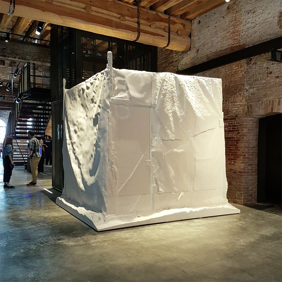
V&A features Sam Jacob’s replica refugee shelter in copying exhibition at Venice Biennale


Venice Architecture Biennale 2016: scale reproductions of Nefertiti’s bust and a shelter used by refugees in Calais’ Jungle are among the myriad replicas of cultural artefacts included in a V&A-curated show about the value of copying (+ slideshow). (more…)

http://ift.tt/22CtyCM

North Face / nodo17 group


© Pablo Cruz

© Pablo Cruz


© Pablo Cruz


© Pablo Cruz


© Pablo Cruz


© Pablo Cruz

  • Architect: nodo17 group
  • Location: 28280 El Escorial, Madrid, España
  • Design Team: Félix Toledo Lerín, Noelia Sonmolinos, Luis del Rey Cristobal
  • Partners: Manuel Pérez Romero, Jaime Tarazona Lizárraga.
  • Project Year: 2015
  • Photography: Pablo Cruz
  • Execution Director: Ignacio Delgado Conde.
  • Structure: Jofemar.
  • Facillities: A.C.H. + Euring.
  • Site Manager: Mario Arias, Javier Díaz, Javier Bravo
  • Subcontractors: Alser, Aimad, Alumifyl, Complufer, Celsius, Nadalux, Jardinería-Sostenible, Levantina, Mosso, Lumbre.

© Pablo Cruz

© Pablo Cruz

From the architect. North Face was designed as a protection wall from cold winds. It was built reusing granite masonry from a house in ruins. In the inner facade of North Face wall grows a humid landscape of climbing plants, ficus and palms trees. A south oriented solar chimney illuminates the interior landscape from above. 


© Pablo Cruz

© Pablo Cruz

Section

Section

© Pablo Cruz

© Pablo Cruz

The program is developed between the inner landscape of north face wall and the exterior landscape formed by liquidambars and cedars. The house volume is fragmented to enhance diagonal views of the exterior landscape.


© Pablo Cruz

© Pablo Cruz

The project is opened to south orientation and protected to west one, trying to minimize energy consumption. Eaves and deciduous trees allows optimal sun protection. Inner landscape works as a greenhouse during winter enhancing cross ventilation in summer. The building envelope is formed by multiple isolation layers preventing any cold bridging. An 80 cms  pipe with a total length of 300m is buried along site, working as a Canadian pipe system that allows pre-conditioned air. 


© Pablo Cruz

© Pablo Cruz

http://ift.tt/1sS4zPl

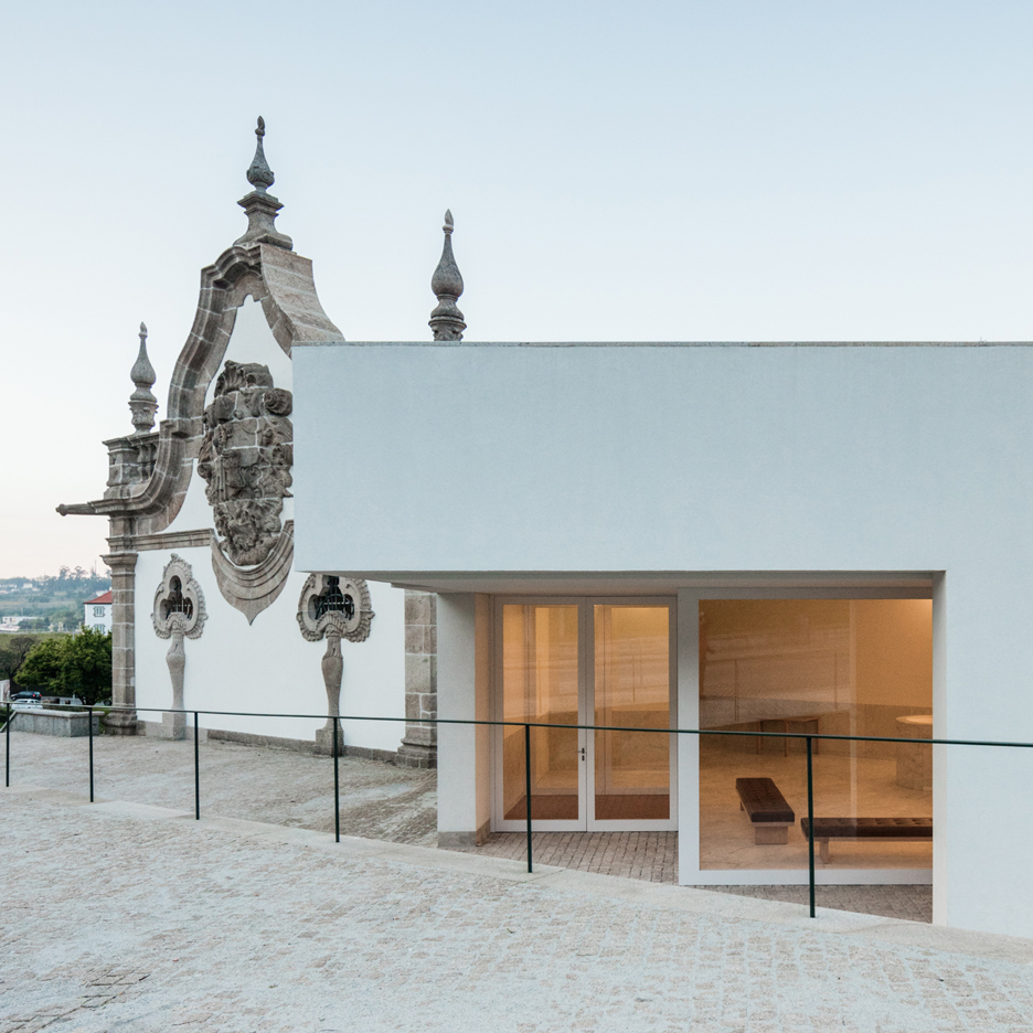
Álvaro Siza and Eduardo Souto de Moura team up for Portuguese museum project


Pritzker Prize winners Álvaro Siza Vieira and Eduardo Souto de Moura have teamed up to renovate a museum at a historic Portuguese monastery and have also added a new contemporary sculpture museum (+ slideshow). (more…)

http://ift.tt/1PqAssw

Job of the week: creative director at Squint/Opera

Dezeen Jobs architecture and design recruitment

Our job of the week on the new and improved Dezeen Jobs is for a creative director at digital animation studio Squint/Opera, whose past projects include visualisations of a flooded future London (pictured). Visit the ad for full details or browse more architecture and design opportunities on Dezeen Jobs.

http://ift.tt/1UAfBC9

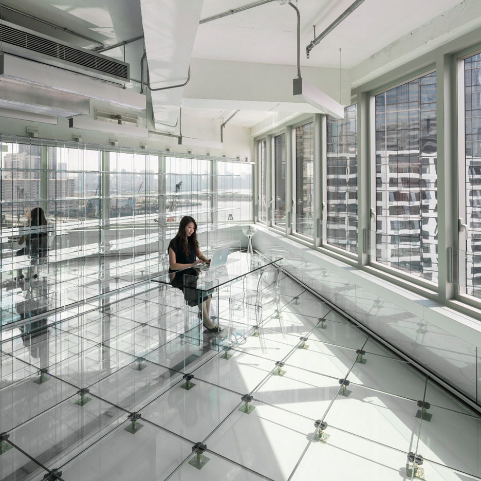
MVRDV creates transparent interior for Hong Kong office block


Transparent glass walls, floors and furniture all feature inside this office block, created by Dutch firm MVRDV in a stripped-out Hong Kong factory (+ slideshow). (more…)

http://ift.tt/1U1VBJI

Westway Architects & Stefano Pavia Architect Work Together to Create a Private Residence in Milan

RLM by Westway Architects & Stefano Pavia Architect (5)

RLM is a private residence located in Milan, Italy. It was designed by Stefano Pavia Architect & the Rome-based firm Westway Architects. RLM by Westway Architects & Stefano Pavia Architect: “A detached building, after being completely emptied out and consolidated, redesigned by a sequence of floors and walls that wind like a ribbon inside the empty space defining the rooms of the house, facing both inwards and outwards. Each floor..

More…

PTW Reveal Trio of Towers for Parramatta, Australia


New plaza view (60 and 25-storey towers by PTW Architects, 35-storey by Collins and Turner). Image Courtesy of PTW Architects

New plaza view (60 and 25-storey towers by PTW Architects, 35-storey by Collins and Turner). Image Courtesy of PTW Architects

Peddle Thorp and Walker Architects (PTW), in association with Collins and Turner and McGregor Coxall, has revealed their winning proposal in the competition to transform Parramatta’s former Cumberland Newspaper site. Selected by an independent design jury, the mixed-use scheme features three towers, each incorporating residential, commercial, retail and public spaces. The towers line the south and western edges of a new urban plaza, which opens up to a public reserve on the banks of the Parramatta River.

One of the key elements of the proposal is the maximization of the views afforded from its central position, with the Sydney CBD rising to the east, and the Blue Mountains beyond the Parramatta River to the north. Yet this focus on connectivity is not exclusively visual, passageways encourage pedestrians to walk across the plaza to the riverfront, explain the architects in a press release.


New North-South laneway (PTW Architects and Collins and Turner). Image Courtesy of PTW Architects

New North-South laneway (PTW Architects and Collins and Turner). Image Courtesy of PTW Architects

Situated at the gateway to Sydney’s second largest central business district, the new scheme had to respect several adjacent heritage sites, while delivering a programmatically dense collection of buildings. The proposal includes 964 residential apartments, which are distributed across a 60- story tower and two smaller buildings of 25 and 35 stories. The design was driven by the desire for the buildings to be recognised as both a collective as well as individual entities.

Solar access, shading and view acted as catalysts for the orientation of the masses and the articulation of the facades, with extra sensitivity taken to not overshadow or detract from the existing historical context.


Aerial view (60 and 25-storey towers by PTW Architects, 35-storey by Collins and Turner). Image Courtesy of PTW Architects

Aerial view (60 and 25-storey towers by PTW Architects, 35-storey by Collins and Turner). Image Courtesy of PTW Architects

In accordance with these principles, the tallest tower shifts in orientation in its uppermost portion, creating visual interest in the Parramatta skyline.

A cohesive material palette of masonry brick and metals unify the three towers, with architects Collins and Turner describing their medium-height building as “designed to appear from a distance as a 3-dimensional collage of woven multi-toned metallic tapestries.” The facades have an added dynamism through the colored modulation of shading devices, allowing the buildings to glisten in the sun.

“Our vision for the public domain allows the tallest residential tower to energise the new plaza directly, with the two taller towers responding to one another and the skyspace between the two creating an exciting silhouette,” said PTW Director, Siobhan McInerney, in a press release.

http://ift.tt/1X2garF

Amélia’s House / M2.senos


© Fernando Guerra | FG+SG

© Fernando Guerra | FG+SG


© Fernando Guerra | FG+SG


© Fernando Guerra | FG+SG


© Fernando Guerra | FG+SG


© Fernando Guerra | FG+SG

  • Architects: M2.senos
  • Location: 3830 Ilhavo, Portugal
  • Authors: M2.senos (Ricardo Senos, Sofia Senos)
  • Area: 183.0 sqm
  • Project Year: 2016
  • Photographs: Fernando Guerra | FG+SG
  • Engineering: Pedro Tavares
  • Builder : Licínio Lourenço Lda

© Fernando Guerra | FG+SG

© Fernando Guerra | FG+SG

This is not just another house. Those alleys were well known to us. Not that much…we used to run endlessly over there, always waiting for someone to invite us to dinner. It was always too early to end the day. And that was the house of Aunt Amelia. Built by only one man, that used to show us a smile of pride and some benevolence, the perfect stereotomy of the stone cladding. To us, that has so much to learn and fancy about building. This was not just another  house.


© Fernando Guerra | FG+SG

© Fernando Guerra | FG+SG

And yet, find out that at the bottom of the bottom of the alley, there was that land that did not fail to astonish. And the fig tree? And the church? Just there, so close! For the first time a peek beyond the alley. And that was a revelation.


Plan

Plan

Section

Section

And it was there, that we had the demanding task of enlarging the house. That house, built   in time and with time. That house with terraces, outbuildings, stairs…, all connected…, workrooms, concrete sinks. All in a tiny space. It was an alley inside the alley, over the gradation of the exterior spaces.


© Fernando Guerra | FG+SG

© Fernando Guerra | FG+SG

© Fernando Guerra | FG+SG

© Fernando Guerra | FG+SG

And each one of the spaces had its own autonomy,  always adjusting to a domestic scale,    for which contributes, undoubtedly, the presence of gabled roofs and fragmentary volumetric composition.


© Fernando Guerra | FG+SG

© Fernando Guerra | FG+SG

Just keep going. Everything seems so natural. One more house, another volume, two more rooms. The vertex facing the church cut it – we want to look at her; on the backside of the house a fig tree imposes the limit and invites the pool. The connection to the pre-existing constructions it would be of course through terraces. This piece it is autonomous, with one floor and flat roof,   witch trough a more organic design also resolve the connection between the house and the new garage area and the covered outdoor space, delimiting the lot. At South, dematerialized up its presence through the large mirror window in which the green garden is  reflected.


© Fernando Guerra | FG+SG

© Fernando Guerra | FG+SG

The interior is quite simple: almost only a kitchen with a nice dining area, controlling the ceiling height, the volume of the room is suspended on the roof pitch, wich is accessible via a terrace or a staircase in black iron, is a scenic presence to counteract the clear tones of the  interior. The dark color of the outside complemented by the use of flat tile, is another chapter in the history of the house, made of grey and white volumes, that at the same is looking for some abstraction in volumetric addition, balancing the composition.


© Fernando Guerra | FG+SG

© Fernando Guerra | FG+SG

http://ift.tt/22C0mMq

Studio ro+ca Design a Small but Stylish Apartment in Rio de Janeiro