Situated in the increasingly crowded gated community at West Jakarta, Indonesia, the 110 sqm design architecture office “RAW architecture” occupies a 150 sqm in 375 sqm plot of land and built at the periphery and inside main house’s garage. Reflected by its name, RAW architecture office, the finishes is bare and using natural material. Size-wise it is extremely efficient, and relatively small, but its dotted exposed plywood facade combined with exposed concrete, black painted wall gives it a distinctive look yet privacy from outside the gated neighbourhood.
Detail
The office is divided by 2 main structure located at the garden and the garage of the existing house. The first structure is meeting space which made by plywood structure located at outdoor The office has one meeting room dedicated for OMAH library, which is made by plywood which housed all of the architecture books, OMAH is community based library and sometimes is used for hosting architecture talks and discussion. OMAH is made by plywood forming an arch as its geometry, This 2.4 m wide span arch pavillion is made entirely from prefabricated plywood. The fabricated system is designed to be built within 2 weeks accommodating efficiency, affordability, movability as temporary structure.
The second structure is working space located at the garage of the main existing house. The office space is designed based on efficiency to create intimate feeling for designers working on intense architecture projects. The working space has no receiving area, no permanent wall. A simple foyer and a big openingwith generous footwear storage- guests are to take off and store theirs there before entering-precede the lounging area. After the entrance, the separation between technical and designer also takes some importance its final layout is the result of few adjustments based on the designer and technical’s domestic habits. The only enclosed space in the first story is administration room study, which doubles as a office storage. The second story mezanine area is more private spaces to store vast material library, and some drinks for chill out time.
Section
RAW has been arranging summer architecture fellowship program which invites 50 people per year in South East Asia to be trainee, learning skill of programming, designing space, and more is to understand the local craftsmanship available developed in the office.
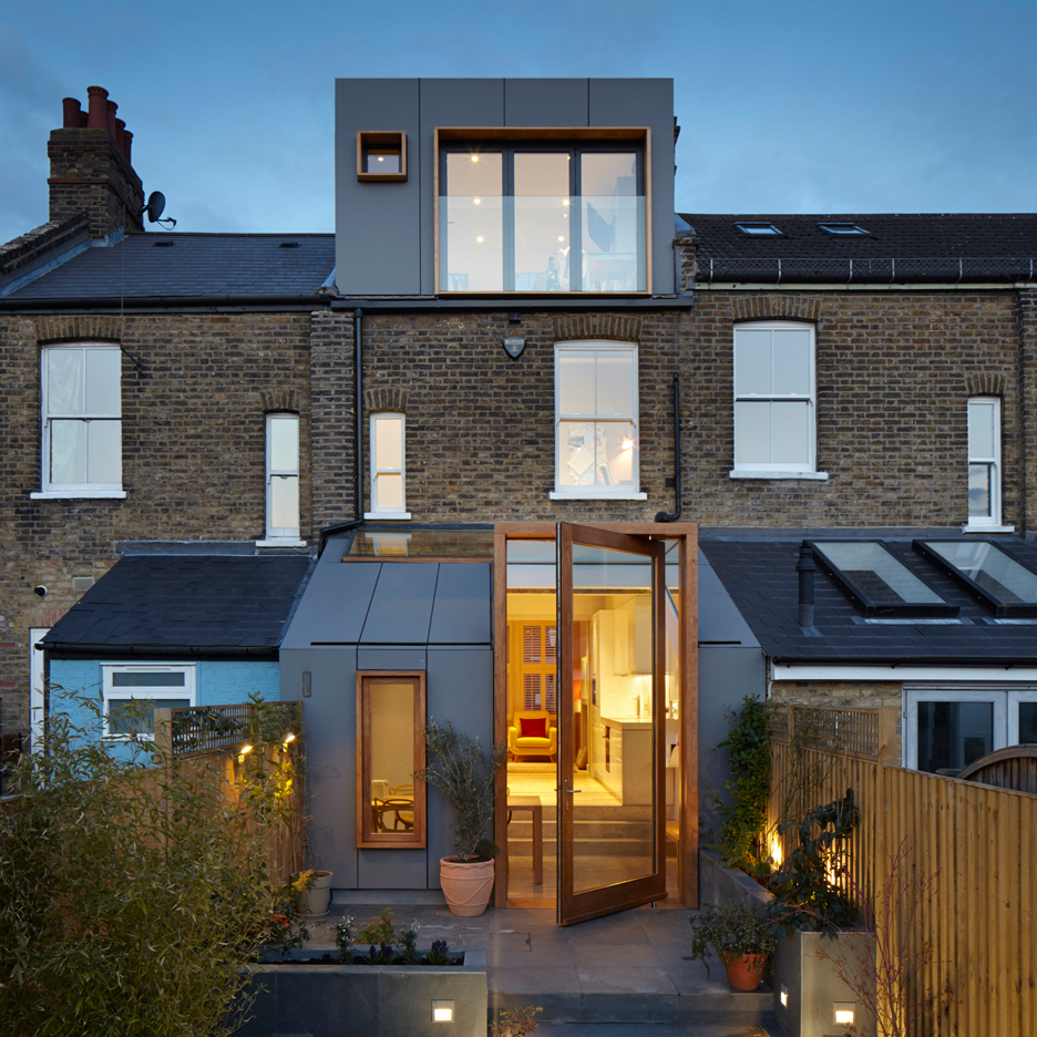
A three-metre-high pivoting glass door protrudes from the sloping roof of this London house extension, which is clad in fibre-cement panels to match a refurbished dormer window (+ slideshow). (more…)
Following a competition that received 286 entries from 26 of the 32 states of Mexico, 31 proposals have been selected to be presented at the Mexican Pavilion at the 2016 Venice Biennale. Narrating the “deep history of social participation in Mexico,” the exhibit, “Unfoldings and Assemblages,” will feature “architectures assembled from fragments, modules, relations, stories, tactics, technologies and construction strategies.” The exhibit will focus on work and experiences that can change, propagate and adapt, rather than closed systems or final products.
The pavilion is built around a principal axis of historic manuals. The manuals, and the work connected to them, shifts the focus from architecture’s common perception of unique authors and stand-alone works. These manuals provide the knowledge for self-determination, allowing communities to build their own environments and asking what modern instruments or technologies can further bring the public into architecture.
The exhibition pavilion itself is built using the same principles of assemblage and dissemination. Using a repeating system of large structural modules and a textured honeycomb structure – all of which are made stable with rigidly flexed plywood panels – the pavilion exhibits notions of adaptability and resilience.
Every component of the pavilion can be disassembled, collapsed of folded for easy transportation and storage. Each module is divided in three pieces, reducing the transportation volume by over 80%.
Two large walls hold each module, acting as storage spaces for all transit and packing materials, both for the pavilion and furniture, and all the exhibit boxes. The storage space is accessed through the outside walls by means of removable panels, leaving the inside walls free to display prints, photographs or other artwork.
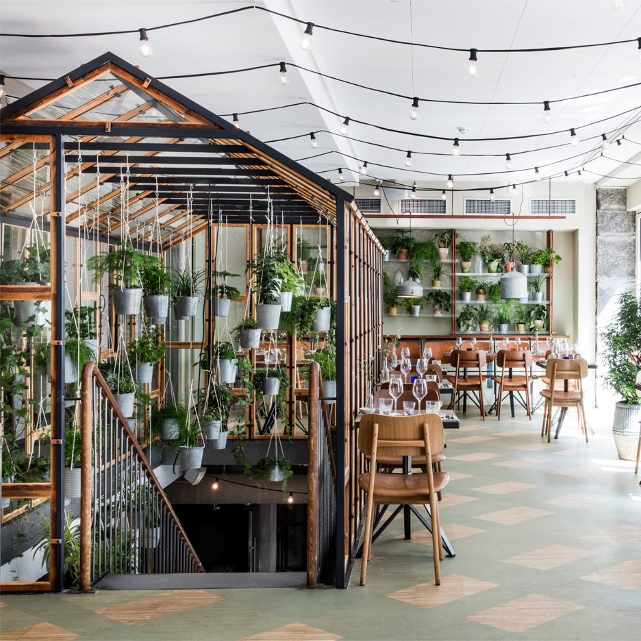
The centrepiece of this garden-inspired Nordic restaurant in Copenhagen is an indoor greenhouse that Danish design studio Genbyg has created using recycled materials (+ slideshow). (more…)
Located in São Paulo, this barbershop shows its minimalistic prerogative since the very first look at the façade. Straight lines and neutral materials compose the design and empathize its most important element, the inclined roof.
Section
The inclination, heritage of the previous structure, creates the shape of the iron and glass entrance door on the facade which allows to have a glimpse of the interior even from outside. The extrusion of this shape, clad in white squared tiles, creates the interior volume if the shop.
Still on the exterior, the classic barbershop pole, receives the black and white colors, recurrent in the visual branding, both on the door logo and in other elements inside.
The same squared tiles on the inside turns into dimension unit, characterizing the whole project. It makes the bar counter, the spacing between work stations, mirrors, wall niches, even the ceiling lights are modeled inside the grid that structure the space.
This material contraposes to the opposite wall and part of the ceiling, made in light carpentry, helping make the space cozy, and join themselves in a lighting plaster molding. The gray floor unites all the working area to the more private, blending the ensamble. The bottom of the building, in a different height, is reached with a monolithic white marble stair.
Plan
The reception desk, together with the bar, welcomes costumers in a cozy environment, protected by the door´s wired glass, which gives privacy to the space, decorated with vintage furniture.
In the working area, same materials as marble, wood and iron, create different elements and furniture, especially designed for this barbershop, such as the lavatories, the mirrors and the product-displaying shelf.
This shelf divides the working area from the more private one, where are host the manicures as well as all the spaces dedicated to the office, deposit and bathroom; inside it, the white tiles appear once again covering the whole perimeter up to half height and creating the washing basin, blending all the spaces with the minimalistic proposal made for this project.
In early 2016, we introduced Vardehaugen, a Norwegian office that created a series of life sized drawings of their projects in their own backyard. After publishing this exercise on our site, Spanish architect and academic Alberto T. Estévez reached out to tell us that this same exercise has been carried out at ESARQ (UIC Barcelona) for the past 10 years with second and third year architecture students. According to Estévez, the exercise “represents something irreplaceable: it brings you closer to experiencing life-sized spaces of classic works of architecture” from the Farnsworth house to José Antonio Coderch’s Casa de la Marina.
About 10 years ago I had an idea for a special teaching exercise, one that I thought would be interesting and instructive at the same time. So I started doing the practice class we’ve been talking about with architecture students in their second and third year of study at ESARQ (UIC Barcelona): the School of Architecture, which I founded 20 years ago as the first Director at the International University of Catalonia.
Now, we do the lesson every year in the Architectural Composition class that I teach, which discusses the theory and history of architecture.
I have the students reproduce 1:1 scale floor plans of works that are specially chosen for the occasion. To do this they are given the floor plans of a specific building, and after an explanation of what the exercise is about, they break up into teams and trace the layout across campus with string, tape, and chalk.
Out of all the examples that we’ve done, we’ve seen that it’s best to start with Ludwig Mies van der Rohe: first, for his obvious relevance and also because the activity should be done in one morning, something that his simplicity allows. Additionally, this way the subject matter of the courses deals with the same time period as the works that are being reconstructed.
The sequence that has worked best for us over time is: first, in the Architectural Composition 1 course (2nd year, 1st Semester), the Farnsworth House (Plano, 1946-1951), and then, in Architectural Composition 2 (2nd year, 2nd Semester), the 860-880 Lake Shore Drive Apartments (Chicago, 1949-51).
Finally, in Architectural Composition 3 (3rd year, 1st Semester), the students recreate Jose Antonio Coderch’s Marina house (Barcelona, 1952-1954), the best Spanish architect from the 50s to the 70s. This house has a very complex floor plan to recreate, but provides a highly educational experience due to the skillful details it requires. It ends up being an exciting contrast, going from Mies’ plans and then ending with the one from Coderch. The last one we also go see in person, since it’s right there in our city, Barcelona. It’s the perfect finishing touch for this activity.
This whole exercise is key to learning something basic for an architect, how to make a 1:1 scale floorplan from a drawing with a 1:100 scale, or something similar. And above all it represents something irreplaceable, what it’s like to begin to experience real life spaces. In this case, through classic works of architecture.
Actually, there’s a bit of “magic” in the gradual process of the students recreating the floor plan: they start off in an empty space, with just a piece of paper in their hands, and they end up being able to walk around a building that they’re able to imagine in its true scale. In short, it’s a good way to understand, in the most illustrative manner, the measurements and sizes of spaces by famous architects, and that are normally only seen as small drawings in books or online.
Profesor: Alberto T. Estévez Subjects: Architectural Composition (grades 2 and 3) Location: ESARQ, School of Architecture, Barcelona UIC (International University of Catalonia), Barcelona, Spain Years: 2007 to date
Governors Island is a small, pedestrian-only island to the south of Manhattan and to the west of Brooklyn. It’s just across from Red Hook, the Brooklyn neighborhood known to many a Manhattanite as the home of New York’s only Ikea. To get there, you have to take the East River Ferry—that’s the only option. No subway, no bus, no rail. But it wasn’t always that way.
Nancy Nowacek is a Red Hook-based artist whose vision, since 2012, has been to create an alternative way to reach this backyard of New York City. She has always had a close relationship with the waterfront, but many, she suggests, do not. “It’s really hard to get to the water’s edge from most points inland,” she says. “It’s not a part of the New York that the kids in my building…live in, nor many others who live a few miles away geographically, but experientially are a world away.”
via Citizen Bridge Kickstarter Campaign
Yet, when Nowacek lived in Austin, Texas, a city without access to a coastline, she noticed that people had a close association with the water. “There are signs everywhere you go that tell you what watersheds you’re in and when you’re crossing from one watershed into another.” The signage, according to Nowacek, brings people in contact with water, a vast public asset.
With a similar idea in mind, her latest project aims to bring people to the water in a more direct, physical way, via a floating bridge (it would be New York City’s first). Citizen Bridge is a community-built and crowd-funded project; Nowacek has consulted with everyone from engineers to students, yielding a total of six prototypes throughout the process. The Kickstarter campaign, which raised over $25,000 from over 500 backers, aims to get the project off the ground with an installation of a segment of the bridge.
Once completed, the full bridge would allow pedestrians to walk across Buttermilk Channel and stand in the middle of the water—as New Yorkers did over a century ago. During her research, Nowacek came across photos from the early 20th century in which the Channel was “teaming with people.” In these photos, she saw people using the water– in boats, swimming, even attending floating churches. Her goal is to effectively restore that public utility: traversing that 1,400-foot stretch should remind us that that the water is public space like any other. And it should be used.
via Citizen Bridge Kickstarter Campaign
Robert Moses, that contentious figure in New York city planning known for massive infrastructure projects like the Triboro Bridge and the Cross Bronx Expressway, similarly proposed a bridge that would connect Manhattan and Brooklyn. The Brooklyn-Battery Bridge proposal– shut down in 1939, ostensibly for reasons relating to obstruction of access to the Navy Yard– would have opened up Governors Island to six lanes of automobile traffic. Instead, the bridge was abandoned for the Brooklyn- Battery Tunnel, which passes over the northern end of Governors Island.
Nowacek believes that the fact that Moses’ bridge was never built indicates the historical importance of pedestrianism as an integral element of New York City.
What Citizen Bridge does is provide a people-oriented alternative to Moses’ highway: by the people and for the people. Moreover, Citizen Bridge is designed not to reach straight across Buttermilk Channel, but to interact with different areas and different parts of the water. It’s about experiencing the bridge and the space it opens access to, about standing in the middle of the water and taking in everything around you—and it’s about experiencing that with other people. It’s still a bridge, but not one that facilitates fast access to an endpoint. It emphasizes the route over the destination.
Music: Brooklyn director Ken Edge’s video for American musician K Flay’s FML track follows the journey of a young girl fighting an internal battle between good and evil. (more…)
Studio Farris Architects has integrated an office into a staircase made from stacked timber beams, and installed it inside a renovated barn in West Flanders, Belgium (+ slideshow). (more…)