Uniplaces Headquarters / Paralelo Zero


© Francisco Nogueira

© Francisco Nogueira


© Francisco Nogueira


© Francisco Nogueira


© Francisco Nogueira


© Francisco Nogueira

  • Design Team: Duarte Pape, Pedro Marchand, Rodrigo Rebelo de Andrade, André Cruzeiro

© Francisco Nogueira

© Francisco Nogueira

From the architect. Located in the heart of Lisbon, in the emblematic railway station of Rossio, this project was designed for Uniplaces, a young, international, dynamic company that operates in the global student housing market.


© Francisco Nogueira

© Francisco Nogueira

We stipulated two lines of action: one concerning the space occupation strategy, geared toward maximising work performance, and another concerning the space’s character, as regards its ability to represent the company’s values and culture and its integration in the surrounding architectural environment.


© Francisco Nogueira

© Francisco Nogueira

In terms of functionality of the office areas, it was our understanding that an open-space environment would best suit Uniplaces. Communication between the various company departments is enhanced by creating a work space with as few partitions as possible. A balance in the relationship between the individual and the collective is attained by creating spaces for contemplation within the open-space. Therefore, small-scale spaces are strategically distributed, be it through fixed elements, such as the library and semi-open meeting rooms, or through movable furniture, such as the small structures intended for making Skype calls.


Axonometric

Axonometric

One of the major challenges for companies of this kind (start-ups) is the exponential and sudden spurt in headcount. For this reason, the space’s evolution-friendly structure and the ability of certain functional areas to adapt to different programmes (leisure versus work space) were a fundamental aspect in the project’s design.


© Francisco Nogueira

© Francisco Nogueira

Plan 1

Plan 1

© Francisco Nogueira

© Francisco Nogueira

We also took into consideration that this office would be serving itinerant employees. Work space is not limited to a desk, but encompasses the whole of the supplementary areas intended for relaxation and leisure. The goal was to stimulate communication and interaction between employees and to make the work-day less tiring through a change in setting and the created dynamic.


© Francisco Nogueira

© Francisco Nogueira

As regards the space’s character, we propose Uniplaces’ identity be communicated through the creation of a daring environment that is both young, but above all welcoming. As a result, we created static spaces, such as the living room, greenhouse, reading corner (library), together with dynamic systems that are both innovative and challenging in the experience their use provides, such as in the horizontal extension of the mezzanine with a suspended net structure.


© Francisco Nogueira

© Francisco Nogueira

In addition, we sought to architecturally interconnect the office space with the surrounding context. The building of the Rossio railway station, where the offices are located, is one of the great examples of the neo-Manueline style. This style is strongly evocative of the great voyages of the Discoveries. Elements such as ship ropes and armillary spheres mark the facade. Drawing on that, we have used rope netting as an architectural material in various office areas. The netting, given its ephemeral character, communicates the young and dynamic environment intended.


Sections

Sections

Lastly, in order to emphasize the romanticism associated with this building, we propose a greenhouse be created at the heart of the office. This light-filled nook contextualises the stone masonry of the imposing arcs and becomes the main visual bridge to the adjacent exterior urban square. 


© Francisco Nogueira
© Francisco Nogueira

http://ift.tt/1U2WKPU

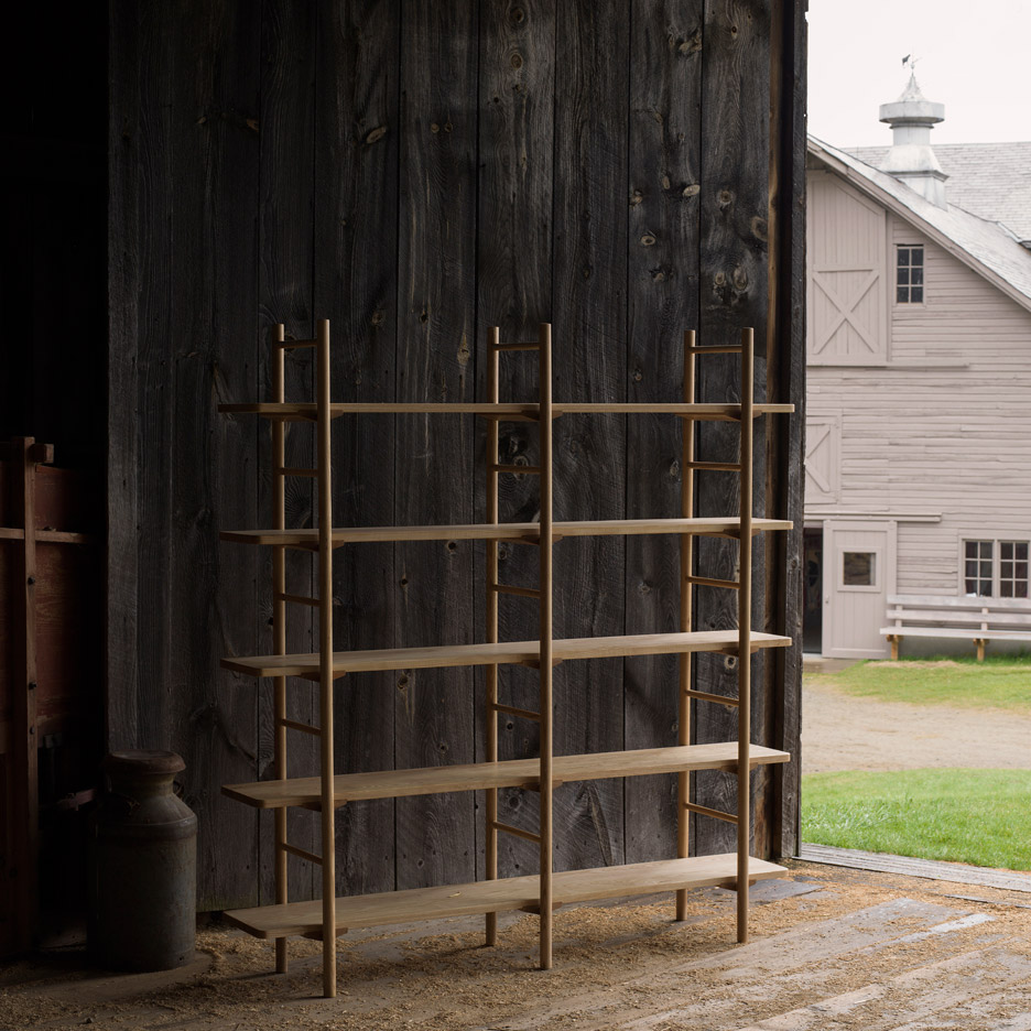
Designers reinterpret Shaker artefacts for Furnishing Utopia exhibition


New York 2016: 11 international designers and studios have produced a range of simple furniture and homeware based on the American Shaker movement (+ slideshow). (more…)

http://ift.tt/1RcqoNZ

Interior Renovation in Tokyo / frontofficetokyo


Interior Renovation in Tokyo / frontofficetokyo


Interior Renovation in Tokyo / frontofficetokyo


Interior Renovation in Tokyo / frontofficetokyo


Interior Renovation in Tokyo / frontofficetokyo

  • Architects: frontofficetokyo
  • Location: Akazaka, Minato, Tokyo 107-0052, Japan
  • Design: Koen Klinkers, Dan Yu, Will Galloway
  • Area: 50.0 sqm
  • Project Year: 2016


Plan

Plan

First built in the 1970’s the apartment was cramped by contemporary standards, even for Tokyo, with low ceilings and short and narrow rooms. After stripping the space down to a single room, the design takes a hint from the overlapping spaces in the city and is composed from three simple shapes. 


A grey wood box houses the laundry, a concrete box contains the bath and sink, while an S shaped partition forms a closet and space for the fridge. The updated space is simple but comfortable and connects to the city perfectly.


http://ift.tt/1qxzEGy

Down Size Up Size House / Carterwilliamson Architects


© Brett Boardman

© Brett Boardman


© Brett Boardman


© Brett Boardman


© Brett Boardman


© Brett Boardman

  • Landscape: Melissa Wilson
  • Landscape Architect Engineer: Cardno
  • Builder: Andrew Burton Constructions

© Brett Boardman

© Brett Boardman

From the architect. Moving from a nearby apartment, our clients wanted a modest home they could settle into and begin a family.

Natural lighting introduced to a dense and constrained site through strategically placed linear skylight, provides ample natural lighting and a playful shadow that shifts with the day.


© Brett Boardman

© Brett Boardman

Materially this project benefits from a robust and complimentarily palette. Reclaimed bricks provide a textured backdrop for matt black joinery. Overhead cabinets hover off the wall, with lighting placed to dramatise the brickworks colour, texture, and rhythm.

A sensitively placed Japanese Maple fills the tile lined courtyard addressing the main living area, bathroom, bedroom, and elevated deck. A window seat here provides for a contemplative reading space.


Ground Floor Plan

Ground Floor Plan

1st Floor Plan

1st Floor Plan

Carved within the existing roof, lined completely in black mosaic tiles, a deck off the master bedroom creates a private space with glimpses of water views, while allowing the tight bedroom to visually extend.

A small, but well planned garden is embraced through sliding doors that pull outside the building.


© Brett Boardman

© Brett Boardman

O’Leary House is an example of project with a constrained site, built on a tight budget, going beyond it’s confines to delver a well considered project with a robust and balanced material palette.

Uses structure to dramatic effect,with the thin skylight blades adding a rhythm to the space.


© Brett Boardman

© Brett Boardman

Demonstrates how robust materials usually seen on the exterior like reclaimed brick, and concrete can be used to create a warm and inviting interior.

O’Leary House is an example of minimising material layers to include only what is necessary to craft warm, inviting, and generous spaces.


Section AA

Section AA

Section BB

Section BB

Fundamental amenity designed into the home was able to see the concept translate from an retired couple with 6 children wishing to downsize, to a young professional couple wanting to start their family.


© Brett Boardman

© Brett Boardman

The single living space has been designed to allow different moments. Island bench and skylight help delineate space, while the deep timber door threshold forms a soft and warm transition to the garden.

Our clients now enjoy a home flexible enough to allow for their family to grow, without creating excessive rooms.

http://ift.tt/1WF8R9O

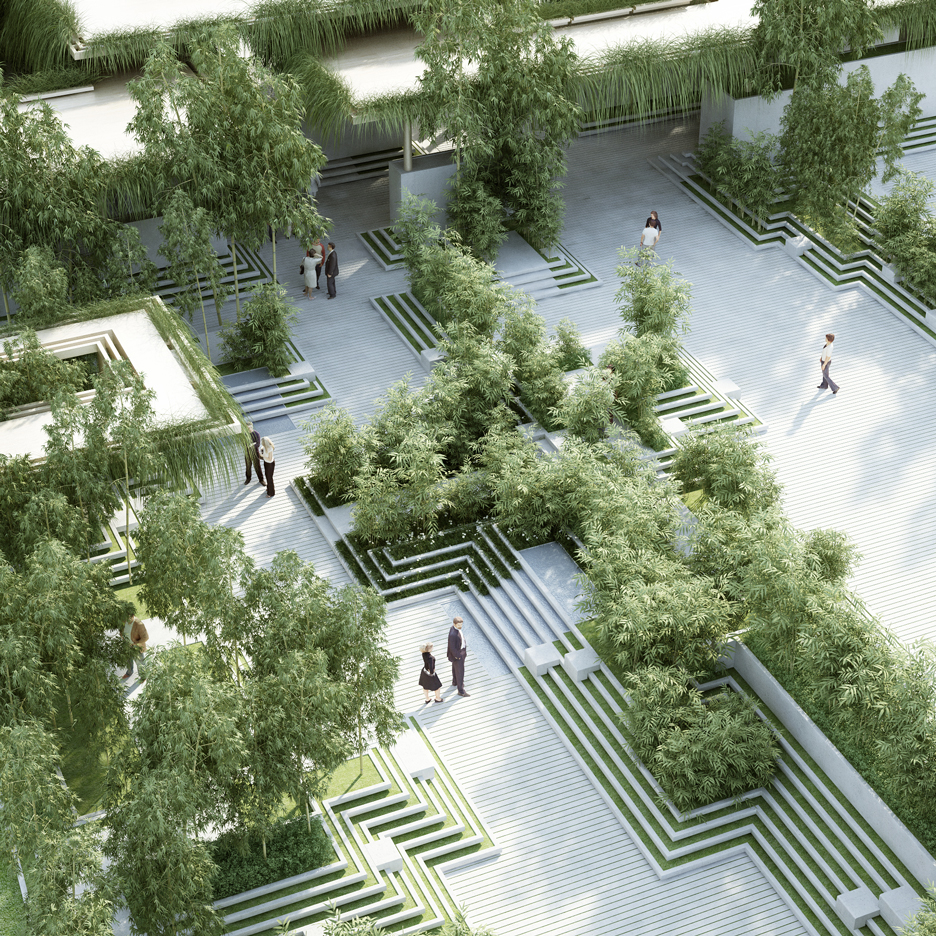
Penda combines stepwells with water mazes for Indian garden design


The design features of Indian stepwells and water mazes are combined in this proposal for a landscaped garden by architecture studio Penda (+ slideshow). (more…)

http://ift.tt/1U3dljK

Paco’s Tacos / Technē Architecture + Interior Design


Paco’s Tacos  / Technē Architecture + Interior Design


Paco’s Tacos  / Technē Architecture + Interior Design


Paco’s Tacos  / Technē Architecture + Interior Design


Paco’s Tacos  / Technē Architecture + Interior Design


From the architect. Colourful Mexican culture characterises the new Paco’s Tacos restaurant designed by hospitality design leaders, Technē Architecture and Interior Design.

The MoVida-owned taqueria is part of Eastland Shopping Centre’s new ‘Town Square’ – Ringwood’s own open-air dual community and dining precinct.
The design brief provided to Technē call for the inclusion of the original yellow, bright and fun aesthetic established at the founding CBD store, combined with the feeling of an authentic Mexican eatery.  Influences of the revered Mexican architect Luis Barragán are evident throughout the restaurant, which is designed to feel like an open-air piazza.


The space is attractively divided by individual height large timber and reo mesh arches that play with the scale of the 200 square metre floor plan.
Banquette seating runs the length of the dining area, with different seating configurations to suit small and large parties.
Block shades of pink, blue and yellow have been used in each zone between the arches, referencing the vibrant, coloured facades commonly found in Mexican architecture.


Section

Section

Plan

Plan

“We used reo mesh and an abundance yellow in the space to tie to the original Paco’s Tacos site, but we have brought in an overtone of softness with the pink and blue,” says Jonny Mitchell, senior interior designer at Technē.
“As with all of our projects, we have collaborated closely with the client, and the design was led by the food offering and original brand,” Mitchell says.


Technē teamed up with landscape architects Ayus Bontanical for green space and planting, maximising the opportunity to create a courtyard-like ambience.
“It’s our mission to create sustainable spaces that will stand test of time, so we’ve used extremely durable materials while still making the space comfortable for patrons,” Mitchell says.
Fun touches – like a projector screening old Mexican movies – mirror the playful nature of Mexican dining.


http://ift.tt/1U3dPX6

Erber Research Center / Chiangmai Life Construction


© Create Up Co., Ltd. and Markus Roselieb

© Create Up Co., Ltd. and Markus Roselieb


© Create Up Co., Ltd. and Markus Roselieb


© Create Up Co., Ltd. and Markus Roselieb


© Create Up Co., Ltd. and Markus Roselieb


© Create Up Co., Ltd. and Markus Roselieb

  • Architects: Chiangmai Life Construction
  • Location: Klong Wan Fishery Research Station Kasetsart University, Tambon Khlong Wan, Amphoe Mueang Prachuap Khiri Khan, Chang Wat Prachuap Khiri Khan 77000, Thailand
  • Architect In Charge: Markus Roselieb & Tosapon Sittiwong of Chiangmai Life Construction Co., Ltd.
  • Area: 563.0 sqm
  • Project Year: 2014
  • Photographs: Create Up Co., Ltd. and Markus Roselieb

© Create Up Co., Ltd. and Markus Roselieb

© Create Up Co., Ltd. and Markus Roselieb

From the architect. The Erber Center, sponsored by Mr. Erich Erber, the founder of Biomin, an animal nutrition company. Biomin is partnering with Kasetsart University, Thailand’s main agricultural university, on research of how to commercially grow healthy chicken without the use of pharmaceuticals. Biomin had already sponsored and built a broiler hall at Kasetsart’s huge Kamphaengsaen Campus which covers over 5,000 acres and is situated about 200km northeast of Bangkok. This broiler hall was in the middle of fields, about 5-10 km from the main campus.


Floor Plan

Floor Plan

The brief was to design and build a facility that allowed students and visitors to study chicken rearing through the windows already provided on the broiler hall. For hygienic reasons visitors are not allowed to enter the broiler hall itself. Furthermore the facility should house a lecture hall for about 70 students, a smaller conference room for about 20 people, an office for the professors and administration as well as a kitchen and the bathrooms. All this using natural materials, i.e. bamboo and earth only. The challenge was how to adapt these materials to the functionality desired and to the aesthetic requirements of 21st century folks.


© Create Up Co., Ltd. and Markus Roselieb

© Create Up Co., Ltd. and Markus Roselieb

Chiangmai Life Construction’s concept of this 563 sqm facility is based on the lay-out of the traditional farm house with a square courtyard. A covered observation platform allows students and visitors to observe the broiler house activities without getting soaked in the rainy season. We hired a famous Thai spray artist to transform the boring looking windows into the eyes of a chicken. This platform connects on one side in a right angel to a meeting room and a lecture hall and on the other corner to an office for the researchers as well as the necessary infrastructure – kitchen and bathrooms. These two legs of the institute are connected in the front by a traditional “moon gate”.


Section BB

Section BB

This layout of a central open-air space encircled by a shady arcade with lounge like informal spaces which again is surrounded by rooms filled with activity not only refers back to the roots of agricultural life but also immediately creates an intimate space conducive for exchanging ideas and concentrated learning in an otherwise vast open expanse of fields. This design brings traditional agricultural architecture to today’s students who grow up in concrete bunkers.


© Create Up Co., Ltd. and Markus Roselieb

© Create Up Co., Ltd. and Markus Roselieb

The connection to agriculture is further enhanced by the materials used – mainly earth and bamboo. The walls are made of adobe bricks which were produced on site or rammed earth and the roof is made of Borax salt-treated bamboo.


© Create Up Co., Ltd. and Markus Roselieb

© Create Up Co., Ltd. and Markus Roselieb

Roof Plan

Roof Plan

These materials create very comfortable and cool spaces, and when used correctly can last for centuries as seen in earth buildings all around the world.

They reduce the carbon footprint by an estimated 90% without any loss in modern day comfort or increased cost.

This is in line with the purpose of the building – how to enhance agricultural or architectural outputs without damaging the natural environment.


© Create Up Co., Ltd. and Markus Roselieb

© Create Up Co., Ltd. and Markus Roselieb

http://ift.tt/20cbnlI

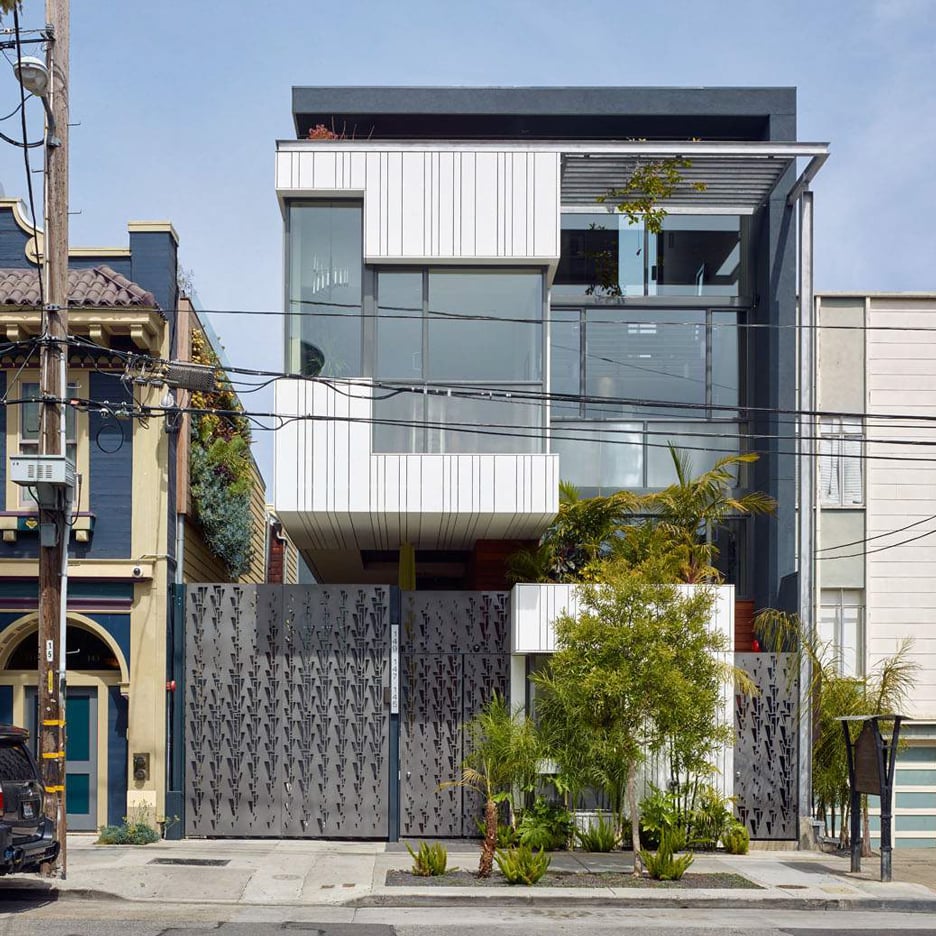
Kennerly clads San Francisco townhouse in glass and white plastic


Kennerly Architecture & Planning has completed a San Francisco residential building with a number of distinctive features, including a perforated metal gate, white plastic cladding and lush landscaping (+ slideshow). (more…)

http://ift.tt/1rXpkJn

REX Designs a Concave and Crystalline Office Building for Washington DC


Courtesy of REX

Courtesy of REX

REX has released designs for 2050 M Street, an office building in Washington DC’s Golden Triangle Business District. The 41,800 square meter (450,000 square foot) building evolves and merges two existing typologies in the US Capitol: heavy masonry or concrete buildings, with high relief facades and punched windows – in styles ranging from Beaux Arts to Neoclassical, Art Deco and Brutalist – or modern structures with taut glass envelopes, many with applied decorative treatments. To reconcile these two competing strategies, 2050 M Street provides hyper-transparent, floor to ceiling glass, without view-impeding mullions. From the exterior, the panels appear scooped or concave, establishing that an all-glass building can also have a high-relief facade befitting of the nation’s capitol.


Courtesy of REX


Courtesy of REX


Courtesy of REX


Courtesy of REX


Courtesy of REX

Courtesy of REX

Made with approximately 900 identical, insulated glass panels – 3.2 meters tall by 1.5 meters wide (11 feet six inches tall by 5 feet wide) – each curved to a 2.9 meter (9 foot 6 inch) radius, the facade yields structural efficiency that is thinner and more transparent than comparable all-glass buildings. Gaining rigidity in the compression process that forms them, the panels only need to be fixed to floor plates at the top and bottom. Adding to the illusion of weightlessness, exterior columns are set back along the building’s edges and the floor plates taper, aiding in the establishment of a “ethereal lightness of the skin,” say the architects.


Courtesy of REX

Courtesy of REX


Courtesy of REX


Courtesy of REX


Courtesy of REX


Courtesy of REX

On the exterior, the glass is treated with a subtly-reflective pyrolytic coating and the insulating cavity is coated with a high-performance, low-E coating, both of which reduce solar gain and achieve thermal performance requirements. The combined effect of the coating and curves “creates an unusual kaleidoscopic effect of repetitive transparency and reflection that simultaneously animates and dematerializes the façade,” according to the architects.


Courtesy of REX

Courtesy of REX

As a counterpose to the facade, the building’s lobby incorporates warm wood floors and ceilings, and book matched cowhides for wall panels. The effect is meant to be like that of a yacht deck, and the hides are intended to recall the use of stone patterns for ornament by Mies and other Modernists.


Courtesy of REX

Courtesy of REX

2050 M Street is set to open in 2019.  

http://ift.tt/20c4pwW

Milton Glaser designs Get Out The Vote graphic for US election

Milton Glaser's entry to Get Out the Vote, graphic design campaign for the presidential election

Graphic design legend Milton Glaser is among the designers who have created posters encouraging Americans to head to polling stations and vote in this year’s presidential election. (more…)

http://ift.tt/1W4RNJR