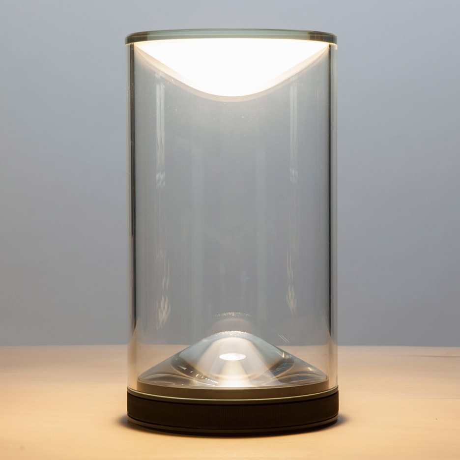
British architecture studio Foster + Partners has launched its latest light produced in collaboration with Italian manufacturer Lumina: a tabletop design that emits a gentle glow. (more…)
British architecture studio Foster + Partners has launched its latest light produced in collaboration with Italian manufacturer Lumina: a tabletop design that emits a gentle glow. (more…)

From the architect. Wuzhen is a typical ancient water town in south of China. Renovated as the venue of 2016 International Contemporary Art Exhibition, Wuzhen Beizha silk factory was built in 1970s and declined in 1990s. The factory which witnessed the development of the old town’s industry had been abandoned more than ten years. In our renovation original layouts and spatial features of the site are conformed to adapt new program.
Structure reinforcement and roof refurbishment are generally taken in the reconstruction. Some of excessive windows are blocked due to the requirement of exhibition while keeping the dents of window to indicate the history. All suspended ceilings are removed to expose the slim roof structure and provide suitable spaces for exhibition. Mottled skins of the old buildings have been kept as well. Only the tallest building is enwrapped with dark grey stretched aluminum mesh, which brings an obscure image mixed with modern and traditional features.
All exist trees are reserved and mapped in the reconstruction, specific methods are taken to handle the dialogue between trees and buildings, hence a new status which combines the buildings and the environment emerged. Three different means are adopted to integrate 3 new buildings with the old ones into wholeness.
Apposition: Building A, served as entry and small galleries, is set up along the new road with floating boxes above a pool, which echoed the water town image of Wuzhen. Meanwhile, it is enclosing the outdoor exhibition area with the old workshops.
Insertion: Building B is inserted between two 2-story buildings. The first floor is gift shop and cafe which can serves both the venue and the community. Roof platform with void for trees connects 2nd floors of both sides’ buildings and becomes the recreation and communication space during exhibition.
Connection: The second-floor circulation is established by a bridge which links building C and the old buildings. The transparent hall in the middle connects the east and the west parts of the building. In the 2nd floor of east part, a spacious indoor exhibition hall with skylights is created by folded large-span roof truss.

From the architect. We designed a house in the suburban area of North Kanto. It is a house for a young couple with two small children. As we designed this house, we realized that there is a common question that we are all (including myself) confronted with when living in a contemporary society.
Family structures, household incomes, working styles, hobbies, tastes, weather and climate are all different for different families. Most of us want to be “special” in some way and have a unique lifestyle. At the same time, we all want to be like everyone else, and be average. These thoughts seem conflicting, but it is actually quite natural to feel this way and is considered to be normal consumer psychology: we all want high quality products, but at a cheap price.
Therefore, “mass-production = prefabrication” has been an inevitable solution, and all housing manufacturers have focused on it. However, just like scholar Hideto Kishida wrote in Kenchiku-zasshi in 1947: “I hope for the development of prefabricated houses, but personally I would’t place an order for a prefabricated house”. Not even the older generation who lived right after the war thought prefabrication was a positive solution.
In this project, our main subject was “a non-mass-produced house made with mass-produced components”, and we reconsidered the way the modern housing should be in terms of the construction method.
It has been about sixty years since we started using the metric system after abolishing the Japanese measuring system. However, Shakkanho, the Japanese measuring system, is still the preferred measuring system in the construction industry, especially when constructing wooden houses. In Japan, based on one Tatami mat (3 shaku x 6 shaku), mass-produced components have been widely distributed among manufacturers and they have been prefabricated through a “conventional method” all around Japan. This has made it possible for anyone to achieve modular coordination, meaning that anyone can become an architect as long as he or she can draw a layout on a grid sheet.
By using the measuring system for our expressions – something which comes so natural for Japanese people – we wanted to obtain not only economic efficiency, but also a modular effect when it come to both design and experience.
In terms of the floor planning, 1 grid has been composed of 3 shaku x 3 shaku (910 x 910mm), and the upper floor of 6 x 8 grids, and the rooms have been assigned according to the grids. Vertically, we have set the height of the upper floor at 4 grid (=2 Tatami mat ) and kept it simple. The rafters in the ceiling are mass-produced, six-meter-long square timbers (120 x 120mm, it is usually used as pillar material ), and we have used them as they are, without cutting them. The excess parts are used as eaves. The measurements of the house is dependent on the mass-produced components, which makes it very cost efficient. In terms of expression, the vividness comes through the “physical material”. And as for the experience, the structure is based on the modular system we are all accustomed to in Japan, which also assures the nostalgic comfort factor.
Just like Michelangelo et al. used a giant order to escape the classic architectural order during the Renaissance, this is a giant Shakkanho, which replaces the traditional Shakkanho that has supported Japanese architecture. The ideal, normal state of mind that all Japanese people have been looking for has been found in a natural system they all already have access to.
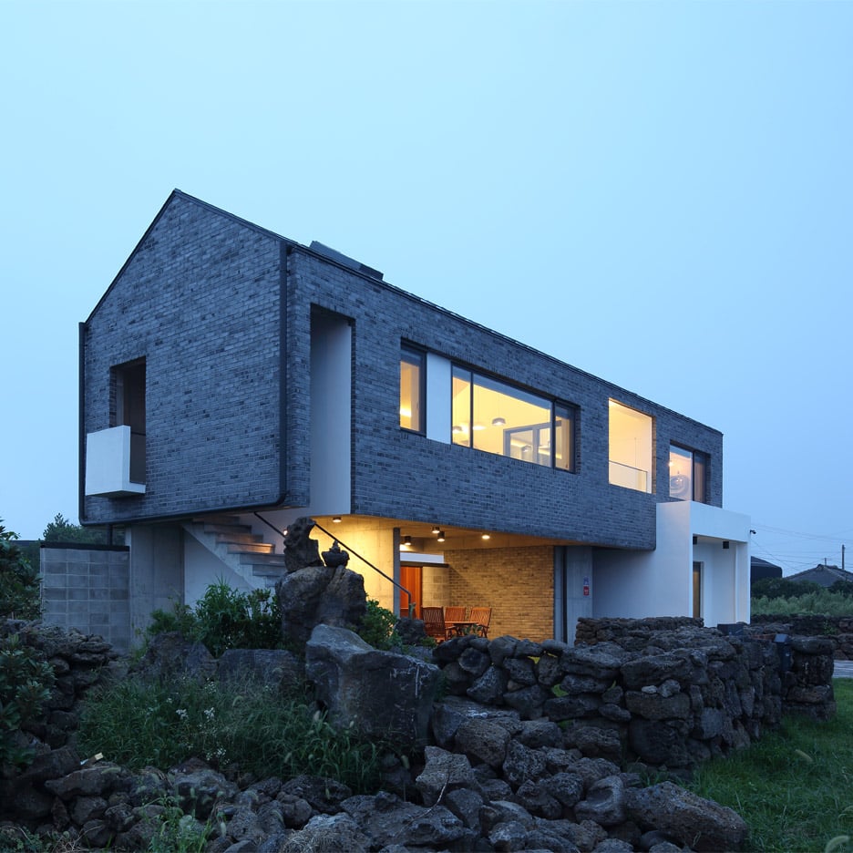
Panoramic windows puncture the grey brick walls of this guest house, designed by South Korean studio Z Lab to optimise views of Jeju island‘s picturesque coastline (+ slideshow).

From the architect. Since the owner’s family just started their new business which is “bakery catering”. So, they decided to build a new house in proximate distance which will become their sweet home and a business place. The name of this project comes from “Kanom” which means “dessert” in Thai language and the street named “Chan” where the project is located.
About 100 square was, the site location is in a high-density area of Sathorn which surrounded by houses, row houses and old buildings. Taxicabs always come in and out, because the taxicab parking space is next to the site, and this particular parking space will create privacy to this project. This particular context has become a very important role in design aspect, as it defines building massing and orientation. Anonym was requested to design based on factors, to create privacy for owner’s family. The key idea is to layer functions as well as arrange zoning vertically for public & private space separation. The whole spaces of first and second floor are dedicated as public area. There are offices and pantry where all office staffs can access. And third floor is divided into 2 living spaces for 2 families.
Then, the building massing was created. Three stories solid walls on the East and West side provides privacy to the inner room The space in-between is the inner court that allows natural light to penetrate the space inside. This is where the main staircase connects to each floor. Natural light plays a leading role in this area when it cast a shadow through the glass louvers. Anonym put full height windows on the Southern side to expand the view of a big splendid tree in the neighborhood, as well as to employ natural ventilation. At the front of the house, the architect designed a double volume balcony that creates an inviting main entrance. it is a multifunction area where the owners and office staffs can use for any special events.
Another element that is very important to the house design is various materials application, such as glasses, black steel frames and white plaster walls. The contrast of contexts makes the house stand out from the neighborhood and has become a widely noticed building in this area.
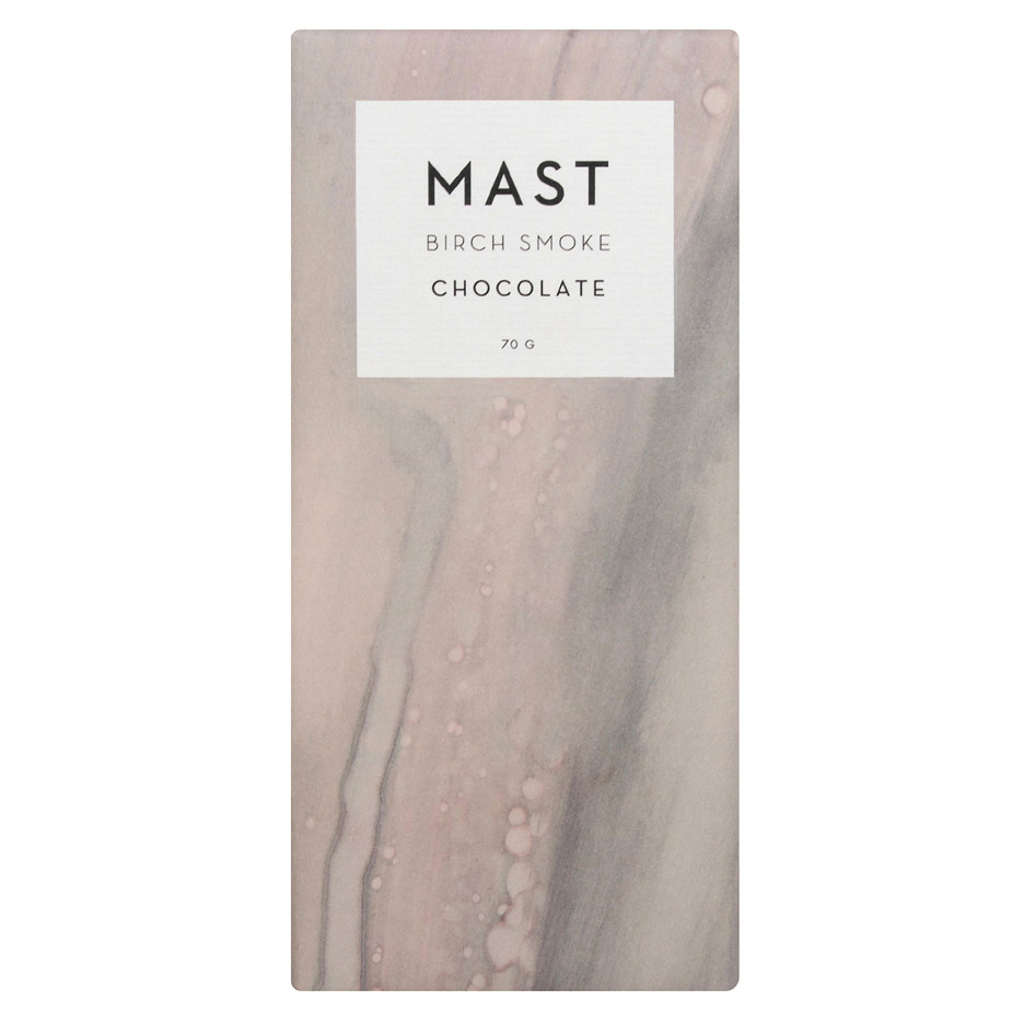
New York 2016: Brooklyn company Calico Wallpaper has used the salts in Mast Brothers’ new chocolate range to create marbled packaging for the bars (+ slideshow). (more…)
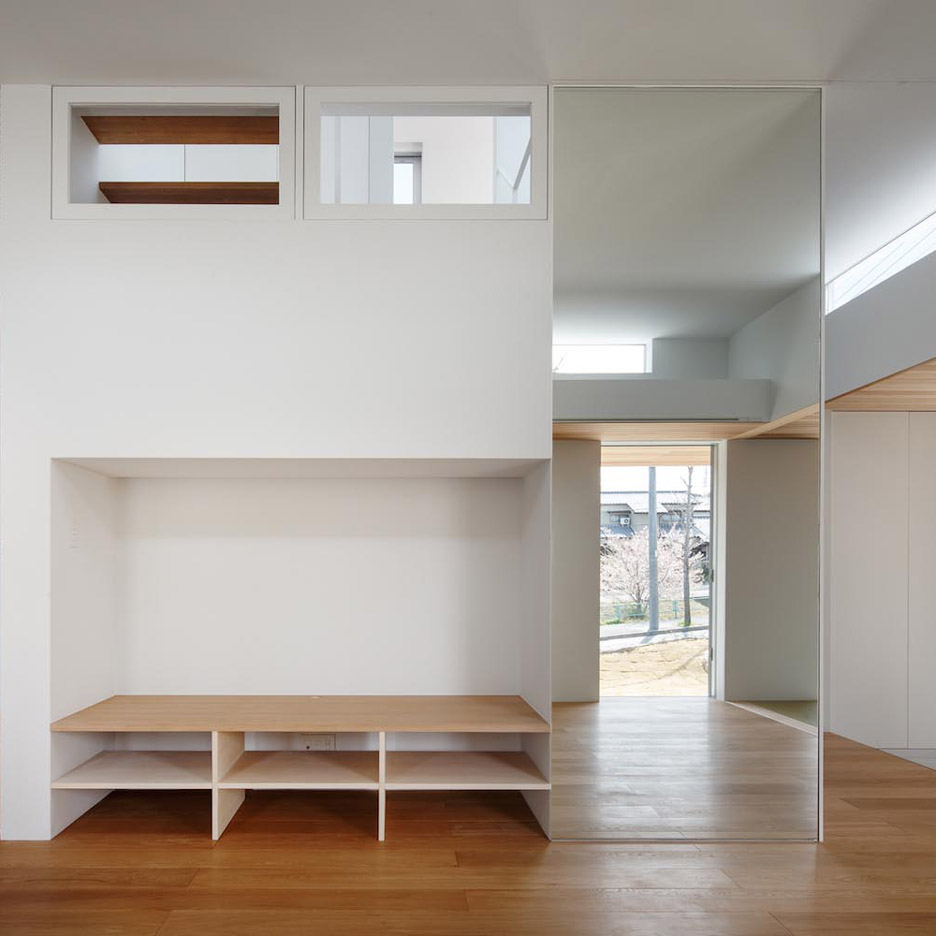
This house in Japan features bright white walls and mirrored surfaces inside and out to make the most of the surrounding greenery and natural light (+ slideshow). (more…)

Description
Located on the scenic drive along Tasmania’s East Coat, the new Devil’s Corner Cellar Door and Lookout sits within one of Tasmania’s largest vineyards, with a panoramic view over the Freycinet Peninsula. Reopened in December 2015, this project for Brown Brothers seeks to amplify the experience of this iconic view to create a new tourism experience on the East Coast of Tasmania.
Originally a small demountable building, the Cellar Door has been extended and expanded, paired with a lookout and complimentary food experiences, providing a backdrop for seasonal events. The Cellar Door and Lookout were designed as a loose collection of timber clad buildings that, through similar aesthetic and material treatment, form a modern interpretation of traditional farm / rural settlement that gather over time.
The Cellar Door & food market have been collected around a courtyard space which allows shelter and respite from the surrounding environment, while allowing views through the tasting space to the Hazards beyond and access to open deck spaces. Through the careful placement of a series of timber clad shipping containers, visitors are invited to visually explore the landscape within and around the vineyard through curated framed views.
The lookout element is a critical component of the design, not only in providing a visual signifier for the settlement but also as a way of interpreting the landscape from which the Devil’s Corner wines originate. In the same way that an appreciation of wine can be gained through understanding its subtleties and varying ‘in-mouth’ sensations, there are many ways landscape can be appreciated. The lookout plays with this idea. The three distinct spaces reference different and unique views of the site – firstly the SKY, then the HORIZON and lastly the TOWER which winds its way upward providing views to each of the compass points before culminating in an elevated and expansive view of the bay.
By creating a dynamic scenic lookout and providing associated facilities, visitors are drawn to the new upgraded cellar door for the Devil’s Corner wine label.
Material Summary
Steel was an ideal material for the project as it allowed for a large amount of structure to be prefabricated off-site, providing timing and logistics advantages for the remote location. The underlying structure of the buildings and tower for the Devil’s Corner is made from repurposed and adapted shipping containers, chosen not only because of their easily transportable modular size, but also because of their structural integrity and steel’s inherent flexibility and ability to be modified. A total of 10 containers have been used – 5 in the lookout and 5 in the market area.
The integral strength of the containers made them a perfect choice in the construction of the lookout in particular, enabling the structure of the building to be delivered to site and erected quickly. Each container has been modified in various ways – the cranked ‘sky’ lookout cut from two parts of a container and reassembled; the ‘horizon’ lookout which is able to bridge between land and the ‘tower’ despite one side being cut out; and the ‘tower’ lookout constructed from two containers end on end, inside of which a steel plate stair winds its way up past projecting landings on each side. These landings provide views over the landscape as the viewer moves up the tower; the black steel box frames fixed to the container and cantilevering over the vineyard.
Craned into position in parts, the lookout’s structural integrity relies on all of the pieces locking in together. The design deliberately reverses the typical aesthetic treatment of steel. Rather than cladding the building in steel, it has been expressed internally, revealing the raw, industrial nature of the construction and hinting at the industrial underpinning of the production process. The external timber cladding (which acts as an visual screen only) plays on the rural / agricultural qualities of the site, with the internal steel skin being revealed in a consistent manner through the expression of each of the openings – the apertures in the lookout and opening to the cellar door.

Researchers from the Massachusetts Institute of Technology have developed a method for 3D printing extremely fine hair-like structures, which could be used to create touch-responsive surfaces or customised paintbrushes with ultra-thin bristles (+ movie). (more…)

Louis Kahn’s Yale Center for British Art has reopened to the public after a multi-year restoration project led by Knight Architecture, LLC. The building, which began construction in 1969 and was completed after Kahn’s death in 1977, was designed to house Paul Mellon’s gift of British art to Yale University. According to the museum, “this was the most complex building conservation work undertaken at the Center to date, comprising the entire structure, from roof to basement. It renews the Center’s public galleries, internal systems, spaces, and amenities, and has provided an opportunity to reimagine and reinstall the Center’s renowned collections of more than five centuries of British art—the largest outside of the United Kingdom.”

Speaking to The Guardian about the subtlety of the intervention, the museum’s conservation assistant Mary Regan-Yttre said, “We spent a lot of money to make it look exactly the same.” The $33 million restoration made updates that were both code related and cosmetic, including the revival of finishes and materials, such as travertine floors, white oak wall panels, Belgian linen display walls, and concrete ceilings on the interior, and the matte steel and reflective glass facade. Some of the more technical building improvements relate to the mechanical and electrical systems, fire protection, telecommunications, and safety services, all of which were implemented to expand resiliency, ensure the stability of the collections environment, and enhance the patron experience. The Yale Center for British Art, one of Kahn’s last projects, is located directly across from his first major commission, the Yale University Art Gallery (1953). Sited on opposite sides of New Haven’s Chapel Street, the two structures act as bookends to the architect’s short but highly accomplished career.

AD Classics: Yale Center for British Art / Louis Kahn
//cdn.embedly.com/widgets/platform.js

