From the architect. A bungalow in Naarden built in 1967 was extended and transformed by Dick van Gameren into a contemporary villa. The visionary design led to a timeless house that reflects the personalities and needs of its owners. Previous renovations closed off the original heart of the house from the living space and entrance hall.
The renovation restores the relationship between the landscape and the house that had disappeared over the years. Sustainability also played an important role. This renovation marks the fourth version of the house. Using the existing structure as a basis, the elevations and roofs were updated.
Insulating materials were added and windows and facade elements were replaced. Removing the walls in the centre of the villa created space for a new living hall that overlooks the landscape on four sides. Two geometric roof constructions with skylights contribute to a spacious and light atmosphere. Adjacent to the living hall, a new glass pavilion extends towards the flowing stream. A fruitful collaboration with various partners ensured the sustainable ambitions of the house were fulfilled.
As part of the garden design by Michael van Gessel, felled trees from the site were stored as firewood for the ultra-efficient wood-burning stove in the kitchen.
A heat pump, solar water heating system and LED lighting address all other energy-intensive requirements such as the heating, cooling, hot water and electricity. IDing designed the timeless interior to echo the architecture.
Fishers Island House is a residential project completed by Resolution: 4 Architecture. It is located in Fishers Island, New York, USA. Fishers Island House by Resolution: 4 Architecture: “Situated on a wooded lot with views to either side of Fishers Island, this vacation home boasts all the amenities one could desire of a beach home. Built for a family that currently resides in London, this 4,469 sf home serves as..
In his recent article, Nick Axel puts forward a compelling argument for the (re)distribution of city-space according to use value: kickball trophies and absentee owners out, efficient use of space in. Distributing urban space according to use certainly makes sense. Along with unoccupied luxury condos that are nothing more than assets to the 1% and mostly empty vacation apartments, expelling (rarely accessed) back-closets to the suburbs frees more of the limited space in cities for people to actually live in.
When, however, this is stretched into a rationale for micro-apartments, the argument begins to thin. There is a big difference between arguing against large apartments, holding nothing but wealth, and arguing that 400sqft apartments (the current legal minimum) are under-used and inefficient. Axel is arguing that micro-apartments offer a design solution to urban inequality by seeing them “as a legal mechanism to distribute, through architecture and urbanism, standards of living.”
While he is perhaps right to acknowledge that for many people the current minimum floor area is “nothing more than an ideal,” lowering the standards we aspire toward will not make living conditions better and will, in reality, only legitimize more substandard-sized homes. Allotting residents apartments that are smaller than the current legal minimum may indeed allow for more of them to squeeze in, but can it really be argued that living standards are reducible to nothing more than their proximity to downtown?
The market-rate rent in the Carmel Place micro-apartments in Kips Bay—Axel’s case study—might be comparatively low for the neighborhood, but they remain more expensive than an average Manhattan studio that does meet the legal size minimum. A 302sqft apartment in the new building costs $2750, compared to a median studio rent of $2568 and an average of $2685, but the new apartments cost an astonishing $109.27 per square foot compared to an average of only $65.87. These apartments are only good deal within a very limited framework.
The premium is arguably the product of a better location, but with half of Manhattan studios being at least $200 cheaper per month, it’s difficult to believe that the extra $43.40 per square foot is a product of location alone. More likely, they are charging for something else.
Reviews of the Carmel Place apartments report that they seem remarkably spacious. According to Amy Plitt at Curbed, “The first thing you notice when you enter […] is how big it feels.” Carefully designed and compactly organized, the promotional material suggests that the minimum standard of living is facilitated by nothing more than a certain range of furniture – what the apartments lack in size, they make up for in retractable beds and expanding tables. With a couch that folds into the bed, a table that folds into the wall and expands and contracts, and a range of hidden storage units, the extra 100sqft becomes superfluous. The spaces use clever design to glamorize a sort of luxury substandard that can all too easily become a justification—or, more worryingly, a normalization—of substandard conditions for people who don’t have access to the same palliatives. The Clei-designed furniture that makes the apartment so versatile and so spacious is far beyond the price range of the vast majority of New Yorkers.
"Nuovoliola". Image Courtesy of Resource Furniture
To further mitigate the limited spaces in the apartments, Carmel Place comes equipped with shared facilities including, according to nARCHITECTS, “a gym at ground floor level, a small lounge, den, community room and public roof terrace, bicycle storage, tenant storage room and separate storage lockers dispersed throughout the building, and a small garden.” Even the marketing material acknowledges that the space afforded is inadequate—supplemental spaces are necessary to make 250sqft attractive.
What the apartments show is not the reasonability of micro-apartments as a typology, but the reasonability of living in these micro-apartments. Their cost is what provides for these additional facilities, thus their cost is what makes them habitable. In the same way that the quality of full-sized apartments depends on the quality of their context and components, the only lesson here is that even very small apartments can be well-decorated.
The ultimate difficulty with Axel’s argument is not his defense of micro-apartments – some people will surely love them. But these people are only a small portion of the population. At their best, micro-apartments might present a stopgap for well-off New Yorkers who want to live alone. What they fail to provide is a generally applicable standard of living.
Axel argues that it is “plain to see that the affordability of micro-apartments are first and foremost relative […] and so long as real estate value is at least in part determined by quantity, [he] neither see[s] their affordability going anywhere nor view[s] it as a model to be glossed over.” But even on a relative scale these micro-apartments are not affordable. Perhaps allowing micro-apartments will allow more people to live downtown, but the benefit is still unclear. If additional micro-apartments come with all of the amenities that have allowed the Carmel Place apartments to be rented at above average prices, they are also likely to be rented at higher rates. If the micro-apartments don’t come with those amenities, they will fail to provide a basic standard of living.
Good design may or may not be able to protect living standards, but we are unquestionably lowering our standards if we accept expanding tables and furniture that folds into the wall as a solution for inequality.
From the architect. From the beginning, the thinking behind the Life House was an uncompromisingly modern design where it would be possible to inhabit a different sort of architectural space. Experiments with massing and orientation have produced a composition that is bedded into the fall of the land. The proliferation of blackened gorse in the surrounding heathland is reflected in the dark exterior brickwork, whilst the rough moor grass provides a reference for the lighter bricks used inside.
The house’s programme is arranged as a series of self-contained folds, opening off two corridors. Meeting at a right angle, these passageways generate extended internal vistas and a plan designed to allow groups living in proximity to spend time together and apart, in a spatial arrangement that shares certain characteristics with the monastic cloister. The corridors — one light, one dark — represent more than just the means to get between the different parts of the house, they are key architectural experiences, each charged with its own distinctive character.
In the spirit of creating a contemporary Walden, communal and private quarters are shaped by the idea of supporting and enriching specific rituals and activities. Across the Life House this translates into optimised inventories of equipment and functional conditions, but also into a series of finely calibrated atmospheres.
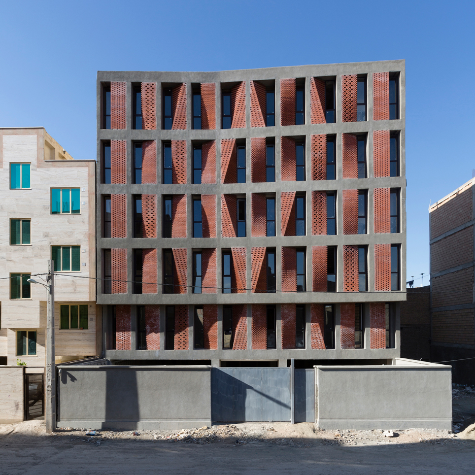
Angled screens of perforated brick provide ventilation and shade for this housing block in Tehran by CAAT Studio, providing its residents with relief from the city’s hot and dry climate (+ slideshow). (more…)
From the architect. A residential care home for 105 elderly residents has been constructed on Statteggerstraße in Graz on a park-like plot in the immediate vicinity of the Andritzbach brook.
The passive house has no basement due to the challenging ground conditions and because of its location within the Andritz flood zone. It is a composite construction and features controlled domestic ventilation. Load-bearing ceilings and walls are made of concrete while all other structural elements are wood. The façade elements, each extending across two rooms, were prefabricated, their size determined by the maximum dimensions suitable for transport.
The two-storey building consists of four wings arranged around a semi-public “village square”, designed to host various events. This is also the location of the roofed vestibule, the central nurses’ station, an oratory, a cafe, a hairdresser as well as an open, tended atrium.
Three residential areas on the ground floor and four on the top floor host one carer and 15 residents each, primarily in single rooms, thereby creating a manageable and friendly atmosphere. A large common living area for each residential group, wide loggias and zoned gardens, some of which are suitable for dementia patients, on the ground floor and atria with tower galleries on the top floor serve as additional living zones. Special attention has been paid to ensure sufficient natural light floods the entire building.
Nurses’ stations and secondary rooms are always nearby, making work processes highly efficient. Shorter and longer walks around the building with varying visual references and pleasant quiet zones ensure diverse free movement opportunities, even outside set therapy sessions.
The interweavement of the building with the outside space has been assigned particular significance. The green and open space was designed with the typology of the care home in mind and is based on a sequence of gardens which differ in size and character. The gardens also form the passage into the park bordered by the Andritzbach to the east. A particularly attractive space for recreation has been created by designing a wooden platform that juts out over the water which, together with the manifold zones of a manageable scale inside and around the building, generates a familiar yet invigorating atmosphere.
Private Apartment is a residential project designed by Normdsgn in 2015. It is located in Zaporizhia, Ukraine. Private Apartment by Normdsgn: “Entire volume of the apartment divided into private area and common area. Main task was to create open space of common area by removing non-load bearing walls. Thus, we were able to place open kitchen, dining and TV zone. To create warm ambience we chose pale yellow as a..
From the architect. From design to completion, it took only a short period of two months for this less than 60 square meters’ Chimney Café, which open up in a light gesture in the courtyard of SPSI Art Museum. Passers-by from the sidewalk of Jinzhu Road could vaguely see the cafe and bamboo courtyard space through a semipermeable steel mesh wall.
A secret door opens in Art Museum’s iconic stainless steel mesh wall, but it does not obtrusive. From the material, detail to lighting, the café’s design seeks to coordinate with the overall surface of this Museum.
1st Floor Plan
Although the courtyard space itself is very narrow, only five meters at its widest point, it still creates a rich and interesting spatial sequence. A dynamic arc wall guide people to the entrance through an interesting winding path; and then to find the other side of the arc wall is where to enjoy coffee. The patios decorated with bamboo are bright and vivid. Two patios in subtle angles to each other conform to stencil wall’s trend, leading guests to another relatively private coffee space.
Application of anodized aluminum expands the space sense of courtyard; the slightly blurred mirror effect gives people a hazy unreal visual experience, just as drinking a cup of good coffee.
Section
The interior white walls create the most favorable conditions for small exhibitions and art salons. And lighting bands following the arc walls undoubtedly strengthened the sense of movement of the wall, so that the space is full of dynamic effect.
This small cafe effort to create a space of its own character and overcome all constraints at the same time: soft but no lack of tension, natural and full of fun.
S+H HOUSE 2 is the client’s second house, a second opportunity to create a new work with ideas and concept like never before and design which differs from the previous one.
The house is located inside a residence and the site is on a rectangle space with 12x26m in size. The front side faces west which has the residence’s park.
Plan
This project requires plenty of space for the house itself and a gallery inside to display the client’s art collection. With the first thought of an area of 655m2 and only having 312m2 to work with, it becomes a challenge for the architect to succeed and present uniqueness and most importantly, comfort.
The first solution is to assemble the rooms and spaces in vertical way. Between each levels must bring a nice flow and continuity, but still having a special element that create differences. Bringing uniqueness by making a relation between walls and no-walls spaces and a bordering element to connect indoor and outdoor.
The use of split level is to create height between each level as a media for natural light and air to come in and circulate.
Section
The room process starts from the stairs to the main entrance and the front porch. The front porch is an area protected from sunlight and rain because of the overhanging plate and the kids bedroom ‘box’ above. The entrance door uses solid wood and heads towards the foyer inside that blends in with the family room. To split the foyer from the family room, a laser-cut wooden panel with traditional Chinese pattern is used.
The dining area is an open and transparent space with special design and structure to create a hanging effect between the levels above and underneath it. The dining area floor gets an effect of ‘flying’ above the swimming pool and the spaces between them is used as a media to let light and air flow to the service area below.
The first level holds the function of private space. It has the master bedroom on the back side and 2 kids bedrooms with its own bathrooms in the front.
Circulation access is continued until the highest level through a straight and long staircase that ends in the gallery with the size of 6x10m and small and effective light openings that gives a dramatic, silent and calming effects to the gallery.
Transparency brings in air and light that makes the room always looking fresh and bright. Crossed ventilation is created from glass sliding door which is easy to open and close. The air conditioner doesn’t need to be used all day for the ground level. Radiation from sunlight is blocked by the architectural shape of the house which is dynamic with voids and overhanging spaces that keeps the temperature stable. A second skin element from perforated GRC concrete will allow the house to breathe, prevent excessive heat to come inside and allow cool air to come in for a comfortable micro climate inside the house.