House U / Atelier KUKKA Architects


© Kai Nakamura

© Kai Nakamura

From the architect. This is a small house with red cedar outer walls, for a couple, located in Tokyo, Japan. It was built to the end of a street (extending 150m over 3blocks) with an impressive cherry tree, in a quiet residential area slightly away from the city center.

The site was a small one in the dense residential areas. It surrounded by houses on three sides, with loopholes of light and wind coming from  diagonal directions.

Owner requested an impressive form of the house, like an objet heading to the street. They also wanted to feel a presence of the cherry tree while in the room, but didn’t need a large window capable of peeking from the outside.

For that requests and a purpose of introducing light and wind, based on a rectangular arrangement, I made a design that cut a southwest corner of the house, arranging a garden. and designed two windows ; a dent window and a bay window.

The small dent window of the work room (2nd floor) faces the cherry tree and the street. In Japanese summer, afternoon sun raises the temperature of rooms highly. So the small window has a function not only avoiding peeking but also keeping the room cool. Converging walls toward the window have an effect to show the window larger than the actual, so contribute to the general impression of the house as like an objet. 

The big bay window on a southwest diagonal  wall,  has a function to enter the sunlight from the south without reducing interior space, at the same time avoids to seen directly from the street. In the future, we can expect a blindfold by trees in the garden visible through the window.

I wanted to create a woody warm impression of the house where the indoor light spilling from windows. As a result, the house shows an impressive facade consists of two elevations, each has a contrasting window. It looks like a woody objet.

To avoid the flat ceiling space of the ground floor, I designed different ceiling heights by putting a step at the second floor. A small rise at the second floor can be used as a chair and put the floor an accent. On the other hands I planned a dining kitchen with a void it took light from 2nd floor terrace at southeast corner.

I arranged a space with no partition spirally around the dark blue accent wall (serving as a construction wall); a living room with a bay window, a dining kitchen with a void, a Japanese-style room (bed room), and a work room on the small rise. They make various whereabouts and constitute the space of gradual upward spiral form. By the void and the step, I made the space feel wider than the actual area.
http://ift.tt/1N0XNQJ

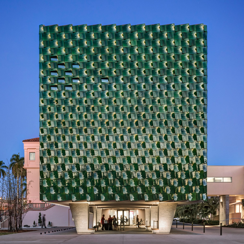
Machado Silvetti clads Florida museum extension in over 3,000 green ceramic tiles


US firm Machado Silvetti has used jade-coloured terracotta tiles to sheath an extension to an Asian art centre on a museum campus in Florida (+ slideshow). (more…)

http://ift.tt/1NUMFQn

Shenzhen VC-PE Tower / Studio Georges Hung


  • Architects: Studio Georges Hung
  • Location: Nanshan, Shenzhen, Guangdong, China
  • Design Team: Dalva Dong, Ryan Vilennia
  • Area: 90000.0 sqm
  • Project Year: 2015
  • Executive Architects/Engineers: Huazhu Architectural & Engineering Company Ltd.-Shenzhen
  • Design Principal: Georges Hung Architecte D.P.L.G.
  • Client: Shenzhen Science, Industry, Trade and Information Technology Commission

The VC&PE Tower, by Studio Georges Hung-HK ( formerly AtelierBlur –HK ) for the concept design stage and Huazhu Architectural & Engineering Design Company Ltd-Shenzhen for statutory submissions and technical stages, creates a new perspective on the city of Shenzhen. It forms the most visually distinctive landmark tower within the Nanshan district, a newly developing entrepreneurial zone.  It acknowledges the city’s past, its cultural heritage, while projecting its future.  It defines a gateway between the past and present, between Binhai Road, one of the major east-west artery linking Shenzhen and its western corridors, and the newly planned road, Keyuan road. Standing at standing at 190 meters high, the VC-PE tower is situated within the overall master plan forming a clear and coordinated office park district dedicated to supporting start-ups and creative ventures. A covered arcaded outdoor space facilitates pedestrian traffic flow and creates a primary entry into each plot. This common feature is the element that ties all the commercial towers within this development into a coherent and specific urban context. 


The tower features 6 level high communal vertical sky gardens that “wrap” around the corners of the tower.  These gardens open up towards the city skyline, connecting with refuge floors, and transforming it into communal exterior green lounge spaces.  The sky-gardens contain protruding volumes, generating shared informal gathering spaces and providing natural ventilations to flow through the interiors, along with new flow of cross communication between different companies. A panoramic canteen for all occupants on the 6th floor, with access to the roof terrace of the podium for outdoor relaxation, and a rooftop business centre with conference rooms and business lounge space, contiguous with a green landscaped roof terrace, both offer spectacular views of the Shenzhen landscape. The lower levels are defined by a light retail podium structure that aligns with the overall urban development and creates a linked pedestrian arcade experience.

One of the key elements of design is the strategy of flexible, adaptable and efficient commercial leasing space for the demanding and ever-evolving needs of start-up companies. Our objective was to eliminate imposing elements such as interior structural columns in order to free up net leasable space and offer total flexibility to adapt to changing needs of an enterprise. In response, the unique feature of the VC-PE tower lies in its visual and functional skin, which forms the shape of the tower. The dia-grid structural system allows for the primary support to be pushed out towards the exterior skin thereby freeing up the interior space. In turn, the efficiency of the dia-grid becomes the visual identity of the tower. The distinctive trellis network of re-composed steel profiles and aluminium cladded finishing panels provide an iconic identity amidst the conventional “lambda” office-park look. The tower thereby provides adaptive and flexible leasing space, panoramic views of Nanshan and the Nanshan Bay on all 4 sides, and historic identity for start-ups to be associated in creating their marketing brands.

The VC-PE tower, therefore, is bold and subtle. It combines the flexibility and adaptability of commercial value while creating a sensorial and visual experience. It combines a contemporary boldness and commercial efficiency. It is iconic in its architectural solution. It will truly make a place amongst Shenzhen’s most recognizable contemporary towers. 

http://ift.tt/1pHwP5n

Zhengzhou Xinzheng International Airport Terminal 2 / CNADRI


Courtesy of CNADRI

Courtesy of CNADRI

From the architect. Terminal 2 is in the east of the terminal zone of Zhengzhou Xinzheng International Airport, which is to the northeast of Terminal 1, and 270m away from the closest point of Terminal 1. It is at the end of Yinbing Road, and perpendicular to the airport access entry. A plaza is enclosed by Terminal 2, Terminal 1 and the future Terminal 3. The X-layout of T2 includes the main building, the southeast, northeast, southwest and northwest concourses, as well as the internal connection concouses. It is a four floors building for both domestic and international passengers.

Advanced experiences from domestic and international big airports are fully considered during the planning phase of Phase 2 of Zhengzhou Xinzheng International Airport. Following the design principal of seting up an integrated transportation system, an airport Ground Transportation Center is built simultaneously to establish a transportation hub for the city group of Central China, with high speed train, intercity railway, urben rail transit, speedway etc all coming into this hub.


Courtesy of CNADRI

Courtesy of CNADRI

Once it is built, Zhengzhou Airport will become a modern integrated transportation hub with zero-transfer for passengers and seamless connection for cargo.

http://ift.tt/1pGGrxc

Kengo Kuma unveils plans for curved apartment tower in Vancouver


Japanese architect Kengo Kuma has revealed plans for his first tall building in North America – a residential tower in Vancouver with a curved silhouette (+ slideshow). (more…)

http://ift.tt/1NUusT1

Kengo Kuma Unveils Mixed-Use Skyscraper in Vancouver


Courtesy of v2com

Courtesy of v2com

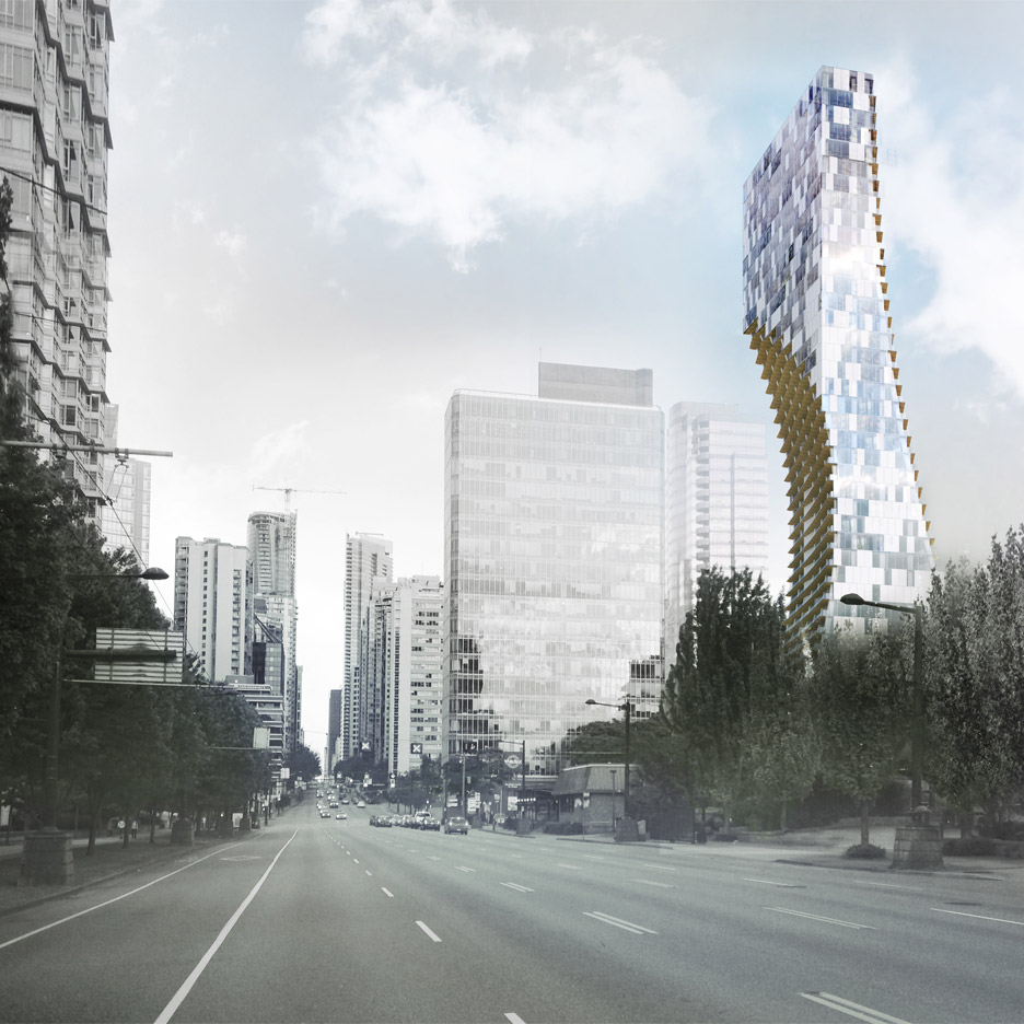
Kengo Kuma and Associates has revealed plans for the office’s first North American skyscraper, a mixed-use luxury tower on a site adjacent to Stanley Park in Vancouver. Known as ‘Alberni by Kuma,’ the 43-story tower combines 181 residences with retail space and a restaurant in a rectilinear volume accented by “scoops” on two sides. These curvatures are the building’s most important formal attribute, while a moss garden at the tower’s base is its most important spatial feature. The project is being organized by Westbank and Peterson, and is part of a group of architecturally significant projects being developed by the pair in the west coast city.

“I have always wanted to have a project in Canada because of its closeness to nature,” says Kengo Kuma. “Typologically, this is a large-scale project in North America, a dream for any foreign architect. We have done towers, but not to this scale and level of detail.”

The building’s facade is a combination of anodized aluminum and glass panels to reflect neighboring structures and the sky. Wood panels are visible on the underside of extruded floor plates – where the facade has been “scooped” – creating patio spaces meant to act as open gardens and personal urban spaces. Wooden planks are also used for the floors within the building, adding similarities to other signature works by Kengo Kuma and Associates.

“In Japanese space, boundaries are considered mutable and transient,” says the architect. “This is always an important part of my work. In this project, the minimal glazing details and the layered landscaping blurs conventional boundaries to enhance the sense of continuity. The design celebrates the presence of nature in Vancouver.”

http://ift.tt/1NUiZTj

UFC Russas Advanced Campus / Rede Arquitetos + RI Arquitetura


© Joana França

© Joana França
  • Contributors: Moacir Weyne (Estrutura / Structure), Transitar Engenharia (Instalações prediais / building facilities), Arquitetura Instalações (Ar Condicionado / air conditioning)
  • Construction Company: Construtora Porto Ltda.
  • Coordination: Neudson Braga

From the architect. The Russas Advanced Campus of the Federal University of Ceará is part of a larger plan to take public University to the interior of Brazil, democratizing opportunities. The first stage consists of three structural units: the portico access, the connecting walkway and the administrative and teaching building. The design was thought to facilitate future expansions and design each unit according to their specific function, also seeking to give unity to the group, either through building elements and materials used, or through the appreciation of the free shaded areas without a defined use, also present throughout the buildings. The understanding that the exchange of knowledge occurs also in these meeting spaces has motivated the creation of it.

The portico defines the access, with spaces for services and reception. The walkway, a large span of twelve meters, serves as a great articulator of the campus, as a covered street that will connect all the blocks. From there you access the teaching block, a large volume with the presence of three internal courtyards, facilitating ventilation and lighting. This block houses the administration, coordination, teachers room, classrooms, the library, the auditorium and laboratories, as well as toilets and a cafeteria.

The use of modular structure and the concentration of wet and common areas allows flexibility of the internal spaces, enabling changes over time. All rooms are flanked by corridors, serving sometimes as circulation sometimes as technical areas, but also act as protection against direct sunlight, necessary strategy due to the climate of the place. In the external facades alternate “cobogós”, traditional elements of vernacular construction, with aluminum brises, creating a dynamic shell which allows ventilation and protects from direct insolation. Due to the diversity of shapes and dimensions of the blocks, we used simple finishes, with textures in white and gray colors and ceramic in the circulation areas, exploring the shadows and shapes.

http://ift.tt/1pGiaHI

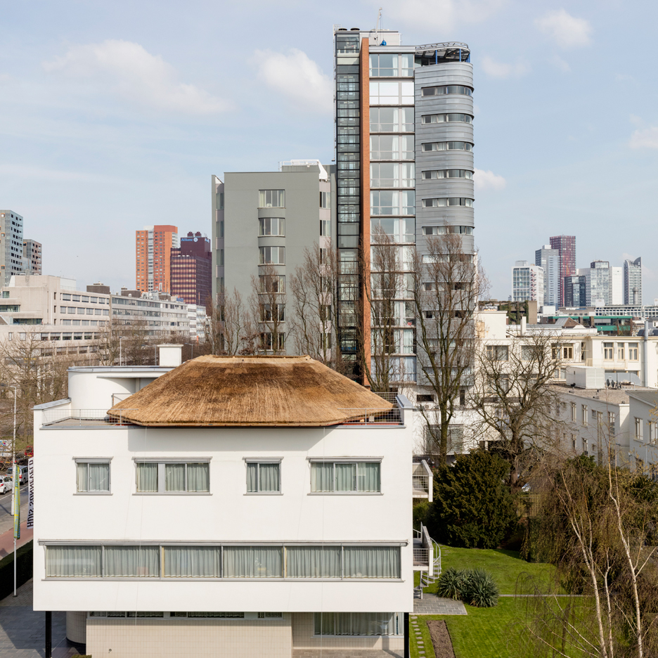
Thatched observatory installed on roof of 1930s Sonneveld House in Rotterdam


Mexican artist Santiago Borja has built a thatched observatory on the roof of one of Holland‘s best-preserved Modernist houses (+ slideshow). (more…)

http://ift.tt/24ktg4S

“Smart technology is a solution looking for a problem,” says Rotterdam Biennale curator


Technologies like driverless cars and smart heating systems could end up making cities dysfunctional according to Maarten Hajer, curator of the International Architecture Biennale Rotterdam 2016 (+ interview). (more…)

http://ift.tt/1SBrCnZ

Lisson Gallery New York by studioMDA and Studio Christian Wassmann Opening Soon Beneath the High Line


Courtesy of Lisson Gallery

Courtesy of Lisson Gallery

On May 3, Lisson Gallery New York will open beneath the High Line between 23rd and 24th Street. Designed by studioMDA and Studio Christian Wassmann, the 8,500 square foot space is split between a gallery, offices, viewing rooms, and storage. Although the main gallery is directly under the High Line – the steel columns in the photos are actually supports for the elevated railway – it will receive ample sun from dramatically angled skylights along the space’s edge, which also aid to extend the walls vertically. The gallery’s polished concrete floors, white walls, and natural light are typical of today’s contemporary art spaces, but also maintain the aesthetic of Lisson’s other galleries. The public will access the space via 24th Street, while the 23rd Street entrance will be reserved for staff purposes and private functions.

“The architecture is consistent with the aesthetic of the London galleries, with polished concrete floors and an abundance of natural light, provided by two large skylights on either side of the main exhibition space,” says Lisson Gallery. “The space allows for 16-foot ceilings and two massive, undisturbed display walls. The façades will be cast in exposed white concrete, highlighting the entrance at 504 West 24th Street.”

http://ift.tt/1Tejqtk