Penthouse Apartment in Bielefeld / Architekten Wannenmacher Möller

© Csaba Mester

Architects: Architekten Wannenmacher + Möller

Location: Bielefeld, Germany

Project Year: 2010

Photographs: Csaba Mester

© Csaba Mester

From the architect. The former factory building was converted to an inner-city living space in 2000. At total of 51 living units with various layouts were created in this listed former industrial area. One of the most spectacular was the tower apartment on the intersection of two streets, which extended over three floors and changed hands in 2008.

© Csaba Mester

Because the requirement for additional living space could only be partly satisfied by changes to the layout the idea was formed to add a further level to the tower. The architectural style of the new level purposely stands out from the existing building.

Section

 The transparent glass and aluminium structure creates a clear contrast to the punctured façade of the historical brick architecture. A small shadow gap separates the additional storey from the existing building. The repetition of existing colours does, however, refer back to the older building and facilitate integration into the complex as a whole.

© Csaba Mester

http://ift.tt/22PJSP8

AD Classics: Vitra Fire Station / Zaha Hadid

© Christian Richters

Although Zaha Hadid began her remarkable architectural career in the late 1970s, it would not be until the 1990s that her work would lift out her drawings and paintings  to be realized in physical form. The Vitra Fire Station, designed for the factory complex of the same name in Weil-am-Rhein, Germany, was the among the first of Hadid’s design projects to be built. The building’s obliquely intersecting concrete planes, which serve to shape and define the street running through the complex, represent the earliest attempt to translate Hadid’s fantastical, powerful conceptual drawings into a functional architectural space.

Painting (Zaha Hadid). Image © Zaha Hadid Architects

Model. Image © Zaha Hadid Architects

The Vitra Campus is a vast complex comprising factories, showrooms, and the Vitra Design Museum. Since the original factory’s destruction by a fire in 1981, Vitra has commissioned replacement structures by renowned architects from around the world: buildings by Frank Gehry, Tadao Ando, Alvaro Siza, and several other notable designers all stand within the same estate. After a bolt of lightning caused a fire that burned more than half the factory campus in a single night, Vitra was determined to prevent a similar disaster from destroying its new campus.[1,2]

Hadid was initially tasked only to design the fire station itself. The project, however, would eventually expand to include boundary walls, an exercise space, and a bicycle shed. These elements were to sit along a bend in the main road running through the Vitra Campus. The street—and by extension, the new fire station—was designed to act as a linear landscaped zone, one that would reference the layout of the surrounding farmland.[3]

Model. Image © Zaha Hadid Architects

It was the road, as well as the factory sheds surrounding the site, that would inform the rationale of Hadid’s proposal. As envisaged by Hadid, the Vitra Fire Station would do more than simply exist as an object in space. Rather, she used the building to define and structure the street on which it faces. It would also serve to shield the campus from its incongruously traditional, vernacular neighbors.[4]

These design intentions resulted in a long, narrow structure that stretched the program along the edge of the street. The building itself is composed of a series of linear concrete walls and roof elements, with the program fitted into the interstitial spaces between them. The walls, which appear as pure planar forms from the outside, are punctured, tilted, or folded in order to meet internal requirements for circulation and other activities.[5]

© Christian Richters

The planes which form the walls and roof are formed from exposed, cast in-situ concrete. Hadid specified that the visual purity of these elements was to be strictly maintained; roof cladding and edging, which would have distracted from the otherwise crisp edges of the concrete, was avoided. This conspicuous visual simplification was carried through in every aspect of the building, from the frameless glazing down to the lighting treatment in the interiors; the very lines of light that permeate the fire station are logical and straightforward.[6]

By insistenting on aesthetic simplicity, Hadid intended to highlight the highly conceptual nature of the design. Excessive detail would detract from the abstraction of the building’s prismatic concrete volumes, reducing the impact of the concept itself.[7] The result is a highly sculptural building, and one which resembles the paintings for which Zaha Hadid was already well-known by the time she was commissioned. Her paintings, while considered beautiful enough to be exhibited in art museums, were widely considered too avant-garde to be translated into physical architecture; it is unsurprising, then, that one of her first major projects to make that step would hew so closely to its conceptual roots.[8]

© Christian Richters

The building, as in her paintings, carry a powerful sensation of movement. The impression of the building changes dramatically as one moves past it – the walls, which are visually impenetrable from oblique angles, suddenly afford a view to the inside of the garage as one approaches a perpendicular angle. Lines inscribed in the pavement reflect the movement of the building’s intended occupants: tracks curve out of the garage meant to house fire engines, while other paths hint at the choreographed exercises of the firemen. Even the walls of the building seem poised to slide past each other; in the case of the garage, two large panels actually do.[9]

The resulting impression is that of “frozen movement.”[10] It is a fitting architectural mood for a fire station, which must remain on constant alert; the design reflects that tension, as well as the potential to burst into action at any given moment.[11] With as much effort as Hadid put in to represent the nature of a fire station, it is ironic that her design saw no real service in that role – instead, it is now used an exhibition and special event space.[12,13]

© Helene Binet

Although the Vitra Fire Station would ultimately come to serve a different function than it was originally designed, it nonetheless represents a significant milestone in the career of Zaha Hadid. In realizing her proposal, the Iraqi-born British architect proved that she was capable of moving past her reputation as a “paper architect” to create architectural space that was as functional as it was radical.[14] Though Hadid would spend the next twenty three years producing revolutionary architecture, her Vitra Fire Station remains one of her most notable projects – one that stands out even in Vitra’s assemblage of exceptional architectural projects.

Painting (Zaha Hadid). Image © Zaha Hadid Architects

Model. Image © Zaha Hadid Architects

References

[1] Koivu, Anniina. “Happy Birthday Fire Station.” Vitra, June 11, 2013. [access][2] “Vitra Campus.” Vitra Design Museum. Accessed April 11, 2016. [access][3] Noever, Peter, ed. Zaha Hadid Architektur. Vienna: Hatje Cantz Verlag, 2003. p144.[4] Jodidio, Philip. Zaha Hadid: Hadid: Complete Works 1979-2009. Köln: Taschen, 2009. p119.[5] Noever, p145.[6] “Vitra Fire Station.” Zaha Hadid Architects. Accessed April 12, 2016. [access][7] Noever, p146.[8] Zukowsky, John. “Dame Zaha Hadid.” Encyclopedia Britannica. Accessed April 11, 2016 [access][9] Noever, p145-146.[10] Noever, p146.[11] “Vitra Fire Station.”[12] Jodidio, p119.[13] “Vitra Campus.”[14] Zukowsky.

Architects: Zaha Hadid Architects

Location: Charles-Eames-Straße 2, 79576, Germany

Architects In Charge: Zaha Hadid, Patrik Schumacher

Project Architect: Patrik Schumacher

Client: Vitra International AG

Design Team: Simon Koumjian, Edgar Gonzalez, Kar Wha Ho, Voon Yee-Wong, Craig Kiner, Cristina Verissimo, Maria Rossi, Daniel R. Oakley, Nicola Cousins, David Gomersall, Olaf Weishaupt

Local Architect: Roland Mayer

Area: 852.0 sqm

Project Year: 1993

Photographs: Christian Richters, Helene Binet, Zaha Hadid Architects

http://ift.tt/1MJP9pG

A Tiny Apartment in San Francisco California

Domino Loft is a residential project designed by ICOSA Design in 2015. It is located in San Francisco, California, USA. Domino Loft by ICOSA design: “In the heart of urban San Francisco, a multi-functional loft transforms a small condo into a dynamic space. Custom designed and pre-fabricated, this project combines a guest bed, dining room, full-size closet, spacious bedroom, and dynamic work are into one compact loft. All of the..
More…

http://ift.tt/20ZCVf1

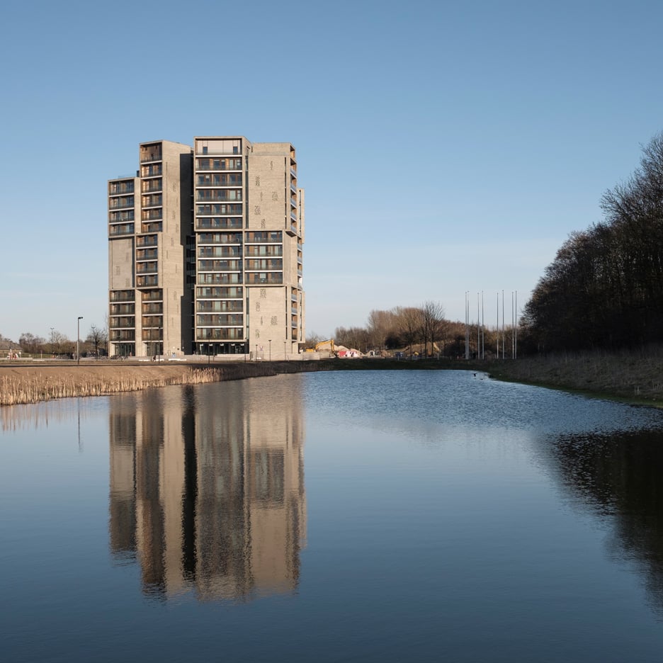
CF Møller’s student housing in Odense is a trio of intertwining brick towers

CF Møller Architects has completed a halls of residence for a Danish university, which features large communal living spaces, an underground bicycle park and a “sky lounge” overlooking a wetland park (+ slideshow). (more…)

http://ift.tt/1Sxe9Tf

Kunstmuseum Basel / Christ & Gantenbein

© Stefano Graziani

Architects: Christ & Gantenbein

Location: Basel, Switzerland

Area: 8079.0 sqm

Project Year: 2016

Photographs: Stefano Graziani, Walter Mair

Construction Manager: FS Architekten GmbH

Structural Engineer: ZPF Ingenieure AG

Building Services Engineer: Stokar + Partner AG

Project Consortium: ARGE Generalplaner KME Basel,Christ & Gantenbein AG / Peter Stocker AG

Owner: Municipality of the City of Basel

Client: Construction and Transport Department of the Canton of Basel-Stadt, Städtebau & Architektur,Hochbauamt.

© Walter Mair

From the architect. The Kunstmuseum Basel’s new building redefines a prominent location in the heart of the Basel. As a place for the exhibition and preservation of art as well as events, it embodies both a new departure and continuity.

The new and enlarged museum consists of two buildings that together form a unified presence in the urban space. They are in direct communication with each other across the street that runs between them. The new building’s roof line is level with that of the existing structure, so it meets its counterpart on an equal footing; its entrance looks out toward the main building’s arcades, which conversely enjoy an excellent view of its striking façade. The new building’s distinctive inverted corner is a symbolic response to the old Kunstmuseum’s no less distinctive projecting corner. At the same time, the indented façade is a gesture of welcome, an invitation. It frames the intersection, effectively turning it into its own forecourt.

© Stefano Graziani

Each  floor of the new building has two exhibition tracts connected vertically by the monumental central staircase. Together with the foyer zones, the staircase describes a free and expressive  figure in space illuminated from above by a large round skylight. By contrast, the gallery suites as such are structured by right angles. The rooms vary widely in size, ranging from cabinet to large hall. On average, the galleries in the new building are a good deal larger and hence more  flexible than those in the old building, while still hewing to classical expectations of what museum spaces should be like: serene and restrained, agreeably proportioned, and made of timeless materials. These are spaces that allow art to take center stage.

Section AA

Section BB

The rooms have a powerful physical presence. The elements that define them are clearly articulated components; assembled, they generate a tectonics that maximizes the architectural effect of the whole. The galleries feature an industrial parquet floor made of oak strips glued directly onto the screed and grouted with wood cement. The supporting wall made of concrete with gray rendering is similarly explicit, as is evident in the door and window reveals. Visibly fronting it, but set back at the edges, is the solid, ten-centimeter- thick plasterboard wall that serves as both substrate and backdrop for the paintings. As exposed structural elements, the prefabricated, sandblasted concrete ribs that span the galleries visualize the load-bearing relationship between walls and ceiling. Not only do they lend the ceiling its own specific structure, they also give direction to the space underneath.

© Stefano Graziani

In the foyer, the marble flooring and galvanized steel wall cladding come together in an aesthetic whole that is expressive of both difference and harmony at once. The unusual combination of two materials with radically different connotations generates the distinctive and unmistakable character of our building, in which contemporary technology is used to implement the timeless laws of architecture.

© Stefano Graziani

The actual connection between the main and new buildings beneath the road is not so much an underpass as an ensemble of large open spaces leading into a generous hall that is foyer, gallery, stage, experimental space, auditorium, and function room rolled into one. Here starts the central staircase of the new building, which echoes motifs of that in the main building: gray, veined Bardiglio marble from Carrara on the floor and rough scraped plaster in a cooler shade of gray on the walls.

© Stefano Graziani

The façades are gray brick walls that exude the timeless and archaic air of an ancient ruin. They were designed to be self-supporting and monolithic, and their emphatic horizontality, with elongated bricks that are just four centimeters high, heightens their presence. The striking pattern of shadows cast by the alternately projecting and receding layers of brick amplifies this impression. Like the main building’s façades, those of the new building hint at classical architecture’s standard tripartite order of base, middle, and capital. This order is visualized through the brickwork’s different shades of gray as well as a frieze executed as a delicate relief.

© Stefano Graziani

The frieze, in its archetypal form, has always been part of the traditional architectural canon, but in the form it takes here it represents something quite new: sunk into the grooves of the frieze blocks are strips of LEDs that illuminate the hollows between the bricks, shedding an indirect light into the surrounding urban space. The result is a visually stimulating effect as the archaic-looking masonry begins to shine or, at a lower power setting, to glow.

© Stefano Graziani

Thus, while the new building does indeed speak the same language as its counterpart, the story it tells is a different and novel one. We understand it as neither a repetition nor a copy of the main building, but rather as an emphatically contemporary, forward-looking building capable of accommodating completely new forms of art and the engagement with it.

http://ift.tt/1XJQ9dY

Studio PROTOTYPE Design a Contemporary Home in Amsterdam

Villa Schoorl is a private residence designed by Studio PROTOTYPE. It is located in Amsterdam, The Netherlands. Villa Schoorl by Studio PROTOTYPE: “At the leap of one of the most beautiful dune areas in our country you can find the small town called Schoorl. It has an almost surreal surrounding of peace, meadow, nature and a gorgeous view. This altogether being a piece of typical authentic Dutch landscape, of which..
More…

http://ift.tt/1ScBDLw

Student Housing / C.F. Møller

© Torben Eskerod

Architects: C.F. Møller

Location: Odense, Denmark

Architect In Charge: C.F. Møller

Area: 13700.0 sqm

Project Year: 2015

Photographs: Torben Eskerod, Kirstine Mengel

Engineer: Niras

Landscape Architect: C.F. Møller Landscape

Client: The A.P. Møller and Chastine Mc-Kinney Møller Foundation

© Torben Eskerod

From the architect. The design of the new student housing for the University of Southern Denmark in Odense is based on a strong community spirit. The 250 student residences are located in three interconnected 15-storey buildings. This means that the residence has no front or back, but appears attractive from a 360-degree perspective. The building’s distinctive shape will make it easily recognizable on the campus, and clearly advertises its distinct residential content.

Ground Floor

Diagram

The project constitutes a link between the 1966 linear university campus and the new Cortex Park, a Research and Knowledge Park designed by C.F. Møller in 2009 as a more irregular and dense urban cluster. The university’s clear structure is also an inspiration for the student residence: with its layout centred on common spaces on all floors, the new building reinterprets the existing university’s manageable and human-scaled campus laid out around common environments – a sort of vertical campus.

© Torben Eskerod

The site’s terrain slopes gently towards an elongated wetland to the south and the residential building becomes part of the science park structure, with the three towers forming a clear landmark on the development’s eastern end. The three towers are rotated relative to each other, inscribing them in faceted angles of the science park, while the direction of the front plaza uniting the towers refers to the linear modernism of the university campus.

© Torben Eskerod

The dorm rooms are located on the outer faces of the three towers, where they all enjoy views of the countryside without overlooking neighbouring rooms, due to the building’s turns and twists. Each room has a private balcony, which both helps make the homes attractive, but also has an environmental function: The shading internal balconies help manage solar gain, contributing to significant energy savings.

© Torben Eskerod

Dorm_ Room Plan

© Torben Eskerod

Moving inwards from the private rooms towards the communal kitchen in the centre, areas gradually become more and more collective: A shared living room acts as a social meeting place for the small cluster of seven rooms, which all residences are grouped in, and as a transition to the fully communal spaces. The kitchens at the centre of each floor are shared by all, and feature generous glazed facades that ensure light and views in three directions.

© Torben Eskerod

12th Floor Plan

© Torben Eskerod

The common areas are not only present on the residential floors: The Campus Hall also features a ground floor café as well as group rooms, study areas and party spaces on the top floors, with roof terraces on several levels enjoying a magnificent view of the city and university. The shared areas are carefully graded from small and intimate communities to larger rooms for big occasions, to establish a balance between the common and the need for privacy.

© Torben Eskerod

The Campus Hall is a low-energy construction made from quality materials that meets the strict Danish codes for low-energy class 2020 and gives priority to public transport and cycling – a bike for each resident is provided. The building’s overall energy concept is based on the optimization of passive design parameters such as shape, orientation, adaptation to climatic conditions, daylighting, ceiling heights and structural thermal mass, as well as a highly insulated and airtight building envelope, use of natural cross-ventilation, and extensive heat recovery from exhaust air, waste water and showers.

© Torben Eskerod

The three towers are constructed of bespoke, warm-toned greyish bricks, with slightly pronounced joints. The curtain walling also appears in warm tones, in a mixture of hardwood profiles and tombac panels. Despite its unique height, the student housing blends organically into the surrounding protected forest landscape, with its own park and small lake.

© Torben Eskerod

The surrounding landscape is designed in accordance with principles of sustainable use of resources, where soil balance, precipitation and wildlife habitats are considered in a recreational hierarchy of managed areas and wild nature. A series of precisely defined plots constitute activity areas and multifunctional garden spaces with features such as volleyball courts and sitting steps. They are distributed in proximity of the building, interspersed by nature with wetlands and reeds, and linked by a network of paths, which allow the rest of the Science Park and the University to experience the residence’s lush garden.

© Torben Eskerod

http://ift.tt/1WGTNqF

MAD models Marilyn door handle on its curvaceous Canadian skyscrapers

Milan 2016: Chinese studio MAD Architects has created a door handle based on the shape of the firm’s skyscrapers in Mississauga, Canada, which have been nicknamed the Marilyn Monroe Towers. (more…)

http://ift.tt/1Sct5Ey

ALBUM Bff016 / SET Architects

© Simone Bossi

Architects: SET Architects

Location: Foro Buonaparte, 14, 20121 Milano, Italy

Team: Lorenzo Catena, Onorato di Manno, Andrea Tanci

Project Year: 2016

Photographs: Simone Bossi

© Simone Bossi

ALBUM “Bff016” has been declared the winning proposal of Exhib-it!, a competition promoted by Florim4Architects. It will be on display during the Milanese Design Week inside the central flagship store of Florim, a world leader in ceramics. 

© Simone Bossi

The proposal was awarded by a jury comprised of Odoardo Fioravanti (industrial designer), Ippolito Pestellini Laparelli (OMA/AMO), and Amelia Valletta (Domus Academy) (among other members). The installation consists of photographs of the Azerbaijan Pavillion of EXPO 2015, which was realized with ceramic products of Florim. 

Diagram

Diagram

ALBUM “Bff016” is an essential object composed by two elements: a steel free-standing structure, which can be infinitely reproduced, and juta black cloth, which is durable and biodegradable. The steel frame is based on modular elements that are easy to assemble thanks to a bolt-less system that allows maximum flexibility. The juta cloth wraps the structure delineating five distinct exhibition areas; ten photographs are distributed among these spaces. The black cloth gives rise to a chequered pattern, which consists of a modular grid of 1 square-meter spaces. Thus, the cloth serves not just as a discreet background for the photographs but also as a tool to highlight the value of the images. ALBUM “Bff016” is much more than a simple showcase: it does not impose itself on the content but gives it value and conveys it with great elegance. 

© Simone Bossi

The installation, which is located in the vicinity of the flagship store’s windows, stimulates and attracts visitors allowing for a fluid circulation within the exhibition space. The wings created by the steel free- standing structure and the juta cloth generate diverse paths and ways to interact with the space. The spotlight points at the concept of art fruition. 

© Simone Bossi

http://ift.tt/1SlFqms

Poly WeDo Education Institution / ARCHSTUDIO

© Xia Zhi

Architects: ARCHSTUDIO

Location: Chaoyang District, Beijing, China

Design Team: Han Wen-Qiang, Wang Ying, Li Yun-Tao

Area: 1300.0 sqm

Project Year: 2015

Photographs: Xia Zhi

© Xia Zhi

From the architect. Poly WeDo is a new children’s education brand of Poly Culture Group, which aims at exploring and developing kids’ gift and potentiality in music, and improving their comprehensive art accomplishment. ARCHSTUDIO is invited to do the design for their teaching space within Yongli International Shopping Centre in Workers’ Stadium North Road, Beijing. The top issue to be solved while doing the design thinking is how to create an open, free and flexible modern teaching environment which breaks the limits of rigid structure and creates a feeling of closeness between children and the space.

Diagram

The project covers the area cross 7 pillars of the shopping center on the first floor. The basic structure of the space is framework + shear wall, it enjoys an area of about 1000 sqm and has a basement with an area of 300 sqm. ARCHSTUDIO removes the concrete block wall as much as possible to open up the closed space; a corridor is used to connect the classrooms to the public space. All the teaching spaces including music classroom, private classroom, reception hall, theatre and rehearsal room, etc. stretch out horizontally to the atrium of the shopping Centre. The slope shape roof extends to the wall and then the floor, which becomes the extension of classrooms and public space. The entire teaching space is like a translucent “indoor village”, which presents spaces of variety of scales and texture according to different needs. It presents the kids an intimate, natural and cozy music playing and learning environment.

© Xia Zhi

Section

© Xia Zhi

ARCHSTUDIO introduces green landscape to soften the restriction of structural walls and to keep teaching get in touch with nature all the time. Part of the floor slab of the atrium is removed; the bamboo courtyard extends to the dancing classroom, Yoga classroom and office in the basement. The bamboo courtyard is the highlight of landscape of the entrance hall, and the shift point of traffic of the two floors. Gaps between walls of classrooms are used to create landscape area, thus “outdoor” space are formed in the indoor space. And the combination of plants and book shelves make kids’ reading coexist easily and naturally with rest.

© Xia Zhi

Music classrooms need to satisfy acoustical requirements of sound insulation and sound absorption. For the purpose of soundproof, three layers hollow glasses are used for the walls of music classrooms, wood grain aluminum grille and aluminum plate are used for the ceiling. In additional to soundproof treatment, the shape of the slope roof and the wavy surface of grille have the effect of audio mixing. Because of the limitation of height of the small theatre, we keep the original ceiling, only use some sound-absorbing wood panels on part of the wall,  which heightens the space visually and achieves excellent acoustic effect as well.

© Xia Zhi

http://ift.tt/242ecZv