Renata Ramos Designs a Lively Private Residence in Porto Alegre Brazil

Humaita Apartment is a private residence designed by Renata Ramos. The home is located in Porto Alegre, Brazil and was completed in 2015. Humaita Apartment by Renata Ramos: “The purpose of the renovation was to adapt the 70m² (754.5ft²) apartment to the demands of a young couple. The main requests were the visual integration in social area (living, dining and kitchen), and the need for storage. The couple works partly..
More…

http://ift.tt/1WdBWam

EDP Headquarters / Aires Mateus

© Juan Rodriguez

Architects: Aires Mateus

Location: Av. 24 de Julho, Lisboa, Portugal

Architect In Charge: Aires Mateus

Design Team: Manuel Aires Mateus, Francisco Aires Mateus,

Area: 46222.0 sqm

Project Year: 2015

Photographs: Juan Rodriguez

Project Leader : Francisco Caseiro, ana rita rosa, pedro ribeiro

Colaborators: Mariana Barbosa mateus, vânia fernandes, paolo agostini, francesca lupo, marco campolongo, joão ortigão ramos, teresa mascarenhas, patricia marques, neus beneyto, olga sanina, luisa sol, humberto fonseca, humberto silva, joão esteves, rita conceição silva, filipa ferreira, diana mira, andré passos, catarina bello, joão caria, carlotta fantoni, valentina del motto, francesca gagliardi, martina palocci, borja fernandez, duarte madrugo, joão pedro miguel, mizuho anzai

Consultants: Frederico Valsassina, José Maria Assis

Engineer: AFA Consult

Constructor: Mota Engil / HCI

Client: EDP

© Juan Rodriguez

From the architect. The legacy designed the project´s major gesture. The extended past of the city, or the history of the land claimed from the water, dictated the establishment of the forms along the river’s edge. They lock a square, a public space, and a mass of air that gives meaning to the building.

© Juan Rodriguez

The structure is etched with vertical elements which give modulation, structure, protection from the sun, and resolve the whole building. Variable profiles are subtly modeled within a smooth and continuous design, where plans delicately suggest themselves. An ever-changing facade varies with the light, half-light, or shadow, and changes from more opaque and mysterious, to more transparent, revealing the light pulsating within it. The gesture resolves the project, protecting working space, creating courtyards in section, and public functions within the horizontal square.

© Juan Rodriguez

Section

© Juan Rodriguez

http://ift.tt/1S93YSY

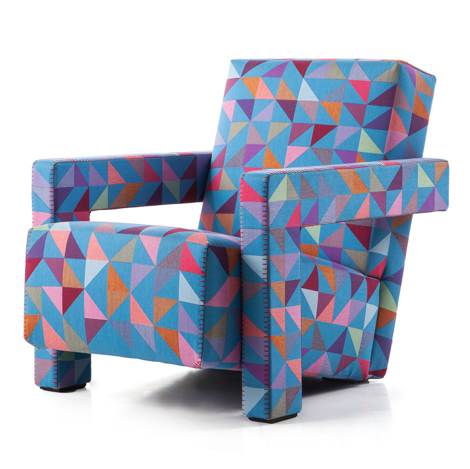
Bertjan Pot designs bespoke Jacquard textile for Cassina’s iconic Utrecht armchair

Milan 2016: Dutch designer Bertjan Pot has created a colourful textile to upholster Cassina’s Utrecht armchair, designed by Gerrit Rietveld in 1935. (more…)

http://ift.tt/26ejwec

De Fu Junior High School / Atelier GOM

© Su Shengliang

Architects: Atelier GOM

Location: Jiading, Shanghai, China

Area: 12783.0 ft2

Project Year: 2016

Photographs: Su Shengliang, Zhang Jiajing

© Su Shengliang

De Fu Junior High School is located on De Fu road ,Jiading new town ,Shanghai .It is a campus which can accommodate 24 junior high school classes .On the north side ,it is adjacent to the De Fu primary school ,and for the south side ,there is normal residential area .There are two buildings on campus ,respectively ,the main teaching building, gymnasium and canteen. 

© Su Shengliang

The main teaching building which sits on the west part of the site can hold classrooms ,office facilities for teachers ,and ancillary facilities .The building has north-south teaching classrooms and east-west special classrooms .It descends towards the sun from three floors to one floor and then generates plentiful roof platform area. Four barrier-free ramps connect the main teaching building with gymnasium and canteen. 

Plan

Four courtyards .The space of courtyard has always been the essence of Chinese traditional architecture .When deals with the relationship between architecture and site, the architect subtly designs four courtyards .Inspired by the culture of Chinese characters ,these four courtyards present themselves as a Tian-font layout. The dimension of the four courtyard is 25m on each side ,each of them has its own form and they connect each other with the ground floor .They are like four seasons ,students can feel the time changes ,sunrise and sunset in these four courtyards. 

© Su Shengliang

Sunken courtyard. The elevation of canteen’s outdoor terrace is 1.5m below the elevation of the main teaching building’s outdoor terrace .Here the architect creates a sunken courtyard in which the students can rest on the steps after a meal. 

© Zhang Jiajing

Although restricted by the shape and the size of the site, the architect expects that the building can provide a free walk place for the school teacher and students .The main teaching building has an inside–outside double corridor design .Besides basic vertical transportation ,the architect also designs abundant roaming traffic system .The free stretching corridor combines itself intimately with the scattered roof platform ,they blur the boundary of the inside and outside ,and make walking experience more interesting .The architect hopes that the utilizer can perceive the environment unexpectedly and understand the nature. 

© Su Shengliang

The gymnasium provides a semi interior basketball court, it can also be used as an exhibition hall and auditorium .The vertical shading devices adopt the cast-in-place concrete plate with a rectangular cross section .And the roof is a well-shaped beam structure with cast-in-place hanging concrete plate .The section is trapezoidal ,and the minimum thickness of each concrete plate is 15 cm. 

© Su Shengliang

Each square classroom is designed with a student’s locker room . And the architect also conducts a daylight factor analysis for the square classroom to ensure that the children are able to receive appropriate daylight in the classroom. 

Diagram

The external wall of dry clay is a response to the traditional external wall style of Shanghai ,and also an attempt to the durability of low cost building materials. 

© Su Shengliang

http://ift.tt/1rhKXEe

Roc Von Restaurant / Vo Trong Nghia Architects

© Hoang Le Photography

Architects: Vo Trong Nghia Architects

Location: Xa Phu Cat, Huyen Quoc Oai, Hanoi, Vietnam

Project Architects: Vo Trong Nghia, Takashi Niwa

Design Team: Mai Lan Chi

Bamboo Manager: Nguyen Ba Tuong

Area: 1100.0 sqm

Project Year: 2015

Photographs: Hoang Le Photography, Le Anh Duc (AIF Studio)

Contractor: La Vong group JSC.

Bamboo Construction: Vo Trong Nghia Architects

Site Area: 6,560 m2

Client: La Vong group JSC.

© Le Anh Duc (AIF Studio)

The building is located 30 km from Hanoi, besides the main road connecting Hanoi and Hoa Binh. This area is popular for stopover of buses and cars in order to enjoy and have a rest long journey and also it is a destination for Hanoians to enjoy one day trip. 

General Plan

The restaurant is located right next the road. To create an intimate space and protect guests from the busy road the floor of the restaurant is designed lower than the road. After stepping down from the busy road to the dining space, the guests are facing to a natural lake with a bamboo arches above their heads. The 12 bamboo columns with the shape spreading upwards are supporting the roof structure of semi-outdoor dining area. The curved plan with center stage is prepared for events usage at the same time giving embracing intimate atmosphere.     

© Le Anh Duc (AIF Studio)

Elevation

For the bamboo columns we have used two different bamboo species – Tam Vong and Luong. Each of them provides different material qualities which are crucial for the building structure. The bamboo has been treated by Vietnamese natural traditional method in order to reach the high quality and long term durability of the material. The natural treatment contributes to a sustainable building approach as well. 

© Le Anh Duc (AIF Studio)

The space under the columns is naturally cross ventilated and a cooled by evaporation of water from the adjacent lake. 

Section 01

Section 02

The support area is separated building volume with the walls cladded by a local material – laterite blocks. These orange colored soil blocks express traditional in the area together with the bamboo structure.

© Hoang Le Photography

The building provides the space where guests can feel the strong connection to the local culture of the North Vietnam. The application of an open space and usage of natural materials meet the required connection. 

http://ift.tt/1VAHCg2

Zaha Hadid’s D’Leedon complex in Singapore features towers with petal-shaped plans

Seven skyscrapers with flower-shaped plans are dotted across this residential complex in Singapore, which was completed by Zaha Hadid’s firm before her untimely death last month (+ slideshow). (more…)

http://ift.tt/23Y8GqJ

Beverly Hills to replace public transport with self-driving cars

Beverly Hills City Council has unanimously approved plans for a driverless-car programme that could replace the affluent Los Angeles neighbourhood’s public transport system. (more…)

http://ift.tt/1VCskXu

Galmuri Publisher / ThEPluS Architects

© In Keun Ryoo

Architects: ThePluS Architects

Location: 464-56 Seogyo-dong, Mapo-gu, Seoul, South Korea

Architect In Charge: Hanjun Cho

Area: 133.12 sqm

Project Year: 2015

Photographs: In Keun Ryoo, Youngchae Park, Courtesy of ThEPluS Architects

Mechanical Engineer: Hanbaek engineering

Structural Engineer: Yongwoo engineering

Construction: Moowon Construction

Site Area: 63.71 sqm

Total Floor Area : 133.12 sqm

© In Keun Ryoo

From the architect. In an alley in the city, on a small piece of land, the [horn] has risen. The width of the land facing the road is 6 meters, and the depth 10 meters. 60 square meters of land was what I had to work with. The pre-client, who is the representative of Galmuri Publisher, is also a writer, and political philosopher. He wished to build an independent space for his publisher on this small piece of land, and was looking for an architect who could help him fulfill his wishes. (“Galmuri” in Korean means reaping harvested grain or crops for food and to use as seeds. Thus the name “Galmuri” implies that the publisher intends to carefully reap the intellectual and practical achievements of humanity, while sowing the seeds of intelligence proper for our new era.)

Courtesy of ThEPluS Architects

By chance or destiny, I became in charge of the building design. In spite of the small size of both the site and the building, the process was every bit as difficult and intense as any large building. The entrance alley was as narrow as the size of our site, neighbors surrounding the site were all the more close to the construction site which resulted in frequent complaints from neighbors throughout the process, the site’s soil was soft filled with underground water, and there wasn’t enough space to load materials.It was the harshest environment imaginable for the construction workers.

Courtesy of ThEPluS Architects

Though small in size, I wanted the building to look bold amidst the high-density surroundings. Somewhat expressionless yet impressive, simple yet refined was what I aimed for. Finally, a white “horn” rose at the end of a small alley that retained the traces of time.The horn was very close to the publisher’s previous office space which they had used for a long time. 

© In Keun Ryoo

The publisher’s previous office space was filled with traces of their time, and by looking around the office one could easily grasp the attachment my client had for the space. However, the building was sold to a new landlord and it became financially difficult for the publisher to continue renting the space they had been using for so many years. Yet my client did not want to leave the vicinities, and decided to build a new independent space nearby. However with his budget, the land he could afford was very limited. Eventually he was able to buy a very small piece of land 6 meters wide and 10 meters in depth (60 square meters) in the neighborhood.

Section

My client began to worry about how to achieve his goal on this small piece of land. My client seemed to be looking for an architect who could successfully build their independent space on this small piece of land, an architect who could show positive energy and passion for this project. When my client and I first visited the site, our perspectives on the situation were a bit different. My client had doubts and was anxious about whether they’d be able to create an environment large enough and sufficiently convenient for their activities on this small land. On the other hand, the architect, as soon as he entered the alley, understood the potential of the site, and believed he could realize the symbolism by creating an object that is small yet confident. The alley that leads to the land is only wide enough for one car at best.

© In Keun Ryoo

However, as soon as one enters the alley it became a linear axis, and at the very end of that alley was where the new building would be built. I did not want the linear direction to disappear at the end of the alley. What I wanted was to maintain the continuous new axis-direction by constructing a new building on a small ground. I wanted something that stands natural, something that is consistent with the direction of the entrance alley, so that the alley’s direction would naturally slide by the building.

© In Keun Ryoo

I wanted the building to embody the sense that the horn sprouted out from the land.I thought the first impression of the building should be the feeling of a ‘lump’.

© In Keun Ryoo

The ‘lumpy’ feeling could be achieved by minimizing decorative elements and using the building’s mass itself as a design feature. As it happened, the front of the building was facing west, so the building’s brightest expression could be read in the late afternoon. Eventually the architect was able to create the expression and impression of the building that he intended, and materialize the small yet bold image.

© In Keun Ryoo

The architect tried to give the building a variety of expressions that differed depending on the viewing angle, so that the building had an indeterminate quality that in turn arouses curiosity from viewers.

http://ift.tt/1SYacBm

ÉCAL students use wood offcuts to create objects based on e15 stool

Milan 2016: students from Swiss university ÉCAL have collaborated with Germany furniture brand e15 to create objects based on the company’s tooth-shaped Backenzahn stool, which was originally designed by co-founder Philipp Mainzer in 1996 (+ slideshow). (more…)

http://ift.tt/1SjbcjQ

City Beach Surf Club / Christou Design Group

© Douglas Mark Black Photography

Architects: Christou Design Group

Location: City Beach WA 6015, Australia

Area: 4000.0 sqm

Project Year: 2016

Photographs: Douglas Mark Black Photography, Saltywings

Structural Engineer : Pritchard Francis

Civil Engineer : Pritchard Francis

Landscape Architect : 4 Landscape Studio

Building Surveyor : John Massey Group

Gabriels Environmental : Section J

Hydraulic Engineer : GHD

Mechanical Engineer : GHD

Electrical Engineer : BEST

Quantity Surveyor : Aquenta

© Douglas Mark Black Photography

From the architect. The project was commissioned through an architectural competition. The initial brief for the project required a single two storey building comprising of a surf club at ground level and a first floor commercial space. The CHRISTOU scheme challenged the brief and offered a composition of orchestrated buildings, framing a new public space and capturing views of the expansive Indian Ocean coastline.

© Saltywings

The design was inspired by the rugged coastline, the beach and the icon. The intensification of a coastal outpost, carving out space from the dunes. The project includes; a dedicated surf club at the edge of the ocean, three commercial pavilions and alfresco decking areas, extensive green roof, landscaped plaza and street, and sea wall constructed to a depth of RL -1.0 extending from the groyne in the south to the boardwalk in the north.

Site Plan

The design nestles into the site, working the topography to create a sequence of programmatic datums; transitioning from arrival, hospitality, public space, promenade and beach. At all times the lure of the ocean is present through framed and expansive views of this iconic destination.

© Douglas Mark Black Photography

The linear surf club, hidden from view on arrival, emerges from the south as a low-slung angled wall projecting itself north onto the beach, extending the ecology of the dune with extensive landscaped green roof and lookout. The surf club wall providing shelter and amplifying the sound of the ocean along the promenade.

© Douglas Mark Black Photography

The commercial buildings, appearing as a series of low-slung transparent pavilions, are set back from the surf club and wrap the plaza to the south, creating a protected internal street and public courtyard for the tenancy. The pavilions are broken, the gaps between, framing views of the coast, the groyne and lookout tower, filtering wind, and creating an arrival zone which allows for the scheme to evolve in the future.

© Saltywings

The public space cascades from south to north, beginning as a protected courtyard, opening into a protected outdoor amphitheater with full views to the beach northward.

© Saltywings

Existing pine trees were relocated to create shade within the public space and preserve the character of the landscape on the site.

© Douglas Mark Black Photography

The scheme merges the rugged coastal topography, architecture, and landscape open space, to create a singular expression; land form and built form become one.

http://ift.tt/23IJo3f