Lightspeed’s Headquarters / acdf architecture


© Adrien Williams

© Adrien Williams
  • Architects: acdf architecture
  • Location: Amherst / Viger, Montréal, QC H2L, Canada
  • Architect Team: Maxime-Alexis Frappier, Joan Renaud, Laure Giordani, Laurence Le Beux, Christelle Montreuil Jean-Pois
  • Area: 2620.0 sqm
  • Project Year: 2015
  • Photographs: Adrien Williams


© Adrien Williams


© Adrien Williams


© Adrien Williams


© Adrien Williams


© Adrien Williams

© Adrien Williams

For the new global headquarters of Lightspeed, a burgeoning, Montreal-based developer of point-of-sale software, ACDF Architecture reinvigorated three floors of the historical Viger train station and hotel, a nearly forgotten, chateau- style building whose pointed turrets overlook a prominent civic square. The studio did so by preserving the found, raw elements of the once-abandoned space, superimposing a layer of select, slick, wit-filled elements that pop against the roughness and reflect the clients’ dynamic, creative and vigorous brand. 


© Adrien Williams

© Adrien Williams

Lightspeed has had a fast, audacious rise since it was founded in 2005, growing from a home-based business to a thriving global entity with satellites in Europe and North America. It aims to be the first Montreal tech company with a billion dollar valuation. At its headquarters, which are currently 30,000-square-feet with plans for another 20,000 by spring 2016, the company wanted room for an expanding workforce while retaining its culture as a tight-knit, nimble startup. Throughout, ACDF forged connections between the past and the future, reflecting the unique heritage and joie de vivre of its locale (setting it a part from the standard tech offices in Silicon Valley). Contemporary interventions such as slick glass walls, colourful pavilions, vibrant furniture and graphic art — with murals by Sao Paulo’s Arlin Cristiano and Montreal’s Jason Botkin — juxtapose industrial, found elements that speak to the building’s long history. 


© Adrien Williams

© Adrien Williams

When the Viger Train Station and Hotel first opened in 1898, it was a local landmark with grandly detailed terra cotta walls. The onset of the Great Depression and the shift of Montreal’s downtown to the west caused a downturn in the 1930s. After a long period of disrepair, including 15 years of utter abandonment, ACDF began the office conversion, leaving a palimpsest of the station’s past. The studio revealed soaring double height spaces, with their immense timber beams, that were obscured during a 1950s remodeling; retained the rough-hewn brick walls that remained after the structure was stripped of its asbestos in the early 2000s; and left unadorned the ends of monumental, studded steel girders as they slide in and out of the work spaces. 


Plan

Plan

© Adrien Williams

© Adrien Williams

Plan

Plan

Now, a revitalized sense of levity is evident as soon as visitors step into the lobby. When seen from the elevator, the laminate reception desk looks like the flattened graphic of Lightspeed’s red-and-white logo — a fluid L and S that coil into the shape of a bright flame. From different perspectives, the anamorphic nature of the design is revealed. An assertive assemblage of sharply edged volumes jumps out, all the more because of the surrounding, coarse textures. 


© Adrien Williams

© Adrien Williams

A similar sense of humour pervades the rest of the space. For example, ACDF installed three laminate cabana-shaped meeting pavilions in the lobby. Each looks like a mini, high-gloss house, a nod to the comforts of home as well as Lightspeed’s previous, much-smaller office, which was in a residential neighbourhood. An extra layer of wit heightens the sense of play: the studio painted permanent “shadows” on the adjacent floor and walls outside the pavilions. The cabanas are adjacent to the “pool,” a kitchen-side common area that references the backyard swimming pool at the previous office. The aqua-coloured area has a teal epoxy floor and fiberglass stools with a waterlogged pattern, custom- made by millworker Etienne Hotte, both of which make the area feel as dream-like as the swim-up bar at your favourite resort. (Meanwhile Arlin Cristiano’s The Phoenix, a large, graffiti-style wall mural, adds an edge.) 


© Adrien Williams

© Adrien Williams

In the open-plan workspaces, stark white systems furniture streaks past the preserved ruins of industrial-age relics, soaring timber ceilings, garret-like nooks and elegantly frayed brick walls. The new-old contrast, as well as the infusion of Jason Botkin’s graphic, abstract lines and shapes, inspires a dramatic synergy that sparks the imagination and helps the youthful employees (the average age is 32) create. 


© Adrien Williams

© Adrien Williams

Future additions will push the themes further. A new, 960-square-foot patio off the “pool” area will have hot tubs and BBQs; an indoor, cigar-style lounge with herringbone floors and tufted leather couches; and a cloud-inspired, diaphanous amphitheater will ensure the 215 and counting employees feel entirely at home in the space. 


© Adrien Williams
© Adrien Williams

http://ift.tt/1YpiPck

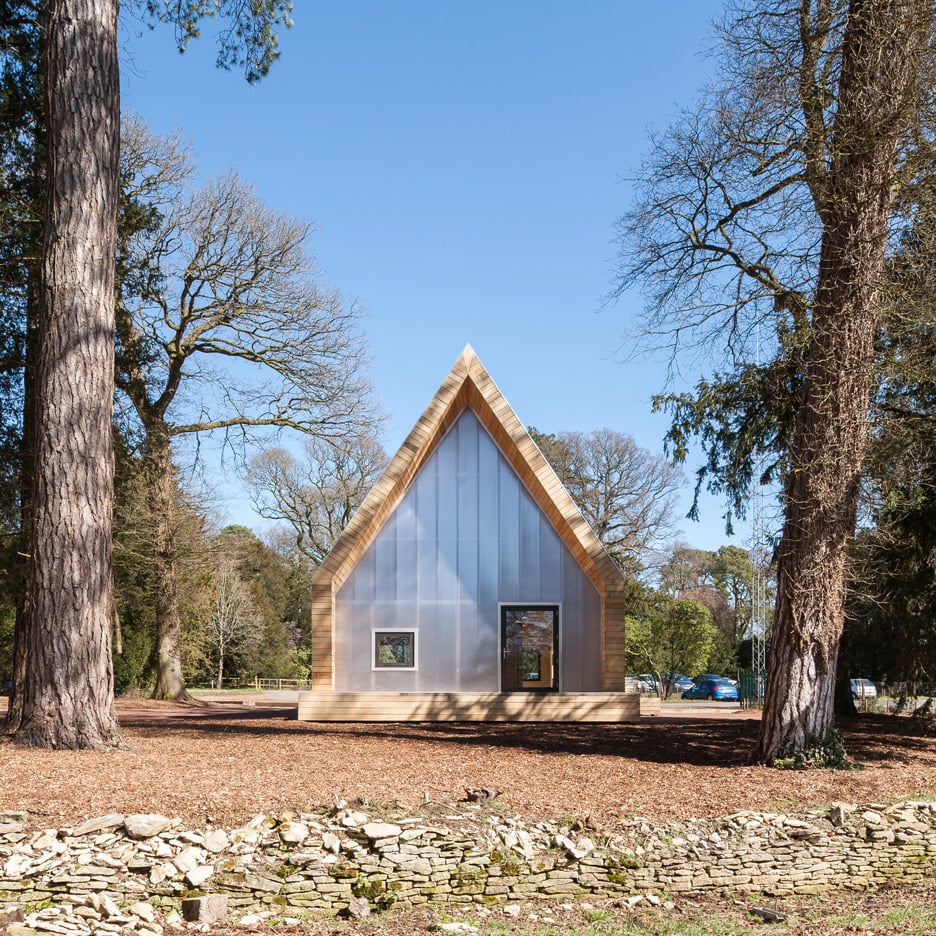
Invisible Studio uses only felled tree specimens for arboretum buildings in Gloucestershire


Piers Taylor’s firm Invisible Studio has added a pair of woodland maintenance buildings to the National Arboretum in Gloucestershire, England, using only trees felled in the routine maintenance of the estate (+ slideshow). (more…)

http://ift.tt/1Q2VEhK

ODA Unveils New Residential Towers for Brooklyn


Courtesy of ODA

Courtesy of ODA

New York-based ODA has revealed their design for new residential towers in Brooklyn‘s Williamsburg neighborhood. These three towers, called 416-420 Kent, aim to revitalize the neglected East River waterfront and will introduce a new sense of community, while providing ample natural light and green spaces for residents.


Courtesy of ODA

Courtesy of ODA

The towers comprise 800,000 square feet of residential space and 857 residential units overall, twenty percent of which will be affordable housing. Each tower will stand at twenty-two stories tall.


Courtesy of ODA

Courtesy of ODA

What makes these towers architecturally unique is how they utilize the space of corner apartments, which will comprise more than eighty percent of the total number of units. By using two standard floor plans that mirror around a central axis, the three towers form “multi-dimensional facades and mid-floor ‘corner’ units.”

The shifting plans also create private green spaces, allowing residents to interact both indoors and out with a total of 77,000 square feet of outdoor space.  The towers provide views towards the Williamsburg Bridge, the East River, and downtown Manhattan and Kent’s promenade will contribute to the preexisting boardwalk that stretches from Greenpoint to Dumbo.


Courtesy of ODA

Courtesy of ODA

http://ift.tt/1TM6f7L

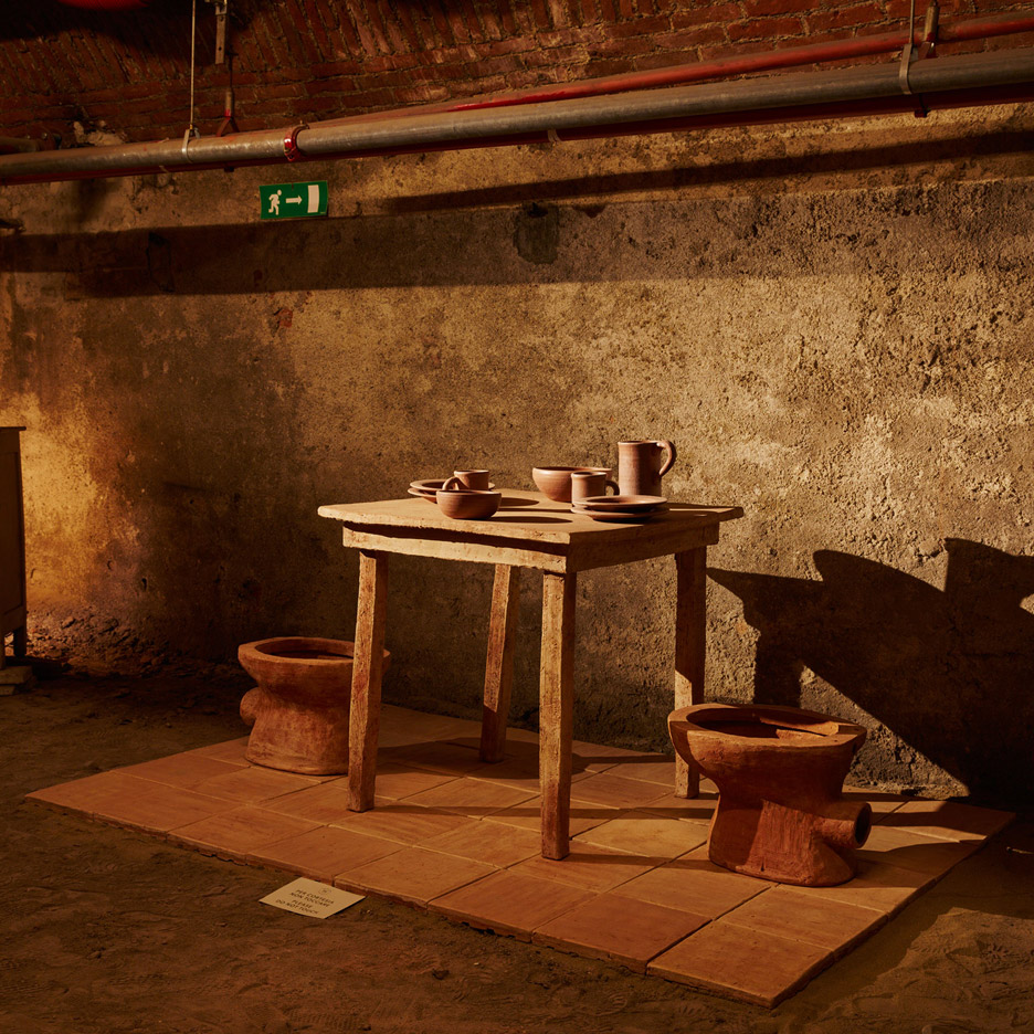
The Shit Evolution in Milan presents dung as a “beautiful” material


Milan 2016: products made from a new material that uses recycled poo are presented in darkened rooms with crap-covered floors at The Shit Evolution exhibition curated by the Museo Della Merda (+ slideshow). (more…)

http://ift.tt/1Q2RRRM

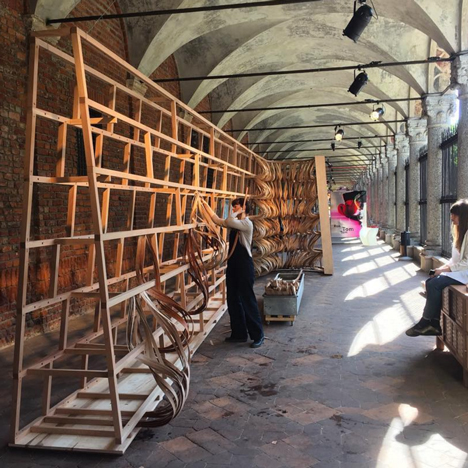
Dezeen’s #milanogram2016 highlights: day one

milanogram2016-milan-design-week-design-sebastian-cox-aloing-the-line-of-happiness

Milan 2016: it’s day one of Milan design week, the world’s biggest and most important design fair, and over 1,000 images from around the city have already been posted to our #milanogram2016 hashtag on Instagram. Click through to see a selection of the best photographs. (more…)

http://ift.tt/1UV8TsY

Dezeen Jobs: latest jobs update

Dezeen latest jobs update

See the latest from our recruitment site Dezeen Jobs, including positions with Studio Weave, Heatherwick Studio and Waugh Thistleton Architects, one of the studios pioneering the construction of timber-framed high-rises (pictured). This is also the last chance to apply for roles with Hawkins\Brown Architects, UNStudio, RIBA and more… (more…)

http://ift.tt/1qiHkg2

Minotti London & Red Button Development Work Together to Design an Elegant Contemporary Apartment in Kiev

Italy Presents 20 Projects for the Common Good with “Taking Care” Exhibition for the 2016 Venice Biennale


Courtesy of TAMassociati

Courtesy of TAMassociati

Italy has selected “Taking Care, Designing for the Common Good” as the theme of their pavilion for the 2016 Venice Biennale, examining architecture as a community service that takes care of individuals, spaces, places, principles and resources. The exhibit will present 20 projects by Italian architecture firms that address a range of problems from health to housing, education and culture. The exhibit will be curated by a team from TAMassociati comprised of Massimo Lepore, Raul Pantaleo and Simone Sfriso.

Displaying the relationships that various commissioning bodies have with architecture – including public, private, associative and civic – the exhibition opens with photographs that exemplify the idea of common good in Italy. It will then progress into tested experiments in the field, presenting five original projects spearheaded by national associations committed to fighting marginalization across Italy.


Courtesy of TAMassociati

Courtesy of TAMassociati

“We want an architecture that is a driving force for new visions, a powerful medium of communication, an instrument by which the many urban peripheries will lay claim to rights, progress, opportunities and inclusion,” explain the TAMassociati team.


Courtesy of TAMassociati

Courtesy of TAMassociati

The TAKING CARE exhibition will have a low-cost installation, eliminating the superfluous, cutting costs and optimizing efficiency and reuse.


Courtesy of TAMassociati

Courtesy of TAMassociati

More information about the project as it develops will be made available here.

http://ift.tt/1Mp77NW

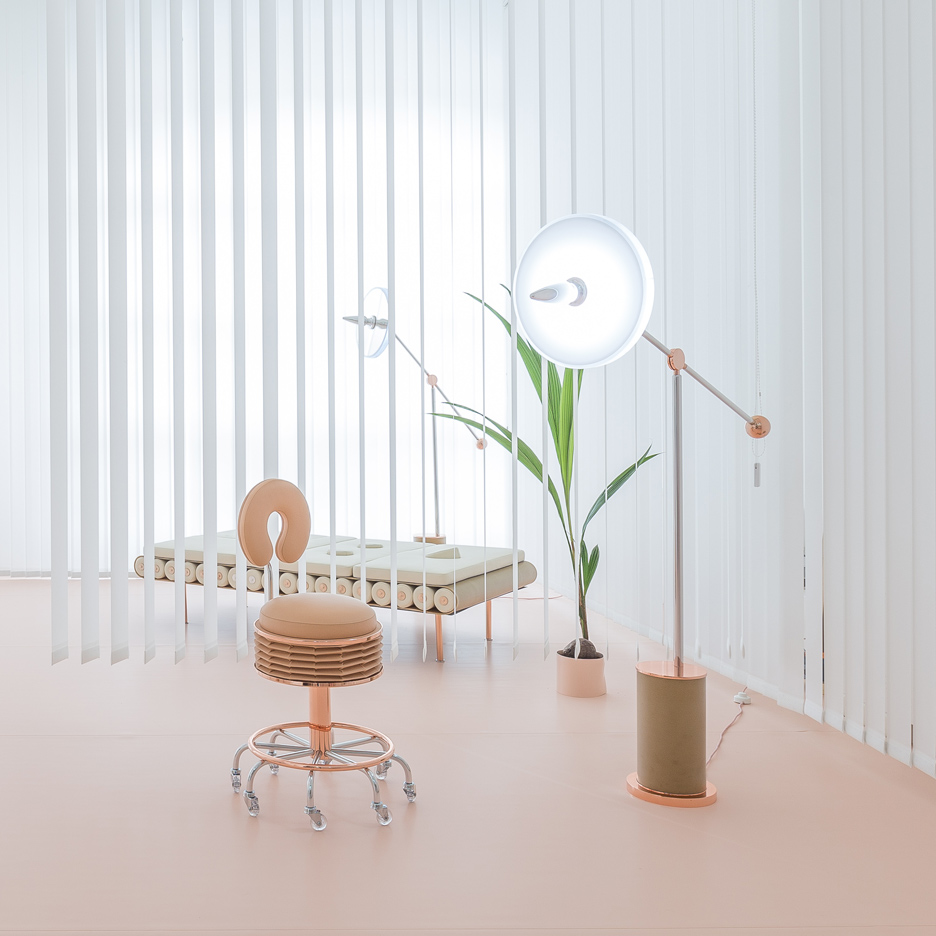
No Sex by Atelier Biagetti is a “futuristic paradise” for sexual rehabilitation


Milan 2016: Atelier Biagetti invites people to take sanctuary from an over-sexualised world inside a surreal clinic featuring pastel pink furniture, clinical curtains and attendants in nurse’s outfits (+ slideshow). (more…)

http://ift.tt/1Nk1NXb

House Robert-Jan & Inge / Personal Architecture


© Ossip van Duivenbode

© Ossip van Duivenbode


© Ossip van Duivenbode


© Ossip van Duivenbode


© Ossip van Duivenbode


© Ossip van Duivenbode


© Ossip van Duivenbode

© Ossip van Duivenbode

From the architect. On a parcel almost a kilometer in length, Personal Architecture (PA) realized a new-built home with a sweeping view of the surrounding meadows and the nearby church tower. It is a traditional dike house, at rst glance. But on closer investigation, it is a contemporary residence with a hint of mystery.


Section

Section

“The house should not be a ‘stark box in an empty eld’ but also not a ‘quaint ol’ farm house’. Not too striking, but certainly titillating: warm and friendly with a oorplan that is both spacious and practical.”


© Ossip van Duivenbode

© Ossip van Duivenbode

PA created a unique design that is both charming and bold. From outside, the home resembles a traditional, two-story house clad in bricks and slate. Yet it is evident that the pallet of materials has been applied in a contemporary manner, which gives the house a bold presence. Details like the four meter high windows in the north and south-facing walls and the subtle band of brickwork that protrudes from the façade reveal that this is no ordinary house.


Plan

Plan

Plan

Plan

Plan

Plan

Inside, the duality of the residence comes to fruition. The living program is spread over ve di erent oor levels, which are spectacularly brought together by the ribbon-like staircase that weaves from one level to the next. The open kitchen at ground-level forms the heart of the home. Large, story-high sliding doors on either side make this room an extension of the garden. The ooring contributes to this notion: a ‘carpet’ of single- red tile runs from the southern terrace, through the house, to the northern terrace.


© Ossip van Duivenbode

© Ossip van Duivenbode

From the open kitchen you can descend a half story to the semi-basement, where the hobby space and music room are located, or climb past the landing to the living room. The living room is just a half-story higher than the kitchen, which preserves the interaction between the two spaces whilst enabling a view over the dike to the estates across the water from the comfort of the living room couch. From the living room you can see the elevated split level oor on which the study, master bedroom, children’s rooms and bathroom are located. At the top of the staircase, two bedrooms and another bathroom are nestled comfortably in the gable roof.


© Ossip van Duivenbode

© Ossip van Duivenbode

http://ift.tt/1WmVLfD