House Miyagino / Kazuya Saito Architects


© Yasuhiro Takagi

© Yasuhiro Takagi


© Yasuhiro Takagi


© Yasuhiro Takagi


© Yasuhiro Takagi


© Yasuhiro Takagi

  • Structural Design : Atsuhiro Nakahata
  • Builder: Kyoei Housing
  • Site Area: 94.33 sqm
  • Building Area: 69.63 sqm

© Yasuhiro Takagi

© Yasuhiro Takagi

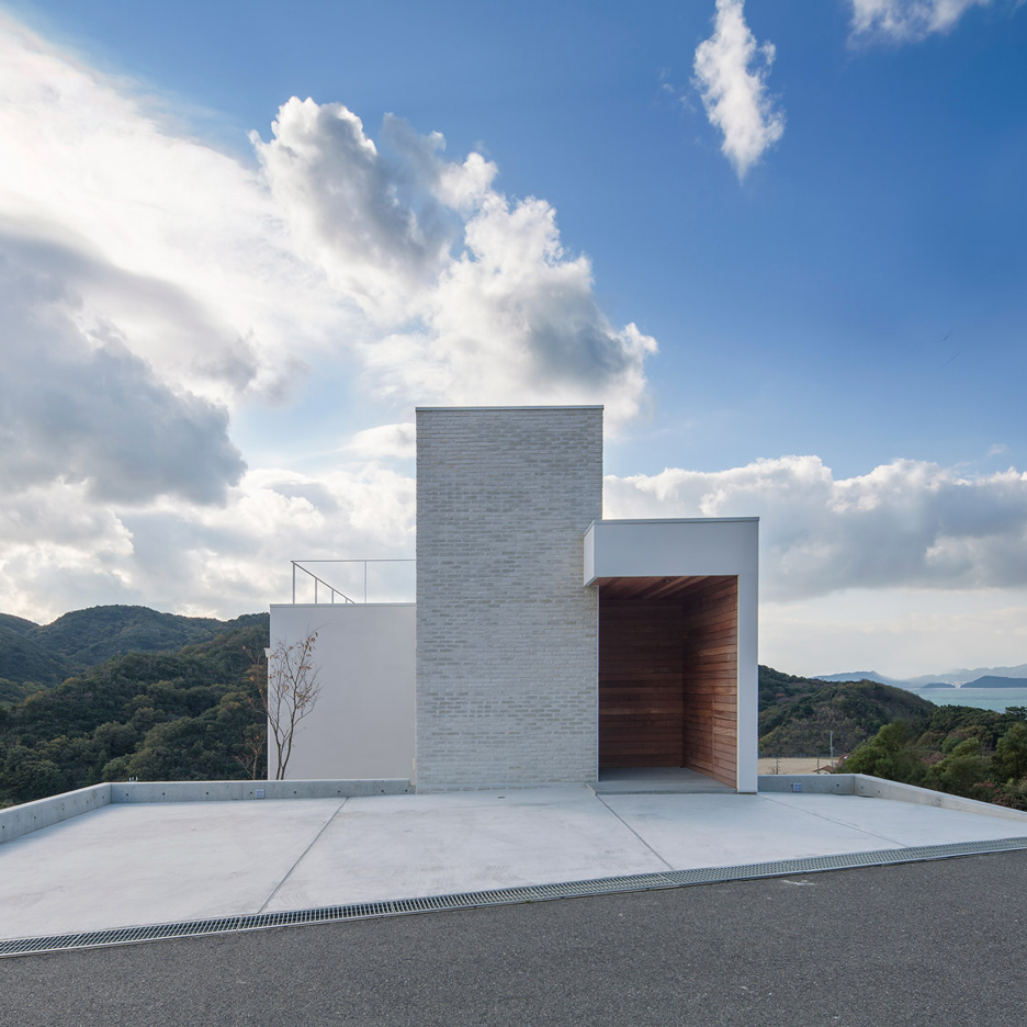
It is a steeled house with shop consisted of “1 core”, “2 volumes”, and “3 stories”.

Miyagino, located 1.5 km east of Sendai station, is the active area packed with sports facilities such as a baseball stadium and general athletic park. The site has a frontage of 8 m and a depth of 11 m. There used to be a two-story wooden house as a Tofu shop owned by a client’s grandfather, so the clients were living in this house and running a cafe. Because the house became old and the clients expected new family members, they requested a rebuilding of two-family dwelling combined with a cafe shop.


© Yasuhiro Takagi

© Yasuhiro Takagi

Plan

Plan

The surrounding area used to be a shopping street, so a row of narrow buildings remains as the trace of the old days. If we piled up the requested floor space from clients while setting the height at 9 m to relax the legal limitation, the house would be a huge volume and out of accord with its surroundings. Therefore, we divided it into two long narrow volumes to achieve harmony with the surrounding. The east side of the volume is 2.7 m cantilevered to secure a parking space. Thick exterior wall designed with a Tofu motif is finished by an elastic plastering. The thickness of the wall can conceal facility equipment in it, and avoid direct sunlight and rainwater instead of eaves.


© Yasuhiro Takagi

© Yasuhiro Takagi

Plan

Plan

© Yasuhiro Takagi

© Yasuhiro Takagi

The interior is a skip-floor structure combining high-ceiled 2 floors and low-ceiled 3 floors. Whereas cafe and dining where people stay for a long time face the south so that those spaces become expansive and bright, bedroom and water section are calm and quiet with the low-ceiling. That difference modulates the space of the house.


Section

Section

The core connecting 2 volumes has multiple functions, such as the flow continuing from the entrance to the terrace, the path of wind and daylight for the whole house, and the structure supporting a cantilever. While securing the independence of each room, connection of the core to each room gently expands the living spaces sequentially. We hopefully could actualize here a breezy and multidimensional living way like a horizontal house hollowed on mountains.


© Yasuhiro Takagi

© Yasuhiro Takagi

http://ift.tt/1qv2yYx

Up2green / 2305 studio


© Quang Dam

© Quang Dam
  • Architects: 2305 studio
  • Location: Lái Thiêu, tx. Thuận An, Binh Duong, Vietnam
  • Architect In Charge: Ngô Việt Khánh Duy
  • Area: 250.0 sqm
  • Project Year: 2015
  • Photographs: Quang Dam


© Quang Dam


© Quang Dam


© Quang Dam


© Quang Dam

  • Contruction: Nguyễn Hữu Công Uẩn, Lê Duy Tân
  • Model: Gia Triết

© Quang Dam

© Quang Dam

From the architect. This house is located in a spontaneous residential area (5x17m), where is also very mess and surrounding environment is relatively lack of greenery in Vietnam.


Model

Model

When architects and young couple met in a story about feelings, the future and their children, we want to give them a secret, a secret that only the children and who they love are known. 


© Quang Dam

© Quang Dam

Plan 1

Plan 1

© Quang Dam

© Quang Dam

The secret of the orchard, a secret about that every morning the children will rejoice because of the newly blooming flowers, the scent of ripe fruit on the branches or joy about her mother’s vegetable garden have added a new leaf color. The garden is a gift, the gift from dad to his daughter.


© Quang Dam

© Quang Dam

The children will grow up with the garden, along with orchard plants like grass growing up with his siblings. They will understand what the garden said and the garden will understand them. But all of them are secrets, the secret of emotions that only can feel like the way they open the window, eyes closed.


© Quang Dam

© Quang Dam

Plan 2

Plan 2

© Quang Dam

© Quang Dam

http://ift.tt/1YfA7sh

T Weekend Residence by Process5 Design lets residents dine and bathe in sea breeze


Osaka studio Process5 Design created this weekend retreat in western Japan to accommodate activities that are usually impossible in a city house (+ slideshow). (more…)

http://ift.tt/1MfppkJ

Dayangsanghoi / TUNEplanning


© Jeong Taeho

© Jeong Taeho


© Jeong Taeho


© Jeong Taeho


© Jeong Taeho


© Jeong Taeho


© Jeong Taeho

© Jeong Taeho

From the architect. Proyect description Pyeongchang-dong at the northern end of Jongro-gu, Pyeongchang was warehouse of Seonhyecheong, a government office which had managed receipt and disbursement of rice, cloth and coin used as means of tax payment in Joseon Dynasty, under the name of Daidongmi, Daidongpo and Daidongjeon each. As its name derived from Pyeongchang tells, this area had to build a ground up high with embarkment because of its high and slope topography as a village of power and wealth. At the end of the road, we can meet an interesting alley leading to a house of Pyeongchang-dong along the winding ridge of mountain Bukhansan edge which shows the views one by one.


© Jeong Taeho

© Jeong Taeho

Huge rockwall of this house ‘The piano was drinking, not me’ introduced on this magazine in Aug. 2009, is assimilating with nature while accumulating time with rain and wind as if it has been located there originally. Window and wall sloped obliquely stagger zigzag as they are drunk on nature like tipsy voice and lyrics of Tom Waits’ song, ‘The piano has been drinking, not me’. Whole space was embraced by metaphorical expression whether the wall is sloped or I am sloped. The designer created underground space of this house newly over the years.


© Jeong Taeho

© Jeong Taeho

Rocky mountain in the middle of Jongno-gu, heart of Seoul. Mountain is nothing but mountain in the distance. However, it becomes an object of faith when it spreads in front of people. The mountain Bukhansan formed by granites adapting to the times may be one of mountains which have such an energy. Bukhansan is the highest mountain in the suburbs of Seoul, has magnificent geographical features, has been guardian mountain of Seoul from old times, and also was called Sambongsan and Samgaksan because it consists of three peaks. (Sam means three, bong means peak, and gak means angle in Korean) As it says ‘celebrated temples are situated in celebrated mountain’, Bukhansan houses considerable places sacred to Buddha here and there.


Floor Plan

Floor Plan

I wanted to attach the much greater importance to the energy of rocky mountain than the region of Pyeongchang-dong. Unpolished beauty felt from pine trees and rocks of Bukhansan which have endured long-suffering has different feeling from the pretty and tender nature in the heart of city. In a sense, borrowing nature may feel disrespectful. Huge rocky mountain Bukhansan embraces Pyeongchang-dong and pine trees rooted in the rock has endured rain and wind. Compared to their scale, I only hope that artificial nature becomes to assimilate with nature through the times.


© Jeong Taeho

© Jeong Taeho

Dayang Sanghoi was planned as exhibition hall at first, but it is created as private lounge through several changes of plan to office, company training institute, studio, restaurant and cafe for some years. Dayang Sanghoi is a space for client’s leisure and party with acquaintances. It also has a stage on mezzanine for performance. Literally, it is a space which can hold every events diversely and keeps the natural feeling as it is. Therefore, it is named Dayang Sanghoi. (Dayang means diversity in Korean) It can be said that Dayang Shanghoi is an episode of previous project. While I expressed artificial concrete motivated by natural rook at the previous project, dense pine trees in the rocky mountain are the motif of this project. I wanted to show the natural raw materials such as stone and tree as they are. Artificial nature is doubtedly an imitation. I admitted it is an imitation and wanted it to look like an imitation. Therefore, I aim at fundamental meeting of natural stuff and artificial stuff by showing the processed material property. I placed furnitures unintentionally just like the nature formed without any intentional plan.


© Jeong Taeho

© Jeong Taeho

I recreated annual rings of pine trees as layers of plywood. A hanging pine tree was also calculated to express a gnarl more directly. Secret room is finished with mirror box and supported by pine tree trimmed roughly. Underground space was very humid because it has been empty for years. I enclosed its wall with metal angles, filled it up with charcoals and stones to circulate humid air, and equipped soundproofing. I placed rock on the floor intuitively while plastering work, and inner rock and outer rock of waterfront play a role to demolish the border between inside and outside.


Elevation B

Elevation B

I have proceeded the project ‘The piano was drinking, not me’ only through shop drawing without any master plan about for a year. Underground space has been empty for 4 years after being introduced on this magazine. Meanwhile, the unfinished ‘The piano was drinking, not me’ has been a burden in my mind, but now I seem to take it off.


© Jeong Taeho

© Jeong Taeho

http://ift.tt/1XhKDiy

OMA and Hassell to Design Perth’s New WA Museum


WA Museum in Perth. Image via Perth Now

WA Museum in Perth. Image via Perth Now

The Western Australia Government has commissioned OMA and Hassell to design the new WA Museum in Perth. The team was chosen over three shortlisted consortia for the reputation of “creating dynamic architecture” and “international reputation,” according to WA Culture and the Arts Minister John Day. A schematic design is expected to be released this summer. The museum plans to open by 2020. 

News via Perth Now

http://ift.tt/1UWWzZC

Standard Architecture creates minimal Hollywood showroom for Helmut Lang


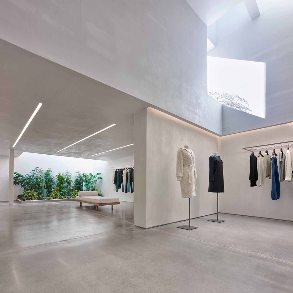
Los Angeles-based Standard Architecture has completed a store for fashion brand Helmut Lang that features smooth plaster walls, cove lighting and a light-filled garden (+ slideshow). (more…)

http://ift.tt/22daclU

YAS House / Estudio Arzubialde


© Franco Piccini

© Franco Piccini
  • Architects: Estudio Arzubialde
  • Location: Azcuénaga 444, Roldán, Santa Fe, Argentina
  • Architect In Charge: Franco Piccini, Santiago Rafael Baulíes, Martín Cabezudo
  • Collaborator: Cecilia Pellegrini
  • Area: 93.0 sqm
  • Project Year: 2014
  • Photography: Franco Piccini


© Franco Piccini


© Franco Piccini


© Franco Piccini


© Franco Piccini

  • Owner: Yasmina Roganovich – Franco Piccini
  • Construction Company: EA&ASOC

From the architect. In a next-to-a-square plot of land: the boundary between is considered as a facade. If we look though it, our plot may be perceived larger than it´s real size.  


Plan

Plan

Diagram

Diagram

The house is organized in two blocks: the day area, oriented to the north, with a straight connection to the backyard; and the night area, included on a parallel-to the-square block. A non-solid wall, made with bricks, helps to stop the strong western sun.


© Franco Piccini

© Franco Piccini

The house and its construction where solved with a mortgage credit which was given in quotas. The needs to fulfill the restricted, consecutive stages of this credit and the low budjet, made us organize the building phases with a layers-logic. Each layer responds to a particular phase of the credit, shaping precisely every construction period.


© Franco Piccini

© Franco Piccini

Because of the low budjet, the house was thought as a shell which attempts to cover the largest area as possible, considering but not building inner divisions and extra surfaces. Thereby, the room´s block was conceived as a unique space to be subdivided in the future, in three bedrooms, with furniture walls made with plywood and, in the North’s block, the roof folds generating a high space and suggesting the possibility of a future mezzanine. In this place, a big window allows the incoming of South’s difuse light and, once the mezzanine is built, the opportunity to contemplate the whole adjacent public area´s extension.


© Franco Piccini

© Franco Piccini

http://ift.tt/22d1jZC

Boston architecture students complain about “unacceptable” studio space


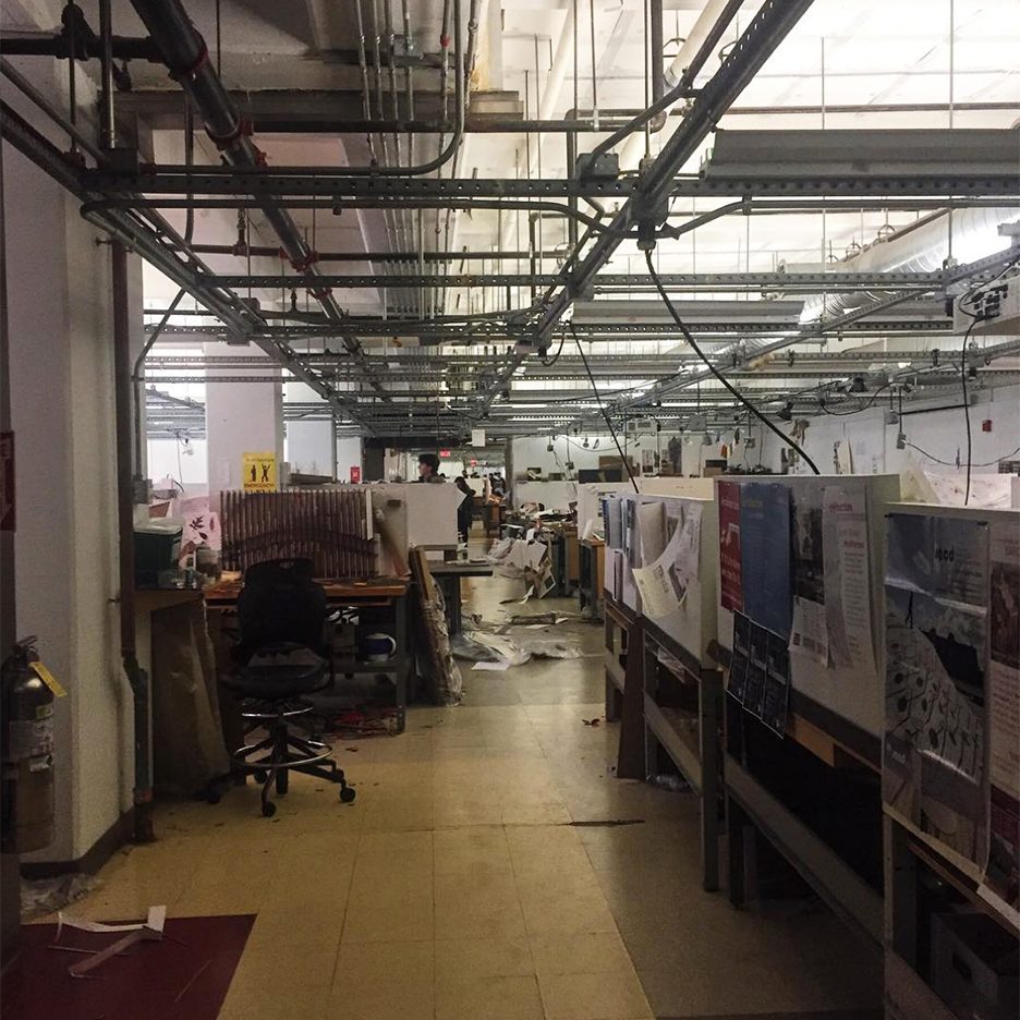
Architecture students at Boston‘s Northeastern University are petitioning for improved studio space, alleging their current working conditions are unsanitary, unsafe, cold and cramped. (more…)

http://ift.tt/1RECuUW

ETFE: The Rise of Architecture’s Favorite Polymer


The Eden Project / Grimshaw. Image © flickr user timparkinson, Licensed under CC BY 2.0

The Eden Project / Grimshaw. Image © flickr user timparkinson, Licensed under CC BY 2.0

Until recently, the architecture world largely viewed plastic polymers as inferior building materials, handy for wipe-clean kitchen surfaces, but not practical in full-scale building applications. But with technological innovations driving material capabilities forward, polymers are now being taken seriously as a legitimate part of the architect’s pallet. One of the most widely-used of these materials is a fluorine-based plastic known as ETFE (Ethylene tetrafluoroethylene). Brought into the public consciousness thanks to its use on the facade of PTW Architects‘ Water Cube for the 2008 Beijing Olympics, architects are now realizing the film’s capabilities to express a new aesthetic and replace costlier transparent and translucent materials.


© flickr user manusascorner, Licensed under CC BY 2.0


SSE Hydro Arena / Foster + Partners. Image Courtesy of Figueras


Anaheim Regional Transportation Intermodal Center / HOK. Image © John Linden


Watercube National Swimming Centre / PTW Architects. Image © flickr user garrettziegler, Licensed under CC BY-NC-ND 2.0

ETFE was originally developed in the 1970s by DuPont as a lightweight, heat resistant film to serve as a coating for the aerospace industry. Since that time, the film has been used sporadically in various agricultural and architectural projects, such as coverings for greenhouses and protection for solar cells. Then, in 2001, the material saw its first large-scale application as the encapsulating membrane of the Eden Project in Cornwall, UK, a natural evolution of Buckminster Fuller’s Biosphere concept. The consultant engineering firm for the project, Arup, selected ETFE because of its ability to reliably regulate environmental conditions within the building through UV transparency – the film can be printed with specific patterns and layered to control solar conditions – which was essential to a structure whose function is to house climate-specific flora. Additionally, the architects noticed ETFE’s low friction coefficient that prevents dust or dirt from sticking to its surface, reducing maintenance requirements.


Watercube National Swimming Centre / PTW Architects. Image © flickr user garrettziegler, Licensed under CC BY-NC-ND 2.0

Watercube National Swimming Centre / PTW Architects. Image © flickr user garrettziegler, Licensed under CC BY-NC-ND 2.0

Seeing the material’s success as a large surface membrane, Arup proposed ETFE in subsequent projects for the Allianz Stadium with Herzog & de Meuron (2005) and the aforementioned Watercube National Swimming Centre, in the latter project selecting the film not only for its aesthetic and functionality as cladding, but also for its acoustic qualities. In these applications, layers of ETFE are continually filled with air from a pneumatic system to create pillow-like cushions that provide thermal insulation and structural stability against wind or snow loads. In both arenas, individual cushions can be lit with color-changing LEDs to create unique patterns, allowing the building facade to reflect whatever event is taking place inside.


2015 Serpentine Gallery Pavilion / SelgasCano. Image © Iwan Baan

2015 Serpentine Gallery Pavilion / SelgasCano. Image © Iwan Baan

U.S. Bank Stadium / HKS. Image Courtesy of Minnesota Vikings

U.S. Bank Stadium / HKS. Image Courtesy of Minnesota Vikings

In the past few years, ETFE has blown up in the realm of stadium design, currently being featured in Foster + Partners’ SSE Hydro Arena, 360 Architecture’s New Atlanta Stadium, ACXT’s San Mames Stadium, and the soon-to-open U.S. Bank Stadium in Minneapolis, whose retractable ETFE roof is the largest installation of the material in the United States. But ETFE is also seeing a surge in non-sports architecture, most notably in SelgasCano’s design for the 2015 Serpentine Gallery Pavilion. Rather than using ETFE cushions, the architects wrapped 19 different colors of the film around a minimal steel frame to evoke a kaleidoscopic effect. In another example, KieranTimberlake Architects design for the U.S. Embassy in London included ETFE fins which would help shade the building’s exterior on its east, west and south sides while admitting daylight and increasing visibility for birds.


Anaheim Regional Transportation Intermodal Center / HOK. Image © John Linden

Anaheim Regional Transportation Intermodal Center / HOK. Image © John Linden

Unlike potentially health-threatening plastics such as PVC, ETFE is both easily recyclable and long-lasting, holding up to extreme climatic conditions. It is cost-effective to produce, and has a low-energy manufacturing and transportation process, thanks in large part to its light weight. Due to its elasticity, ETFE performs well during natural disasters such as earthquakes, and is self-extinguishing in case of fire.


CEPSA Service Station / Saffron Brand Consultants + Malka+Portús arquitectos. Image © Montse Zamorano

CEPSA Service Station / Saffron Brand Consultants + Malka+Portús arquitectos. Image © Montse Zamorano

Plastic polymers seem to have finally become accepted as practical and successful building materials, and ETFE has already been utilized to great effect in a number of architectural projects. Now it’s up to architects to continue to discover new ways of using the material.


SSE Hydro Arena / Foster + Partners. Image Courtesy of Figueras

SSE Hydro Arena / Foster + Partners. Image Courtesy of Figueras

http://ift.tt/22cRIlE

Front designs bent-wood rocking horse for Gebrüder Thonet Vienna


Milan 2016: Stockholm studio Front has based the design of this minimal rocking horse for Gebrüder Thonet Vienna on an old bent-wood chair from the furniture brand’s archive. (more…)

http://ift.tt/1Mesf9L