20 Things You Didn’t Know About Mies van der Rohe


Philip Johnson, Ludwig Mies van der Rohe, y Phyllis Lambert frente a una imagen de la Torre Seagram, Nueva York, 1955. Impresión, 7½ × 9⅜ in. Fotógrafo desconocido. Fonds Phyllis Lambert, Canadian Centre for Architecture, Montreal. Imagen © United Press International

Philip Johnson, Ludwig Mies van der Rohe, y Phyllis Lambert frente a una imagen de la Torre Seagram, Nueva York, 1955. Impresión, 7½ × 9⅜ in. Fotógrafo desconocido. Fonds Phyllis Lambert, Canadian Centre for Architecture, Montreal. Imagen © United Press International

Today marks 130 years since the birth of German architect Ludwig Mies van der Rohe. In honor of this tremendously influential figure, we’re shining some light into the lesser known facts about Mies’ life in order to better understand and contextualize his architecture.

For this, our colleagues at ArchDaily en Español have referred to “Vidas construidas, Biografías de arquitectos” (Constructed Lives, Biographies of Architects), a book by Anatxu Zabalbeascoa and Javier Rodríguez Marcos. This text, released by publisher Gustavo Gili, features the biographies of 20 of the world’s most celebrated architects, from the Renaissance to the Modern movement. Each story is a fascinating journey into the lives of each architect, and the details allow us to understand the genesis of many works that are today considered classics.

We’ve chosen 20 facts that reveal the thoughts, influences and decisions that brought Ludwig Mies van der Rohe’s architecture to the forefront of modernism.

1. Defying convention, Ludwig Mies decided at age 30 to keep his mother’s (Amalie Rohe) last name, and fuse it with the last name of his father (Michael Mies) with a self-invented “van der” in the middle. This constructed name reminded him of his birthplace in Belgium and its neighbor, the Netherlands.

2. He learned about materials from his stonemason father. His senstivity to the beauty of combining different material palettes is best expressed in his masterpiece, The Barcelona Pavilion (1929).

3. He earned his first job in an architecture studio after working out (in one hour!) a drawing of a facade that his boss had been trying to resolve for weeks.

4. His first commission came in 1906 in the form of a project for the Philosopher Alois Riehl in Potsdam. The resulting traditional house carries echoes of 19th century design principles.

5. In 1908 he met Peter Behrens, a master who inspired Mies’ passion for the work of Karl Friedrich Schinkel (1781-1841) –Germany’s preeminent Neo-Classical architect.

6. In Peter Behren’s office he became the colleague of Walter Gropius. Gropius worked on industrial projects while Mies attended to more traditional tasks. During this time they developed a “cordial rivalry.”

7. Mies appreciated and was influenced by the work of Dutch architect Hendrik Petrus Berlage, even though Behrens was not as impressed with Berlage’s work.

8. The parents of Mies’ first wife, Ada Bruhn, were pleased about their daughter’s relationship with the architect since they considered his future bright. They were not as pleased, however, with his last name (Mies), which in German means “lousy” or “crummy.”

9. The architect’s interest in abstraction and rationalism was strengthened by his friendships with artists like Hans Richter, El Lissitzky and Theo van Doesburg.

10. In 1927 Mies was in charge of the urban plan of the Weissenhofsiedlung, an avant-garde showcase of the International Style. He selected, among others, Le Corbusier, Walter Gropius, Peter Behrens, Bruno Taut and Hendrik Petrus Berlage to participate in the project, and he himself designed a three-story house for the estate.

11. In 1930, while the Barcelona Pavilion was taken down from its original location, Mies was named director of the Bauhaus. He was brought in to replace Hannes Meyer, and the students complained as they preferred Meyer’s functionalist approach over Mies’ aestheticized vision.

12. Many at the Bauhaus were disillusioned when they learned that Mies had been the only one to sign a motion of support for Hitler and National Socialism in 1934.

13. When Mies realized that Hitler’s preferred the monumental Neoclassicism of Albert Speer, he decided to leave Germany in 1937.

14. In 1937 the Armour Institute of Technology (later to be known as the Illinois Institute of Technology, IIT) in Chicago offered Mies the chance to direct the School of Architecture. He accepted, but only after turning down a similar position at Harvard University’s architecture school.

15. One of the first things Mies did when he arrived in Illinois was meet Frank Lloyd Wright, who received him warmly. (Wright did not extend the same courtesies to Le Corbusier or Walter Gropius, sadly.)

16. During his first years in Chicago he lived in a hotel and claimed to have only three necessities–Martinis, Dunhill cigars and expensive clothes. To that he added three prized possessions–works of art by Max Beckmann, Wassily Kandinsky and Paul Klee.

17. The only commission he received in his first decade outside of Germany came from the University that employed him. He was called on to design the masterplan of the IIT campus, which resulted in the building of a chapel and the famous Crown Hall.

18. In 1945 Edith Farnsworth chose Mies over Le Corbusier and Frank Lloyd Wright to design her weekend retreat house.

19. Mies’ involvement in the design of the Seagram Building came out of his relationship with Philip Johnson. He maintained an intense love-hate relationship with the curator throughout his life.

20. Ludwig Mies van der Rohe passed away in 1969, mere weeks after Walter Gropius died. A year before his death, Mies was asked what kind of building he would have liked to build; he answered, “A cathedral.”
http://ift.tt/1UuZ59h

Industrial Facility designs mushroom-shaped Ode lamps for Herman Miller


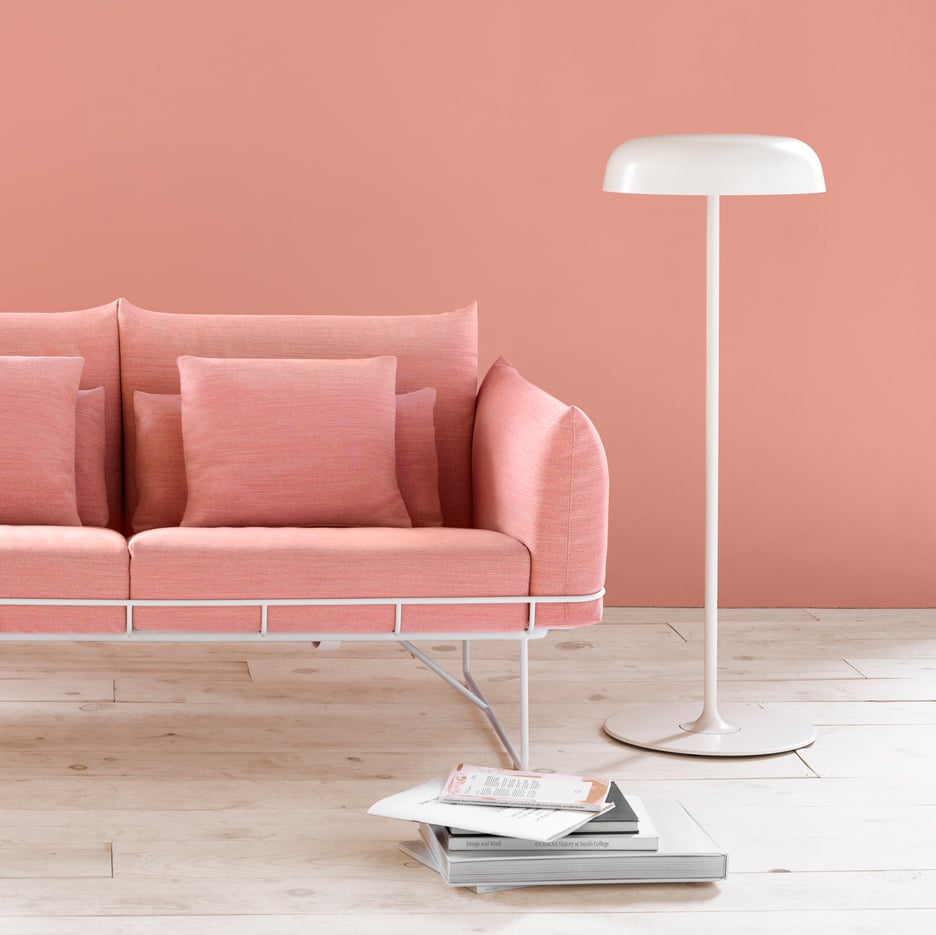
These lamps by London design studio Industrial Facility feature rounded shades modelled on the shape of street lights, designed to cast pools of light. (more…)

http://ift.tt/1LRcyVO

Caramoniña Allotments / Abalo Alonso arquitectos


© Hector Santos Diez

© Hector Santos Diez
  • Architects: Abalo Alonso arquitectos
  • Location: Rúa da Caramoniña, Santiago de Compostela, A Coruña, Spain
  • Architect In Charge: Elizabeth Abalo, Gonzalo Alonso, arquitectos
  • Area: 2650.0 sqm
  • Project Year: 2015
  • Photographs: Hector Santos Diez


© Hector Santos Diez


© Hector Santos Diez


© Hector Santos Diez


© Hector Santos Diez

  • Collaborator: Roi Ríos
  • Structure: Carlos Bóveda
  • Installation Design: Gaia Enxeñería
  • Technical Architect: Francisco González
  • Construction: Copcisa. Delegado Javier Sal. Jefes de obra, Rocío Alonso, Julio Vendrell
  • Geotechnical And Quality Control: Euroconsult
  • Topography: Xeotec
  • Promoter: Concello de Santiago, Javier Fernández, arquitecto municipal en proyecto. Diego Briega, arquitecto municipal en obra.
  • Cost: 348.000,00€

© Hector Santos Diez

© Hector Santos Diez

From the architect. The Spanish city of Santiago de Compostela became a World Heritage Site in 1985. Since then the Council has been working on buildings, both public and private. Over the last years, the Council has begun working on public space too; the parks, the streets or the squares. But even so there are still vacant sites in the city, complicated sites, without any clear use or even good access.


Master Plan

Master Plan

Caramoniña is one of these sites. It is on the way from the Historical City to the nearby Almáciga neighbourhood, completed in the seventies. Both of them are little hills. But Caramoniña is also situated in the east green belt of the Historical City. We have to walk a narrow path to reach it from the historical side and go down a lot of steps from the other side. It has a difference of over twenty metres in height between the two entrances, with six platforms. And there are also several ruins of traditional constructions. There are buildings by Lopez Cotelo, close to the plot, on the east side. We can see Bonaval Park, by Alvaro Siza, on the south side, and several little terraced houses and a big school are situated on the west and north sides. The land falls from the east to the west side. There are also several trees, four wells and very good views over the Historical City.


© Hector Santos Diez

© Hector Santos Diez

First of all, we analyzed the slope to favour the connection and accessibility among the platforms. There is over three metres between each one. Due to the space we could design ramps to connect the lowest three of these platforms and low lying steps between the highest two. You can enter directly from the outside to the intermediate platform without steps. We can call this the long walk. We also designed a short, and quick, walk, close to the ruins. In some strategic points, between the ramps, or among the trees, or sites with good views, we put benches to rest, or to talk, or to enjoy the Historical City picture. People can even use the old stone walls to seat on.


Diagram

Diagram

However, the maintenance of a park can be expensive sometimes. If we introduce other uses or opportunities, citizenship can collaborate with this maintenance. If we look into the site history we can recover the old allotments and bring them back to the present. In fact these plots were the kitchen gardens of the old houses in the current ruins. The neighbourhood can use these allotments, over forty or fifty, and collaborate in the maintenance of the plot, among other advantages.


© Hector Santos Diez

© Hector Santos Diez

Is there anything more sustainable than a site which cares for itself? Accessibility plus activity lead to sustainability. In order to complete this sustainability, we restructure and purge the land, and reuse the old stone walls. We also recover the old wells and make a watercourse through the sequential platforms. At the end of this watercourse we shall rehabilitate two of the ruins as storage, wash room and toilet, where we will recycle the water. The wash room is important for the workers, but public toilets are also very important for children and the elderly.


Render

Render

We illuminate the plot as if we were in the fantastic “Campus Stellae”, with several types of embedded lights in the ground. Some people say that the name of the city proceeds from the Latin “campus stellae”, star field.


Sketch

Sketch

Accessibility plus activity plus sustainability give us a better quality of life. We improve the connection and accessibility between both of the neighbourhoods, those who live in the Historical City and those who live in the Almáciga. We also allow them get better and well known fresh food while they do exercise. We design a place where they meet, a secure place easy for the elderly or disabled to use.


© Hector Santos Diez

© Hector Santos Diez

We use stone in some of the walls, concrete in other walls and some pavements, and earth in other pavements. And we also use orchards, and onions, and lettuces, and carrots, and…

http://ift.tt/1Py7gJv

Jaro Krobot Designs a Home Surrounded by Rolling Green Hills in Slovakia

Wooden Brick House by Jaro Krobot (2)

Wooden Brick House is a private home located in Lučatín, Slovakia. Completed in 2014 it was designed by Jaro Krobot. Wooden Brick House by Jaro Krobot: “The house is built in Lučatín, a small village in central part of Slovakia. This fragile environment has clearly set the limits and inputs – volume of building, scale, urbanism of village, wood as a material – both structural and visual. There has been..

More…

Pump House Renovation / NAN Architects + JWDA


© NAN Xu, XIAO Xiao

© NAN Xu, XIAO Xiao


© NAN Xu, XIAO Xiao


© NAN Xu, XIAO Xiao


© NAN Xu, XIAO Xiao


© NAN Xu, XIAO Xiao


© NAN Xu, XIAO Xiao

© NAN Xu, XIAO Xiao

© NAN Xu, XIAO Xiao

© NAN Xu, XIAO Xiao

From the architect. The pumping station has been abandoned for many years, staying lonely in the neighborhood. People passing by,never realize its existence nor even take a look at it. However, Mottled walls and wild vines hide a lot of memory. It is the architect’s topic to revoke its existence. The client wants to convert it into office of 8-10 occupants. Space is the essence of architecture. Our strategy is to maintain its structure and spatial relationship, and eliminate superfluous decorative elements, dig out its inherent memory and value.


Second Floor Plan

Second Floor Plan

Different from the common buildings,The pump House has many holes on the floor for device use , and two exhaust chimneys on the corner. Although these components are no longer used, we still reserve and convert them into new building elements to have a dialogue with the old memory.


© NAN Xu, XIAO Xiao

© NAN Xu, XIAO Xiao

As the office is settled in a residential area, the privacy of the office is one of the most important factors in this design. We locate the terrace on the south facade which is away from the residential buildings. On the north facade which is visible from the residents, we built a solid wall with a skylight and a bottom ribbon window, which make the space mysterious but not depressed. The pumping station is six meters high, with lots of high-side window . An added mezzanine space can take advantage of these windows. What we only need to do is to adjust its size and proportion slightly. We convert the original underground water storage space into a basement. In order to avoid risks of bio-gas, the basement entrance is located outdoors,where cantilevered steel steps can be located between the gap of the arc retaining wall and the main building. Two old trees adjacent to the building looks more prosperous in front of the pure white wall.


© NAN Xu, XIAO Xiao

© NAN Xu, XIAO Xiao

© NAN Xu, XIAO Xiao

© NAN Xu, XIAO Xiao

http://ift.tt/1MsY3HE

A Clean, Luminous Apartment in Saint Petersburg

Our latest Pinterest board is crammed full of ideas for compact living

Micro apartments feature on Dezeen's Pinterest board

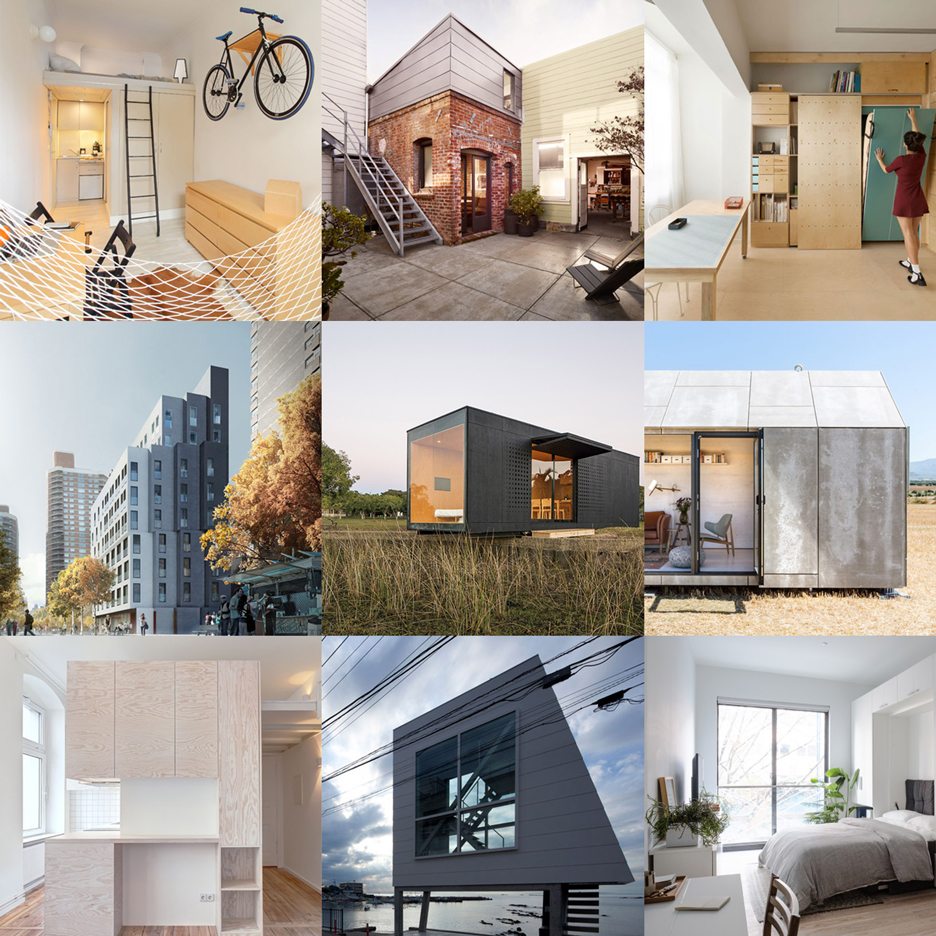
Micro apartments are being touted as the solution for cities facing an affordable housing crisis, so we’ve squeezed some examples onto our Pinterest board dedicated to tiny homes. Explore a Wroclaw flat occupying just 13 square metres, a dwelling in Madrid with rooms connected by ladders, and many more.

Follow Dezeen on Pinterest | See more micro homes in our archive

http://ift.tt/1RH9m1k

LK+RIGIdesign Office Design / Kai Liu, RIGIdesign team


© Jack Wen

© Jack Wen


© Jack Wen


© Jack Wen


Model


Isometric

From the architect. After more than ten years’ development, RIGIdesign has grown into a comprehensive design team consisting of young designers. As time moves on, RIGI has developed its unique design concept and style; its work covers brand, space, visualization, and product. There are no boundaries for design, and the world is multidimensional, thus design does not belong to only one category. Logic, skill, the expression of emotion and sense of beauty that contains in design are what designers chase for. RIGI’s designs are simple and warm, and we spend a great deal of energy making real connection with people.


© Jack Wen

© Jack Wen

Kai Liu, Founder of RIGI thinks that he needs a suitable space to accommodate and convey RIGI’s temperaments. And this leads to the reconstruction of RIGI office. A nice space should be emotional and simple, and could have some kind of connection with people. And the most important thing is that it presents its understanding of life and reveals true feeling for people. The essence of design is to solve problem, from this point of view, there is no difference in designing a button and a city. To understand customers’ needs, the designer must pay attention to people and to life. Kai Liu begin his new tries and experiments in this space with an area of more than 200 square meters.


© Jack Wen

© Jack Wen

The site is located in a creative complex building which reconstructed from a former factory. It used to be a studio, a common and standard rectangular space with natural lighting from one side. The only advantage that the designers can use is the comparatively high storey height. After taking functional requirements into account, this space is divided into an open office, an independent office, lab area, a meeting room, a material room and a small show room. To grant different functional spaces unique characteristics, different design approaches are adopted. Through weaving of spaces with different characteristics a complicated and simple office is built. Just like designers of RIGI, every one of them may have a unique understanding about design, but together, they make the unique RIGI. Every day, they gather here to create something interesting.


Isometric

Isometric

On one side of the reception area, it is the meeting room. The original space is narrow and with a height of 4 meters, which is not an ideal space for meeting room. In order to eliminate the stereotype of normal meeting room, the ceiling is shaped as pitched roof with chamfered edges, and at the end of the meeting room, a light spread out from the wall is designed by Kai Liu, which eliminates the original sense of narrow, and blurs the boundaries of the whole space while adding a feeling of ritual to the meeting room. Kai Liu hopes designers can have pure communications in this pure white geometric space. For a minimalist space which is built with single material, more attention should be given to sense of layer and details. Thus random shadow is used to express the relationship between blocks of walls and skirting board of the meeting room. The side cutting edge of the conference table keeps its natural color after polishing, you can see the board is multiply wood, and you can touch the nature of the material, it shows an attitude of pure and frank.


© Jack Wen

© Jack Wen

To create a cozy and spacious office, the ceiling is kept and exposed with purpose by the designers, which creates an open, bright and cozy space for stuff. Above different function zones, several colorful boxes which hide behind the pipe and equipment give a clear definition of the areas below, and increased the rhythm of the overall space. Visual effect is introduced into the blocks, which brings the space a feeling of living fun.


© Jack Wen

© Jack Wen

Creatively using of soft dark gray felts as wall material conveys a feeling of intimacy which at the same time presents a rich texture layers through comparing with black and white coat of paint. Meanwhile, by using light weight open bookshelves as partition, together with appropriate plants, the environment becomes more friendly and lively. Space is a carrier which carries the emotions and stories of the user. So design is not that complicated, just adding a little tolerance and fun to life will work.


© Jack Wen

© Jack Wen

A lab named “LKLAB” is built inside the office, it is the place where Kai Liu and other designers build models and display their favorite objects. Within this space, designers can have discussions, develop products and produce models of space. To design is to create something unknown, so it should be a passionate thing. Design is not completely computer operation, although computer may help to improve the efficiency of design, designers need to use their hands and eyes, and do their own thinking in order to get good designs, sketches and models. So Kai Liu hopes that designers do not be over dependent on computers. A space may have different kinds of combination under different thinking and timing.


© Jack Wen

© Jack Wen

“Sometimes a space is like a book, when turning pages and finding the sentences you like, you may label or mark them; while in a space, you have to walk through it and try to feel it and understand it, this is another kind of reading” said Kai Liu. And this should explain why Kai Liu loves to add visual effects into the space to create connection between human and the space. Every word and number printed on the bottles designed by Kai Liu has some kind of meaning. When you open the door, some contagious and meaningful sentence in Sans serif stick on the wall will come into your eyes; they grant the ordinary wall a kind of emotion. Kai Liu believes that sense of dimension is very important for an interior designer, so in order to develop designers’ accurate sense of dimension through constant implication, many of the walls and furniture in RIGI office are marked with dimensions.


© Jack Wen

© Jack Wen

In RIGI’s office, the texture of wall, ceramic tiles, cabinets, flower pots, lamps, electrical outlet and cord hole are all in the most basic geometric shapes such as triangle or square. RIGI’s designers believe that simple shapes are more powerful. The same goes for material, the most direct texture can impress Kai Liu the best: soft felt, matt painting and cool cement. He gets rid of methods of complicated stacking, and trying his best to make his design as simple as possible.


Isometric

Isometric

It could be a kind of habit or a kind of literacy, designers are born sensitive to display. Kai Liu and his colleagues have been collecting lots of utensils, plants and models. When playing with them, it is a process of thinking and having fun. A space is just a container, only when there are people living and working in it, it has life.


© Jack Wen

© Jack Wen

Color is another thing that designers care about. Through the using of colors, designers hope to project a kind of mood which is hard to be defined, which at the same time will not bring people an extremely direct and strong feeling. Two contrast colors are used in the design of RIGI office. Instead of pure red and blue, they are combination of colors whose saturation is lowered and which brings people a sense of happiness.


© Jack Wen

© Jack Wen

Comparing with the office space itself, we care more about colleagues who will enter this space, stories and designs that will happen here, and the collision of thoughts results from behavioral requirements, experience and subjective feeling. This is what RIGI is pursuing to – creating interesting and warm designs which have connections with people. RIGI grows together with people and life.

This is RIGI’s room, houses joy and annoyance and a period of time. Better Design, Better Life,Our big dream never die.


© Jack Wen

© Jack Wen

http://ift.tt/1LQvLaf

Honeymoon retreat by Andrew Patterson nestles on shoreline of a New Zealand peninsula


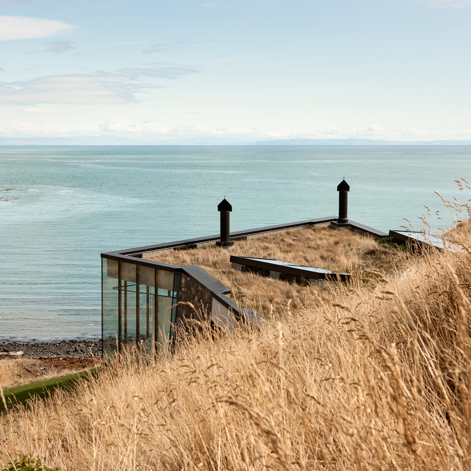
This tiny stone cottage by Patterson Associates provides a remote honeymoon retreat on the rugged coast of a New Zealand peninsula (+ slideshow). (more…)

http://ift.tt/1q8h6NC

Melike Altınışık Architects Wins First Mention in Competition for Kızılırmak Bridge in Turkey


Courtesy of Melike Altınışık Architects

Courtesy of Melike Altınışık Architects

Melike Altınışık Architects has won first mention in a competition to design the Kızılırmak Bridge located in Sivas, Turkey. The competition, which was hosted by Sivas Municipality, called for ideas to design a bridge to support pedestrian movement, vehicular transportation, and cycling activities. The proposal aimed to create an “avant-garde looking design approach to obtain coherency between plan and sections, and harmonize the bridge with its topography.”


Courtesy of Melike Altınışık Architects

Courtesy of Melike Altınışık Architects

The designed bridge fully grasps both the morphological and structural elements which define the physical conditions of Sivas. This new bridge also plays a key role in bringing together two socially and culturally significant hubs of Sivas Cumhuriyet University and Sivas City Centre.

The new route integrates various green areas which help organize the routes of transit and will be nourished by the water flor of the Kızılırmak below. The green space creates the potential for social activities around the pedestrian walking areas, allowing the program to evolve from just a bridge into s place to gather.

Update: The title of this article has been updated to reflect the fact that Melike Altınışık Architects did not win the competition, but were awarded first honorable mention for their competition entry. 


Courtesy of Melike Altınışık Architects

Courtesy of Melike Altınışık Architects

Courtesy of Melike Altınışık Architects

Courtesy of Melike Altınışık Architects

http://ift.tt/1MJ33Tw