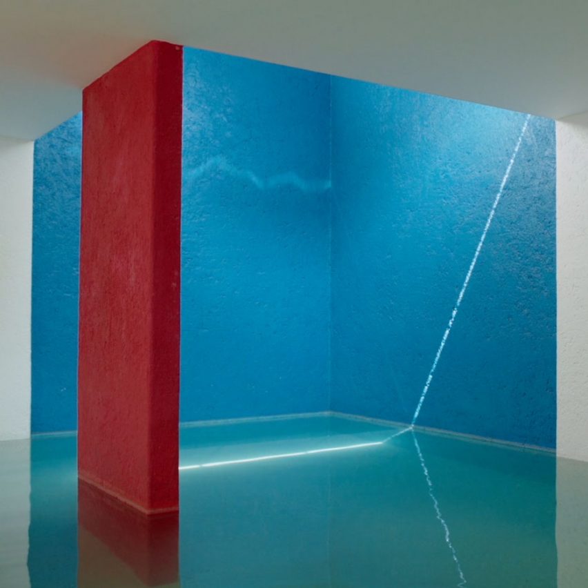
This film created for design video channel Nowness gives a tour around legendary Mexican architect Luis Barragán‘s last house – a bachelor pad turned family home in Mexico City. Read more
This film created for design video channel Nowness gives a tour around legendary Mexican architect Luis Barragán‘s last house – a bachelor pad turned family home in Mexico City. Read more

Artist Rolf Sachs has collaborated with Leica to cover the camera brand’s M-System model in the same material used on ping-pong bats. Read more

From the architect. The initial brief for a largely unrefurbished Victorian house on the South Side of London’s Westbourne Grove, centred around establishing a new family home for two adults and their young children. During the course of the project the family expanded from two children to four. Behind the original façade, the buildings circulation, rear form and fenestration limited the development of a new section able to generate enough space for a growing family.
The resulting project involved the complete demolition of all original accommodation behind the front façade, and substantial excavation to facilitate the new proposal.
The original half landing and cross wall configuration was superseded by vertically stacked circulation over six levels, and more generously proportioned and planned spaces. The living and dining area, over two levels, are linked by a double height gallery and motorized door, which opens directly onto a rear courtyard. Family accommodation extends beyond the new lower ground level up to the Westbourne Grove pavement.
Level 1 is dedicated to the Master suite, with the upper levels accommodating the 4 children. The carefully considered simple palette of materials have been chosen to absorb and reflect light and provide continuous surfaces for the clients substantial art collection. Florentine Pietra Serena limestone is used throughout the living spaces and bathrooms, and grey oiled Oak is the primary floor surface in all bedrooms.
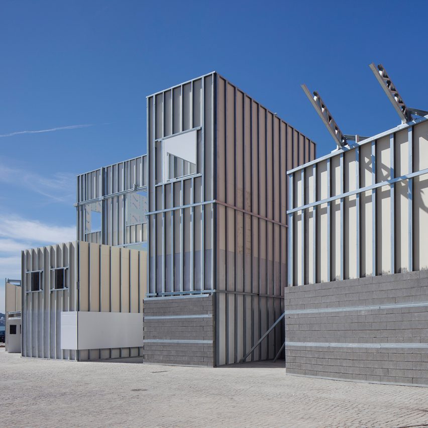
This pavilion created for the Lisbon Architecture Triennale mishmashes the architectural styles of three studios to question authorship. Read more

Museums are increasingly becoming key landmarks that help define the image of a city, housing part of its memory and culture. In recent decades they have gained even more importance thanks to their architectural designs. Briktop was inspired by iconic designs to create this video that features works that stand out in architectural history and are important references for all architects.
See the video and the list of works below.
Learn more about all the museums that appear in the video by clicking on the following links:

Finnish practice Alt Arkkitehdit has covered a family home in northern Finland in weathering steel panels and greying spruce planks that help it to blend into its woodland setting. Read more
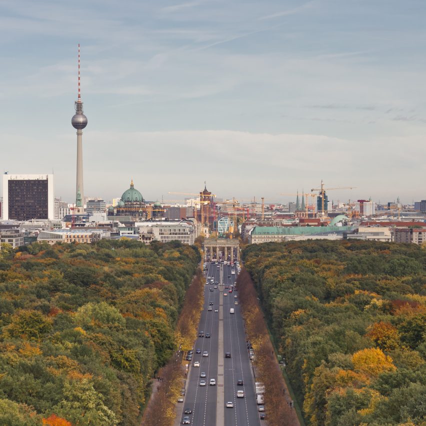
Dezeen promotion: this year’s World Architecture Festival will address a range of housing issues, including displaced communities, modern lifestyles and global urbanisation. Read more

This article originally appeared on guggenheim.org/blogs under the title “Nine Guggenheim Exhibitions Designed by Architects,” and is used with permission.
Exhibition design is never straightforward, but that is especially true within the highly unconventional architecture of Frank Lloyd Wright’s Guggenheim Museum. Hanging a painting in a traditional “box” gallery can be literally straightforward, whereas every exhibition at the Guggenheim is the reinvention of one of the world’s most distinctive and iconic buildings. The building mandates site-specific exhibition design—partition walls, pedestals, vitrines, and benches are custom-fabricated for every show. At the same time, these qualities of the building present an opportunity for truly memorable, unique installations. Design happens simultaneously on a micro and macro scale—creating display solutions for individual works of art while producing an overall context and flow that engages the curatorial vision for the exhibition. This is why the museum’s stellar in-house exhibition designers all have an architecture background. They have developed intimate relationships with every angle and curve of the quarter-mile ramp and sloping walls.
The Guggenheim is Wright’s one and only art museum. Approaching the museum holistically, he conceived of it as a comprehensive display system, intending the museum to frame art objects naturally: continuous skylights on the ramps were designed to pour natural light onto walls that are set, like easels, at a 97-degree angle. He envisioned paintings simply resting against the angled back walls, and the gallery was equipped with an integrated security system—the sloped apron-base that joins the gallery floor to the back wall was developed to keep visitors a safe distance away from artwork. [1] All of these built-in details were nice in theory, but even Hilla Rebay and James Johnson Sweeney, the first two directors of the museum, had their concerns. Since the inaugural exhibition in 1959, the skylights have been covered and substituted with artificial light and the artwork hung vertically—mounted off the back walls.
Since 1959, the Guggenheim has hand picked a select few esteemed architects to interpret and confront Wright’s rotunda, three of whom now hold the most prestigious award in architecture, The Pritzker Prize. Both Frank Gehry and Zaha Hadid’s offices designed their own retrospectives (in 2001 and 2006, respectively), but prior to designing the display of their own work, the architects had each designed notable exhibitions at the museum. In 1992, Hadid designed The Great Utopia: The Russian and Soviet Avant-Garde. Her design was characterized by sharply angled vitrines and a prominent red wall that zigzagged down the ramps. In 1998, one year after the opening of the Guggenheim Museum Bilbao, Gehry designed The Art of the Motorcycle. His design took its cue from the materiality and craftsmanship of the vehicle, cladding the face of the museum’s ramps with chromed stainless steel. The intervention accentuated the curves of the rotunda, offering distorted reflections that revealed fleeting glimpses of the motorcycles and emphasized a feeling of speed. The installations embodied each architect’s signature aesthetic while actualizing very specific display solutions for the work on view.
The architects Gae Aulenti and Arata Isozaki chose a more minimalist approach to the ramps, establishing dramatic “moments” in the rotunda. For China: 5,000 Years (1998) Isozaki, architect of the Guggenheim SoHo (a branch of the Guggenheim Museum formally operating in lower Manhattan, 1992–2001), designed four statuesque sculptural banners that sliced vertically through the rotunda’s ramps. The banners were accompanied by a streamlined system of white vitrines, the cohesion of which facilitated the display of a wide variety of works. Aulenti, best known for converting a train station into the main hall of the Musée d’Orsay in Paris, conceived of a giant sculptural installation for The Italian Metamorphosis, 1943–1968 (1994): triangular wire-frame structures that projected into the museum’s central void. As visitors walked up the ramps, the shapes appeared to transform, visually overlapping and collapsing.
Jean Nouvel fashioned a dramatic design for the 2001 exhibition Brazil: Body and Soul, painting the rotunda almost entirely black and installing a large-scale light projection that loomed over the space. Perhaps the most striking object featured in the exhibition was a monumental 18th–century carved and gilded cedar altarpiece that towered over the floor of the rotunda, reaching halfway to the oculus. The altarpiece’s arrival from Brazil was delayed, which meant that early visitors to the show got to witness its painstaking assembly as they walked up the ramps.
In 2002, Hani Rashid and Lise Anne Couture, of Asymptote Architecture, experimented with playful materials in their design for Moving Pictures, an exhibition of photography, video, and film. On the top ramp of the museum, they clad tall inclined walls with bright blue pyramid foam, creating small cave-like theaters in the museum’s bay galleries. The material not only provided soundproofing but also served as a bold design accent, much like the dark industrial felt employed by Enrique Norton, of Ten Arquitectos, and Meejin Yoon, of Höweler + Yoon, for The Aztec Empire in 2004. The architects enveloped Wright’s bays, deploying serpentine walls to accommodate variously sized artifacts with a range of humidity-control and lighting requirements. The felt covering absorbed both light and sound, effectively rendering the museum mute.
The distinctive exhibition design of each of these architects was ultimately a system of highly functional design interventions. The installation of these environments has been a perennial feat by the Guggenheim’s in-house design, construction, and fabrication teams. Their collaboration with each architect has produced a series of holistic atmospheres that have set the stage for viewing multifarious art objects. Rather than suppress the unique qualities of Wright’s museum, each of these reinventions of the space amplified its singularity. The building never fades into the background.
[1] Levine, Neil. “Competing Visions of the Modern Art Museum and the Lasting Significance of Wright’s Guggenheim.” The Guggenheim: Frank Lloyd Wright and the Making of the Modern Museum. New York: Guggenheim Museum, 2009. 85. Print.
© 2016 The Solomon R. Guggenheim Foundation

Modern Loft is a residential project designed by Idwhite in 2016. It is located in Kaunas, Lithuania. Photos courtesy of Idwhite