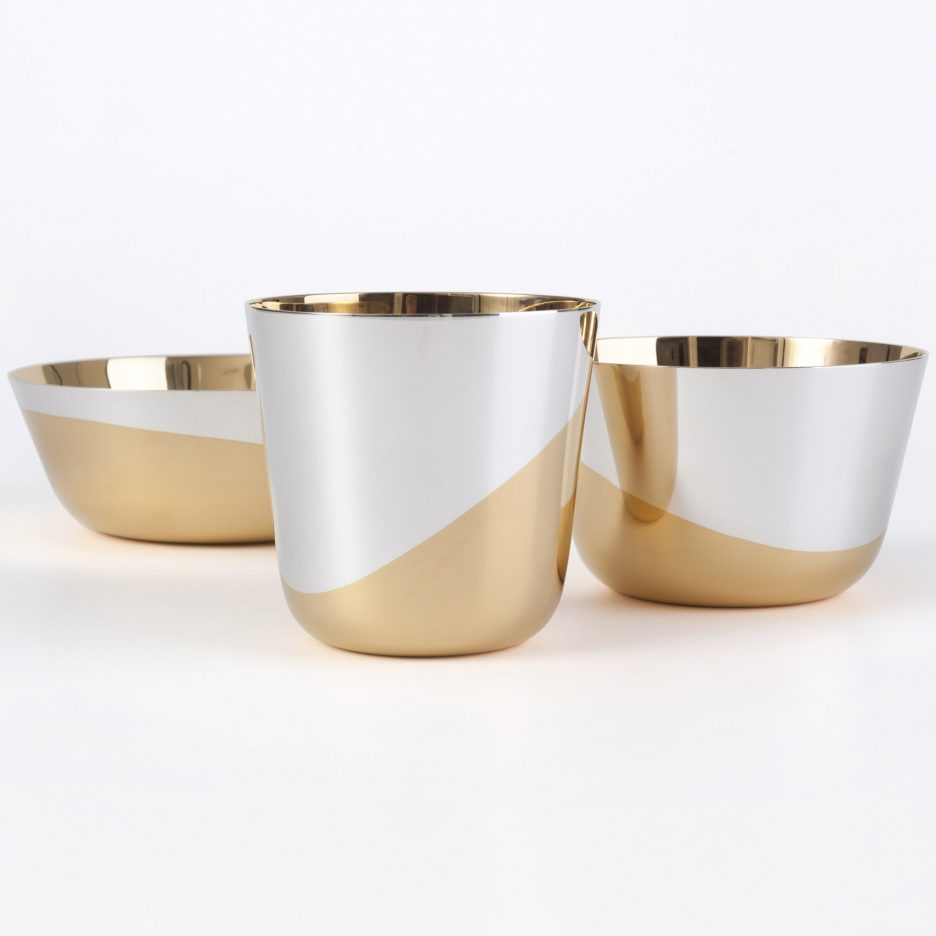
Vienna Design Week 2016: Austrian designer Thomas Feichtner has collaborated with silverware manufacturer Jarosinski & Vaugoin to create a set of minimal tableware featuring uneven washes of gold (+ slideshow). (more…)
Vienna Design Week 2016: Austrian designer Thomas Feichtner has collaborated with silverware manufacturer Jarosinski & Vaugoin to create a set of minimal tableware featuring uneven washes of gold (+ slideshow). (more…)

From the architect. Once was a time when a roof was a roof. Mostly it just sat up there to keep the rain off, but more importantly, it looked like a roof. A roof would hold itself in such a way, with its jaunty gables, casual hips and firm ridges, to let the world know that this house is a house. A noble task indeed. Yet, for the most part, a roof would do precious little to enliven the warren of rooms below.
With Hip & Gable, Architecture Architecture pays homage to a dignified, long-serving Californian Bungalow, while enticing it to say a little more and to do a little more too. We began by studying its ways: it’s darkened plinth, bricked chimney stacks, outlined fascias, ribbed gables and deep, bruised eyes. We emulated these ways, lending contemporary inflection to old charms. Yet it was the roof where things really got smart.
Indeed, the roof is still a roof. It rests over the house and it shelters its occupants. But where the ceilings were once low and flat, now they are generous and varied. A gentle underbelly has been revealed; it lifts and dips, shades and illuminates, shaping the many rooms and moods of the house.
From the backyard, a reclining hip casually slouches over the bedroom wing, while an attentive gable stands to attention over the more formal living spaces. Side by side, they are like the ears of a dog, one alert and the other playful, ready for whatever comes next.

From the architect. In the city of Sakai, Osaka, the site sits on the edge of a crowded residential section located in the middle of the Mozu Kofungun (a cluster of ancient tumuli) area.
This project involved a plan to integrate two buildings on two adjacent lots with different purposes: a gas station and an office for a public interest incorporated foundation.
We pursued a design that would visually integrate the foundation, which supports scholarships for outstanding students with bright prospects and provides funding for small- and middle-sized companies that have demonstrated superb performance in manufacturing technologies, and the gas station, which is a basic facility vital to the local community.
The two purposes that usually have completely different configurations were united by disassembling functions into boxes and repositioning them to create a spacious area, and by using fill-up concrete block structure for a fire-resistant fence that divides the two sections. The building group gives a sense of unity and scale that fits seamlessly into the surrounding residential area.
Similarly, eaves were allocated to unify the office and the gas station. They also contribute to the ambience of the cherry tree-lined street that leads from the Mausoleum of Emperor Nintoku into the site. They also help create an open space connecting the gas station and also the foundation office sitting behind it to the cityscape.
Also, by raising the approach to the innermost foundation office to the second-floor terrace, a balance was created between the two sections that were not divided by the fire-resistant fence, and a three-dimensional street-like space was produced. From the terrace, cherry trees lining the roadside can be seen over the gas station, providing open feeling.
For the grouped buildings, the structure is made of fill-up concrete blocks (W600×H150×D240). The eaves also have a group-like configuration with inter-locked steel plates that are 6 mm, 9 mm and 12 mm thick.
These site and structural plans have produced a building group that fits into the city environment as well as nestling in comfortably with the local community.
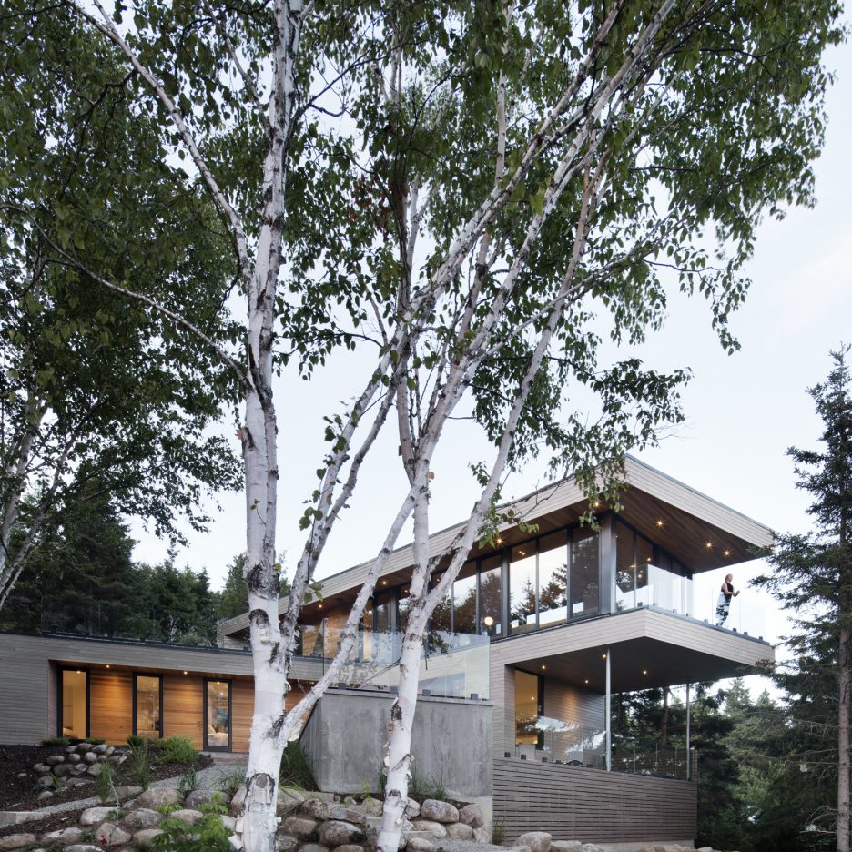
Canadian studio Bourgeois Lechasseur Architects has stacked two wood-and-glass volumes at opposing angles, resulting in a home designed to embrace its picturesque surroundings (+ slideshow). (more…)

The name of house is Yoojeongheon. Nearing the completion of the construction, the owner gave its name and described the meaning to me as, ‘wind stays, sunshine caresses’.
This building is located in an old village on the hill that looks out to the North Port of Jeju Island and is built by an old resident of the village. He is a geologist and a teacher, and of course, he has scientific mind.
Like many, I have intolerance towards the term ‘science’. I distanced myself from its field and it seemed to have the same attitude towards me.
So my approach to look at and to interpret things is with sensibility. I, then translate the collective senses onto 2-dimensional representation and finally build it up with spatial narratives onto a physical ground.
However, this time, the resident-to-be-geologist added more stories onto my pile. While designing the house I heard the history of the earth, a story about the life of a typhoon and the movement of the sun; and most of the stories were about the special location, which the house was later built to look out to: the Jeju Island.
The house sits on a hill that is laid out a step back from the forefront of the beach. I was told, until not very long ago, the sea level was up to the bottom of the hill and underneath the hill itself was the birthplace of the legendary female merchant Mandeok Kim.
When I first visited the site, an old apartment building was standing with its back turned around and blocking the view out to the sea. Only some fragment of the ocean could barely be seen pass its side.
But as we began, an unexpected restorative project of Kim’s birthplace took place and the apartment disappeared during this time. Without being aware of its disappearance, I flew from Seoul to Jeju and got on a taxi to the site. As I arrived, I felt something different was grabbing a hold of me that I had to stop to take a look at the view. However still, I only felt that something about the scenery had changed and did not quite register the change to be the lack of a mass that used to block the view.
Only except for the time during his college years, the geologist lived in the same neighborhood for over 50 years. Although his old house was long gone, he tended the lot by cleaning up, decorating with pebbles and laying the ground with grass. On the way back from work, he would stop by to sit down next to the lot to read or to gaze at the sunset to think about a new house that would once be built in the location.
The lot was not large. It was perhaps about 130 sq meters. Plus, despite its high ground, the view from the location was not very impressive due to the sounding houses barricading all four horizons of the lot.
I thought of a house that where the sunlight caresses though and the wind comes in to stay a while. The idea took its form as to vacate the center and to take away the portions of the ground level to provide openings of horizontal access. The design also included a strong outer membrane to make it withhold the powerful salty wind from the ocean and, carried by the same wind, the heavy rainfall that strikes horizontally.
Naturally all the processes passed by my ideas and the scientific verification of the owner. The house was built with concrete and the same concrete was used to complete the finishing surface. Here, the focus was not, so to speak, on the ‘exposed concrete’ but on the way to ‘expose the concrete.
To apply concrete as a finishing product properly, more effort is put on fabricating the mold to make the surface of the concrete more aesthetically pleasing, which generally raises the overall cost. Contrarily, the surface of concrete used for constructional purpose, in other words, ‘what goes inside’, is left rough because it will eventually be covered with other finishes.
For the finishing the constructional concrete mold was used. The first plan was to cover up the surface later with some other material. But truth to be told, I do prefer the rough texture of the construction finish over the smooth finish. Plus, Jeju is native to the Porous Basalt (Hyun-mu-am) which offers its own rough surface. Perhaps because of this, the decision ended up favoring having the construction finish.
Entering the square courtyard, the sky opens up; then follow the porch, Daechuhng (an outer platform) and Sa-rang (a reception room) arrayed towards the ocean. The East and the West are left open for the wind to run through the courtyard. The membrane is embracing the functional spaces such as the furnace room, and the parking lot. The North-west corner of the house yields the best view of the house, which could be seen while climbing up the staircase leading the way from the porch to the next level. Here, I thought, it would be nice to have this staircase to become a place where one could sit down to ponder upon the great view to be found.
The second floor was designed as a living space consisted of two bedrooms, a living room, a kitchen and a toilet. These rooms were distributed into the North and the West sides of the building and were connected by two bridges. The two bridges were made with different widths to allow multiple perspectives while walking in and out through the space.
Lastly, one can climb a ladder to access the rooftop which has one small room and a terrace with a closed top. However consequently to the disappearance of the apartment building and the horizon was made possible to be viewed from the second floor, the rooftop was the designed to be the designated spot to have the best view of the surrounding area. Here, standing on the top of the hill, he looks forward to spend the rest of his life alongside the mothering ocean and his family.

The Crossing Wall House, designed and built by Mobile Office Architects (MOA), is sited where the Santa Ynez Mountains meet the Pacific Ocean, overlooking the City of Santa Barbara and the Channel Islands.
The parcel’s steep grade necessitated careful site planning and guided the building form as it utilized two narrow existing terraces. The two differing orientations of the terraces are expressed by two geometric grids that come together in the homes central living space and open the home to views toward the ocean, islands, and lowlands. Two crossing retaining walls at the upslope side express the two project geometries and define the project’s position on the site. At the back, one wall takes on an open and porous techtonic blurring the boundary between the constructed environment and the wild chaparral landscape.
The primary living space acts as an indoor-outdoor pavilion; opening fully at the back to the entry courtyard and to a deck at the front with downslope views beyond. The raw corten steel and concrete exterior material palette was developed to create a building that ages with the landscape and responds to localized threats posed by wildfire and wood-eating termites.
The project utilizes passive solar, thermal mass, passive ventilation, and solar hot water strategies to produce a fluid indoor-outdoor environment that operates at high levels of energy efficiency.
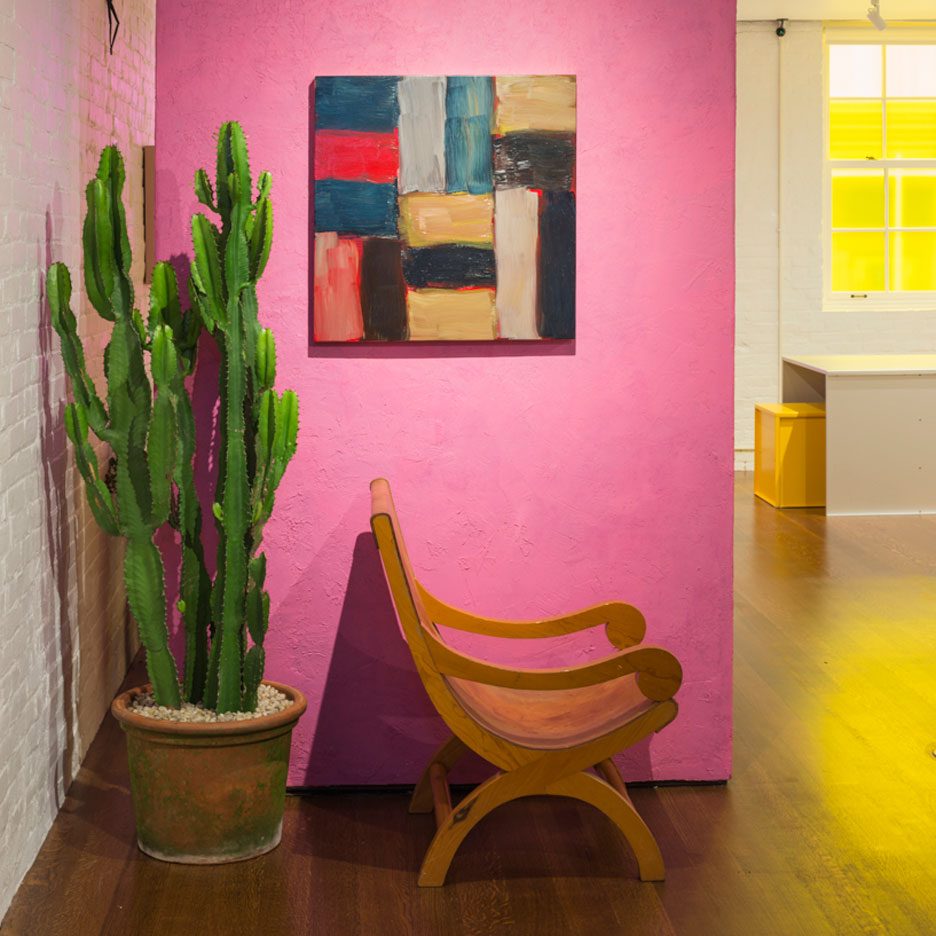
Drawings and furniture by legendary Mexican architect Luis Barragán are on display in Manhattan, alongside the works of prominent artists who have also used colour distinctively (+ slideshow). (more…)

The iPhone Photography Awards (IPPAWARDS) has announced the winners of the 2016 edition of the annual competition. Founded in 2007, the same year as the release of the first iPhone, IPPAWARDS is the first and longest running iPhone photography competition. Now in its 9th year, the awards continue to select the best images taken by iPhone, iPad or iPod touch from a variety of categories including Landscape, Animals, People, Still Life and Architecture.
This year’s architecture category was won by Jian Wang of Beijing China for his shot “China Red,” taken at the Beijing Olympic Park. Second and third prizes were awarded to Patryk Kuleta for two shots from his series, “Modern Cathedrals.” Kuleta was also selected as the IPPAWARDS Photographer of the Year for the series, which featured layered-exposure captures of historic cathedrals in Warsaw and Strasbourg.
Continue after the break to see the three winners and honorable mentions.
1st Prize – Jian Wang, Beijing, China
2nd Prize – Patryk Kuleta, Warsaw, Poland
3rd Prize – Patryk Kuleta, Warsaw, Poland
Honorable Mentions
Hover over the image for photographer credits.
To see all of the 2016 winners from every category, visit the IPPAWARDS website, here.
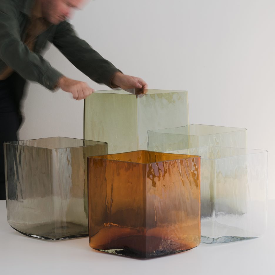
French designers Ronan and Erwan Bouroullec have used wooden moulds to create a series of giant versions of their diamond-shaped Ruutu vases (+ movie). (more…)

Great Expectations
What would you expect, when entering a 250 m2 loft at De Rotterdam, the biggest building of The Netherlands, (designed by OMA/Rem Koolhaas), at the height of 143 meters, on the 43rd floor? Rotterdam seen from the air shows the omnipresence of water flowing through the city centre. The 25 meter total glass façade stretching from floor to ceiling, offers you a view of the Maas river, flowing through the city towards the Rotterdam harbour. You will look down upon the Erasmus Bridge (designed by UN Studio), the Markthal (designed by MVRDV), the city centre, Delft and on a clear day even The Hague is part of the view.
Flow like the river
Suppose you go up 143 meters high and enter a living room with a 35 meter wide panoramic view on the Rotterdam cityscape. Which interior could match this overwhelming view? From above you will discover that the city is a flow: the water is an important part of the city. We took ‘flow’ as a design language for the interior. We used it for wavy floor and ceiling patterns and a 20 meter long curvy walnut wooden wall. With these gestures we were able to create a big open 150 m2 living area with grandeur and create places within this open space that feel intimate as well. The curvy walnut wall hides all the living necessities such as the television and storage room, as well as hidden entrances to bedrooms. To avoid that the huge glass walls will evoke an ‘unprotected’ experience of the open space, the long wavy screen of wood is used as a background. It covers the cupboards of the living room and kitchen. It guides you to the bedroom area, as the wall and doors are part of the bedroom. An 8 meter long ‘flowing’ cooking island transforms from a cooking area into a bar area and will give you one of the best panoramic views. This furniture is designed for small family rituals as well as big party events.
Two apartments, one luxury penthouse
In order to create a spacious home, 2 properties are combined into this one luxury penthouse. One apartment is designed as one big living area including kitchen. The second apartment includes 3 bedrooms, 2 bathrooms, a jacuzzi and a sauna – 6 meter long bathroom for the master bedroom with a view towards the Rotterdam harbour – a jacuzzi besides the bed in the master bedroom – a glass sliding door behind for semi outside experience. Even from the 2 person shower you can enjoy the view because you can look all the way through the 13 m long bathroom and bedroom.

