M Woods Entrance Revitalization / Vector Architects


© Xia Zhi

© Xia Zhi


© Xia Zhi


© Xia Zhi


© Xia Zhi


© Xia Zhi

  • Architects: Vector Architects
  • Location: Beijing, China
  • Architect In Charge: Gong Dong
  • Design Team: Dongping Sun, Yinxi Lu
  • Project Year: 2016
  • Photographs: Xia Zhi
  • Structural Consultant: Lixin Ji
  • Site Architect: Dongping Sun

© Xia Zhi

© Xia Zhi

From the architect. M Woods Entrance Revitalization is an urban renewal project in Beijing 798 Art Zone. The site was an abandoned industrial warehouse originally and it was used as an art museum since two years ago. The museum operators expect to have a façade and entrance renovation in order to refine visiting experience, and to improve the recognition of the museum’s public image.


Before

Before

© Xia Zhi

© Xia Zhi

In the past two decades, Chinese cities have experienced a rapid development: a substantial amount of old buildings, streets, historical blocks, and even topography were wiped out and replaced by newly “designed” urban appearances. Our living environment becomes more generic but unfamiliar progressively, and this separates our emotion from the settlement we live on. Therefore the key issue of the design is to rethink the urban renewal. Although our existing structure is not a historical heritage, such old architecture is still precious, since it reflects the trace of time.


© Xia Zhi

© Xia Zhi

Sketch

Sketch

© Xia Zhi

© Xia Zhi

Our primary strategy is not to reform the exiting facade, but to add a layer of translucency on it. Hence people are able to sense the old when they experience the new, and read the historical information of the city. Another challenge is time and budget. The project has to be implemented within 40 days from design to construction. Due to this critical condition,we choose the “galvanized iron wire mesh” as main material. By taking advantage of its light weight and self-support quality, a big number of stud works were eliminated. In addition, translucency and reflectivity of the metal mesh turns the entrance façade into a more lively condition, since the mesh can bring sunlight to where it is in shadow.


© Xia Zhi

© Xia Zhi

Plan-New

Plan-New

© Xia Zhi

© Xia Zhi

We revitalized not only the M Woods entrance but also a “negative” green belt which is enclosed by a fence across the street. We opened it up, and embedded a small plaza there. This plaza is under a metal mesh canopy with same material as the entrance, unifying surrounded space with the museum. It becomes a public resting area and children’s play ground in 798 Zone. Meanwhile, some public art activities will take place occasionally here, besides a regular Sunday Farmer’s Market. After revitalization, this area becomes a vivid city node which enlivens the block with culture and arts, and brings out a more energetic urban lifestyle.


© Xia Zhi
© Xia Zhi

http://ift.tt/2bAMDF6

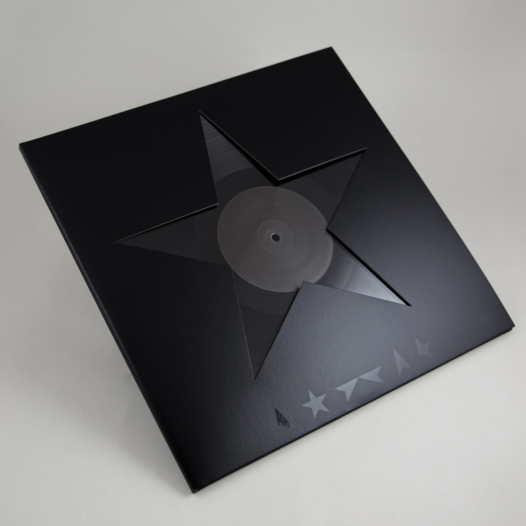
Designs of the Year 2016 nominees announced


Herzog & de Meuron’s Tate Modern Switch House, Ikea’s flatpack refugee shelter, and the artwork for David Bowie’s final album are among projects nominated for the Design Museum‘s Designs of the Year awards 2016 (+ slideshow). (more…)

http://ift.tt/2bAH8q9

Museum of Socialism-Jayaprakash Narayan Interpretation Center / Archohm


© Andre J. Fanthome

© Andre J. Fanthome


© Andre J. Fanthome


© Andre J. Fanthome


© Andre J. Fanthome


© Andre J. Fanthome

  • Architects: Archohm
  • Location: Lucknow, Uttar Pradesh 226002, India
  • Architect In Charge: Sourabh Gupta
  • Area: 3269.0 sqm
  • Project Year: 2016
  • Photographs: Andre J. Fanthome
  • Client: Lucknow Development Authority
  • Design Team: Sanjay Rawat, Amit Sharma, Bhoomika Singhal, Ram Sagar, Shahzad Ahmad, Neha Aggarwal, Vineet Rao
  • Experience Design: Design Factory India
  • Structural: ROARK Consulting Engineers
  • Mechanical: Sunil Nayyar Consultants Pvt. Ltd.
  • Electrical: ARCHOHM Consults
  • Civil : Shalimar Corp. Ltd.
  • Landscape: Shaheer Associates S.J.A. Consultants
  • Hvac : Sunil Nayyar Consultants Pvt. Ltd.
  • Plumbing: Sunil Nayyar Consultants Pvt. Ltd.
  • Site Area: 18.6 acre (75464 sqm)
  • Project Cost: 9.87cr

© Andre J. Fanthome

© Andre J. Fanthome

From the architect. The JPN Museum is a gateway framing the centre placed as a wedged-shaped monument with a massive arch carved out of the mass; its nine-metre height and twenty-metre ambitious span are clearly attempts to push the limits of structural design and construction. Its stepped roof terminates in a pavilion that gifts a panoramic view of the R.M. Lohia Park and the Convention Centre.


© Andre J. Fanthome

© Andre J. Fanthome

The museum within is an experience in space design with the depiction of Jayaprakash Narayan as a chronological narrative of a linear journey. It is divided into two zones; the zone of absorption and the zone of reflection. As the names suggest, these spaces enable absorption of information triggering curiosity and contemplation which then is expected to lead to reflection and assimilation.


© Andre J. Fanthome

© Andre J. Fanthome

Thus the museum is not just a container that preserves frozen albeit inspiring moments of a past but breeds them and ensures that they percolate into current reality, and lay the foundation for the future.Thus while the various exhibits and narratives remain centre stage, the building offers surfaces, volumes and elements as   tactile backdrops.


Section

Section

The convention centre and the museum inserted as anchor points defining a principal node of the city along with their bold but sculptural forms seem destined to remind people of the immense power they possess; the power to bring about change. 


© Andre J. Fanthome

© Andre J. Fanthome

Archohm Consults, a multidisciplinary architecture studio, in line with Shri Akhilesh Yadav’s (Chief Minister- Uttar Pradesh) vision, has been responsible for the design of this museum.


© Andre J. Fanthome

© Andre J. Fanthome

http://ift.tt/2bQRd0P

Veranda in Shanghai / ppas + tf Architecture Office


© SHEN-PHOTO

© SHEN-PHOTO


© SHEN-PHOTO


© SHEN-PHOTO


© SHEN-PHOTO


© SHEN-PHOTO

  • Architects: ppas, tf Architecture Office
  • Location: Langxia Town, Jinshan District, Shanghai, China
  • Architect In Charge: ZHANG Ning
  • Design Team: LI Zhenguo, LIU Jinpeng, LI Yi, WU Dan, TANG Ying
  • Project Year: 2016
  • Photographs: SHEN-PHOTO
  • Client: Government of Langxia Town, Jinshan District, Shanghai, China
  • Landscape Designer: WANG Hong, WANG Pengcheng, DONG Xiaohui
  • Structural Engineer: LIU Mingyuan
  • Construction Manager: YU Xunzhou

© SHEN-PHOTO

© SHEN-PHOTO

From the architect. According to an ambitious plan, the Jinshan Modern Agricultural Park, located on the southwestern outskirts of Shanghai, is being transformed into a suburban park with composite functions. Enhancement of the public space in the core area of the park is the pilot project for initiating this transformation. In the conception of design, the veranda, an essential element in traditional Chinese gardening, has been selected as the theme of the design. In the park, a veranda extending in the east–west direction links up several isolated agricultural tourism projects on the north side of the freeway.


© SHEN-PHOTO

© SHEN-PHOTO

© SHEN-PHOTO

© SHEN-PHOTO

This veranda will be expanded farther westward and will pass through the eastern landscape mound to be integrated with other tourism projects towards the south via a pedestrian bridge. The landscape mound on the south side of the veranda will isolate the park from the noise and sight of the freeway, and the freeway-facing side of the park, together with the veranda, will form an extended earthscape, thereby ensuring high identifiability along the freeway line.


© SHEN-PHOTO

© SHEN-PHOTO

Axometric

Axometric

© SHEN-PHOTO

© SHEN-PHOTO

Replacing the expensive and complex wooden structure of a traditional veranda, a simple, white concrete structure will not only harmonise the agricultural environment and the surrounding modern facilities but will also effectively ensure that the project costs less than 80 euros/square metre, in accordance with the financial restrictions of the project. The overall folded planar structrue provides sufficient activity space in various eastern and western areas of the project.


© SHEN-PHOTO

© SHEN-PHOTO

Elevations / Sections

Elevations / Sections

© SHEN-PHOTO

© SHEN-PHOTO

In particular, the courtyard enclosed by the central veranda and the sightseeing pavilions has become a rest stop for the visitors and a centre for tourist activity in the core area. Combined with the landscapes in various areas, the alternative guiding openings on the walls at each side of the veranda allow the scenery to change with each step. Similar to the traditional high-platform architecture, the bottom platform endows the veranda and surroundings with subtle height changes and powerful styling characteristics.


© SHEN-PHOTO

© SHEN-PHOTO

http://ift.tt/2bUa1vs

Rumah Miring / Andyrahman Architect


© Mansyur Hasan

© Mansyur Hasan


© Mansyur Hasan


© Mansyur Hasan


© Mansyur Hasan


© Mansyur Hasan

  • Architects: Andyrahman Architect
  • Location: Jl. Medokan Asri Tim. IX, Rungkut, Kota SBY, Jawa Timur, Indonesia
  • Architect In Charge: Andy Rahman, Abdi Manaf
  • Civil Contractor: Griya Karya Mandiri
  • Area: 238.0 sqm
  • Project Year: 2016
  • Photographs: Mansyur Hasan
  • Surface Area: 350 sqm

© Mansyur Hasan

© Mansyur Hasan

From the architect. If we see how far the architecture development nowadays, most of them have ‘forgotten’ the basic principles of architecture, people are increasingly distant from the spiritual dimension, disharmony with the nature, and far from urban awareness. Because of that, Andy Rahman decided to design this house with Back to Basics principles. Basics in this context cover the basics of spirituality, materials, and urbanity.


© Mansyur Hasan

© Mansyur Hasan

Back to basics on spirituality, the house plan is started with the design of the praying room (mushola) as a place for the owners and the people in the neighborhood to pray. In Islam, muslims have to pray facing the Qibla. And the Qibla is slightly on the northwest of Surabaya. This is the reason why the praying room layout is somewhat angled from its site line.


© Mansyur Hasan

© Mansyur Hasan

This unique angled layout is becoming a design idea. So that is why it has a basic shape of a cube that have been cut diagonally. This diagonal shape is elaborated hostically to the outer areas, such as the porch, carport, and the fences.


Section

Section

Section

Section

Back to basics on materials, the building is designed with unfinished touch, such as unpainted plaster, cement paints and rolls (with original cement color) to make it easier for the owner to maintain the building. Thus, these finishes make this house doesn’t need high cost maintenance, with its principle: low budget low maintenance.


© Mansyur Hasan

© Mansyur Hasan

In addition, it also returns to basic principles of recycling which has currently started to be applied by architects, by adopting recycled materials such as used wooden crates. They are remade as furnishings in many areas, from the living room which is public area to bedrooms that are more private.


© Mansyur Hasan

© Mansyur Hasan

With urbanity, its started from the phenomenon that most houses in the big cities (including Surabaya) are commonly used all the land on its site for buildings. Instead, this house wants to give the earth a room to breathe, its only using 40% of the land for the building and the remaining 60% is dedicated as one of the city open spaces in the neighborhood.


Plan

Plan

Eventhough the house has monolith form, it still adopts tropical elements such as wide openings on the sides of the building. So, even with the usage of concretes which are very dominant, it remains aware of the environment and climate, and it is livable because of good lightings and better air circulation.


© Mansyur Hasan

© Mansyur Hasan

It is also to actualize the grand idea of green city, so that our cities are more humane to be inhabitated without losing its spirituality, materiality and urbanity elements. These three basic principles become a strong conceptual starting point in the design of this house.


© Mansyur Hasan

© Mansyur Hasan

Today most of modern people are forgetting these basic principles, and preferring to pursue his personal interests and ambitions without regard to the nature and others. From this house, we can learn how architecture can make peace with God, natures and its city, and it becomes a meaningful architecture.

http://ift.tt/2bPvq6R

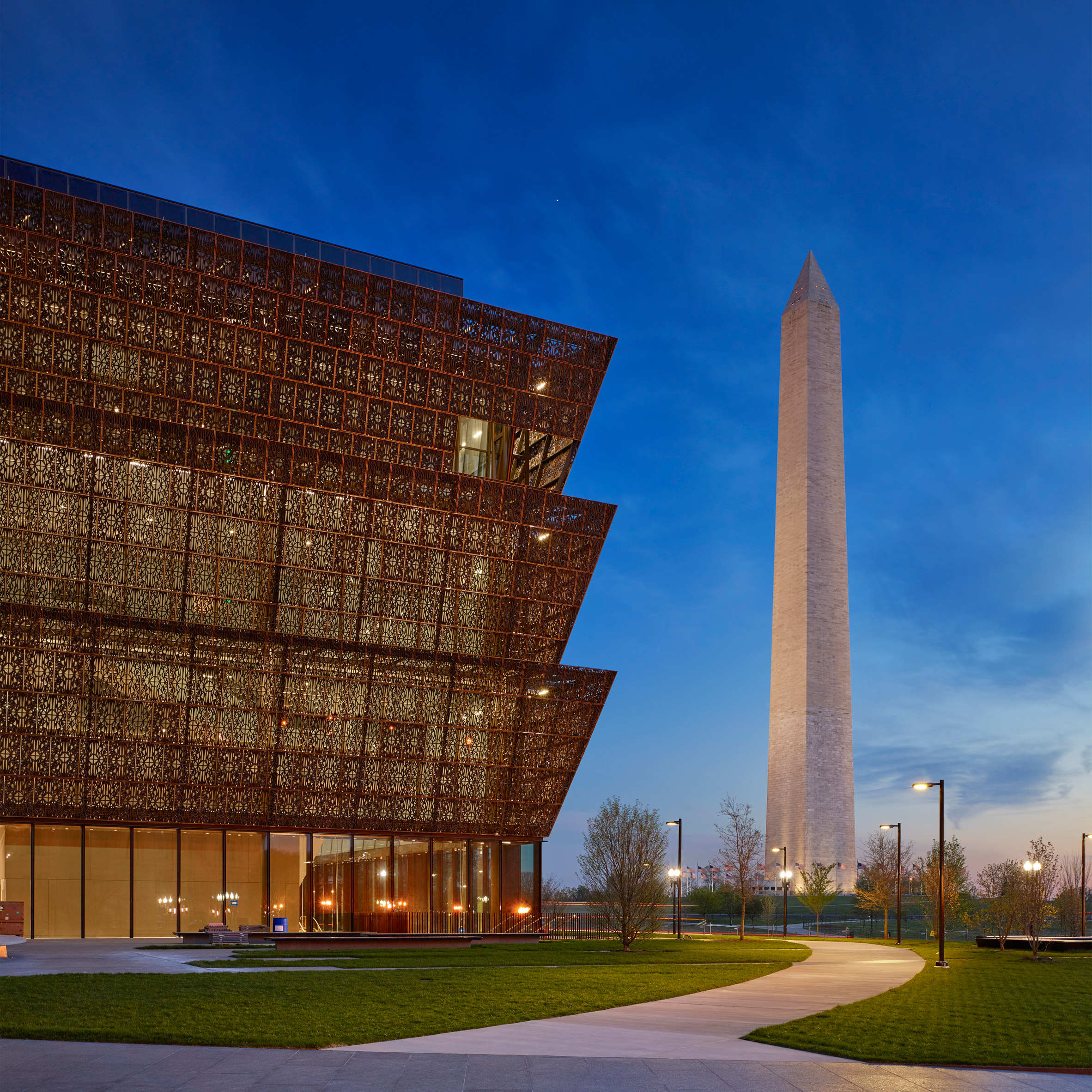
David Adjaye’s NMAAHC gets set to open in Washington DC


Work has completed on the Smithsonian National Museum of African American History and Culture by British architect David Adjaye, which is poised to open next month (+ slideshow). (more…)

http://ift.tt/2c6FBVq

Double House / ON Architecture


© Joonhwan-Yoon

© Joonhwan-Yoon
  • Architects: ON Architecture
  • Location: Ulsan, South Korea
  • Architect In Charge: Woongsik-Jung, Namsu-Kim
  • Design Team: Hyukki-Kim, Minsung-Kim, Suji-Jung
  • Area: 395.73 sqm
  • Project Year: 2015
  • Photographs: Joonhwan-Yoon
  • Client: Pansuk-Yoon
  • Site Area: 253.5 sqm

© Joonhwan-Yoon

© Joonhwan-Yoon

From the architect. The house is located on a sloped corner site in the Innovation City, and it’s looking at a distant mountain in the northeast. The site is sitting at an intersection of a mixed-use housing block and a general dispatched housing block. To use the existing slope, the floor of the retail area on the 1st floor is divided from its corner into two in a diagonal direction, and the level of those two floors are set differently in order to maximize spatial flexibility. For the house on the 3rd floor, its access, entrance and living room are designed to offer a view to the mountain in the northeast. The living room is placed on a space where the mass is segmented in two directions so that it can be linked with a deck outside and also take advantage of natural ventilation all the time.


© Joonhwan-Yoon

© Joonhwan-Yoon

We are living in the era of single households. Yet in Ulsan, decent housings for them are very scarce. For the people who are living in a rented house under the circumstances, the architect wanted to create a quality space. And as single-room or two-room housings don°Øt provide any independent or private space at all, he wanted to give a separate access and a sense of privacy to the residents while proposing a communal space by using a central circulation established on the corner. For the residence of the owner on the 3rd floor, he attempted to place a kitchen, the owner’s most valued element, in a most decent area, and also to introduce an outdoor space which can be accessed from the living room, kitchen and bedroom. 


Diagram

Diagram

The essence of this project is the experimental and unconventional circulation system. The straight stairs which draws a diagonal line across this corner site is an unacceptable concept for general owners of mixed-use housing because they think it will affect the lease income of the 1st and 2nd floors. However, considering the nature of the site connected with a dispatched housing (2-storey) block, the architect thought it would be better to split the retail area on the 1st floor into two independent leasing spaces. And as the site is touching the streets on both sides, there would be no problem to use the entire retail area as one space. On entering the 3rd floor via this stairs, one always comes to face a scenery of distant mountains and the close one behind the dispatched housing block. The outdoor stairs provide an access to each unit, and in the end, turn out to be an outdoor terrace for them. During this process, space comes to experience contraction and expansion alternatively and ends up stimulating an architectural excitement. 


© Joonhwan-Yoon

© Joonhwan-Yoon

The tight budget was the biggest challenge of this project. The owner couldn’t allow going over the budget, and the architect had to use it very meticulously. As all owners do, it was natural for the owner to desire better and more things within a given budget. So it was very difficult to lead the owner who is possessed by such an idea and set priorities through choice and concentration in accordance with the budget. But during that process, the owner agreed with the architect suggesting to give a top priority to essential elements in order to create a good space, and also he gave full support to ideas proposed by the architect. 


© Joonhwan-Yoon

© Joonhwan-Yoon

http://ift.tt/2byUg04

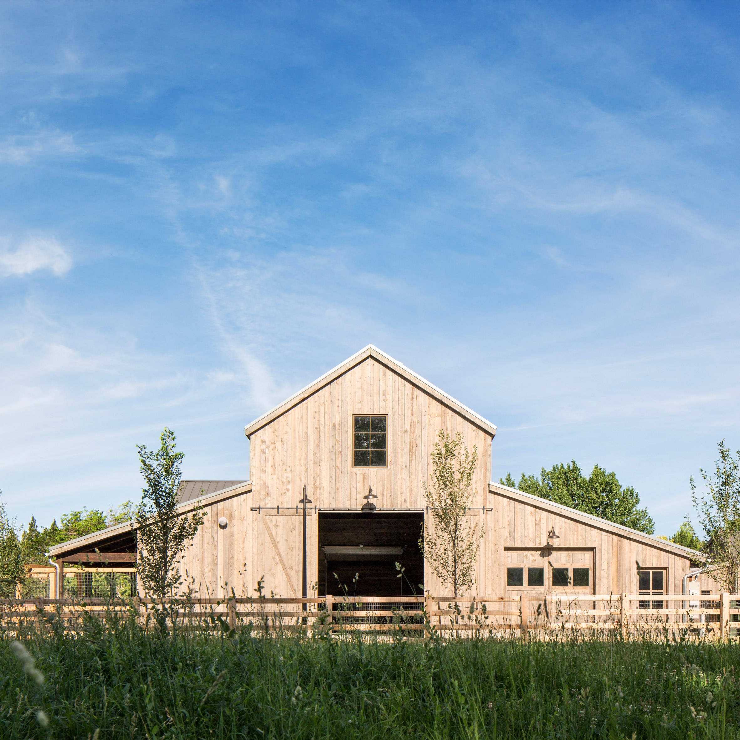
Lloyd Architects builds community-oriented farmhouse in Utah


US firm Lloyd Architects has completed a new barn in Utah for a family that has been farming the same land since the 1800s (+ slideshow). (more…)

http://ift.tt/2bYl7ke

Aedas’ Pebble-Inspired Lè Architecture in Taipei Nears Completion


Courtesy of Aedas

Courtesy of Aedas

Aedas has released new renderings and photos of Lè Architecture as the 18-story building approaches completion. Inspired by the form and striations of river pebbles, the office building will provide a unique work environment along the Jilong River and will mark an important milestone in the revitalization of the Nangang District of Taipei.


Courtesy of Aedas


Courtesy of Aedas


Courtesy of Aedas


Courtesy of Aedas


Courtesy of Aedas

Courtesy of Aedas

Imitating a moss-covered pebble found in a river, the building employs multiple strategies for adding greenery to the facade. On the west face, a series of vertical green belts provide sunshading for the interior office spaces, while the north and south ends feature a series of vegetated outdoor terraces to create “diverse façade layers with unparalleled views.”


Courtesy of Aedas

Courtesy of Aedas

Courtesy of Aedas

Courtesy of Aedas

“Efficient, interactive and healthy” office spaces have been carefully arranged to provide “an urban living room” centered around communal areas with kitchens, coffee shops, libraries and “brainstorming spaces.”


Courtesy of Aedas

Courtesy of Aedas

The design has been conceived with environmental sustainability in mind to aim for a LEED gold certification. The glass facade of the building has been optimized for construction feasibility, while vertical aluminum fins and the green planters on the west facade lower the interior temperature in the summer through sunshading, reducing the need for mechanical cooling.


Courtesy of Aedas

Courtesy of Aedas

Project: Lè Architecture
Location: Taipei, Taiwan
Architect: Aedas
Client: Earnest Development & Construction Corporation
Gross floor area: 14,169 square metres
Completion year: 2017
Director: Andy Wen

News via Aedas.


Courtesy of Aedas

Courtesy of Aedas

http://ift.tt/2bDKl3x

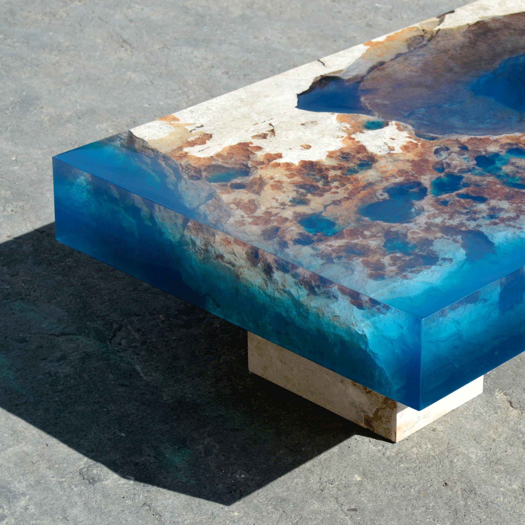
Alexandre Chapelin designs resin tables to look like the ocean


Saint Martin-based designer Alexandre Chapelin combined resin and stone to create a table that resembles ocean reefs (+ slideshow).  (more…)

http://ift.tt/2c9kDp5