architecture

Three architecture studios complete low-cost housing complex in San Francisco
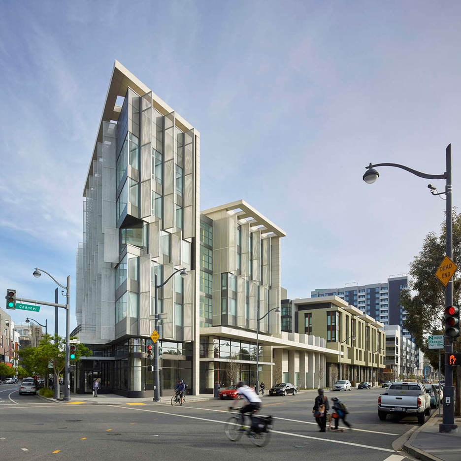
A trio of local design firms teamed up to create an affordable apartment building that occupies a full city block in San Francisco‘s urban core (+ slideshow). (more…)
Rawhiti Bach / Studio Pacific Architecture

© Simon Devitt
- Architects: Studio Pacific Architecture
- Location: Rawhiti Rd, Rawhiti 0184, New Zealand
- Design Team: Nick Barratt-Boyes, Peter Mitchell, Arindam Sen and Beth Chaney with Michael, Davis, Wayne Lightfoot, Patrick Thompson, Anna Windsor
- Area: 640.0 sqm
- Project Year: 2013
- Photographs: Simon Devitt
- Contractor: Mather Builders
- Structural Engineer: Dunning Thornton Consultants
© Simon Devitt
Forty years of summers in Rawhiti had imprinted themselves on the Struthers. To accommodate the next generation of their family, Di and John wanted to replace their much-loved bach with one that would embrace the culture evolved over decades, would cater for anything from an intimate couple to a large celebratory crowd, and importantly become an heirloom for the next generation.
© Simon Devitt
The main building provides primary gathering spaces, main bedroom, informal ‘loft’ space, and boat store. Together these contain a trace of the spatial arrangements of the previous bach, leading to a form designed as an assemblage of objects, with intended misalignments, slippages and quirks. It climbs out of the ground, projecting out to near and distant views.
© Simon Devitt
Plan 2
While the bach was embedded in the family psyche, the additional structure, nicknamed the ‘sleep-out’, had no precedent; instead, it takes its lead from the site’s geographical qualities and, as a counterpoint to the main building, hunkers down into the hillside. Its bedrooms offer a retreat from the communal bustle of the main building. Shutters create a dynamic façade providing occupants with control over privacy and views to the landscape beyond. Together with the light-wells these look to manipulate the movement of light and air.
© Simon Devitt
Dispersing the functions into two structures lessened the impact on the sensitive setting, and activated an outdoor space that is left deliberately relaxed and spontaneous.
Section
The buildings have been designed to be long lasting, be grounded in the site, engage with the landscape, reinforce the sense of place, and sculpt light and views. Richness comes from a high level of craft, the quality of the spaces and the expression of materials, texture, colour, and grain. And ultimately, the design looked to reinforce and provide for a multiplicity of ways to come together, and share time and memories.
© Simon Devitt
PLUKK Designs Town Hall and Community Center On Sloping Site in Czech Republic

Courtesy of PLUKK
Czech firm PLUKK has released designs for a community center and town hall in the city of Brno-Kohoutovice, Czech Republic. Located in the historic downtown, the project takes advantage of a sloping site to create two buildings of differing architectural language, connected together with active public space to create one multifunctional town center.
Courtesy of PLUKK
Important to PLUKK was that new development should feature ample public space easily accessible to the community. With that in mind, they decided to design the complex as “half-landscape, half-house.” The program of the project is split into two parts, with the town hall located on an upper terrace, and the community center below. A plaza in front of the town hall, which could serve as a public meeting space, farmer’s market or a place to screen movies in the summer, slopes up to become the accessible roof of the community center. An entrance to the community center is notched into the roofline, connecting the buildings on the same plane.
Courtesy of PLUKK
A second public space is located on the lower level in front of the main entrance to the community center, which features a glass façade to invite in residents. The two public areas are connected by fan-shaped terraces activated with lawns, gardens, sculpture, chess tables and picnic areas. A staircase at the center of the arc provides circulation between the upper and lower levels.
Courtesy of PLUKK
According to PLUKK, the design of the town hall is centered around the concept of the modern town hall which is “transparent, open to public and offers new technologies for administrating all possible requests comfortably.” The community center features a cafe, a small library and work space, as well as a multipurpose studio to house class activities like yoga.
Courtesy of PLUKK
Courtesy of PLUKK
Courtesy of PLUKK
- Architects: PLUKK
- Location: Brno-Kohoutovice, Brno, Czech Republic
- Area: 3300.0 sqm
- Project Year: 2016
- Photographs: Courtesy of PLUKK
Maison de la Culture by Le Corbusier features an asymmetrically curved concrete roof
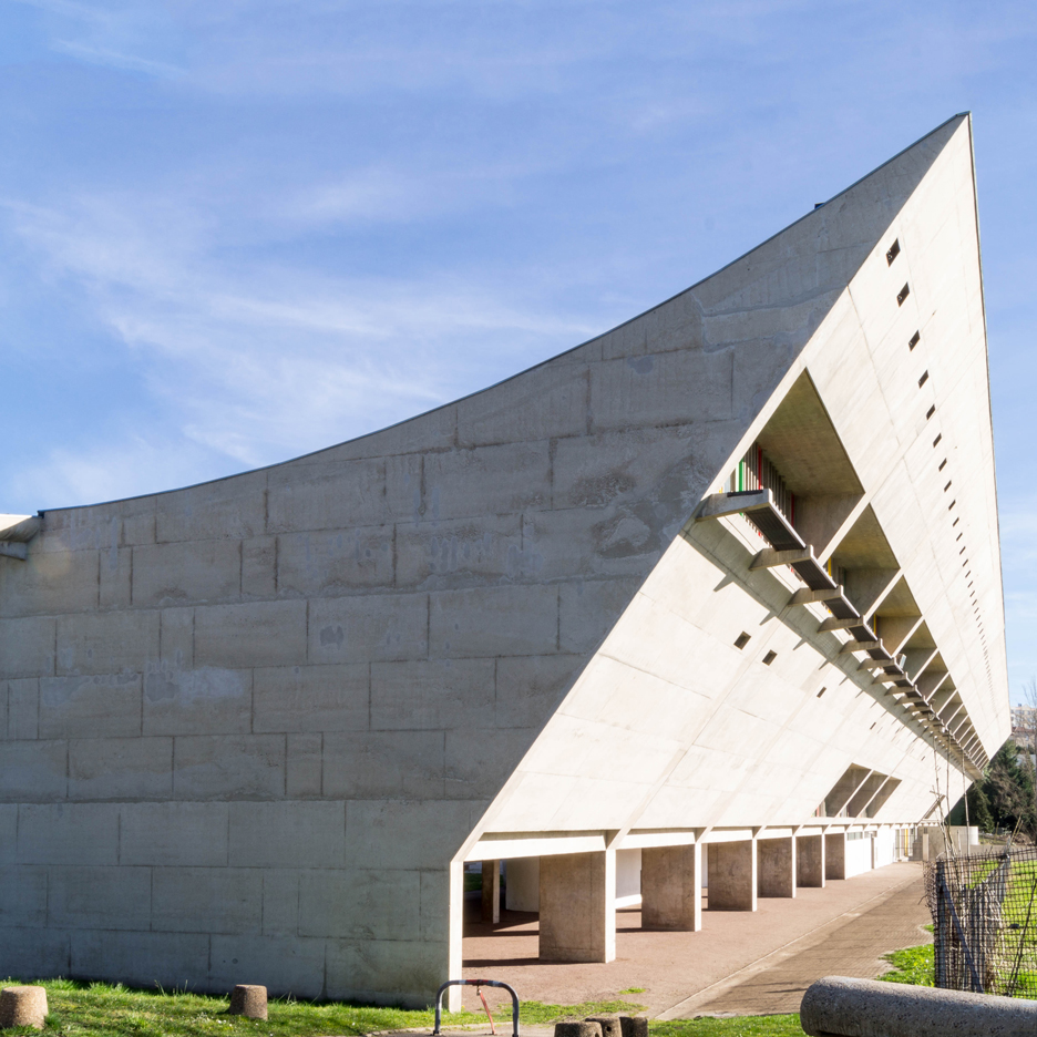
World Heritage Corb: next up in our series on the 17 Le Corbusier buildings that have just been added to UNESCO’s World Heritage list is the Maison de la Culture, a cultural centre in Firminy, France (+ slideshow). (more…)
LILLIAD – Learning Centre ‘Innovation’ / Auer Weber

© Aldo Amoretti
- Architects: Auer Weber
- Location: 2 Avenue Jean Perrin, 59650 Villeneuve-d’Ascq, France
- Project Associate: Prof. Stefan Niese
- Project Manager: Eric Frisch, Nina Schuberth
- Team: Markus Böhm, Carmen Duplantier, Gabriel Kiderlen; Julia Schmid, Jieqing Zhao
- Area: 8800.0 sqm
- Project Year: 2016
- Photographs: Aldo Amoretti
- Local Architect: MorphoZ 2.0 architectes
- Landscape Architect: Atelier Villes & Paysages
- Structural Engineer And Electrical Planner: Maning
- Energy Consultant: Symoé
- Services Engineer: JLL Ingénierie
- Guidance System: CL Design
- Façade Planner: VS-A
© Aldo Amoretti
Forward-thinking education requires contemporary concepts, including renovation of university infrastructure, which the French ministry of education has provided extensive funding to expand. An important goal of these reforms is to rethink outdated learning concepts. Technical progress, as well as new methods of communication between teaching institutes (students and teaching bodies) and the public, begin to question the traditional form of scientific libraries. The new Learning Centre “Innovation” is part of a series of similar institutes tasked with stepping up to the new challenges and preparing for the future.
© Aldo Amoretti
During the mid-60’s, the architect and Le Corbusier-student Noël Le Maresquier designed the central, identity-defining volume of the new university campus: a circular library building. As a refuge for research and learning, the library aged not only structurally. The existing building and its iconography were to be kept, and spatially extended and reinterpreted in its urban landscape with new contents. A new events area, cafeteria and experimentarium, the “Xperium” – a place where current research results are presented to the public – were therefore added to the existing use of the building as a university library. These changes redefined the classical library as a modern “Learning Centre”.
© Aldo Amoretti
Plan
© Aldo Amoretti
This raised the question of how to deal with the perfect circular form of the existing building and its defining facade, which was to be kept. Our competition design chose to forego a typical extension building, favouring instead the expression of a landscaped solution: A tall landscaped element surrounds the volume, creating a new main entrance and integrating the new spaces into the concept.
© Aldo Amoretti
The new landscaped base defines a clear spatial edge to the western square, becoming the threshold between Learning Centre and the neighbouring cultural centre. The square becomes a new space for communication between students, harbouring life on the campus. The organisation of the accesses and new functions beneath the plateau are legible as “old” and “new”: a light-well gap offsets the landscaped base from the existing cylindrical volume and uses the strip of light as the threshold between the old and new bodies. A large hall from the entrance level to the upper floor connects both. The existing façade is neither broken nor disfigured. The form of the existing building – the geometry of the circle – serves as a design element between old and new. The circular form is repeated, scaled and offset to each other. This defines new spaces with various functions, architectural qualities, depths and illumination.
Plan
The division of interior spaces follows the composition between existing building and the new landscaped plateau. While the generous reading areas and book stores are organised in the existing building, the functions such as the events area and Xperium, loaded with new technology, are publically positioned in the base.
© Aldo Amoretti
The university presents itself as a modern institution, able to connect innovation with tradition. The Learning Centre offers many different learning environments. Boundaries dissipate in the digital age; the classical library is obsolete; digital media and interaction are gaining significance and cause the dissolution of the spatial boundaries in the learning areas. The building sketches a landscape of knowledge, surrounding a central hall as a communicative area. Various learning institutions flow into each other and create spaces with multifunctional uses, providing the users with spaces to be used flexibly. Working with the inner facade of the circular building allows an extension of the library to the exterior space.
© Aldo Amoretti
Photos offer glimpse at interiors of Rafael Viñoly’s 432 Park Avenue
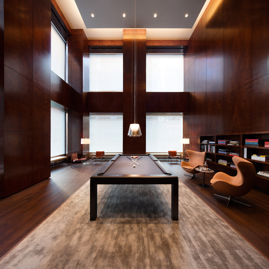
The developers of Rafael Viñoly’s 432 Park Avenue skyscraper in New York have released photographs that show the facilities shared by residents of the skinny tower (+ slideshow). (more…)
These Photographs Capture the Colorful Architecture of Europe’s Metro Stations

© Chris Forsyth
Photographer Chris Forsyth has released the latest images from his photo series Metro. Having previously gone underground to capture the surreal beauty of Montreal’s metro system, Forsyth traveled to Europe to shoot stations in Munich, Berlin and Stockholm. His photographic style portrays the stations in their best light – bright, clean, colorful and completely absent of people.
“Seeing the design strengths of various metro systems, from the hand painted cave-like stations in Stockholm, to the well-lit modern platforms of Munich’s U-Bahn, I really began to feel the how good design can change your day for the better,” says Forsyth. “Whether it be awe-inspiring or simply bright and colorful, I can only imagine how it feels to start your daily commute in one of these metro stations.”
Continue after the break for a sampling of Forsyth’s favorite photos from the series.
© Chris Forsyth
© Chris Forsyth
© Chris Forsyth
© Chris Forsyth
© Chris Forsyth
© Chris Forsyth
© Chris Forsyth
© Chris Forsyth
© Chris Forsyth
© Chris Forsyth
© Chris Forsyth
© Chris Forsyth
© Chris Forsyth
© Chris Forsyth
For more photos, the complete series can be viewed at Forsyth’s website, here.
Photographer Chris Forsyth on the Montreal Metro, Going Underground, and Overlooked Architecture
//cdn.embedly.com/widgets/platform.js
UK designers’ rights “will be swept away” by Brexit, warns intellectual property lawyer

Brexit crisis: UK creatives could be left at a significant disadvantage after Brexit unless the government acts, according to lawyer Margaret Briffa, who has issued a guidance note to help designers understand the legal ramifications. (more…)
Open-plan office design is preventing workers from concentrating, studies find
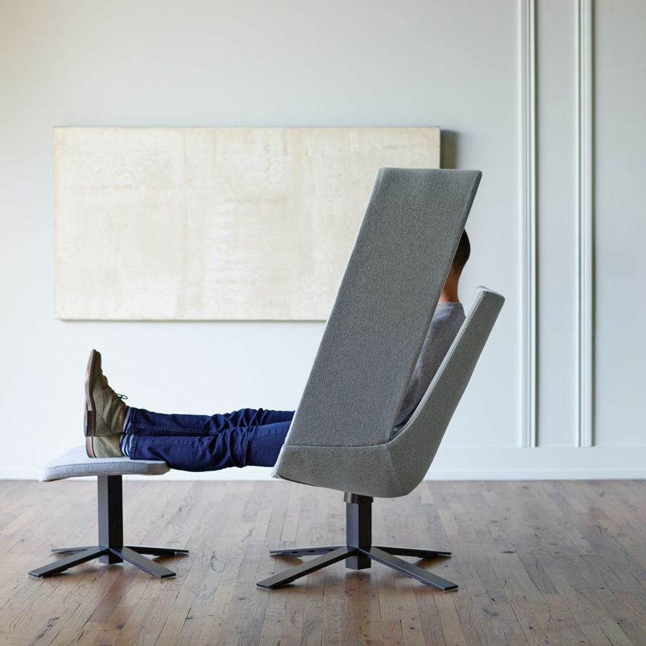
Lack of private space in office interiors is constraining the creativity and productivity of workers, according to data from two new UK workplace surveys (+ slideshow). (more…)

