In this video, Jesús Granada takes us inside the Austrian Pavilion at the 2016 Venice Biennale. The exhibition, titled Orte Für Menschen (Places for People), focuses on the creation of innovative housing solutions required to handle Austria’s current refugee crisis. The pavilion displays three projects currently underway in Vienna, where three architect teams have been paired with NGOs to convert abandoned buildings into temporary accommodation for asylum seekers, and later, into long-term residences.
Designed by Delugan Meissl Associated Architects, the exhibition consists of three elements of equal size and proportion: a concrete platform in front of the pavilion, 20 stacks of posters depicting refugees in their current housing situation, and a long desk displaying the three housing projects.
According to the pavilion’s curators, “the objectives of these interventions are to subject the social responsibility of architecture to a reality check, to provide humane places to live for those affected and to present the results in Venice to a broader public.”
This video is part of a partnership between ArchDaily and the Spanish photographer Jesús Granada. These videos have been filmed in 4K, a level of quality that allows viewers to perceive details that don’t come across in standard video formats. Granada’s stock images of the Biennale can be obtained on his website, here; ArchDaily’s complete coverage of the 2016 Biennale can be found here.
A rare empty lot in the Glen Park neighborhood of San Francisco served as the site for this ground-up residence. The design goal of the project was to harness natural light throughout the day, capture views of a wind-swept park, and to make a strong visual connection to the split-level road at the front of the property. At the main living level, a continuous wall of rift-sawn oak veneer cabinetry runs the full length of the building tying the living area, kitchen, and dining area into one cohesive space. Floor-to-ceiling glass at the master suite and dining area opens the interior spaces to a dramatic view of downtown San Francisco.
The living/kitchen/dining floor is located one level above the street to provide easy access from the sidewalk and garage. This places the three bedrooms on the top floor, perched above the city for inspirational views at the beginning and end of each day. A guest bedroom is located at the lower level with a direct connection to the rear yard via floor-to-ceiling sliding glass doors. Given the narrow site, a simple straight-run stair is located along the north property line wall, allowing for an open floor plate and the ability to look through the building from the split-level street at the front of the property. Traditional notions of privacy between the public and residential realms are therefore challenged.
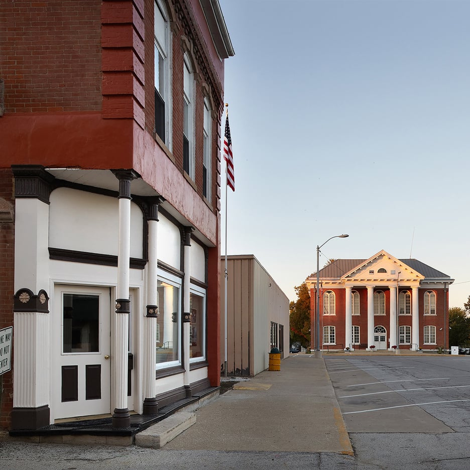
London and St Louis-based design studio Kiku Obata & Company is overseeing the redevelopment of an ageing downtown district in the US heartland, in a rural town where big-box stores have taken over (+ slideshow). (more…)
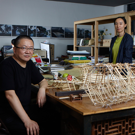
Johanna Agerman Ross is leaving her post as editor of quarterly design journal Disegno to join the V&A as curator of 20th century and contemporary furniture and 20th century product design. (more…)
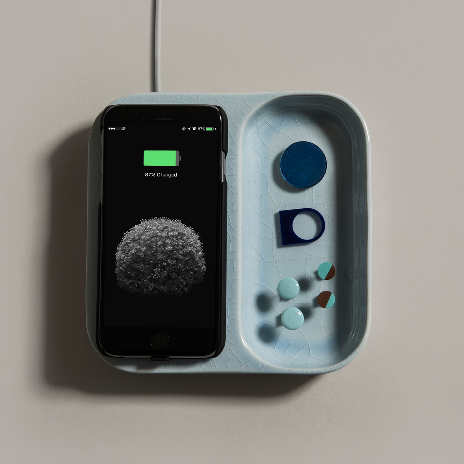
Benjamin Hubert‘s design studio Layer has created a collection of slip-cast ceramic trays with an integrated charging system that allows tablets and mobile phones to be powered wirelessly. (more…)
Courtesy of Bee Breeders Architecture Competitions
Architecture competition organizers Bee Breeders have announced the winners of the London Internet Museum competition. This speculative project challenged architects to design a museum for “something historically profound and typologically unprecedented — the internet.” Given a site at the former Great Eastern Railway terminal station building, designers were tasked with creating a location that would “connect visitors to both the history of the internet and open them to the possibilities of the future.” Submissions took a wide variety of approaches, and prizes were awarded to projects that rejected the typical associations and precedents that the internet calls to mind.
Continue reading to see the winning entries with brief descriptions.
First Prize Winner: 404: NOT FOUND / Shaun McCallum and Aleksandra Belitskaja
Courtesy of Bee Breeders Architecture Competitions
404: NOT FOUND questions the traditional authorial nature of architecture, instead placing the building’s design into the hands of internet users themselves. Using a specifically developed app, users can create blocks of the museum with tools such as push, pull, slice, color and material selection. The images are then shared to a social media platform where they can be liked and commented on. The final assemblage of the pieces is also up to app users, as they are given the opportunity to manipulate the placement of blocks, battling for position until a time limit is reached. The end result will be a reflection of the internet itself – a piece of architecture that is both chaotic and hilarious.
Second Prize Winner: Transistor / Ryan Anthony Ball
Courtesy of Bee Breeders Architecture Competitions
Lauded by the jury for its “indifference to the contemporary digital discourse in architecture,” Transistor draws inspiration from the history of the internet and the functionality of its components, as well as the historical context of the given site. Located in an industrial site full of shipping infrastructure, Ball noted the similarities between rail car switches and the most basic element of a computer, the transistor switch. Just as the transistor correctly aligns the circulation of information, the museum is designed with distinct linear circulation converging at specific and intentional exchange points. These paths are articulated in the structure’s sawtooth roof, reminiscent of the area’s many rail yards.
Third Prize Winner: Unlimited Possibilities / Michal Daniszewski
Courtesy of Bee Breeders Architecture Competitions
Third Prize was awarded to Unlimited Possibilities for its expression of the internet museum as a digital monument. Attempting to create a physical manifestation of the internet, the piece’s polyhedral structure houses a projected hologram that transforms into various patterns and shapes. The rest of the museum is located beneath ground, allowing the monument to stand alone in the above ground plaza. Within the museum, spaces are organized around the particular devices through which one engages the internet.
From the architect. In the highly competitive world of higher education, first impressions are critical. Building on the strength of Missouri State University’s long history and brand image, this new 13,000 square foot facility serves as the institutions “front door”, welcoming visitors to the campus at its primary entrance. In addition to providing a point of origin for campus visits, the two story lobby and 100 seat presentation room provide a multi-purpose venue for special events such as press conferences, distinguished guests and networking events. Tasked by the University with providing a “signature piece of architecture”, the design solution is both economical and monumental. Originally founded in 1905 as a teacher’s college, Missouri State University now carries the Public Affairs mission in higher education for the state.
Courtesy of Dake Wells Architecture
The building program is arranged in a two-story scheme, placing administrative functions on an upper level in order to increase the building’s visual presence as it reinforces the campus edge. The scheme considers a future expansion that will relocate existing admissions and registration services to this location, providing a one-stop-shop for new applicants.
Plan
Courtesy of Dake Wells Architecture
The building enclosure is derived from the surrounding campus context combined with an interpretive reading of the institution’s history and mission. Limestone provides a durable and contextual surface at the ground, increasing in transparency to the north toward the entrance. Two white planes are elevated above the base defining the east and west facades, almost paper thin. A two-story curtain wall angled toward the campus entrance serves as a gesture to welcome visitors and increase the building’s transparency. The west plane extends slightly beyond the pointed corner of the building signifying the main entry point to the building and folds slightly away as if dog-earring a page for future reference. Circular perforations derived from the pattern of a composition booklet provides added shade on the west facade and dappled light in the lobby interior. A wall of slate recalling the classroom chalkboard provides the backdrop to the building’s entrance and defines a generous reception desk for student greeters, with a twenty foot maroon and white bear suspended from the structure.
Courtesy of Dake Wells Architecture
Visitors can experience the University through interactive displays on their own, or participate in a guided tour that begins in the lobby, moves to the presentation, then through the linear gallery and out onto campus. Recognizing the capacity of architecture to both engage and inspire, Missouri State University is strengthening its position in the higher education market while staying true to its mission to educate citizen scholars.