Public Condenser / MUOTO


© Maxime Delvaux

© Maxime Delvaux


Courtesy of MUOTO


© Maxime Delvaux


© Maxime Delvaux


© Maxime Delvaux

  • Architects: MUOTO
  • Location: Saclay University Campus, Paris, France
  • Architects In Charge: Gilles Delalex, Yves Moreau, Paulo Neves, Anne Gerard, Andra Stanciu
  • Area: 4097.0 m2
  • Project Year: 2016
  • Photographs: Maxime Delvaux, Courtesy of MUOTO
  • Consultants: Y-Ingénierie, Bollinger & Grohmann, Alternative, Novorest

© Maxime Delvaux

© Maxime Delvaux

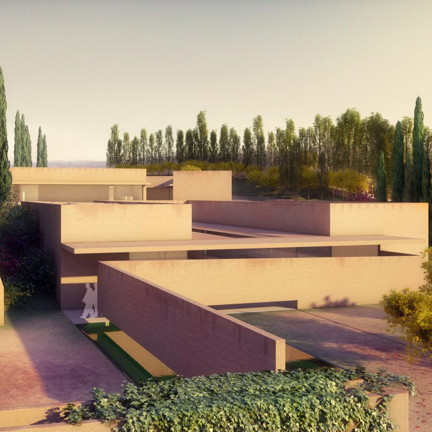
From the architect. The project is a public facility, situated on the new campus of Paris-Saclay. The building hosts a mix of activities including indoor and outdoor sports facilities, a restaurant, cafeteria, and various public spaces: a pedestrian square, street terraces, park areas for deliveries, bikes and cars. The building is organised vertically with its different activities superimposed on one another, using the roof as a panoramic playground for football and basketball games. The different areas are linked by an open staircase that allows independant accesses. The building takes the form of an urban shelf, a vertical public space, accessible to all campus visitors, day or night.


© Maxime Delvaux

© Maxime Delvaux

It is a shared facility, encouraging the encounter of various populations living close to one another, but rarely meeting. The Restaurant, cafeteria and sports activities are made accessible to students, company employees, teachers, and researchers. It aims at creating a meeting point for everyone by mixing activities that are usually separate.


Courtesy of MUOTO

Courtesy of MUOTO

The building has been conceived as a minimal structure, using rough materials, robust and long lasting techniques. Technology is used minimally to provide a place that will last in time, without need for complicated maintenance. 


© Maxime Delvaux

© Maxime Delvaux

Section

Section

© Maxime Delvaux

© Maxime Delvaux

In response to the low construction budget, detailing has been kept to a minimum. This economical approach has allowed for the inclusion of a generous public square in the construction price, ensuring a planted pedestrian connection with the existing academic buildings next to the site. The vertical configuration of the building provides a minimal footprint.


© Maxime Delvaux

© Maxime Delvaux

Product Description. – The main materials used in the building are glass and concrete. The glass façades are characterized by large aluminium sliding doors with triple rails. The concrete beams have been prefabricated and casted in industrial moulds, while concrete columns have been casted on site.


© Maxime Delvaux

© Maxime Delvaux

http://ift.tt/2idk0PY

Penthouse in Holon / OMY design


© Gideon Levin / 181 architecture photography

© Gideon Levin / 181 architecture photography


© Gideon Levin / 181 architecture photography


© Gideon Levin / 181 architecture photography


© Gideon Levin / 181 architecture photography


© Gideon Levin / 181 architecture photography


© Gideon Levin / 181 architecture photography

© Gideon Levin / 181 architecture photography

From the architect. When we first saw the grand space we couldn’t ignore its height and incredible view.

We decided the best way to tackle it would be to focus on a few elements to fit its proportions. 

We chose a minimalist design concept so that the view remained the main focal point. 


© Gideon Levin / 181 architecture photography

© Gideon Levin / 181 architecture photography

The flooring tiles are large and resemble cement, providing a wide clean surface for furniture on it. Black furniture and lighting fixtures contrast with the white kitchen. 


© Gideon Levin / 181 architecture photography

© Gideon Levin / 181 architecture photography

The living space was kept soft with several textiles: a mint green velvet couch, a vintage private collection carpet, and a custom-made entertainment center and coffee table fit the size and ambiance of the living room. 


First Floor Plan

First Floor Plan

The heart of the living room is an entertainment center made of brass colored metal profile and aluminum net, which gives the space it’s industrial and approachable feel. 


© Gideon Levin / 181 architecture photography

© Gideon Levin / 181 architecture photography

The dining room lighting fixtures are made of thin metal wires, making them almost see-through in order to avoid disturbing the views. 


© Gideon Levin / 181 architecture photography

© Gideon Levin / 181 architecture photography

The family of five who lives here loves to entertain; therefore we selected a large dining table suited to the size of the sofa. 


Section

Section

The kitchen is full of storage, creating an organized and minimalistic space. The same goes for the parent’s master bedroom features. A walk-in closet constructed from thin metal profiles and industrial glass, elegantly matching the bed-room and serving as its main focal point. 


© Gideon Levin / 181 architecture photography

© Gideon Levin / 181 architecture photography

Product Description: We chose to use a large colored metal framework in order to create an anchor to the bright white open space of the living area.  Metal profile is a material that is typically thought to be cold and industrial, but with the right color and accompanying materials, it can transform into something new.

Using a metal framework allowed us to build this storage unit on a very large scale. The slick and elegant design compliments the apartment’s proportions, keeping a homey feel.


© Gideon Levin / 181 architecture photography

© Gideon Levin / 181 architecture photography

http://ift.tt/2iWUZYe

DressingForFun / NTYPE


© Xiao Yi

© Xiao Yi


© Xiao Yi


Interior Courtyard . Image © Xiao Yi


Interior . Image © Xiao Yi


Open deck. Image © DressingForFun

  • Client: DressingForFun

Before-After. Image © Joao Lemos

Before-After. Image © Joao Lemos

Chinese residential buildings dated from 1980s/90s are now facing challenges of being upgraded in order to adapt to new needs and current way of living.


© Joao Lemos

© Joao Lemos

The site consists of two parts, the front part along the street, and the back part which is an apartment with a separate access from the residential building. In-between there is an open space, forgotten and abandoned by its previous users, hidden behind by a brick wall.


Floor Plan Diagrams

Floor Plan Diagrams

In the design, this open space is revealed, transformed into three green patios, and a transparent glass pavilion connecting the front and the back, providing the space with a continuous sense of interior/exterior with natural light, enriching, and adding stimulating moments to the overall experience of the space. Extended into the front space, one of the green patios can be seen from the street level. While standing inside of the glass pavilion, street life can also be seen directly or captured by mirror reflection.


© Xiao Yi

© Xiao Yi

The shop is called DressingForFun. Located in a local Chengdu street, it encourages young people to come back to our street life rather than spending enormous time in shopping malls. A series of fun elements are designed, creating interesting and interactive moments in the space. The space itself is also designed to be flexible, allowing the possibilities for events and exhibitions.


Axonometric

Axonometric

The entrance revolving door has the shop logo cut out from the front steel panel, with back-lit colorful acrylic plate behind, which can be rotated by a door handle from inside, accordingly the logo will show different color.


Entrance. Image © Joao Lemos

Entrance. Image © Joao Lemos

The idea of clothes racks comes from unfolding paper clips. Two types of clothes racks are formed by “unfolding”: moveable standing ones, and fixed hanging ones with lighting integrated.


Interior Courtyard . Image © Xiao Yi

Interior Courtyard . Image © Xiao Yi

The changing room is a moveable box with ceiling open. Its location in the shop can be varied according to the program and layout in the space.


Interior . Image © Xiao Yi

Interior . Image © Xiao Yi

http://ift.tt/2iWJLmo

The Joyful Church / The Beck Group


© Seung-Hoon Yum

© Seung-Hoon Yum


© Seung-Hoon Yum


© Seung-Hoon Yum


© Seung-Hoon Yum


© Seung-Hoon Yum

  • Architects: The Beck Group
  • Location: Pohang-si, Gyeongsangbuk-do, South Korea
  • Area: 35600.0 m2
  • Project Year: 2014
  • Photographs: Seung-Hoon Yum
  • Design Architect: Beck Architecture
  • Llc: Rick del Monte, Jay Chung, Ik Joo Lee, Yoo Sook Lee, Yoon Kang, Michael Kiser, Tom Greenwood
  • Architect Of Record: Posco Architects

© Seung-Hoon Yum

© Seung-Hoon Yum

Joyful Church chose Beck to create a new facility for the church’s growing, vibrant worship and education programs on Sundays and for the church’s many social welfare ministries during the week.  The church’s vision was to have a design that expressed a strong symbolic Christian message, but that also used traditional Korean symbols in a fusion of architecture, faith and culture.  The location was a 10 acre site in a new town development area of Pohang.  This site had many development challenges included steep, wooded hillsides and strict zoning limitations. 


© Seung-Hoon Yum

© Seung-Hoon Yum

Beck’s solution provided a 383,500 SF design that integrated into the landscape with gently flowing lines that wrap around a large central plaza. Spaces included a 2700-seat sanctuary, 800-seat chapel, cafeteria, cafe, library, fitness facilities, children’s and youth spaces, welfare ministry facilities and a 350 car underground parking garage.  Placement of the buildings into the natural hillsides and careful orientation of the windows allowed ample natural light into the spaces while providing greater energy efficiency.  Forms and patterns in the architecture were inspired by traditional Korean crafts and calligraphy, and the use of natural materials and colors further harmonized the entire building into its unique place.


© Seung-Hoon Yum

© Seung-Hoon Yum

Courtesy of The Beck Group

Courtesy of The Beck Group

© Seung-Hoon Yum

© Seung-Hoon Yum

Courtesy of The Beck Group

Courtesy of The Beck Group

“Beck showed its devoted effort and undivided attention to our church until completion of the building and advised church step by step during church’s decision making procedure.”    Senior Pastor Park, Jin Suk, Joyful Church


© Seung-Hoon Yum

© Seung-Hoon Yum

Product Description. Brazilian granite was used to create forms and patterns in the architecture which were inspired by traditional Korean crafts and calligraphy, and the use of natural materials and colors further harmonized the entire building into its unique place.

http://ift.tt/2jwD4uD

House M / Jaime Ortiz de Zevallos


© Juan Solano Ojasi

© Juan Solano Ojasi


© Juan Solano Ojasi


© Juan Solano Ojasi


© Juan Solano Ojasi


© Juan Solano Ojasi


© Juan Solano Ojasi

© Juan Solano Ojasi

From the architect. House M is located on a corner plot overlooking a public park, about a mile away from the coast, in Lima’s 1950´s traditional residential neighborhood of San Isidro.                                                 


© Juan Solano Ojasi

© Juan Solano Ojasi

The project has been developed as a basic composition of volumes, planes and materials that define the spaces in response to the views, light, privacy, and a large program.


Floor Plan 1

Floor Plan 1

The four story building is defined by a half sunken garage, office space and service area, all of which raises the living quarters above street level generating a platform for the rest of the building. 


© Juan Solano Ojasi

© Juan Solano Ojasi

The first floor of the house, with the garage roof top garden, living, dining room and the kitchen area sit above the street, overlooking the park through glass walls, while solid concrete walls block the view from the street and generate an entry sequence in to the house.


Section

Section

The third and fourth levels are defined by a two story wood screen and a horizontal white cantilever volume, with the bedrooms, family room and gym that floats along the tree canopies over the ivy covered concrete wall that surrounds the house. 


© Juan Solano Ojasi

© Juan Solano Ojasi

http://ift.tt/2ibQPwE

Video: This Kinetic Green Wall Displays ‘Pixel’ Plant Art


Courtesy of BAD. Built by Associative Data

Courtesy of BAD. Built by Associative Data

BAD. Built by Associative Data’s Associative Data Research has collaborated with Green Studios to create Kinetic Green Canvas, a prototype Green-Art Installation for building façades.

The Canvas consists of individual modules, each of which is a cube made from steel framework, back paneling, L-shaped jambs, secondary structure, waterproofing board, irrigation piping, Green Studios hydroponic skin, and plants. These layered components are assembled on four sides of the cube module, with a motor and water pipe attachment that circulates water throughout.

Thus, hydroponic plants in varying shades are grown on each face, and when put together, modules can create changeable “pixel” art.

News via BAD. Built by Associative Data

http://ift.tt/2j16no8

Moneypenny Headquarters / AEW Architects


Courtesy of Moneypenny

Courtesy of Moneypenny
  • Client: Moneypenny
  • Main Contractor: Pochin’s Ltd
  • Development Director: Hatrick Property
  • Project Managers: Avid Property Consultants
  • Structural Engineers: Cundall
  • M&E Consultants: Cundall
  • Landscape Architect : CW Studio
  • Quantity Surveyor: Todd and Ledson

Courtesy of Moneypenny

Courtesy of Moneypenny

From the architect. AEW Architects has completed a £15m, 91,000sq.ft headquarters for Moneypenny, the UK’s leading telephone answering specialist. The offices in Wrexham have been said to rival the offices of Google and Apple, and boast a tree house meeting room, nature trails, vegetable gardens and even its own pub.


© Pochin’s Ltd

© Pochin’s Ltd

The staff are at the heart of Moneypenny’s business and the brief from the client reflected the importance of its team and the desire to create an interesting, inspiring working environment for them, bringing everyone together from several different offices.


Plan

Plan

The office was designed as two three storey wings flanking a dramatic, 17m high central atrium, known affectionately as ‘the middle’, which is the hub of the building. One of the challenges was to ensure that the staff, no matter which floor they were on, felt connected to the ‘middle’. This was achieved through the use of large picture windows looking directly into it from the offices and through the placement of bridge links crossing at high level. The atrium includes a treehouse meeting room, indoor terrace and stadium seating.


© Pochin’s Ltd

© Pochin’s Ltd

Set within a 10 acre site in a semi rural location on the edge of the Wrexham town centre, the office building was designed in response to the surrounding environment to provide a strong relationship between interior and exterior and includes a nature trail for staff through the extensive grounds with landscape features including a meadow, woodland, an orchard and wetland.


Courtesy of Moneypenny

Courtesy of Moneypenny

Phil Hepworth, Associate at AEW Architects said “This really has been a dream commission for AEW Architects and a real honour to work with such an exciting, forward thinking company such as Moneypenny. The opportunity to create a bespoke office of this magnitude on such a beautiful site where the brief is to ‘ignore the norm and create a space that inspires’ is rare. We really hope that the design helps the company continue to excel and inspires the staff to enjoy working there.” 


Courtesy of Moneypenny

Courtesy of Moneypenny

Ed Reeves, co-founder and director of Moneypenny believes the building represents the future of office design. He said:”What we believe is simple – the happier our staff, the happier our clients. So when we made the decision to build a new office, we asked ourselves: how we can make sure that our receptionists are the happiest in the UK? The answer was easy – ask them. So that’s what we did. AEW Architects were the perfect partners to help make their vision become a reality. They took our thoughts, suggestions and ideas and created our dream home. What’s even more remarkable is that they have delivered a world-class and visually stunning commercial development for the same budget we’d been quoted for a standard brick ‘box’ office”


Axonometric

Axonometric

The main contractor was Pochin’s Ltd, with Hatrick Property as Development Director, Avid Property Consultants as Project Managers, Cundall as M&E Consultants and Structural Engineers, CW Studio as Landscape Architect and Todd and Ledson as Quantity Surveyor.


© Aliva UK

© Aliva UK

http://ift.tt/2i6UlKv

Federico Babina’s ARCHITALE Brings Fairytales To Life

Imaginative Italian illustrator and architect Federico Babina has unveiled his latest series, ARCHITALE, “a tribute to the fairytale universe where the architectures are reinvented to accommodate the protagonists of the story.”

Through his illustrations, Babina imagines 17 structures that dance between reality and fantasy, with each architectural detail revealing information about the characters and story of the respective fairytale.

“My first steps as an architect were visiting the homes and castles of fairy tales that as a child made me travel with fantasy,” says Babina. “The lighted windows in the dark night that hide secrets and surprises, the objects that have been transformed and come to life, were for me a prelude to the universe of architecture and design.”

“The idea is to use architecture and its shapes to take part in the relate of stories, transforming the buildings into ‘narrative objects.’”

See the entire set of ARCHITALE illustrations, including designs for Pinocchio, Snow White and the Seven Dwarves, Peter Pan, Aladdin, and Mary Poppins, after the break.


© Federico Babina


© Federico Babina


© Federico Babina


© Federico Babina


© Federico Babina


© Federico Babina


© Federico Babina


© Federico Babina


© Federico Babina


© Federico Babina


© Federico Babina


© Federico Babina


© Federico Babina


© Federico Babina


© Federico Babina


© Federico Babina


© Federico Babina


© Federico Babina


© Federico Babina

© Federico Babina

© Federico Babina

© Federico Babina

© Federico Babina

© Federico Babina

© Federico Babina

© Federico Babina

© Federico Babina

© Federico Babina

© Federico Babina

© Federico Babina

© Federico Babina

© Federico Babina

© Federico Babina

© Federico Babina

© Federico Babina

© Federico Babina

© Federico Babina

© Federico Babina

© Federico Babina

© Federico Babina

© Federico Babina

© Federico Babina

© Federico Babina

© Federico Babina

© Federico Babina

© Federico Babina

© Federico Babina

© Federico Babina

© Federico Babina

© Federico Babina

© Federico Babina

© Federico Babina

© Federico Babina

© Federico Babina

News via Federico Babina

http://ift.tt/2iVyK4T

House in Trees / Anonymous Architects


© Steve King

© Steve King


© Steve King


© Michael Wells


© Michael Wells


© Michael Wells


© Michael Wells

© Michael Wells

The site is characterized by its remote feeling and mature trees; this despite being surrounded by dense urban development.  It is an unusual paradox to have such a natural setting that occurs in the middle of Los Angeles – a city known for its endless sprawl and crawling traffic. 


© Steve King

© Steve King

The goal was to preserve the natural features where practical – even if this meant having a tree grow through the house.  The steep hillside allows the house to cantilever as a design solution to minimize foundations.  This act of cantilevering also preserves as much native yard space as possible for planting. 


© Steve King

© Steve King

Floor Plan

Floor Plan

© Michael Wells

© Michael Wells

To maintain privacy, the house is located close to the center of the lot to create a buffer between it – and other adjoining conditions such as a public street and other houses. 


© Michael Wells

© Michael Wells

The house is conceived as two separate units under one roof.  The main part of the house is two bedrooms and is designed for a family of four.  The other component – separated by an outdoor breezeway –  is self-contained with one bedroom, a living area, a bathroom, and a kitchen.  This secondary area is used daily as an office and entertainment area, but can easily be closed off from the main space and used by visiting friends or family. 


© Michael Wells

© Michael Wells

http://ift.tt/2iWvVTf

Álvaro Siza’s Alhambra project scrapped