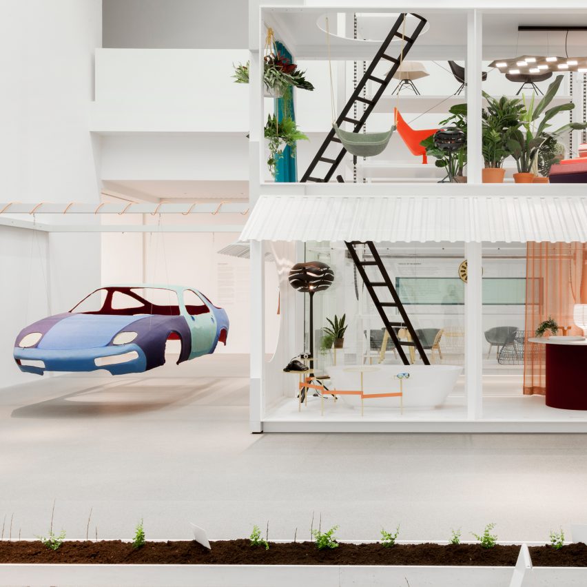
This installation by German designer Werner Aisslinger predicts a whimsical, sustainability-focused future that combines domestic life with farming and robotics. Read more
This installation by German designer Werner Aisslinger predicts a whimsical, sustainability-focused future that combines domestic life with farming and robotics. Read more

This article was originally published by Metropolis Magazine as “The Build Up.”
This November, the Manetti Shrem Museum on the University of California, Davis, campus opened to the public. Designed by New York City–based SO-IL with the San Francisco office of Bohlin Cywinski Jackson, the museum pays homage to the agricultural landscape of California’s Central Valley with an oversize roof canopy. The steel members of the 50,000-square-foot (4,650-square-meter) shade structure, nearly twice the size of the museum itself, reference the patterning of plowed fields and create a welcoming outdoor space for visitors. It is both expressive and practical, but getting that balance wasn’t easy.
SO-IL, founded by Florian Idenburg and Jing Liu in 2008, has a portfolio filled with smaller projects, installations, and exhibition-related work. The Manetti Shrem Museum is easily the firm’s largest work to date, demanding a rigorous design-build process while maintaining a strong conceptual vision. In short, it required architecture.
For some emerging firms, architecture’s delicate pas de deux between ideas and physical realization is a newfound pleasure and challenge. The economic consequences of the late-2000s recession meant that many young designers entered into practice at a time of limited building opportunity. Research dominated, and commissions—seemingly juicy ones—came in the form of installations or exhibitions. Although a great way to develop conceptual ideas on architecture, these smaller, temporary works sometimes prove an awkward training ground for larger-scale, permanent projects.
Michael Young of New York City-based Young & Ayata experienced this firsthand last year, when the firm was named one of two first-prize winners in the international competition for the new Bauhaus Museum in Dessau, Germany. His practice explores lofty questions of objecthood, nature, and representation through research and image making. Yet for the last stage of the competition, Young and his collaborator, Kutan Ayata, were asked to produce detailed construction documents and a budget to accompany the arresting scheme—multicolored clusters of organically shaped “vessels” in a park setting. Although the commission ultimately went to a more conservative project from Spanish architects González Hinz Zabala, Young noted in remarks during SCI-Arc’s 2015 Right Now symposium that evolving an experimental design into something ready for construction was a stranger process than the speculative or analytical work they were more accustomed to. “At the time, we were knee-deep in figuring out how to build,” he says on recent reflection. “We came up with a convincing piece of construction, convincing in all rights, but over budget.” The structure of the competition didn’t allow for readjusting the scheme to fit the price tag, so the architects were left frustrated by their own trial in complexity.
“Money” can be a dirty word in design circles—especially in the academy, where any whiff of budget, value engineering, or even the dreaded “professional practice” makes defenders of the discipline recoil in disgust. Budget is lowbrow, concept highbrow. But steering the budget toward a design imperative can make or break a project. Today, Young & Ayata has a more deliberate relationship with the building process. For an upcoming apartment building in Mexico City, the architects have constrained their formal language to the facade. “All the design effort was put into a couple experimental moves that we thought we could pull off,” Young says of a project that privileges realization of an actual edifice.
“You have to know where the key moments are in a project where you either keep the concept or lose it,” says Idenburg. SO-IL won the Manetti Shrem Museum commission in a 2013 competition and was required to stay within a $30 million budget. To ensure that their concept carried through to realization, the architects labored over the canopy design, tweaking it in collaboration with Bohlin Cywinski Jackson and facade consultants Front Inc. Intensive modeling helped them create a cost-efficient design, and together they developed a Grasshopper script to control the length of steel members and every connection. The end effect, adds Idenburg, was that each piece was tied to an exact cost. “We were able to play with the model and the spacing of the steel while always guaranteeing the final price.”
A year after winning the Turner Prize for art, and thus scrambling the art world’s preconceived notions of architectural practice, Assemble Studio opened its own construction company. The London collective was founded in 2010, and while its socially minded designs span furniture to installation to building, the 18-member group is dedicated to a practice—however theoretical to start—that’s grounded in the real world. Taking over the reins of production would ostensibly allow them to explore territory between design and delivery—and, as with some of their work to date, offer transparency in a process that’s generally pretty opaque to a larger public.
“We are interested in playing with existing material and industry processes,” explains Assemble member Maria Lisogorskaya. “We enjoy the unexpected changes and adaptations which can be a result of working with engineers, fabricators, and other building experts—these make our work richer.” Completed projects have yet to manifest, but there’s something exciting and thought-provoking in situating architectural experimentation at the heart of construction.
Perhaps, then, a practice’s maturity can be judged in the ways it hardwires concept into the construction practice. When the Mexico City-based firm Productora designed a textile museum and community center in the Mexican town of Teotitlán del Valle, Oaxaca, architect Wonne Ickx knew that some details would succumb to budget cuts. The work-around was to design everything in concrete—“even the sinks,” says Ickx—and then have the structural engineer sign off on the drawings. The designers had anticipated changes during the building process and gambled that the client wouldn’t tamper with the engineering package. It paid off. The museum is scheduled to open in March 2017, with a full complement of concrete details.
“We always have a very strong concept or radicality in how we try to do architecture,” says Ickx. Still, he stresses the importance of a kind of radicalism in practicality and the building process. It’s something that he sees as part of the Mexican architectural tradition, where the basic agenda for architecture is far closer to a buildable project.
“There’s an understanding that the set of buildings realized by the architect are the work of the architect, not the postures or the critical writing,” he says.
Ickx, who also teaches in the architecture department at UCLA, is critical of what he sees as a primarily U.S. phenomenon—an enormous stigma on building and detailing. He sees it in his students, who worry more about the overall integrity of a formal agenda than the complex and highly negotiated process it takes to get something built. “In the end you have to make a concession,” says Ickx of the act of going from concept to construction. “That’s where the architectural project is—one way or another. How you make it determines if it’s a good or bad building.”

St Mary at the Quay, Ipswich reopens on 17 October 2016, as a heritage and wellbeing centre, 68 years after being boarded-up due to a dwindling congregation and WW2 bomb damage. This £5.1m regeneration project sees the rescue of a mediaeval grade II* listed building through a unique partnership between The Churches Conservation Trust and the charity Suffolk Mind.
Ipswich had been at the height of merchant and maritime prosperity between 1450 and 1550 when the church was constructed. At that time, the building found itself at the heart of the town surrounded by the houses of the wealthy. However, over the 19th and 20th centuries and as the town centre grew away from the quayside, St Mary found itself in an increasingly deprived and industrial backwater. The building was in a sorry state when saved from demolition in 1958 – stone decaying both internally and externally, the south side of the building suffering from structural movement and the under floor having been flooded with sewage.
Work on the current project began in 2008 when Suffolk Mind visited the building and saw potential to create a good working environment with strong historical links to the local community. A two year period of careful negotiations with the then English Heritage (now Historic England) was required before listed building consent was granted to add the 2 storey consulting room extension and to make the internal mezzanine interventions. A similar period was required for fundraising and successfully bidding to the HLF for a £3.6m grant. Identifying suitable contractors was difficult but after having done so, two phases of work on site has taken almost 2½ years.
The insertion of the mezzanine structure to the south aisle has reason: it replaces ungainly internal concrete buttresses which were added in the 1960’s – work which required careful temporary support of the building followed by pre-loading of the steelwork to receive lateral loads.
Considerable internal stone decay had been caused by rising saltwater from the ground. The insertion of stainless steel sheet barriers into the nave arcade columns below floor level has completely halted moisture movement and stone damage. All columns have been repaired carefully.
The church and extension have underfloor heating throughout and all colours and materials have been chosen to sit comfortably with the limited palette of the existing building. Care was taken in cleaning and repairing the hammerbeam roofs and the new mezzanine deck has been designed to be as structurally slender as practicable (150mm) so that visually the intervention appears delicate and understated.
The project partners are grateful to the HLF for the £3.6m grant. Molyneux Kerr Architects are grateful to the CCT and Suffolk Mind for placing their trust in the practice’s partners.

We’ve always loved the unique aesthetic that architects establish when they build a home that differs greatly in style from the other buildings around it, or from what you’d expect to see in a particular area or neighbourhood. For example, there are few things quite as cute as a home built with traditional style and decor to make it look like an old fashioned structure nestled among contemporary buildings on..
The post Desai Chia Architecture Remodels a Cottage in Water Mill, New York appeared first on HomeDSGN.

Oleksii Venediktov a designer and architect from SPECIAL PROJECT VENEDIKTOV, has reorganized an apartment inside a high-rise residential building in a new home for a young family.
The apartment is situated on the 30th floor of one of the highest buildings in Kiev. It’s panoramic windows open a spectacular view of the city and the Dnieper River.
The construction of the building, specifically its concrete frame, suggested the need to divide the living space into separate functional zones. The opportunities presented by the existing plan of the premises, were also factored into the future optimal apartment plan.
The customers asked us to create an individual design, for unique living quarters. While discussing the project, we quickly found out how lucky we were to have similar tastes in design. We offered to use a rich color palette for this design concept; the colors of the interior should be highly compatible with the space, light, and shadows.
An illusion of a larger space, compared to the actual parameters of the area, is created through the sophisticated color palette. The colors of the interior vary depending on different shades of natural light, and are changed significantly in artificial lighting. That is why it was crucial to make the photographic survey of the site both at daytime and at night.
We favor minimalism and Scandinavian style, modern design objects, authentic materials, and original surfaces. In order to emphasize its texture, we decided to paint the concrete. We are confident that the future belongs to interiors, capable of triggering emotions.
The apartment contains an open space consisting of the living room and the kitchen separated by a glass wall which allows light to freely pass through. The entrance hall, that includes the guest bathroom, is part of the open space providing access to the panoramic view from the window right from the doorway.
Perpendicular to the hall, there is a corridor leading to the private section, with two bedrooms and two bathrooms. Special premises accommodating a home office, a home cinema, and a bar, from inside which you can enjoy the beautiful view.
The “Green Apartment” keeps altering its looks throughout the day; the interior is different in the morning, the day, and the evening, changing the atmosphere of the apartment with it.

Powerhouse Company has completed its most recent project in Beijing, China. The 1,000 m2 project, located on the ground floor of the Yintai centre at Guomao, is a multifunctional social venue with ski and snowboard simulators, a sports area and dance club, all shaped in a white mountain landscape under a warm golden sky.
The project is located between JianWai SOHO and the Park Hyatt hotel. The site is the latest addition to John Portman’s Yintai Centre, and with a full glass facade it gives the project great exposure in the CBD area of Beijing.
Powerhouse Company was asked by developer Yintai to design the interior for their ski and sports experience centre called inSports. This high-end multifunctional venue facilitates activities like virtual skiing, virtual sports and endurance classes, while placing them in a social setting. Projections on floor and walls create a wide array of simulated environments. During the night the area is turned into a dance club.
inSports follows a new trend in Chinese retail where live action and participation becomes an integral part of the retail experience.
The simulators function like a sideways treadmill; you can move left and right on your skis or snowboard while looking at a large screen with a projection of an idilic, dazzling snow slope which finely follows your movement for optimal experience results.
This virtual aspect of the skiing intrigued the design team, and they created the concept of a digital summit scenery. Large triangles on a variety of platforms visualise mountains that organise the multifunctional area in a natural yet fluent way. The main seating elements around the ski simulators are integrated into the mountain shapes, and the triangular language is continued in central interior elements like the bar with DJ-booth and reception desk.
The mountain landscape is constructed in white corian, which forms a harmonious contrast with the light grey sports floor and the golden anodised aluminium ceiling panels. The bold interior columns are cladded in large mirror panels making the structure disappear. A softer edge is given to the space with dark fabric panels, which cover the walls and improve the acoustics of the space. The bar and reception desk are both a combination of golden triangles and frosty white marble. A snowlike gradient covers the facade, and creates a beautiful and soft winter feeling for this cool new venue in China’s capital city.

Following last year’s introduction of MultiFab, a multi-material 3D printer, researchers at MIT’s Computer Science and Artificial Intelligence Laboratory has pioneered a system for designing multi-material objects. The new interface, Foundry, is meant to be accessible to non-programmers, whereas multi-material 3D printing technology has historically been prohibitive both with respect to cost and user-friendliness.
The team at MIT hopes that Foundry will become 3D printing’s analog to graphic design’s Photoshop. To aid rapid prototyping, the platform enables the designer to assign distinct material properties to each part in a composite print. For example, it could produce a dental appliance containing a rigid, tooth-like material connected to a softer and more malleable material to merge with the gums.
The software is compatible with any commercially available multi-material printer. Currently, users must import geometry from traditional CAD software into Foundry to designate material composition, but the researchers are looking into integrating Foundry into CAD programs. Additionally, the team hopes to add the capability to preview a part’s behavior.
Learn more about Foundry at DesignNews.

From the architect. A new state-of-the-art high school designed by Cuningham Group Architecture, Inc. (Cuningham Group ®) is providing students with an interactive and personalized learning experience and exposure to future career opportunities. Pathways Innovation Center offers junior and seniors in the Natrona County School System in Casper, Wyoming, an interactive and personalized education through four academies focused on multiple disciplines, including engineering and design.
“The goal is to inspire kids who are not necessarily planning to move on to four-year colleges,” says Scott Krenner, the project’s Design Lead and Associate at Cuningham Group. “Rather than follow a traditional vocational approach, this high school presents new pathways to success; a way to shine that may not be found in standardized tests. Here, their inventive thinking and new skills are much more visible.”
Cuningham Group worked with a local partner, MOA Architecture, to design a 38-acre campus, which also includes the new Roosevelt High School. The Pathways program is open to all juniors and seniors in the school district.
At the center of Pathways Innovation Center is “Fabrication Hall,” a 5,000-square-foot, two-story common space surrounded by labs equipped with cutting-edge technology, and is meant to encourage teams from all academies to collaborate on projects. The architects’ innovative design concept for Fabrication Hall was inspired by private sector facilities, including Boeing in Washington state, where engineering and design teams work under one roof.
“This is a unique space that you don’t see at other schools,” Krenner says. “It is fully sun-filled and large enough to build homes and solar-powered airplanes.” The hall has 16-feet-high, custom-fabricated glass bay doors that fully open to the outside. On the inside, the hall is viewed from glass-walled design spaces, including a “floating blue box” overlooking the hall for informal learning.
“This approach creates a conversation between academic disciplines, including construction, woodworking, metals, welding, robotics, arts and furniture making,” he says. “It’s an incubator for prototyping. Ideas are generated and then connect with the different academies at the school. As the Fabrication Hall, the transparent design stimulates synergy and is a celebration of student achievement.”

Sinan Günay and Nurhayat Oz of Superspace have won second prize in the MetsäWood competition, The City Above the City, which called for architects to design wooden extensions to city centers. With their project, Colliding Lines and Lives, the team designed a series wooden housing modules to be appended to a fourth-century Roman aqueduct archway in Istanbul.
Built by the Roman emperor Valens, the archway was an important water supply for the Romans and Ottomans but later lost its significance and functionality with technological and infrastructural advancements, leaving it an unutilized landmark in the city.
In the district of Fatih, 921 meters of this archway remains, which becomes the foundation for the Colliding Lines and Lives proposal.
A [grid] structure, located above the archway, referencing the openings of the arches, serving as a vertical but linear underlay for the wooden housing modules shot with the pattern of the surrounding, is exposed to and separated from the archway to create a promenade with overlapping the fabric of wood and stone, [old and new], history and future, hard and soft, day and night, heavy and light, and ultimately generating an alternative elevated life, keeping tabs of the city, instead of just being watched, explained the architects in a recent press release.
News via: MetsäWood.

//players.brightcove.net/136368194/V1xBaDVb6l_default/index.html?videoId=4750990665001
The “living memories” of Los Angeles are seen and sensed in the way that space is occupied in the city; the traces left behind by what has been. “Lost Hills,” a short documentary by LA-based television station KCET, is a snapshot of LA’s lost neighborhood, Bunker Hill, that in 1955 was approved for “slum clearance.” As a result, the entire area was removed almost without a trace – Angels Flight, a funicular railway that transported residents from Bunker Hill to the city center, is the only remaining structure after reopening half a block away from its original location in 1996.
Bunker Hill was originally an area inhabited by upper-middle class people, but that changed in the 20th Century when those people began to move away. This made it somewhat easier for LA to erase the history of the Hill in order to make way for functionality, following late 20th Century modernist thinking. Illustrating how space is so strongly tied to memory and emotion, the video depicts what one interviewee calls an “absence [that] makes a presence”; the city is the materialization of memory, partial and partly erased.
