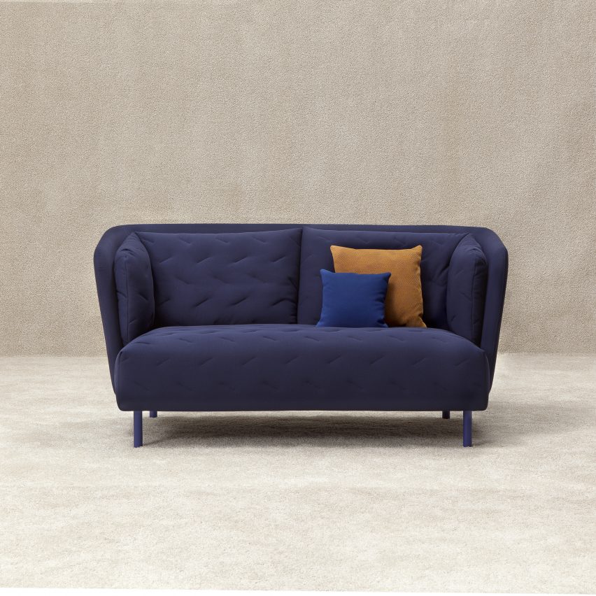
Dezeen promotion: Japanese kimono dresses informed the design of this bed-like sofa by Spanish brand Sancal, which features quilted fabric covers ideal for afternoon napping. Read more
Dezeen promotion: Japanese kimono dresses informed the design of this bed-like sofa by Spanish brand Sancal, which features quilted fabric covers ideal for afternoon napping. Read more
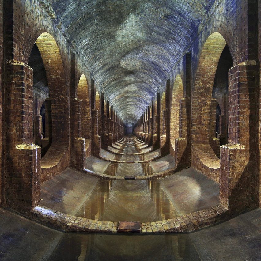
A shot of a brick reservoir in London’s Finsbury Park has been selected as the best architecture photograph of the year at the Arcaid Images Architectural Photography Awards 2016. Read more

After 30 years in a turn-of-the-century Porfirian villa, the renowned contemporary art gallery OMR decided to move to a new location. The chosen site was an existing brutalist building called Sala Margolin, originally dedicated to the sale of records and books. The building’s design consisted of a single large space covered by a coffered concrete roof slab under which the different sections of the store were organized by subtle changes in floor level. The roof was supported around the perimeter and by four slender concrete columns framing a central skylight, the most important light source for the space.
The design strategy was to preserve the existing building as much as possible. A central bathroom core was demolished and some interior details toned down so as to bring out the character of the building and transform it into a generous exhibition space. In order to provide the flexibility required by the client, the concrete floor was leveled and structural wall linings were applied to the interiors, allowing the hanging of substantial artworks anywhere within the 5.5 meters room height. Accompanying the main exhibition space on the ground floor are an access courtyard, reception, technical storage space and a rear garden courtyard onto which a bar opens.
A vertical extension accommodates supplementary programs in order to not compromise the existing spaces. This new top floor houses a multipurpose space, art storage, offices, a library, meeting room, kitchen and terrace. By thickening the wall that faced the rear courtyard it was possible to resolve the vertical circulation to the new top floor without affecting the structure of the existing slab. This “thickened wall” – a mere two meters wide – allowed the accommodation of a mezzanine with bathrooms as well as the opening up of the newly added interior spaces towards the courtyard by means of a modern and paired down glazed facade. Built on site using standard steel profiles and arranged in rectangular modules this façade integrates projecting windows allowing for passive ventilation. In lieu of a fixed goods lift that would have required the perforation of the existing slab or the introduction of an extra volume infringing on the rear courtyard, the facade has an openable section that allows the movement of large format artworks to the top floor via a mobile lifting platform.
The newly built top floor is organized according to the structural scheme of the original construction, roughly forming a 9-square grid layout that provides a maximum of flexibility by allowing a variety of ways to subdivide space and distribute circulation. On reaching this floor, visitors discover the large multipurpose space that functions as an extension of the main exhibition gallery, a showroom, a work space and a place for workshops and lectures. In keeping with the position of the original skylight, the library becomes a new central light space that articulates all other functions. Facing the street is a more private space where the meeting room, kitchen, executive office and terrace are situated. The terrace is the result of a 4-meter setback of the top floor which functions as a mediating element towards the street, keeping the proportions of the original facade intact and allowing for a discreet intervention. A lateral staircase leads from here to the rooftop effectively creating an extension of the terrace during larger scale social events. In turn, this space has been conditioned to function as an outdoor workshop where part of the preparatory work for exhibitions is done.
The result is a sober project that amplifies the character of the original building whilst preparing it for a new cultural life without falling back on the international conventions of the sterile white cube.

The Royal Incorporation of Architects in Scotland (RIAS) has announced Hugh Martin & Partners’ Princes Square as Scotland’s Building of the Century at the finale celebration of Scotland’s Festival of Architecture 2016 in Dundee. Open to buildings built in Scotland in the past 100 years, voters selected the winning building from a 10-strong shortlist that included projects by Enric Miralles and Reiach and Hall Architects.
Located in the heart of Glasgow’s Style Mile, Princes Square was renovated into an iconic multi-level shopping center and public space by architects Hugh Martin & Partners in 1987, preserving and restoring the original building while creating a modern shopping and dining venue “of quality and distinction.”
Distinctive for its main entrance guarded by a giant metal peacock, the building features whimsical architectural elements throughout, such as symmetrical criss-cross escalators and spiral staircases, and is capped by a airy glass roof.
Hugh Martin & Martin have won numerous awards for the renovation, including the RIBA Scottish Regional Award for Architecture (1988), the Edinburgh Architectural Association Centenary Medal (1989), and a Civic Trust Award (1989).
The award was organized as part of the traveling Scotstyle exhibition, which has visited over 30 venues throughout Scotland, telling the stories of Scotland’s top 100 buildings of the past century.
“The Festival of Architecture has tapped into a keen public appetite for architecture and events on an architectural theme,” said Neil Baxter, RIAS Secretary and co-editor of Scotstyle. “With over 460 events and well over a million participants, it is the most substantial ever year-long celebration of a single art form in Scotland’s history. Princes Square is a worthy popular choice for the best building of the last 100 years.”
More information on the award and the Scotland Festival of Architecture 2016 can be found here.
News via RIAS.
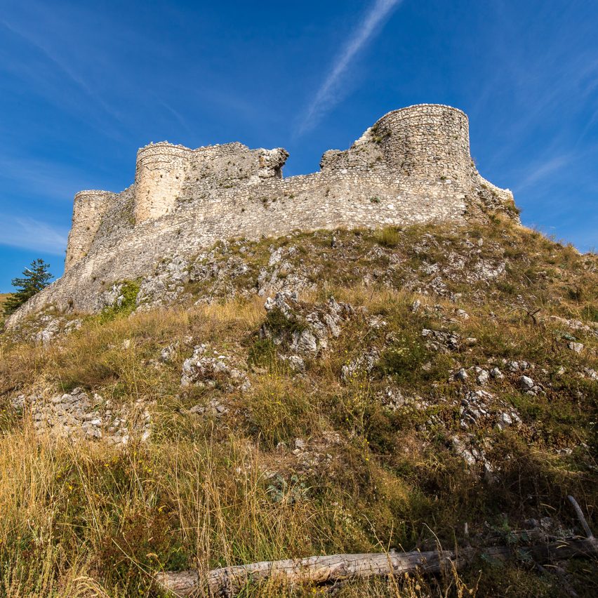
Dezeen promotion: Young Architects Competitions is inviting architects and designers to come up with ideas for transforming the ruins of a medieval castle in Italy into a holiday destination. Read more

From the architect. The Karlovac freshwater aquarium is located by the river Korana. The building volume is partially dug into the ground and covered with earthen embankments and greenery from its outer edges. The design concept was inspired by the city’s historic center “Karlovac star” surrounded by “Šanci” – defensive earthen walls and mounds. The goal was to form a new city focal point and to validate the promenade by the river. Three walking routes were formed: towards the city center and the river; towards the south and the sports and recreational center; and towards east and the road access. A new point is located at the junction of the walking routes – a square around which all of the aquarium facilities are located: entrance spaces, souvenir shop, cafe bar, library and offices.
The aquarium exhibition displays the flora and fauna of Croatian rivers and their ecosystems. The display layout follows the flow of a karst river – together with its flora, fauna and biodiversity. The exhibition starts outside, with a water surface on the square. It continues inside the building with a system of ramps that wind like a river down into the basement level because specific plant and animal species require complete control of lighting conditions in order to survive. Aquariums are placed along, above and below the visitor paths. Along the pedestrian ramps the fish are first observed from above, as they are when walking along the river; and then from the sides – they can be seen below the water surface. After the headwaters (upper part of a river) the sounds quiet down, visitors plunge into caves that feature endemic species which are often found in subterranean streams. The space expands, lighting comes from the tanks, and visitors can take a break in the central area, listen to the sounds recorded in caves, and observe the exhibited endemic species. After the cave, the visitors arrive to an aquarium with larger specimens of rare species that have disappeared from their natural habitats in Croatia. The visitors can observe the fish and aquatic plants that live in warmer parts of the riverbed. The aquariums are seen from the side, and then from underneath as the visitors walk into a tunnel that evokes immersion into a river. After the tunnel, visitors pass through a series of aquariums with water lilies and rushes usually present downstream, in the marshy habitats of a river. The exhibition ends with a system of cascading aquariums whose biotopes display waterfalls and a travertine barrier.
Finally, a stairway and an elevator return the visitors to the entrance hall through the gift shop. A space for analysis of the technological parameters of water, a scientific research center and fish aclamatization spaces are located in the center of the layout.
Karlovac freshwater aquarium is co-financed from the European Regional Development Fund under the “Regional Competitiveness” 2007-20013 Operational Programme. The total value of the project is 36.691.939,28 Kuna’s, of which the grant from the European Regional Development Fund is 36,222,282.45 Kuna’s.
Product Description.
Pigmented concrete
The concrete used on the façade is pigmented and produced by a special in-situ method right on the construction site. A special type and size of grain was selected to achieve the desired effect – to make the façade color resemble the color of ground/soil. First, the concrete is carefully applied on the hull, vibrated in layers and cultivated for a period of time. Before it is mounted on the façade the hull is coated with a cement milk retardant to slow down the binding process in the concrete. After the hull is removed the concrete surface is washed to obtain a specific texture. The mineral grains become visible and clearly define the structure and texture of the complete and solid concrete surface.

Last week ArchDaily attended the 2016 World Architecture Festival in Berlin. We chatted with Sir Peter Cook and asked him about the current state of global affairs (Brexit, the US election, etc). He explained how his experience and work has influenced a career that has spanned over five decades, and reminds us of the inspiring power of architecture.
Peter Cook: You have to understand that I’m a very particular kind of animal both politically and in my general opinions. I’m what I would call a creative cynic. I’m an old person and I’ve seen a lot of not very good things happen. On the other hand I was privileged as a child to have free education and free college.
I don’t see things in the extremely black and white. I think there are variants on the not quite right and variants on the nearly possible. And so I think even in the Archigram days my projects were actually based upon a kind of liberal tradition. Although the mechanics looked outrageous, perhaps, the actual society that I was imagining into them was what I would call an North European liberal society, such as I actually grew up in. Of this made—there’s a tendency away from that. And my great belief in Europe, which I did before there was even an EU, was that one had seen all these countries fighting each other—I was a child at the war time, and I heard bombs dropping—and you saw all these countries coming together and that seemed wonderful, irrespective if there was a bureaucracy or not.
In a way, I think the architectures that I make is based upon an optimism. Optimism with a side knowing that it won’t quite happen, but not saying “Oh! All is terrible!” or “Oh! All is wonderful!” It’s, “Yeah, it’s going to be a bit better or a bit worse.” That, of course, is a very English attitude. That we’re survivors. It’s interesting that when sometimes there are these economic downturns, for example in Spain when there was the last economic downtown, everyone said “It’s all collapsing, what are we going to do, what are we doing to do!” The English said, “Hmm it’s not so good, but it’ll get better.” And then things are good in England and they say, “Uh, any minute it’s going to go down.” And it’s a kind of protective tissue which is very funny for foreigners. My wife is not English and she can never understand how we have this—we’re never totally optimistic and we’re never totally pessimistic. We say, “Well, let’s keep going and something will turn up.” And you have to put my architecture in that perspective. It’s what I would call liberal in a traditional sense of liberal. It’s inquisitive, reasonable, it’s to the left but not extreme left, it’s beneficial for the underprivileged, but not in an extreme way. It uses the economic system that we have, as long as it doesn’t go extremely badly. And I think this is difficult, particularly for Latin people or Mediterranean people to understand. They say, “What turns you on?”
You can use your imagination of course, and when I was doing the Archigram stuff I always thought it could be built. If you looked at it, it had handrails, it had toilets. And the toilets were the right size and the escalators were the right pitch. I always used to get irritated by people from other cultures who’d say, “This is a wonderful scheme; this is the city of the future.” And you thought, “How the f*ck are you going to walk around on it! You’re going to fall off the edge.” So, you have the bear that in mind, and therefore I don’t see any divide between what I was showing before lunch there, the blue thing [Drawing Studio at Bournemouth University], which is actually built, and what I was drawing in Archigram. That [project] looks a bit unusual in an English university, but it’s only what we were doing in Archigram. And Archigram looked a bit unusual but actually it could have been built, and that was what was very interesting when I built the Graz building—that you could do that. And yet, people for years had been saying you couldn’t do our kind of stuff. And they you say, “F*ck you, look there it is!” What do you do then? And I think it’s… in a way a rather cynical background. You somehow can do things because the cynicism is a protective crust for what is fundamentally optimism. And there you are.
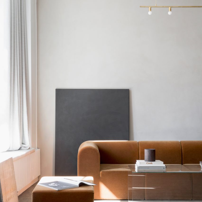
Danish studio Norm Architects has taken influences from both Scandinavian and Japanese design to create this pared-back gallery and workspace for Kinfolk magazine in central Copenhagen. Read more

ATLAS HOTEL HOIAN is located in Hoi An’s “Old Town; an area which has rapidly grown since it was officially named by UNESCO as a World Heritage Site. Recently, most of the ancient houses have been converted into shops and restaurants that serve the daily influx of tourism. The neighborhood is well known for its beautiful tiled-roofscape and its internal courtyards that provide a layered spatial quality between the inner and outer spaces. This quality has been slowly eroded due to chaotic commercial flow. As a consequence, Old Town has lost its charm of a calm and peaceful lifestyle.
Located in an irregular plot of land, the design approach of Atlas Hotel is to turn this constrain into its unique character. The linear layout is divided into several internal courtyards, and by lifting the building above the site, it completely frees the ground floor to create an inter-connected network of courtyards. This spatial quality reflects the dynamism of the new Hoi An but also retains the charm of the Old Town.
The five story hotel includes 48 guest rooms as well as various leisure functions such as restaurant, café, rooftop bar, spa, gym and swimming pool. Due to the complexity of the site, each guest room is shorter and wider than typical hotel rooms. Rather than a problem, this presented an opportunity for the rooms to have greater access to greenery not only from the bedroom but also from the bathroom.
The building façade is clad with locally-sourced sandstone pieces used in combination with an exposed concrete slab and a series of planters along the corridors. The planters are arranged along the entire façade of the hotel not only provides solar shading but also allows cooler air to ventilate the spaces. In addition, the perforated stone walls admit daylight without blocking air flow. This scheme allows the place to be naturally ventilated to minimise the use of air conditioner. The use of these green and natural elements embodies the particular interest of the office and the House for Trees concept: to integrate greenery into design as a way to rejuvenate urban areas and to contribute to societal improvement. At its core, Atlas Hotel reconnects man with nature.

