Brooklyn-based design studio, workshop and think tank CAZA (Carlos Arnaiz Architects) has announced its plans for Ospital Pacifica de Juan and Juana Angara, a hybrid hospital and trauma center prototype located in rural Baler, Philippines. As the first combined General Hospital and Trauma Care Center in the country, the project will drastically improve medical support in this remote area.
With a daily patient capacity of 75 people, the 6,120-square-meter space will feature a variety of medical services, including maternity wards, imaging, operating rooms, a chapel, and a café.
“The Hospital will also offer patients a therapeutic presence of nature, as the luscious exterior landscape of Baler permeates the facility through a series of undulating canopies that create an architectural figure in an open field of green” – described the architects in a media release.
Courtesy of CAZA Architects
In order to provide flexibility and adaptable modularity, the hospital is planned around a nine-by-nine-meter grid that will accommodate a variety of organizations for patient and examination rooms.
Courtesy of CAZA Architects
A central, integrated spine will run through the hospital, circulating staff and medical supplies, as well as creating a centralized service delivery mechanism.
Courtesy of CAZA Architects
Courtesy of CAZA Architects
“As a prototype design, the hospital will be prefabricated and repeatable for other rural regions with similar health and trauma care needs. Its contextual design can be adapted to other environments through customized external presence and public spaces in response to specific local conditions.”
Courtesy of CAZA Architects
The $8 million project will begin construction in December of this year and will be completed in March 2018.
From the architect. Rest Area Niemenharju is located on European highway E75 which runs from Greece in the south to North Cape all the way in the North of Europe. After a long drive, it’s a perfect place to stop for the night and take in the natural environment. The Rest Area is located on a beautiful spot next to a large pond and a ridge (in Finnish harju, hence the name) bordering lake Kolima, which is a remnant from the ice age.
Diagram
The Rest Area takes its inspiration from the surrounding nature. It offers a break from driving, with beautiful, unobstructed views to the water. The Main Building, a buffer between traffic and nature, is comprised of 24 treelike columns placed on an 8m x 8m grid. The columns give visitors the feeling of being in a forest. They carry a huge canopy that curves upwards towards the road as if to catch the attention of the passing motorists. The canopy provides shelter for both the fueling area and the pedestrian area around the building. All supporting functions are placed in black boxes under and on top of the canopy so they seem to disappear against the dark backdrop of the forest.
The columns are made of glued laminated timber sourced from local wood. CLT (cross laminated timber) walls in the interior enhance the natural atmosphere and bring a sense calm to the place, not typically found in a rest stop. On the second floor are 10 hotel rooms with views towards the lake and a sauna area to relax and recharge one’s batteries. The camping area is used during the summer months and comprises of 5 cabins, a service building and 42 camping spots. The camping area is in close relation to the pond. Most of the camping spots have a view towards the shore and from the saunas in the service building one can make a refreshing dip in the water.
The architecture of the buildings on the campsite take their inspiration from the vernacular buildings that were already on there. The new buildings are stained black so as to blend into nature. This also helps the original buildings stand out. Rest Area Niemenharju is not your typical service station. It offers a retreat from traffic and a peaceful environment to enjoy the surroundings, local food and a good night sleep. All of this is achieved through structural wooden architecture that is innovative, out of the ordinary and sustainable.
Tlv Gordon 8.2 Apartment is a private residence renovated by Dori Interior Design. It is located in Tel Aviv, Israel and was completed in 2016. Photos by: Adi Choen-zedek
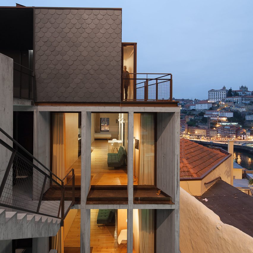
Architects Nuno Melo Sousa and Hugo Ferreira have created a apartment block for holidaymakers in Porto, backing onto a steep granite cliff beside one of the city’s most prominent bridges. Read more
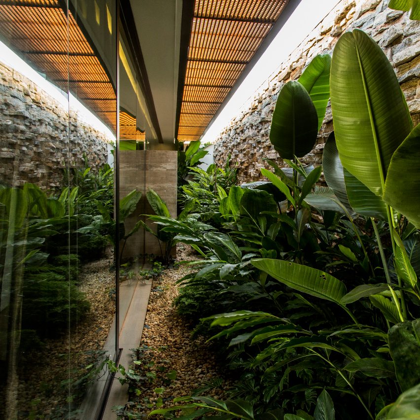
A walled garden filled with tropical plants flanks a glazed hallway at this house in the Brazilian town of Franca, which is influenced by the country’s modernist architecture. Read more
After being the only prominent designer to argue in favour of Brexit, James Dyson is giving UK design education a boost with the creation of a new engineering university. Read more
For Casa Cor Rio 2016, the most important architectural and interior design event in Brazil, Gisele Taranto Arquitetura was challenged to create six different designs for a dining room. The 26th edition of the event takes place in a house surrounded by Burle Marx gardens in Gávea, an affluent residential neighborhood located in the South Zone of the city of Rio de Janeiro. Ovoo Dining Room by Gisele Taranto –..
Attracted by the large garden and the tranquil environment of this house located a few kilometres away from Brussels, the new owners wished to carry out works to make it brighter and to open it up on the outside.
As they were ambivalent about the aesthetics of the existing house, part of the project was also to redesign the architectural expression, outside as well as inside, while keeping the original spirit. One of the childhood friends of the new owner put him in contact with architect François Martens who asked his colleague Edouard Brunet to team up with him.
With its rather old-fashioned architecture, the house is characterized by a visually heavy slate roof. Over the years, the artificial black slates gradually took a pink hue which is not in harmony with the bricks of the ground floor. The eaves, the size of the windows and the materials make for a particularly dark interior which lacks opening on the large tree-filled garden.
Architectural principles The intention of the architects was naturally to build large windows on the back of the house (opening on the garden) as well as on the side façades. The new extension on the back is largely glazed and opens on the long garden. The large side windows that have been opened allow to track the sun’s path and to take advantage of the natural light throughout the day.
Courtesy of François Martens + Edouard Brunet
In order to respect the existing architecture, the two architects deliberately chose to make sure their works would be clearly identifiable. To achieve this, each new opening was highlighted by a black frame that extends from the inside to the outside. They act as frames for the environment of the house.
Slates and the roof insulation have been replaced while maintaining the shape of the distinctive roof. The interior set up was modified with a kitchen in contact with the terrace and a room made available in the basement via a new staircase on the rear of the house.
A new extension open on the garden and natural light The spaces enlarged thanks to the extension appear even larger as the continuity between the inside and the outside has been thought in the smallest details. Thus, in order to minimize as much as possible the visual presence of the poles and sliding frames of the extension, these have been aligned. This allows that each pole hides behind another in a simple and rhythmic architectural expression.
This also reinforces the great visual axes that accentuate the feeling of open space through new perspectives, including that going from the front door to the garden.
Thanks to a specific technical detail, the sliding frames of the extension go up beyond the ceiling, allowing to see the sky and the treetops from the living rooms.
Large windows to track the sun’s path Following with the idea of renewing a link with the house environment, details of the newly windows opened in the brick walls was worked so that the inner and outer black frames would only be interrupted by a glass slide. The indoor / outdoor continuity is striking and reduced to its bare minimum. The frames thus formed are like animated pictures conversing with the artworks set up by the residents.
The façade being rather closed, the lobby and upstairs hallway were relatively dark. To overcome this, the architects suggested to set up a new roof window above the lobby. This allows to open a view from the upstairs hallway but also to bring light to the lobby through the glazed ground. This also creates a fun visual link between the two levels and divide them both in terms of acoustics and temperatures.
The level of details into which the architects went to set up the new roof window make it look like it was gently placed on the roof.
Materiality serving architecture principles While respecting the existing volume, the architects wanted to improve it by modifying the dimensions of some windows and reducing the heaviness of the roof. To achieve this, they used shaded slates with dimensions similar to the existing bricks. These bricks were kept. This gives a new coherence to the house by reducing the feeling of juxtaposition of two separate volumes (the roof and the base). The continuity of lines between the different sides of the roofs was achieved thanks to the collaboration with the roofers.
The choice of a matte and textured black for the new openings is also part of the reflexion of the architects on materiality. In contrast with the sand-coloured bricks and slates, the overall is harmonious and elegant.
The owners’ choice for interior materials with similar colours to those of the facades give a coherence to the inside as well as the outside.
Conclusion With limited yet precise interventions, architects François Martens and Edouard Brunet managed to transform the outside expression of the existing house while keeping the original spirit. The technical details serving the architectural intentions enable to bring lightness and elegance to a rustic original building. Besides the external makeover, these interventions have also helped to add to the quality of life of the residents by offering a bright interior connected to its environment. The house is all the more generous and enjoyable.