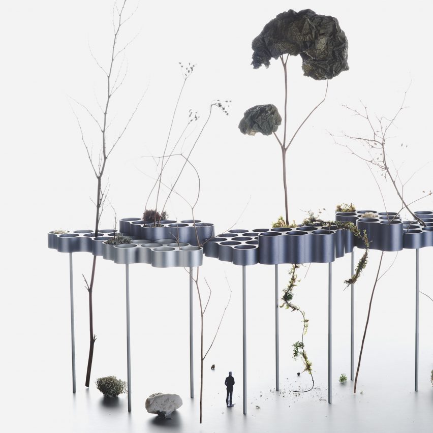
Ronan and Erwan Bouroullec have created models exploring how nature and cities interact, which they are showing in an exhibition at the Vitra Design Museum. Read more
Ronan and Erwan Bouroullec have created models exploring how nature and cities interact, which they are showing in an exhibition at the Vitra Design Museum. Read more

City Guide publisher Blue Crowe Media and Deane Madsen, Associate Editor of Design at Architect Magazine, have collaborated to produce the Brutalist Washington Map, which features 40 examples of Brutalist architecture in Washington, D.C. This is Blue Crowe’s fourth architectural guide map, following their Brutalist London Map, Art Deco London Map, and Constructivist Moscow Map. One can only expect further releases on the horizon.
As more and more examples of classic Brutalism face demolition by neglect, we hope that putting these examples of D.C.’s Brutalist architecture on the map will foster public appreciation that ensures their longevity, said Madsen.
Of the 40 Brutalist structures highlighted on the map, many like the Hirshorn Museum and Dulles Airport are familiar, while others like the National Presbyterian Church may prompt a visit. With Brutalism’s increasing popularity, the creators of Washington D.C’s Brutalist Map hope to inspire readers to gain more knowledge.
Brutalism hit its stride in the mid 20th century, but it may be having a moment again. The style most notably associated with Le Corbusier’s initiative also worked its way into structures by Paul Rudolph and Louis Kahn. Brutalist architecture’s reinforced concrete and ominous impressions served government buildings particularly well due to the mandates for economic construction methods and unidentifiable appearances.
As the style sees a small revival, the two Brutalist maps in the collection may attract a large number of architects. The Washington, D.C. map is two-sided with an introduction to post-war construction and Brutalism, in addition to architectural details for each photo.
News via: Blue Crowe Media
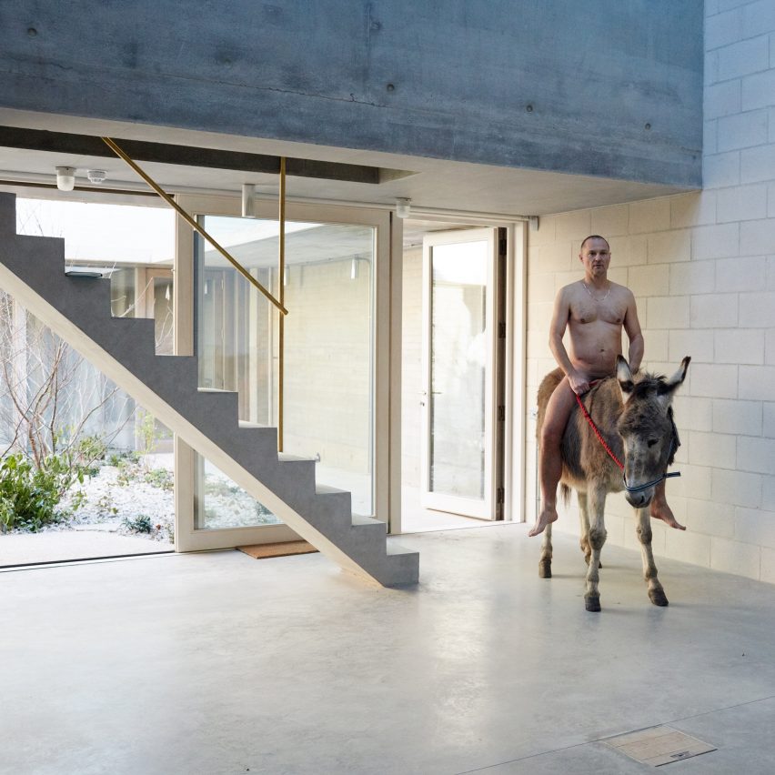
Fashion photographer Juergen Teller has posed naked on a donkey to celebrate the completion of his new west London studio by 6a Architects. Read more

This article is part of our “Material Focus” series, which asks architects to elaborate on the thought process behind their material choices and sheds light on the steps required to get projects actually built.
In this exceptionally imaginative and thought-provoking exercise in perceptual shifts, Ithaca- & Brooklyn-based CODA transformed hundreds of humble plastic lawn chairs into a project in the Arts Quad at Cornell University. Viewed from afar as a spiky singular entity, close inspection reveals the simple, unpretentious repeated module. CODA explains, “the object’s features are no longer understood in terms of their use (legs, arms, seat) but in terms of their form (spikes, curves, voids) as, due to their rotation away from the ground, they lose their relationship with the human body.” We asked Caroline O’Donnell, principle at CODA, to explain the challenges faced in the development and construction of the fully-recyclable URCHIN.
What were the principal materials used in the project?
White plastic chairs (polypropylene).
In terms of materials, what were your biggest sources of inspiration and influence when selecting what the project would ultimately be made of?
We were interested in using an everyday object to play with the perception of the object. From afar, the aggregation appears as a singular (and furry) designed object. Upon approach, the viewer realizes that the unit of aggregation is a familiar object: a common chair that they have sat in before.
Describe how material decisions factored into concept design.
It was important not to damage the chairs in order for them to be reused after the pavilion is demounted. We needed to make minimal incisions, while allowing the curve of the overall pavilion to be constantly changing. We also needed the unique connections to be as invisible as possible to focus the attention on the chairs. After many tests, we settled on threaded rods of unique lengths that were connected by bolts through small incisions (ear-piercings) in the chair.
What were the advantages that these materials offered in the construction of the project?
There are no real advantages to using chairs in terms of construction, of course. The point is to make people think about everyday objects: where do these chairs come from? Where does the material come from? Can it be recycled? How am I doing with my own recycling practices? The thoughts go in two directions: one is towards recycling and ecological footprint, the other is re-thinking about the chair as a beautiful object..the way that the light comes through it, the curve of the back, the friendly spike in the upturned legs…
Were there any challenges you faced because of your material selection?
Many! While the chairs are rated structurally, they are rated only for sitting in the usual position, not having the loads in the directions that we had them. This was very difficult to calculate. We modeled it digitally and made mock ups and compared the results. Since they are outdoor furniture, the chairs are not fire rated and a fire rating was required from the City in order to get building permission.
Did you consider any other possible materials for the project, and if so how would that have changed the design?
We looked at a number of different chair types, but ultimately cost and the ubiquity of this chair won out. Someone asked me after a lecture if it would not be better to build this out of a standard material like plywood. They missed the point. It would of course be easier to build with a known material, but the point of the project is that moment of realization, a snap to reality, when the object becomes apparent, and a chain of other thoughts follow. It’s not necessarily easy, what we do, but it is not meant to be easy. It is meant to make you think.
How did you research and select providers or contractors for the materials used in your project?
We attempted to buy in bulk from the manufacturers, as well as to have the chairs donated. Eventually the best option was buying chairs at a discount from Home Depot. All of the chairs have unique connections (threaded rod) which were modelled in Grasshopper, and installed by our team. Chairs were built in vertical C-shapes inside over the course of a few weeks, then carried out to the site and installed together (36 C-shaped columns) in two days.

Penthouse in Moscow is a residential project visualized by Shamsudin Kerimov Architects. It is located in Moscow, Russia. Renderings courtesy of Shamsudin Kerimov Architects

In a competition to design Lithuania’s new National Science and Innovation Center, known as “Science Island,” TARI-Architect‘s proposal aims to exemplify sustainable design and construction practices. Although three architecture firms were already selected on September 30th, TARI-Architects were one of 144 firms to submit a proposal, making the competition the largest design contest in Lithuania. The Rome-based firm, which recently won second place for a design competition in Seoul, formed its design around the idea of science and its progressive nature.
Linking the pedestrian bridge to the Congress Center to the Island “symbolizes the aim of moving forward, of the human evolution, and the scientific discoveries,” writes TARI-Architects.
Spaces within the museum are visually connected, allowing the visitor to journey through its fluid composition. An external exhibition area (complete with green roof) provides gorgeous views of the river, while its terrace steps gently kaleidoscope to the water’s edge. Internally, a spiral staircase centers itself as the main circulation (with an incredibly vast view of the museum on each landing).
In addition to promoting scientific discovery, the firm also focuses on the building’s sustainability, allowing the structure to adapt to its surrounding conditions — specifically the water level of the adjacent Nemunas River. A sun-shading system helps cool the building as well.
TARI-Architect’s main ambition was to promote Science Island as a place capable of cultivating a lasting relationship with science and understanding through hands-on activities through its extroverted character.
News Via: TARI-Architects.

From the architect. Founded in 1921, the Concervatoire de Vanves today has 40 teachers for over 700 students. The new building, named Ode, replaces the cramped, dilapidated offices scattered around various places in the town, representing both a qualitative and quantitative leap. Acting as a music school and a performance theater, the facility is as much a teaching center as a disseminator of the musical and dramatic arts. The project is both a building and a public space with a piazza able to host open-air shows, located on a small square that provides a centrality that is mostly lacking in the area.
Located in a mixed urban fabric composed of constructions that each play their own partition, from houses to tall buildings, the new facility seeks appeasement and subtlety in the same way a musical composition organizes dissonant harmonies. The color white establishes calm and neutrality on volumes that nonetheless remain impressive, although some of it lies beneath the piazza. The visible part of this iceberg is a platonic cube that rises as an integral whole to its roof-terrace, a fifth wall covered with a metallic web that hides the technical equipment and evacuation air vents.
The coating is intended to be as smooth as possible with lacquered aluminum panels running from slab to slab, giving an inkling of the life inside. All exterior floors are faced with stone which extend to the building’s ground floor following a guiding line from the street towards a bay window opening onto the auditorium.
An orthogonal pattern controls the spaces with their highly varied dimensions and functions, from the dedicated rooms for percussion instruments, amplified music, piano, wind or vintage instruments to the dance and theatrical rooms, passing through the auditorium, a theater that is open to the public outside of teaching hours. As part of this orthogonal grid, the distribution scheme is repeated on all levels except for the ground floor. A generous hallway with stairs at either end provides access to the different rooms, each equipped according to its sound-proofing needs with airlocks or double doors. Teaching includes a vast sound spectrum from music played with vintage instruments to amplified music or gospel with either individual rooms or rehearsal rooms for a 70-musician symphonic orchestra. Besides the classrooms, the center also has a recording studio and a radio broadcast studio.
The auditorium has a proscenium stage and a seating capacity of 221; it can be configured for different kinds of shows (dance, plays, choirs, opera, concerts and contemporary music). There is a sound and light control room, an equipped grid above the stage, technical walkways over the hall and a retractable orchestra pit made of mobile panels in the shape of a concave shell to concentrate the sound for symphonies.
Acoustic constraints imposed several solutions, i.e. sound-proofing with the box in a box method and separation from the concrete structure. Sound-proofing applied to the ceilings and walls or smooth absorbent surfaces alternate with raised surfaces for rendering optimal sound. Double windows with a double-glazed frame combined with a single-glazed frame eliminate the risk of causing noise pollution to the vicinity. With the front windows permanently shut, double-stream ventilation ensures that the air remains fresh. All air vents are hidden, the lighting system built-in and the ventilation grids flush with the walls. The concept of spatial neutrality evacuates visual stimuli so as to place the emphasis on sound and instrumental lines with the plant-life of the patios as the only tangible reminder of the world outside of this microcosm’s walls. Removed from city noise, music takes pride of place.

Inside Outside House is a private residence designed by Loyn and Co Architects. It is located in Dean, England and was completed in 2015. Inside Outside House by Loyn and Co Architects: “The site lies in a sensitive rural location in the Forest of Dean and comprises 4 acres on a south facing gently sloping, wooded hillside. From within the site, there are panoramic views looking towards the Wye Valley..

In 2016 the Festival was visited by not less than 20 000 visitors and was committed to raising awareness in schools.75 kindergarten and primary classes took part in this new program.
The twelfth edition of the Festival will take place from 13th June to 18th June. The FAV in La Grande Motte will take place from 17th to 25th June 2017.
The FAV will keep to aware a wide public to architecture, to highlight a young generation of architects and to discover places from the urban heritage.
CALLS FOR APPLICATIONS :
– To realize 10 interventions for the FAV Montpellier
– To realize 8 interventions for the La Grande Motte
Like every year, the FAV will offer to the visitors a path, a kind of architectural discovery. In Montpellier, it will take place in the town center ‘s private hostels, while in La Grande Motte it will invest the public space of the seaside town with the Jean Balladur’s specific architecture.
The deadline to submit your application is fixed on Friday, December , 2nd of 2016.
Download the information related to this competition here.

From the architect. 2007 four friends from Bavaria (southern german state), sat together in germanys capital city Berlin. They decided to do something against their notorious shortage of fellow players in “Schafkopf“, a card game only popular in Bavaria. The simple solution was the website http://www.sauspiel.de that soon became extremely popular. Seven years later the team had already grown to 14 people, meaning that the old office was not big enough any more. For their new home, the Sauspiel GmbH made a find in the district of Neukölln, very close to the better known Kreuzberg, a lively area commonly referred to as „Kreuzkölln“. On sale there was the raised ground floor of the old chocolate factory, that was soon to become the new Sauspiel headquarters.
The task was not an easy one. An open office and a flat hierarchy were to be combined with the need for a lot of storage space and a separate little flat to host guests. Sanitation facilities and a little kitchen were also missing. An especially interesting problem to solve was the power and data supply of the new workplaces in a building, without destroying the wonderful original material for such profane reasons.
All considerations were driven by the wish to show and preserve the existing in it’s original form. The removal of later additions and un-orderly structures was therefore the starting point for the spacial concept where the whole unit is reorganised only by adding two room-high installations.
The design of the new shows a strong connection to the existing and plays between the poles of old and new. Seen from outside the new installations integrate and subordinate to the old. Taking a closer look though, one discovers that the new, especially it ́s insides, offers some great surprises.
In the main office on the lower level, the installation is a wall-like built-in furniture that separates the working area from the anteroom. It holds not only storage and an open kitchenette, but hides also toilets and a secret second entrance in it’s insides.
On the upper level (above the gateway through the building to the inner courtyard) the second installation shows itself more openly as a new element. The little „construction trailer“ contains another kitchen on the outside and a showerbath on the inside. This way the upper area can not only be used as a meeting and a lounge room but also as a little flat. With a separate entrance from the staircase, guests can be hosted here completely autonomous from the operating office.
