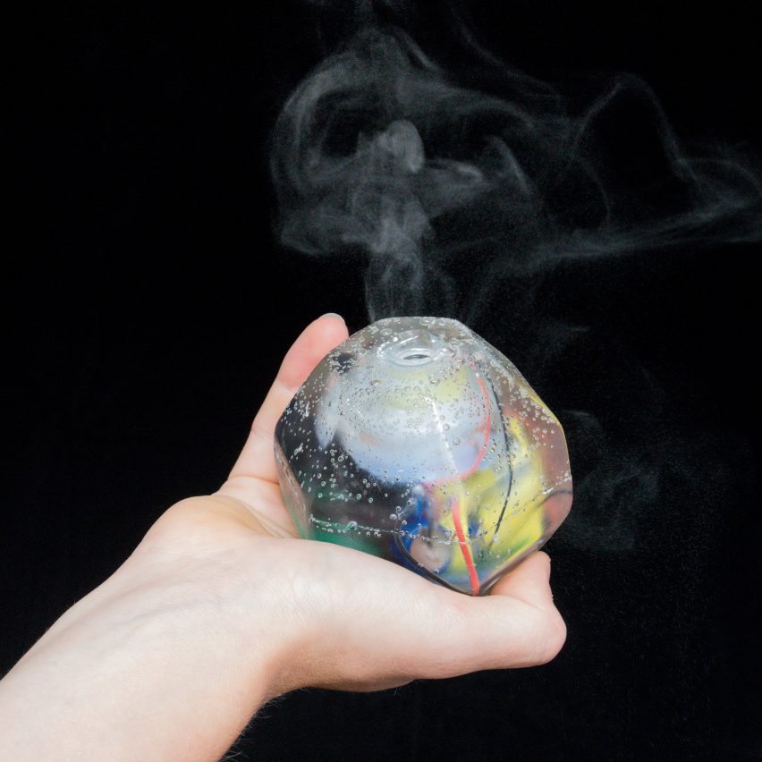
This grenade-shaped scent diffuser has been designed to alert internet users of data leaks from their smartphones, tablets and computers. Read more
This grenade-shaped scent diffuser has been designed to alert internet users of data leaks from their smartphones, tablets and computers. Read more

Even as modernism promoted the transparency of glass architecture, many within the movement were conscious of the monotony of large glass facades, with even Mies van der Rohe using elements such as his trademark mullions to break up his facades. But in the years since, countless uniform structural glazing skyscrapers have emerged and bored urban citizens. In response to this, unconventional reinterpretations of facades have gained interest.
Accompanied by the belief that light and brilliance could help in creating iconic architecture and a better human world, glass and metal have been innovatively transformed to create crystalline images. As a result, the locus of meaning in architecture has shifted from the internal space-form towards the external surface.
Celebrating the expressive materiality of transparency and reflective imagery for entire building skins emerged during the early 20th century, when Paul Scheerbart and Bruno Taut envisioned a new glass culture made of “colored glass” “sparkling in the sun,” “crystalline shapes of white glass” which make the “jewel-like architecture shimmer.” Mies van der Rohe absorbed this vision when he discarded the rectangular tower in favor of a free-form glass skin in his proposal for the Glass Skyscaper in Berlin in 1921. In a 1968 interview, Mies explained his skepticism regarding the urban monotony of glass mirror effects: “Because I was using glass, I was anxious to avoid dead surface reflecting too much light, so I broke the facades a little in plan so that light could fall on them at different angles: like crystal, like cut crystal.” Norman Foster materialized this glass dream with his Willis Faber & Dumas Headquarters in Ipswich in 1975 and SOM presented it in its tallest manifestation with the Burj Khalifa Tower in Dubai in 2009.
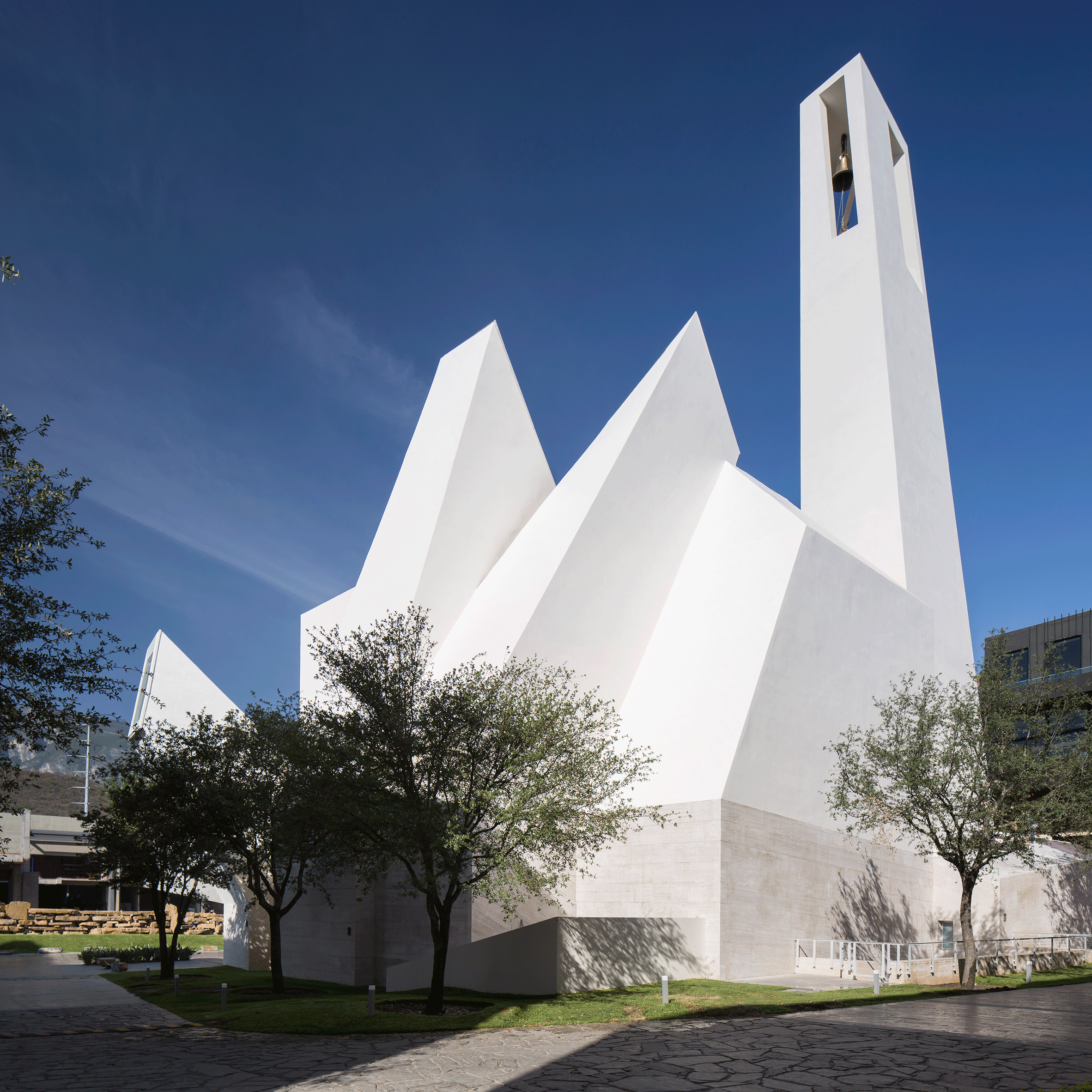
Undoubtedly the glass façade at the Elbphilharmonie in Hamburg by Herzog & de Meuron refers to the visionary glass culture of Scheerbart, and indirectly to the golden shimmering skin of Berlin’s Philharmonic by Hans Scharoun as well. Inwardly and outwardly curved glass elements distort the perception of the city, water and sky. They build a fresh contrast to the uniform plane glass curtains of the International Style. The environment is not appreciated as a clear mirrored picture, but instead goes through a process of modification and reproduction.
Due to the curves of the balconies, the building reflects points or lines of brilliant light streaks. With a blue or diffuse sky the distinctive curves reflect the light as bright lines, similar to the horizontal lines seen in the designs of the automotive industry. Under direct sunlight, bright glossy points appear and evoke a jewel-like shimmer. Additionally, the vertical and horizontal convex curves of numerous single glass elements reinforce the shiny distorted reflections of the sky. Overall the curved façade with its printed dot screens evokes a vivid and liquid image, which expresses a close link to the water around. Built upon the historic brick warehouse below, and with its abstract choreography of complex distorted light reflections, the Elbphilharmonie operates as a magical eyecatcher.
The precursor to the Elbphilharmonie, which first showcased Herzog & de Meuron’s desire to transform the mirror effects of modernist glass skyscrapers, was the Prada Epicenter in Tokyo, completed in 2003. The glazing shell consists mainly of rhombus-shaped elements, but selected parts create distinct distorted reflections due to the convex exterior shapes of the glass – comparable to a contact lens resting on the façade.
The intriguing imagery of brilliant reflections on transparent glass facades is fortunately not limited to those outside the building; it also offers interesting views for those inside. However, for closed exhibition or concert halls, the concept of veiling an entire building with brilliant reflective effects has been adapted with other shimmering panels.
The American architect Frank Gehry transferred this aesthetic of brilliance from glass to metal with the titanium cladding of the Guggenheim Museum Bilbao in 1997. While the connotations range from a ship for the larger form to fish scales regarding the reflective panels, the building as a whole has turned into an urban jewel that kicked off numerous urban redevelopments with its iconic signature. Many an aspiring metropolis assumes that the structural form is the key successful factor in “Bilbao effect.” However, with the sparkling light qualities of the titanium sheets and its changing appearance, Frank Gehry has not only brought a dynamic composition of forms to Bilbao but reinforced his design with a distinctive, dynamic image which varies with every cloud and sunbeam.
Though they are less than half a millimeter thick, the titanium sheets evoke an interesting, almost corrugated- tactile dressing – an association which the New York Times critic Herbert Muschamp connected with Marilyn Monroe: “Frank Gehry’s new Guggenheim Museum is a shimmering, Looney tunes, post-industrial, post-everything burst of American optimism wrapped in titanium (…) The building is the reincarnation of Marilyn Monroe.” With the Walt Disney Concert Hall, opened in 2003, the lustrous gesture subsequently arrived in the glamorous Hollywood scenery.
Later Paul Andreu covered the monumental dome of the National Grand Theatre of China with a shiny titanium skin and heightened the effect with a surrounding reflecting pool to stand out against the nearby ancient red walls of the Forbidden City. But continuous glossy skins do not present the only option for sparkling jewels in the city.
The play of elegant veils in fashion and shiny cladding in architecture combined in a Paco Rabanne dress for a British retail temple. Future Systems stylishly covered the Selfridges Birmingham department store, opened in 2003, with a dense mesh of 16,000 anodized aluminium discs. The store was able to avoid attaching any logos to the building due to the fact that the building itself was turned into a sign. Its sensuality immediately spurred the marketing world to utilize the sensational setting for advertisements. The glistening net creates a fascinating feeling for scale: Small discs generate a haptic, human feeling while the overall form offers hardly any clues about the building’s number of stories or size. The diffuse reflections of the façade cladding leads to an abstract transformed image, which is primarily determined by the brightness and colour of the sky and neglects any clear mirror effects of the neighborhood.
In contrast to the shimmering disc dress at Birmingham, the stretched metal gesture at Messe Basel New Hall by Herzog & de Meuron introduces a linear interpretation of light reflections. The building’s twisting bands of aluminum avoid the well-known monotony of windowless exhibition halls. The homogeneous but stretched aluminum modulates the building in a light way. When oriented towards the sky, the surface gives brightness to the building which is set in stark contrast to the dark perforations and areas where the bands leans toward the ground.
For an Australian science facility the veil has even fulfilled the task of protecting against the harsh sunlight. The architects Woods Bagot erected an urban icon with enveloping the entire building with aluminum sunshades, each individually computer modeled, for the South Australian Health and Medical Research Institute in Adelaide.
Some forms of sparkling reflective patterns are even able to initiate political discussions and influence the names of buildings. The “Fernsehturm Berlin” is an excellent example of this, with its reflection in the form of a cross emanating from the sphere. Built in 1969, the socialist and atheist party of the German Democratic Republic erected the tower to resemble the Russian satellite Sputnik. Located in the historic center of former East Germany next to a medieval church, the tall tower was intended as a political statement addressing the deconstruction of the old city. But the selection of pyramidal stainless steel panels led to an unintended effect: The reflections of the sun create a clearly visible cross pattern on the sphere. Thereby, the communist regime had accidentally installed a highly visible Christian symbol in an ostensibly atheist environment. Hence, the people in Berlin nicknamed the lighting effect the “Pope’s revenge.”
These strategies with shimmering veils have significantly increased the relevance of the surface as a carrier for the meaning of a building. The International Style has come to a point in façade design where the uniformity of mirroring cubes has begun to erode a sense of human scale. Consequently, concave and convex building forms, reflective curved façade elements, or a mixture of the two, have opened another set of options, generating more multifaceted images for the city. Furthermore, the interest in complex reflection patterns has swept aside brutalism with its raw concrete dualism of dark voids and light surfaces. These shimmering facades have also superseded Kahn’s monumentality, where the material’s purpose is primarily to cast a shadow. Neither shadows nor simple mirror effects seem to evoke enough attraction for our spectacle-oriented society today. Therefore, new landmarks will continue to reach for innovative combinations of material and form to create brilliant veils and a bright urban future.
Light matters, a monthly column on light and space, is written by Thomas Schielke. Based in Germany, he is fascinated by architectural lighting and works as an editor for the lighting company ERCO. He has published numerous articles and co-authored the books “Light Perspectives” and “SuperLux”. For more information check www.erco.com, www.arclighting.de or follow him @arcspaces.

A building on a privileged site in dialogue with the emblematic D.Luís I bridge, the river, facing the houses and Porto´s Ribeira, embedded within a unique landscape that leads us where the Douro crosses the horizon. Building on top of this area protected under the flag of Unesco with its charming historical character, was a delicate process – a deep reflection made of very strong restrictions.
The existing building, buffeted by abandonment and full of add-ons, would have to adapt to a new type of use: apartments for local tourism. On four floors, measuring 13.80m by 7.20m, it was necessary to organise five independent studios for flexible use, a penthouse, a reception with a common kitchen, back office and technical areas.
Given the constraints of the building´s weakness, the remaining thick perimeter granite walls, and new programmatic use, the design concept serves three principal structures:
1- a longitudinal concrete axis serving as backbone to support the existing structure and to solve all the technical necessities: bathrooms, kitchens, vertical ducts, lighting and the elevator. Applying this layout, the studios became open spaces and the longitudinal view: the courtyard versus the Oporto, the Douro river, the bridges, and the ocean.
2 – a staircase, on the concrete spine alignment, connects all floors and different exterior areas.
3 – a new volume, assuming as an “add-on”, with the typical black slate outside skin- two bedroom apartment with a large living room facing the best panoramic views towards Oporto.
The proposal is expressed along a longitudinal section, between the margins of reconstruction, the new structure and the backyard areas, from the street level to the top. These relations enhance the inner experience of the building, framing the construction site challenged by conditions concerning space and light, became the design themes, articulating different levels of privacy within the excavated granite, under tension with the sculptural stairs, the back concrete hill and the D.Luís I bridge.
From the inside, the building, reveals the structural and conceptual narrative. The concrete slabs and walls, show the spine which holds the thick granite walls, with the existing windows as framed views. And the penthouse, as it is a penthouse, is white!
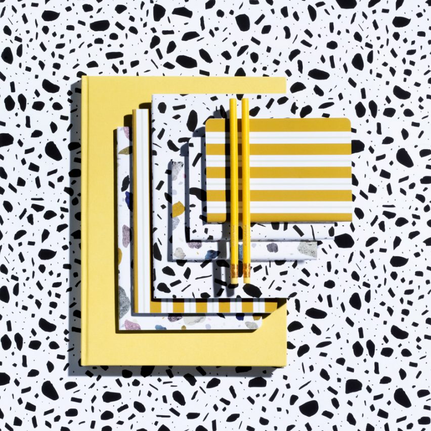
Design brands are looking for new ways to infiltrate each area of the home and are creating products that cover all the bases. From beautiful stationery to hotel shampoos, we’ve rounded up five of the most successful examples. Read more

Casa “Elle” Bianca e Grigia is a private home designed by MAMESTUDIO. Completed in 2014, it is located in Rome, Italy. Photos courtesy of MAMESTUDIO

While using technical drawings, Zema Vieira makes architectural illustrations by using only AutoCAD without any further techniques. Her body of work became a project called “Fachada Frontal” or “Front Facade.” In it, the artist depicts buildings from cities around the world, with a particular focus on Belo Horizonte, Brazil.
Check out below the illustrations made by the artist.
“The project came about through an admiration for the way that architectural designs use to be represented. Not just the buildings, but the project themselves relied on a wealth of detail and an artistic sensibility that I believe would be impossible to recreate with the coldness of technical drawing tools used today, particularly CAD software. That’s where it came from, a desire to try.”
“Facades especially caught my attention – an architect always plays with shadows to highlight volume, a technique now replaced by using different line thicknesses. The illustrations in Fachada Frontal, with maybe one or two exceptions, are always elevations, drawings without vanishing points, the same way they would be in technical drawings.”
“Choosing which buildings to do was partly based on personal taste, but also involves practical issues. A major feature of the piece is the representation of each detail of the building, which makes a trip to the place for a photographic survey a fundamental step in the process. This visit also helps in understanding the object and its relationship with the urban landscape that surrounds it, and this is often reflected in designs that include this context.”
Learn more about Fachada Frontal here or follow the project on Instagram or Facebook.

From the architect. More than 80 years ago, visionary minds of alpine climbers in Slovenia decided to build alpine shelters in the Julian Alps. In 1936 there were no access roads. What used to take climbers and hikers days, takes a couple of hours nowadays. With better infrastructure and general access however, parts of Triglav National Park’s most sacred places still remain pristine and less visited.
In 1936 Skala club members had decided that building small, but functionally ingenious alpine shelters, would save time and effort to climb mountains and make them more accessible for exploration. Bivak II na Jezerih was built on the designs of engineer and mountaineer Karlo Korenini. Together with climbing buddies, they have transported over a ton of wood and steel on their backs alone and built the shelter on the spot! It was in service for respectful 80 years, especially considering the harsh environment and relatively basic materials available at the time. However, wooden construction finally gave way and deteriorated the the point of breaking down.
The original 1936 bivouac was airlifted on a custom made platform so that it would not crumble into itself. It was donated to the Slovenian Mountaineering Museum as an exhibit.
Main restrictive factors affecting the design were thus set both by highly restrictive policies of the Triglav National Park and the extreme mountain weather and conditions as well as air-transportation limitations.
The following criteria had to be met:
Bivak II na Jezerih was thus conceived on the basis of the 1936 bell-shaped original, retaining traditional outline, but with major improvements to construction, use and finishing materials and details. All with functionality and ease of installation and maintenance in mind.
Beside the extreme environment with hurricane force winds and few meters of snow and general exposure, having a relatively useful space on an area of less than 9m2 for 6 people is a challenge. With a folding table, overlapping bench (when sleeping feet are below and you sit from the other side), a box for accessories which you can also sit on plus many other details, make up for a better living comfort in the mountains.
Having respected ingenious architects and builders of the 1936 and especially the solutions which proved to be working for almost a century, the newly built and vastly improved bivouac now stands open after over 600 hours of voluntary work for the mountaineers and climbers and the test of time.
Product Description. IMPOL Group 2 mm EN 3103 Aluminum was chosen as the main material for the harsh environment of the high alpine world, both from practical and aesthetic reasons, with limestone rock gray color blending nicely with the material in the sensitive alpine world.
The aluminum has a great look, low weight, is long lasting and is easy to work with. It was delivered in pre-cut plates from a roll by IMPOL Group. Plates were laser cut and trimmed in the workshop and pre-bent for later fixing. The aluminum had a natural look and finish of the EN3103 and with the passing of the time will get it’s final (somewhat oxidized) look, without any need of using paints or whatsoever, blending in the environment even better.
Aluminum EN 5754 of 4mm thickness with 3D pattern was also used for the entrance and floor, dividing the sleeping part. It was wrapped up on all sides to the verticals (wood) and welded, so it also holds water that could come off of wet boots of snow or equipment. There is an opening on one end where water can escape out of the bivouac. Aluminum for the floor is durable, non-slippery, and can withstand pressure of crampon points, should there be negligence or emergency by mountaineers walking in with crampons still on.
Construction was made of 4 mm steel, welded and optimized for low weight, galvanized and painted. All points of contact with aluminum were specifically protected to prevent negative galvanic cell effects. Special care was also taken with the selection of proper screws and at all points of contact.
REFLEX provided specialty glass that is both safe and has protective features with superior insulating capabilities. The biggest concern was that the glass would not break before the final installation on the mountain due to the difference in altitude and thus pressure at the time of the production and before being installed on the mountain.

Remembrance of Childhood is a private home located in Taipei, Taiwan. Completed in 2015, it was designed by Ganna Design. Remembrance of Childhood by Ganna Design: “Like the old house in the memory of childhood, the house is adopted with the traditional patterned glass in the windows. In this project we extend the visual feeling and let the sunlight in by redefine octagonal window frame and lattice glass on the..