High School in Noisy-le-Grand / Ateliers 2/3/4/


© Luc Boegly

© Luc Boegly


© Luc Boegly


© Luc Boegly


© Luc Boegly


© Luc Boegly

  • Architects: Ateliers 2/3/4/
  • Location: 93160 Noisy-le-Grand, France
  • Design Team: Samuel Rose, Rauzier Sylvain Mathieu Ribald, Adrien Petit
  • Project Year: 2016
  • Photographs: Luc Boegly
  • Competition (Design): Laure Mériaud, Emily Bernard
  • Competition Images: Fabrizio Glorioso
  • Model: Tae Hyung Kim
  • Construction Team: Samuel Rose, Derk Sichtermann, Nathalie Befve Daphne Boyer

  • Landscape Architect: Atelier 2/3/4/ – Agate Mordka, Director, Landscape Division
  • Project Architect: Juan Francisco Seage
  • Engineering Consultancy And Cost Control: Mizrahi
  • Hqe Consultant: Éléments Ingénieries
  • Kitchen Consultant: Conceptic’Art
  • Acoustics Consultant: Peutz et Associés
  • Drawings: Atelier 2/3/4/
  • Text: Jean Mas
  • Site Area: 2.5 hectares

  • High School Area: 8 986 sqm
  • Student Accommodation: 3 764 sqm
  • Staff Accommodation: 1052 sqm
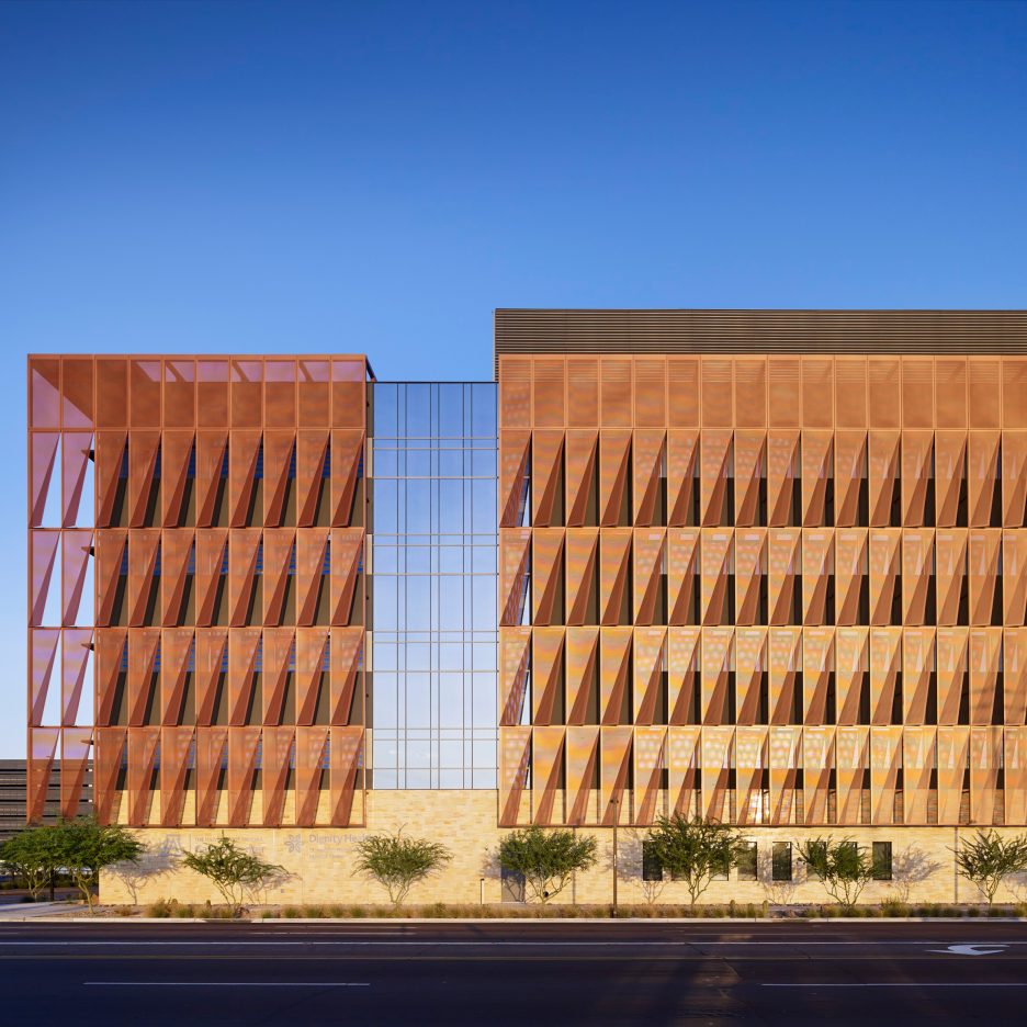
© Luc Boegly

© Luc Boegly

“Designed to eventually accommodate more than 1200 students, the new International High School to the east of Paris is deeply rooted in the Grand Paris (Greater Paris) project : to rebalance the city to the east as well as its insertion, at several scales, within the vast landscape at the edge of the Marne-la-Vallée plateau, overlooking the Marne River and the capital – both poised and raised on the city horizon.


General Plan

General Plan

Model

Model

The project is also strongly influenced by its exemplary sustainable development approach and durability : built on a tight budget that is expressed in the explicit simplicity of its volumes. The in-depth work on energy and the elements (water/air/earth) makes it the first ‘zero energy’ high school in the Ile-de-France Region.


© Luc Boegly

© Luc Boegly

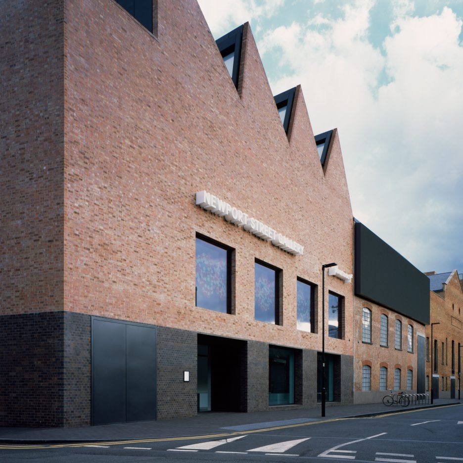
In architectural terms, the project is planned around the ‘place-forte’ (stronghold) concept, at the same time able to take position and be located with precision within this exceptional site. It federates and unites the adjoining area through the exemplary nature of its public education programme and the quality of the calm public spaces it generates within its immediate surroundings. In an environment marked by deep inconsistency, there is only one exception : the Abraxas Palacio by Bofill whose exemplary ‘place-forte’ and durable construction have managed to maintain its dignity. The high school project takes on and extends this intention, noteably through the use of basic materials (concrete, brick, timber, glass), as well as in the rigour and simplicity of its structural expression where the concrete is – in contrast – visible and expressed in its essential and structural reality and not just as a cladding.


© Luc Boegly

© Luc Boegly

Section

Section

© Luc Boegly

© Luc Boegly

Here, the ‘place-forte’ by Vauban loses its defensive dimension to favour openess, expressed through the disappearance of the ramparts and by raising of the edifice above the slope, that is raised in order to see. This measure frames distant views and creates extensive glimpses of the imposing landscape, thus depassing the brief to give it an important sense of purpose – visuel and luminous – that this public project assumes with conviction.


© Luc Boegly

© Luc Boegly

This quality also precedes the work on the adjoining landscape, on the role of nature and planting in the high school. It contributes to the location of two appreciated gardens suspended overhead at the very centre of the edifice, but also the quality of the gardens and the external areas of the high school that are structured on the terraced slope with perennials, inscribed into the distant views from the site.


© Luc Boegly

© Luc Boegly

The ‘place-forte concept – beyond this high school – today becomes an ambition that every architect confronted with the mutations procurement in France, should assert in the role of edifices as well as the urban project. Especially for public works that should be identified as strong volumes set out in series within the public space, on this major site in the city”.


© Luc Boegly

© Luc Boegly

http://ift.tt/2d7HwLL

JamesPlumb uses ancient dying technique to create indigo fabric for limited-edition bench


London design studio JamesPlumb has revisited a medieval technique it previously used for dying fabric, and has this time used it to create a limited-edition bench (+ slideshow). (more…)

http://ift.tt/2d7B1sz

Mohammad Kebab / Logical Process in Architectural Design


© Farshid Nasrabadi

© Farshid Nasrabadi


© Farshid Nasrabadi


© Farshid Nasrabadi


© Farshid Nasrabadi


© Farshid Nasrabadi

  • Client : Omid Akbari

© Farshid Nasrabadi

© Farshid Nasrabadi

Renovating one of the City Center’s food court units to a new branch of “MOHAMMAD KEBAB” was proposed to our office in spring of 2016.


Diagram

Diagram

The main restaurant of Mohammad kebab is locating in “Dorche” district near Esfahan city. Since It is the purity, originality and archaism which booms this type of old suburb restaurant, designing this branch in the food court of “City center” as a modern shopping mall, in fact was a new definition of this brand while keeping its original sprit of a suburb kebab restaurant.


© Farshid Nasrabadi

© Farshid Nasrabadi

Creating a space having presence sense and fixation without physical attendance became the base of designing ordering section In connection with the public court area and it became possible through scoping the mass volume emphasizing on the void.


Diagram

Diagram

The project includes two parts of kitchen and ordering section .considering the limitations penetration of some parts of kitchen in ordering section and visual use of that was one of the solutions of Maintaining the originality and identity of MOHAMMAD KEBAB.


© Farshid Nasrabadi

© Farshid Nasrabadi

The result was a diverse combination of spherical arcs which is cut by a white skin so doesn’t end and enclasps a bigger space. This way the crowded public space penetrates into the narrow section of MOHAMMAD KEBAB.


Diagram

Diagram

Considering the local Facilities, Constructing the spherical sections was done by the combination of accurate detailed maps and skillful workers.


© Farshid Nasrabadi

© Farshid Nasrabadi

The corporate identity of the whole branches was completed based on the new space and an animation plays by a video projector on the white skin as a dynamic shop sign. 


Diagram

Diagram

http://ift.tt/2dPBZHh

House in Tokyo / miCo.


© Shinkenchiku-sya

© Shinkenchiku-sya


© Shinkenchiku-sya


© Shinkenchiku-sya


© Shinkenchiku-sya


© Shinkenchiku-sya

  • Architects: miCo.
  • Location: Arakawa, Tokyo, Japan
  • Architect In Charge: Ako Nagao, Mizuki Imamura + Isao Shinohara
  • Area: 88.93 sqm
  • Project Year: 2015
  • Photographs: Shinkenchiku-sya
  • Structural Engineer: Yasushi Moribe
  • Construction: STYLE
  • Site Area: 43.154 sqm

© Shinkenchiku-sya

© Shinkenchiku-sya

From the architect. The site is located between reinforced concrete mid-to-high-rise apartments and an old wooden housing area, where it almost feels like you are left out in an island.  It is a dwelling for a couple with music studio, in such a complex Tokyo-like environment.


© Shinkenchiku-sya

© Shinkenchiku-sya

Floor Plan

Floor Plan

© Shinkenchiku-sya

© Shinkenchiku-sya

We felt it is not appropriate to have a building for this particular site that is either “building type or “house type.”  So we made a volume to be gradually connecting the two facades, the apartment side with a small window on vertical big wall and the housing side with a large “Mado” and low leaves.  The volume needed to be closed and “inward-looking” for music studio space but at the same time the space should spread beyond the site for the couple’s livelihood.


© Shinkenchiku-sya

© Shinkenchiku-sya

It recently has become quite natural to live in “inward-looking” space in such high-density urban space.  On the other hand, it is important to obtain open-minded life to develop its potential of    diverse and complex surrounding environments.   We believe it is important to challenge the hybrid configuration and environment such as this project in the modern city.


© Shinkenchiku-sya

© Shinkenchiku-sya

http://ift.tt/2dwvnD2

The Rock / Studio Pacific Architecture + Warren and Mahoney


© Patrick Reynolds

© Patrick Reynolds


© Patrick Reynolds


© Patrick Reynolds


© Patrick Reynolds


© Patrick Reynolds

  • Client : Wellington International Airport Limited
  • Project Management: IMPACT Project Management
  • Structural Engineer: BECA
  • Civil Engineeer : SKM

© Patrick Reynolds

© Patrick Reynolds

From the architect. A challenging brief with a double ambition meant that the 2010 redevelopment of the Wellington International Airport Passenger Terminal required a unique and innovative design.


© Patrick Reynolds

© Patrick Reynolds

The first task was to meet a set of complex technical specifications that included functionality, planning efficiency, economy in building materials and optimisation of the available pocket building site, heavily constrained by aircraft choreography. In conjunction with external apron works, the project involved the expansion of interior floor area, new retailing, linkages from the recently reconfigured passenger processing area, and an increase to eight aerobridge-capable gates from the original six. The project encompassed 3,500m2, of which 2,017m2 was additional floor area, including the new terminal building. 


Courtesy of Studio Pacific Architecture + Warren and Mahoney

Courtesy of Studio Pacific Architecture + Warren and Mahoney

Crucially, the brief also demanded the creation of a memorable visitor experience through a unique, edgy aesthetic that embodied a strong sense of place.


© Patrick Reynolds

© Patrick Reynolds

Connected strategically to the surrounding structures via a glass link that allowed the existing airport buildings to remain fully operational during construction, the new terminal building is a standalone structure. Its oscillating outline was derived from the indentations of aeroplane docks into the triangular site. The organic irregularity of this outline dovetailed with the concept of the building as a crusty, enigmatic rock – a gesture to the land’s geological past, recalling the craggy, sea-battered Wellington coast. A radical departure from airports worldwide, preoccupied with imagery of lightness and flight, The Rock terminal instead evokes the anchoring qualities of the land that rises to meet planes as they touch down and the coast that recedes away as they depart. Its copper finish provides unparalleled durability in a corrosive environment of sea air and aircraft fuel gases.


© Patrick Reynolds

© Patrick Reynolds

In contrast to the bland interiors that typify most international airports, the interior exudes warmth and resounds with personality. Honey-coloured macrocarpa ply softens theatrical strata of dark-stained panels fissured with light. Spaces unfold on varying levels and exploration is welcomed, with journeys gently modulated by a series of ramps. Travellers are able to enjoy areas that are engaging and restful, impressive and intimate.


Plan Level 0

Plan Level 0

Plan Level 1

Plan Level 1

A range of integrated design initiatives enhances the building’s environmental performance. These include the use of low-velocity air displacement through arrays of slotted panels to minimise mechanical plant, the retention of as many finishes as possible in the existing building, the use of ramps over mechanical options where possible for vertical circulation, a highly insulated building envelope and the selection of sustainable timbers for interior linings.

Product Description. The 0.6mm KME TECU folded copper sheet cladding was the ideal material that could be formed to the complex geometries of the building form, and at the same time withstand the demanding aeronautical and maritime environment Wellington Airport is located in.  The oxidising patina that has developed over time has further reinforced metaphorical references to the rocky geology of the region that the project is inspired by.


© Patrick Reynolds

© Patrick Reynolds

http://ift.tt/2dQ4lXm

ZGF wraps Arizona medical facility in layer of creased metal panels


American firm ZGF Architects has completed a cancer centre in downtown Phoenix with a faceted, copper-coloured screen that evokes the scaly skin of a desert reptile (+ slideshow). (more…)

http://ift.tt/2dOspW5

Dezeen Mail issue 326 features this week’s best stories and discussions

Super Villa / Wolf Architects


Courtesy of Wolf Architects

Courtesy of Wolf Architects


Courtesy of Wolf Architects


Courtesy of Wolf Architects


Courtesy of Wolf Architects


Courtesy of Wolf Architects

  • Architects: Wolf Architects
  • Location: United States, Los Angeles, CA, USA
  • Area: 1327.0 sqm
  • Project Year: 2014
  • Photographs: Courtesy of Wolf Architects
  • Collaborators: Ellias Constructions, AT & L Tile Company, A green plan energy consultants

Courtesy of Wolf Architects

Courtesy of Wolf Architects

From the architect. The site is on a rare flat area of what is actually a relatively hilly suburb, the overall land plot is a combination of two lots, one housed the original dwellings and the other was the neighbouring land previously used as a tennis court. There were originally two dwellings on the site. One was the original 1960’s house and next to that was a newer house built by the client in the 1980’s. The 1960’s house was mainly used as guest quarters and being very period and original has been retained as the staff quarters. The 1980’s house no longer worked for the client despite being lavishly appointed. Thus the building was to be demolished to make way for a new Dream Wolf house.


Courtesy of Wolf Architects

Courtesy of Wolf Architects

Floor Plan

Floor Plan

Courtesy of Wolf Architects

Courtesy of Wolf Architects

Demolishing the old house was not however a complete waste, as many quality fittings and materials were recycled and reused. Many large slabs of marble were used as feature wall panels as seen flanking the main entry door which was then highlighted with a minimalist bronze frame. The Main building shell is rendered in an off white cement render. Within the shell is a solid double brick structure clad in a variety of sand stone and travertine tiles.


Courtesy of Wolf Architects

Courtesy of Wolf Architects

“A clever combination of periodic style & contemporary residential design…”

The main challenge was introducing cues to the 80’s as per the clients wish without creating a style that looked dated and out of place. In this regard Wolf Architects focused a lot on the material palette. Key moments and spaces make use of retro slabs of marble with brass or bronze detailing. Throughout the exterior and interior are two toned themes which emphasise the black and white checker-board fashion of the 1980’s. This is particularly highlighted in the master bathroom, where dark charcoal grey was used instead of black to bring a more contemporary feel.


Courtesy of Wolf Architects

Courtesy of Wolf Architects

“A sentimental statement to last a lifetime…”

The kitchen area makes use of the original parquetry flooring of the previous home which in itself had already been recycled from a ballroom the clients used to frequent before it closed down. The finish was intentionally kept relatively rough and original to express the embodied memory of the material. Complimenting that was a semi-industrial looking kitchen with exposed steel posts and timber panelled ceiling. Purple glass splash backs further animate and compliment the vintage designer furnishings.


Courtesy of Wolf Architects

Courtesy of Wolf Architects

Scattered throughout the home are various small courtyards and fish ponds. The original native trees were also kept as they were on the property forming a reserve like garden which separates the main house and the guest wing. The rear of the building has a large swimming pool tiled in Italian mosaics. Framing the pool are perfectly flat manicured lawns, a bowls green and decking spaces, making it all great for entertaining – which the client loved to do. Parking for the owner’s cars and marine vessels was imperative but they also went as far as providing off street parking for their guests.

“The conclusion of one era & the commencement of another…”


Courtesy of Wolf Architects

Courtesy of Wolf Architects

http://ift.tt/2d6Q4Cy

Caruso St John Architects’ Newport Streeet Gallery Wins the 2016 Stirling Prize


© Hélène Binet

© Hélène Binet

Caruso St John Architects has won the top prize in British architecture, the RIBA Stirling Prize for their Newport Street Gallery in Vauxhall, London, beating out competition from Herzog & de Meuron, Michael Laird Architects + Reiach and Hall Architects, Loyn & Co Architects, dRMM Architects and WilkinsonEyre

The Stirling Prize is awarded each year to “the building that has made the greatest contribution to the evolution of architecture in the past year.”

Earlier in the day, the BBC released the results of the People’s choice, which saw top honors go to the Outhouse Gloucestershire by Loyn & Co Architects, with 31% of the vote.

At the ceremony, the RIBA also presented the following national awards for 2015:

Stephen Lawrence Prize: House of Trace / Tsuruta Architects


© Tim Crocker

© Tim Crocker


© Tim Crocker


© Tim Crocker


© Tim Crocker


© Tim Crocker

Client of the Year: Westmorland Limited for Gloucester Services by Glenn Howells Architects and AFL Architects


© Paul Miller

© Paul Miller


© Percy Dean


© Percy Dean


© Paul Miller


© Paul Miller

http://ift.tt/2d6EAPC

Caruso St John wins Stirling Prize 2016 for Damien Hirst’s Newport Street Gallery


Caruso St John Architects has won the RIBA Stirling Prize 2016 with the “highly accomplished and expertly detailed” London gallery it designed for British artist Damien Hirst (+ slideshow). (more…)

http://ift.tt/2dPvKZe