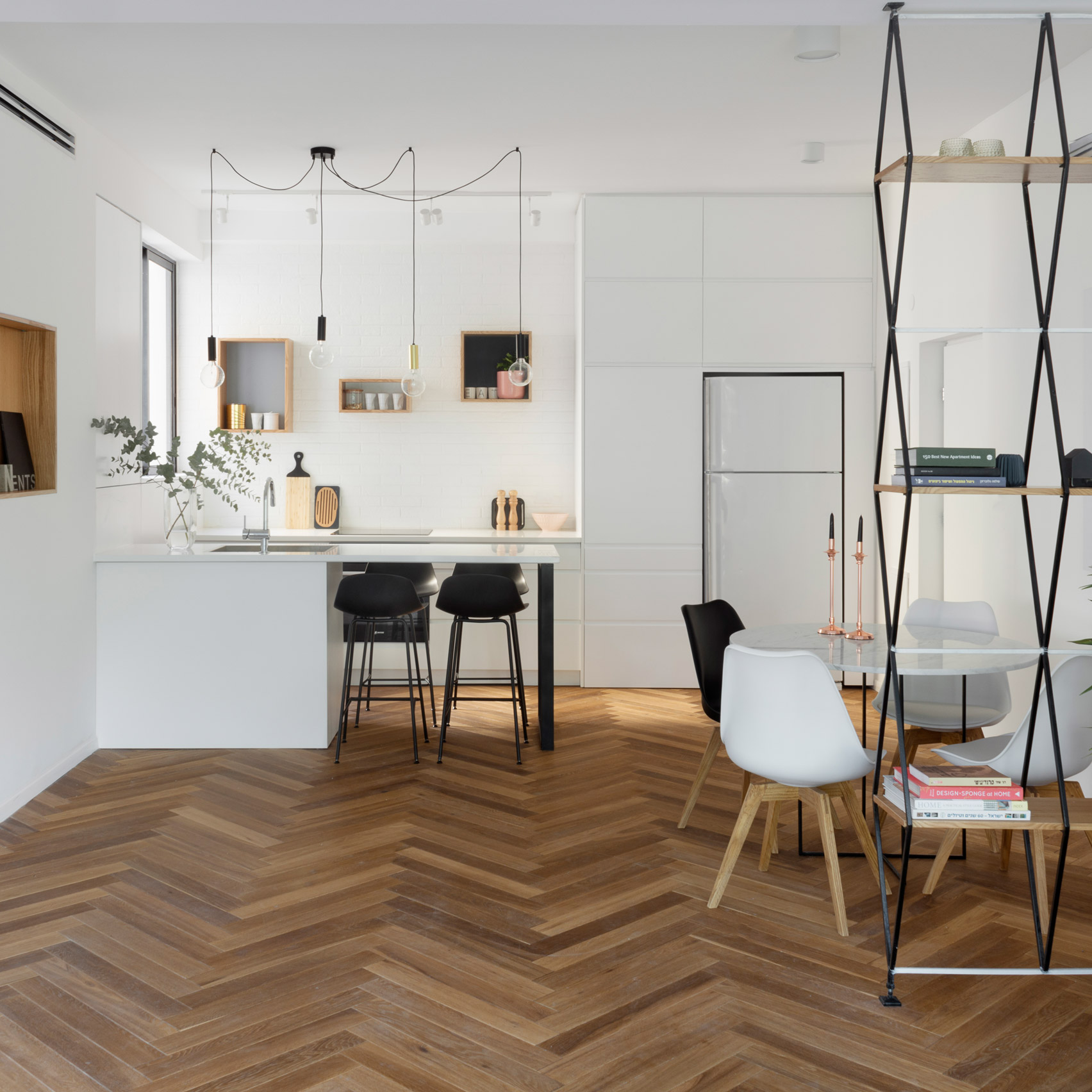
Aiming to make this white apartment feel warmer, interior designer Maayan Zusman used wooden herringbone flooring and soft pastel furnishings (+ slideshow). (more…)
Aiming to make this white apartment feel warmer, interior designer Maayan Zusman used wooden herringbone flooring and soft pastel furnishings (+ slideshow). (more…)

Reiulf Ramstad Arkitekter and Dualchas Architects have unveiled their plans for the St Kilda Visitor Center, which will be located on a cliff-top site at Geodha Sgoilt in the Uig area of the island of Lewis in the Outer Hebrides. Through the project, visitors will be able to experience the drama of St Kilda without physically visiting the famous archipelago, which lies over 50 miles to the southwest.
A triple world heritage site, St Kilda is famous not only for its sea cliffs and marine life but more for the story of how a community survived at the remote location before being evacuated in 1930.
By telling the story of this abandoned community, the current community of Uig hopes to catalyze economic development and reverse the population decline they have been suffering.
High-quality architecture can be an economic generator in remote rural communities- something both RRA and Dualchas have been committed to in rural Norway and the Scottish Highlands and Islands,” stated Dualchas director Neil Stephen. This can only happen if there is ambition and vision, which the community of Uig have in abundance – which is why this project is both exciting and important.
The project has been backed by UNESCO, and will serve as a template for creating “remote access” to the many World Heritage Sites that are geographically out of reach, environmentally fragile, or located in war zones.
News via Dualchas Architects.
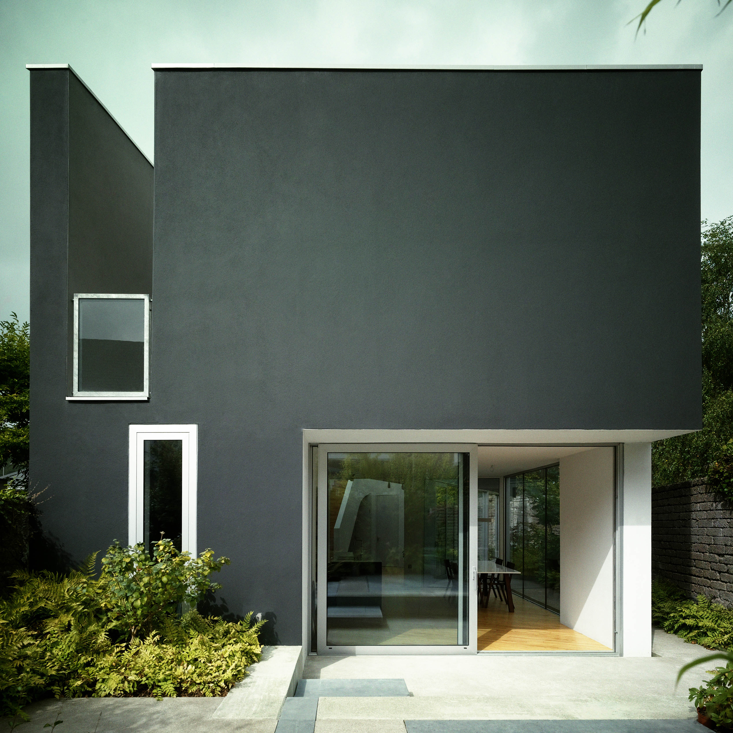
This angular house in Cork, Ireland, was designed by A2 Architects with a crank in its middle to give residents more sun exposure, and to create a route through to a garden courtyard. (more…)

Ristrutturazione Cascina is a project completed by Atre Studio Architetti. It is located in Ozzano Monferrato, Italy.

The “Golden Garland” (K.G. Zochernrug) is a bridge in Tiel that strengthens the route from the shopping area to the city center. The bridge crosses the water diagonally and forms the best possible visual and functional connection between the embankments. By defining the entrance to the city the Garland plays the role of a “city gate”. In an elegant gesture the bridge invites people into the city.
The bridge relates to the canal environment and its design expresses fluidity and flow. It embeds itself into a network of pedestrian paths. The bridge negotiates the difference in the ground levels between the inner city and the station quarter, accentuating the continuity of the route with a graceful curve. A gentle double arc resolves the difference of height between both shores. The bridge doesn’t interfere with the monumental continuity of the canal and therefore appears open and transparent, modestly adding itself to the historic district.
The Golden Garland is an icon of the Burensepoort. Its golden coating, the city color of Tiel, reinforces the gate symbolism and links the bridge to the other two city gates. By night, the bridge looks like a golden curtain hanging above the city canal.
The steel bridge has asymmetrical longitudinal profile with the deck and girder welded into one slender closed form. The guardrails and supports are made of steel too. The concrete foundation at the inner city side disappears in the grass slope. On the other side the concrete foundation is wrapped by brick similar to the embankment. The different treatment of bridgeheads emphasizes the contrast between the inner city and the station quarter.

Twin House in Padua is a project completed by StudioPietropoli in 2015. The home is located in Padua, Italy, and covers an area of 10,764 square feet. Twin House in Padua by StudioPietropoli: “In a quiet residential neighbour in Padua, this house consists of two cubic volumes mounted on a concrete basement. The cubes above ground are made entirely of wood, covered with wood (grey/white and brick red) as well…
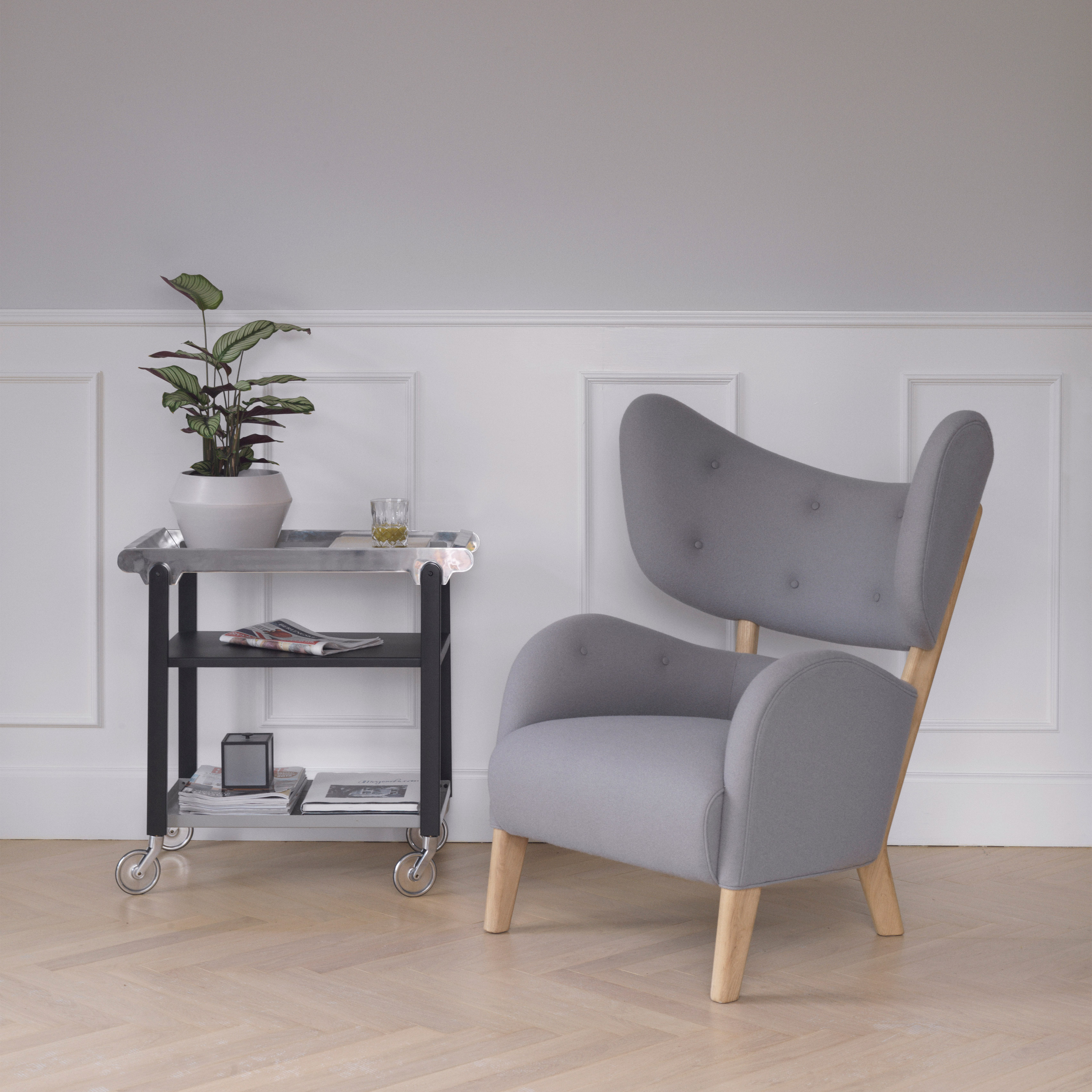
Maison&Objet 2016: Danish design brand By Lassen is the latest company to reissue classic furniture, with a new edition of a chair designed by architect Flemming Lassen 80 years ago (+ slideshow). (more…)

The House and the Trees is a project completed by Iglesis Arquitectos. Completed in 2015, it is located in Las Condes, Santiago, Chile. Photos by: Nico Saieh

Before RIGI took over this project, the owner had already got a complete set of space design plan, but his plan did not solve problems existing in traditional medical space. After RIGI is commissioned to do the design for this project, together with the owner, RIGI overthrows the original design concept. RIGI hopes to get rid of the sense of discomfort created by medical space through the space design, and to create a different atmosphere for the whole space. RIGI hopes to express the idea that medical space needs to show trust and hope through different design insights. There should be warmth, goodwill, openness, communication and smile in life. RIGI wishes that all of these could be shown within this space.
From the architect. Dental clinic is not a happy place to go, or we should say, no clinic could make people feel happy: the cold registration desk, the worrisome waiting chairs and the disturbing doors of the clinic rooms; the whole space is filled with a sense of distrust between doctors and patients. However, from spiritual aspect, clinic should be a place which brings hope, or at least should be a warm space. It might not be a delightful thing to go to the dentist, so RIGI does some magic to this space through design, bringing it some kind of warmth and caring.
Because there’s warmth, life should have been happier. This is a clinic in RIGI’s heart and this is a RIGI-styled life terminal.
The brand logo and brand IP image of this dental clinic is orange. So circle penetrates the whole design as basic element, and wood material and the match of selected colors deliver a warm texture sensually. The space consists of four areas: entrance, kids area, waiting area and clinic. Besides its basic function, each of the areas has its corresponding design insight, and together, these four areas make up the genes of this dental brand and turn the cold medical space into a life terminal which connects to people and spreads warmth and caring.
This project is located in a creative park. To analyze from the perspective of behavior, seeing a doctor is different from going shopping. There is almost no occasional guest for clinics; patients only choose to come after learning about it. The special nature of this industry determines that this space needs no use of eye-catching signs to attract customers, and a friendly façade could narrow the sense of distance between medical space and the patients. Thus, RIGI adopts a design strategy of weakening the boundary between outdoor and indoor space through using plants on the façade to connect the outdoor and indoor space, and simplifies the scale of the logo on the wall to avoid delivering excessive commercial atmosphere. The façade extends to the interior space through circle, an element from the IP image, and interesting materials are used to create a warm commercial atmosphere. The design of the front desk also tries to present an attitude of relaxed and equal. Starting from the entrance, people could tell this is a friendly space and a warm clinic.
Building a sense of trust within the space is one of RIGI’s design focuses. The world of adults is complex and lack of security, excessive attentions may create an unfriendly sense of distance on the contrary, so we suggest the owner to build a kids area in the important place of the entrance. Caring for kids is caring for adults; a clinic which cares for kids would, to some degree, present a sense of caring and responsibility. Space does not exist in isolation, the emotions and need of roles of people’s behavior within the space are what RIGI is always trying to explore. Design idea is not top-down propaganda, but something that users could always perceive and understand in the terminal. That is the key to design in this age.
Waiting chairs in traditional hospitals are arranged in a parallel way and in orders. However, it is this sense of order that enhances the unease of patients. After all, what waiting for you is a terrible experience of seeing a dentist; it is anything but nothing good to be looking forward. So we make the layout of the waiting area looks like a dinner table. Here people can sit face to face; they could communicate with each other or wait quietly. In this way, this waiting process is equal and random during which patients could feel the temperament of the space. The orange and transparent area on the left side of the waiting area is the central supply room of the clinic. All medical devices and gauze will be centralized and sterilized here; thus the philosophy of “going transparent” of the clinic will be reflected through this transparent and open way. All these designs make people have a further perception of the clinic’s philosophy, while life scenario oriented design further expresses the clinic’s warm and caring nature. It might not be a home, but RIGI hopes to bring people a perception of home through design. After all, clinic is a place where problems will be solved and hopes be created, just like a home.
When people see the rows of doorplates such as dental implant department and radiology department, to some extent, a sense of discomfort and anxiety will grow. RIGI cancels all the logos and adds text signs with readable dimensions on the glass of corridors while doing the design. The issue of spatial recognition chaos does not exist in a clinic of this size. RIGI also uses signs of numbers to connect the corridor and departments. Different numbers on the floor mark different functional spaces. To eliminate in maximum the uneasy and anxiety of seeing a doctor is the key point of RIGI’s design.
Design for life
It is about warmth and might also about caring. This is a gift for you and your teeth from RIGI.
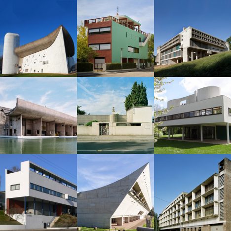
World Heritage Corb: many of French-Swiss architect Le Corbusier‘s most important works feature on our latest Pinterest board, which we’ve created to mark the end of our series exploring the 17 of his buildings recently added to UNESCO’s World Heritage List.
Follow Dezeen on Pinterest | See more Le Corbusier in our archive
