Tate Modern has devoted an area of its new Switch House building to exploring the work of British designer Jasper Morrison. (more…)
Tate Modern has devoted an area of its new Switch House building to exploring the work of British designer Jasper Morrison. (more…)

The Ulugöl Otomotiv Office Building, located on one of the thoroughfares of the region in Ataşehir, which has become one of the most important life and finance centers of the Anatolian side, was approached as integrating a functional, genuine and qualified architectural design, a dynamic block construct, and a frontal identity that will stick in the minds in this region which hosts many iconized new generation real estate projects.
The main design decisions of the project were shaped to act as a vision of a sustainable, rational and ordered structure, and reconstructing the standard office typology through analyzing the physical data of the environment in the city. In this way it was aimed to ensure the versatility of the front by means of flexible blocks, creating looseness and compactness relationships by considering a static construct, and providing a synergy between green terraces, office functions, and social interactions among the employees with collective spaces. Furthermore, thinking that they are integral parts of daily life, the green spaces were integrated into the work places and the transparency of the workplace environment was enhanced.
For the purpose of enriching the front with material diversity, red composite panels were used on the interior faces of the terraces, and stone design ceramics on the windowless walls of the building. On the office front, negative effects of the sun were minimized through mesh sun shade panels and vertical elements. Ground floor of the western front of the Ulugöl Otomotiv Office Building, which consists of 5 basement floors, a ground floor and 10 normal floors with its 14,600 sqm construction field, was allocated as an exhibition hall and its eastern front as office entrances and a parking lot. Connection to the parking garages was enabled through car elevators.

In 2013, Georgian Olympic committee, within 2015 Youth Olympic Festival, invited bid for conduction of design activities. Artstudio Project won the bid and involved in designing of Olympic tennis court. During designing, active consultation took place with organization committee and tennis federation.
Pre-design survey and complexity of terrain resulted in present layout of the sport complex and in terraced-type arrangement of tennis courts, what made the court to gain some kind of individuality. The site is clearly seen from upper views of Vake and Saburtalo districts.
The complex is planned on 17455 sqm land plot and comprises nine and two closed courts, 74 parking lots and administrative building. One of nine courts has covered tribunes with 700 seats. A closed court consists of pre-fabricated wooden arch structure, which double membrane stretched over it. Locker rooms are located at 1st floor of administrative building and are connecting to court with two exits. 3rd and 4th floors accommodate offices for Tennis Federation. Under stands, there are locker rooms, serving open courts, medical points, coach’s and umpire’s rooms; also a premise for media representatives. Administrative building is planned as three different units with premises for closed court, fitness and its infrastructure and offices; each functional unit has separate entrance and infrastructure. Fitness unit, (except gym hall with 500 sqm) accommodates different spa and wellness premises.
Main structure of tribunes is reinforced concrete pillars with metal truss roof. Its concrete shape is represented in exterior view too. Tribune step shape is re-activated in railing plane, underlining its function. Administrative building is finished with natural wood, varnished in two colors; wooden finishing has vertical and horizontal orientations according to colors. Fitness area is glazed with compact laminate infill – rusted copper texture.
In 2015 the complex successfully welcomed competitions that took place within Youth Olympic Festival.

From the architect. he client wished for an eatery which served vegetarian food in a comfortable informal setting, a setting which feels and is accessible to all cadres of society, where the outlook of the project does not depict or is least suggestive of any certain style or form of interiors. The plain contemporary or industrial design approach was too bland for their taste. So, they put forward guidelines where the interiors should be lively and reflective of the brand ideology ; affordable food, experimentation and the interiors would reflect a sense of community, equality and bonhomie.
“No form of Nature is inferior to Art; for the arts merely imitate natural forms” -Marcus Aurelius
The interiors are envisioned as an analogy to a picnic by adding the dimensionality of a comic strip to the translation, furthering the ideology of the brand to provide affordable food accessible to everyone, in an informal quirky setting:
‘People sitting huddled under a tree in full bloom, the leaves rustling in the wind, and light sieving through the foliage to create sun kissed patches all around, to augment light hearted friendly chatter all around’
The sheer rush of feelings, colors and textures experienced in this single moment expanded over an area of 600 sq.ft.; by breaking down the complexity of the experience into basic representation of elements following the depiction of evolution of art from curvilinear and ornamentation like, to its minimalistic industrial depiction in defined contemporary straight lines.
The concept originates when 5 interacting entities are identified – Earth, Air, Water, Vegetation & Sun.
The attempt – To create and an environment where every entity involved is depicted by infusing colors and textures symbolic of their existence to enliven the space, instantaneously detaching it from the concrete urban jungle outside and providing a quirky and eclectic tangent to an industrial interior design.
GRAFFITI
The standout at the entrance is a captivating graffiti which portrays a calm soul emerging, its existence as if anchored in the amalgamation of remaining elements quietly supporting it. With its large vivid tones of blue, it depicts water- the element of life and regeneration. This instantaneously, visually segregates the interiors from the urban environment outside by infusing a mood color relief; initiating calmness.
GREEN WALL
The green wall in its light and dark existence with letters extruded and illuminated in front is derived via a thought of conversations while walking on grass under the sun with the turf being pressed in parts, imagining the reaction of grass when it is being walked on, while playing with your senses visually by the use of soft and hard surfaces.
FLOATING WOOD WALL
The wooden paneling suspended mid air with illuminated niches, devoid of contact with the ground, portrays the trajectory of a gust of wind getting entangled in the branches of a tree before passing through, and dialogues being exchanged while sitting under that tree. The largest extent designated to its depiction for it begins and ends beyond ones physical reach. This element plays a pivotal role as it is meant to dynamically & subconsciously carry an individual from one end to the other of the seating floor.
FLOORING
Following the thought process of depiction of natural elements in their basic colors, the flooring also is portrayed as a rustic brown color over a concrete floor with tarnished patches on it. The flooring has also been set as a dynamic element in the frame, giving it a chance to change naturally with due passage of time.
Rhode Island firm 3six0 has converted the garage of a family home to make room for an in-law residence adjacent to the main house (+ slideshow). (more…)
Global firm Skidmore, Owings & Merrill used a restrained palette of concrete, steel and glass to create a new home for a photography museum in a once-derelict area of Manhattan (+ slideshow). (more…)

From the architect. This house is an exemplary example of what we think should be ‘the norm’. It is designed to be ‘appropriate’ : the right size for its purpose, built as far as possible with sustainable materials, energy efficient, flexible in terms of space, and built for the long term.
Above all, it is a house designed for a family. They have lots of stuff. They have swimming lessons, piano, tennis, soccer. Mum and Dad both work. There’s a lot going on. So the demands on this house, every day, are high.
We strongly advocate to our clients that a key principle of sustainable design is size. A bigger house uses more resources to build but also to light, to heat, to clean and to maintain. So even on this site where space is available we have designed for compact and efficient living. This means every space has to work hard, be flexible and versatile and get it’s feeling of spaciousness from visual tricks, rather than actual bulk space.
Here, we raised and rebuild the upper storey to increase the head height below and allow a good connection to the garden. This gave us the opportunity to provide ample northern light in to both levels of the house and natural cross ventilation throughout. The result also needed to be of a character that is appropriate with the scale of the surrounding buildings and deal sensitively with issues of privacy to and from the neighbouring sites and the street.
The old interwar period house was renovated and has become three bedrooms, a home office and 2 bathrooms. The first floor addition contains everything bedrooms and study spaces for the children. A new entry foyer (the bridge) connects the old and the new, and provides ample space for the dumping of school bags, tennis rackets etc.
The new spaces have a highly controlled complexity. All spaces are interconnected but it’s not ‘open plan’ in the sense of many rear additions. Space is highly articulated and the relationships between them are sophisticated and specific.
All of our projects are ‘sustainable’ architecture. Every project is designed with the following principles as integral to the process and the result.
Passive: the majority of issues to do with energy use, amenity and comfort in houses can be solved by good design. We always design out the need for mechanical systems. We insulate, ventilate and control the sun for heat and light.
Size: keep it small. Smaller buildings use less resources in construction and in the ongoing life of the building.
Adaptive: most buildings, where structurally sound can be adapted to new purposes, so we always look to retain as much existing building as we can.
Materials: keep it simple and recyclable. Use renewable timber instead of steel and avoid all kinds of composite materials where possible. Only use finishes where absolutely necessary for the longevity of the material. Choose materials for their ability to weather well and be stable in the long term.

Open Platform for Architecture (OPA) has released designs for the latest in their series of cliffside buildings: Lux Aeterna / Holy Cross Chapel. Similar to their previous project, Casa Brutale, the chapel employs a style referred to by OPA as “Transcendental Brutalism,” and has been embedded into the side of a cliff. The front profile of the building takes the shape of a cross, to be a seen as a spiritual beacon as it is approached from the water.
According to OPA, “Purity of belief is celebrated in this minimalistic design devoid of earthly distractive elements. The chapel is the third building of the Terra Mater trilogy of underground buildings. Proposed for the island of Serifos, it possesses a single cliff façade that faces the Aegean sea, positioning the human vis a vis with the beauty and magnanimity of creation.”
The proposed chapel would be constructed with simple materials: wood, glass, and, of course, concrete. These textures match the surrounding arid landscape, giving the project the appearance that it is of the earth.
The cross shape continues into the building, organizing the space into three sections – a common division of church architecture. Yet instead of splitting the space horizontally, the function has been separated vertically.
OPA explains, “To this date, the cross has only been incorporated in a horizontal orientation in the design of cross-shaped floor-plan churches (Cross-in Byzantine rhythm). Apart from this historical use, cross-shaped openings are also used as illuminating features on the walls of several contemporary chapels.”
The building benefits from the the thermal insulation created by the surrounding earth, allowing the interior temperature to remain at a comfortable temperature passively. As in many spiritual buildings, light is given a heightened importance.
“Eastern light penetrates the chapel through the front glazed façade and the tinted “vitreaux” glass that runs along the spine of the building, culminating to the western façade with the rotating wooden door. The dynamic light patterns embrace the bare concrete with colorful refractions, a reverent homage to Le Corbusier’s “Ronchamp” church and Tadao Ando’s “Church of Light”. After passing the wide, cross-engraved rotating door (bearing it’s the axis in the middle) you encounter a breathtaking view of the sea, while you are spiritually transported by the solemn and transcendental atmosphere.”
At night, the chapel is lit, becoming the brightest object on the horizon where it can serve as a “lighthouse” for seafarers.
OPA gives special attention to the material quality of the interiors as well:
“The remaining space is bare, pure and humble allowing for quiet and tranquil contemplation and prayer. The Holy table and the auditorium, which is comprised of concrete benches finished with warm wood, are complementary to the simplicity of materials and design.”
Other envisioned features include traditional orthodox frescos, a sanctuary and a display area imagined to house objects like the Evangelion and the Holy Grail.
Learn more about the project here.
Casa Brutale is Getting Built, and Here’s Why (Hint: The Internet)
//cdn.embedly.com/widgets/platform.js
The USA‘s National Park Service celebrates its centenary this week. We’ve picked out eight of the best visitors centres and amenities designed as part of its Mission 66 project, which took place 50 years ago (+ slideshow). (more…)
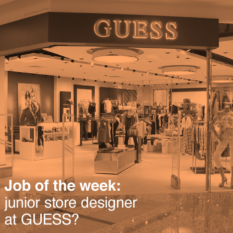
Our US job of the week on Dezeen Jobs is for a junior store planner at international clothing retailer GUESS?. Visit the ad for full details or browse other architecture and design opportunities on Dezeen Jobs.
