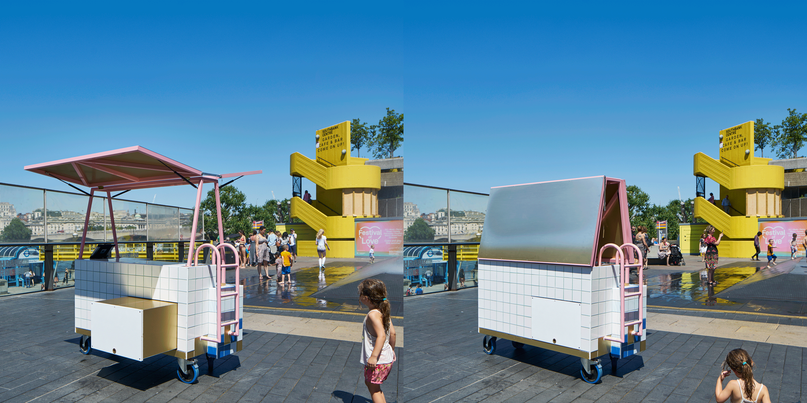
This miniature shop installed at London’s Southbank Centre was designed by How About Studio to resemble the finishes of a public swimming pool (+ slideshow). (more…)
This miniature shop installed at London’s Southbank Centre was designed by How About Studio to resemble the finishes of a public swimming pool (+ slideshow). (more…)

Light House is a project completed by ARKit. Finished in 2015, it is located in Melbourne, Victoria, Australia. Light House by ARKit: “The brief for this project was to create a long desired holiday house for a growing family of five and their dog. Located near a small coastal inlet on a flat, sandy site, the project offers a pared back, family centric escape from city life. Comprising two bedrooms,..

Self-build for public
There is the vacant house which has formed local community. “House of Komajii” in Komagome of Tokyo opened as a place where local people stay in October, 2013. Because originally this vacant house was a dormitory, the space was divided finely. Therefore about half of the building was a storeroom. When I received the request of the design, The client expected that I released the space of the storeroom in the area, and made the structure for “House of Komajii” to become independent, and rotate. (It is run now without almost taking the fee for use by the kindness of the owner.) I plan to break a wall and enlarge the space, and more people can gather in the first floor and convert the second floor to share office as source of profits.
I visited the building several times before beginning design. The state of the building was bad and the outdoor stairs got rusty and died, and the finish of the inner wall had come off. But many people gathered in such the building for some reason. It is the place that everybody can spend from a neighboring child to the elderly freely. It sometimes overflows with a person so that there’s no place to stand in. The community has formed spontaneously by the owner releasing the vacant house in the area. I think the scene like that the community was formed by people gathering for TV in old times when there was only one TV in the town is near that. It is not the “made” public that the government provides administratively, but the new public by “self-build” of citizen.
I collected all the expenses of the renovation from a local user. In addition, I had local people participate in DIY, and the thought of the individual has been left to the building. And I gave priority to that I enlarged the space without spending money. Therefore the things of the different character are simultaneous in one space, for example the rough space that was only dismantled, the Japanese-style room which was just left, newly finished white wall, the old fixtures which I transferred and reused, the pillar that the heights of children were carved , the switchplate which a neighboring foreign student made with cardboard, the signboard which grandfather of the owner handcrafted, and ranma which an old craftsman made. I mix such different things without order and aim at letting them exist in a natural state. I design the architecture which does not make “made” feeling by accumulation of the “self-build” of many people.

Italian brand Riva 1920‘s Earth Table features a bent iron base designed by Renzo Piano to symbolise the Twin Towers wreckage (+ slideshow). (more…)

Rio 2016: if you’ve been inspired to get active after watching this summer’s Olympics in Rio de Janeiro, check out our new Pinterest board full of innovative sportswear designs including athletics apparel created from the same material as condoms and trainers made out of recycled ocean plastic.
Follow Dezeen on Pinterest | See more sportswear in our archive

From the architect. The project involved the redevelopment of three tired 1980s buildings at Monash University’s Clayton campus. The intention was to establish new informal and engaging learning hubs within the three buildings and to clarify campus wayfinding by creating new pedestrian ‘walks’.
JCB’s response was to reinforce the main campus intersection with a formal gesture incorporating folding and twisting concrete canopies, a theatrical stair and seating platforms. The canopies provide shelter, entrance identity and a dramatic engagement with the student realm, allowing for moments of congregation, observation and contemplation from the vantage of the stair.
Themed interiors and informal furniture with complimentary material selections were used to de-institutionalise the interior spaces. The Student Services Desk is sculptural in form, eliminating the traditional linear counter anticipated within this type of facility.
A variety of work tables were designed for self-directed study or collaborative activities. Writable surfaces throughout encourage group learning. Throughout the building, visual links to the surrounding landscape and walks are maximized.
The upper floor schemes took the existing layout of a central corridor with perimeter offices and turned it inside out; open plan office areas, meeting rooms and ancillary spaces have been arranged in bays through the centre of the plan while the new circulation spaces run along the north and south facades, creating break-out spaces and informal seating areas along the perimeter.
The new facades were developed as a colourful ‘kit of parts’ to address solar shading, building identity and transparency. Mild steel shading loops and coloured fins were used to enliven and reinforce the existing structural rhythms of the buildings while the external colour scheme across the precinct sought to both reflect and abstract the surrounding landscape.
From the architect. The project involved the redevelopment of three tired 1980s buildings at Monash University’s Clayton campus. The intention was to establish new informal and engaging learning hubs within the three buildings and to clarify campus wayfinding by creating new pedestrian ‘walks’.
JCB’s response was to reinforce the main campus intersection with a formal gesture incorporating folding and twisting concrete canopies, a theatrical stair and seating platforms. The canopies provide shelter, entrance identity and a dramatic engagement with the student realm, allowing for moments of congregation, observation and contemplation from the vantage of the stair.
Themed interiors and informal furniture with complimentary material selections were used to de-institutionalise the interior spaces. The Student Services Desk is sculptural in form, eliminating the traditional linear counter anticipated within this type of facility.
A variety of work tables were designed for self-directed study or collaborative activities. Writable surfaces throughout encourage group learning. Throughout the building, visual links to the surrounding landscape and walks are maximized.
The upper floor schemes took the existing layout of a central corridor with perimeter offices and turned it inside out; open plan office areas, meeting rooms and ancillary spaces have been arranged in bays through the centre of the plan while the new circulation spaces run along the north and south facades, creating break-out spaces and informal seating areas along the perimeter.
The new facades were developed as a colourful ‘kit of parts’ to address solar shading, building identity and transparency. Mild steel shading loops and coloured fins were used to enliven and reinforce the existing structural rhythms of the buildings while the external colour scheme across the precinct sought to both reflect and abstract the surrounding landscape.
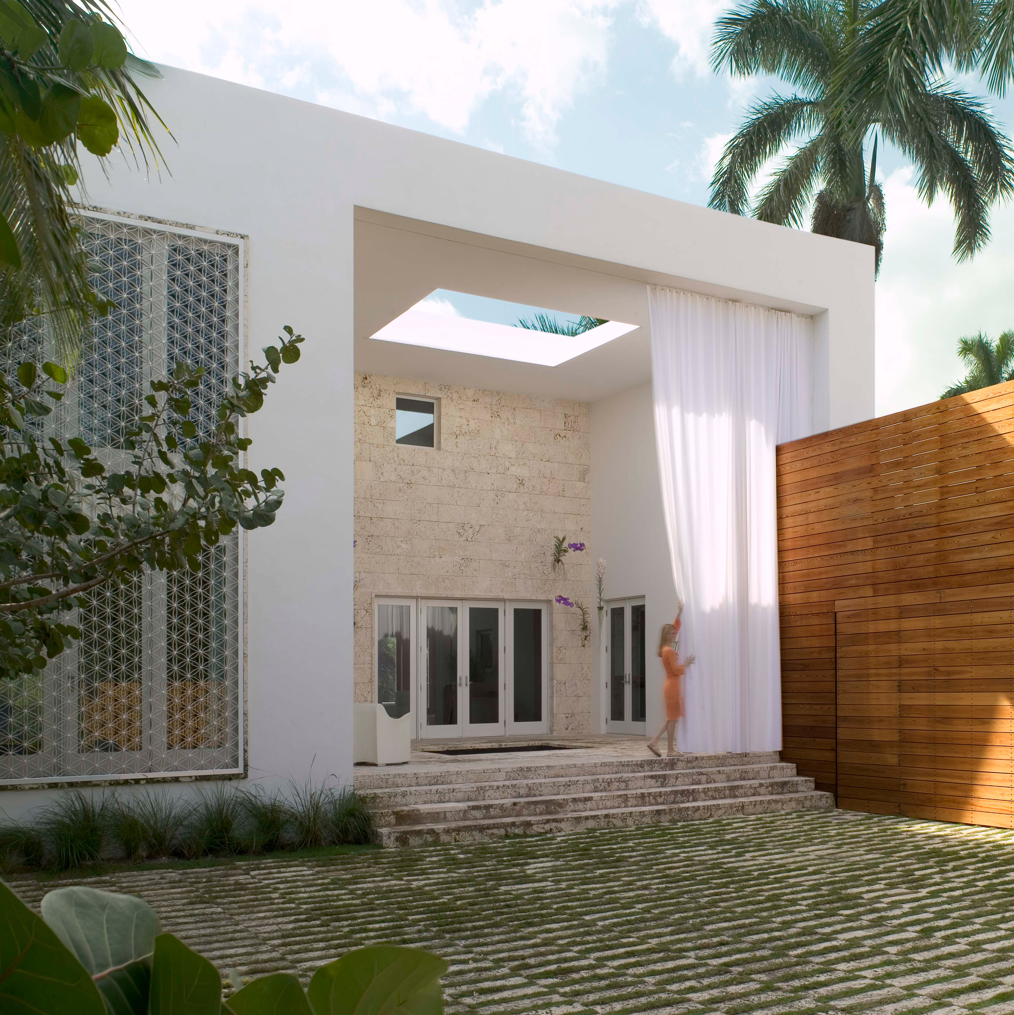
Miami studio Oppenheim Architecture has overhauled a local house to allow residents to divide their time between indoors and out (+ slideshow). (more…)

New-York-based studio Architensions has released the design for its shortlisted project, Rising Ryde, for the Ryde Civic Center in Sydney, Australia. In an effort to embrace local communities and contexts, the project is conceived as a hill-shaped building covered in local vegetation and it aims to prioritize people through its complex system of social connections and interactions with nature.
As an open spatial system, the project “aggregates its micro-cells to the macro scale of the city,” and allows its users to define the use of its space, particularly via a circulation system that is “intertwined with the space that serves as a primary usable social condenser with its intricate succession of public plazas and vertical gardens.”
Instead of creating boundaries, the Center furthermore “multiplies the interstitial space” through transparent and semi-transparent curtain walls. This openness allows the building to appear as a protective device and shading system for urban life, rather than a physically imposing mass.
Similarly, the local vegetation and trees compliment the project as an extension of the local environment and the hill that rises along Parkes Street.
The building will be organized as a micro-city with a multi-level density, intertwining residential, office, garden, and other programs in clusters.
Learn more about the project here.
News via Architensions.