Sacred Landscapes or “Taboo Spaces” in Indian Crematoriums


The Hall of Remembrance. Image Courtesy of Sanchit Arora of RENESA ARCHITECTURE DESIGN INTERIORS STUDIO

The Hall of Remembrance. Image Courtesy of Sanchit Arora of RENESA ARCHITECTURE DESIGN INTERIORS STUDIO

The relationship that humans have with death is complex and ever-changing, this is inevitably reflected in the architecture of spaces related to death. To interrogate the contemporary role of these spaces, architect Sanchit Arora of Indian firm Renesa Architecture Design Interiors used his thesis work, “The Shadow Spaces; Invisible Sacred Landscapes of Indian Cities” to analyze the place of crematoriums within Indian society. 

After a qualitative analysis, Arora has proposed an extension to the Green Park Crematorium in South Delhi. With this project, he aims to provide an example of an architecture which marries poetry and functionality to create spaces which are respectful, experiential, and user-friendly.


The Electric Crematorium. Image Courtesy of Sanchit Arora of RENESA ARCHITECTURE DESIGN INTERIORS STUDIO


The Funeral Space. Image Courtesy of Sanchit Arora of RENESA ARCHITECTURE DESIGN INTERIORS STUDIO


Gathering Space. Image Courtesy of Sanchit Arora of RENESA ARCHITECTURE DESIGN INTERIORS STUDIO


Aerial plan. Image Courtesy of Sanchit Arora of RENESA ARCHITECTURE DESIGN INTERIORS STUDIO

Arora speculates that the decline of ritualistic practices associated with death has seen crematoriums lose their “sanctity.” Whilst the spaces are frequented daily by a number of visitors, the lack of maintenance and consideration for the user has resulted in perfunctory architecture which is “without any sensitivity and respect”.  

Within Delhi, zoning defines the use of the 50-55 crematoriums in operation. Their proximity to nallahs (the streams that run through the city) reflects the Hindu ritual to have a water body at the site, whereas the green areas that often lie adjacent become buffers, isolating the sites from their context.


Crematorium location plan. Image Courtesy of Sanchit Arora of RENESA ARCHITECTURE DESIGN INTERIORS STUDIO

Crematorium location plan. Image Courtesy of Sanchit Arora of RENESA ARCHITECTURE DESIGN INTERIORS STUDIO

Bird's eye view of the site. Image Courtesy of Sanchit Arora of RENESA ARCHITECTURE DESIGN INTERIORS STUDIO

Bird's eye view of the site. Image Courtesy of Sanchit Arora of RENESA ARCHITECTURE DESIGN INTERIORS STUDIO

Arora situated his intervention at the Green Park Crematorium as of the four he investigated in depth, it was the most underutilized. By understanding the spatial periphery of the site, Arora was able to determine a series of macro and micro scales which would better integrate the isolated site into the cityscape. 


The Electric Crematorium. Image Courtesy of Sanchit Arora of RENESA ARCHITECTURE DESIGN INTERIORS STUDIO

The Electric Crematorium. Image Courtesy of Sanchit Arora of RENESA ARCHITECTURE DESIGN INTERIORS STUDIO

The new program is distributed in a way that establishes a series of linkages between the existing and new architecture. The flow and transparency of these spaces was of vital importance, to ensure that an “invisible landscape” was in place to guide mourners in the most sensitive way possible. 


A series of rough sketches depicting the physical manifestation of the emotions ,narrations and sanctity of the space. Image Courtesy of Sanchit Arora of RENESA ARCHITECTURE DESIGN INTERIORS STUDIO

A series of rough sketches depicting the physical manifestation of the emotions ,narrations and sanctity of the space. Image Courtesy of Sanchit Arora of RENESA ARCHITECTURE DESIGN INTERIORS STUDIO

According to Arora, ‘The Shadow Spaces’ observes and remedies issues related to all stated inadequacies, taking instead a holistic approach that considers physical, metaphysical, emotional, and spiritual notions.


The Funeral Space. Image Courtesy of Sanchit Arora of RENESA ARCHITECTURE DESIGN INTERIORS STUDIO

The Funeral Space. Image Courtesy of Sanchit Arora of RENESA ARCHITECTURE DESIGN INTERIORS STUDIO

The Shadow Spaces has been designed as a conceptual intervention, with the intention of submitting some of the plans to the Indian Government. 

News via RENESA ARCHITECTURE DESIGN INTERIORS STUDIO.
http://ift.tt/2btF5ED

Six of the best London warehouse conversions


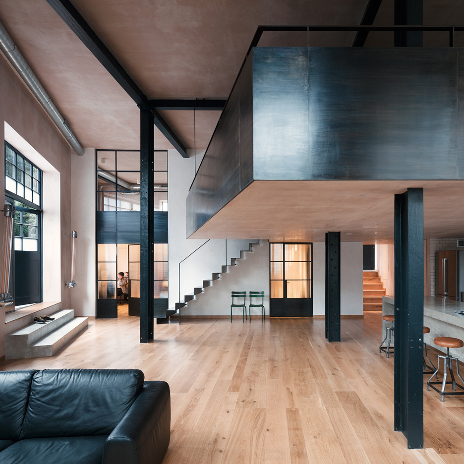
As the demand for houses in London keeps on growing, architects are still managing to find old warehouses to transform into new homes and live-work spaces. We’ve rounded up some of the best examples, including an apartment with a raw-steel movie archive and an industrial space converted into an artist’s studio (+ slideshow). (more…)

http://ift.tt/2bvy4BR

Home Town with a touch of Fibonacci / Wlodek Sidorczuk


© Ignacy Matuszewski

© Ignacy Matuszewski


© Ignacy Matuszewski


© Ignacy Matuszewski


© Ignacy Matuszewski


© Ignacy Matuszewski

  • Architects: Wlodek Sidorczuk
  • Location: Poland
  • Collaborators: Jakub Majzel, Katarzyna Borkowska, Jan Tolksdorf
  • Area: 450.0 sqm
  • Project Year: 2016
  • Photographs: Ignacy Matuszewski

© Ignacy Matuszewski

© Ignacy Matuszewski

From the architect. My Home = My Town.

Every family home has few habitants, diversity of functions and an approach to togetherness and individualism as well.


© Ignacy Matuszewski

© Ignacy Matuszewski

The answer to this design task could be found in a town and urban planning. Home and Town have similar principles: different people living, various functions, communities, streets, places and squares.


Floor Plan

Floor Plan

Applying this principles I created a design where habitants own their spaces as separate buildings. Different function concentrate around a courtyard – a common living space where all meet as in the ancient Agora.


© Ignacy Matuszewski

© Ignacy Matuszewski

The home is symbiotically joined with the site — each space is treated as interior and exterior as well, as in a town every building has a garden or a tarrace. The spaces can live separately as everyone is integrated with its surrounding: courtyard, green area, view axes.

…400m2


© Ignacy Matuszewski

© Ignacy Matuszewski

Axonometric

Axonometric

© Ignacy Matuszewski

© Ignacy Matuszewski

Audio touch.

During the design process future habitants shared with me many ideas and stories from which one created the idea – love to sound and music. I have followed this inspiration and found ideal space based on mathemathic proportions of Fobonacci rule. The risk was to create a theoreticly ideal space for audio listening which practicly meant angled walls and ceiling. Once the concrete was poured the theory was imediatelly aligned with practice – a small private concert hall was created. Additionally we gained one more function building in our Town Home.


Diagram

Diagram

http://ift.tt/2b6jAZJ

Dominic Wilcox designs contemporary art exhibition for dogs


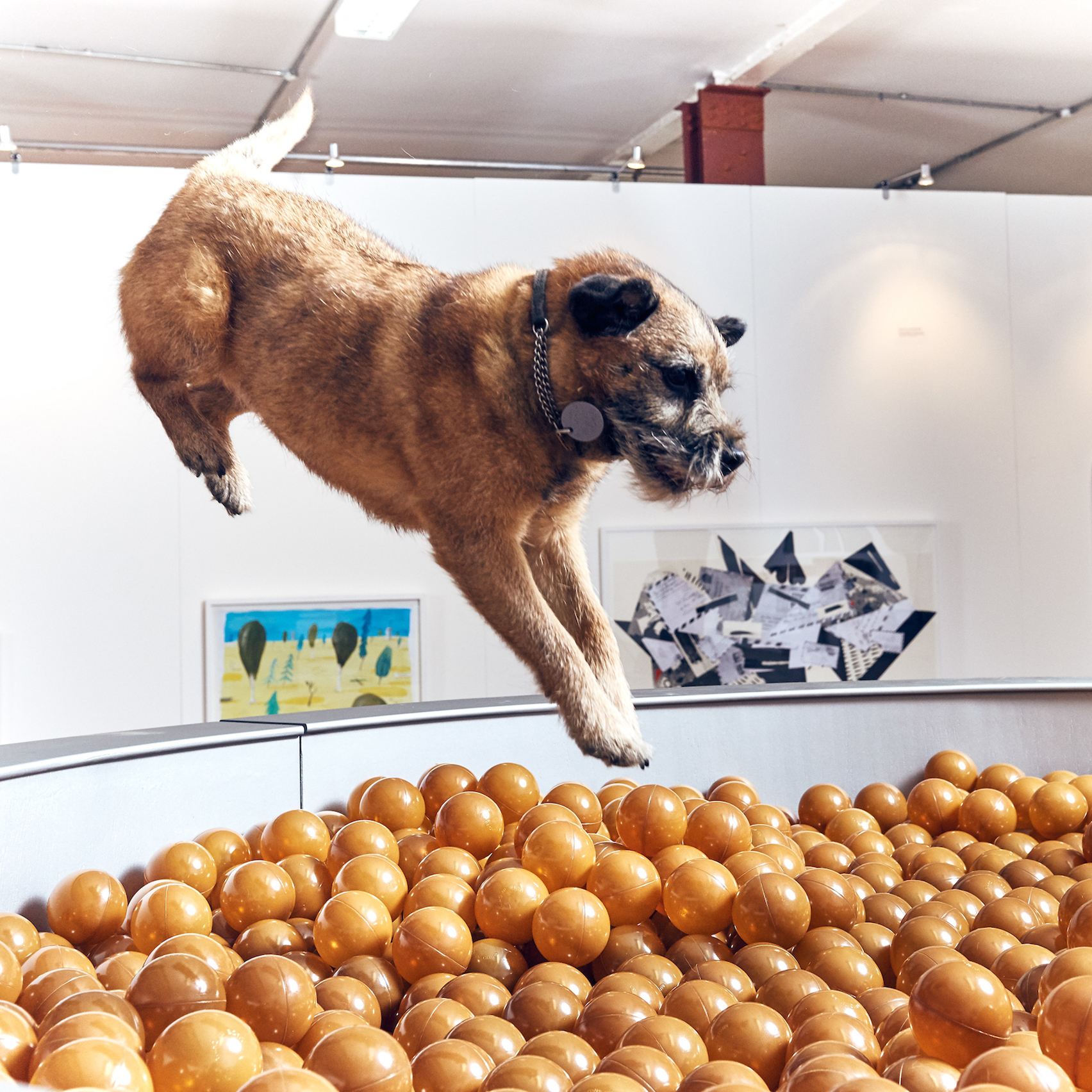
British inventor Dominic Wilcox has designed a contemporary art exhibition for our canine counterparts, featuring a dog bowl-shaped ball pool and an open car window simulator (+ movie). (more…)

http://ift.tt/2bvg7Dq

Submit Your Ideas to The Architectural Review to Stop the Spread of #Notopia


Courtesy of The Architectural Review

Courtesy of The Architectural Review

In its recent issues, The Architectural Review has been on a mission, highlighting a phenomenon that they have named “Notopia.” Characterized by a “loss of identity and cultural vibrancy” and “a global pandemic of generic buildings,” Notopia is – in overly simplistic terms – a consequence of the cold logic of market forces combined with a disinterested populace. The AR’s campaign therefore aims to analyze this “thing of terror” and push back by raising public awareness and by proposing alternatives. And they need your help.

//platform.twitter.com/widgets.js

The AR is collecting postcards of drawings and suggestions by their readers for change; whether it’s a simple proposal such as planting more trees in cities, the resurrection of an idea from a more idealistic time or even a completely original proposal, they want to hear from you. Download and print the postcard template here, and read the rules for submission on the AR’s website here.

Finally, if you’d like to learn more about the phenomenon of Notopia, check out AR editor Christine Murray’s last two editorials here and here. You can also read more articles about Notopia at the AR’s website and in the June issue of The Architectural Review.

//platform.twitter.com/widgets.js

http://ift.tt/2bq6mn2

Petit Mont-Riond / CCHE


© Thomas Jantscher

© Thomas Jantscher


© Thomas Jantscher


© Thomas Jantscher


© Thomas Jantscher


© Thomas Jantscher

  • Architects: CCHE
  • Location: Lausanne, Switzerland
  • Architect In Charge: CCHE Lausanne SA
  • Area: 11000.0 sqm
  • Project Year: 2015
  • Photographs: Thomas Jantscher
  • Artist : ZARIC
  • Client : Petit Mont-Riond SA – Une société du groupe MOBIMO

© Thomas Jantscher

© Thomas Jantscher

From the architect. In the urban context of the underground station area of Lausanne, 2 residential buildings were built. Residents enjoy both urban atmosphere and the nearby city park tranquillity. Generous openings allow those two atmospheres to penetrate inside the centre of the building. All apartments are arranged around a common courtyard exclusively pedestrian who acts as a collector and distributor of inhabitants flows. This welcome and friendly meeting place, with Zaric’s masterpieces, contributes to the creation of social links and for membership sensation between neighbours.


© Thomas Jantscher

© Thomas Jantscher

Floor Plan

Floor Plan

© Thomas Jantscher

© Thomas Jantscher

The variety of sizes and typology of apartments (duplex, lofts, walk-through housing, rent-controlled apartments) promotes social and age diversity 

The buildings development, certified Minergie, offers optimal sunny apartments.


© Thomas Jantscher

© Thomas Jantscher

Section

Section

© Thomas Jantscher

© Thomas Jantscher

http://ift.tt/2bJWXKE

Wireframe staircase leads to mezzanine sleeping “nest” in west London flat renovation


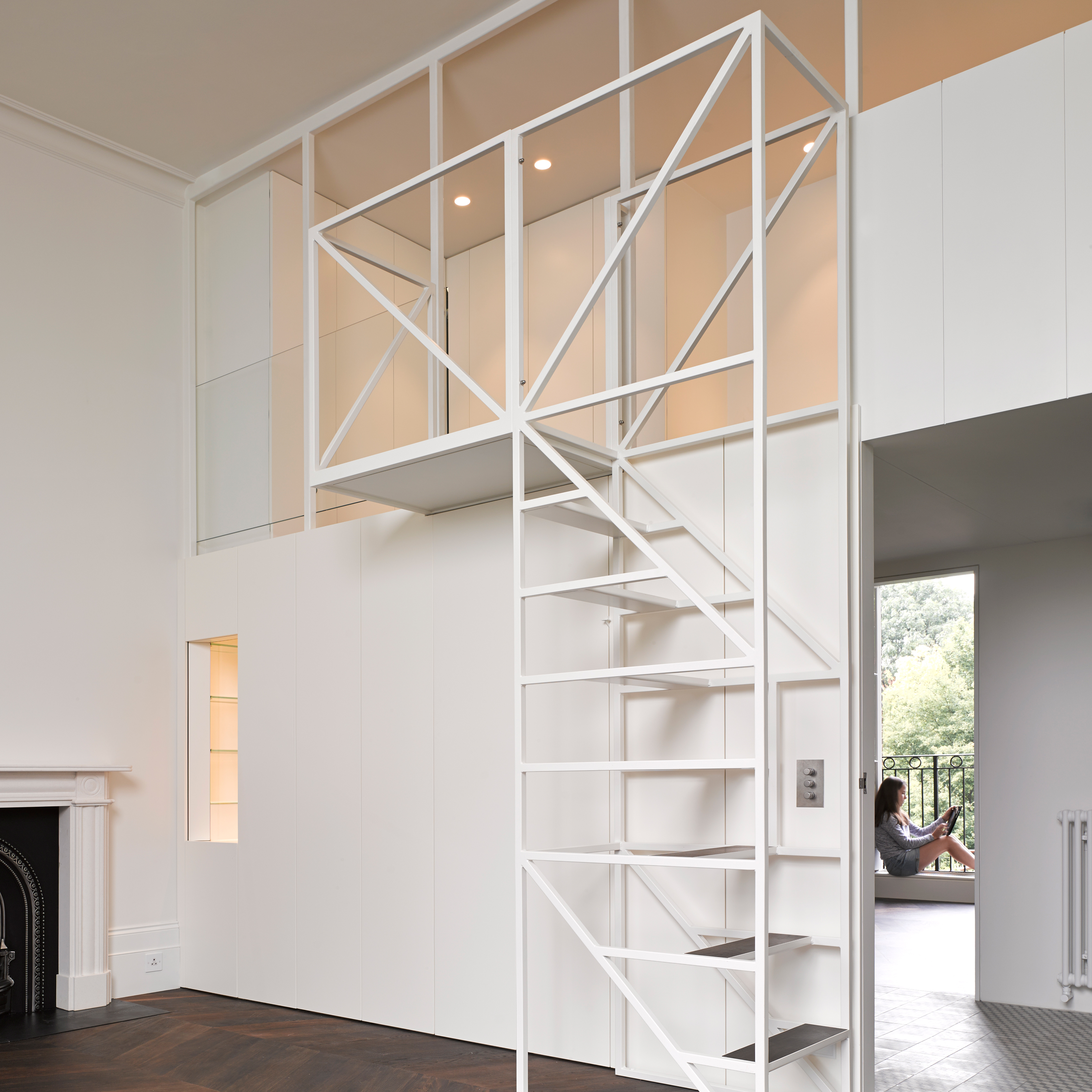
A metal-framed staircase leads to mezzanine floor inside this newly renovated flat in west London, but it also doubles up as climbing frame for the owners to practice circus tricks (+ slideshow). (more…)

http://ift.tt/2bEzBTI

MFRMGR creates semi-transparent cubicles for sound production office in Warsaw


Warsaw studio MFRMGR has renovated the offices of Polish sound production company Ztudio, using wooden frames and polycarbonate sheets to create semi-transparent workspaces (+ slideshow). (more…)

http://ift.tt/2bkXFx5

EVA architecten Design a Private Villa in Ijsselstein, The Netherlands

Villa Ijsselstein by EVA architecten (1)

Villa Ijsselstein is a residential project designed by EVA architecten in 2015. It is located in Ijsselstein, The Netherlands. Villa Ijsselstein by EVA architecten: “A contemporary addition between the original ribbon development. In the direct surroundings old farmhouses are alternated with houses from different periods that were built after the land consolidation. Since the various functions of contemporary houses are no longer in line with a characteristic farmhouse facade (wide..

More…

Salters’ Hall Renovation / dMFK


© Jack Hobhouse

© Jack Hobhouse


© Jack Hobhouse


© Jack Hobhouse


© Jack Hobhouse


© Jack Hobhouse

  • Architects: dMFK
  • Location: 4 Fore St, London EC2Y 5DE, United Kingdom
  • Project Year: 2016
  • Photographs: Jack Hobhouse
  • Qs: Jackson Cole
  • Contractor: 8Build
  • Client: The Worshipful Company of Salters
  • Contract Value: £12m
  • Interiors: Todd Hunter Earle
  • Structural Engineer: ElliottWood
  • M&E Engineer: Hoare Lea
  • Retail Consultant: Ingleby Trice

© Jack Hobhouse

© Jack Hobhouse

From the architect. De Metz Forbes Knight Architects (dMFK) have completed the transformation and renovation of the Salters’ Hall in the City of London. The brutalist Grade II listed landmark, the last building to be designed by Sir Basil Spence, has been extensively refurbished and extended, and a new entrance pavilion installed. dMFK won the project in competition and were appointed by the Worshipful Company of Salters in 2006 to explore ways to improve its income producing potential in office areas, to better it’s poor sustainability credentials, and to increase the public visibility of the building, retaining the livery hall functions.


© Jack Hobhouse

© Jack Hobhouse

Elevation

Elevation

The transformation has resulted in a 40% increase in lettable floor space and services being completely replaced, making ceremonial spaces more comfortable and commercially attractive for events. The development has attracted a single tenant to lease the additional office space created.
The installation of a new entrance pavilion establishes a strong sense of arrival, which was missing from the original design. Full height glazing and glass roof between the new and original concrete structures open up new views of the underside of the statement cantilevered ceremonial staircase on the east side of the building.


© Jack Hobhouse

© Jack Hobhouse

dMFK’s designs, whilst sympathetic to the original 1970s aesthetic, feature a range of innovative materials and installations to enhance the various spaces in the building. Sculptural references to salt feature throughout, from the bush hammered white concrete exterior and salt coloured Tivoli Travertine Classico floor tiles, to a hanging light structure with salt shaped bulbs, which drops through and illuminates the ceremonial staircase.


© Jack Hobhouse

© Jack Hobhouse

The building has achieved an improved energy rating from grade D to B, a BREEAM excellent rating, virtually unique for a modern listed building, and incorporates district heating and cooling from the Citigen system. Landscaping improvements, including the updating of Salters’ garden, realise the aspirations of Make’s London Wall Place Masterplan, improving the public realm in this area and enhancing public access to the historical assets around the site, including fragments of the old London Wall.


Plan

Plan

Ben Knight, Director of dMFK said: “It was a privilege to work with The Salters’ Company to refurbish this fantastic piece of London’s brutalist architecture. As a practice we enjoy unpicking the most complex and interesting buildings and sites. On this project we replaced the uninspiring, hidden entrance, with an extended and welcoming entrance pavilion on the site of an unattractive and redundant garage. This design also allows for greater access and appreciation of the heritage assets around the site, most notably the fragments of the old London Wall and St Alphage remains.”


© Jack Hobhouse

© Jack Hobhouse

http://ift.tt/2bpK2d5