
Casa G is a residence designed by Salvatore Cannito in 2015. The home is located in Gravina in Puglia, in the south of Italy. Photos by: Pierangelo Laterza
This week, Heatherwick defended his Garden Bridge after a funding gap was revealed
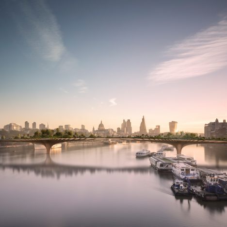
This week on Dezeen: British designer Thomas Heatherwick was forced to defend his Garden Bridge proposal this week after reports emerged that the project was missing £22 million in funding. (more…)
Manuel Ocaña Completes a Refurbishment in Madrid, Spain

Parais@ is a private residence renovated by Manuel Ocaña. It is located in Madrid, Spain and was completed in 2016. Parais@ by Manuel Omaña: “One. It is a refurbishment work for an especially dear, single woman. The apartment is located where the sun sets in Madrid. The space is interior, configured by three bays of 17 m2 (183 ft2). Two. She is determined about what she wants. Authentic wood pavement,..
Loures House / André Mesquita Arquitectos

© João Morgado
- Architects: André Mesquita Arquitectos
- Location: Lisbon, Portugal
- Structure Engineer: Emidio Mendes
- Area: 450.0 sqm
- Project Year: 2015
- Photographs: João Morgado
© João Morgado
From the architect. Three principles lay down the rules behind the intervention which are: the proportions of volumes; the plans metrics and the use of colour.
© João Morgado
It was developed has three different dwelling areas, united morphologically and structurally through the treatment of void areas and zenithal windows. This spatial organization unites and creates living spaces and transit spaces in which the dichotomy between the different types of spaces are revealed through the character of the voids itself. Like a thread stitching the intervention giving a new dynamic to the existing spaces.
© João Morgado
Section
© João Morgado
On the ground floor, the metrics of the space was kept and was introduction a new large window in the entrance hall, framed by a concrete volume, like a box to make time known by the user of the space. This window attempts to join two gardens which were so far apart visually but almost together physically.
© João Morgado
In the other side of the building we take advantage of an old kitchen, creating a connection zone between the old container (the main volume of the old house) and the new concrete volume painted in red. It is through the redesign of the façade, introducing a longitudinal window, preparing the kitchen volume to the inserting of the new form taking advantage of the plastic quality given by concrete to introduce a curve line, which serves as a locking volume for the intervention. Here close to primary colors were introduced in the interior of small round windows and on the façade. The earth incarnated tone serves as to remind the torn of an animal that curves to enter the old form paying tribute to the pre-existing form. Color is introduced as an experimental approach to test how can it change the perception of space and volumes.
Drawing
In the first floor was reintroduce the metric of the ground floor but now correspondence with different living spaces. Black shade is used to prepare for more private rooms. Ceiling heights are amplified or reduced in order to reference pathways, giving it a more solemn space through its different heights. A main volume (a closet) which encloses the bedroom space creates a dressing space in one side while in the opposite side a horizontal tear of modernist nature takes on the contemporary nature of the new spaces.
© João Morgado
Patricia Urquiola designs “warm and masculine” collection for Georg Jensen

Spanish designer Patricia Urquiola‘s first collaboration with Danish metalware brand Georg Jensen includes upside-down jugs and a set of tilted vases (+ slideshow). (more…)
AD Retail / The Purple Ink Studio

© Shamanth J. Patil
- Architects: The Purple Ink Studio
- Location: Bengaluru, Karnataka 560001, India
- Project Team: Akshay Heranjal, Priyanka Bankapur, Jaikumar
- Area: 650.0 ft2
- Project Year: 2016
- Photographs: Shamanth J. Patil
- Owners: Anil Drapes, Bengaluru
- Interiors: The Purple Ink Studio, Bengaluru
- Interior Contractors: Mm Interiors, Mumbai
© Shamanth J. Patil
From the architect. The upbeat and contemporary spirit of the AD boutique – a fabric/drapery retail store is expressed in their new flagship store nestled in the heart of Bengaluru city, India. The modest space of 650 sqft is celebrated with an accentuated idea of the arched windows with drapery, of the by-gone era which is represented in the most quintessential form, the “Arch”. The strong geometry of an arch articulated in a modern dialog creates the setting for a dramatically themed display.
The design is exemplified with the use of both modern and traditional materials in the palette. The arch is entirely structured in wood and finished to appreciate the natural grains while it takes the colossal monolithic form to hold the complete interior space together. The walls constructed in exposed wire-cut bricks along with the floor, walls and part of the display furniture in exposed concrete finish are rugged elements within the space which respect the true characteristic of the material. Although the overall material palette is natural and modernistic in approach, the furniture responds to the elements of the by-gone era and adds in a display of color and a tinge of ornamentation to the overall design scheme.
© Shamanth J. Patil
The interior space breaks up fluidically into waiting, meeting and showcasing areas, each of which carefully weaves the materials on display within the interior design dialog allowing the shopper the freedom to get a look-and-feel all around the retail space.
Elevation
CASA O / Takahashi Ippei Office

© Ippei Takahashi
- Architects: Takahashi Ippei Office
- Location: Tokyo, Japan
- Area: 47.68 sqm
- Project Year: 2014
- Photographs: Ippei Takahashi
© Ippei Takahashi
This house is located in a built-up part of the Tokyo outskirts, an area full of wooden houses. Its location is so tucked away that it can be difficult to find unless one actually lives in the neighborhood. The neighboring environment is quiet and contains a sense of anonymity peculiar to this area, which feels like a primeval forest. The client for this project wanted some distance from society, but to still enjoy their retirement living a convenient city lifestyle. One day I happened to find a worn-out home which perfectly matched their stipulations. I suggested renovating it. This house looked as old as the other homes in the area, sharing a similar appearance. I thought being part of the area’s unique anonymity would suit my client better, rather than my completely rebuilding the house and making it stand out from its surroundings.
Plan
This idea led me to design the house in an open manner. I intended to make someone inside really sense their surroundings wherever they might be in the home. I intentionally did not divide the house up by space. Instead, I treated its location as a living environment. I sought to integrate this environment with its built-up surroundings by making the windows (the ones which don’t face other houses’ windows) as large as possible, so that one has a sweeping view of the neighborhood. The wind that passes between the neighboring houses will also be able to blow through this home. I defined the entrance and windows according to external factors. This resulted in significant changes to the in-house environment, so I arranged the basic living essentials to their right places accordingly: an island kitchen where one can cook with their back against the neighboring house’s wall, while overlooking an alleyway; an island bathtub in the windiest section of the house; a shower booth in a shadowy area; a gently sloped stairway that makes one sense the existence of the next house’s wall; and storage spaces in dark areas. I designed the house dynamically, not methodologically. The actual living experience is three-dimensional and more fluid than what a ground plan can describe.
© Ippei Takahashi
When adding new material, I ensured that it would coexist with what had already been there. This way, one can understand the reconstructed house by seeing the accumulation of its structure and history. For example, I added reinforced beams to the existing wooden frames, and window frames to the exterior of the house in order to expose old pillars.
Section
Until now, when we made plans to live in cities, we lived our lives by dreaming up fantasies: the ideal space, courtyards, the appearance of the city, etc. However, this project strives for a more liberated living environment in a city. Devote yourself to the aimlessly built-up surroundings, recognize them as being like a primeval forest, and spark your real body senses – just like what happens when you spend some summer days in a cottage situated in wild nature.
© Ippei Takahashi
Philip Morris Sabanci Sales and Marketing Inc / mimari Studio

© Gurkan Akay
- Architects: mimari Studio
- Location: Göktürk Sk., 34690 Üsküdar/İstanbul, Turkey
- Design Team: Tolga Bozok, Kaan GüLkiran
- Area: 12000.0 sqm
- Project Year: 2016
- Photographs: Gurkan Akay
- Interior Design: mimari Studio
- Designers: Ayça Akkaya Kul, Önder Kul
- Reducteur: Ali Pasaoglu
© Gurkan Akay
From the architect. The project is the new work and operations headquarters for PMSA which has its design, drafting and project management processes are carried out by mimaristudio. The new office has 12.000 m2 of area on 3 stories, 4000 of which are offices, in Istanbul.
© Gurkan Akay
It can be seen in the designs of mimaristudio that the firm develops brand new approaches for each new project according to the physical conditions and current functional requirements of the place, regardless the studios previous projects or if they are working for the same client or not.
© Gurkan Akay
During the planning phase, first of all the sales teams are grouped in the center of the office floor. Teams who work on different areas are placed to be in close contact with their regional sales directors. Also the directors are placed in the center of workgroup clusters based on this idea.
© Gurkan Akay
Considering the largeness of the space both in area and the volume, team shells to combine two work groups are designed so that each work group can have their own identity. These shells which respond to physical, technical and technological requirements of all the staff of the group, both during their personal or team work, are designed with a space inside a space approach creating open sub-spaces inside the main work area. With this approach showroom- like effect is avoided and a different identify for each team is provided.
Layout
Other units in the office are placed around this core. In addition to this, an open multipurpose hall is proposed for the new place. This hall, which is considered for varying types of usages, is linked to social spaces. The ‘game shells’ which were specifically designed by mimaristudio are placed on the area that is next to this space.
© Gurkan Akay
The green lines function as natural separators that organize the units inside the office area. Plants that can sustain in closed environment and are able to use the natural light that space can provide are selected in the landscape design phase.
© Gurkan Akay
The space between the shells that cover working clusters are composed like streets, the material selection for these spaces are arranged to create a sense of continuity between other meeting and social spaces. 5 mm modular PVC tiles are chosen for the all floor finishing, expect meeting and interview rooms, for its sanitary and acoustic advantages. Their color and texture vary to go along with the interior design concept of each space.
Axonometric
Lighting design criteria are set by mimaristudio team as it was in the previous mimaristudio projects. LED products are used for all of the spaces in the project, linear or spot projections products are chosen for the working spaces, while in open spaces more specialized products with varying sizes and forms some of them having acoustic qualities are preferred.
© Gurkan Akay
With the completion of the project a space that is coherent with both PMSA’s corporate identity and the work that takes place there has come to being. Besides that, a comfortable working space for the staff that operates well and meets the actual and future expectations of the client is created.
© Gurkan Akay
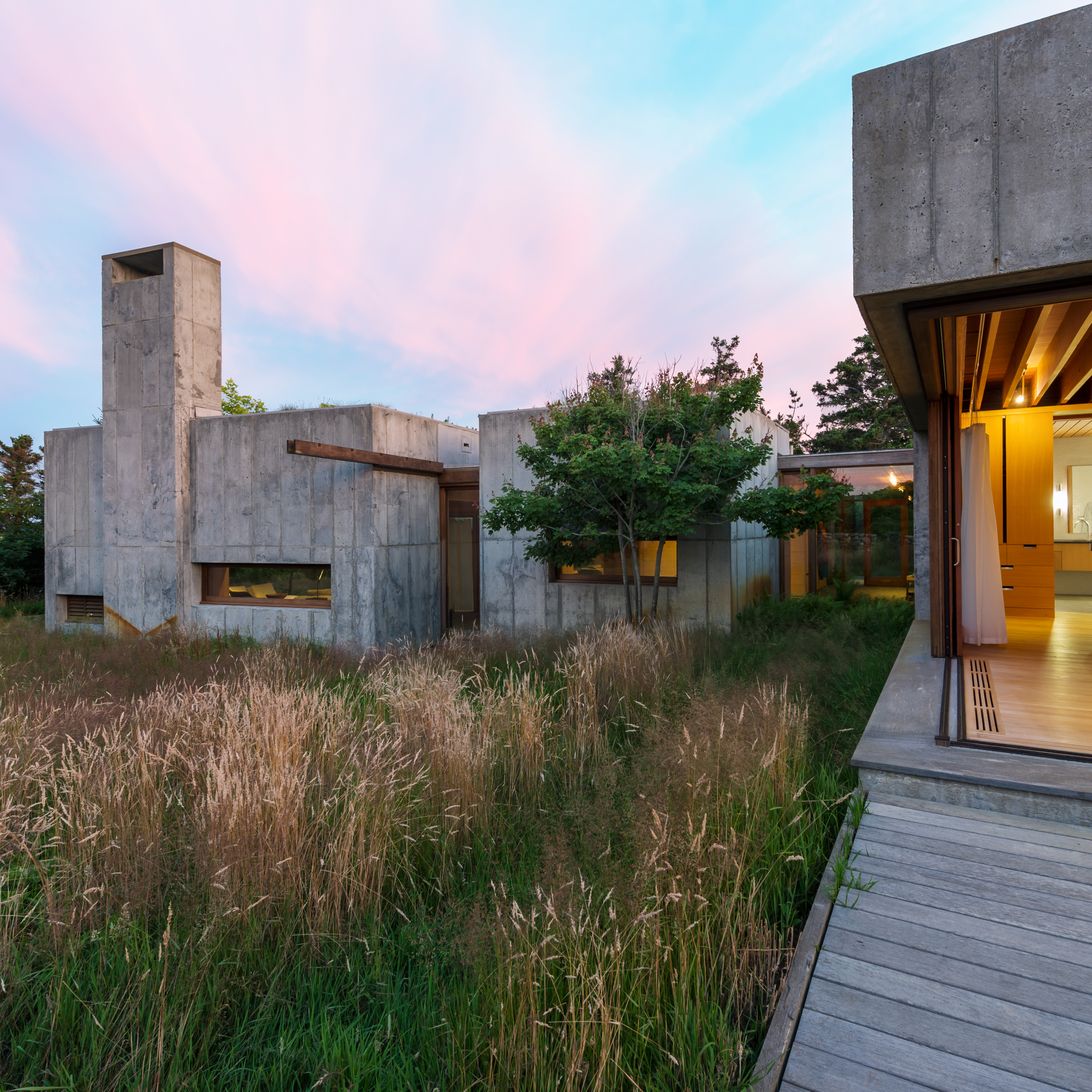
Eight concrete boxes form a “moveable” vacation home on Martha’s Vineyard
Barkingside Town Centre / DK-CM

Courtesy of DK-CM
- Architects: DK-CM
- Location: Barkingside, Ilford IG6, UK
- Area: 5080.0 sqm
- Project Year: 2015
- Photographs: Courtesy of DK-CM, Courtesy of London Borough of Redbridge
- Lead Consultant: JMP
- Graphic Design: Europa
- Structural Engineers: eHRW
- Arboricultural: PJC
- Contractor: Kenson
Courtesy of DK-CM
‘Barkingside Town Centre’ is a strategic project which radically transformed the town centre of Barkingside, a suburban town on the eastern fringe of London. The project provide a new ‘heart’ to the town in the form of a civic square and high street park, supported by a range of strategic interventions along the high street and out into the Green Belt landscape beyond.
Courtesy of DK-CM
The project has transformed a series of previously neglected or inaccessible spaces around Fullwell Cross Library and Leisure Centre, a suite of civic buildings designed in the 1960s by Frederick Gibberd. We have turned these unloved spaces into ones which suggest and support activity, bringing the internal generosity of Gibberd’s buildings into the public realm. A new loggia, modelled directly on Gibberd’s clerestory windows, lines a previously blank wall to create a town square which encourages inhabitation. Entrances to all of the buildings have become open air ‘rooms’, particularly the leisure centre’s entrance which incorporates a stage and Christmas tree pit. At the swimming pool, we have created 3,000m2 of new public park out of a disused and private pool yard, bringing the pool to life as a public building connected to its high street and providing a new leafy entrance to the town centre. Where the leisure centre formerly presented its delivery bay to the High Street, we have provided a small retail unit and public convenience, a miniature of the main building, which turns a back into a front and brings the bulk of the pool into dialogue with both the High Street and the new park.
Courtesy of DK-CM
We have brought generous but aloof modernist architecture into playful and generous dialogue with the suburban high street, in a language which riffs on suburban popular building but also on European traditions of public space. Since the project’s completion, the new spaces have hosted music events, childrens’ theatre performances, evening markets and community gatherings. The park has become part of its high street, providing a much-needed place of pause amongst the shops.
Isometric 1
Isometric 2
The project grew out of a series of productive conversations with the local community, significant for their openness and ambition, and key local community groups have been involved at all stages, particularly Barkingside 21, the local environment group who are advocates of the scheme and are active in promoting the spaces and organising events there. Local swimming groups have told us of their delight at being able, for the first time, to swim under dappled sunlight provided by the park’s new trees, whilst the town square is now the de facto heart of the town and is never empty.
Courtesy of DK-CM
The project also commissioned various designers to design and deliver precise interventions in Barkingside’s wider urban landscape. As an example, Assemble
Courtesy of London Borough of Redbridge
crafted a new pedestrian entrance and beacon for Fairlop Waters Country Park, just outside the town centre, whilst Eveleigh & Klein delivered a series of sensitive, beautiful signage and branding designs for independent businesses along the high street.
Courtesy of DK-CM

