Technical Administrative Planning: S. Gentili, S. Passarini
Engineering Advisors: G. Figliola
Facade Consultant: Nothing Studio, Promo Spa
Mep Engineering: G. D’ottavi Vvf Desing
Landscape: Nothing Studio
Visual Design: Nothing Studio
Courtesy of Enzo Eusebi+Partners
The head office of the Salpi factory has been conceived by Enzo Eusebi as a sustainable building that uses alternative energy sources and has a roof planted with vegetation. The large expanses of glass on the facade are decorated instead with hundreds of the hams produced in the factory. Below ground, to optimize the relationship with the surroundings.
Courtesy of Enzo Eusebi+Partners
Alternative, owing to its use of renewable energy sources. Sustainable, due to the choice of materials. The design tor the Salpi factory, that produces hams in the industrial zone of Preci (Perugia, Italy), was drawn up by Enzo Eusebi – Nothing Studio with a great deal of attention to the environment, understood in its broadest sense.
Plan 1
Partially underground, the block of the production facility has a root of over seven thousand square metres planted with vegetation, providing thermal insulation, a reduction In levels of water runoff and sound pollution, mitigation of the microclimate, the capture of fine particles and a saving in the cost of the roof’s renewal.
Courtesy of Enzo Eusebi+Partners
The parts above ground reflect the surrounding natural space through the use of mirror finishes. At the centre of the C-shaped complex, the management block – raised on pilotis and facing onto a pool that collects rainwater – has façades of aluminium and chestnut wood, known for its resistance to damp. On the roof, photovoltaic panels and solar collectors. The sustainability of the intervention has allowed the company to submit a request for LEED certification.
The KRONA Knowledge and Cultural Centre enhances Kongsberg’s cultural institutions and stimulates interaction between diverse communities and disciplines. Comprised of a variety of functions, KRONA houses new teaching and technical laboratory facilities for Buskerud University College and Tinius Olsen Technical Vocational College, as well as a technical university library. The complex also includes a public library, cinemas, municipal offices and a theatre auditorium. Its functions are organised around a central void with shared functions, enhancing flexibility and reducing programme redundancy. Using subtle landscape elevations and strategically locating programme access points, visitors intuitively gravitate towards the Centre. Throughout the interior spaces, strong visual connections to public functions further enhance the liveliness of the complex.
Courtesy of Mecanoo
Context
Located in one of Kongsberg’s most recognised locations alongside the oldest university building in Norway, Mecanoo’s design is sensitive to its historic context. It is shaped by the site conditions and opportunities. In addition to prefabricated elements, and use of ground source energy, the facility uses locally-sourced materials. A facade of rough slats references local architecture and contrasts with the interior of wood, concrete and subtle silver accents that reflect daylight. Facing the park, the building has a balcony for outdoor performances as well as an amphitheatre formed in the Hasebergtjerndalen park landscape below. The public and university libraries, located in the heart of the complex, appear to be cut from the building volume and continue the public space of the church square. The stone floor of the surrounding courtyards is drawn into the interior, enhancing the material continuity of the public realm.
Courtesy of Mecanoo
Situation
Courtesy of Mecanoo
Flexible
The KRONA Knowledge and Cultural Centre is highly flexible: in the evening the university canteen transforms into a café, the public library serves as a theatre foyer and the art gallery transforms into a bar for the film centre. The very concept of the building is adaptable in its components and form. Central to the shared programme is a number of large assembly rooms that accommodate a range of events including lectures, meetings, performances, receptions and concerts. The auditoria in the heart of the building are equipped for a variety of different configurations. These entertainment spaces are designed to be as open and flexible as possible, yet also create a vibrant, social atmosphere, and a connection to Kongsberg’s historical context.
Hokka is a private residence renovated by SEPTEMBRE Architecture & Urbanisme. It is located in Paris, France and was completed in 2013. Hokka by SEPTEMBRE Architecture & Urbanisme: “Renovation of a 75m² (807 ft²) apartment for a couple in the 11 th district of Paris. Like a jewelry box with multiple compartments, each room has a specific color and material which gives it its own special atmosphere. The overall coherence..
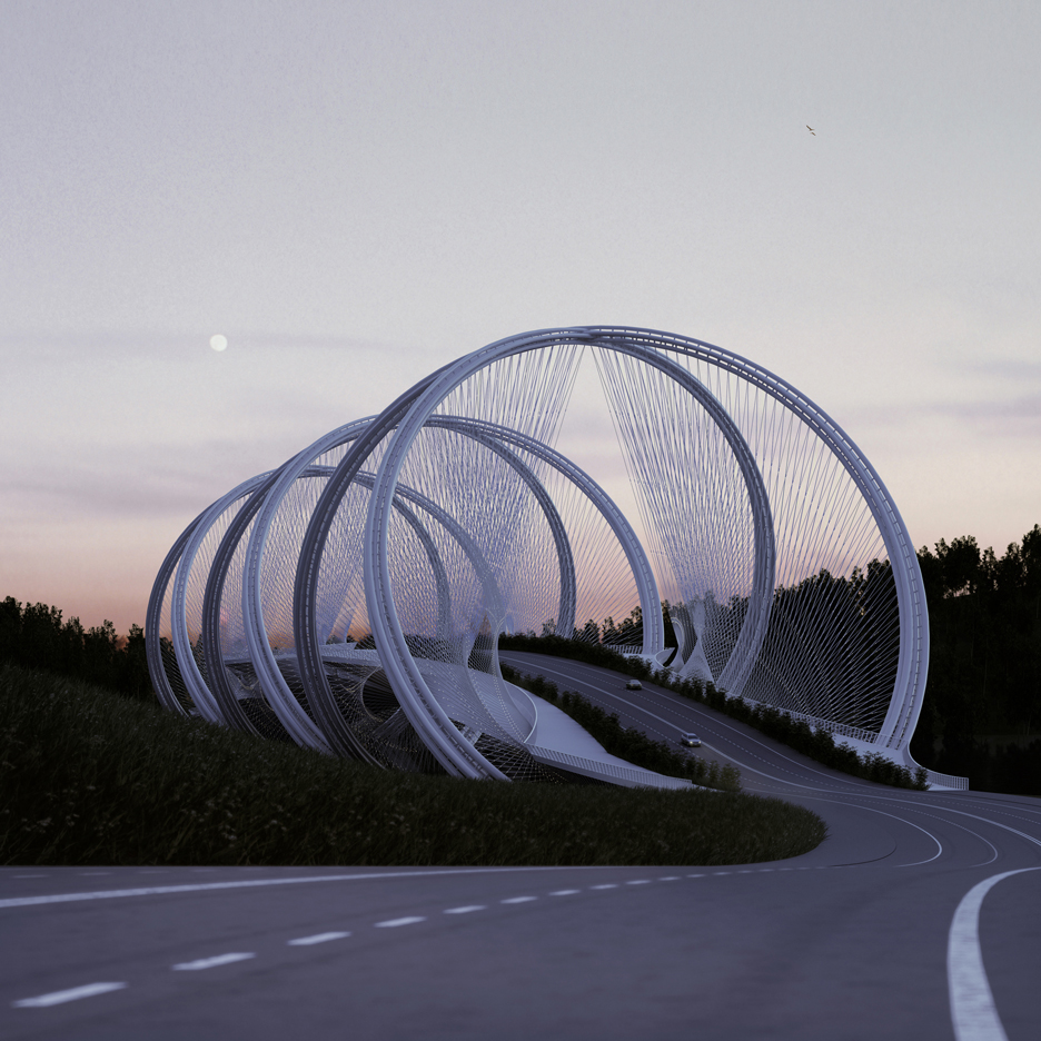
Architecture studio Penda has teamed up with engineering firm Arup to design a bridge made up of overlapping rings for the 2022 Winter Olympics in Beijing. (more…)
From the architect. Sodam-Sodam is a share house. The very first question we asked ourselves about this project was: “what is the most unique charm of a share house in today’s housing reality?”
The answer was simple: nicely designed and spacious spaces such as a kitchen, dining room, living room and bathroom, all of which individuals may not be able to afford or dream of—at least in a crowded and expensive city like Seoul.
As such, what we had to do was also simple and clear, that is, to make those common spaces mentioned earlier as spacious and nice as possible within a limited area.
First, we needed to decide on where to locate those common spaces. In some of existing share houses in Korea, such spaces are usually located on the 1st floor. The reason would be to maximize and diversify space by connecting the area with exterior space.
However, as Sodam-Sodam is located in the middle of a highly dense residential area in Shinrim-dong of Seoul and is to be built for women only, the possibility of utilizing such an exposed space in comfort (or even doing barbecue) seemed pretty much low. Not to mention, the blockage of sunlight by surrounding buildings when built on a lower level ground.
If so, what is the biggest advantage of this site?
It would be a wonderful view of a whole neighborhood and a nearby mountain, full sunlight from the south as well as a benefit of protected privacy, all of which are possible by neighboring buildings of three or fewer stories.
Therefore, we decided to locate the common space not on a lower level but on the top one, creating a spacious high ceiling kitchen with personal storage space and a dining space with a hardwood table connected to the kitchen. From a cozy sofa in the living room that is a half level lower, one could enjoy the view of a nearby mountain through a wide window. Moreover, one could also soak in a bath tub of a common bathroom and admire the view of the sky and the mountain. All of these would not be possible or affordable, particularly in Seoul, if it were not a “share house”.
Section
In addition to this common space of a great view and sight on the top floor, there is another common space of different aspects on the 1st floor. That is a space where people could quietly watch movies, chat together or share their little hobbies. The space is directly linked to a little outside terrace surrounded by a fence for extra purposes.
For the floors of individual rooms, we used a skip-floor structure in order to ensure maximum space in respective rooms and to make a journey to the top floor as relatively natural as possible. By eliminating corridor space that connects each room, we were able to not only secure extra space but also change the perception of a building from a vertical ‘floor’ concept to a whole ‘space’ one by making a vertical movement more natural. Moreover, a staircase that runs across the middle of the building and the same color added to both its interior and exterior bring about complete unity to the space.
Each plan has an independent toilet, a bathroom and a washing machine and a dry-type hand basin that also works as a powder space. In order to tackle the problem of lacking storage in the share house, there is a built-in closet in each room for everyday use as well as an extra individual storage space on the 1st floor for storing items in large-volume or of rare use. Likewise, there is personal storage space in other common areas such as a front entrance, a bathroom, a kitchen. In other words, it is a concept of sharing space (and a very few items) while using one’s own items.
Section
As for the exterior, we wanted to embody an image of simplicity and decency. It was an attempt to create a distinct but refined image within the neighborhood that is already filled with disordered buildings and complex signs.
Construction: Shandong Xincheng Hengye Development and Construction Co., Ltd.
Area: 11800.0 sqm
Project Year: 2016
Photographs: Courtesy of gadGreenton Design
Courtesy of gadGreenton Design
From the architect. If we say that the cultural mechanism of a city does not lie in simple repeating of the past and resolute refusing of the past, but lies in rooting in the past and constant restructuring and creation, then for every sincere architect, cultural inheritance will become an instinctive mission and only from which can they acquire the value of their existence.
Courtesy of gadGreenton Design
Jimo Scientific Creation Center is a beneficial attempt of gad – how to meet the “science and innovation” spiritual demand of architecture itself while respect the urban culture context at the same time?
Courtesy of gadGreenton Design
General Layout Extracted from Qi-Lu Culture
During the four-year-long project exploration of Jimo Scientific Creation Center, together with the proprietors, gad wishes to jump out from the unitary urban architectural thoughts and tries to demonstrate a complete spatial sequence from the perspectives of historical context and new town plan.
Courtesy of gadGreenton Design
The design extracts quintessence from the time honored Qi-Lu Culture, and the guideline of “City of Neutralization, Centre of Nature” is put forward, laying a philosophy foundation for the core center of the entire Creative Intelligence New District. While the Scientific Creation Center presenting to us finally is like a long scroll lying across the square, being stable yet elegant.
Courtesy of gadGreenton Design
As the core architecture governing the Creative Intelligence New District, the architects discard the pursuing for vertical scale at the beginning of the design, following the horizontal development of classical square construction scale. Now we can see the Scientific Creation Center is 286 meters long and 49 meters high, forming a favorable interface scale with the entire central square and showing an extensive bosom which can incorporate things of diverse natures.
Courtesy of gadGreenton Design
Facade Mould Derived from Historical Culture
The neat-formed and fair symmetry of the Scientific Creation Center can make you feel stable and calm, and the classical facade ratio of five sections horizontally and three sections vertically reveals an inexpressible noble temperament, while the smooth and succinct techniques give you a bright and clear modern impression. The artistic conception of vertical lines extracted from the famous geological impression “Mashan Stone Forest” of Jimo brings strong order for the entirety.
Courtesy of gadGreenton Design
In the centre and both ends of the entire facade, the inward retreat of the surface and the dangling handling for the vertical lines seem to want to imply the uniqueness of the internal spaces of these parts through the “transparency” raised by Colin Rowe a hundred years ago.
Courtesy of gadGreenton Design
Space Peculiarity of Opening and Sharing
The three-tier-high round porch at the main entrance, the spoke-shaped glass porch roof, 16 independent pillars of 35 meters high together with the single cable curtain wall of nearly one thousand square meters behind them introduce people to enter the pillarless atrium space of 50 meters high.
The opening and sharing space under the neat-shaped appearance make the techniques of internal and external space uniformly interpret the centrality. This is the centre of the Scientific Creation Center as well as the centre of the overall Creative Intelligence New District. It connects the front and back squares from the south and north, joins the both internal courtyards from the east and west, with conference rooms of each layer suspending above it and the lecture hall and dining hall lying beneath it.
Courtesy of gadGreenton Design
The aluminum alloy window-shades hanging like draperies show the giant Chinese character of “Ren” (which means human in English), manifesting the human-oriented spirit of scientific innovation. The pure-white floating and hazy feeling creates rich and profound visual flow by pure and skillful techniques.
Courtesy of gadGreenton Design
Plane Layout of Horizontal Extending
The atrium and courtyard effectively organize each office space, and the horizontal extending gains more southward open space, improving the comfortableness of office environment. Sharing and communication are the most strong space demands of modern office architectures. The corridor above the atrium, the selected conference rooms and multifunctional halls and the two-tier loft space at the east and west sides provide convenient and comfortable communication sites for the enterprises, hoping to create more possibilities for stimulating unknown values among enterprises.
plan
section
Standing at the north square, the tranquility and elegance of the Scientific Creation Center reflect before our eyes. The modular facade design makes the thinness of metal, the transparency of glass and the heaviness of stone just right, showing powerful order and convincing accuracy.
Courtesy of gadGreenton Design
Scientific Innovation and Place Spirit
When the evening lights are lit, looking back at the fading Jimo Scientific Creation Center on your way back, the light of the atrium is reflecting the comely porch, like an altar, which we know is not too much, because what there worships are science and innovation.
Courtesy of gadGreenton Design
Just as what Koolhass said “Architecture is almost the last industry which is still chasing the time memory, or the last industry which will still trace back to thousands years ago and try to show the certain relations throughout the history.” As another active attempt of propelling new city construction, gad is exploring the cultural memories peculiar to the city in its own way.
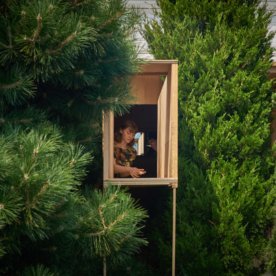
Revellers at a Tasmanian music festival were invited to cool off inside this wooden pavilion filled with Aesop products, designed by architecture studio Partners Hill (+ movie). (more…)
From the architect. The key word of this cafe project is “ Thinking outside the box” which encourage us to initiate the new idea and and break all rules of interior design.
We have twisted the word and rephrase as “Thinkin’ outside the fox”. We have adopted the fox as the symbol of the cafe because fox is the clever animal. It is isolated and independent from the group of itself. The fox character reflect the style of the cafe which is independent and has its own uniqueness.
Elevation
The structure of cafe is the 3 floors of commercial building. The designer has visualised the space as several boxes stacking on each others. The designer team have to restructure the building and make it look spacious and airy, like thinking outside the box.
After we had studied the building structure, we have created the key theme of the cafe, which are TREE , HINT ,and LIGHT. In order to have these theme, we have to think outside the box and break all ordinary rules.
Elevation
Firstly, TREE. We use the from of tree which is the triangle shape to restructure the building. Then the building has the triangle roof likewise the big tree among Thonglor area.
Secondly, HINT. The hint of the cafe make it more fascinated among customer. We make the cafe look like the fox house which should have the foxes in it but suspiciously disappeared and remain only some hint in the cafe. We design the high wall of 9 meters which is resemble to the entrance way of fox cave.
Elevation
Lastly, Light. As the building is slightly dark like the fox cave, we have designed that the light should naturally shine into the building like the sunbeam shine a light into the fox cave. Customer will enjoy the natural light and feel homie when staying here.
Inside the cafe has been divided into three areas, shop, dessert bar and dining area. When customer walking into the cafe, they will firstly impressed in cute collections of foxes then they will enjoy the food and beverage inside the cafe. The cafe was simply decorated as a white tone as a background which make the foreground of variety colour of dessert looking more interesting.
If you are the fox lover and enjoy the natural and comfortable environment, we are surely that you will fascinated in The Thinkin’ Outside The Fox Cafe, the peaceful sanctuary among Thonglor area.
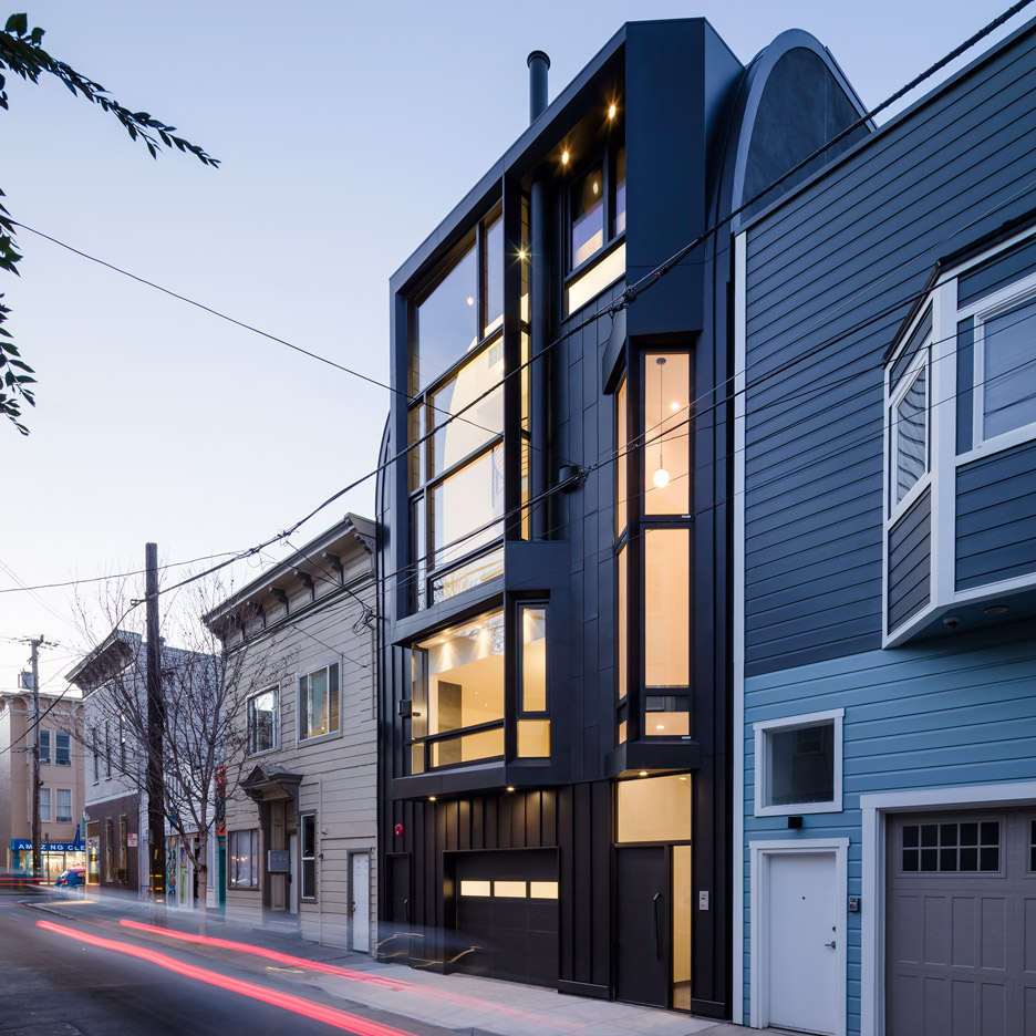
Local studio Stephen Phillips Architects has completed a black duplex in San Francisco that aims to challenge the city’s standard housing typologies (+ slideshow). (more…)