Architecture
HEM House / Sanuki Daisuke architects

© Hiroyuki Oki
- Architects: Sanuki Daisuke architects
- Location: Ho Chi Minh City, Ho Chi Minh 70000, Vietnam
- Architect In Charge: Sanuki Daisuke, Huynh Anh Tuan
- Project Year: 2015
- Photographs: Hiroyuki Oki
- Construction Company: Công ty TNHH Cơ khí và xây dựng & thương mại Tám sáu.
- Structure Engineer: Công ty TNHH Cơ khí và xây dựng & thương mại Tám sáu.
- Building Height: 13.6m, 4 Stories
© Hiroyuki Oki
From the architect. This is the individual house project at a small alley in the center of Ho Chi Minh City.
When having a look at Vietnamese towns, we can realize that the buildings’ blocks separated by main streets, and numerous narrow alleys inside of the blocks like blood capillary. The width of these alleys is quite narrow around 2m – 4m, occasionally less than 1m. When walking around these alleys, we can see very vivacious Vietnamese life., these narrow alleys are called “HEM” and these are quite attractive urban spaces in Vietnam.
© Hiroyuki Oki
Concept Sketch
© Hiroyuki Oki
Houses in the HEM are usually covered by fence or smoke glass for security, privacy and shading. As a result, the houses look like cages. . The spaces inside the house in those cases are dark and broody. People usually use electric lighting in daily activities, especially in the ground floor level. Therefore we made the design target of “How to design enjoyable house in the HEM”.
© Hiroyuki Oki
Floor Plans
© Hiroyuki Oki
The site is located at the corner of HEMs and the widths of HEMs are just 2.1m and 1.7m. It is not easy to keep privacy and security. Thus we attempted to set the “Opening with Depth” at the envelope along to HEMs. Several openings have the depth of 50cm -80cm and are equipped with furniture and shelves. This helps indoor spaces brighter by getting natural lighting’s reflection. At the same time, it keeps the privacy by providing the eye stop from outside. The building has extremely simple shape with maximum area according to the regulation and many openings toward the outside. It usually seems closed from outdoor, but the inside environment is astonishingly bright with natural lighting by reflection at the openings. When the window opened, the natural wind come into the house. We designed the steel mesh with pattern covered each opening. The patterns are considered according to client’s usage and referred to Vietnamese local textile. The meshes provide security and eye-stop from outside.
We made different ceiling height in each floor and create the space of the house as spacious as possible. We also use Vietnamese traditional materials in this project. The outside wall is finished by exposed Terrazzo. The interior cement tile is also local and widely used material.
Section
The locations of the openings were carefully decided by surrounding condition and future planning of neighborhood. We design the views of HEMs from openings to become a part of interior space in this house. The housing in the HEM is usually considered negatively. However we carefully observed and transform the condition of it. This could be the alternative house to enjoy the life in the HEM.
© Hiroyuki Oki
Fukumasu Base and Kindergarten Annex / Yasutaka Yoshimura Architects

© Yasutaka Yoshimura
- Architects: Yasutaka Yoshimura Architects
- Location: Ichihara, Chiba Prefecture, Japan
- Area: 684.81 sqm
- Project Year: 2016
- Photographs: Yasutaka Yoshimura
- Structural Engineer: Eisuke Mitsuda Structural Consultants (wooden) / Hasegawa Sogo Sekkei (Steel)
- Adviser For Kindergarten: HIBINOSEKKEI, Inc + yoji no shiro
- General Contractor: Hirai Kensetsu / Sanwa-kigyo Corporation (Tent Warehouse)
- Building Area: 512.42 sqm
- Max Height: 8,470 mm
© Yasutaka Yoshimura
From the architect. An extension project for the kindergarten in Ichihara, Chiba. It is aimed to be a community center not only for children but also for their families and graduates.
Exploded Axonometric
We provided huge air volume to enables children to run around in the building by ready-made tent warehouse, which reminds of the existed warehouse stood in the same site.
© Yasutaka Yoshimura
1st Floor Plan
© Yasutaka Yoshimura
The tent warehouse also covers the freely folded wooden walls that forms place-like thing. We also tried to stimulate children’s imagination by leaving the things like front side and backside of the walls, and even the confliction of the brace structure.
© Yasutaka Yoshimura
2nd Floor Plan
© Yasutaka Yoshimura
SOHO Bund / AIM Architecture

© Dirk Weilblen
- Architects: AIM Architecture
- Location: Shanghai, China
- Design Team: Wendy Saunders, Vincent de Graaf, German Roig & Zhikun Zhang, Ivan Yu, Liat Goldman
- Client: SOHO China
- Area: 9400.0 sqm
- Project Year: 2015
- Photographs: Dirk Weilblen
© Dirk Weilblen
From the architect. SOHO China, a leading prime real estate developer in China, has recently set up shop on the Bund. Widely acclaimed for both a visionary business model and several landmark buildings, it’s an exciting time for SOHO China – expressed through design, the future is bold and bright.
© Dirk Weilblen
AIM was chosen to design four spaces within the interior of SOHO Bund: the public spaces, basement, show office, and club. This project was a balance between past and future – the government of Shanghai is concerned with the Bund’s facade, and rightly so – we all love the 1930’s style buildings that look out onto the glitzy, modern towers of Pudong.
© Dirk Weilblen
The idea was to simultaneously challenge and evoke the timeless character of the Bund on the exterior, and pair it with a contemporary interior design that was reflective of the SOHO China vision and brand image.
© Dirk Weilblen
We used a simplified beige stone on both exterior and interior surfaces that recalls the material palette of historic Bund buildings and simple, strong white surfaces that bring us into the future. Small details like the 45-degree angles near the lift lobbies and the creamy stone colors offset the open floor plan and bright lighting, balancing the narrative of modern and jazz age Shanghai.
© Dirk Weilblen
The mezzanine floor houses SOHO China’s Shanghai headquarters. The spectacular view informed many of the design choices – this space is used daily for sales and business, and needed a dynamic vibe to match.
We kept things simple and direct: shifting volumes, muted details and bright colors in the interior.
The outdoor space wraps around the mezzanine floor and features both stunning views of the Bund and Pudong, as well as a calming bit of green.
A reminder that even in the heart of the city we can find a little peace and quiet.
© Dirk Weilblen
Big windows looking out and the stairwell platform keep the tension between city and Bund at just the right frequency.
© Dirk Weilblen
The staircase is also a nod to a similar stair in the Beijing headquarters – a design feature that connects the more uniform, corporate side with uniqueness of the Shanghai office.
Lighting can make or break a space. This is where people spend a lot of time so we wanted it to be both comfortable and sophisticated. We created a membrane skin for the ceiling lights, so that the whole ceiling gives light. An innovative, sensitive way to connect the indoors with the outdoors.
© Dirk Weilblen
Subtle details like the custom designed carpets and art are in the spirit of the location, and give the expansive space a feeling of intimacy and luxury.
© Dirk Weilblen
The SOHO Bund experience is orchestrated through the layering of old and new, glitz and minimalism, to create a lasting impression of energy, excitement, and change for the Bund and Shanghai.
Aluminium House by Fran Silvestre Arquitectos features a grand roof terrace and swimming pool
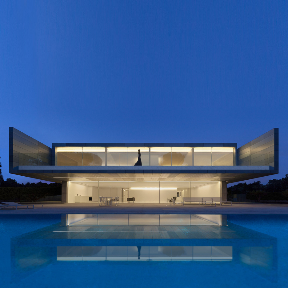
This top-heavy house in Madrid by Fran Silvestre Arquitectos features a roof terrace that spans the entire width of the building and extends out towards a swimming pool (+ movie). (more…)
Pierre Thibault creates compact and light-filled house in a Quebec forest
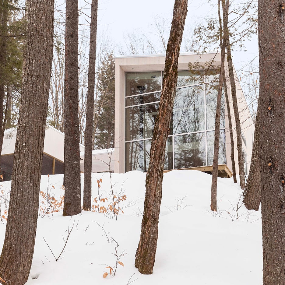
Atelier Pierre Thibault has completed a holiday home in rural Quebec with a giant window wall that provides expansive views of the scenic terrain (+ slideshow). (more…)
Carver Global / D-Werker Architects

© Inwoo Yeo
- Architects: D-Werker Architects
- Location: Daeheung-dong, Mapo-gu, Seoul, South Korea
- Architect In Charge: Jieun Lee, Hwon Yoon
- Area: 1743.27 ft2
- Project Year: 2016
- Photographs: Inwoo Yeo
- Construction: Gaudikorea Co.
- Client: Sang Rok Lee
- Surface Area: 2,710.4 ft2
© Inwoo Yeo
Mapo_ New development and a hybrid urban landscape
Mapo is a district undergoing considerable transformation in Seoul through a recent redevelopment craze. Large enterprises, hotels and apartment complexes unable to bear the cost of rent in existing urban centers are entering Mapo’s competitive market. Therefore, the image of Mapo is changing with the development of large apartments complexes behind a single layer of high-rise buildings positioned along the edge of the main streets. In contrast, a part of Mapo district remains undeveloped and intact as it was built from the 1960’s with small scale buildings.
© Inwoo Yeo
Carver Global_ A strategy for a hybrid urban landscape
In terms of architecture, ‘Carver Global’ sought to achieve harmony with the urban structure of different scales, occupying an important position between apartment complexes and small scale buildings. The project’s intention was to suggest the possibility of ‘incremental development’ in this district which is a mixture of newly constructed apartment complexes and an historic urban structure.
© Inwoo Yeo
Rather than vertically extending the existing building which was relatively large-scale compared its surroundings, a strategy of horizontally extending the mass by segmentation was selected. The new program was inserted over the parking space behind the existing building and connected to the existing building. Through this maneuver, ‘Carver Global’ acts as ‘a neutral medium’ connecting the dual urban landscape of the street-facing large scale buildings with the small scale architecture located behind the site.
© Inwoo Yeo
Horizontal Extension_ Adaptation to a limited time schedule
The method of horizontal extension was not just an architectural strategy considering urban surroundings but a means for resolving the client’s requirement that the building would be ready for use in two months. By horizontally extending the building, the client could utilize the existing building before the completion of the whole project.
© Inwoo Yeo
The project’s time constraint not only influenced the extension method, but also the remodeling method of the existing building. Within a short amount of time the sandwich panel construction of the existing building (formerly used by a package delivery company) needed to be transformed to correspond to the image of a cosmetic company. Metal fabric was selected as a suitable material which could be applied over the existing finishing without having to remove it, effectively improving the façade. This process of hiding and supplementing the existing look also acts like a metaphor for the transforming role of cosmetic products. The metal fabric exterior not only coincides with the image of a newly emerging cosmetic brand, but simultaneously transforms the urban landscape of the neighborhood. Furthermore, as a material which does not exert a negative influence on the neighboring residential environment it creates a positive effect in the building’s relationships with its neighbors.
Section
Spatial Characteristics_ An office for a small to mid-sized company
From the standpoint of an office building of a recently established small to mid-sized company in a society, it was important to conceive a space which could instill pride in the employees in addition to creating a positive image for the company’s customers and investors. In particular, the planning required that the space for this professional cosmetic company should be differentiated from the office spaces of other types of businesses.
© Inwoo Yeo
Height and Size
In comparison to the scale of the building, the size of entrance and lobby were over-emphasized. When the large, heavy, metal door which harmonizes with the building’s colorless exterior is opened, the visitor is greeted by a magnificent bright white space completely different than the exterior. In this large double height space sits a long information desk, while the lights of the ‘stretched ceiling system’ shine like sunlight as people gather together bringing life to this space. The building is connected to the extension wing by a terrace and rooftop garden which not only plays a circulation role by linking the two buildings, but was designed as a space where employees and visitors could encounter a diverse array of experiences in everyday life.
Section
Horizontal Substitute of a Vertical Core_ Transformation into an architectural journey
Normally, spaces for executives are strategically placed on the upper levels in high-rise office buildings. This represents the organization’s hierarchy and an order which reflects the desire to amplify the company’s greatness. However, this “height strategy” could not be applied in this three-storey building project.
© Inwoo Yeo
Instead, the president’s room was strategically placed on the farthest from the main entrance. In addition, each mass was separated using a ‘skip floor’ system with a small hall and skylight placed in between each mass, intentionally creating a long and interesting ‘journey’ to the president’s room.
© Inwoo Yeo
In this way, the core of a high-rise building was transformed into a horizontal form, creating a ‘spatial strategy’ traversed not through machinery but through an architectural device.
KAAN Architecten Integrates Historic School into New Library & Performing Arts Center

© EdiT, KAAN Architecten
The city council of the Flemish city of Aalst have awarded KAAN Architecten with the commission for a new library and home of the Academy of Performing Arts. The building will also integrate the existing “Pupillenschool” (formerly a military school for children) to anchor the new tenant into the Belgian town’s rich history. The complex will be located at the corner of Oude Graanmarkt and Espalnadestraat, becoming a new cornerstone project where the many communities of Aalst can gather, learn and engage in cultural activities.
© EdiT, KAAN Architecten
The design of KAAN’s functional addition starts with the building’s load-bearing shell – thick walls that allow for large open spaces on the interior and complement the Pupillenschool’s historic brick facade. Small group spaces and private reading rooms cluster around the central atrium, which houses bookshelves and spacious reading areas. The building takes direction from recent trends in library design, serving as an open and accessible place for people to work in its primary function, while also being a home for books.
© EdiT, KAAN Architecten
The addition’s relationship to the old school was inspired by the irregular street grid of the historic center of Aalst. At certain points in the downtown, streets converge erratically, creating small public squares that hold street cafés and meeting places. Likewise, the library intersects with the existing building to create two small plazas, one serving as the entrance area for the complex and the other as a terrace housing a reading café.
© EdiT, KAAN Architecten
On the other side of the building, the Academy for Performing Arts will contain classrooms and a theater for music, dance, drama and singing. The building will be balanced between areas of movement and noise, and silence and reflection, which KAAN believes will create a greater sense of community to the complex.
© EdiT, KAAN Architecten
Throughout the addition, windows and skylights have been designed to provide optimal light to reading areas and to radiate light out at night, corresponding to a greater illumination plan devised for the whole of the city center. Windows will also provide curated views of the city and to important historic prints affixed to the walls. The interior surfaces will be dominated by wood cladding, increasing the the warmth and intimacy of the open spaces and contrasting with the cool grey floors and ceiling panels.
The building is scheduled to be completed in 2018.
© EdiT, KAAN Architecten
- Architects: KAAN Architecten
- Location: Graanmarkt 4, 9300 Aalst, Belgium
- Design Team: Bas Barendse, Tjerk de Boer, Sebastiaan Buitenhuis, Sebastian van Damme, Raluca Firicel, Narine Gyulkhasyan, Joost Harteveld, Martina Margini, Giuseppe Mazzaglia, Kevin Park
- Main Contractor: Groep Van Roey NV
- Construction Consultant: UTIL Struktuurstudies
- Installation Consultant: Studiebureau R. Boydens NV
- Fire And Acoustical Consultant: ABT
- Sustainability Consultant: Studiebureau R. Boydens NV
- Area: 8500.0 sqm
- Project Year: 2016
- Photographs: EdiT, KAAN Architecten, Courtesy of KAAN Architecten
Beirut architect designs bullet-resistant Kevlar keffiyeh headscarf

This updated version of the traditional keffiyeh scarf by Beirut-based architect Salim al-Kadi has been designed “for our contemporary landscape” (+ slideshow). (more…)
John McAslan to redesign Britain’s largest mosque in south London
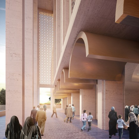
John McAslan + Partners is developing new designs for the huge Baitul Futuh Mosque complex in south London, which was damaged by a fire last year. (more…)

