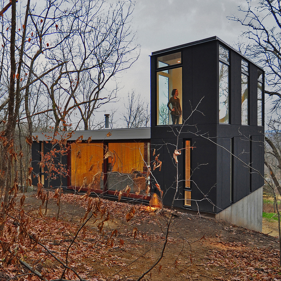
From the architect. The goals for this project were multi-faceted and ambitious- Design a new, modern, sustainable and energy efficient home that had the highest level of craft and attention to detail. The floor plan is open and spacious, providing function and flexibility, three of the five bedrooms are designed with flexible use in mind- they can be master bedrooms, an in-law unit, home office or family room. The house can be easily adapted to the needs of the owner, and it can change in time as the family grows and matures and needs change.
Special attention was paid to energy efficiency starting with the 10Kw solar PV system, which provides the energy for the 300% efficient mini-split heat pump heating and air conditioning. The house has an abundance of large windows, minimizing the need for lighting, which is 100% LED or high efficacy. Where possible materials were sourced to be reclaimed or made form recycled content. Indoor life quality is enhanced by the natural light, access to the exterior form every room and attention to indoor air quality.
The house was designed to be virtually maintenance free with pre-finished or naturally weathering materials.
1st Floor Plan
2nd Floor Plan
3rd Floor Plan
The architect/builder team were focused on providing the highest quality construction, with an obsessive attention to refining every detail, expressing the natural characteristics of materials and refining the sense of craft and quality in even the smallest details.
441 Tamalpais was designed and built as if we were going to live here. We considered the plan, details and materials we want in our house, and which we hope will adapt well to your house.
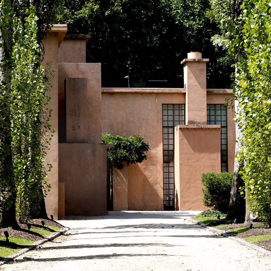
Kean University in New Jersey is purchasing three properties owned by late American architect Michael Graves, including the Princeton house and studio where he developed his Postmodern designs for 40 years. (more…)
White Arkitekter’s Copenhagen studio has been selected as winners of a competition to design 115 individual homes as part of a social housing project in Denmark’s Allerød Municipality. Located north of the capital city of Copenhagen, the new neighborhood will be bordered by forest and a lake, inviting the nature in to complement and screen individual buildings. The project, titled “By the Woods,” will attempt to subvert typical preconceptions about social housing through the blurring of public and private space.
In traditional affordable housing developments, public and private spaces are separated abruptly and unnaturally. In “By the Woods,” White Arkitekter has softened those lines by utilizing existing natural elements on the site, creating semi-public spaces that encourage residents to socialize in common areas.
“There is an unfortunate stigma attached to social housing; they are grey, static, generic, colossal buildings surrounded by parking lots, empty lawns and concrete,” says Morten Vedelsbøl, Creative Director at White Arkitekter in Copenhagen. “For us, it was important to have none of that, so we decided to let nature lead the way. Nature is dynamic and resilient – just like we want our neighbourhood to be”
The project consists of 155 row houses of two, three or four rooms arranged to match the hilly terrain of the site. Sustainably-sourced wood is used to clad both exterior facades and interior walls, and additional natural elements line spaces between the buildings and on rooftops.
“We deliberately created the sensation that nature is taking over. We wanted residents to have a sensuous experience with the woods when outside or looking through the kitchen window from the inside”, says Mikkel Thams, Design Architect and Project Manager at White’s Copenhagen studio.
To further blur lines between public and private, each unit features an individual terrace enclosed on the sides to encourage residents to move their living rooms outside. The terraces can also be used for garden beds or as an outdoor gathering space. There are, however, no fences throughout the complex, giving the neighborhood an open and inclusive feel.
“Traditionally, the transitions between private houses and the outside were abrupt, discouraging people from personalising common areas and the exterior of their homes,” explains Vedelsbøl. “This sends a signal that the community comes before the individual, but it also alienates residents from using common areas, which turns them into dead zones.”
From the architect. Drapers Field has a strategic role in the Olympic Legacy. This new park in east London is the first project integrating new Olympic developments within the Olympic Park to existing communities. KLA were commissioned to revitalise three parks in Leyton in the east London borough of Waltham Forest, through Olympic Section 106 funds. Working strategically in the Lea Valley on these projects, KLA were responding to the London Legacy Development Corporation’s direction to ‘Stitch the Fringe’ around the Olympic boundary.
Leyton is a key regeneration area bridging the existing east London communities, the new East Village (formerly the Athletes’ Village) and the Olympic Park. Drapers Field, which was used during the 2012 Olympics as a service facility, sits at this intersection of new and old. The new park at Drapers Field is linked – via the KLA designed Temple Mill Lane – to several Olympic Village projects: the Chobham Academy and Community Playing Fields and four residential plots. KLA made strategic proposals for all these sites and the practice has used design to help bridge the gap between different projects on either side of the Olympic boundary. Historically, Drapers Field was primarily used for football but was greatly under-utilised by the local community. The initial client brief called for the re-provision of the sports facilities, the refurbishment of the pavilion and the development of a play area. Building on the client’s initial brief, a shared goal emerged that both existing and new communities should bene t from the idea of a wider Olympic Legacy – a legacy that encouraged children and young people into sport, through play and informal activity. This informed the design focus.
Plan
Therefore, a main aim for the park was to create a place of sport and play on the route to school at Chobham Academy, which is located within the Olympic Village. KLA have designed the external spaces for Chobham Academy within the Olympic Village, making it easy to have a common aesthetic between the two sites.
In addition to improved sport facilities, the innovative landscape encourages informal play and other active uses such as a cycling route which can also be used for cycle training. The refurbishment of the pavilion – to become a key community hub and cafe – also has a new strong, physical relationship to the park. The new bold, large-scale corrugated landscape makes the whole landscape playable.
Section
The enticing corrugated forms, made of grass and concrete, enhance the play opportunities and challenges of the play equipment. Cutting through the corrugated grass plane, the playful route also encourages spontaneous activity on the trampolines and other play elements located along it. Water-play, embedded within the corrugated forms, incorporates water pumps and children can control the water’s ow through channels, creating splash pools. The playful route to school includes a bike track with space for obstacles and for basic bike skills courses. This relates to the London Cycling Campaign’s drive for safe cycling routes to schools and to GLA objectives. By increasing footfall into the Olympic Village, Drapers Field is now one of the main opportunities for the new and old community to meet and integrate. KLA have now completed the Chobham Academy project within the Olympic Village and have also designed Temple Mill Lane with a playful urban realm to promote play on the route to school.
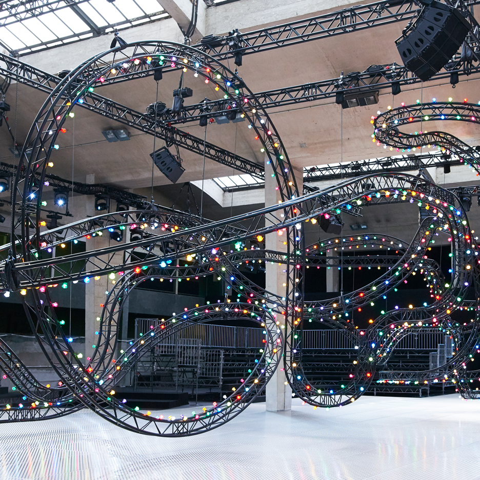
Brussels production studio Villa Eugénie designed a looping rollercoaster studded with multicoloured lights for Dior Homme’s summer 2017 catwalk show (+ slideshow). (more…)
Danish firm CF Møller have been tapped by the LEGO Group to design a 52,000 square meter (560,000 square foot) global hub for the company’s headquarters in Billund, Denmark. The design, which draws inspiration from the colored modular bricks for which LEGO is known, will provide new flexible work arrangements and community spaces centered around a brightly lit 4-story atrium, as well as a new public park for the campus.
Courtesy of C.F. Møller
The new construction will contain offices for a large portion of LEGO’s Danish-based employees, while also serving as a facility to welcome guests and LEGO employees from around the world. To foster interaction between these different groups, the building is designed to be open, with plenty of points where spontaneous meetings can occur. The new atrium will serve as the connection point for the facility, where wide curving staircases are shared by employees and guests and they move throughout the building.
LEGO-familiar motifs and elements have been employed throughout the complex, including round skylight apertures in the atrium reminiscent of holes in a LEGO block and facade panels that evoke the blocks’ stud pattern. The iconic LEGO yellow is featured throughout the interiors and as a pop of color on the building’s exterior.
Another feature of the new office building will be the LEGO People House, an area containing “playspace” facilities as suggested by input from LEGO employees.
“LEGO People House creates a unique social environment that serves as a vibrant, global gathering point, not only for the employees working there on a daily basis but also for the many LEGO employees from the rest of the world, when they visit Billund. It will house exciting facilities, where employees can be physically active and socialize, both during and outside working hours. It is our clear intent that the atmosphere will be both informal and inspirational, making it ideal for employees to get together with colleagues from around the world,” explains Claus Flyger Pejstrup, Senior Vice President at the LEGO Group, and responsible for the LEGO Group Headquarters in Denmark.
Courtesy of C.F. Møller
In addition to the facility’s progressive workplace design, the building also strives for progressive environmental practices; the structure has been oriented to provide optimal daylighting conditions for the office space and will be constructed to meet low-energy consumption standards. To embrace the surrounding community, the new park will be integrated into the master plan for Billund Municipality.
“In close collaboration with LEGO and employees, we have ensured that the project radiates openness, quality and sustainability – all key LEGO values,” says Klaus Toustrup, partner at CF Møller.
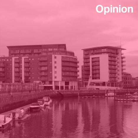
Opinion:Richard Rogers’ vision for a more European form of British architecture promised to create modern and prosperous urban environments. But this “new Europe” failed to reach the suburban council estates and cul-de-sacs that backed Brexit, says Owen Hatherley. (more…)
Three decades ago the Hongkong and Shanghai Bank (HSBC) Headquarters by Norman Foster emerged onto the architectural seen as an exemplary product of industrial design. The open layout with its exposed steel structure generated a powerful corporate identity for the bank. But the restrained atmosphere of white architectural lighting and the lack of distinctive façade lighting has lost its attractiveness after sunset. Now the colorful and dynamic relighting presents a remarkable example of how an architectural icon has shifted from a productivist ideology towards a scenographic image. To the western observer the multicolored light language may give off a playful impression, but to the local culture the transformation evokes grandiosity.
The briefing for Norman Foster was ambitious when the Hongkong and Shanghai Bank asked him to create “the best bank building in the world.” To add to the complexity the client requested a short timescale, which led to the pragmatic solution of a high degree prefabrication and the suspension structure which allowed the contractors to build efficiently both downwards and upwards. The architecture therefore embodies a functional product, as Kenneth Frampton characterizes this style: an open undecorated system with a flexible network and articulated structure characterized by industrial production.
Foster’s structure enables a generous daylight-filled atrium with a 50 meter-high glass wall and a large mirrored sunscoop that reflects sunlight down through the atrium to the public plaza below. For Chris Abel, the British born architectural theorist, the financial institution emanated a sense of a sacred building, as he wrote for The Architectural Review: “There is a lot more that is Gothic than Classical in all this structural and spatial magic, contrary statements about Foster’s work notwithstanding. If the ‘medieval’ services towers, ‘flying braces’ and ‘incomplete’ appearance of the building had not already promoted the idea, then the soaring proportions of the atrium … and the great translucent eastern window, easily justify the building’s popular description as a ‘cathedral of commerce.’”[1] But the productivist attitude suppressed the use of colorful stained glass windows—or any modern light-based equivalent—typical of gothic cathedrals and focused on white for daylight and illumination.
Foster and his lighting designer Claude R. Engle abstained from any decorative or expressive lighting effects in order to achieve a clear architectural message, with lighting as a servant for performance. Regarding the office lighting Engle used only three components: daylight, cool florescent lighting and warm halogen-tungsten lighting. This strategy allowed an easy conversion from a cool lit office area into a warm lit meeting zone for clients without a new installation. In that way the lighting design revealed a very pragmatic approach without losing a representative expression. For the high atrium, the recessed downlights seemed to vanish in the mirror ceiling thereby working with light and not luminaires as a design parameter. Special downlights with narrow beams minimized the glare for a discreet look. Hence when viewed as part of the city the HSBC skyscraper appeared to be softly glowing from within with a nice transparency for detecting interior patterns.
However, 30 years later the atrium lighting no longer fulfilled the bank’s expectations regarding their visual identity. In the meantime, Hong Kong had become much brighter, more colorful, and dynamic concerning lighting. The relighting of the HSBC atrium, designed by Simon McCartney & Peter Kemp and installed in 2015, now presents a distinct counterpoint. The subtle contrasts of cool and warm color temperatures have been substituted by saturated colored light. The LED and lighting control technology have opened an unprecedented flexibility to change hue and saturation. Clean lines emphasize the horizontal structure of the floors and the sunscoop mirror ceiling. They add spectacle and drama to the grand hall. In contrast to the original design the luminaires are clearly visible now.
The large opaque eastern façade, which fills the atrium at daytime with diffuse daylight and which did not have a representative illumination in the original concept, is turned by the new lighting into a colorful pixel screen. Here, invisibly installed luminaires and light sequences are synchronized with the atrium edges and the mirror ceiling. The expressive static building structure vanishes in the evening in favor of a bright, dynamic spectacle of colored lines and pixels to reflect a modern corporate identity for clients and employees. In contrast, the relighting of some executive areas in the HSBC building were more conservative regarding the relighting and luminaire design, with downlights and pendant elements.
However, the first major lighting change at HSBC was even more extravagant than the atrium lighting, and was already installed about a decade earlier, in 2003, for exterior branding. Thus the façade illumination has changed from a discreet glow from within into colorful light lines and bright search lights to create a beacon of light for the Hong Kong skyline, designed by Simon McCartney for Laservision. Since 2004 the Hong Kong Tourism Commission has tried to become a benchmark for city marketing in Asia with the largest sound and light show in the world. With globalization, rising economic competition and political changes, the city has looked to tourism to increase business and to mark a strong, modern and dynamic identity. For the nightly 14 minute show, called “Symphony of Light,” the team from Laservision analysed the skyline and its buildings in regard to the visibility of structures to select significant architectural forms and textures. The show has already undergone five phases of upgrades and now incorporates 45 buildings located on both the Hong Kong and Kowloon sides of Victoria Harbour. Without the façade lighting update, the HSBC building would not have been recognizable as a relevant player for the urban light show.
Nevertheless the 2003 façade lighting did not cover the new expectation of higher visibility and more explicit messages of brand communication. For that reason the façade lighting was amplified with a media wall for the 150th HSBC anniversary in 2015. The new sophisticated media screen, designed by Simon McCartney & Peter Kemp at illumination Physics, enables a legibility from a distance of 100 meters, as well as from the opposite side of Victoria Harbour 2-3 kilometers away. Small vertical LED strips, applied to the inside of the façade, enable a high transparency for the façade and yet the strips appear invisible from outside at daytime. Additionally, the old façade lighting was completely updated with LED technology, which led to an increase of possible hues, more saturation, far less energy consumption and longer lamp life for less maintenance. Synchronized with the façade lighting, the media walls offer a very flexible infrastructure for independent content or echoing the effects of the architectural lighting on the screen or vice versa. The triangular animations and kaleidoscopic patterns refer clearly to the HSBC logo for luminous branding. There’s even a smart phone application which enables people to follow the scenography in real-time on their phone wherever they are. With this new media content the HSBC strives again for visual leadership in Hong Kong´s skyline.
Erected on the ground of a British colony as a distinctive British high-tech office tower, localized with a feng shui geomancer, the HSBC building resides now on an autonomous territory of China. The search for a new identity, significantly influenced by globalization, has led to a new luminous mask to conceal a tough and cold finance building. This colorful overlay of pattern, made of light, has turned the HSBC into an obvious dualism: at daytime it conveys the cool rational image of productivism, but at night the explicit scenography demonstrates a soft emotional character. The brightness of the façade has induced a loss of transparency in favor of luminous decoration, where light has become a brand message. For the western observer this multi-colored and dynamic attention-seeking might embody a loss of clear identity for a respected bank. However, the grand light gesture at HSBC, in combination with the city-wide Symphony of Light show, has positioned Hong Kong as one of the world’s most visited cities, where people regard the colorful scenery at night as more beautiful than at daytime.
But not everyone is excited about the luminous prosperity of Hong Kong. Environmentalists and astronomers have already pointed out the negative effects of light pollution. Jason C.S. Pun, Astronomer at the University of Hong Kong, has found that the night is on average 1000 times brighter in his city than a natural night due to the light used for advertisement and decoration. This loss of the night makes seeing stars impossible.
The trend of global urbanization will bring more buildings into our cities where owners will not tolerate a modest visual identity at night, but seek to send explicit luminous messages into the urban environment. Hence, conflicts will intensify with the public and environmentalists about nocturnal lighting. This 30 year review of the HSBC’s lighting history may even appear small when compared to contemporary skyscraper developments. For instance the super-tall Shanghai Tower by Gensler from 2015 has already set a new benchmark for monumental urban scenography. Its media facade was implemented from its opening, covering the entire 632-meter skyscraper, and appears as an urban movie screen. It is a challenge to imagine how this building and its environment will look in 30 years: Will the latest LED technology last without a larger relighting within this time? Which lighting language will create an appropriate meaning and icon? Will the citizens be able to appreciate the beauty of the urban night and gaze at stars again?
References
Abel, Chris, A building for the Pacific Century. The Architectural Review, July 1986
Light matters, a monthly column on light and space, is written by Thomas Schielke. Based in Germany, he is fascinated by architectural lighting and works as an editor for the lighting company ERCO. He has published numerous articles and co-authored the books “Light Perspectives” and “SuperLux”. For more information check www.erco.com, www.arclighting.de or follow him @arcspaces.
From the architect. The proposal for the 90 square meter Repossi flagship on Place Vendome divides the store into three distinct spaces – contextually referred to as street, gallery and salon. Based on the idea that the collection of jewelry will be experienced and purchased at three different speeds – fast, slow, very slow – each floor responds to the different paces of shopping.
The ground floor is the most public space. It works as an extension of the street providing a quick experience of the store. The first floor is a gallery, the level where the entire Repossi collection is exhibited. The basement is a salon. The most intimate space of the boutique, it allows customized service for clients and patient exploration of special pieces.
The underlying idea for the design was to synthesis architecture and display, using the whole space as a stage for Repossi’s production. Unconventional materials were used, emphasizing this relationship and pulling away from the typical jewelry store. Special colored mirrors developed in collaboration with Dutch designer Sabine Marcelis introduces diverse degrees of reflections and color refractions. Aluminum cladding – both plain and foam – fold over the volume of the staircase and expand onto each floor.
Movement is an integral component of the project. The wall on the ground floor is conceived as a gigantic rotating billboard with three alternating sides: a bronze colored mirror, a traditional mirror, and a display system. Developed in collaboration with Italian-based manufacture, Goppion, the kinetic installation is both display and architecture,transforming the space while adapting to alternating functions. When the jewelry is not displayed, the ground floor is transformed into a pure void, leaving the space free for unlimited occupancies. In the overcrowded retail context of Place Vendome, a “void” is the ultimate form of luxury.
The staircase, an imposing presence in the 90 square meter store, is designed by overlapping two vertical systems: a solid excavated mass that extends between the ground floor and the basement, and a light suspended tread floating between the ground floor and the first level.
Liberated from the traditional requirements of jewelry display, the new flagship store creates an immersive setting, where jewelry is subtly embedded into an architectural void.