AD Classics: Parish of the Holy Sacrifice / Leandro V. Locsin


Courtesy of Wikimedia user Allan Jay Quesada

Courtesy of Wikimedia user Allan Jay Quesada

Once dubbed a “flying saucer,” the Parish (Church) of the Holy Sacrifice is a Modernist expression which embodies the complex colonial history of the Philippines. Located on a university campus in Quezon City (formerly the capital of the nation, now a part of the Metro Manila National Capital Region), the domed concrete church was the product of Filipino architect Leandro Locsin, and of three other national artists who contributed to the building’s interior.[1] Locsin’s design, which combines elements of traditional Filipino architecture with postwar International aesthetics, is a potent symbol of a newly-independent nation following centuries of imperial control.


Courtesy of Wikimedia user Ramon FVelasquez


Courtesy of Wikimedia user Ramon FVelasquez


Courtesy of Wikimedia user Ramon FVelasquez


Courtesy of Wikimedia user Ramon FVelasquez

Naikot ko na ata ang buong UP campus bago pa kita nahanap. Be back soon #VisitaIglesia

A photo posted by @dovz_tinajora on Mar 26, 2016 at 6:23am PDT

//platform.instagram.com/en_US/embeds.js

The Republic of the Philippines was one of the many governments to rise from the ashes of the Second World War. The new country’s independence on July 4, 1946, saw the Filipino people liberated from imperial control for the first time since Spain took control of the archipelago in the late 16th Century. The colony passed from Spain to the United States in 1898 as a result of the Paris Treaty that ended the Spanish-American war. Plans to transition the colony to independence were delayed by the outbreak of the war and subsequent Japanese invasion in 1941. At the war’s end, the Philippines was finally given its long-awaited freedom, but at enormous cost: its capital, Manila, had been almost totally destroyed during Japan’s retreat from the islands.[2]


Courtesy of Wikimedia user Ramon FVelasquez

Courtesy of Wikimedia user Ramon FVelasquez

One of the most prominent architectural losses caused by the conflict were the country’s many Catholic churches. Catholicism had reigned supreme on the islands since the arrival of conquistador Miguel Lopez de Legazpi in 1565; the missionaries attending him, along with their brethren to follow, erected hundreds of Baroque, Neo-Gothic, and Rococo churches throughout the Spanish imperial era. These structures, which typically dominated the central squares of colonial communities and served as fortifications for the Japanese, became primary targets toward the end of the occupation. When the time came to rebuild, the process was carried out by a new wave of architects trained or influenced by the United States – among them, Leandro Locsin.[3]

Locsin studied at the University of Santo Tomas in Manila between 1947 and 1953. The prevailing trend in Filipino architectural practice at the time was to emulate the Modernist architecture of the West, an attitude which stemmed from the impression that such buildings represented order, progress and sophistication. More traditional architecture, especially indigenous design, was popularly seen as unsophisticated. Although Locsin worked in the Modernist style, he was noted as being one of the only contemporary designers to capture a “distinct Philippine look” in his designs.[4]


Courtesy of Wikimedia user Ramon FVelasquez

Courtesy of Wikimedia user Ramon FVelasquez

Shortly after Locsin’s graduation from the UST, he was commissioned by Frederic Ossorio to design a school chapel for the Victorias Milling Corporation. Once the design was underway, however, Ossorio was called away to the United States, and the project ultimately fell through. In 1954, Locsin met Father John Delaney, who was seeking an architect to design a chapel for the University of the Philippines campus at Diliman. With permission from Ossorio, Locsin adapted his previous design for the university.[5]

Delaney’s primary directive for the project was that the chapel should reflect the spirit of the youths who would worship there. Noting that the students tended to sing the Mass in unison, Locsin drafted a circular plan that dissolved the traditional boundary between the congregation and choir.[6] This egalitarian sensibility was further enforced by the placement of the altar at the center of the chapel; a symbolic gesture that, while in line with Delaney’s wishes, was found ill-suited to traditionally linear Catholic rites. There was no single, defined entry point, with several entrances distributed evenly around the perimeter of the chapel. The space was sheltered by a concrete dome, supported by reinforced columns and a ring beam; the apparent lightness of this structure earned the Parish its nickname, “the flying saucer.”[7]


Courtesy of Wikimedia user Ramon FVelasquez

Courtesy of Wikimedia user Ramon FVelasquez

The decentralized, open nature of the Parish of the Holy Sacrifice forced Locsin to use vertical dimensions and light to define independent spaces. The low ceiling forming the rim of the chapel promotes movement from the exterior to the interior of the space, humbling visitors as they enter into a place of worship. The transition from the glaring tropical daylight of the Philippines to a shaded concrete passage further emphasizes the sense of movement toward a different, sacred, environment. Once one passes through the peripheral ring, the ceiling rises toward the apex of the dome, which is brightly lit by clerestory windows at the dome’s base – a gesture that simultaneously unifies the worship space and differentiates it from the surrounding passage, all without the use of boundary walls.[8]

In this place, no one's alone 🙏🏻 #vscocam #architecture

A photo posted by Drew Gozar (@archtgozar) on Sep 15, 2015 at 7:13am PDT

//platform.instagram.com/en_US/embeds.js

Locsin’s chapel initially appears to eschew Filipino tradition entirely, favoring the contemporary design sensibilities of the Western nations that had, until just nine years earlier, been a controlling architectural vocabulary in the Philippines for centuries. The concrete shell dome was, at the time, a new development in Asia – a form without precedent in regional architectural tradition. However, while colonial churches in the Philippines were noted for massive, bottom-heavy walls to withstand frequent earthquakes, the Parish of the Holy Sacrifice’s shell is characterized by visible lightness; at its summit, the dome is only ten centimeters thick. This suspended lightness hints not at Spanish or American influences, but at a traditional Filipino forebear: the bahay kubo (“cube house”).[9]


Example of a typical "bahay kubo". ImageCourtesy of Flickr user Neil Bryan Sietereales

Example of a typical "bahay kubo". ImageCourtesy of Flickr user Neil Bryan Sietereales

The bahay kubo, the traditional indigenous home built in the Philippines, comprises a single-room house built of bamboo with a steep thatched roof, set atop stilts. The elevation and permeable walls keep the bahay kubo ventilated, cool, and dry – highly desirable qualities in the tropics.[10] The elevation of the house gives it the appearance of suspension in midair, a quality Locsin mimicked for the Parish of the Holy Sacrifice’s dome.[11]


Courtesy of Wikimedia user Ramon FVelasquez

Courtesy of Wikimedia user Ramon FVelasquez

The Parish of the Holy Sacrifice was formally inaugurated on December 20, 1955, with a midnight candlelight procession. Almost immediately, the chapel became a popular center for the faithful in Metro Manila, a status it retains to this day.[12] It is also an enduring symbol of what Locsin himself referred to as a “hybrid culture;” while many Filipino architects continue to emulate the aesthetics of contemporary American architecture, Locsin’s “flying saucer” remains one of the few prominent examples of distinctly Filipino Modernist design.[13,14]

References

[1] “The University” (PDF). University of the Philippines Diliman. Retrieved 3 May 2014. [access] p8.
[2] Encyclopædia Britannica Online, s. v. “Philippines”, accessed June 22, 2016, [access]
[3] Rodell, Paul A. Culture and Customs of the Philippines. Westport, CT: Greenwood Press, 2002. p82-85.
[4] Paredes-Santillan, Caryn. “A Study on Bipolarity in the Architecture of Leandro V. Locsin.” Journal of Asian Architecture and Building Engineering JJABE 8, no. 1 (2009): 1-8. p3-4.
[5] “The University.” p8.
[6] De Ayala, Fernando Zóbel. “The Chapel of the Holy Sacrifice at the University of the Philippines.” Philippine Studies 5, no. 1 (1957): 1-8. [access]. p2-7.
[7] Paredes-Santillan, Caryn. “Approaching The Sacred: A Study Of The Spatial Manifestations Of Liminality In The Churches Of Leandro V. Locsin.” Accessed June 22, 2016. [access]. p4-7.
[8] Paredes-Santillan, “Approaching the Sacred.” p8-9.
[9] Ogura, Nobuyuki, David Leonides T. Yap, and Kenichi Tanoue. “Modern Architecture in the Philippines and the Quest for Filipino Style.” Journal of Asian Architecture and Building Engineering JJABE 1, no. 2 (November 2002): 233-38. p237.
[10] Hila, Ma Corazon A. Arkitektura: An Essay on Philippine Ethnic Architecture. Manila: Sentrong Pangkultura Ng Pilipinas, 1992. p11.
[11] Ogura et al, p237.
[12] De Ayala, p8.
[13] Paredes-Santillan, “A Study on Bipolarity in the Architecture of Leandro V. Locsin.” p8.
[14] Ogura et al, p238.

  • Architects: Leandro V. Locsin
  • Location: Laurel Ave, U P Campus Diliman, Philippines
  • Architect In Charge: Leandro V. Locsin
  • Muralist: Vicente Silva Manansala
  • Sculptor: Napoleon Veloso Abueva
  • Floor Tile Designer: Arturo Rogelio Lu
  • Project Year: 1955
  • Photographs: Courtesy of Wikimedia user Allan Jay Quesada, Courtesy of Wikimedia user Ramon FVelasquez, Courtesy of Flickr user Neil Bryan Sietereales
http://ift.tt/295mLfQ

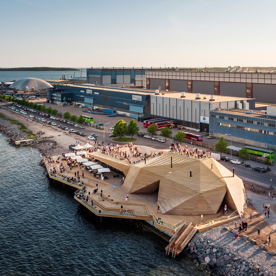
Avanto Architects builds coastal sauna in Helsinki with a faceted timber “cloak”


Wooden slats and bleachers provide the multi-faceted volume of this waterfront sauna by Avanto Architects, allowing visitors to climb the roof for a better view of the sea or to lounge in the sun (+ slideshow). (more…)

http://ift.tt/299JJoA

A Prototype of a Family House / a69 Architekti


© Tomáš Rasl

© Tomáš Rasl


© Tomáš Rasl


© Tomáš Rasl


© Tomáš Rasl


© Tomáš Rasl

  • Architects: a69 Architekti
  • Location: Czech Republic
  • Architect In Charge: Boris Redčenkov, Prokop Tomášek, Jaroslav Wertig
  • Design Team: Michal Nohejl
  • Area: 235.0 sqm
  • Project Year: 2015
  • Photographs: Tomáš Rasl
  • Main Contractor: DIY
  • Technical Design: OMEGA project s.r.o.
  • Construction: Radek Brandejs

© Tomáš Rasl

© Tomáš Rasl

From the architect. A prototype of a family house is built in a former granite quarry in Posázaví.

The purpose of this built project is to check structural, typological, and user qualities of the prototype. 


© Tomáš Rasl

© Tomáš Rasl

The house is located on the edge of a rock above a lake. The project preserves grown trees, emphasizes the view to the water, and allows access to the meadow in the middle of a forest.


Sketch

Sketch

A simple cubic mass 15x15x4 m contains interior spaces formed in a more complex manner.


© Tomáš Rasl

© Tomáš Rasl

Organically moulded labyrinth of the interior habitable space allows more day- and sunlight, vistas out and through from the depth of the layout.


Ground Floor Plan

Ground Floor Plan

The house hovers over the landscape, it is not founded traditionally. A steel load-distributing modular raft is bedded on existing granite blocks – remnants of former mining. A 2×4 timber frame is erected on the raft. The roof structure is nailed trusswork. The roof is flat finished with extensive green. The façade is ventilated made of lumber. Windows are aluminium.


© Tomáš Rasl

© Tomáš Rasl

A sliding glass wall provides for connecting the living area with an outdoor terrace on the meadow.


Exploded Axonometric

Exploded Axonometric

The interior is monochromatic using different shades of white – a neutral frame for colours of the forest at different periods of a day and year.


© Tomáš Rasl

© Tomáš Rasl

The house is a DIY type.

It can be taken into pieces, it may disappear without a trace left.


© Tomáš Rasl

© Tomáš Rasl

http://ift.tt/29h9BOy

Luigi Rosselli Architects Renovate a Home in Sydney, Australia

Twin Peaks by Luigi Rosselli Architects (7)

Twin Peaks is a private residence renovated by Luigi Rosselli Architects. It is located in Sydney, Australia and was completed in 2015. Twin Peaks by Luigi Rosselli Architects: “A Queen Anne style residence reveals its hidden character and history in the late night lights. Two crisp zinc roof gables, observing the shadows on the narrow footpath, guard the new entry door. The early 1900s bricks, shingles and Elizabethan windows have..

More…

Löyly / Avanto Architects


© kuvio.com

© kuvio.com


© kuvio.com


© kuvio.com


© kuvio.com


© kuvio.com

  • Architects: Avanto Architects
  • Location: Hernesaarenranta 4, 00150 Helsinki, Finland
  • Architect In Charge: Ville Hara and Anu Puustinen, Architects SAFA
  • Client : Antero Vartia and Jasper Pääkkönen, Kidvekkeli Oy
  • Operator: Royal Restaurants
  • Area: 1071.0 sqm
  • Project Year: 2016
  • Photographs: kuvio.com
  • Project Management: Qtio Oy
  • Assistants: Antti Westerlund, architect SAFA / Hiroko Mori, architect / Laura Nenonen, student of Architecture / Xiaowen Xu, student of Architecture
  • Interior Architect: Joanna Laajisto Creative Studio / Joanna Laajisto
  • Structural Design: Ramboll Finland Oy / Hans Wilkman, Teemu Nyyssönen
  • Marine Structures: Ramboll Finland Oy / Juha Kärkkäinen
  • Steel Structural Design: SS-Teracon Oy / Reijo Kytömäki, Ville Korkiamäki
  • Glass Structures: Lasifakta Oy / Tahvo Sutela
  • Hvac Designer: Optiplan Oy / Evgeny Nikolski, Aleksei Lätti
  • Electric Design: Optiplan Oy / Jari Muunoja
  • Prime Contractor: Rakennustoimisto Jussit Oy
  • Foundation Works: Kanta Kaivu Oy
  • Electric Contractor: Elektro Asennus Oy
  • Hvac Contractor: Uudenmaan LVI-Talo Oy
  • Timber Furniture Contractor: Puupalvelu Jari Rajala Oy
  • Steel Structures: VMT-Steel
  • Sauna Stoves: Tulisydän Oy and Iki-Kiuas Oy

© kuvio.com

© kuvio.com

Sauna culture
Sauna bathing is an essential part of Finnish culture and national identity. There are only 5,4 million Finns but 3,3 million saunas. Public saunas used to be common in bigger cities but now that most new apartments have sauna of their own, public saunas have decreased dramatically in number. There are only a couple remaining. As a sense of community is becoming a more and more important part of new urban culture, many new public saunas are being planned. With Löyly (meaning the steam that comes when you throw water on hot stones in a sauna) Helsinki will offer foreign visitors a public sauna experience all year round – a must when visiting Finland.

Process
The project started from the city of Helsinki initiative. Hernesaari is a former industrial area on the Helsinki seashore that is being developed into a residential area. New uses are being developed for the area, while waiting for future changes to come. There is a cruise ship harbor in Hernesaari and the city wanted to activate the area with new functions and to serve visitors with new attractions. We started the project in 2011 designing a temporary sauna village at the furthermost end of the peninsula. The concept didn’t prove financially sustainable so the first client quit the project. We developed a floating sauna with the second client but the concept proved impossible as the site faces the open sea and a floating structure couldn’t withstand high waves and pressure from ice packs. The coastline will change with future development, but the city chose an area where the shoreline will remain as it is currently. We developed a new free form concept with triangular faces. The client changed once again and as actor Jasper Pääkkönen and Member of Parliament Antero Vartia finally got funding, the construction works could begin.


© kuvio.com

© kuvio.com

Context
The site is unique. Being less than two kilometers away from the city centre, it is very central but at the same time the landscape is like in the outer archipelago. The plot is situated in a future coastal park that will be part of a broader “Helsinki park” connecting the capital city to the sea. The building was designed to be slim and elongated so as not to cut the narrow park strip. The volume is kept as low as possible so that it doesn’t block views from the future residential blocks. Instead of building a conventional building, the sauna is developed into an easy-going, faceted construction that is more part of the park than a conventional building. When the wooden building turns gray, it will become more like a rock on the shoreline.


© kuvio.com

© kuvio.com

Plan

Plan

© kuvio.com

© kuvio.com

Architecture
The architectural idea is simple: there is a rectangular black box containing the warm spaces that is covered with a free form wooden “cloak”. Instead of being mere decoration, the sculptural structure made of heat treated pine has several functions. It provides people with visual privacy. However, the lamellas don’t limit the sea view from inside it, rather they function like venetian blinds and blocking the views from outside. There are sheltered outside spaces between the warm mass and cloak to cool down in between sauna bathing. The cloak forms intimate terraces between its slopes that serve as a place to sit. The structure protects the building from the harsh coastal climate. It shades the interior spaces with big glass surfaces and helps to reduce the use of energy to cool the building. Moreover, the stepped cloak forms stairs to climb on to the roof and look out terraces on top of the building. The construction forms a big outdoor auditorium for the future marine sports centre’s activities on the sea. There are around 4000 planks that were precisely cut to individual forms by a computer-controlled machine. The big wooden terrace is partly on top of the sea and you can hear the sound of the waves under your feet.


© kuvio.com

© kuvio.com

Spatiality
The building consists of two parts: public saunas and a restaurant. The saunas and public spaces open up to the sea, with interesting views to city center and even to the open sea. The atmosphere is calm and the spaces dimly lit. Different areas are conceived as spaces within a space. Interesting views open between closed spaces as you move from one area to the next. You enter in the restaurant that is a light and open space. From there a dimly lit sauna path leads to bathing area. Shoes are left in a wardrobe before you go to a reception desk where you get a locker key and a towel. Dressing rooms and showers are separate for men and women. A leather curtain covering the door indicates entry into the unisex area, at which point visitors need to wear a bathing suit. Traditionally men and women bath separately and naked. We wanted to develop sauna culture so that there would be a possibility bath together with your friends not depending on the gender. This makes sauna experience available also for foreign visitors that might not be used to bathing naked.


© kuvio.com

© kuvio.com

Interior
The interior architecture of the restaurant and the sauna lounge is by Joanna Laajisto Creative Studio. The objective of the design was to create an atmospheric restaurant which compliments the strong architecture of the building. The approach could be called soft minimalism. The challenge was to create intimate seating areas in the large hall like space with two walls of windows. People often feel most comfortable sitting their backs against the wall. The solution was to build a raised platform for the bar area which divides the space into two different areas. A wooden half wall anchors the long custom designed sofas which have a great view of the sea.


© kuvio.com

© kuvio.com

Plan

Plan

© kuvio.com

© kuvio.com

The main materials used in the interiors are black concrete, light Scandinavian birch wood, blackened steel and wool. All materials are durable and long lasting. The wood used is pressed, glued and slightly heat treated birch, a new sustainable Finnish innovation made of left over materials of the plywood industry that normally is burned to produce energy. This is how waste is turned into a beautiful recycled material. It´s manufacturing process produces a beautiful cool light color tone and heavy durability. 


© kuvio.com

© kuvio.com

In addition to the long sofas, Laajisto´s office has used the glued laminated birch on walls, tabletops, the long bar and even in the unisex toilet sink. The upholstered chairs, which add softness to the space, are by Italian manufacturer Torre. All fabrics are soft natural wool by Kvadrat. The bar stools are by Gubi and the wooden chairs in the sauna lounge are by Finnish Nikari.
The String lights designed by Micheal Anastassiades for Floss create a subtle rhythm to the space without blocking the views of the Baltic Sea.


© kuvio.com

© kuvio.com

Saunas
There are three different saunas that are all heated with wood: a continuously heated sauna, a once heated sauna (that is heated in the morning before the sauna is open and stays warm all evening) and a traditional smoke sauna – a true rarity in an urban sauna. This is how you can experience all sorts of Finnish Löyly during a single visit. Between the saunas there is spa area with cold water basin and a fire place room to relax in, between or after sauna bathing. You can swim in the sea and in the winter there is an “avanto”, the whole in the ice for winter swimming – a popular hobby in Finland and our office name as well.


© kuvio.com

© kuvio.com

Sustainability
The building is heated with district heating and electricity is produced with water and wind power. The building is first FSC-certified building in Finland and second in Scandinavia. Forest Stewardship Council’s certificate proves that wood material comes from responsibly managed forests. The restaurant serves organic food and sustainably caught fish.


© kuvio.com

© kuvio.com

http://ift.tt/29bultv

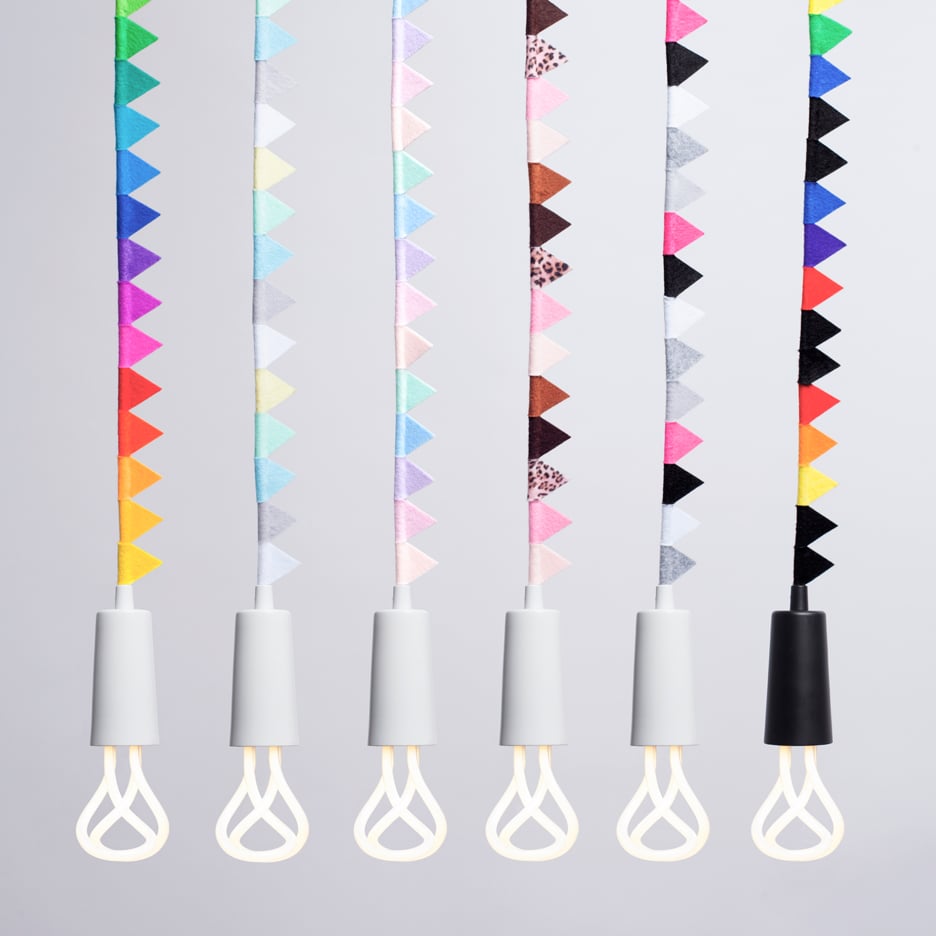
Plumen releases pendants with miniature bunting for kids


Lighting brand Plumen is the latest to enter the children’s design market, adding strands of colourful bunting to its low-energy pendants (+ slideshow). (more…)

http://ift.tt/296gmlz

W House / SLOW office


© Zhiwei Fei

© Zhiwei Fei
  • Architects: SLOW office
  • Location: Beijing, Beijing, China
  • Area: 285.0 sqm
  • Project Year: 2012
  • Photographs: Zhiwei Fei


© Zhiwei Fei


© Zhiwei Fei


© Zhiwei Fei


© Zhiwei Fei

From the architect. This is a studio and residence built from the renovation and expansion of a small single-story building inside a factory campus. The original building is brick structure with slope roof. Now we take away the old roof and change it into three stories by making use of original brick walls and adding new light wooden structure walls.


© Zhiwei Fei

© Zhiwei Fei

Since the surrounding environment is relatively messy, we put office and workshop which is not so private on the first floor facing the campus and make the outside relatively close. the living functions are put onto the second floor from where the orchard and farmland on the west can be seen. The third floor consists two lofts and an outdoor terrace.


© Zhiwei Fei

© Zhiwei Fei

The functions are organized as a series of platforms, from office on first floor, then dining room, living room, kitchen on second floor, finally to loft and terrace on third floor, spiraling up the two-story high atrium.The height differences between the platforms are determined in a way that some of the terraces are floors as well as big seats where people can sit leisurely. Due to the adjustment of sightlines by design of openings, the messy factory is hardly seen from the living space and the main view becomes the orchard. These treatments create a very casual atmosphere that when friends come to visit, they can sit and chat in the living space naturally without any cabined feeling.


© Zhiwei Fei

© Zhiwei Fei

Plan

Plan

© Zhiwei Fei

© Zhiwei Fei

We set not handrail but walls with big openings surrounding the atrium. This has concerns about the space as well as the function of strengthening the structure. With these walls, the entire space cannot be seen at one sight. A layered space that is separated and connected at the same time is created.


© Zhiwei Fei

© Zhiwei Fei

Now the first floor has a wood workshop along with our architecture office. The samples of our wood products are also made here.


© Zhiwei Fei

© Zhiwei Fei

http://ift.tt/29e5i9g

DeeRoemah / Wahana Architects


© Fernando Gomulya

© Fernando Gomulya


© Fernando Gomulya


© Fernando Gomulya


© Fernando Gomulya


© Fernando Gomulya

  • Architects: Wahana Architects
  • Location: South Jakarta, South Jakarta City, Special Capital Region of Jakarta, Indonesia
  • Gerard Tambunan: Gerard Tambunan
  • Area: 196.0 sqm
  • Project Year: 2015
  • Photographs: Fernando Gomulya
  • Contractor: Wahana Cipta Selaras
  • Lighting: Liam Sak Khian
  • Site Area: 280 m2
  • Landscape Area: 104 m2

© Fernando Gomulya

© Fernando Gomulya

From the architect. Located in a rather busy midtown of Jakarta, DeeRoemah is a renovation project of a two-storey house on a 280 m2 irregular shaped site which comprises of 1 master bedroom, 3 child/guest bedrooms, living room, dining room, kitchen, office and storage.


© Fernando Gomulya

© Fernando Gomulya

Recognizing the potential of the surprisingly serene neighborhood, an honest design approach was developed for this particular project. The design should be humble and merge with its neighborhood. The main idea is simply to conserve the existing mass and modify it by utilizing the space under the roof on one side of the L-shaped building as a full story – letting it ‘naturally fit’ the urban setting.


© Fernando Gomulya

© Fernando Gomulya

On the first floor, the living room, dining room and kitchen are designed as transparent as possible towards the surrounding outdoor garden in which the existing trees are preserved to blur the inside-outside boundary, whilst each of every bedroom has the view of a small courtyard.


© Fernando Gomulya

© Fernando Gomulya

Floor Plans

Floor Plans

© Fernando Gomulya

© Fernando Gomulya

The semi public office on the second floor, which can only be accessed by the outdoor twirled stairs, also adapt the same level of openness as it is surrounded with clear glass looking through the terrace and garden. A see-through wooden plane (which is from re-used material of the waste from Furniture Factory) is positioned diagonally at one end as a natural shade where its honest craftsmanship accentuates the silhouette of a ‘kampong’ house. It also works as a building skin to cover inside the office activity from the outside and neighborhood.


Section

Section

Supporting the concept, the range materials used for this project were simplified. The cement-textured finish dominates the entire house with a hint of raw wood detail on the façade and metal for the outdoor staircase.

The need of railing was decoyed by a gray planter box with dangling vegetation while to compress the actual height of the house, a new contoured garden was reset. The landscape element is effortlessly used to soften the whole design.


© Fernando Gomulya

© Fernando Gomulya

Constraints and Solutions achieved

The main concern of this project is the client’s budget and the neighborhood.

The solution we took is to preserve the existing concrete structure and re-use some of the materials. This will cut the budget while also can work so that the new and renovated house not so-far different with its ‘kampong’ like neighborhood.


© Fernando Gomulya

© Fernando Gomulya

Details of landscaping

There are existing trees in the previous house that we preserve and integrate in the new design. The landscape and hardscape of this project really help to create an interesting ambience inside the house. It creates shades for the building while creating mood inside the house and living area.


© Fernando Gomulya

© Fernando Gomulya

Description of the Climatic situation

The project is located at a tropical climate in Indonesia. It is important for the house to have a cross ventilation to keep up with the humidity while also use the passive energy. On daily basis, the glass doors and window are open. The natural air breezes in to the house. And the clear glass and skylight works well to insert the natural light all day long. The vertical garden and wooden panel help to create shades inside the house.


© Fernando Gomulya

© Fernando Gomulya

Cultural

The re-used materials such as clay roofing and wooden panel on the façade of the building help the building to merge with its natural surrounding and its neighborhood. The newly construct upper level looks no different than the houses and other houses on neighborhood from the outside. The building holds critical cultural standpoint in the neighborhood. It is important so that the building and its habitant can communicate in the new area and creates no cultural and economical shocks that may appear, to the neighborhood.

http://ift.tt/293GMT3

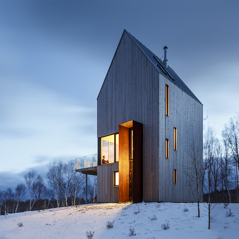
Rabbit Snare Gorge cabin sits on a bluff in remote Nova Scotia


Plates of weathering steel frame the tall doorway to this timber-clad home, designed by architects Design Base 8 and Omar Gandhi for a remote site on Canada‘s Cape Breton (+ slideshow). (more…)

http://ift.tt/291mf0T

Violet Stream Villa Sales Center / Wutopia


© Shao Feng

© Shao Feng


© Shao Feng


© Shao Feng


© Shao Feng


© Shao Feng

  • Architects: Wutopia
  • Location: Suzhou, Jiangsu, China
  • Architects In Charge: YU Ting, HUANG He
  • Area: 100.0 sqm
  • Project Year: 2015
  • Photographs: Shao Feng

© Shao Feng

© Shao Feng

From the architect. The mission to the architect is quite clear, the sales center must be finished in one week including 2-day design, 5-day construction.


 For the sake of building up the sales center quickly, using thin-walled light gauge steel structure with sandwich board and polycarbonate sheet as bounding system is the only choice for architect.


© Shao Feng

© Shao Feng

The Violet Stream Villa is close to the beautiful Yangcheng Lake Peninsula in Suzhou, which is a city filled with the most famous transitional Chinese Garden. Architect wanted to apply spirit of gardens into the center. He created clear fence and complex inside place with dimed architecture and patio. He created a chiaroscuro and garden walking with constant climax in this center which was called by the architect, a net shell.


© Shao Feng

© Shao Feng

The red was used to cover some unavoidable flaws during the fast construction at first, turned out as a highlight landmark comparing to green trees and blue lake. The other conclusion the architect found is red could erase detail and volume while produce richness at the same time.  As in HAMLET‘ I could be bounded in a nutshell and count myself a king of infinite space. ’


The center only stood there for 1 month. It was demolished after villas sold out as a result of eruptible real estate blooming. So the client called it, the instant red.


© Shao Feng

© Shao Feng

http://ift.tt/294zq2E