Architecture
BC Passive House Factory / Hemsworth Architecture

© Ema Peter
- Architects: Hemsworth Architecture
- Location: Pemberton, BC V0N, Canada
- Area: 1500.0 sqm
- Project Year: 2014
- Photographs: Ema Peter
© Ema Peter
The BC Passive House Factory is an all wood construction demonstration project located in Pemberton, BC. Conceived as a simple, light filled, wooden box, the new 1500 sm facility is designed for the manufacturing of prefabricated ‘Passive House’ panels. The design, fabrication, and construction of the new facility exemplifies the client’s, BC Passive House (BCPH), mission in wood construction, prefabrication, energy efficiency, and sustainable design practice.
© Ema Peter
Section
© Ema Peter
The main inspiration for the design came from the belief that the industrial, everyday buildings that make up a vast amount of our built environment can be just as important, and well considered, as our ‘public’ buildings. 360-degree clerestory windows provide natural daylight and views to the surrounding mountains. The exterior wood ‘2×4’ cladding acts as fixed screens for the clerestories and have been designed to provide a varied ‘openness’, offering greater solar shading on the south and west facades, while maintaining the stunning views to the surrounding mountains. The abundance of daylight on the exposed wood finishes transforms a typical factory floor into a warm, comfortable, and inviting space to work in.
© Ema Peter
The facility is the first of its kind in North America and will assist BCPH in their promotion of the Passive House Standard and sustainable, energy efficient, wood based construction.
© Ema Peter
OMA’s Pierre Lassonde Pavilion doubles the size of Quebec art museum
RIBA Releases Longlist for 2016 House of the Year

Courtesy of RIBA
After announcing the list of 2016 National Awards yesterday, the Royal Institute of British Architects (RIBA) has released today the longlist for the 2016 House of the Year Award. Given to the best new house or extension in the UK, this year’s list features residential architecture of all different sites and sizes. Last year’s top prize was awarded to Skene Catling De La Pena‘s Flint House for their earthly, sloping addition to the Buckinghamshire countryside.
Find the complete longlist after the break.
Ansty Plum / Coppin Dockray; Ansty, Wiltshire, England
© Katie Lock
Contemporary Lean-to / Doma Architects; Harrogate, Yorkshire, England
© Ruth Donnelly
Contour House / Sanei Hopkins Architects; Baslow, Derbyshire, England
© Peter Landers
Covert House / DSDHA; Clapham Old Town, London, England
© Christoffer Rudquist
Edge Hill / Sutherland Hussey Harris; Darras Hall, Newcastle upon Tyne, England
© Sutherland Hussey
Garden House / Hayhurst and Co.; Hackney, London, England
© Killian O'Sullivan
House of Trace / Tsuruta Architects; Lewisham, London, England
© Tim Croker
Le Petit Fort / Hudson Architects; Jersey, Channel Islands
© Edmund Sumner
Modern Mews / Coffey Architects; London, England
© Timothy Soar
Murphy House / Richard Murphy Architects; Hart Street, Edinburgh, Scotland
© Keith Hunter
North Vat / Rodic Davidson Architects; Dungeness, Kent, England
© Helene Binet
Outhouse / Loyn & Co; Forest of Dean, Gloucestershire, England
© Charles Hosea
Private House in Cumbria / Bennetts Associates; Cumbria, England
© Brian Ormerod
The Cheeran House / John Pardey Architects; Reading, Berkshire, England
© James Morris
The Narrow House / Sanei Hopkins Architects; Brighton & Hove, England
© Peter Landers
The Owers House / John Pardey Architects; Feock, Cornwall, England
© James Morris
House 19 / Jestico + Whiles; Old Amersham, Buckinghamshire, England
© Grant Smith
Private House 1109 / GA Studio Architects; Cheshire, England
© Charlie Coleman
Tin House / Henning Stummel Architects; Shepherd’s Bush, London, England
© Luke Caulfield
Zinc House / LJR+H Chartered Architects; near Monikie, Angus, Scotland
© Mark O'Connor
News via the Royal Institute of British Architects (RIBA).
Pierre Lassonde Pavilion at the Musée National des Beaux-arts du Québec / OMA

© Bruce Damonte
- Architects: OMA
- Location: Parc des Champs-de-Bataille, Québec City, Canada
- Project : Expansion of the Musée national des beaux-arts du Québec (MNBAQ)
- Lead Design Architect: OMA (New York)
- Partner In Charge: Shohei Shigematsu
- Associate Architect: Provencher_Roy Architectes (Montreal)
- Client: Musée national des beaux-arts du Québec
- Area: 14900.0 sqm
- Project Year: 2016
- Photographs: Bruce Damonte, OMA
- Team (Oma): Jason Long, Ceren Bingol, Patrick Hobgood, Luke Willis, Rami Abou-Khalil, Richard Sharam, Tsuyoshi Nakamoto, Sandy Yum, Sara Ines Ruas, Ted Lin, Markus von Dellingshausen, Andy Westner, Jackie Woon Bae, Carly Dean with Sue Lettieri, Michael Jefferson, Mathieu Lemieux Blanchard, Martin Raub, Demar Jones, Cass Nakashima, Rachel Robinson
- Team (Provencher Roy Architectes): Michel Roy, Claude Provencher, Pascal Lessard, Jonathan Audet, Réal Baril, Anik Bastien-Thouin, Mélanie Caron, Véronique De Bellefeuille, Konstantin Demin, Danielle Dewar, Daniel Legault, Layla MacLeod, Sonia Mailloux, Guillaume Martel-Trudel, Céline Coralie Mertenat, Katell Meuric, Fanette Montmartin, Franck Murat, Audrey Piché Mandeville
- Structure: SNC Lavalin
- Mep: Bouthillette Parizeau / Teknika HBA
- Code: Technorm
- Acoustics: Legault & Davidson
- Vertical Transport: Exim
- Cost Control: CHP Inc.
- Lighting: Buro Happold
- Façade Design: FRONT
- Façade Engineering: Patenaude Trempe, Inc., Albert Eskenazi, CPA structural Glass
- Auditorium: Trizart Alliance
- Local Advisor (Competition): Luc Lévesque
- Contractor: EBC
© Bruce Damonte
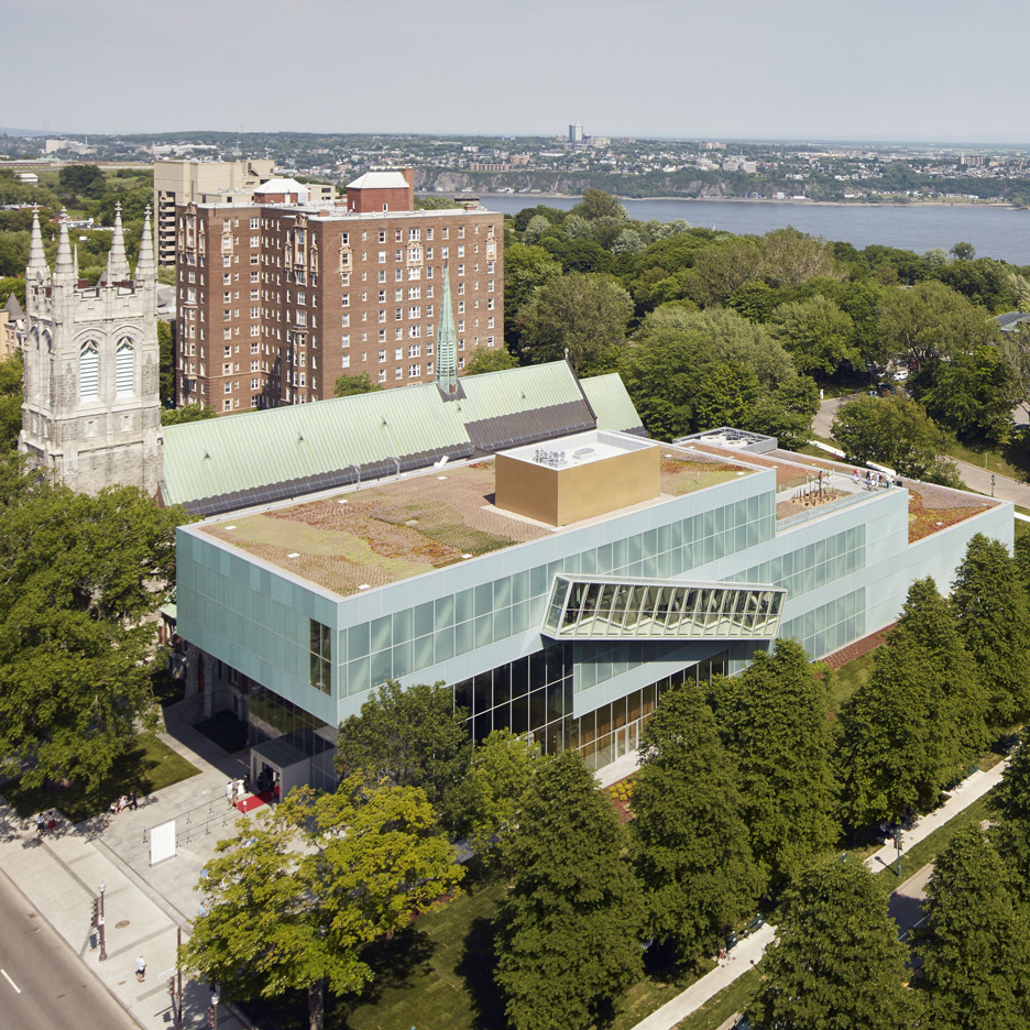
From the architect. The Pierre Lassonde Pavilion—the Musée national des beaux-arts du Québec’s fourth building is interconnected yet disparate—is a subtly ambitious, even stealthy, addition to the city. Rather than creating an iconic imposition, it forms new links between the park and the city, and brings coherence to the MNBAQ.
© OMA
The intricate and sensitive context of the new building generated the central questions underpinning the design: How to extend Parc des Champs-de-Bataille while inviting the city in? How to respect and preserve Saint Dominique church while creating a persuasive presence on Grande Allée? How to clarify the museum’s organization while simultaneously adding to its scale?OMA’s solution was to stack the required new galleries in three volumes of decreasing size to house temporary exhibitions, permanent modern and contemporary collections, and Decorative Arts and design, as well as Inuit artworks, creating a cascade ascending from the park towards the city. The building aims to weave together the city, the park and the museum as an extension of all three simultaneously.
© Bruce Damonte
Ground Level Plan
© Bruce Damonte
While they step down in section, the gallery boxes step out in plan, framing the existing courtyard of the church cloister and orienting the building towards the park. The park spills into the museum (through skylights and carefully curated windows) and the museum into the park (though the extension of exhibitions to the terraces and the outdoor pop-out staircase).
© Bruce Damonte
The stacking creates a 12.6m-high (42 ft) Grand Hall, sheltered under a dramatic 20m (66 ft) large cantilever. The Grand Hall serves as an interface to the Grande Allée, an urban plaza for the museum’s public functions, and a series of gateways into the galleries, courtyard and auditorium.
© Bruce Damonte
© OMA
© Bruce Damonte
The cantilevered structure is supported by a hybrid steel truss system and accommodates galleries uninterrupted by columns. The layered façade is simultaneously structural, thermal and solar, addressing the seemingly contradictory needs of natural light and thermal insulation for Québec’s harsh winter climate. The triple layered glass façade is composed of a 2D printed frit that pattern mimics the truss structure, a 3D embossed glass, and a layer of diffuser glass. In the galleries, insulated walls are located behind the translucent glass system, with a gap between that lights the building at night like a lantern in the park. The Grand Hall is enclosed by a glass curtain wall with glass fins that allow virtually unobstructed and inviting views to the Charles Baillairgé pavilion through a glass wall and ceiling. The contrast between the translucent gallery boxes and clear grand hall reinforces the reading of the building’s stacking and cantilevering massing.
© OMA
Complementing the quiet reflection of the gallery spaces, a chain of programs along the museum’s edge—foyers, lounges, shops, bridges, gardens—offer a hybrid of activities, art and public promenades. Along the way, orchestrated views from a monumental spiral stair and an exterior pop out stair reconnect the visitor with the park, the city, and the rest of the museum. Within the boxes, mezzanines and overlooks link the temporary and permanent exhibition spaces. On top of each of the gallery boxes, roof terraces provide space for outdoor displays and activities.
© Bruce Damonte
New exhibition spaces are connected to the museum’s existing buildings by a 130m (427 ft) long passageway, creating a permanent home for the museum’s 40m (132 ft) “Hommage à Rosa Luxemburg” by Jean-Paul Riopelle. Through its sheer length and changes in elevation, the passage creates a surprising mixture of gallery spaces that lead the visitor, as if by chance, to the rest of the museum complex.
© OMA
OMA wins competition for the Beaux Arts Museum in Quebec expansion
//cdn.embedly.com/widgets/platform.js
Pierre Lassonde Pavilion / OMA
© Bruce Damonte
- Architects: OMA
- Location: Parc des Champs-de-Bataille, Québec City, Canada
- Project : Expansion of the Musée national des beaux-arts du Québec (MNBAQ)
- Lead Design Architect: OMA (New York)
- Partner In Charge: Shohei Shigematsu
- Associate Architect: Provencher_Roy Architectes (Montreal)
- Client: Musée national des beaux-arts du Québec
- Area: 0.0 sqm
- Project Year: 2016
- Photographs: Bruce Damonte, OMA
- Team (Oma): Jason Long, Ceren Bingol, Patrick Hobgood, Luke Willis, Rami Abou-Khalil, Richard Sharam, Tsuyoshi Nakamoto, Sandy Yum, Sara Ines Ruas, Ted Lin, Markus von Dellingshausen, Andy Westner, Jackie Woon Bae, Carly Dean with Sue Lettieri, Michael Jefferson, Mathieu Lemieux Blanchard, Martin Raub, Demar Jones, Cass Nakashima, Rachel Robinson
- Team (Provencher Roy Architectes): Michel Roy, Claude Provencher, Pascal Lessard, Jonathan Audet, Réal Baril, Anik Bastien-Thouin, Mélanie Caron, Véronique De Bellefeuille, Konstantin Demin, Danielle Dewar, Daniel Legault, Layla MacLeod, Sonia Mailloux, Guillaume Martel-Trudel, Céline Coralie Mertenat, Katell Meuric, Fanette Montmartin, Franck Murat, Audrey Piché Mandeville
- Structure: SNC Lavalin
- Mep: Bouthillette Parizeau / Teknika HBA
- Code: Technorm
- Acoustics: Legault & Davidson
- Vertical Transport: Exim
- Cost Control: CHP Inc.
- Lighting: Buro Happold
- Façade Design: FRONT
- Façade Engineering: Patenaude Trempe, Inc., Albert Eskenazi, CPA structural Glass
- Auditorium: Trizart Alliance
- Local Advisor (Competition): Luc Lévesque
- Contractor: EBC
© Bruce Damonte
From the architect. The Pierre Lassonde Pavilion—the Musée national des beaux-arts du Québec’s fourth building is interconnected yet disparate—is a subtly ambitious, even stealthy, addition to the city. Rather than creating an iconic imposition, it forms new links between the park and the city, and brings coherence to the MNBAQ.
© OMA
The intricate and sensitive context of the new building generated the central questions underpinning the design: How to extend Parc des Champs-de-Bataille while inviting the city in? How to respect and preserve Saint Dominique church while creating a persuasive presence on Grande Allée? How to clarify the museum’s organization while simultaneously adding to its scale?OMA’s solution was to stack the required new galleries in three volumes of decreasing size to house temporary exhibitions, permanent modern and contemporary collections, and Decorative Arts and design, as well as Inuit artworks, creating a cascade ascending from the park towards the city. The building aims to weave together the city, the park and the museum as an extension of all three simultaneously.
© Bruce Damonte
Ground Level Plan
© Bruce Damonte
While they step down in section, the gallery boxes step out in plan, framing the existing courtyard of the church cloister and orienting the building towards the park. The park spills into the museum (through skylights and carefully curated windows) and the museum into the park (though the extension of exhibitions to the terraces and the outdoor pop-out staircase).
© Bruce Damonte
The stacking creates a 12.6m-high (42 ft) Grand Hall, sheltered under a dramatic 20m (66 ft) large cantilever. The Grand Hall serves as an interface to the Grande Allée, an urban plaza for the museum’s public functions, and a series of gateways into the galleries, courtyard and auditorium.
© Bruce Damonte
© OMA
© Bruce Damonte
The cantilevered structure is supported by a hybrid steel truss system and accommodates galleries uninterrupted by columns. The layered façade is simultaneously structural, thermal and solar, addressing the seemingly contradictory needs of natural light and thermal insulation for Québec’s harsh winter climate. The triple layered glass façade is composed of a 2D printed frit that pattern mimics the truss structure, a 3D embossed glass, and a layer of diffuser glass. In the galleries, insulated walls are located behind the translucent glass system, with a gap between that lights the building at night like a lantern in the park. The Grand Hall is enclosed by a glass curtain wall with glass fins that allow virtually unobstructed and inviting views to the Charles Baillairgé pavilion through a glass wall and ceiling. The contrast between the translucent gallery boxes and clear grand hall reinforces the reading of the building’s stacking and cantilevering massing.
© OMA
Complementing the quiet reflection of the gallery spaces, a chain of programs along the museum’s edge—foyers, lounges, shops, bridges, gardens—offer a hybrid of activities, art and public promenades. Along the way, orchestrated views from a monumental spiral stair and an exterior pop out stair reconnect the visitor with the park, the city, and the rest of the museum. Within the boxes, mezzanines and overlooks link the temporary and permanent exhibition spaces. On top of each of the gallery boxes, roof terraces provide space for outdoor displays and activities.
© Bruce Damonte
New exhibition spaces are connected to the museum’s existing buildings by a 130m (427 ft) long passageway, creating a permanent home for the museum’s 40m (132 ft) “Hommage à Rosa Luxemburg” by Jean-Paul Riopelle. Through its sheer length and changes in elevation, the passage creates a surprising mixture of gallery spaces that lead the visitor, as if by chance, to the rest of the museum complex.
© OMA
Dezeen Mail issue 311 features this week’s best stories and discussions
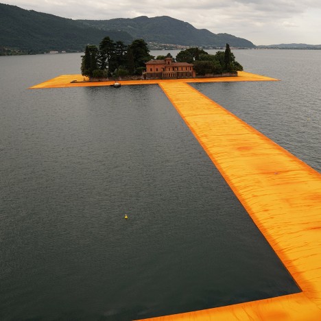
Floating saffron-coloured pathways on Italy’s Lake Iseo (pictured), updates on the UK’s European Union referendum and the opening of Herzog & de Meuron’s Tate Modern extension feature in this week’s Dezeen Mail.
Read Dezeen Mail issue 311 | Subscribe to Dezeen Mail
A Virtual Look Into Beverley David Thorne’s Case Study House #26

© Kathi Elliott
The biggest surprise in this Archilogic model is the spectrum of color. Anyone who has visited the Case Study House 26 in San Rafael, California during the last 40 years would be familiar with the building’s classic all-white steel frame look, but the architect, Beverley David Thorne, had originally picked a very different color scheme: “Dull Gold” for the steel, saffron and other more vivid colors for the interiors. “The choice of exterior colors,” wrote Thorne in Arts & Architecture magazine, “was dictated by the climate and the character of the surrounding landscape.” This Archilogic model recreates the original 1963 conditions, down to the bedroom wall and tile colors.
With the all-white scheme, Case Study House 26 resembles Mies’ Farnsworth House or one of modern architecture’s favorite references, the ocean liner. This is never more prominent than when you step out on the deep deck that floats over the site and offers a sweeping panoramic view of the Marin County hills, virtually denying that the house is built on solid earth.
The Case Study House program was an initiative sponsored by the Arts & Architecture magazine to address the housing shortage after World War II. Its mission was to provide a vision of how families might live in modern homes built with contemporary materials and technologies. With the post-war population and building boom, buildable land in California became scarce and more expensive, resulting in builders looking to hillsides as cheaper alternatives. For Case Study House 26, addressing the steeply sloped site was a self-imposed criteria that qualified the building for inclusion in the series. Ironically, the series resulted in architectural gems that did not shape mass housing, but rather influenced the tastes of discerning fans of high design. Steel frame construction was too expensive, and required too much precision, to be applied to cheap tract housing. Material-intensive details, like solid wood floors, made such houses unaffordable for most American families.
© Kathi Elliott
However, steel is an ideal material for construction on a steep slope. The large spans made possible by steel required fewer foundations, and by having the floor levels follow the terrain, the design avoided both expensive excavation or an unattractive “toothpick” look with exposed floor undersides.
“Touching the ground lightly” signaled an early environmentalist position and was a very important aspect for Thorne, who expressed this key intention in the A&A article as “resolving the integration of a space platform to the site without affecting the contours or natural state of the land or the occupants feeling that they are living on a hillside.”
A single drawing showing the section is enough to explain the entire house. It details the overall compositions and most construction details. Using only this section and a basic floor plan, the house could have been built. It is hard to imagine today, but the entire drawing set consisted of only four sheets. Many key decisions were made directly between the architect and contractor during construction, without the use of drawings. On site, the floor plan layout was flipped and prominent corners got windows instead of walls. Fittingly, the architect even got his hands dirty, helping to weld the steel frame himself.
© Kathi Elliott
Originally commissioned by the CEO of Bethlehem Steel, the first owners of Case Study House 26 were the Ketcham family, a TWA pilot and flight attendant couple, who raised their family there. The modern design corresponded perfectly to their profession. They equipped the home with cutting edge technology, like an intercom system and Jetson-esque kitchen appliances. Thorne, in addition to a few alterations, made plans to add a lower floor and pool, though they were never realized. With a few exceptions, like the current almost monochrome color scheme and a kitchen remodel, the house is preserved in its original 1963 condition.
The current owners maintain a website with more information, images and literature references on www.csh26.info, or follow them on Instagram.
We encourage you to experience Archilogic’s Virtual Experience in your Browser, create your own designs and share your tours online. To join the Archilogic Platform Sign up here and enjoy the free trial version of the pro subscription.
Archilogic transforms 2D floor plans into interactive, accessible and customizable 3D virtual tours in 24 hours from $69 upwards. Don’t miss Archilogic’s previous models shared on ArchDaily:
- Case Study House #1 / Julius Ralph Davidson
- Case Study House #9 / Charles Eames and Eero Saarinen
- Case Study House #6 / Richard Neutra
- Case Study House #22 / Pierre Koenig
- Case Study House #21 / Pierre Koenig
- Case Study House #8 / Charles & Ray Eames
- Farnsworth House / Mies van der Rohe
- Barcelona Pavilion / Mies van der Rohe
Marginal Street Lofts / Merge Architects Inc

© John Horner Photography
- Architects: Merge Architects Inc
- Location: United States, East Boston, Boston, MA, USA
- Architect In Charge: Elizabeth Whittaker
- Design Team: Allison Austin, Deb Katz, Parker Lee, Jamie Pelletier
- Area: 12110.0 ft2
- Project Year: 2015
- Photographs: John Horner Photography
- Project Architect: Anne-Sophie Divenyi
- Project Manager: Amit Oza
- Contractor: Delvecchio Construction
- Structural Engineer: Evan Hankin
- Mep Consultant: BLW Engineers
- Civil Engineer: GPR Inc.
- Façade: Boston Forging & Welding Corp.
© John Horner Photography
From the architect. This new nine-unit residential building occupies a small but unique site on the waterfront in East Boston. Located between the residential neighborhood of Jeffries Point and an active shipyard, public art gallery and cafe, the design utilizes industrial materials to effect a contemporary interpretation of context while dissolving the boundary between building and city. Planning limitations, including height restrictions imposed by neighbors, parking requirements from the city, and the developer’s desire to provide water views for every unit, presented an opportunity to strategically rework standard residential typologies. The result is tube-like stacked units opportunistically interlocked to effect sectional and proportional shifts within the space of the unit. Living, dining, and cooking areas on the front of the building are compressed and horizontal, leading the eye through a series of layered spaces toward framed views of the water and the Boston skyline beyond. Sleeping spaces in the rear of the building are compact in plan and tall in section, focusing the eye upward.
© John Horner Photography
On its façade, the building mixes an industrial material palette of corrugated steel and cable mesh with warm red cedar siding reminiscent of its triple-decker neighbors. The architects worked closely with a highly skilled team of metal workers to develop a fabrication method for the façade frame and attachment detail for the wire mesh, ultimately combining factory labor and the handmade. Each wire-mesh panel was partially fabricated by the mesh manufacturer in the factory and then painstakingly handwoven into the cables defining the edge of each facet on site.
© John Horner Photography
Diagrams
© John Horner Photography
The unique geometry of the façade, elevation of the building off the ground, and transparency of the lobby perform a tectonic negotiation between the territory of the building and the surrounding neighborhood. The porous boundary of the mesh façade pushes the private space of the unit into the public space of the street, while the parking void and lobby become an extension of the sidewalk. The façade and lobby thus becomes an amenity shared between the building’s residents and the neighborhood: climbing plants both green a predominantly concrete streetscape and provides shade for the residents in the summer, while the lobby acts as a display case for a rotating art exhibition visible from within as well as the street.
© John Horner Photography